Power Athletics

Nubraas Ali


Power Athletics – Complete Brand Redesign
Client Brief
Power Athletics, formerly Minnesota Power Athletics, wanted a complete rebrand to match their evolution into a more modern and focused gym wear brand. While we had designed their original logo back in 2018, the client wanted a fresh start with no elements carried forward from the previous identity. They envisioned a look that conveyed strength, power, class, and an elevated feel.
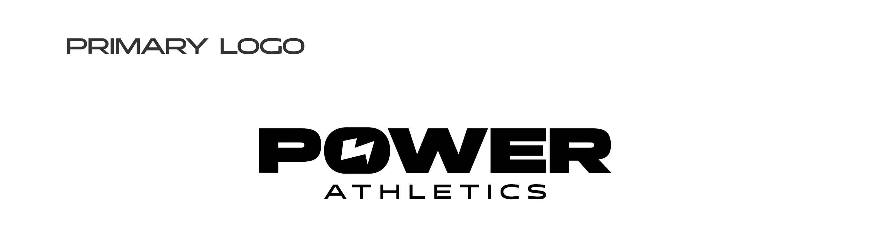
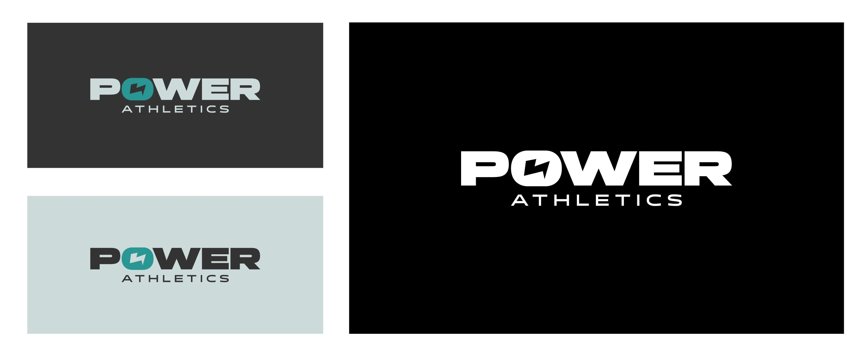
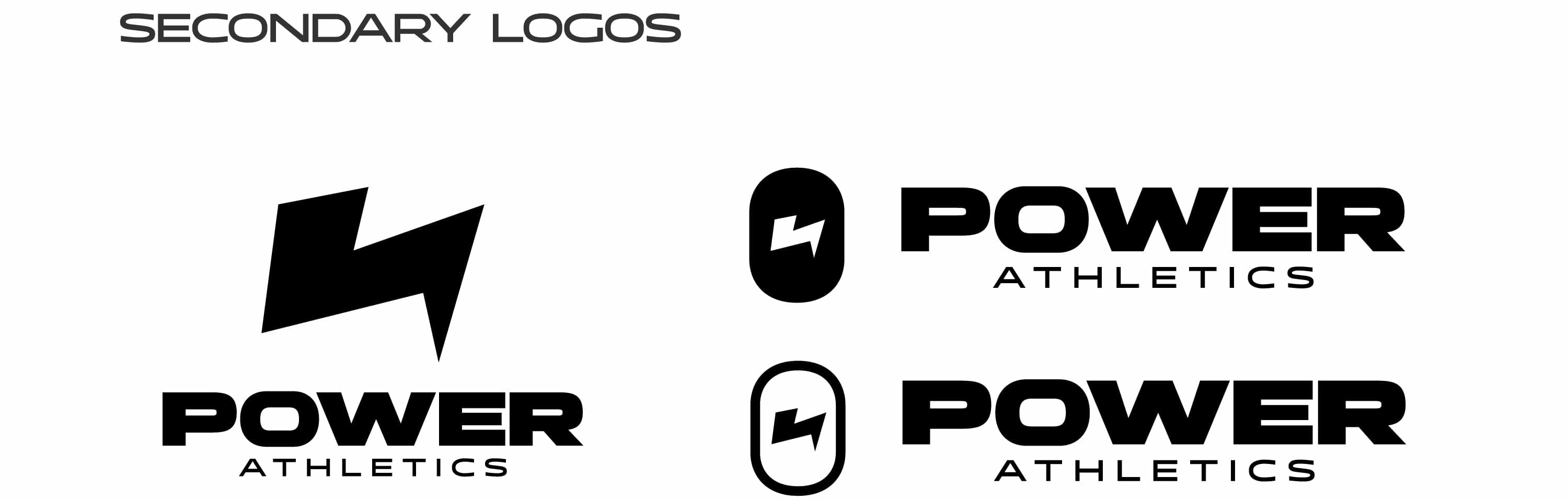
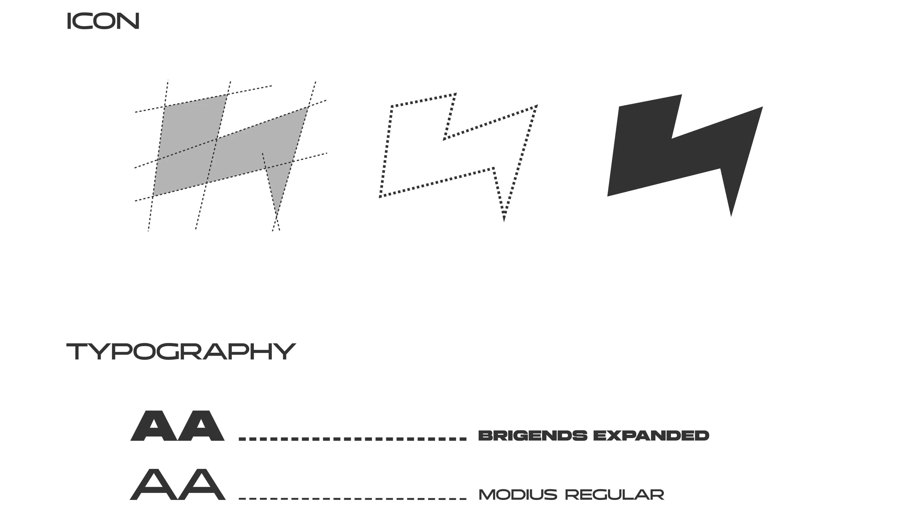
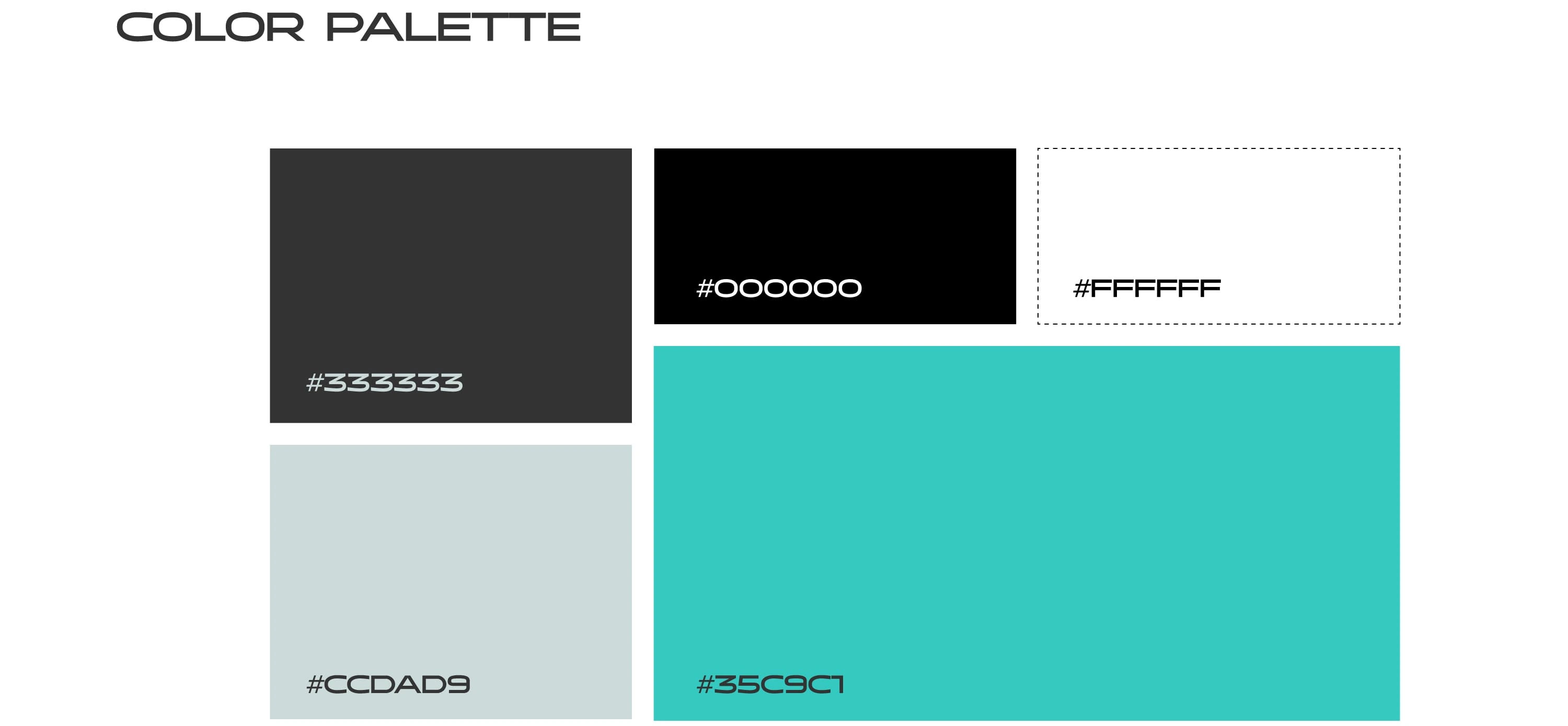
The new direction included changing the typography to something more clean and bold—replacing the previous slanted style—and restructuring the layout so that “POWER” appears large on top, with “ATHLETICS” placed smaller underneath. They also requested a lightning bolt element, ideally integrated into the “O” of “POWER,” and a standalone icon based on the bolt for use on merchandise and branding assets. Teal was chosen as the brand accent color, adding a vibrant and energetic tone to the identity.
Project Overview
The project involved a complete brand redesign, including logo development, typography, and a refined color palette. We explored strong, clean, and confident typefaces that matched the brand's bold, athletic character. The lightning bolt—designed as both part of the wordmark and a separate icon—served as the core visual element symbolizing motion, intensity, and strength.
The final deliverables included:
Primary logo with custom structure and lightning bolt integration
Secondary logo and icon versions for flexibility across print, apparel, and digital
A defined color palette with teal as the hero color
Typography guidelines to ensure consistency and tone across all brand materials
This rebrand established a sharp, powerful, and elevated identity that reflects Power Athletics’ ambition and growth in the gymwear space.
Like this project
Posted Apr 6, 2025
Complete rebrand for Power Athletics—revamped the logo, crafted bold new primary/secondary logos, and added a signature lightning icon.


TINTCreations
Shakes and Fries

Mill Wright Logistics