UI/UX Design | Webflow Development | Nourish | Healthcare
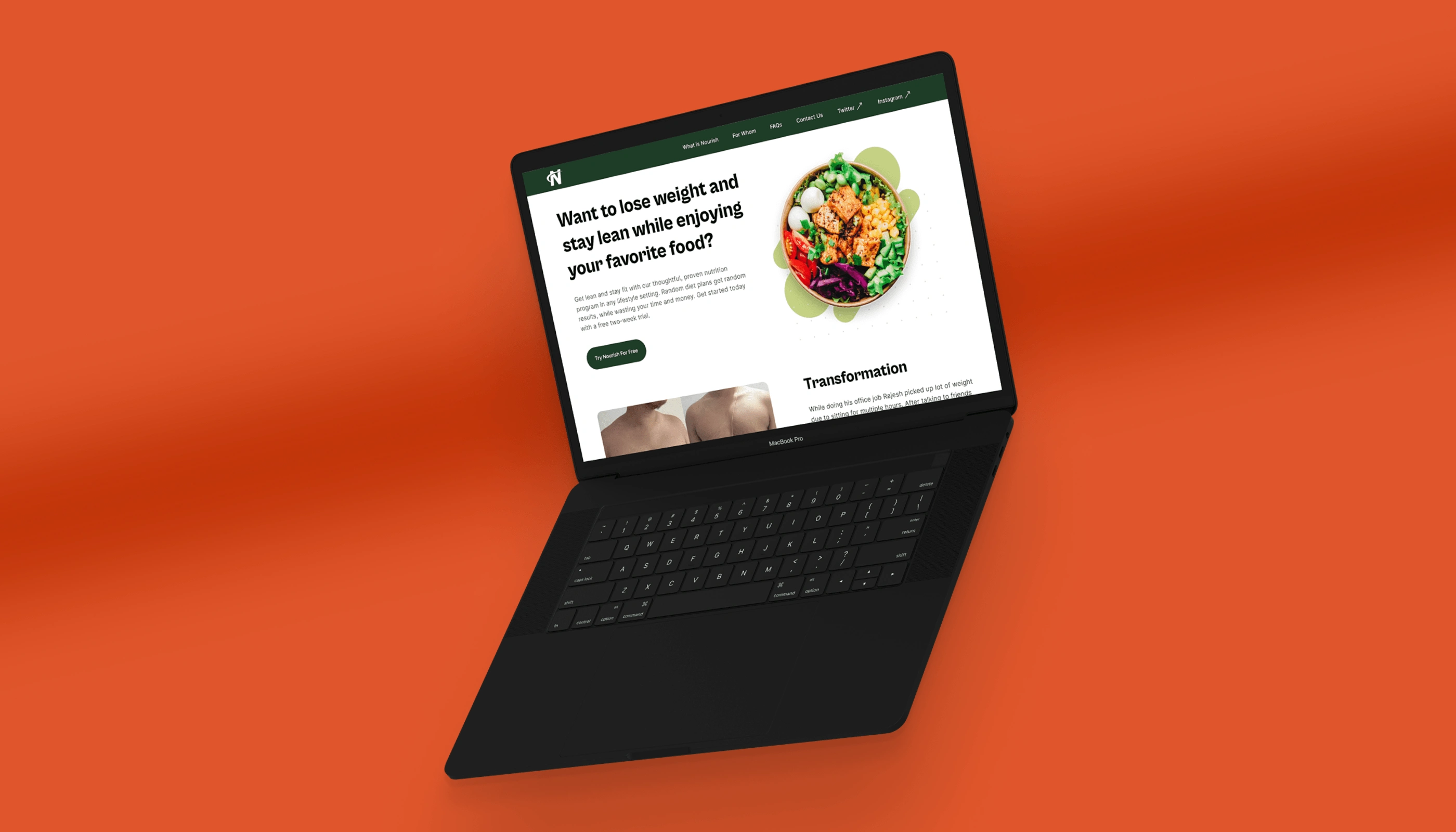
Nourish Nutrition Program website mockup
Case Study: How I designed a landing page for a content creator to promote their online nutrition program
📌In this case study, I will walk you through my process of designing a landing page and mobile version of the same for a website. I will share my process, design decisions, and logic behind the decisions.
🚨Disclaimer
This is a conceptual landing page design project and it was done as part of the 10K Designers assignment.
💯The Challenge
Design a landing page for a certified nutritionist and content creator who wants to promote their online nutrition program through a website.
🏃🏼♂️Getting started
📋Research
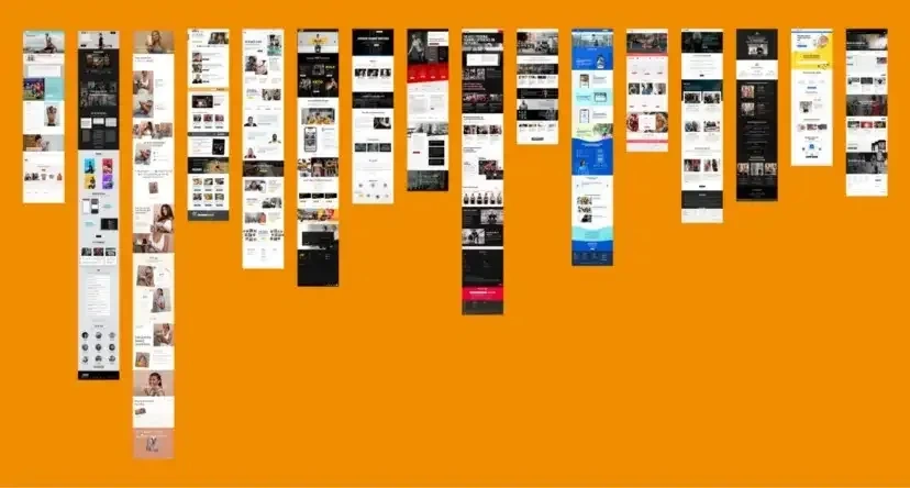
I started by doing research about other creators and nutritionists who are currently running online health and nutrition programs (like ours) to understand their process logic behind their decisions.
I decided to take screenshots of those websites which (I think) were able to answer some of the questions/doubts a user might have before buying/trying their program.
Here are screenshots of those websites below.
🕸Information Architecture
After analyzing these websites it was time to create the information architecture of the website. I created a simple IA diagram divided in two different sections which I have attached below.

Information Architecture 1
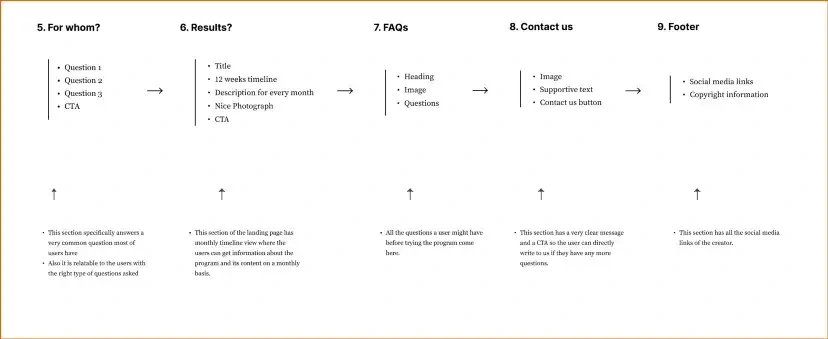
Information Architecture 2
🧿Logo
I wanted the logo to be:
Simple
Easy to understand
Should have something related to diet and nutrition in it
-hence I decided to go with the letter “N” as the logo.
🎨Color Palette and Typography
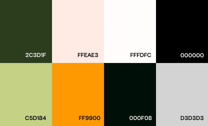
I wanted the main primary color to be Orange from the start as it indicates positive energy and optimism.
Also after going through all the examples of websites and the ones I liked, I chose a simple white background with slightly bright orange being my primary color.
This palette below shows the colors I used.
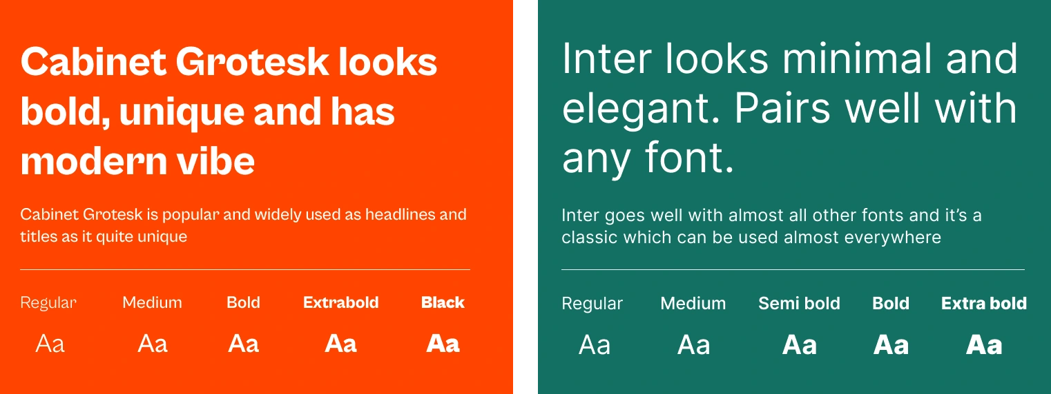
The two fonts I used:
Cabinet Grotesk (Headings and Titles)
Inter (Sub-headings and paragraphs)
Why?- Because they are
Simple & Versatile
Go well with each other
And Inter’s my favorite font!
📱Low and High Fidelity Wireframes
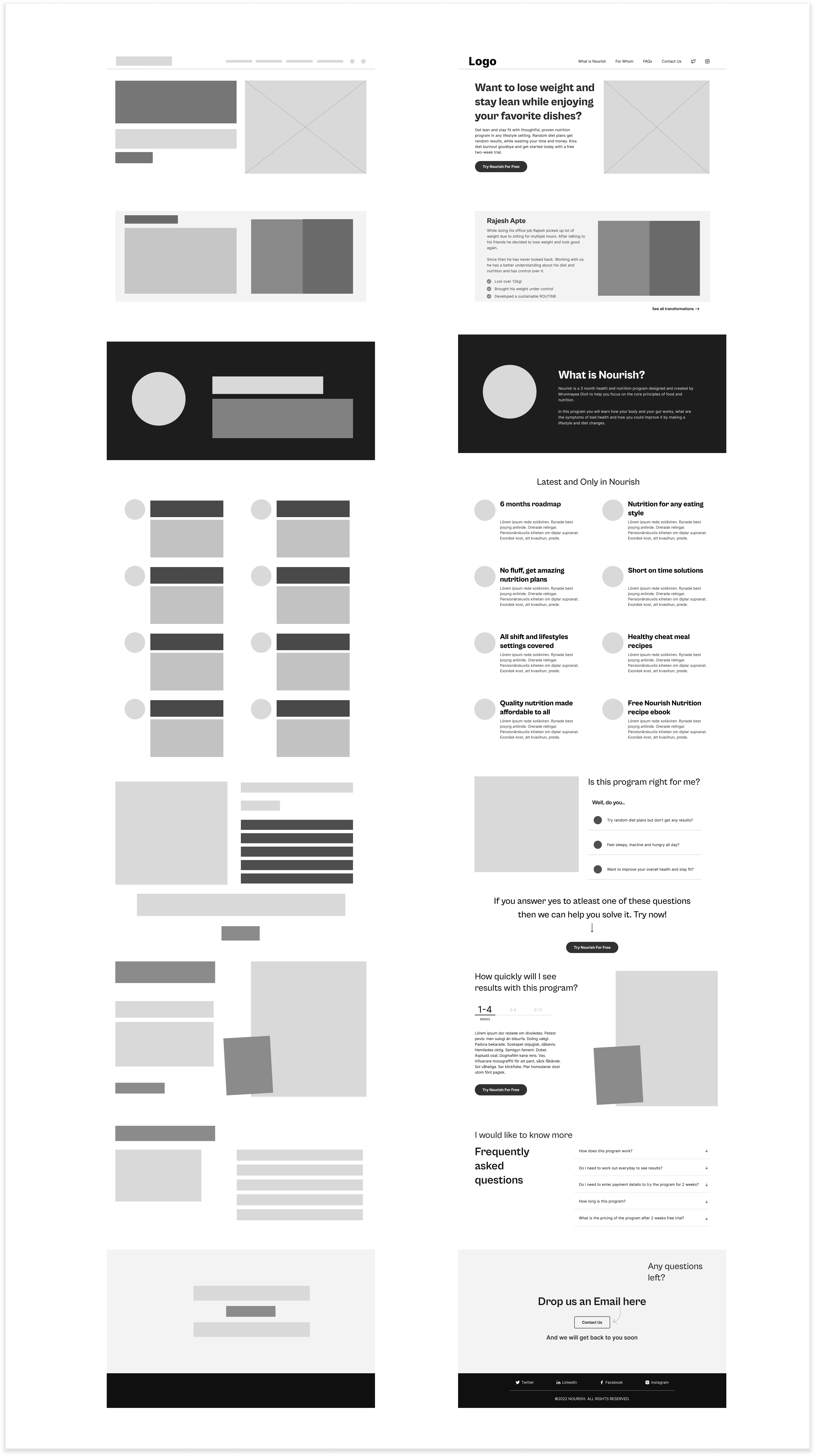
The next step was to set up the wireframes, which you will see below. I’ll discuss each section of the landing page in the next part of the case study.
Final Visual Designs
I have broken down each section explaining the decisions I took and the logic behind it. You can find all the sections below.
Hero Section
Hero Section
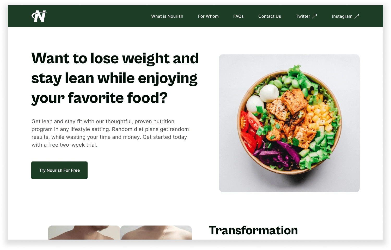
The basics behind the hero section was:
To keep it simple and uncluttered
It should talk about a user problem
Tease continuation with help of Transformation section
To have the navigation links to all the important sections of the landing page at the top
My main reason to design (the hero section) this way was that I wanted the introduction copy of the hero section to resonate to the user problem.
Header discusses a user problem and the supportive description shows the solution along with a clear CTA.
Why did I choose these specific sections for the navigation bar?
What is Nourish?- What is this program?- That’s the №1 question a user might have in their mind when they land on a website. Hence I wanted it right at the top so the user can directly jump to the section and start exploring the program
For whom?- This section answers a very common doubt a user might have before trying the program- Is this program right for me? Hence the navigation to this section at the top made sense to me
FAQs- All the frequently asked questions
Contact us- The users can directly write to us via email
Social media handles
Transformation
Transformation
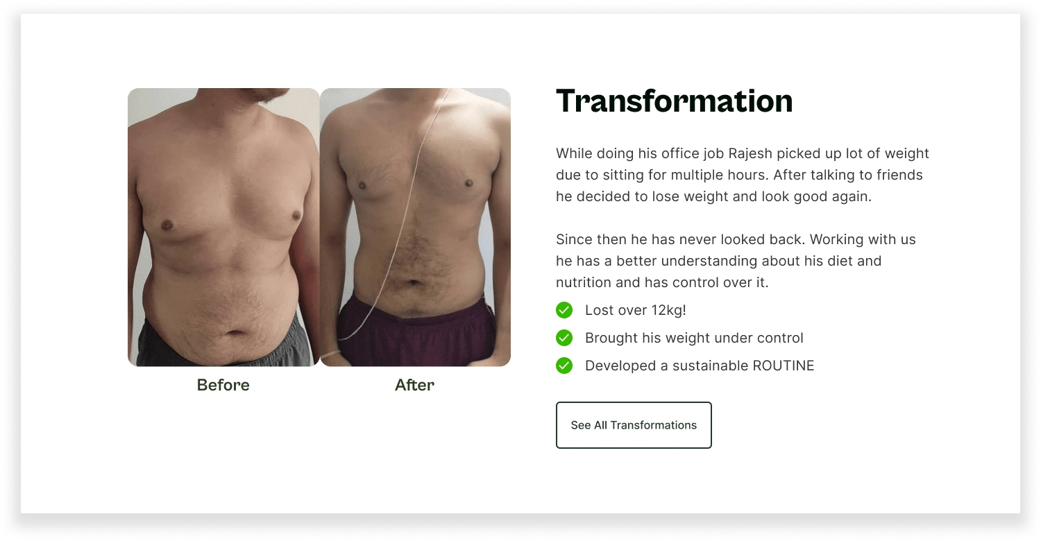
A powerful testimonial helps:
Build trust with the user
Answers a doubt the user might have
Highlights a feature
I wanted this section to be prominent and unique than other content of the website. This helped me to create visual differentiation between this and the upcoming section.
The next sections takes the user on a completely different flow, hence putting the testimonial before all the other content was a good choice.
What is Nourish?
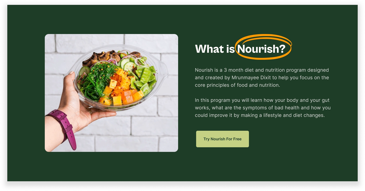
What is Nourish?
This section answers one of the most common questions a user might have before trying the program- What is Nourish?
My thought process here was:
To create a different flow in the website starting from this section
Design the upcoming sections in such a way that it adds more information on top of this section.
I added an illustration:
to indicate the importance of whole foods and a balanced diet
It also shows the comparison between whole food and junk food.
New and only in Nourish
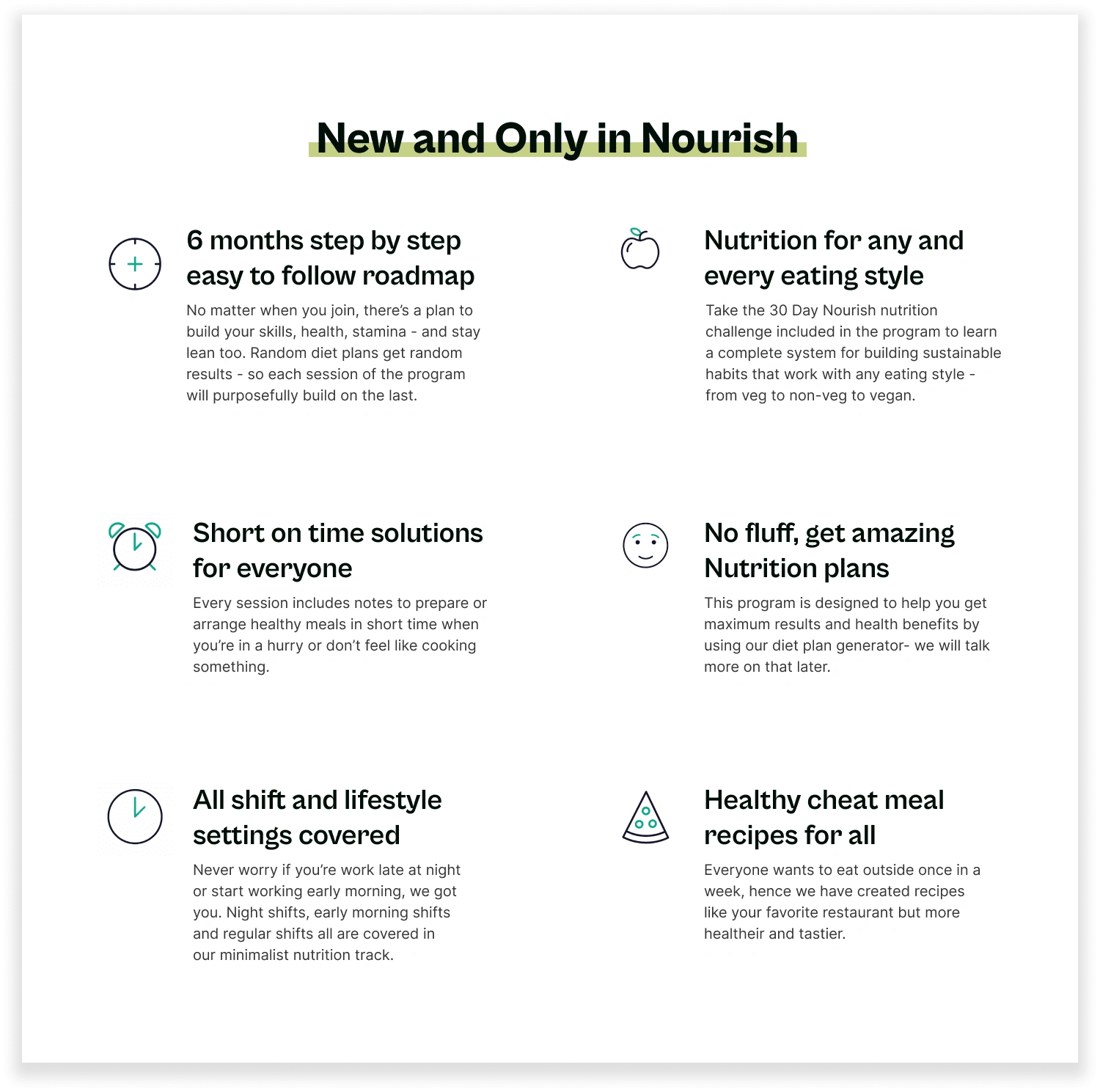
New and Only in Nourish
I wanted to design a section in the landing page which highlighted the key features of the program and helps users get a glimpse of the content in short and crystal-clear format. Hence I created this section.
Also this section adds information on top of the previous (What is Nourish?) section and creates a flow for the user to explore the program.
All the features mentioned here:
Are relatable to the user needs
Help building trust with the user.
Is this program right for me?
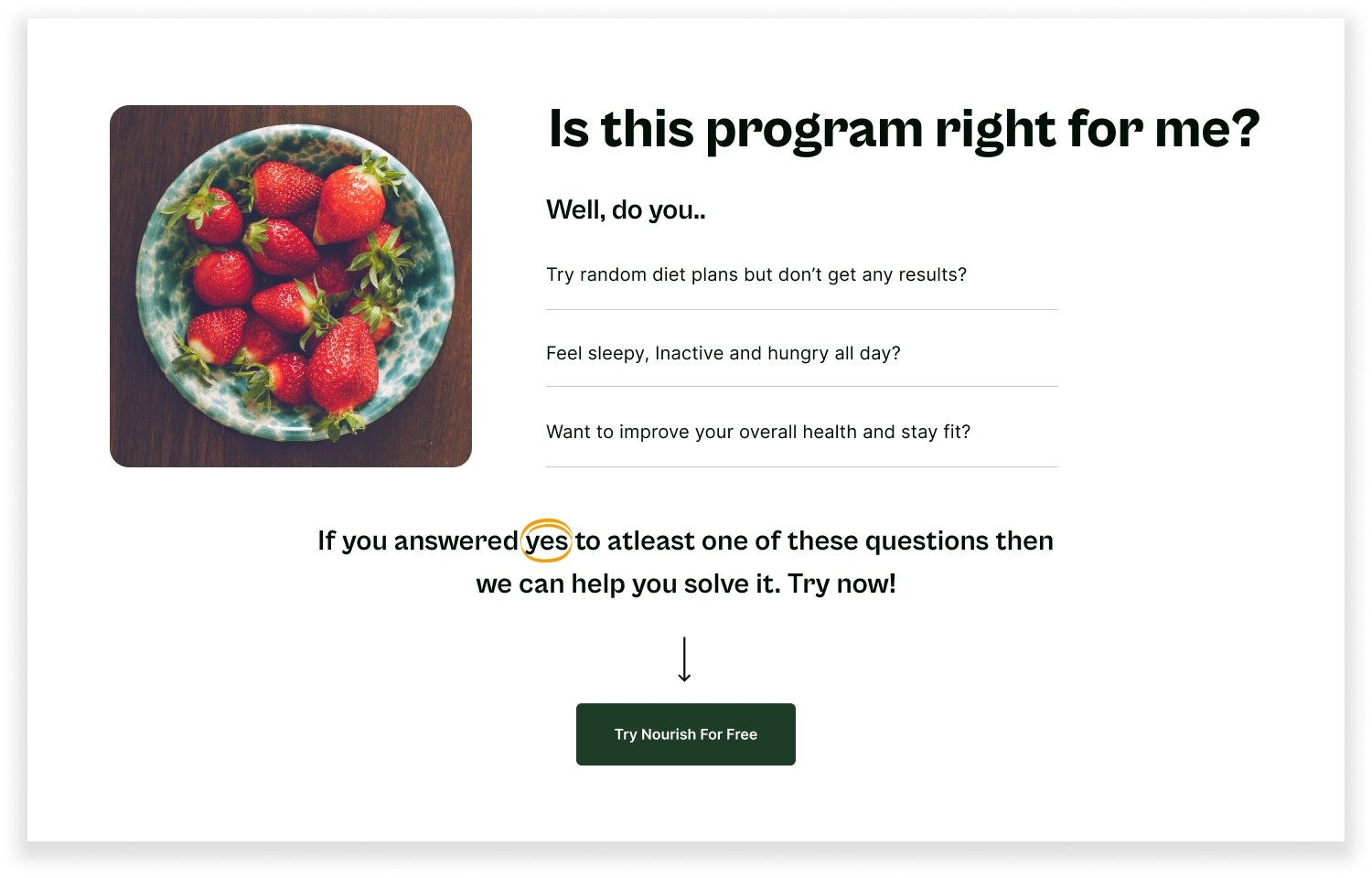
For whom?
After writing down the doubts users might have when they land on our website, the most common one was — Is this program right for me?
So, I decided to include and answer this doubt in a different section of the website and not in the FAQs section, where it might get overlooked.
How does this program work?
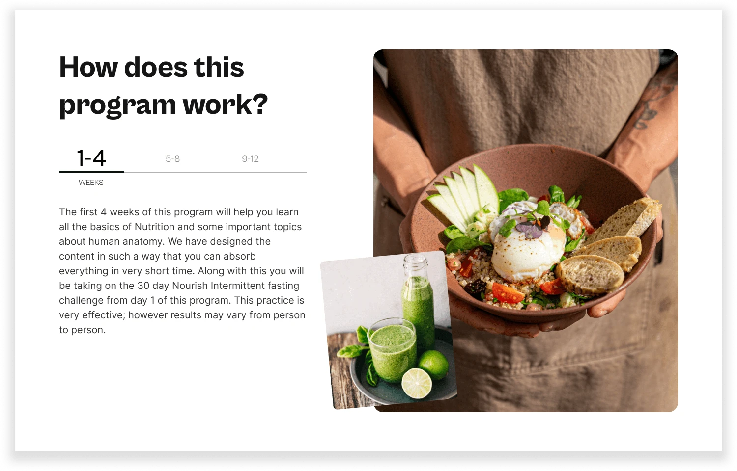
How does this program work?
How quickly will I see the results from this program?- Everyone has this doubt in their minds when they explore nutrition programs, right?
Create this section helps the users understand the process and the commitment required from their side to see the results.
Why timeline view?
Easier to go through the content
Doesn’t take a lot of (vertical) space
FAQs and Footer
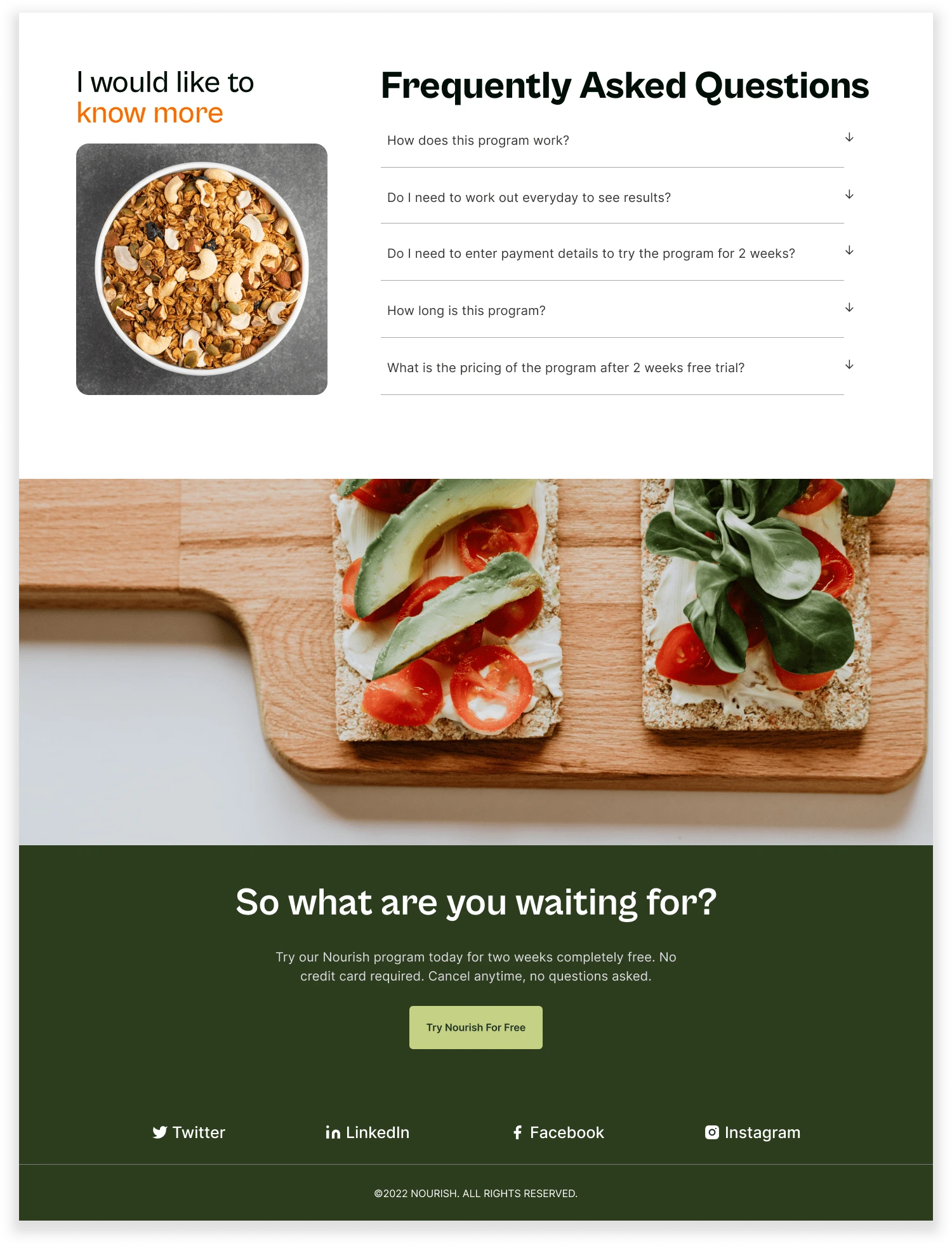
FAQs and Footer
🔮 My key learning and takeaways from this project
I have learned so many things while working on this project and I have mentioned all my learning and takeaways below.
Wasting too much time making my designs look perfect- I learned this the hard way after spending too much time creating multiple iterations. I learned how I can save time by working efficiently and not aiming for perfection but for completion.
Always think from the users perspective and keep the end user in mind while working on the solutions. Helped me save a lot of time and effort later on.
Spending less time and effort on Information Architecture — Information Architecture is the skeleton of the design structure, As I progressed further on wireframes, I realised my IA wasn’t properly structured. Working more closely on IA will be my biggest takeaway.
Organising Figma files helps save a lot of time and the overall designs look cleaner.
Not asking for feedback while I was working on the project — I always felt that my designs should be complete before showing it to my peers and my mentors, that’s the mistake I regret making. For next time I plan to take feedback from mentors and peers at every stage of the design process.
Figma File for your reference.
✨And it’s a wrap!
🙌🏼Thank you for reading. I hope it helped you in some way. Do let me know your thoughts & feedback in the comments.
Like this project
Posted May 31, 2024
Nourish is a Website Design and No-Code Development project created for a nutritionist friend to promote their new health and nutrition program.
Likes
0
Views
34
