Republic Bank UI Refresh
Ryan Augustine
Republic Bank
Redesigning the user interface & experience of a Caribbean banking app.
The Problem
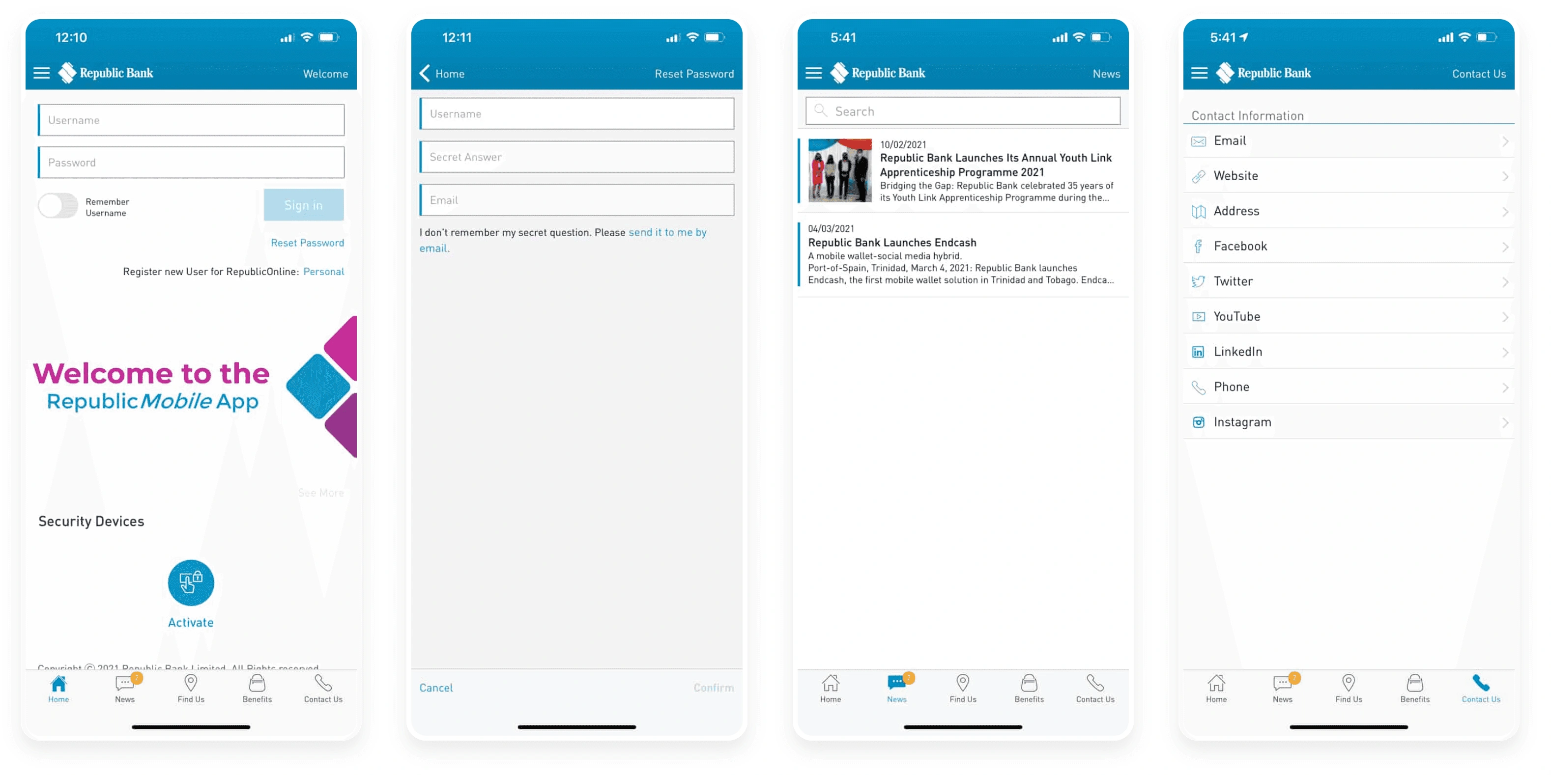
During a zoom call with my friend and business partner, I witnessed him get quite flustered using Republic Bank’s mobile app and receiving very little help from a customer support representative. Funny enough, I gave up on trying to use the app the day it was launched because the pain points were just unreal. Being a UX/UI designer and an advocate for accessible design, I couldn’t help myself but to redesign their user interface to see what a more user-friendly solution would look like.


Let’s Dive In – The Approach
To understand the problem better and coming up with the strong rationale solution, I followed the Human-Centered design approach.
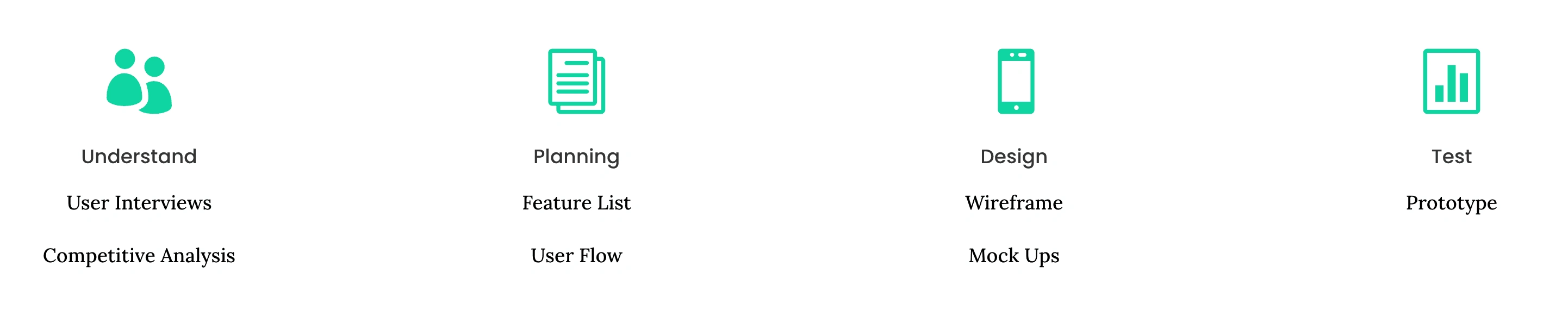
Understand
Before further user research there are some hypothesis that can be validated through personal experience and understanding the market.
Users age ranges from 19-65 years old.
User pain points could lead to major ramifications.
Accessibility needs to be at the forefront of all design considerations.
Interviews
I took the time to ask a couple friends and family members about their experience with the app and unfortunately (also expected) they were all very displeased and discarded the notion of it being a potential solution for online banking.
Main Takeaways:
Most people cannot access their accounts.
Most people call the bank for assistance and still don’t get through.
Most people who have access still have issues with the app.
Competitive Analysis Summary
After taking a look a the alternatives, there is only one competitor who truly provides a modern user-friendly solution which is Scotiabank (the only non-Caribbean bank which is understandable…sadly). Based on user feedback though, not many people mentioned this as a major concern because there is a level of expectation that online banking is still relatively new and will take time.

In my personal opinion it’s quite unfortunate because the conveniences of an effective solution could have a major impacts on the daily lives of locals, businesses and consequently, the economy.
Planning
I started with identifying the user task flows before we redesign the user experience and interface.
Design
Brainstorming — laid out all the key pointers in one place to keep in mind whilst get into redesigning.
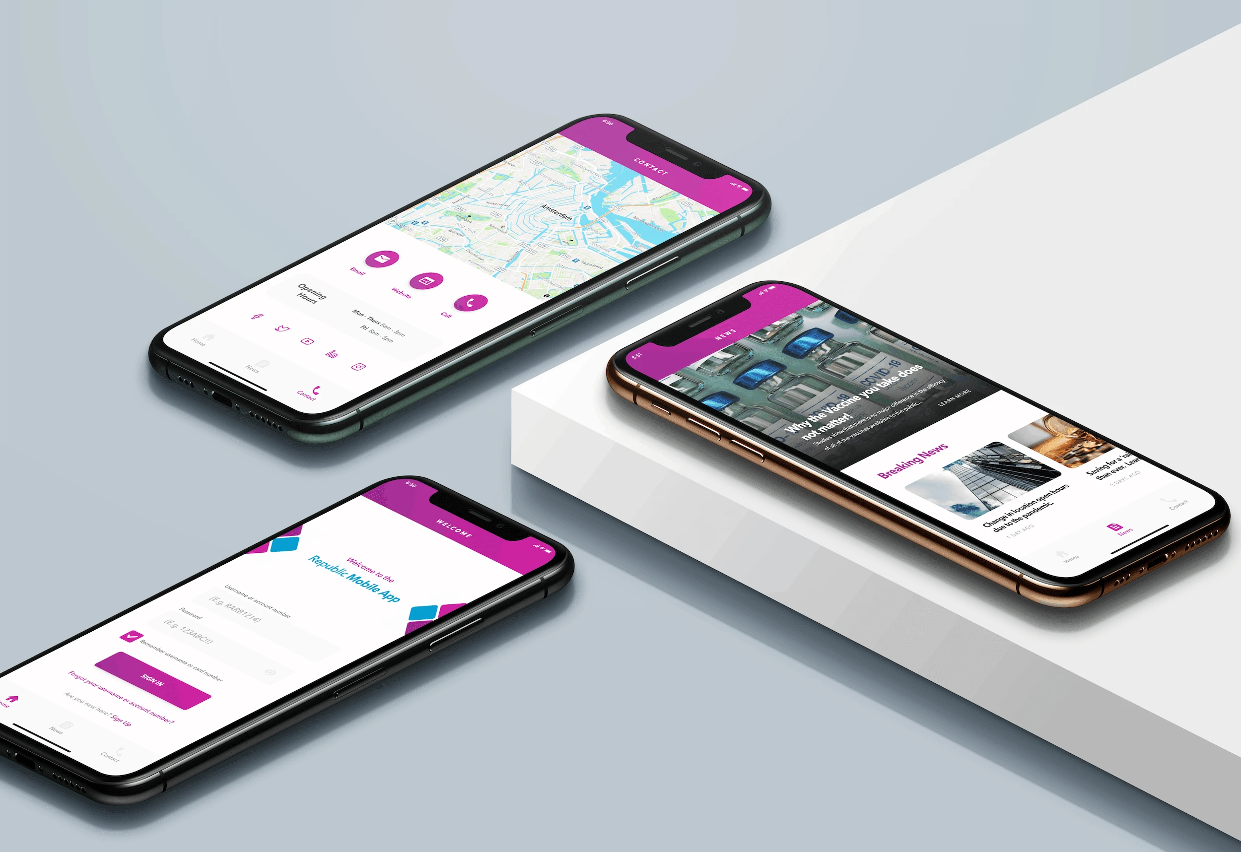
Here are the main UI I am redesigning:
Sign in/sign up
Reset Password
News
Contact
I went a bit deeper with the signup/sign-in UI as it is the landing and is the most consequential.
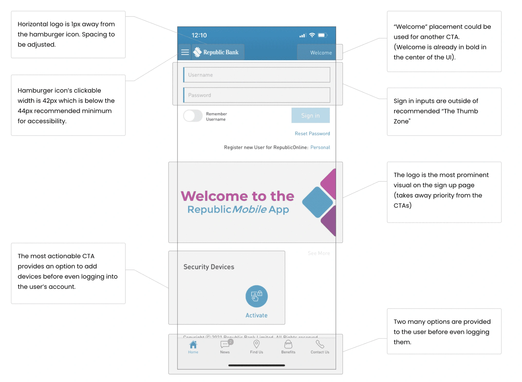
Main takeaways:
CTAs are poorly prioritized
We need to remove and consolidate elements
Accessibility has not been considered
There are too many options on landing (Hick’s Law)
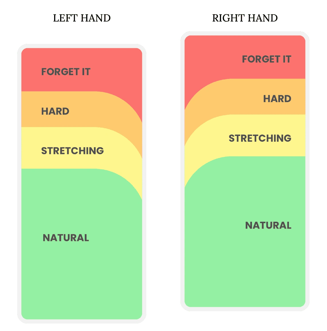
Let’s take a look at how the UI fits the Thumb Zone and identify how we can approve the accessibility of the experience.
The thumb zone is basically the “safe zone” on a mobile device where thumbs feel the most comfortable when interacting with the screen. The term was first coined by Steven Hoober, an expert in mobile interfaces.
Here are the regions the represent the Thumb Zones for the average mobile phone for both right and left handers.
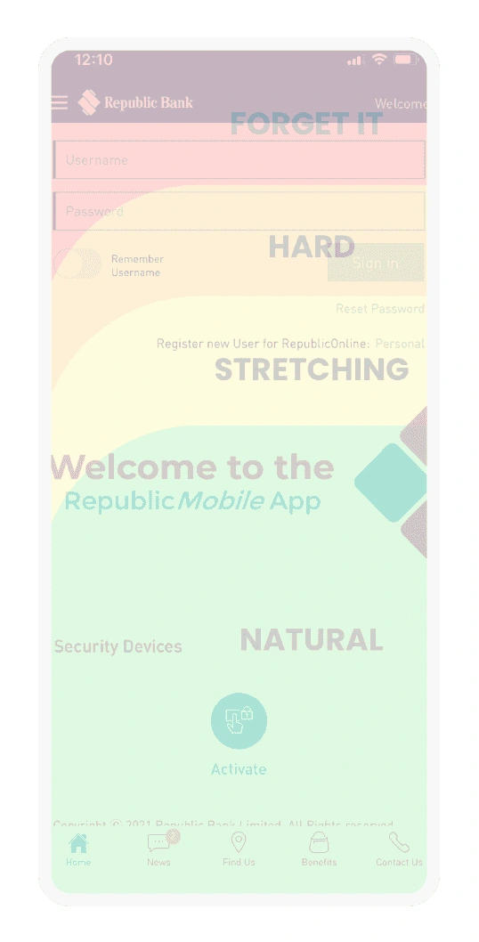
Here is the Thumb Zone used an overlay on the UI to identify what the current UI permits.
Main takeaways:
Sign-in/signup inputs are in the most difficult region to reach which makes it almost impossible for the average user to use one hand in this instance (accessibility issue).
The logo, which is not a call-to-action, occupies about 20%-30% of the natural region.
The natural region only consists of secondary CTAs.
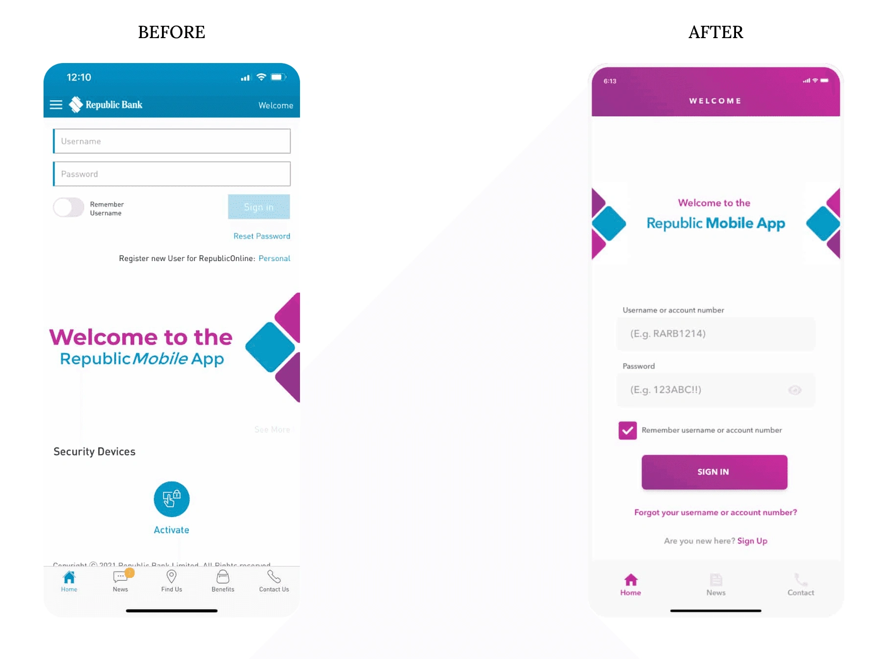
Here is a redesign of the UI with accessibility considerations while addressing the other issues mentioned.
Primary considerations:
Primary CTAs in the Thumb Zone
Consolidated Menu Bar
Logo & “Welcome” moved into the most difficult regions to reach as they are not CTAs
Clearly hierarchical organization
Remove unnecessary CTAs
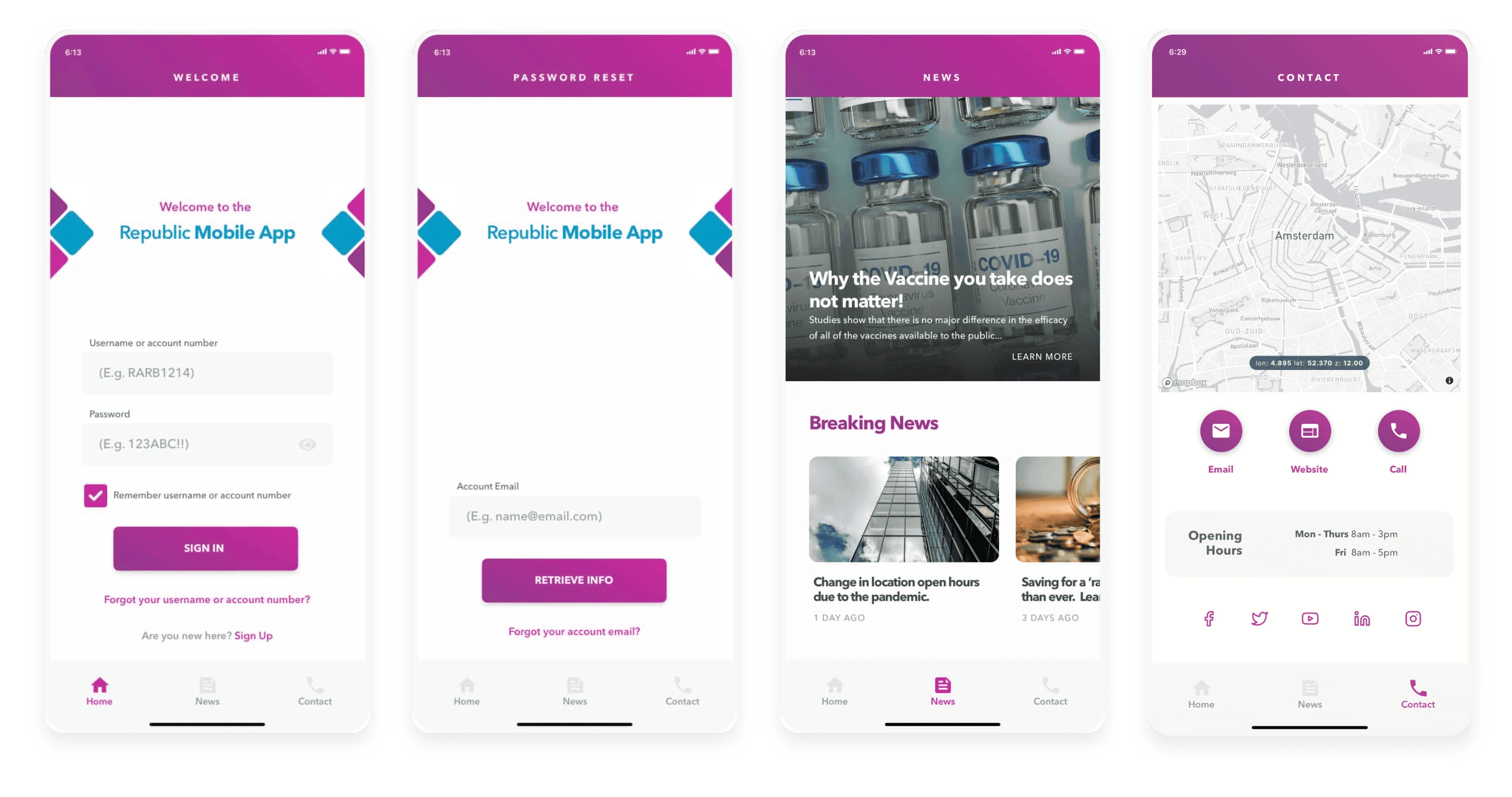
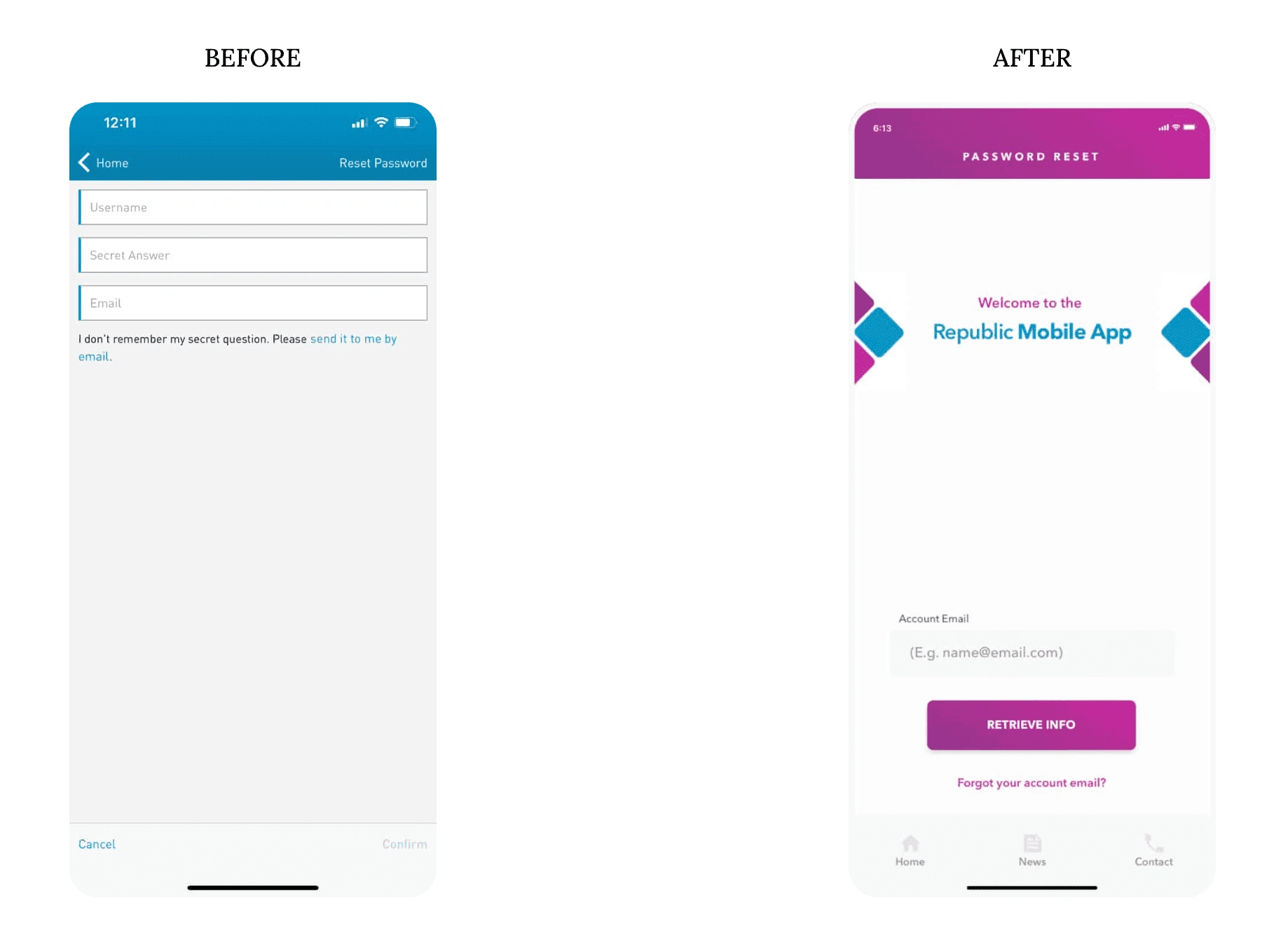
Here is a redesign of the Reset Password UI with accessibility considerations.
Primary considerations:
Primary CTAs in the Thumb Zone
Logo and screen label moved into the most difficult regions to reach as they are not CTAs
Simplification of reseting with the use of email only
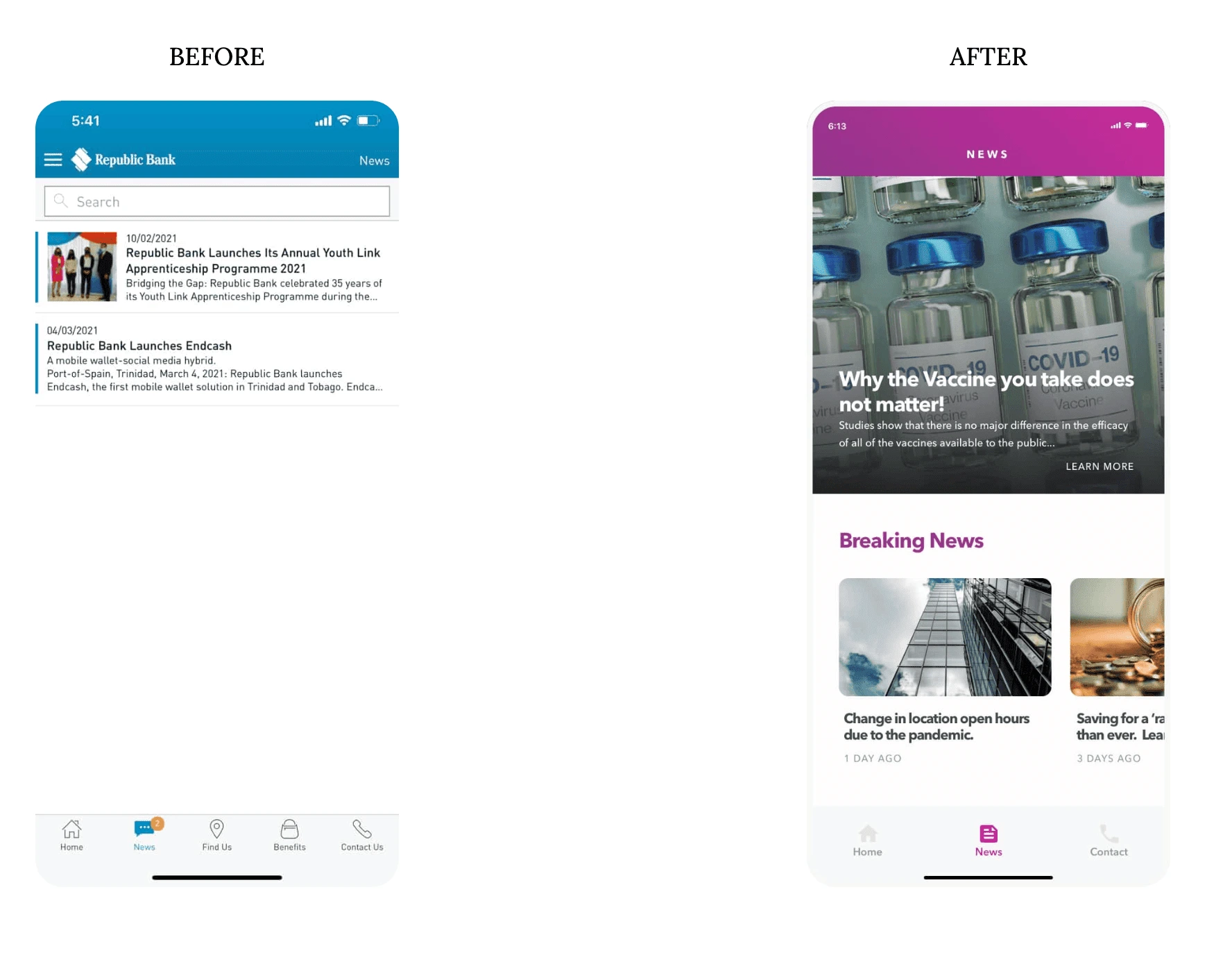
Here is a redesign of the News UI with accessibility considerations.
Primary considerations:
Primary CTAs in the Thumb Zone
Larger font size titles for readability
Image usage
Hierarchical structure
Here is a redesign of the Contact UI with accessibility considerations.
Primary considerations:
Primary CTAs in the Thumb Zone
Consolidation of “Find Us” (map) in the menu bar and the Contact Us
Hierarchical structure
Social media icons (outlines without text) as they are secondary CTAs
Feel free to leave feedback. I would love to hear your views and recommendations.

Like this project
Posted Mar 21, 2024
Redesigning the user interface & experience of a Caribbean banking app.
Likes
0
Views
14
Clients
Republic Bank