Buoy Health AI Assistant
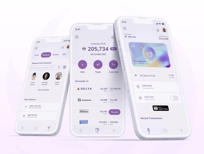
Ryan Augustine
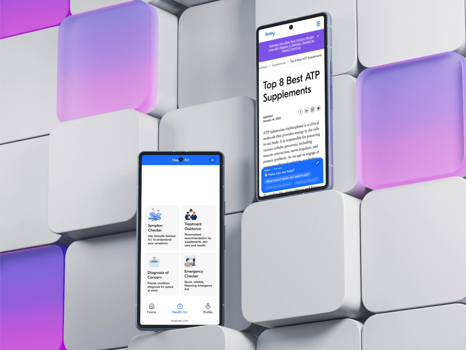
AI-driven chatbot to give personalized recommendations and expert reviews, giving users the guidance they need to take control of their health.
The Problem
How do we include the currently form-like solutions on the web platform into an AI assistant seamlessly. This was of course both a major user experience and user interface challenge that was really enjoyable to say the least. The key challenges:
Diving deep into the minds of users to understand their needs, pain points, and aspirations. Craft design solutions that put them at the heart of the experience.
Generating bold and imaginative UI design concepts that challenge the status quo in healthcare.
Continuously refine and enhance user journeys and UI designs based on user feedback and evolving business goals.
Uphold the company's brand identity, ensuring design consistency across all touch points.
Applying thinking out of the box in UI design, such as gamification.
Ensuring flexibility and scale-ability
Let’s Dive In – The Approach
To understand the problem better and coming up with the strong rationale solution, I followed the Human-Centered design approach.
Understand
We began with concept testing before iterating and leading into usability testing. We established the user demographics we would be testing for this specific experience, and here is where we landed:
Users age ranges from 18-65 years old.
User have a moderate interest in getting health care assistant.
Interviews
We utilized usertesting.com for both our concept and user testing and we landed on some very apparent but also very surprising insights.
Main Takeaways:
Most people said the initial previews to use the assistant did not clearly communicate the value (expected)
Most people were not distracted by the ads on the web page (surprising)
Most people found that the assistant journey was more favorable than the form-like structure (validating)
Competitive Analysis Summary
For the sake of research, unfortunately there was only 1 direct health care assistant that was providing a similar but they were not even very well established. They were a good gauge to understand the currently approach but validating that there was a gap in the market.
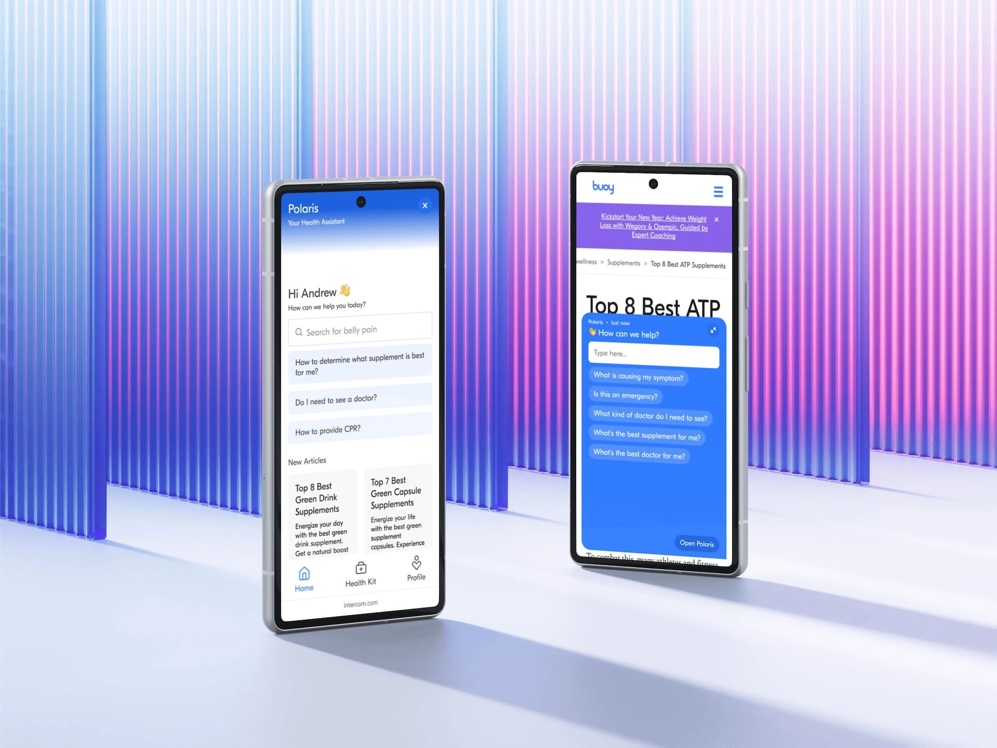
We took a look at a number of indirect competitors, primarily Intercom.com, as they had extensive research and data around their customer service AI assistant.
Planning
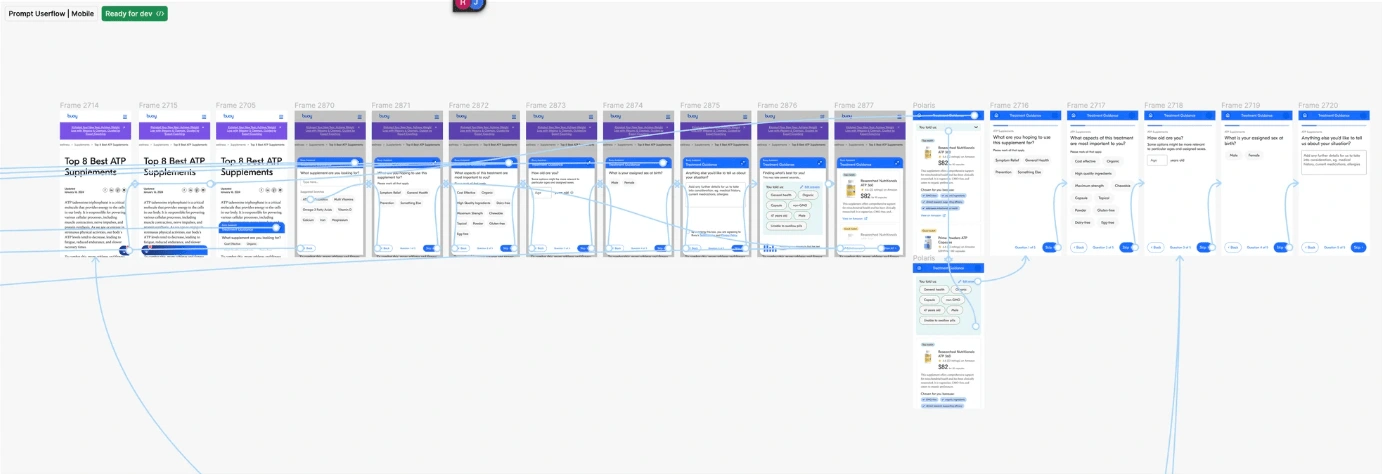
I started with identifying the user task flows before we designed the user experience and interface.
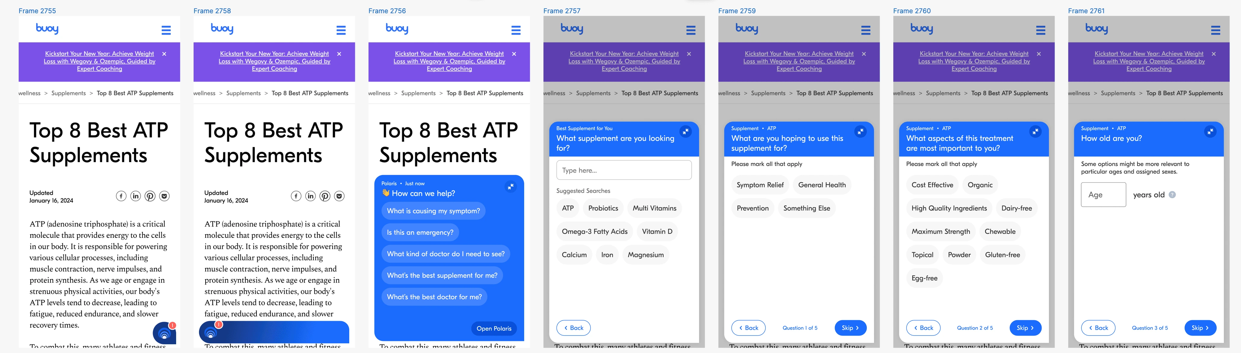
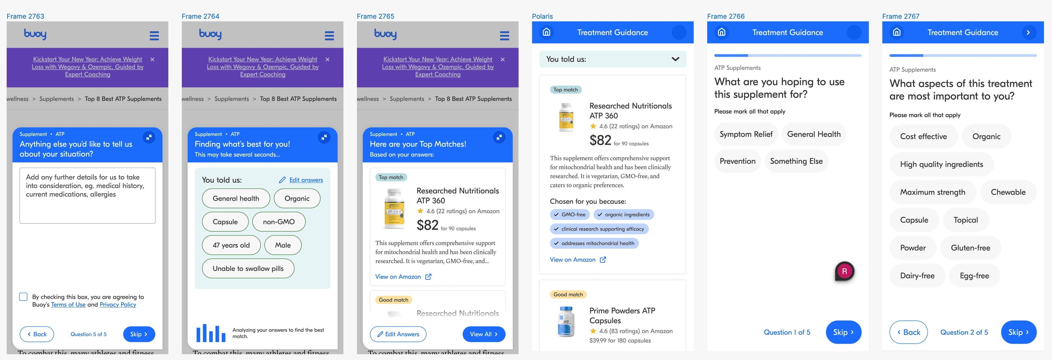
Design
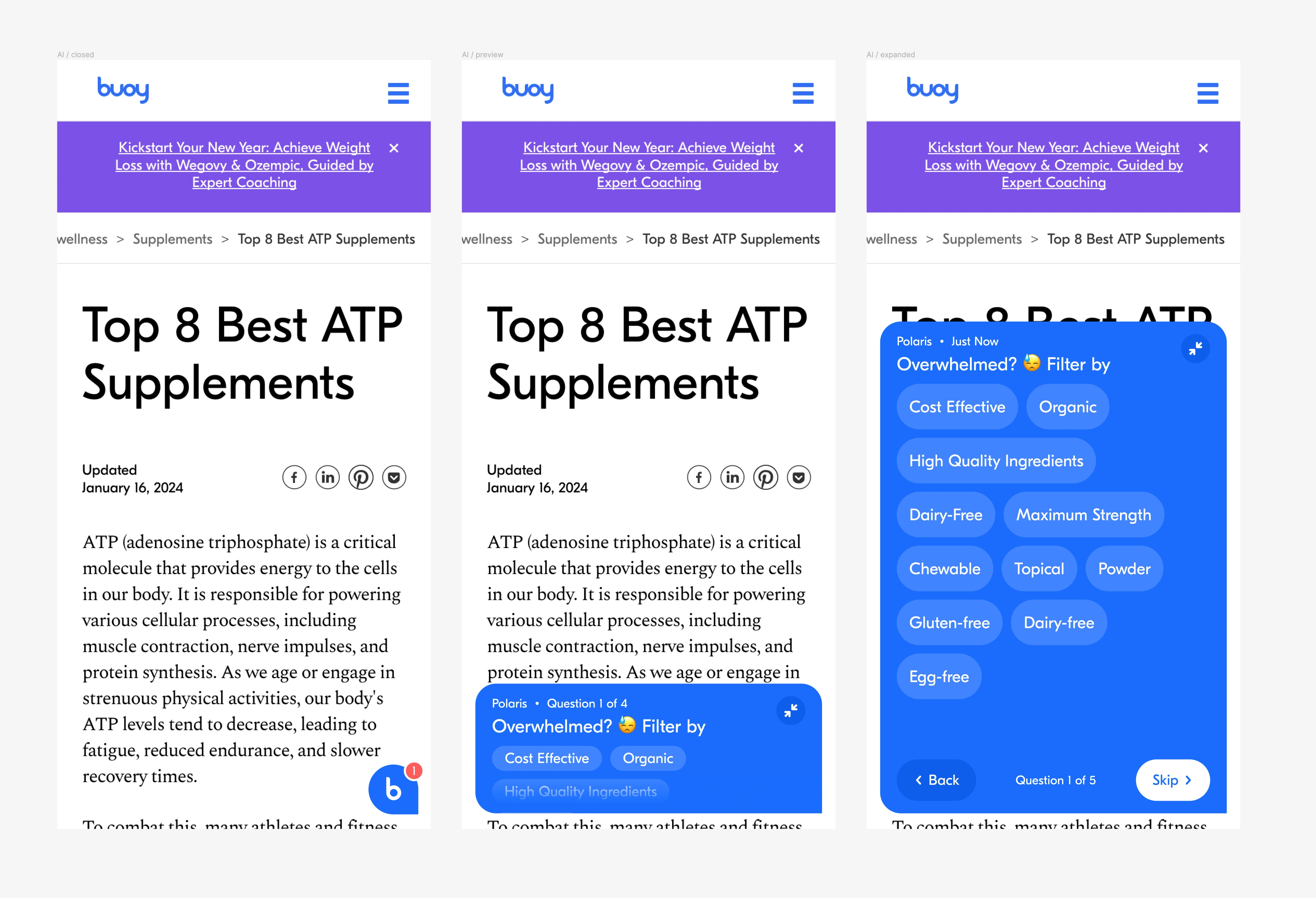
Here are the form-like UIs we were considering when including them within the assistant.
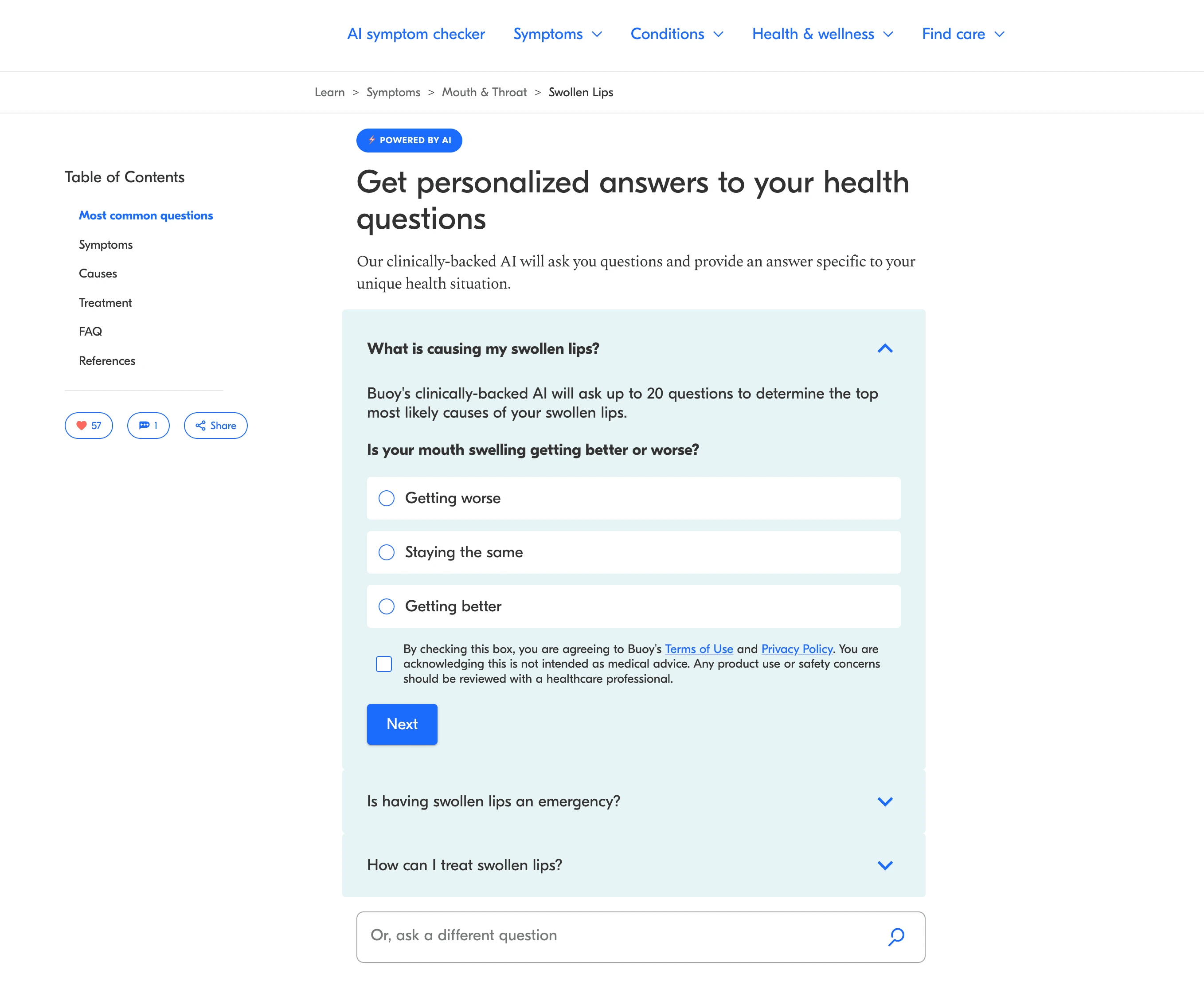
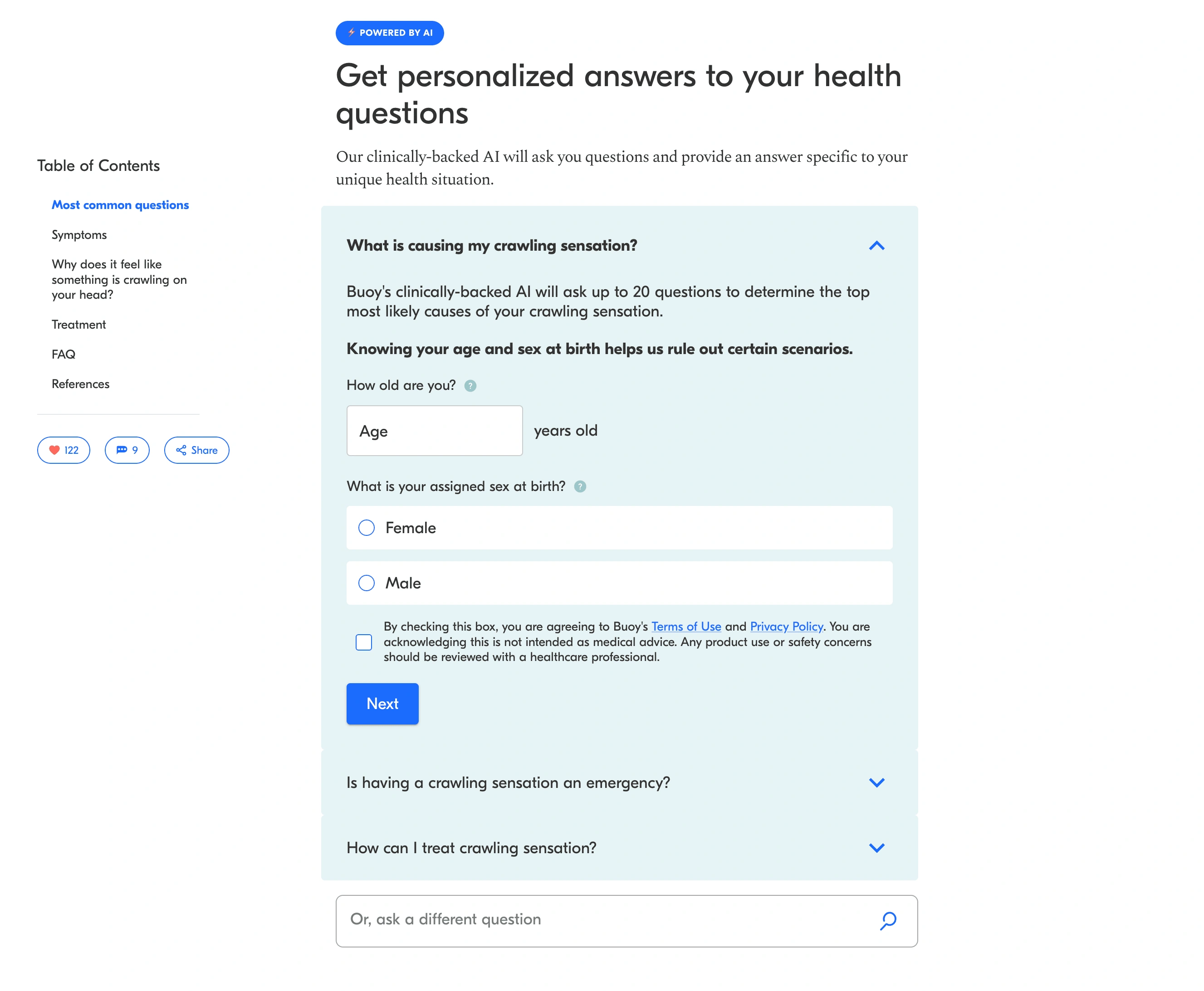
Main considerations:
Ensuring accessibility despite the screen size
Flexibility with a change in user intent
Storing and recovering data
Visual hierarchy improvement
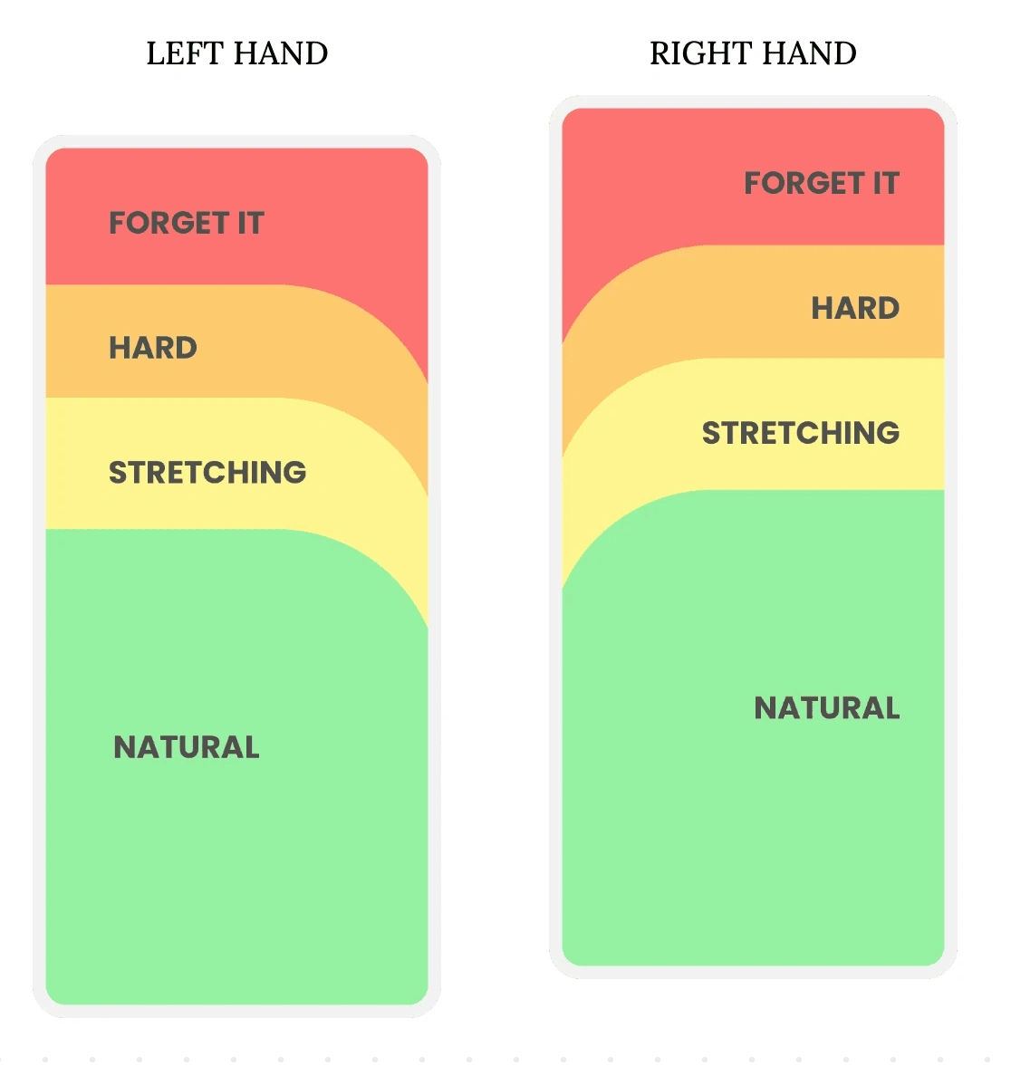
Let’s take a look at how the UI fits the Thumb Zone and ensure that the experience could be one-handed with minimal interaction cost.
The thumb zone is basically the “safe zone” on a mobile device where thumbs feel the most comfortable when interacting with the screen. The term was first coined by Steven Hoober, an expert in mobile interfaces.
Here are the regions the represent the Thumb Zones for the average mobile phone for both right and left handers.
Primary considerations:
How does the assistant work with fixed and dynamic ads?
How do we solve for longer forms with heavier text requirements?
How do we avoid highjacking the user experience?
Wireframing & Mockups
We already had an established brand identity and design system foundation so I leaned into hi-fi wireframes and mockups.
Test
I then prototyped all final designs and these were then testing on the live website and within the first month we were able to validate our design foundation for future iterations.
Main Takeaways
What I learned
The experience was immensely challenging but was really enjoyable. It validated my inner desire for harder challenges and to seek those out before anything else. The product also is having a positive impact on society and if I could marry the challenge with a positive impact, I'm almost sure to find fulfillment.
What I would have done differently
I would have fleshed out more of the potential userflows in the beginning of the process. Granted they didn't exist, we had some idea where we were headed, so I should have put pen to paper (or cursor to canvas lol) to consider including these which may have avoided some rework.
Like this project
Posted Mar 21, 2024
AI-driven chatbot to give personalised recommendations and expert reviews, giving users the guidance they need to take control of their health.
Likes
0
Views
21
Clients
Buoy Health