StudySpace Edtech Solution
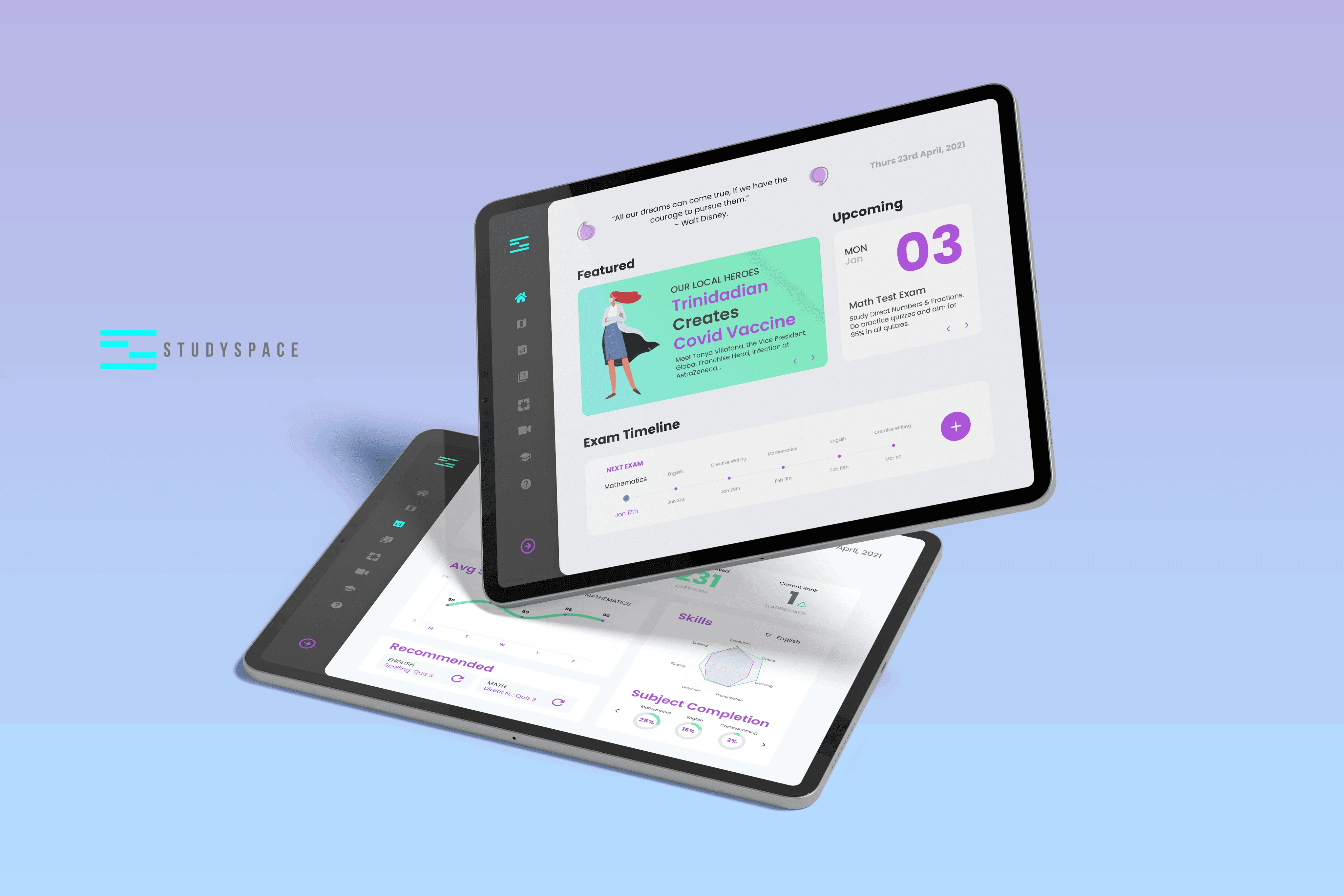
Studyspace is transforming how children are educated from K12 to job-ready skills with an AI driven platform providing k12 curriculum-based and non traditional education access nationwide.
Why an Education App? – The Problem
The Caribbean education system has been impacted immensely by Covid-19, and this pandemic has only increased the already glaring gap in education levels between the 1% and the majority of society. What really strikes a nerve and even more concerning is that my home, Trinidad and Tobago, has the highest education levels in the Caribbean, but out of approximately 300 high schools the top 4% of them have the highest quality teachers.
What does this mean for the next generation? What does the mean for the future of the labor force?
114 million children still outside of the classroom in Latina America and the Caribbean.
Let’s Dive In – The Approach
To understand the problem better and coming up with the strong rationale solution, I followed the Design Thinking approach.

Empathize
Before diving into the user research there are some hypotheses that can be validated through research.
Users need to have access to devices for this solution.
Users also need to have access to the internet.
Building for “the next billion users” needs to be prioritized.
Interviews
Firstly, we confirmed the hypotheses by conducting quantitative research and lead into qualitative research to identify the most accurate user persona. The major stakeholders are: students; teachers; parents; and government. Based on the limited information I can provide here, we will only focus on students. To help me in this task, I have extracted key interviewees’ insights and built a unique Empathy Map.

Main Takeaways:
Most students need a personal device to study at their own will.
Most students have lost the willingness to study but miss the social aspect of school.
Most students are not engaged with the current online options.
Most students are detached from the importance of their assignments.
User Story
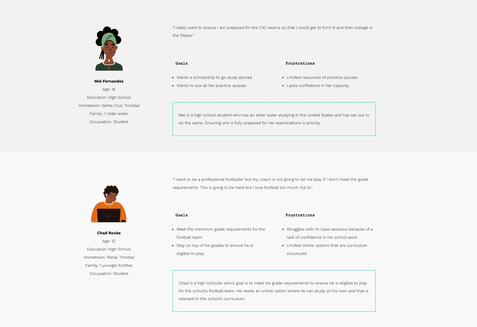
As a high school student going into form 6, I want to ensure I’m properly prepared for my exams so that I can get the grades I need to get me into from 6 comfortably and assist in getting me a scholarship.
As a new high school student, I want to meet my minimum grade requirements so that I can be eligible to play for the school’s football team.
Problem Statement
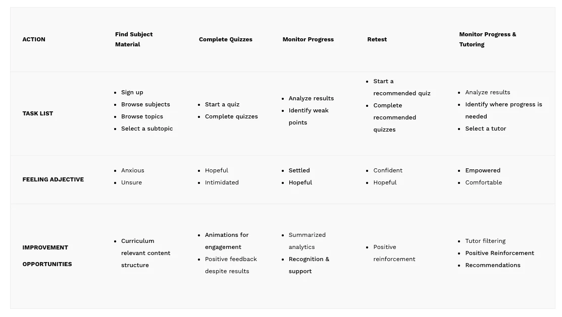
The user persona, story and journey helps hone in on the specific problem we are trying to solve.
Mel is high school student who needs to ensure she excels in her exams because she wants to get into form 6 comfortably and prepare herself to apply for a scholarship.
Chad is a new high school student who needs to ensure he meets his minimum grade requirements by practicing quizzes because he wants to be eligible to pay for his school’s team.
Competitive Analysis Summary
I’ve only identified 3 competitors based on what I’m allowed to share at this point, which are Pennacool and Khan Academy as direct competitors and Youtube as an indirect competitors.
Main Takeaways:
There is a huge demand for high school content for the Caribbean market.
There is a huge gap for curriculum based content.
Engagement is a major issue for users.
Local solutions lack brand identity.
Ideate
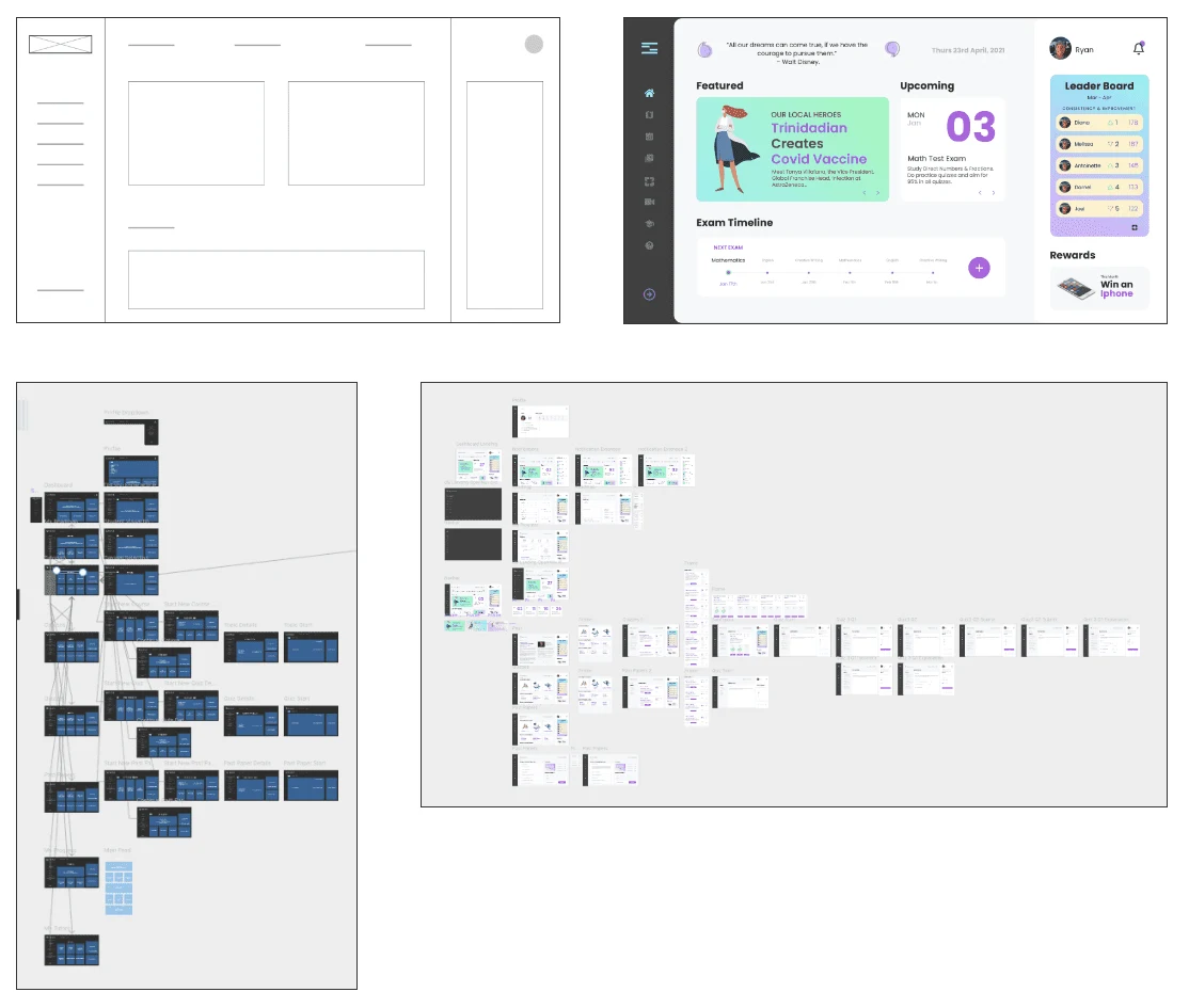
It’s time to map out all the gathered information and insights that I’ve collected from our user research. A sitemap was constructed to support the user’s needs and give a structure to the website.
Wireframing
Brainstorming — laid out all the key pointers in one place to keep in mind whilst get into wireframing. Graceful degradation is the prioritized approach as the user research indicated that students would be doing additional practice at home.
Prototype
I then proceeded to create digital wireframes, mockups, lo-fi and hi-fi prototypes to prepare for usability testing. Due to time constraints a few assumptions were made based on secondary research, moving us directly to the hi-fi prototype after in-house testing of the the lo-fi prototypes.
Test
Usability testing was done in-house for the lo-fi prototype which led to minor tweaks, followed by usability testing done with users who match our determined personas.
Usability Testing on Hi-Fi Wireframes
I wanted to validate my search flow, to get that done I conducted the usability testing on the hi-fi wireframes. Usability testing was conducted via interviews over Zoom with the help of prototyped version of wireframes. Below are the insights gathered and the final product.
It was observed that 4/5 subjects found it easy to complete quizzes and found the interface more engagement than its competitors.
It was observed that 3/5 subjects found the analytics a bit intimidating and confusing.
It was observed that 4/5 subjects found the platform easy to navigate.
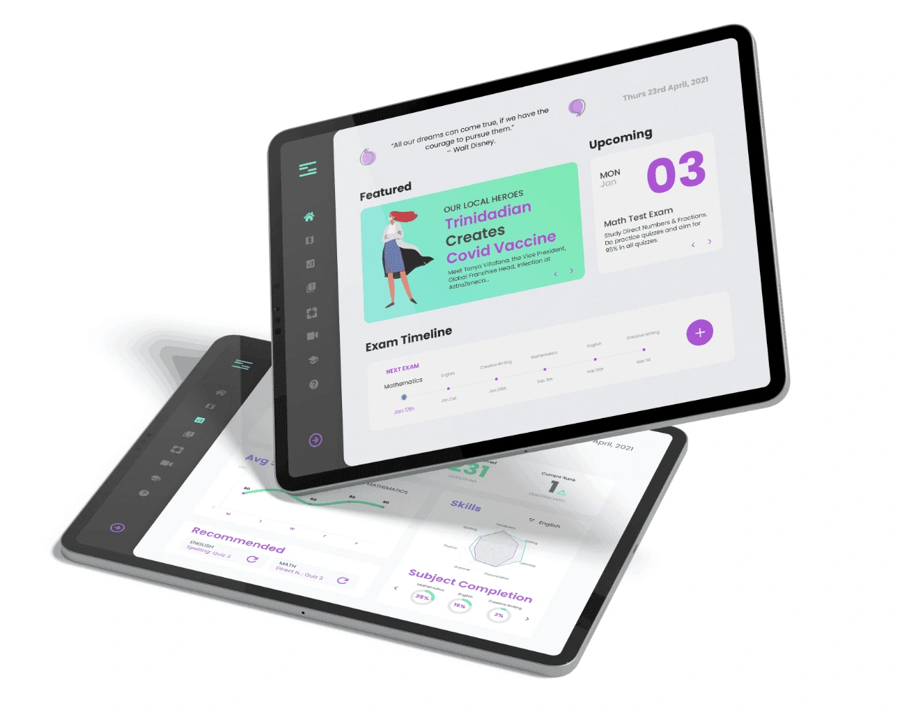
Main Takeaways
We were a bit concerned with the majority of feedback being positive, so we have scheduled two upcoming usability tests: 1 moderated; and the other unmoderated. We have also changed the questions and the goals for the usability studies with the intention of acquiring more detailed and open feedback.
"Thanks again to the users, who have supported us in gathering useful insights to translate their feelings into a more user friendly and impactful education solution."
We do look forward to the continued development and evolution of the product, and we do hope that we are successful in providing a useful solution for the stakeholders.
Like this project
Posted Mar 22, 2024
Studyspace is transforming how children are educated from K12 to job-ready skills with an AI driven platform providing k12 curriculum-based and non traditional

