Bility - Event Task Manager
Ryan Augustine
An Event Task Manager
The Problem
The challenge identified was to create a task manager that could allow event task managers, primarily general coordinators, to do all of the following within a mobile app:
The ability to create and assign new tasks
Make requests to another team
Raise an alert if a problem occurs
Keep track of the progress for all tasks assigned
There are no limits to additional features that may fit the needs of the users.


Let’s Dive In – The Approach
To understand the problem better and coming up with the strong rationale solution, I followed the Design Thinking approach.
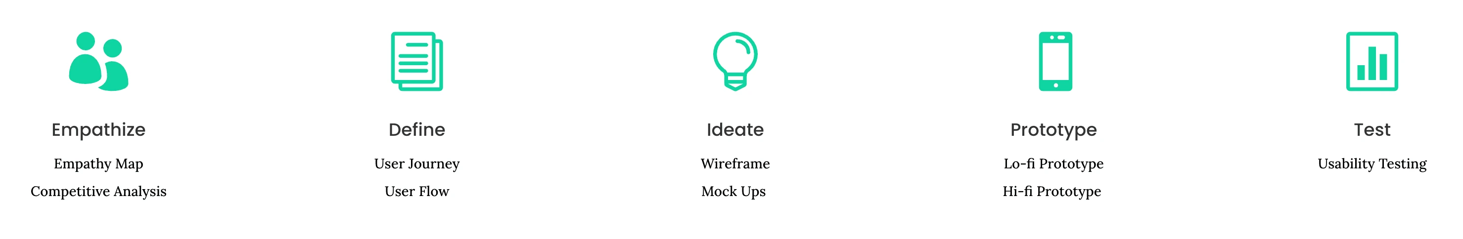
Empathize
Before diving into the user research there are some hypotheses that can be validated through the details provided.
Users are open to managing events through an app.
Targeted users age range is 30 – 55 years old.
Interviews
In prioritizing qualitative date over quantitative data in the initial phases of this project, I ran online interviews with multiple users from the pool provided. My goal is to create a relevant Empathy Map and drill down to 2 user personas for future reference.
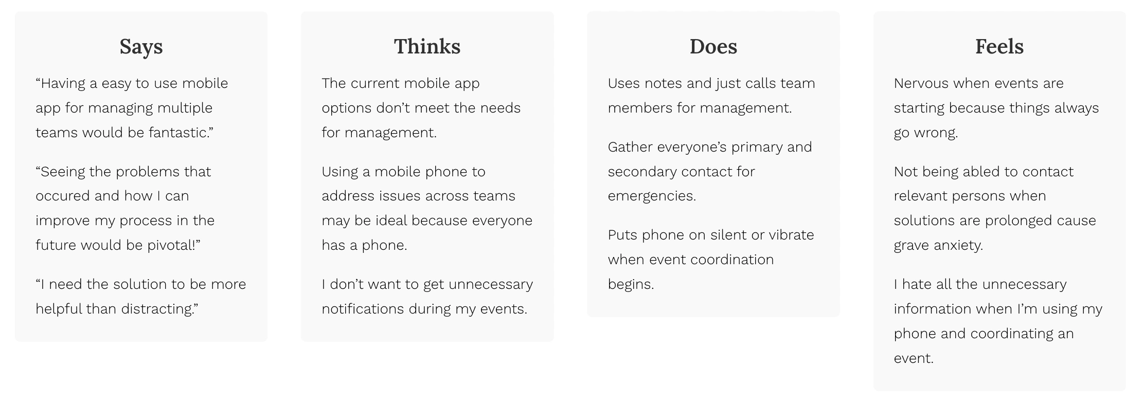
Main Takeaways:
Most people suffer from anxiety and nervousness when starting and managing events.
Most people want multiple options to solve problems fast.
Most people want to be focused solely on the event and want to minimize distractions.
User Personas
From the user research, I have developed personas to guide my design decisions.
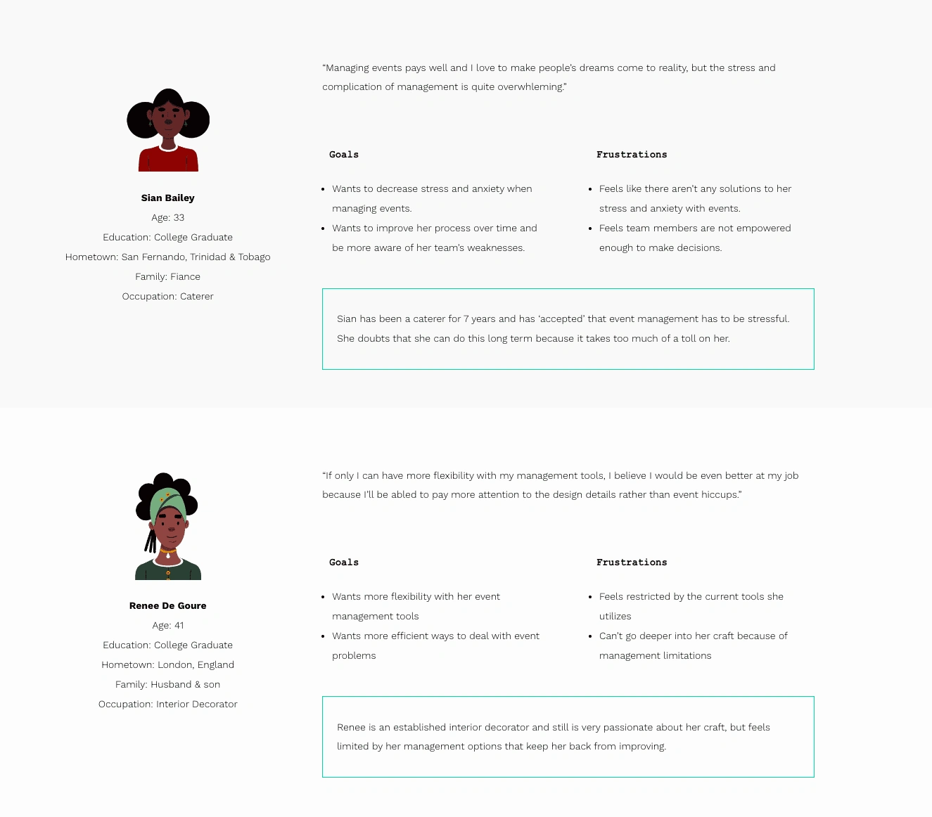
User Story
As a growing caterer, I want to decrease my stress and anxiety when managing events so that I can focus on providing better experiences for my clients and get more fulfillment out of my work.
As an established interior decorator, I want more flexbility with my management tools so that address problems more effectively and focus more on the design details.
Define
After empathizing and identifying the user’s needs, we aimed to define the user journeys and user flows.
User Journey
Problem Statement
The user persona, story and journey helps hone in on the specific problem we are trying to solve.
Sian is a passionate caterer who needs an easy event management process because she is stressed and develops anxiety with her current process.
Renee is a established interior decorator who needs more flexibility with her event management tools because she wants to spend more time focusing on design details.
Competitive Analysis Summary
To get context of the market and what solutions exist, I’ve identified 3 main competitors and what they offer to our audience. This will allow us to understand how we can differentiate ourselves and improve upon existing solutions.
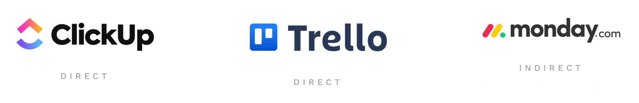
Main Takeaways:
There is a huge demand for event management software.
None of the competitors offer in app calling or messaging.
None of the competitors offer dedicated teams within an event.
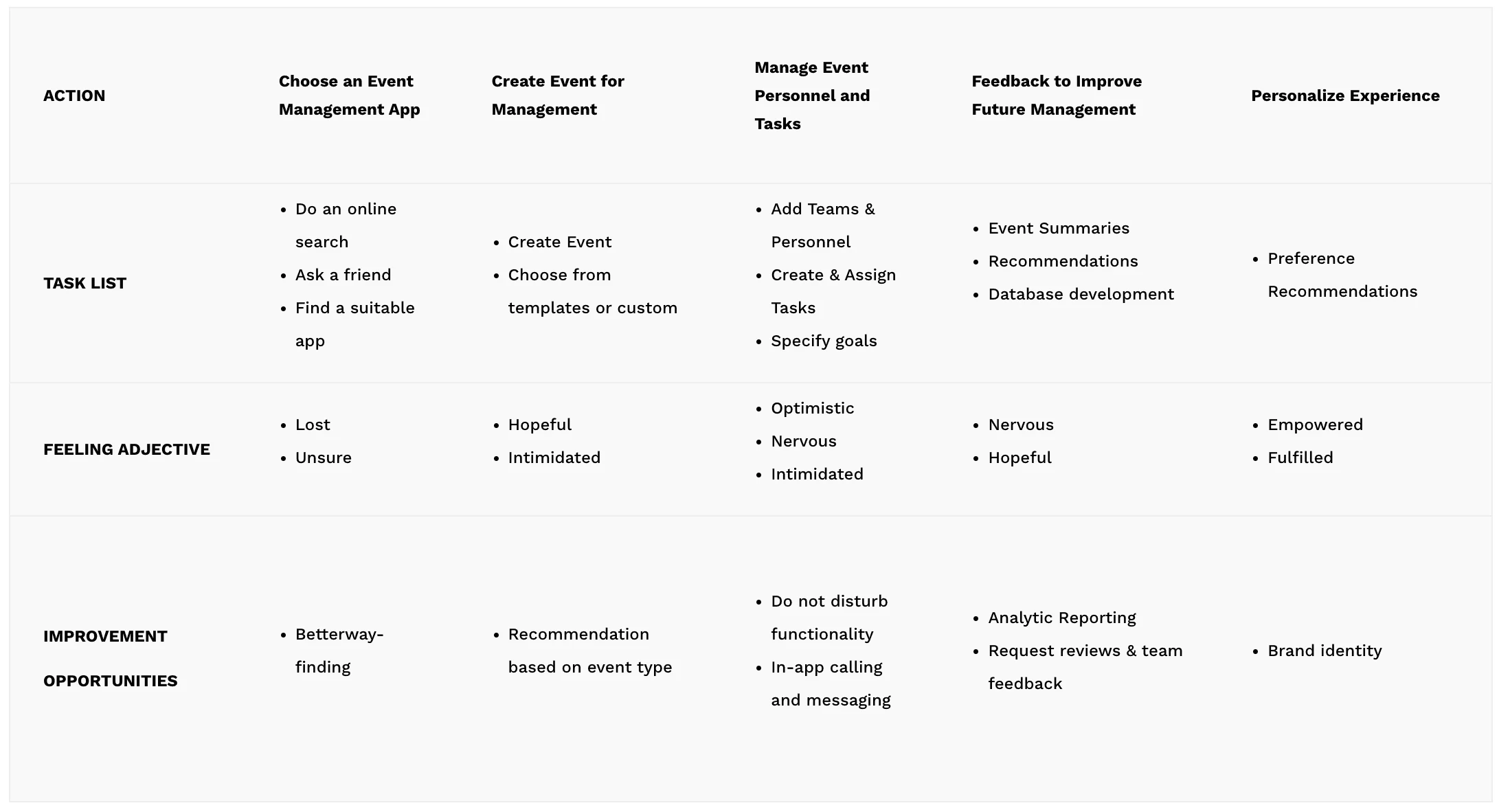
Ideate
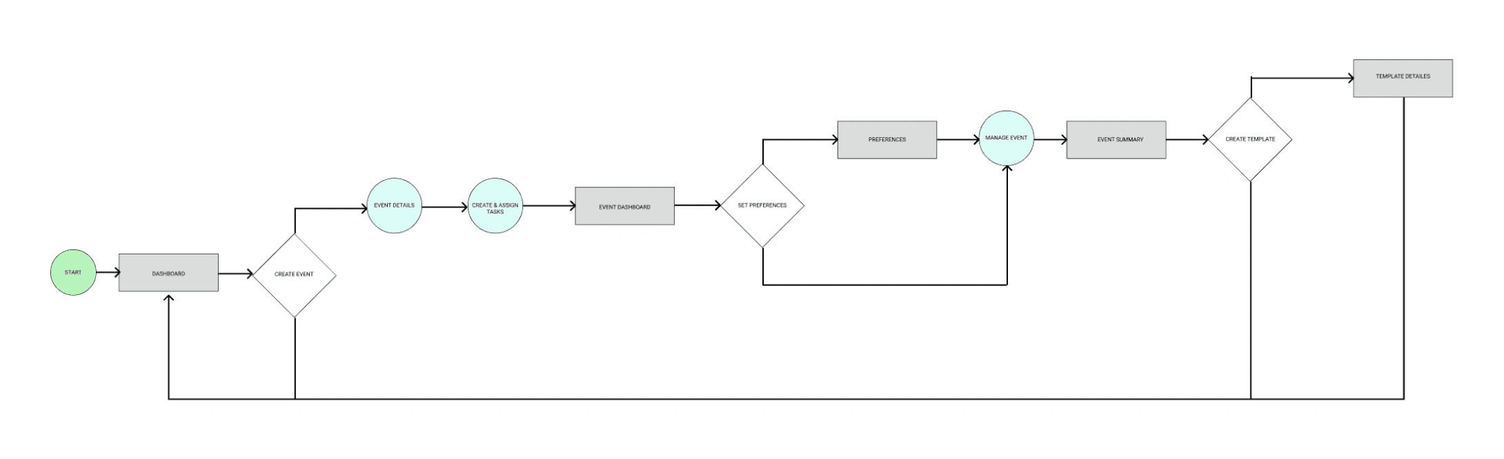
Tasks flows were created to identify the pain points in the journey

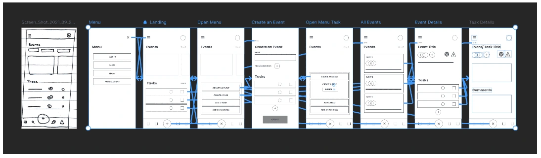
Wireframing
Brainstorming — laid out all the key pointers in one place to keep in mind whilst get into wireframing.
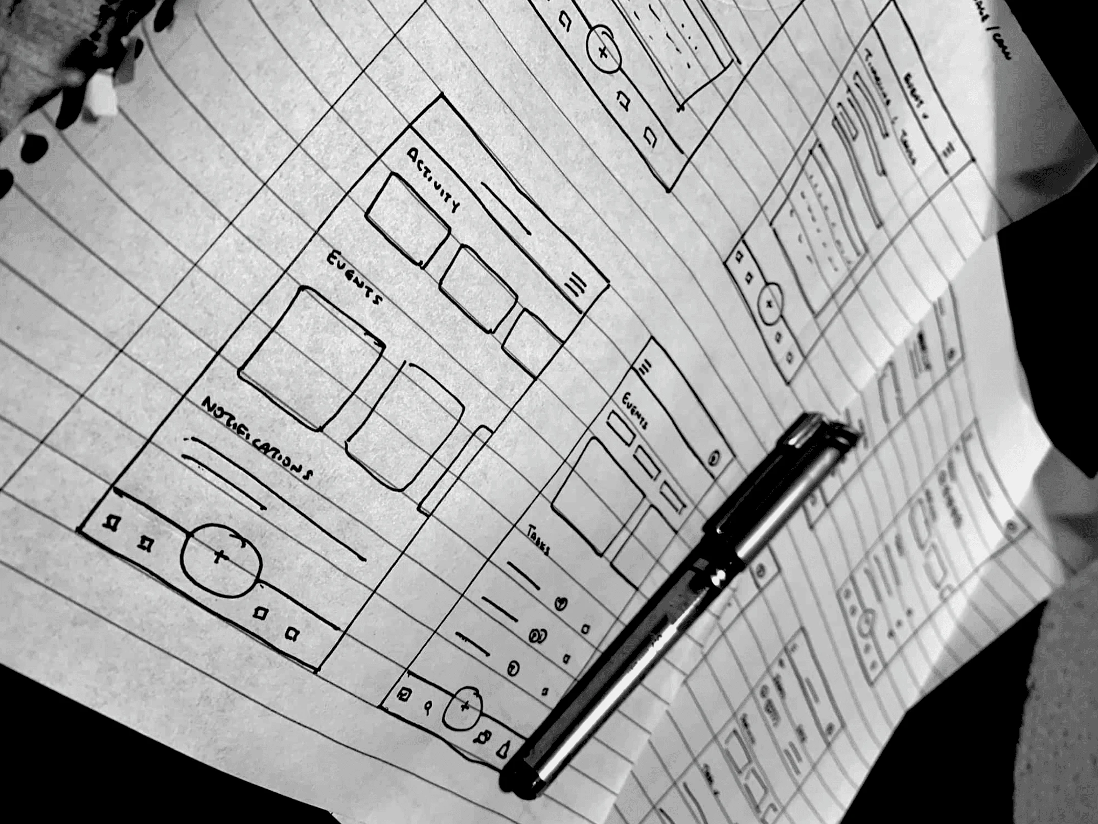
Paper wireframe iterations for the app home screen.
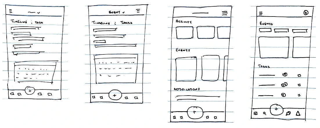
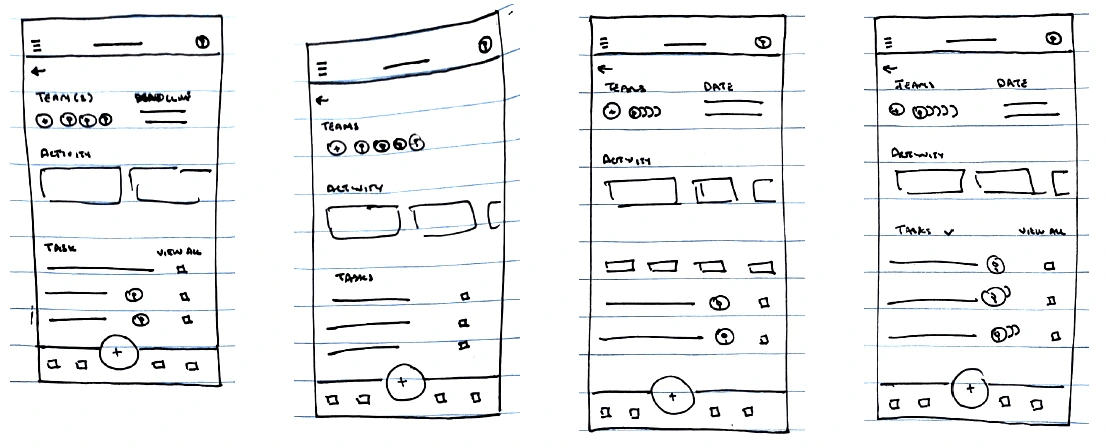
Paper wireframe iterations for the event dashboard.
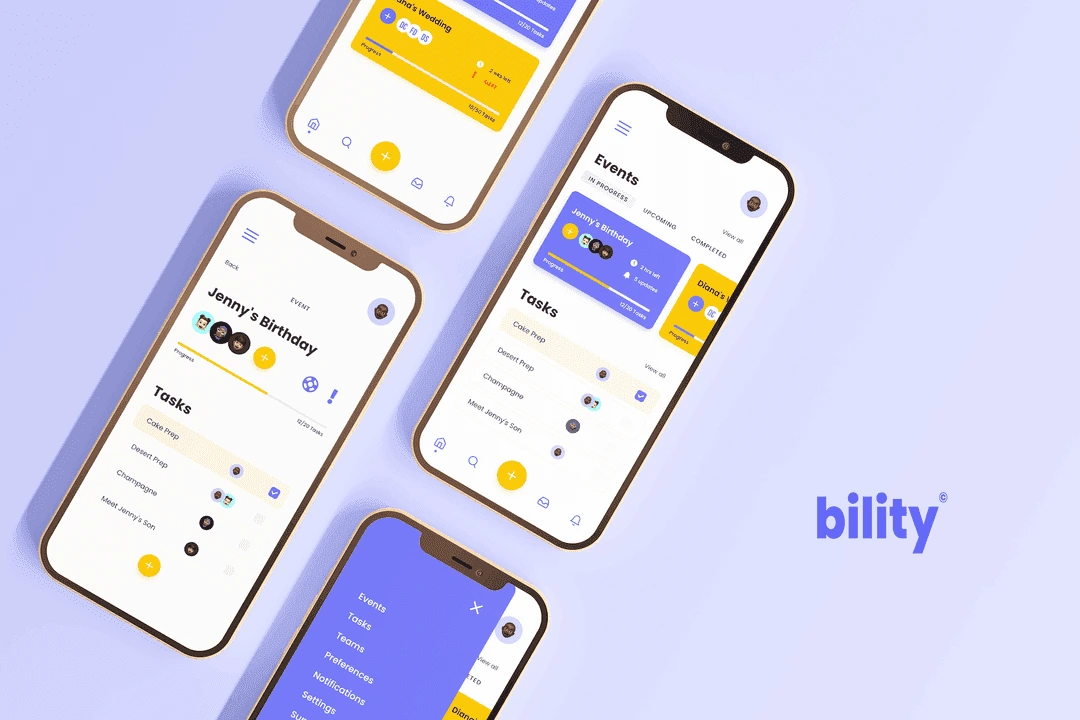
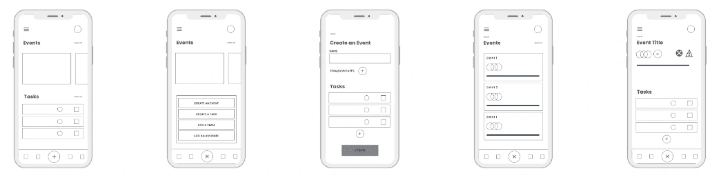
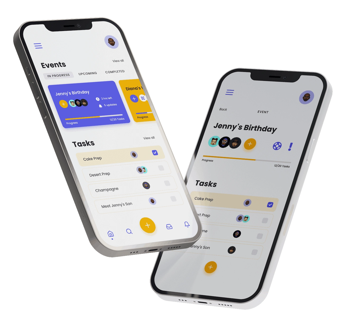
Digital Wireframes
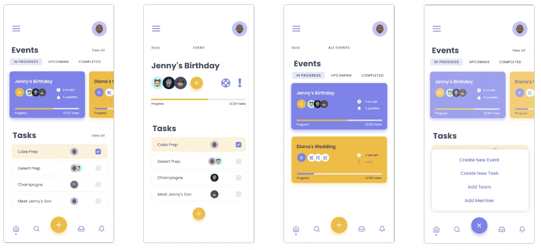
Mockups
I used a combination of color recommendations from coolors.co and testing them with WCAG Color Contrast Checker to verify its compatibility.
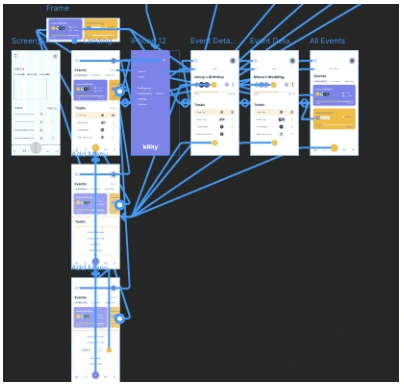
Prototype
I then proceeded to create lo-fi and hi-fi prototypes to prepare for usability testing.
Tools
I used Framer X instead of Figma and Adobe XD for prototyping as it makes the process much faster and allows for much greater flexibility. Here is a link to the framer prototype!
Test
Usability testing was done on the hi-fi prototype with 5 users which dictated our direction for the MVP before usability testing and handoff.
Usability Testing on Hi-Fi Wireframes
Usability testing was conducted via interviews over Zoom with 5 users. Below are a few of the insights gathered:
Both users did not know how to create an alert or request from another team because the couldn’t relate to the icons used.
Both users found the app intuitive otherwise and easy to navigate and understand.
Both users love the feel of the app and found the call to actions easy to identify.
Both users found the app met their basic needs and would consider using the product.
Like this project
Posted Mar 26, 2024
The challenge was to create a task manager that could allow event task managers to work both remotely and at location on multiple events at a time.
Likes
0
Views
16