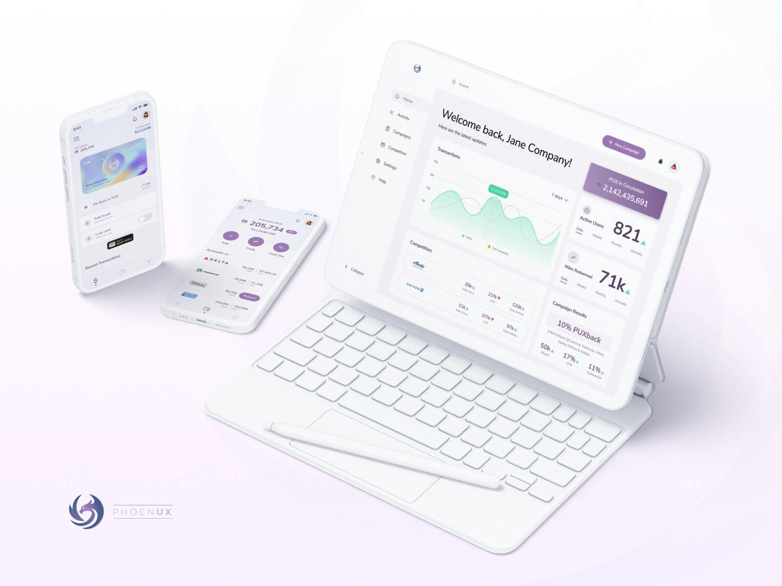
PhoenUX Crypto Exchange
Ryan Augustine
A web3.0 solution to bridge the gap between loyalty benefits and cash.
The Problem
The client presented a challenge to design a crypto solution from scratch, focusing primarily on empowering users to convert rewards points and miles to the cryptocurrency PUX.
Let’s Dive In – The Approach
To understand the problem better and coming up with the strong rationale solution, I followed the Design Thinking approach.
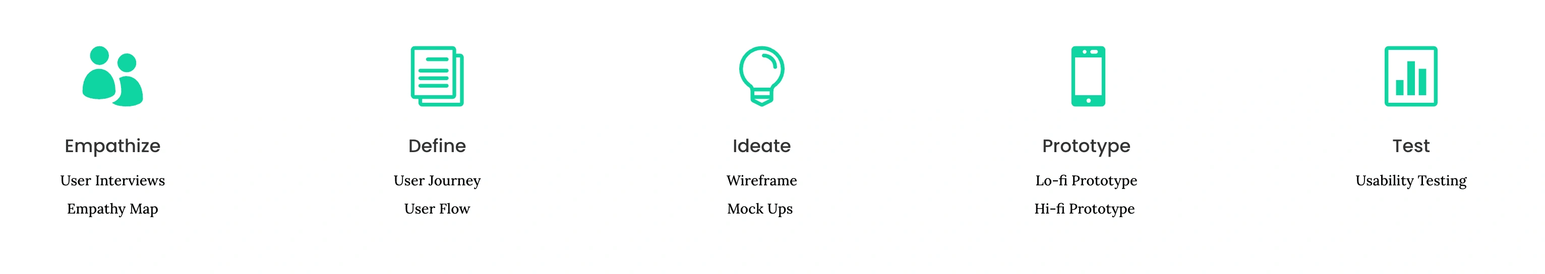
Empathize
The client provided these user insights based on research done:
A need for simplicity as crypto is hard to understand.
Security is a major concern.
Users need to manage 6-10 different loyalty programs on average.
User Story
We established one main user story to focus on.
"As a frequent traveler, I want to manage all my loyalty points and benefits in one place so that I can get extra cash when needed and easily use my additional points from my secondary options with my favorite companies."
Problem Statement
The user persona, story and journey helps hone in on the specific problem we are trying to solve.
Eric is a frequently traveling business associate who needs to manage all his travel points in one place because he wants to use his accumulated points to purchase annual vacation tickets for his family.
Competitive Analysis Summary
We've only found 2 direct competitors as solutions for the problem are scarce, and we also looked at 3 indirect competitors to understand what the current user expectations are for reputable fintech solutions that simplify complexity.
Main Takeaways:
There is a huge opportunity for a native, user-friendly option.
Users find the current solutions too complexed.
There is no established leader in the space.
Ideate
It’s time to map out all the gathered information and insights that I’ve collected from our user research. Userflows were constructed to support the user’s needs and give a structure to the solution.
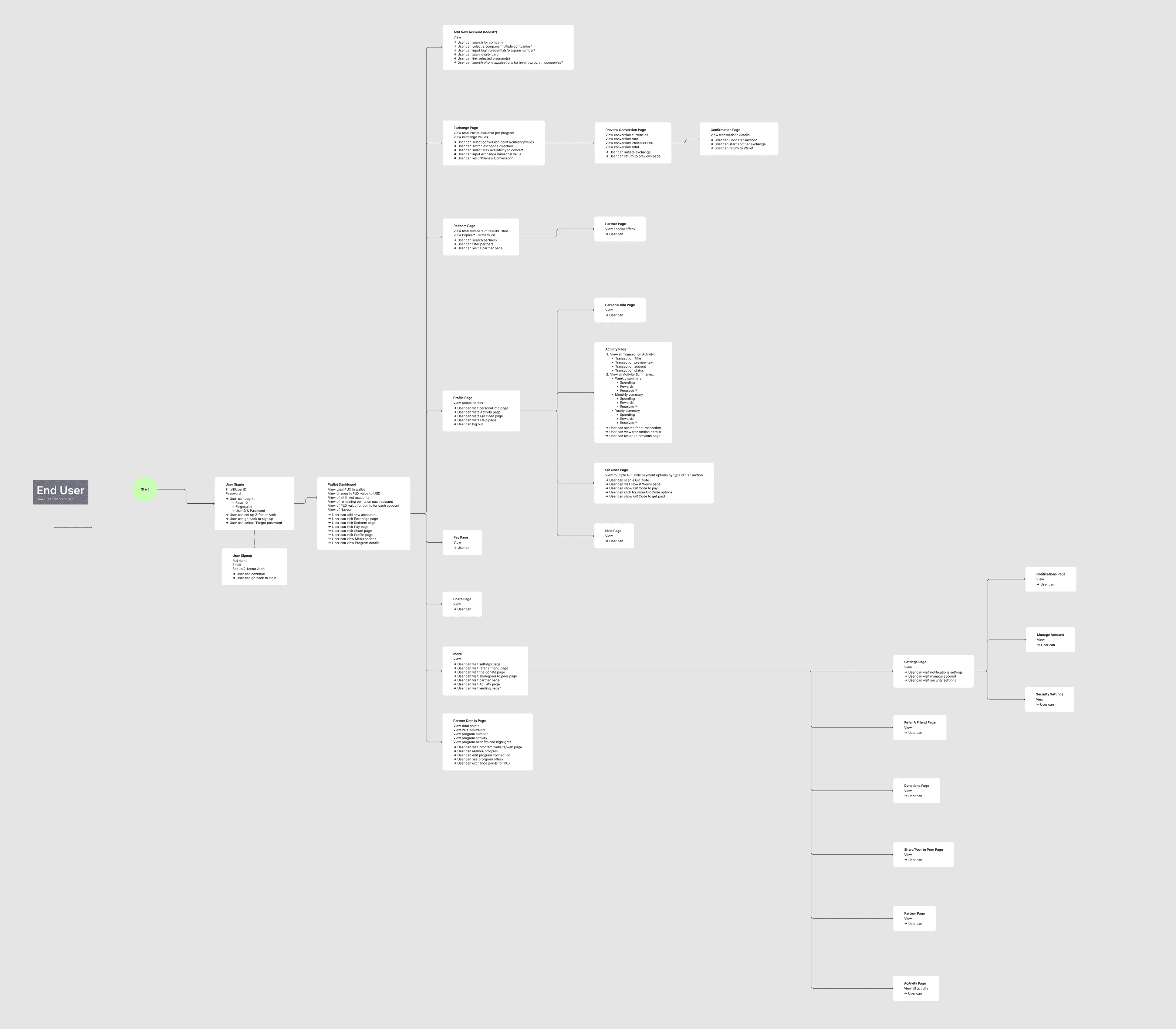
Wireframing
Brainstorming — laid out all the key pointers in one place to keep in mind whilst get into wireframing. We ran tests with 4 users to get feedback on the solution and approach before moving into mid-hfi designs for testing.
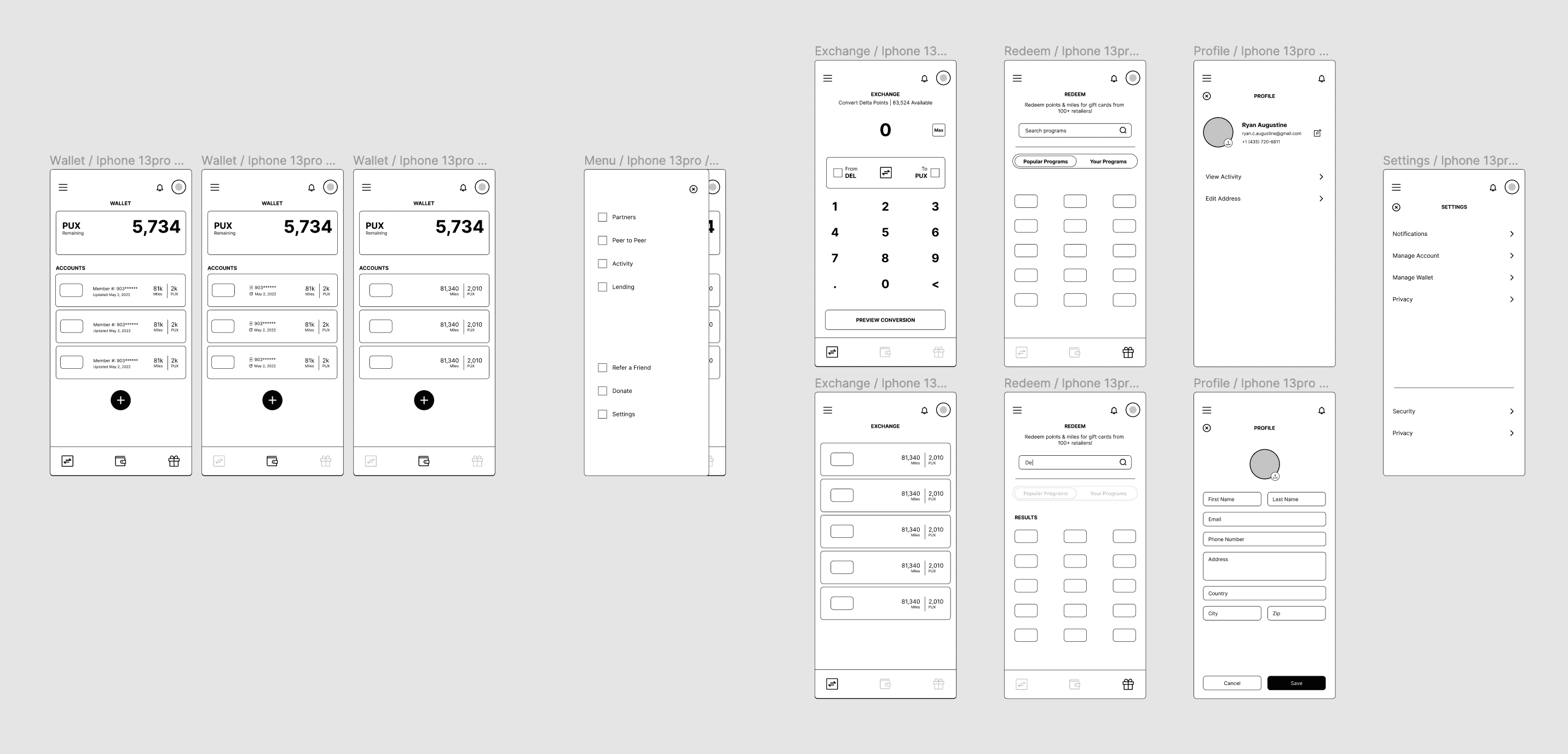
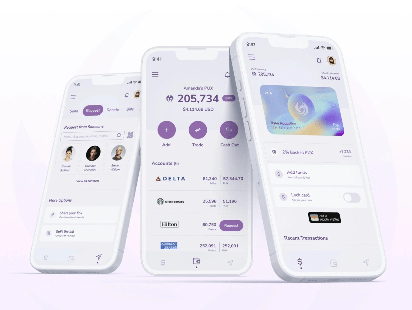
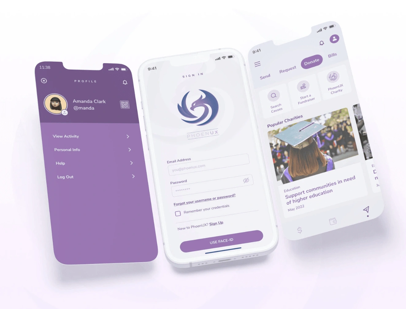
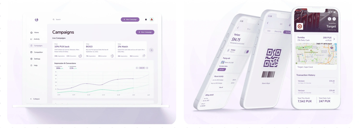
Prototype
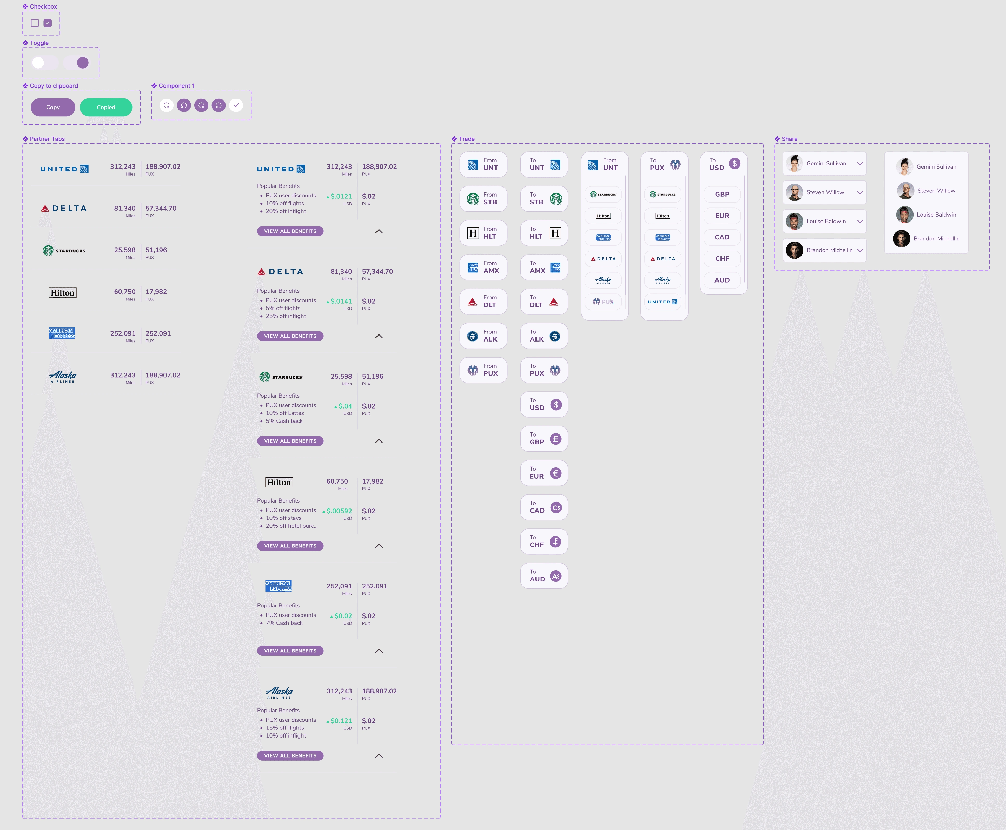
I then proceeded to create digital wireframes, mockups, lo-fi and hi-fi prototypes for testing. We were able to validate our approach through interviews and user testing, finalizing an MVP design to take to potential partners such as American Express, Starbucks and Alaska Airlines to name a few.
Test
Usability testing was done in-house for the lo-fi prototype which led to minor tweaks, followed by usability testing done with users who match our determined personas.
Usability Testing on Hi-Fi Prototype
I wanted to validate our design approach, added to using a design foundation established, to equip us with the foundation to complete designs for handoff after testing and iterating. Usability testing was conducted via interviews with usertesting.com. Below are the insights gathered.
It was observed that 4/5 subjects found it easy to add loyalty programs and see what their balances equated too.
It was observed that 3/5 subjects found it easy to convert their points to crypto or cash.
It was observed that 4/5 subjects found the platform easy to navigate and understand.
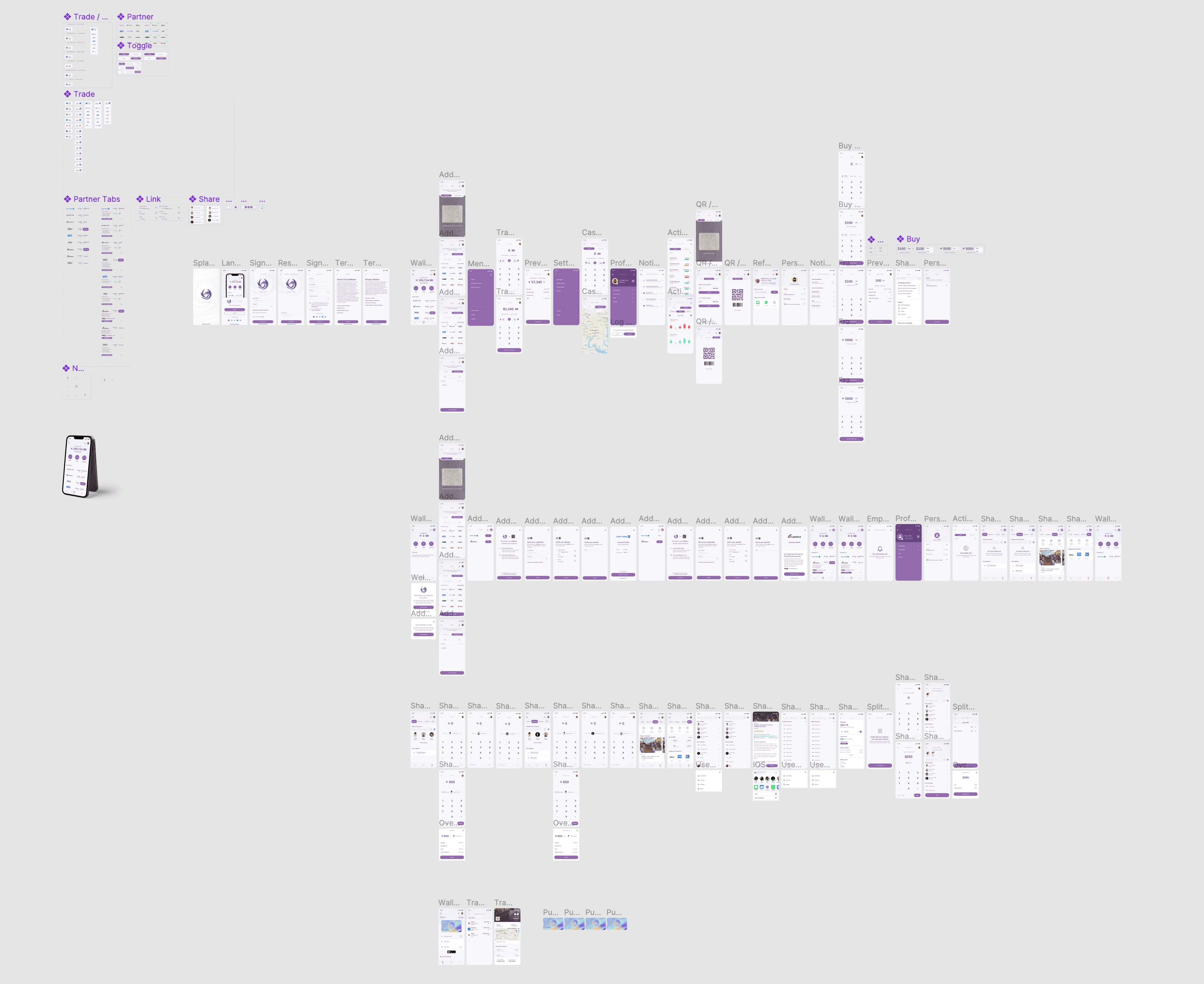
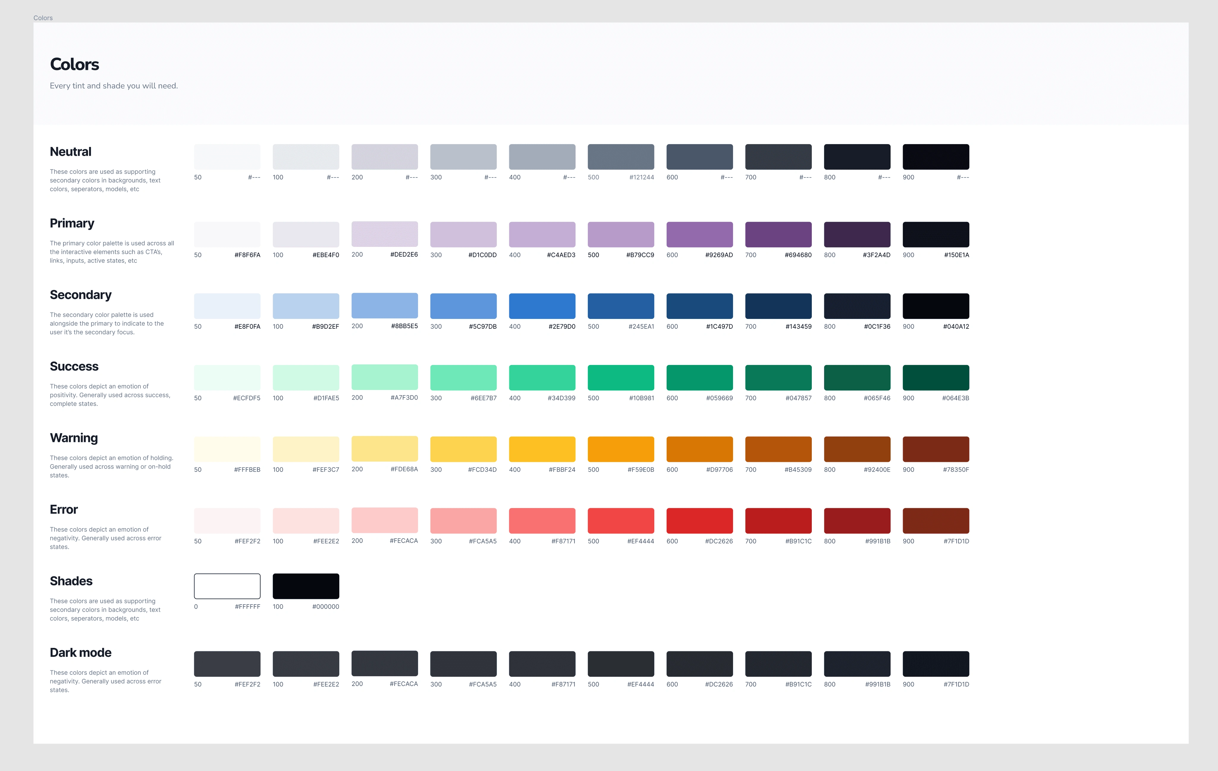
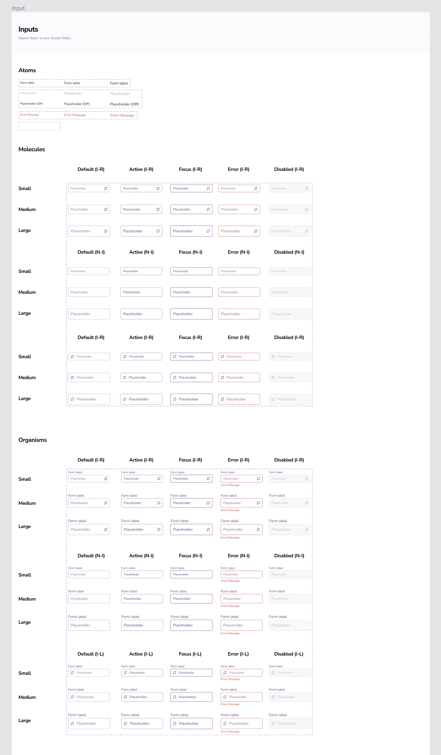
The Design System
Finally, I was brought back into the team to help product a design system and brand guidelines for the team that prioritized accessibility.
Like this project
Posted Mar 21, 2024
The client presented a challenge to design a crypto solution from scratch, focusing primarily on empowering users to convert rewards points and miles to the cry