Ana Scassia - Redesign
When you don't love what you already have, you can change it! This is my redesign for my own design business!
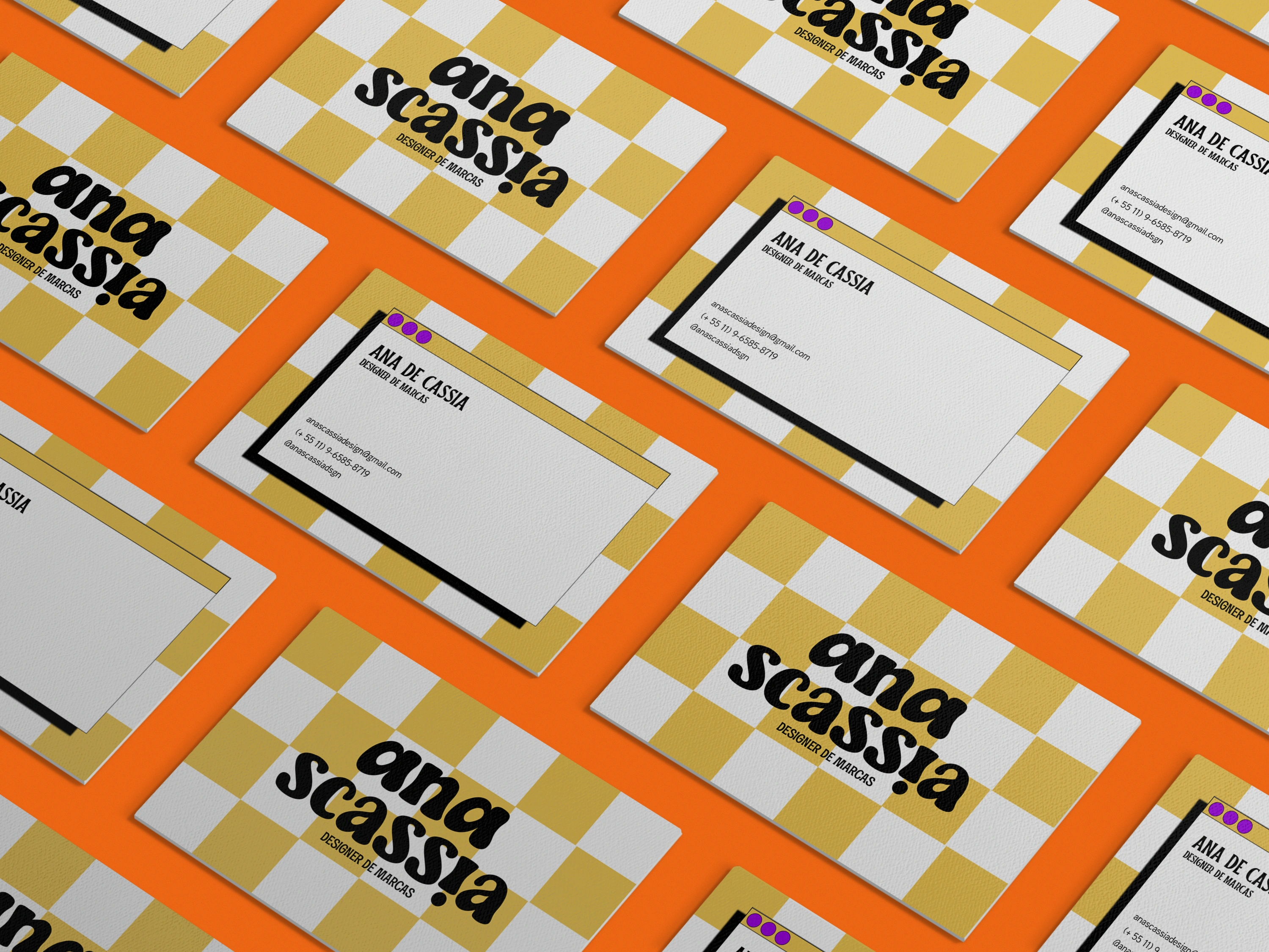
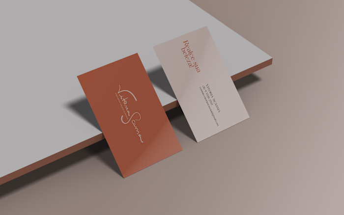
Ana Scassia's new business card.
A few months ago I had the pleasure to develop my own company's Brand Identity, based both on research and on what I wanted to show my public in 2022. If you want to, you can find this project here.
With the changing of the year, though, I found myself questioning if the message I was trying to share hadn't changed, if I — both as a businesswoman and person — hadn't changed, and the obvious answer was that, yes, both those things had changed.
With that said, I come back with a new Identity and a new purpose:
To align brand strategy with brand identity in order to turn your dream into a whole other level of small business!
So, without further adue, this is the new Ana Scassia!
01. THE MOODBOARD
As usual, the first step for all my creation was the moodboard. Creating a cohesive and purposeful moodboard helps me through the whole process, making sure I don't lose sight of my visual message.
While designing, the key-words I wanted for my visual message and my brand were: colorful, creative, professional and enchanting. Also, the idea was to bring some aspects of a vintage design, mainly on the typography used.
The moodboard used on this project was this one:
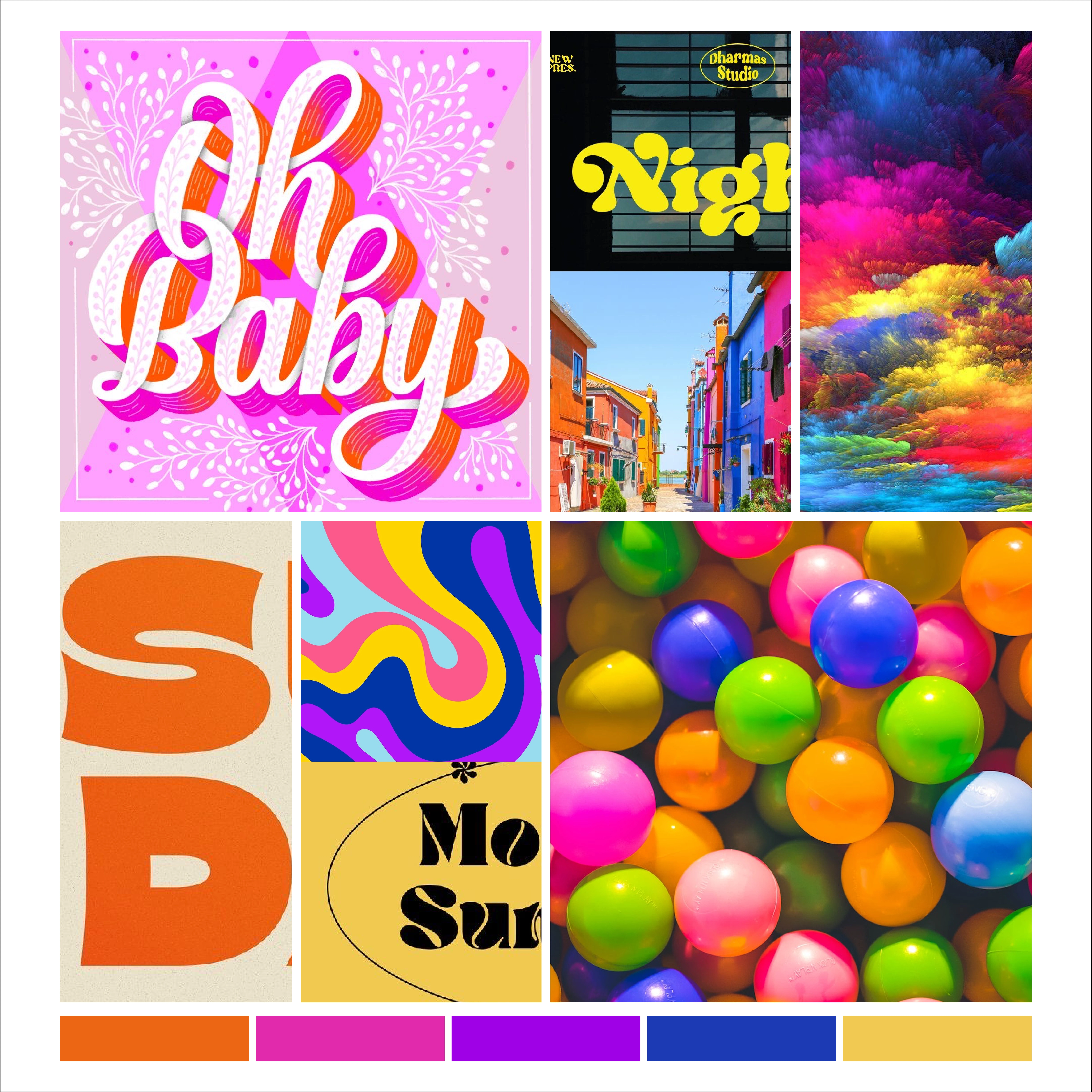
Just a quick reminder: the moodboard is a guide for the project, and not its final destination, which means that aspects of this moodboard can be changed during the development of the project.
02. THE COLORS
The process of chosing the colors was also part of the moodboard construction. The idea was to pick colors that were bold, strong, and could be used with each other (usually with the adition of the color black).
As you can see in the original Brand Identity, the colors orange and yellow remain a part of the selected colors (because of what they represent, yellow being lightness and creativity and orange being enthusiasm and change); and, instead of using pastel colors, in this redesign I focused on saturated colors.
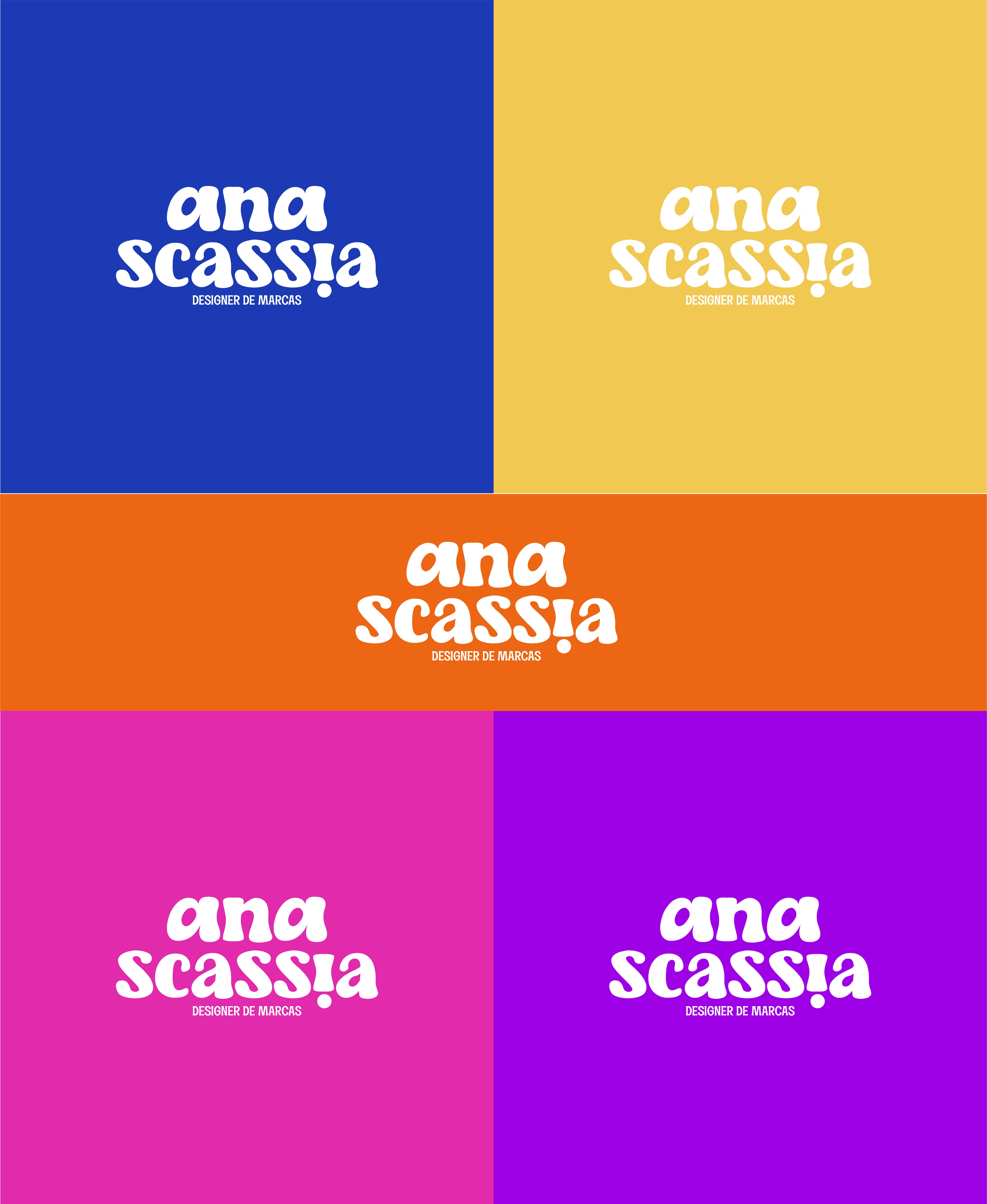
Another important change made was that previously the logo was supposed to be used all in black, this time I chose to keep white as the main color, black being used in content creation (social media).
03. THE TYPOGRAPHY
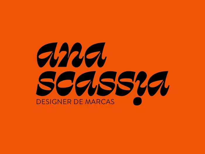
The typography used on the logotype was Retro Sick, a serif font. As pointed on the moodboard phase, the idea was to bring some vintage feeling to the creation, and it was displayed nicely on the round shape of this font.
Also, I kept the original idea of using the letter "i" upside down, bringing that creative side to the creation!

For the titles, I picked the font Liberton, a display font that also reinforce the retro vibe I was looking for this project. You can see it being used on the "Brand Designer" description under my company's name.
For texts, the typography picked was Addington. This choice was made both for legibility and because of its typographic family, that allows me to think outside the box and vary different heights and styles.
You can see them both in action on the Instagram Post below:
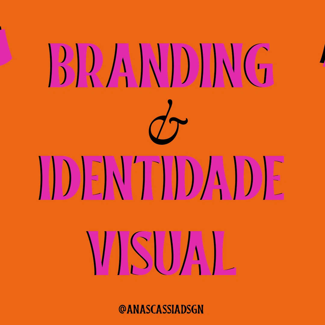
On the image, the words: branding (brand strategy) & visual identity, a description of the services I offer. The titles "brand identity" and " visual identity" are written with the font Liberton; meanwhile, the & is written with the font Addington in italic.
04. THE MONOGRAM
As in the previous design, a monogram was build for my brand, but its original purpose was to be a pattern. This time, though, I removed the idea of building a pattern out of this monogram, and decided to use it as an identification element for my brand!

05. THE PATTERNS
Even though the monogram is not a part of the patterns anymore, a pattern was built for Instagram purposes. The pattern in question is meant to be used as reels covers, and the idea is to ressemble an "old-school" web page.

That was it for this project!
Thank you so much for taking a time reading it, I really hope you liked :D
Like this project
Posted Feb 2, 2023
When you don't love what you already have, you can change it! This is my redesign for my own design business!
Likes
0
Views
7
