Brand Identity: Ana Scassia
Hey! This was the first brand identity I created for my own business, back in June; it's full of colors and fun, and it's a project I'm proud of!
The phrase below my business' name reads "brand designer" in my mother language, portuguese.
When I created this brand identity, the idea was to make something that would be bold, fun, and offer the playfuness I wanted to my brand, but without making it too childish or "too much"; the idea was to dare to be risky, but without doing something that would make me uncomfortable.
01. THE MOODBOARD
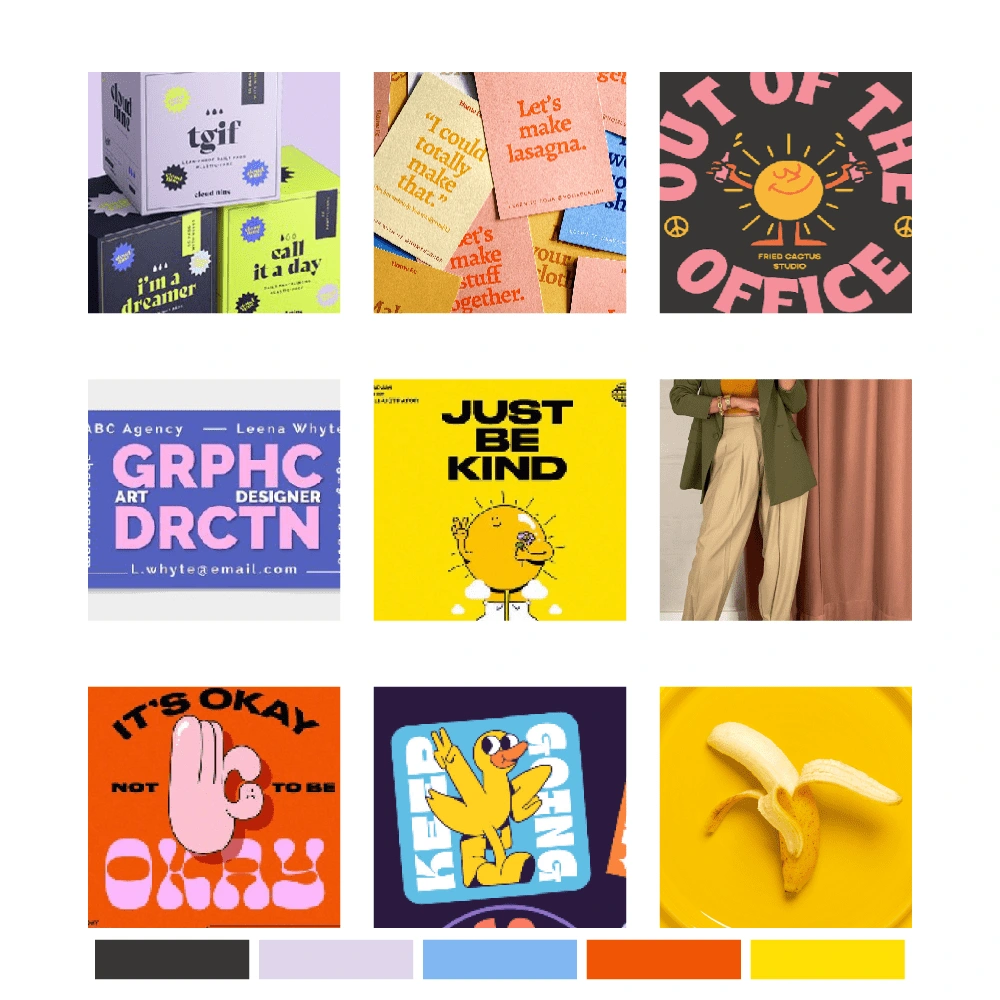
Every aspect of the brand identity was chosen based in a thoroughly thought moodboard that gave me the creative direction needed to build this brand.
When in my creative process, having a moodboard that shows me exactly what I'm expecting from a brand, the creative direction I wanna follow (colors, fonts, illustrations — when needed) helps me to avoid the bumps in the road. Does it remove all the obstacles? Unfortunately, no; but it helps.
The moodboard that followed me through this project was this one.
02. THE COLORS
Picking the colors was, as previously said, part of my moodboard construction.
To me, it was important to pick colors that had a deeper meaning, and not only something that would be functional; with that said, I picked the color lilac, that represents sincerity, blue, that represents creativity, yellow, that represents lightness (and also creativity, by the way) and orange, that represents enthusiasm and change.
03. TYPOGRAPHY
For this project, three different fonts were used, all of them found in Adobe Font.
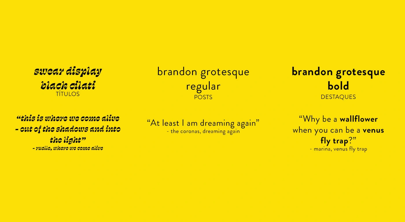
For the logo and titles, I picked the font swear display black cilati; the choice was make for it's playful characteristic, something I wanted to be highlighted in my business.
For long texts, the font was brandon grotesque regular; while it's bold version was picked as an option for informations that should have a contrast, due to its importance. Both the fonts were picked with the legibility criteria, thinking that they would be used on instagram posts, principally.
04. PATTERN
Two patterns were also build for the company, both with the same art, but in different colors; they were originated from the business' monogram.
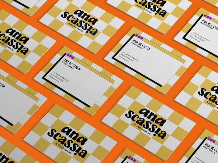
05. BUSINESS CARD
The final design I've built for my business was the business card.
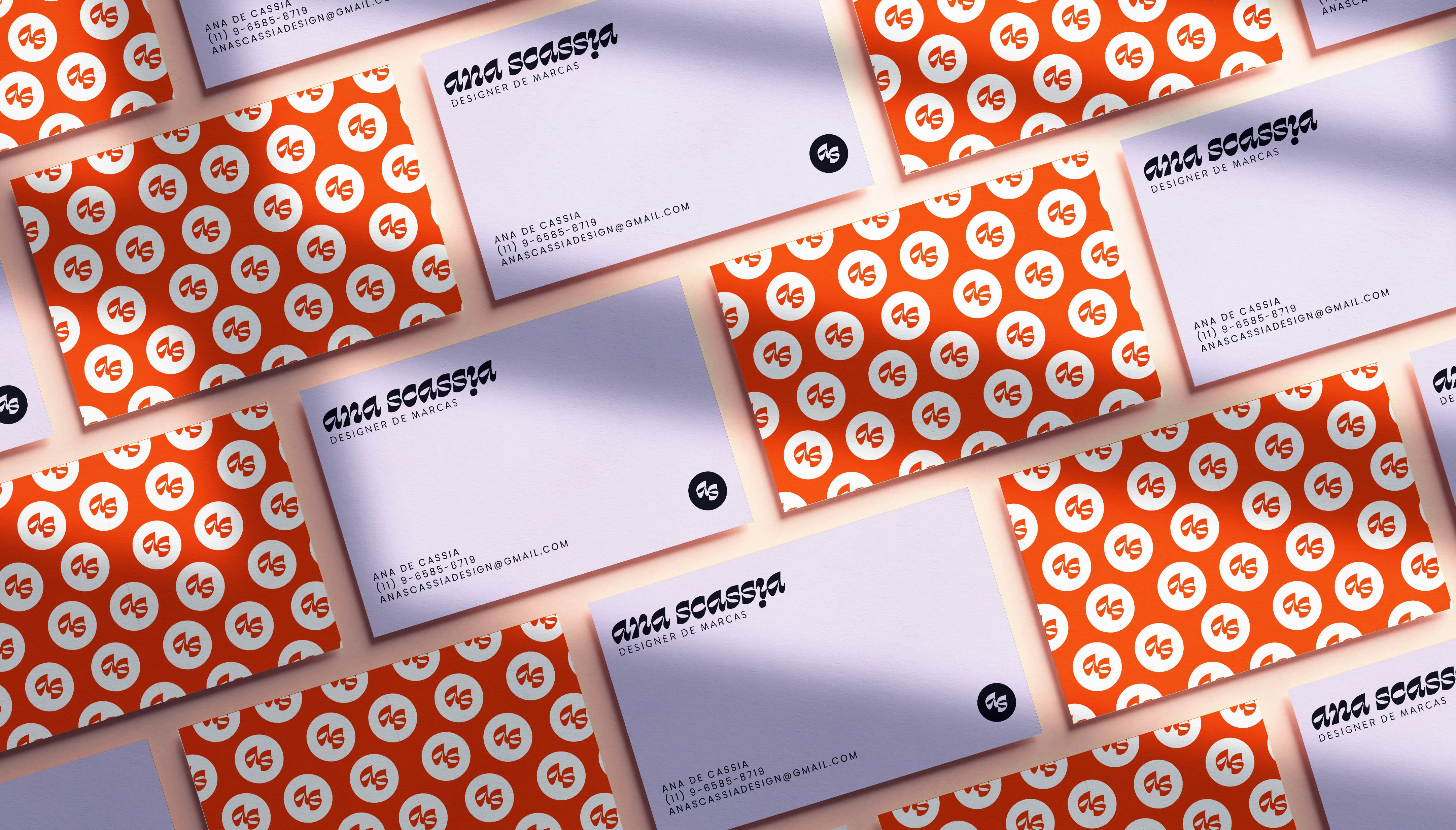
It was built using elements previously used throughout my brand identity, such as the monogram pattern, the fonts and the horizontal logo. It was, most definitely, my favorite part of the creation.
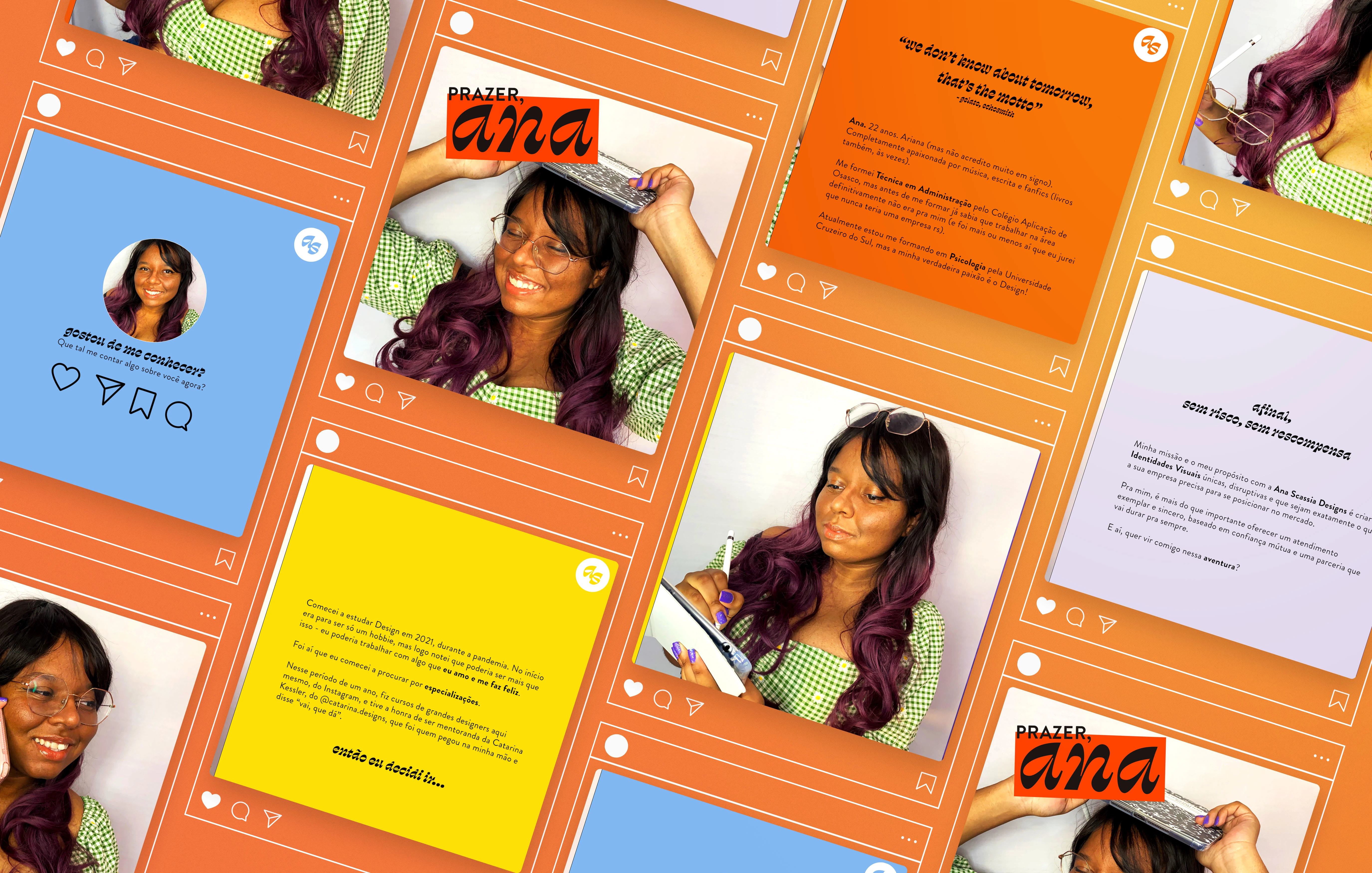
An example of instagram post built for my own page @anascassiadsgn
That was it for this project!
Thank you so much for taking a time reading it, I really hope you liked :D
Like this project
Posted Dec 19, 2022
Hey! This was the first brand identity I created for my own business, back in June; it's full of colors and fun, and it's a project I'm proud of!
Likes
0
Views
4
