Designing an Identity for a black-owned Aromatic Candle store
Hello, Chuchu's!
Chu Aromática is a Brazilian e-store founded by two black sisters, that's focused on prompting people to have a moment of well-being and self-care through the calming scent of their Aromatic Candles.
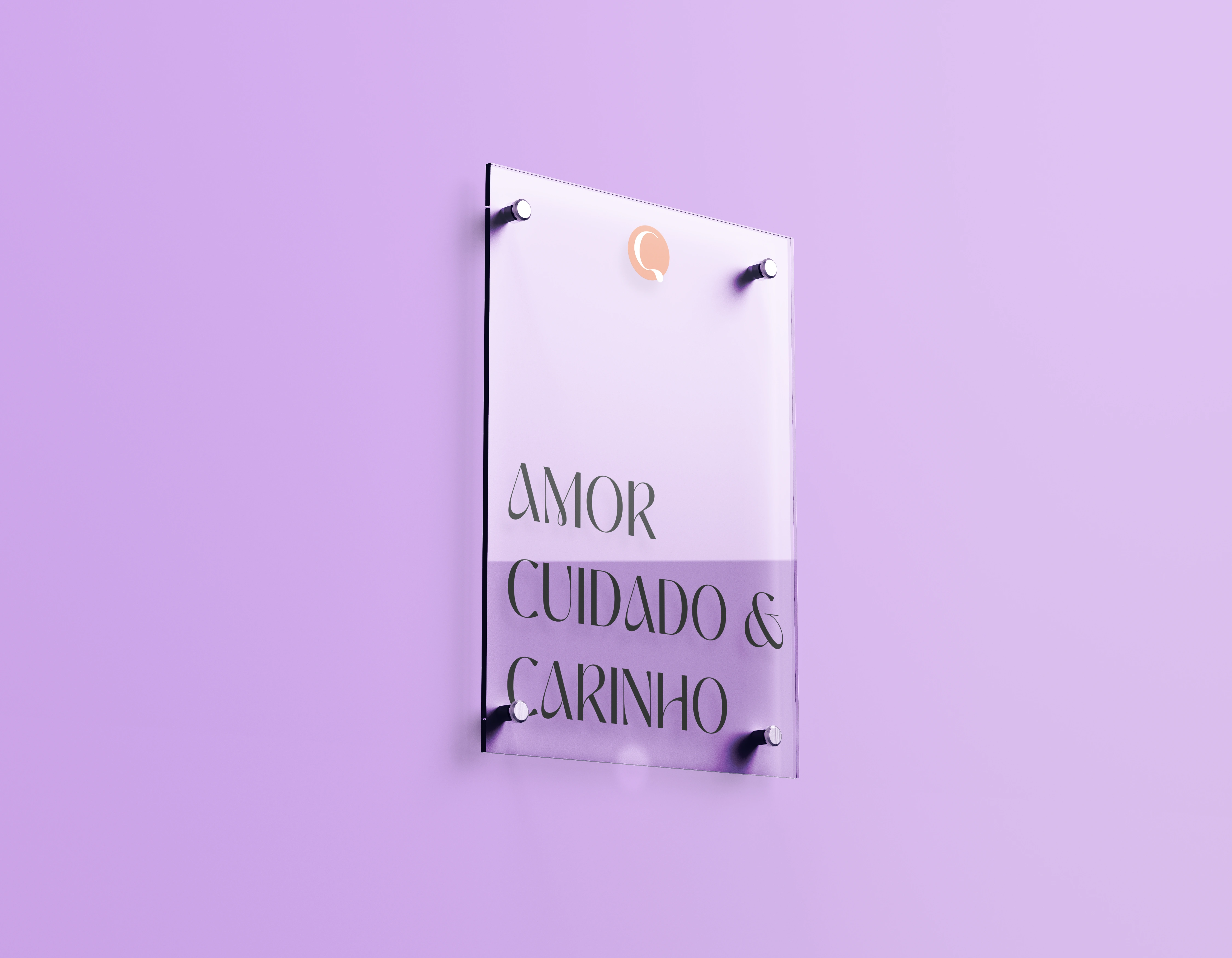
A Chu poster where it reads "Love, Care and Kindness".
The Colors
Picking the right colors is a vital part of the process of creating a brand identity. They are responsible for bringing the right mood to the composition, and in more than one way, it was proven that the colors can impact on the consumer's choice.
For this project, I decided to follow the path of delicacy, based on the self-care theme; the idea was to use soft and pastel colors to communicate relaxation and elegance.

Logotype & Logomark
That's definitely my favorite part.
Choosing a typography for this project was hard because it had to be both serious, elegant, and, yet, funny. The obvious way, for me, was to pick a cursive font that would bring elegance to the room, but we don't go with the obvious or the easy. As Tina Turner said, we do things nice n' rough.
So, for the logotype, I picked a serif letter to make a nod to the serious and elegant aspects of the Visual Identity, and its letters were personalized to remember the tail of a dog and the liquid property of the wax during the candle confection.

Chu's logotype
Logomark
Chu's logomark consists on the personalized letter "C", and can be used with any of the colors from the color palette. Here you can see it applied to a mockup of the candles' box.
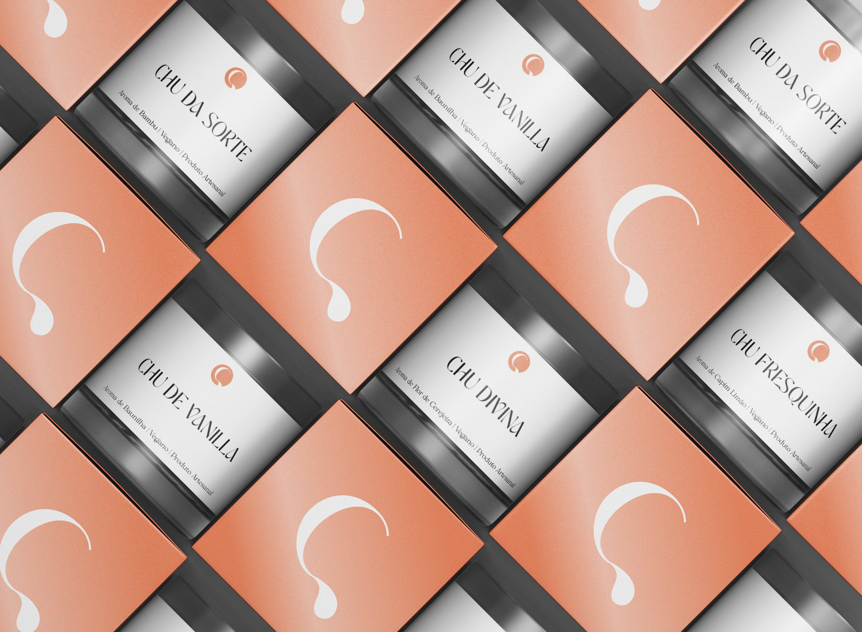
Chu's logomark applied
If you wanna know more about Chu Aromática, head to their Instagram: @chuaromatica
Thank you for watching!
Like this project
Posted Jul 5, 2023
Brand Identity created for Chu Aromática, a Brazilian e-store of Aromatic Products!
Likes
0
Views
10
