Built with Framer
Ironworks Gym - Brand & Website Design
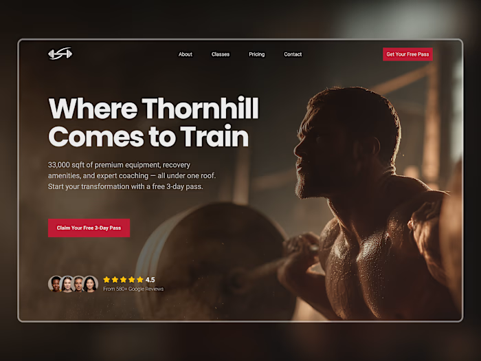
Ironworks Gym needed a digital presence that matched the intensity of their training floor, serious, no-nonsense, but still welcoming to newcomers ready to commit.
The Challenge
Most gym websites fall into two traps: either they look like generic corporate fitness chains, or they're so aggressive they intimidate potential members. Ironworks needed to communicate credibility to experienced lifters while remaining approachable enough to convert first-timers browsing for a new gym.
The Approach
I built the visual identity around warm neutrals and deep maroon - a palette that feels grounded and premium without the cliché black-and-neon "hardcore gym" aesthetic. The typography pairs a bold condensed serif for headlines with clean sans-serif body text, striking a balance between personality and readability.
The layout uses a bento grid system to showcase amenities (equipment, sauna, juice bar, personal training) in a scannable format that lets visitors quickly find what matters to them. Each card uses real gym photography with subtle overlays to maintain visual consistency.
Key Design Decisions
Trust-first hero section: Member count and social proof visible above the fold
Transparent pricing: No hidden fees, no "contact us for rates" - displayed clearly to reduce friction
Testimonial integration: Real member feedback positioned to reinforce the community aspect
Dual CTAs: "Join Now" for ready-to-convert visitors, "Book a Free Tour" for those who need more convincing
Tools: Figma, Midjourney, Framer
[Live Preview →] https://ironworksgym.framer.website/

Like this project
Posted Oct 1, 2025
A bold, conversion-focused website for a strength training gym that needed to stand out in a saturated fitness market.


