Built with Jitter
Viva Health — Wellness & Medical Center Website Design
Denis Faerman
Viva Health — Wellness & Medical Center Website Design
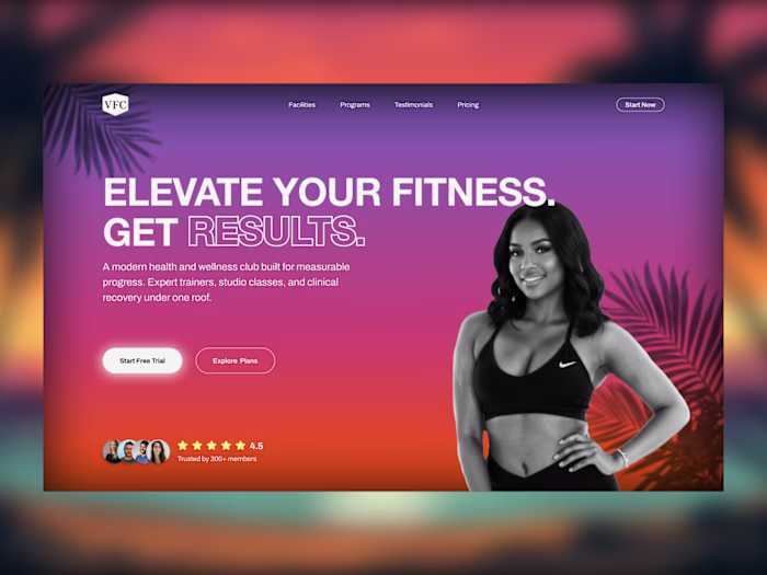
Viva Health needed a website that reflected the full scope of what they offer: personal training, naturopathy, psychotherapy, massage therapy, and medical weight management, all under one roof. The business was strong. The website wasn't showing it.
The Challenge
The existing site felt like a generic health clinic page. It didn't communicate the breadth of services, the credentials of the team, or the premium nature of the offering. For a business where trust is everything, the website was doing the opposite of building it. First-time visitors had no clear reason to book, no sense of who they'd be working with, and no obvious next step. The challenge was to design something that immediately established credibility, made the service offering impossible to miss, and turned a curious visitor into a booked consultation.
The Approach
I designed the page around one core idea: when your team is this qualified and your services are this comprehensive, lead with that. Don't make visitors dig for it.
The hero section opens with a bold, direct statement and a single CTA. From there, the page walks visitors through exactly what Viva Health offers, who delivers it, and why they should trust it, before asking them to take action. The layout stays clean and high contrast throughout to keep the focus on content rather than decoration.
Key Design Decisions
Bold service breakdown: Every offering is visible above the fold so visitors immediately understand the full scope of what's available, not just "gym" or "wellness clinic"
Team-forward structure: The team section is elevated to a primary page element, not an afterthought. In healthcare, people buy the practitioner before they buy the service
Social proof placement: Real client reviews are placed after the team section, at the natural point where a visitor is already considering booking, to close the trust gap right before the CTA
Single focused CTA throughout: Every section points to one action, book a free consultation. No competing links, no distractions
Clean high-contrast layout: Bold typography and a light background keep the page feeling clinical and premium without being cold or intimidating
Tools
Figma, MidJourney, Jitter

VIva Health website design
Like this project
Posted Mar 11, 2026
Homepage design for a wellness & medical center. Bold layout, team-forward structure, and a single CTA built to convert visitors into booked consultations.