Built with Framer
Thornhill Fitness Studio Website Redesign
Denis Faerman
Gym Website — Thornhill Fitness Studio
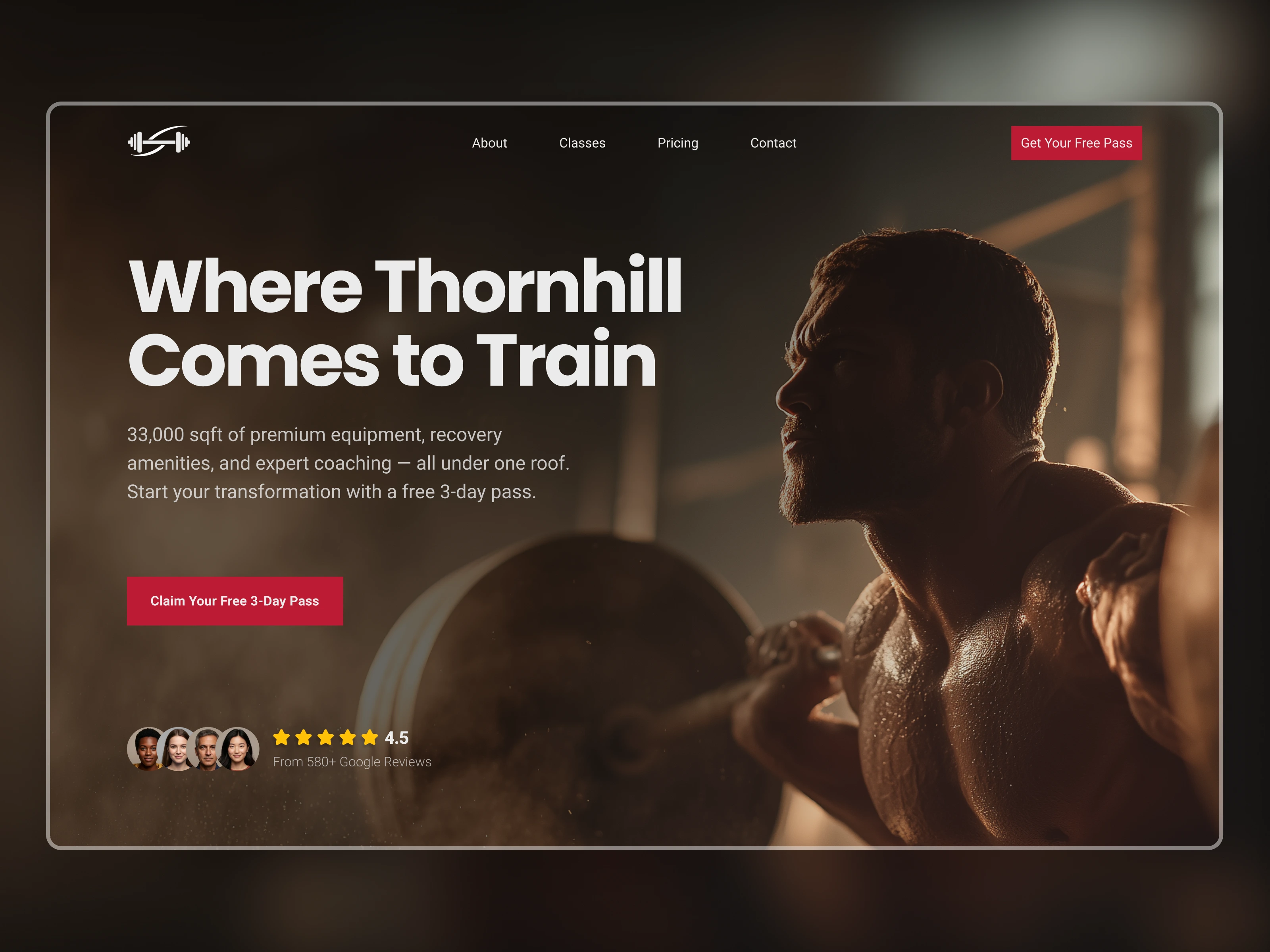
Thornhill Fitness had 580+ Google reviews, a 33,000 sqft facility, and expert coaching staff. The website wasn't showing any of it.
The Challenge
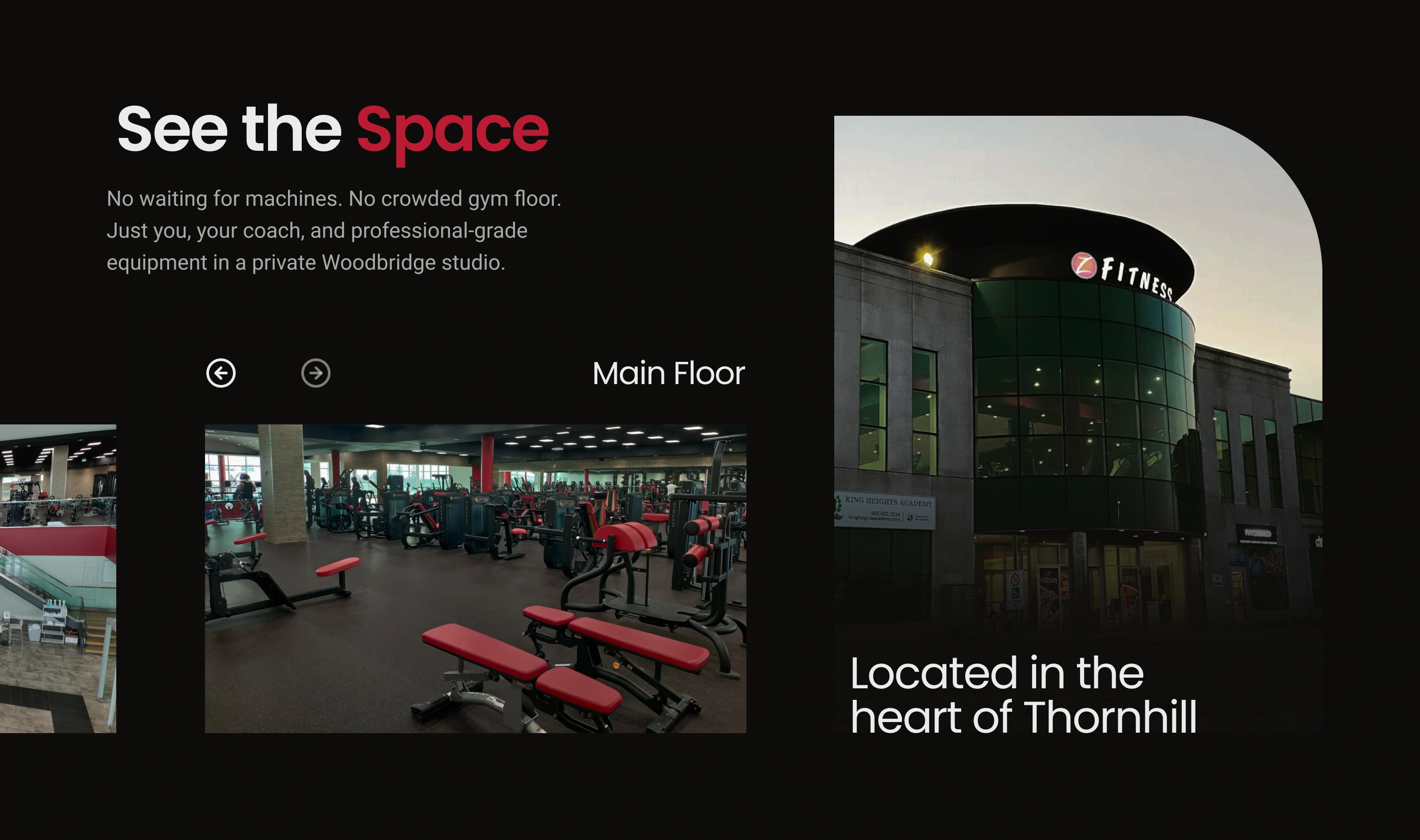
No social proof, no real facility photos, no clear reason to book a trial. The goal was to fix the first impression.
The Approach
When the facility is this good and the reviews are this strong, lead with that. The hero opens with a location-specific headline, real review count, and a single CTA. The rest of the page walks visitors through the space, classes, and coaching before asking them to act.
Key Design Decisions
Social proof in the hero: 580+ reviews above the fold, not buried on a separate page
Real facility photography: actual gym floor and exterior shots throughout
Location-specific headline: speaks directly to the community the gym already serves
Single CTA: every section points to one action, claim a free 3-day pass
Tools
Figma
Amenities section design

services section design

Coaching section design
Like this project
Posted Mar 17, 2026
Gym homepage redesign for a Thornhill fitness studio. Dark UI, facility photos, social proof front and center. Designed in Figma.