iPayBTC — Brand Repositioning &
Leonard Adams
iPayBTC — Brand Repositioning & System Design
iPayBTC wasn’t a design problem — it was a clarity problem.
The brand had already run campaigns, but without a defined voice or system, every execution felt disconnected. Messaging was vague, the website lacked direction, and the product wasn’t communicating trust to new users.
I stepped in to fix that at the root.
This was a full repositioning — not just visuals. I restructured how the brand thinks, speaks, and shows up across every touchpoint.
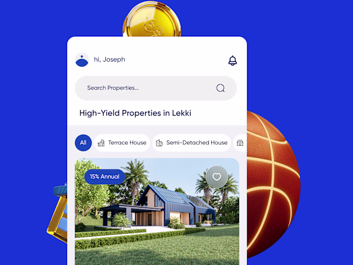
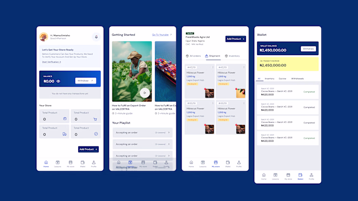
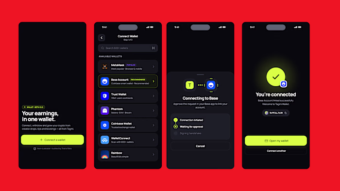
I defined a clear voice, rebuilt the messaging to be direct and human, and replaced abstract, crypto-native language with communication that actually converts. The goal was simple: make Bitcoin feel usable, not intimidating.
On the design side, I developed a scalable identity system built for both product and marketing. The logo reflects value in motion, reinforcing speed and usability. Typography was split intentionally — Futura LT Condensed for bold, disruptive marketing, and Neue Haas Grotesk for clarity across product and interface.
Every part of the system was designed to work together:
A website that explains without overwhelming
Marketing that communicates in seconds
A product experience that feels clear and trustworthy
Brand assets that scale across real-world touchpoints
This wasn’t about making things look better.
It was about making the brand work.
The outcome is a cohesive, high-performance brand system that positions iPayBTC as a serious, user-focused Bitcoin product — built for adoption, not just awareness.
Like this project
Posted Apr 13, 2026
iPayBTC — Brand Repositioning & System Design iPayBTC wasn’t a design problem — it was a clarity problem. The brand had already run campaigns, but without a ...