Built with Framer
Brand & Web Design for B2B Tech brand - Rentspot
Miru H.
Overview
Rentspot is a B2B SaaS platform designed to revolutionize property management for landlords. It aims to simplify and streamline the process of finding, managing, and renting out properties in a fast-moving rental market. The brand emphasizes clarity, trust, and flow, reflected in its logo and overall design. This brand + website design project aimed to grain clarity and trust in a fast-moving rental market.
My Role
Brand Design: Consistent, high-quality visuals and copy reinforce RentSpot’s brand identity, building trust and credibility with potential customers.
Framer Design: Led the entire UI/UX design process, creating a visually appealing and intuitive layout that enhances user experience and maximizes engagement.
Framer Development: Translated the design into a fully functional, high-performance website using Framer's development capabilities.
Spline 3D Design: Integrated 3D graphic to increase user engagement and dwell time, contributing to higher conversion rates.
Copywriting: Developed compelling, business-oriented copy that aligns with RentSpot's brand voice, effectively communicates value propositions, and drives user action.
Deliverables
Rentspot Logo
Brand Guidelines
Web Design
Digital Assets
Browser favicons
App icons for various digital platforms
Physical Brand Application
Building signage
Large format displays for events or advertising
Branded merchandise, including: ▪ Tumblers. ▪ Buttons. ▪ Tote bags.
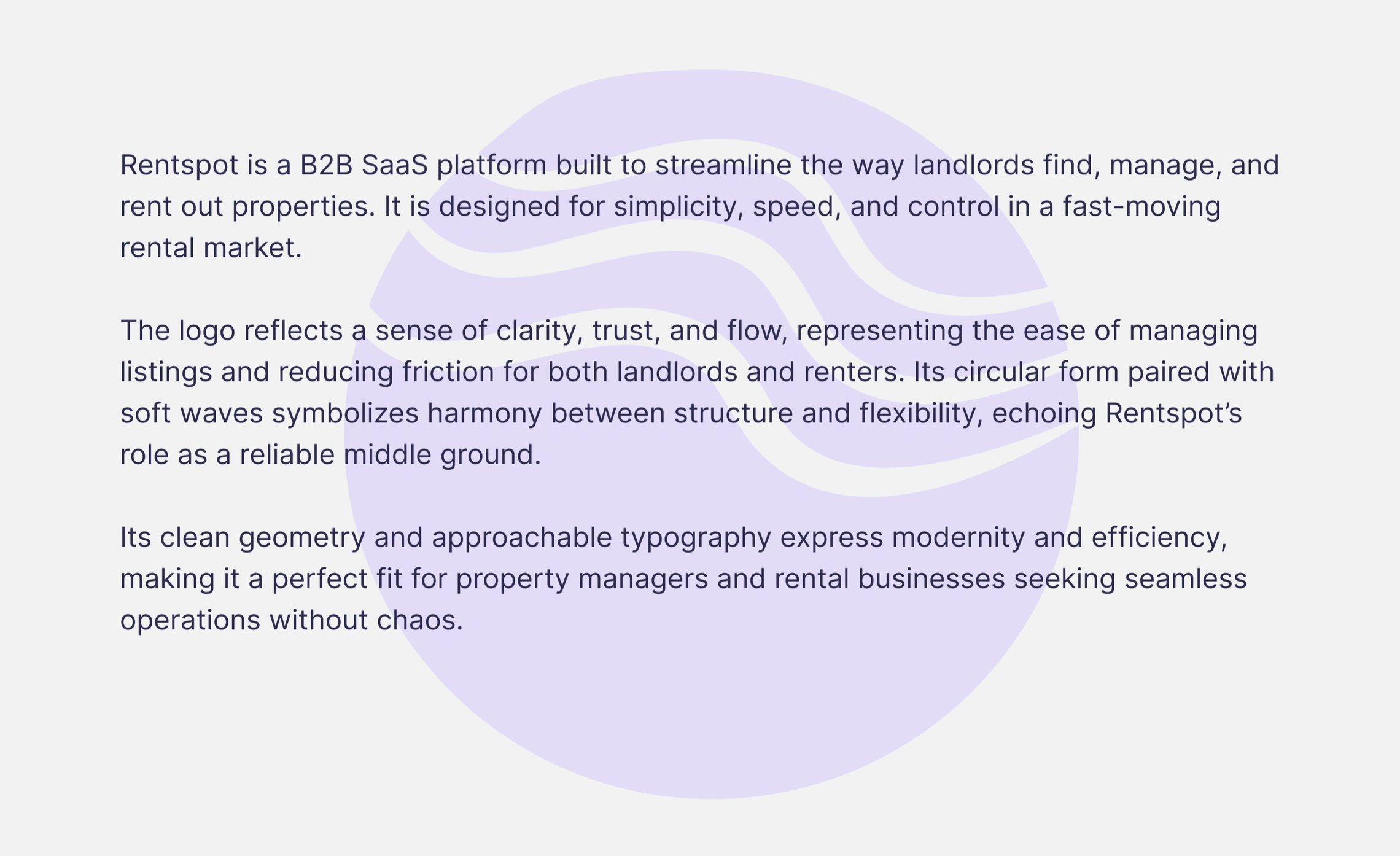
Brand Identity and Values: Clarity, Trust, and Flow
Brand Values & Messaging: Clarity, Trust, and Flow
Ease in managing listings and reducing friction for both landlords and renters.
Harmony between structure and flexibility, positioning Rentspot as a reliable middle ground in the rental market.
Modernity and Efficiency through its visual elements, specifically clean geometry and approachable typography.
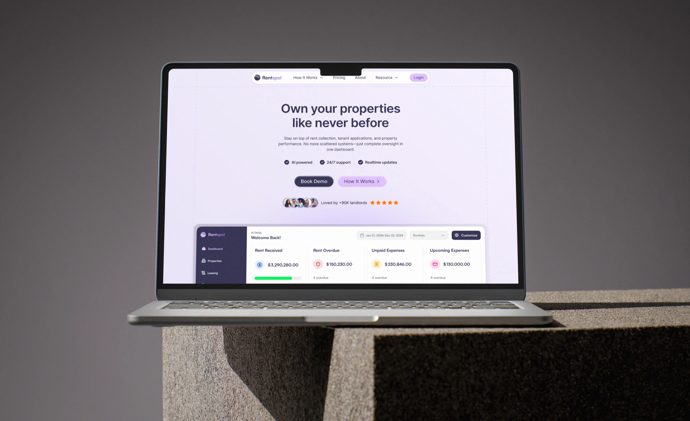
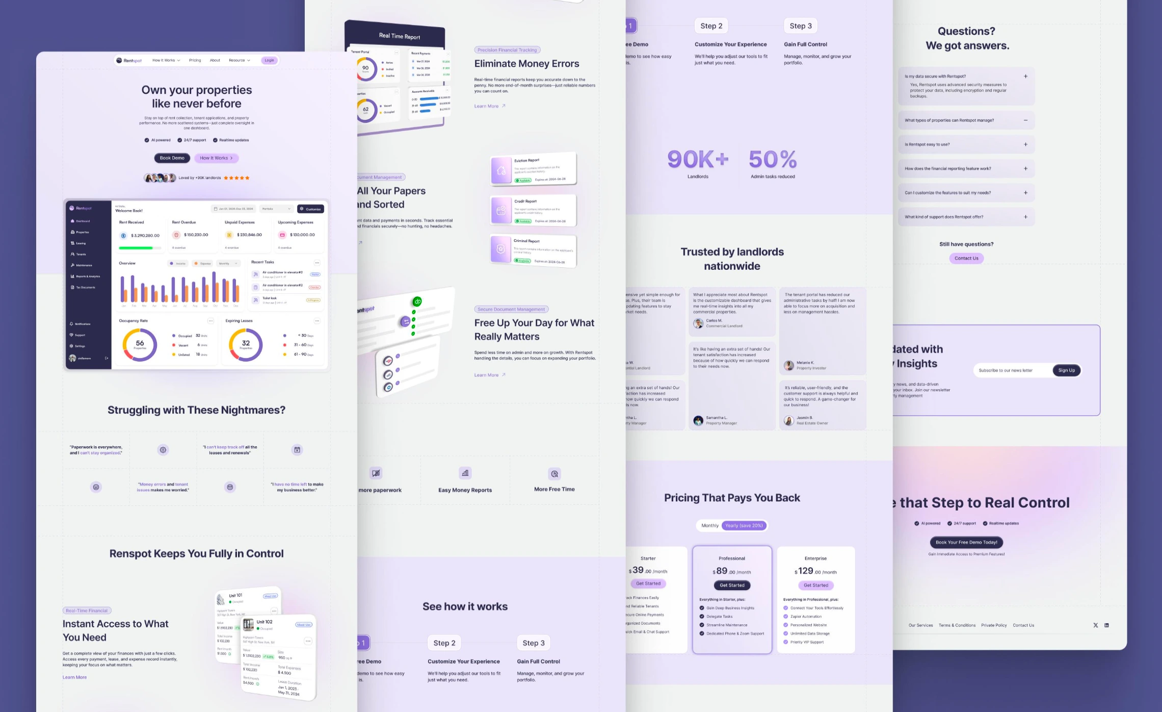
The messaging emphasizes the ability to "Own your properties like never before" with features like AI-powered insights, 24/7 support, and real-time updates.
It promises to help users eliminate money errors, keep all papers sorted, and ultimately gain "Full Control". The platform is "Loved by 90K+ landlords"
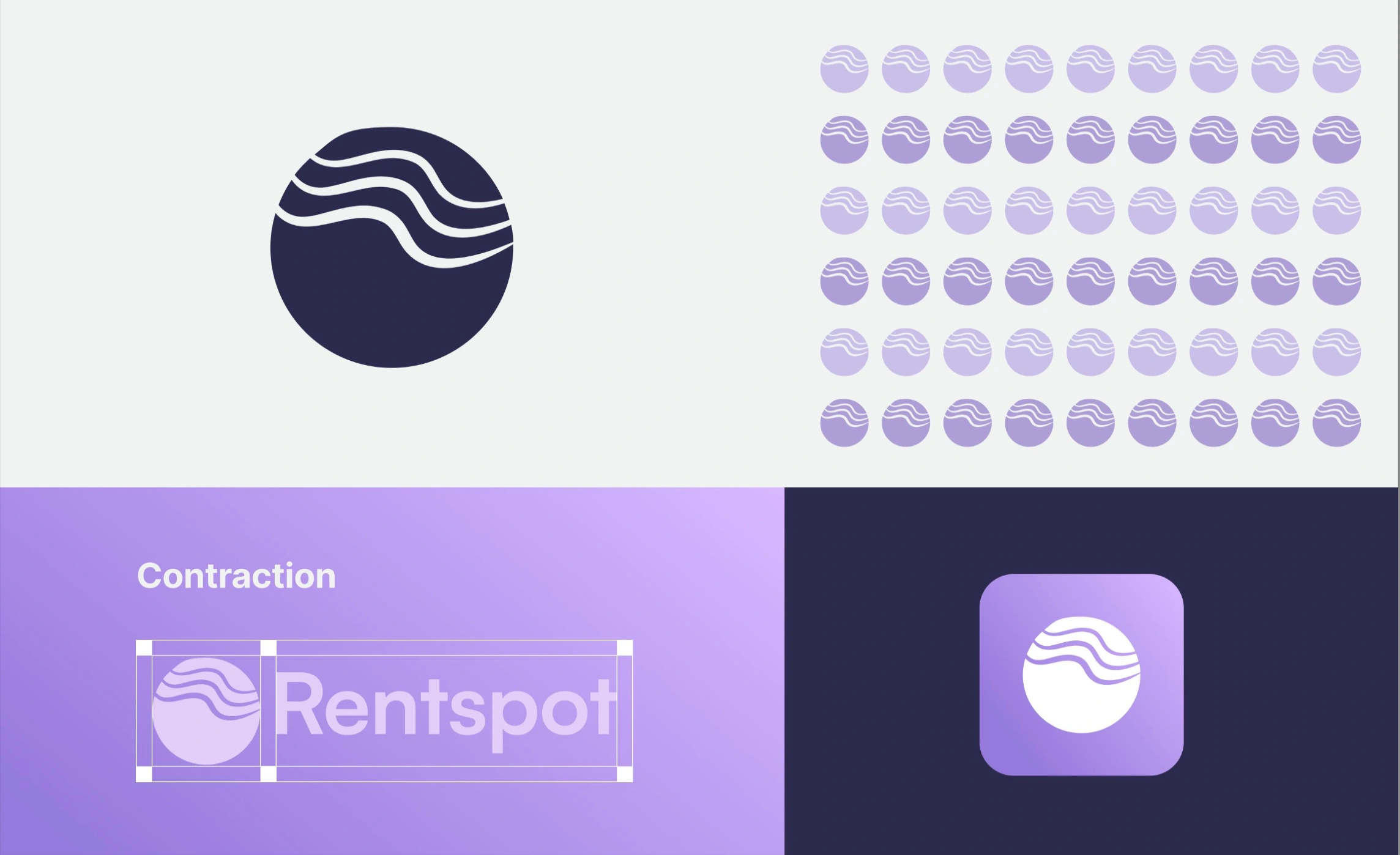
Logo
Logo Symbolism
The logomark is a circular form adorned with soft waves. This design symbolizes harmony between structure and flexibility and echoes Rentspot's role as a reliable middle ground. The logo’s clean geometry and approachable typography are intended to express modernity and efficiency.
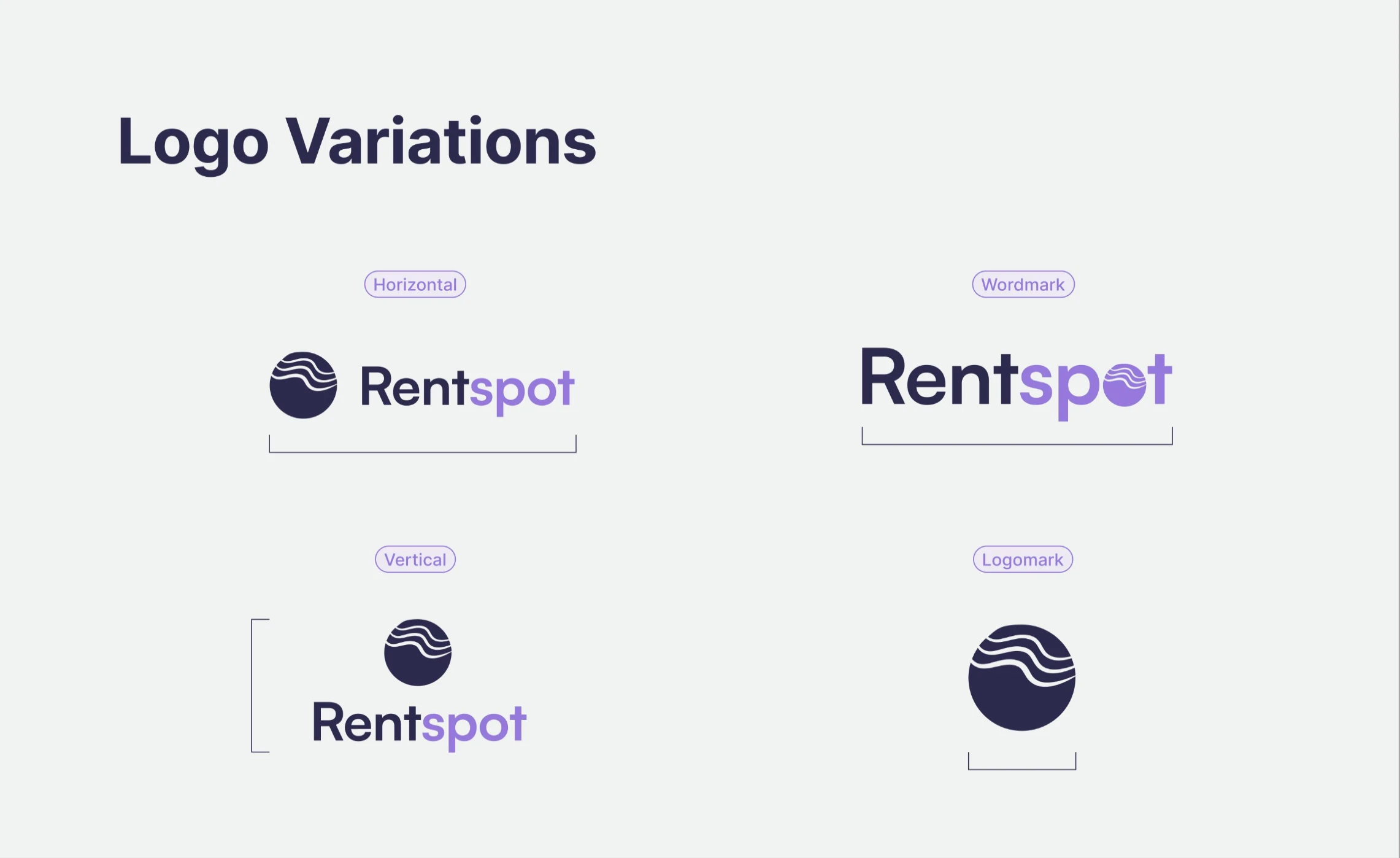
Logo variations
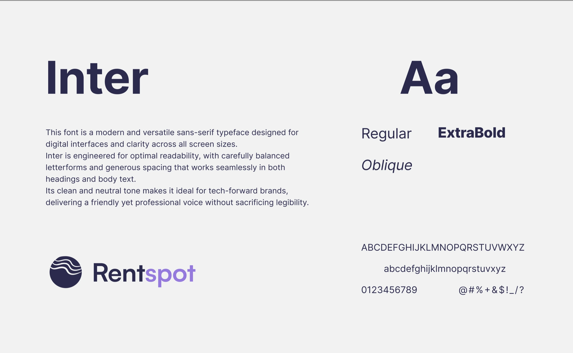
Typography
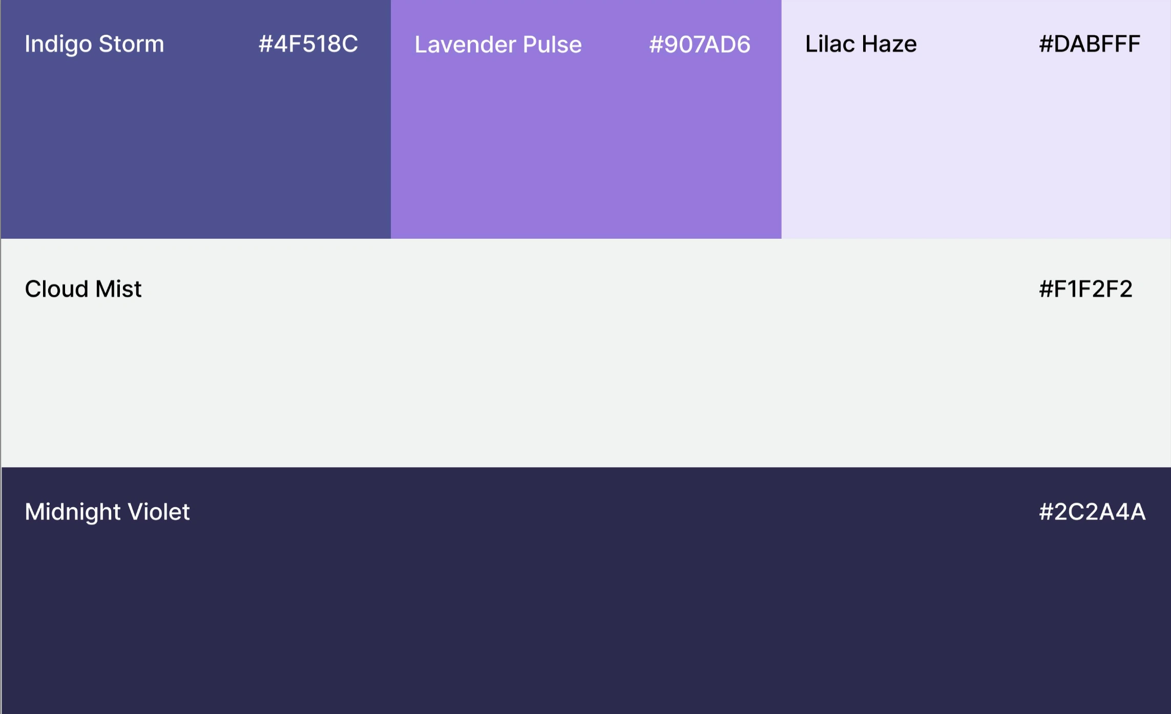
Color Palette
Color Palette
The brand's color palette includes distinct shades, contributing to its modern and approachable aesthetic
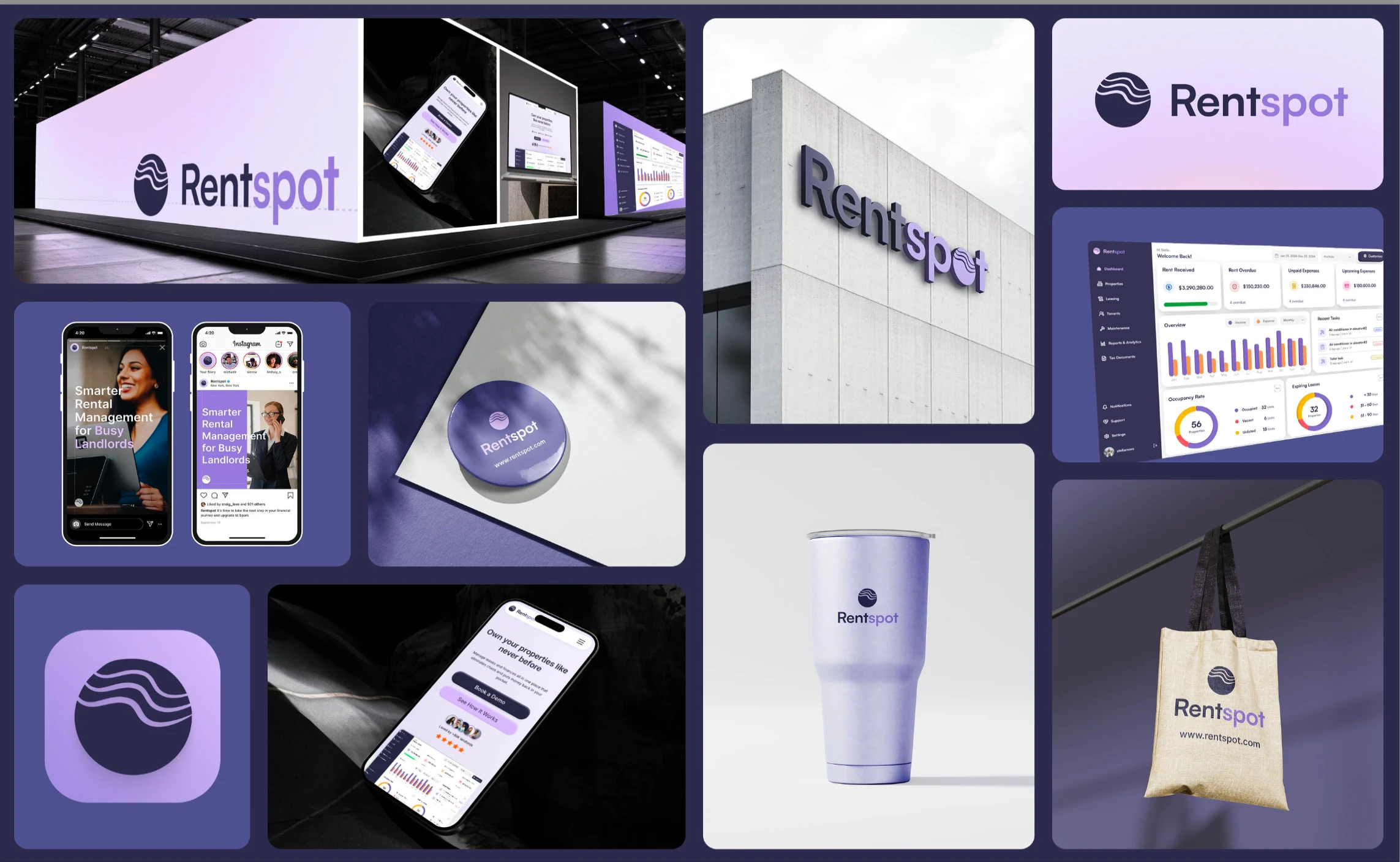
Applications & Deliverables
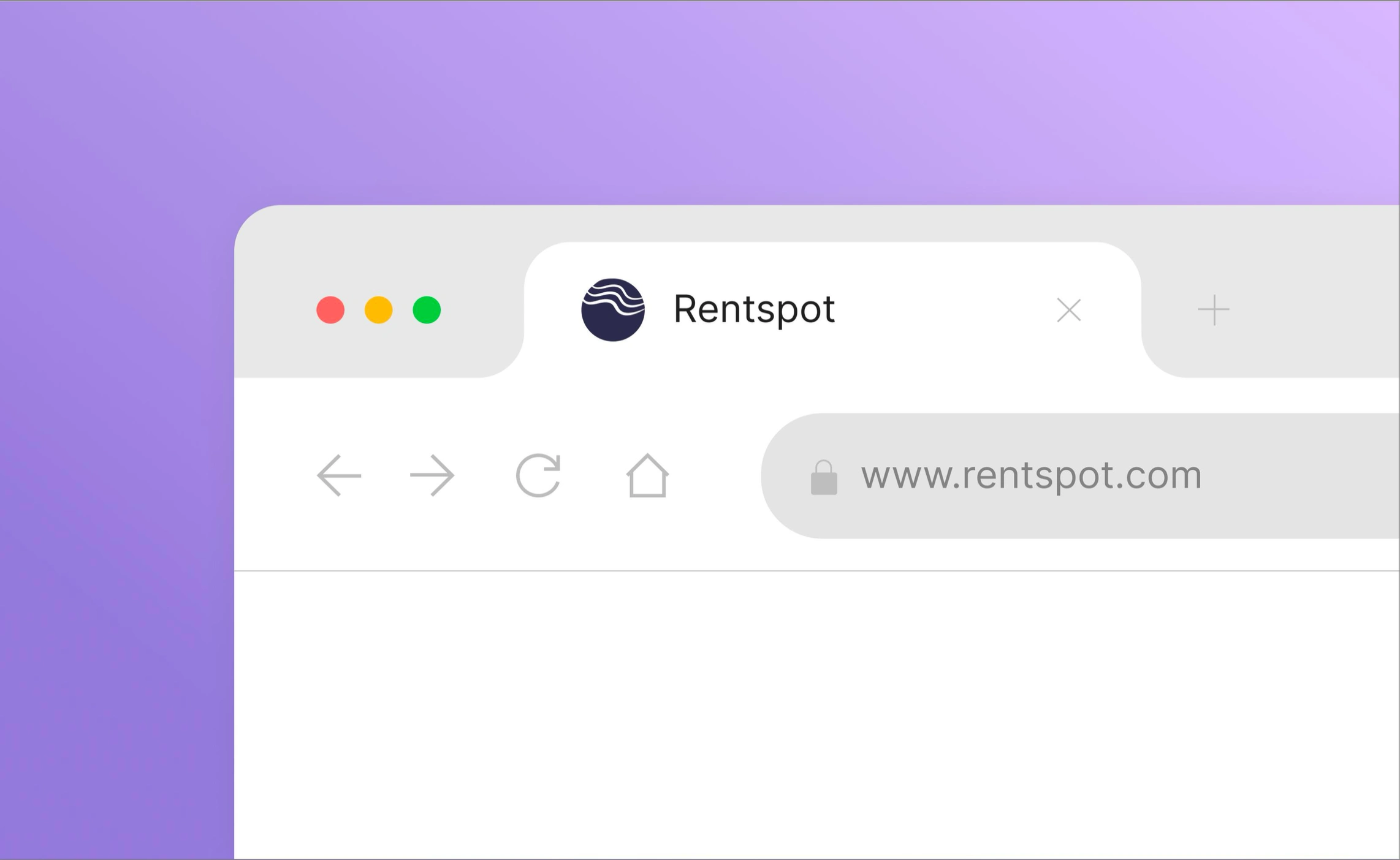
Browser favicon
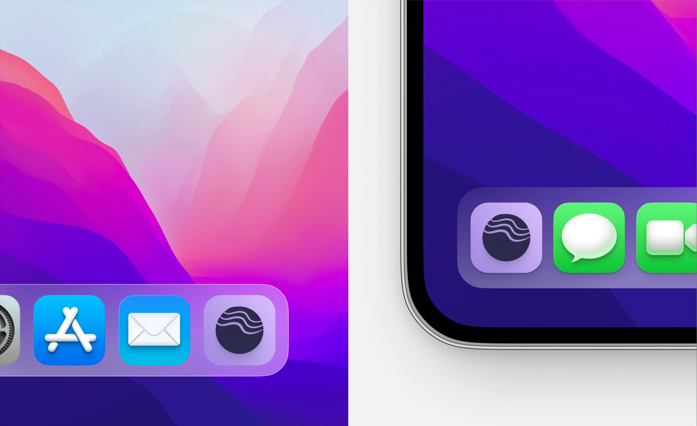
App icons
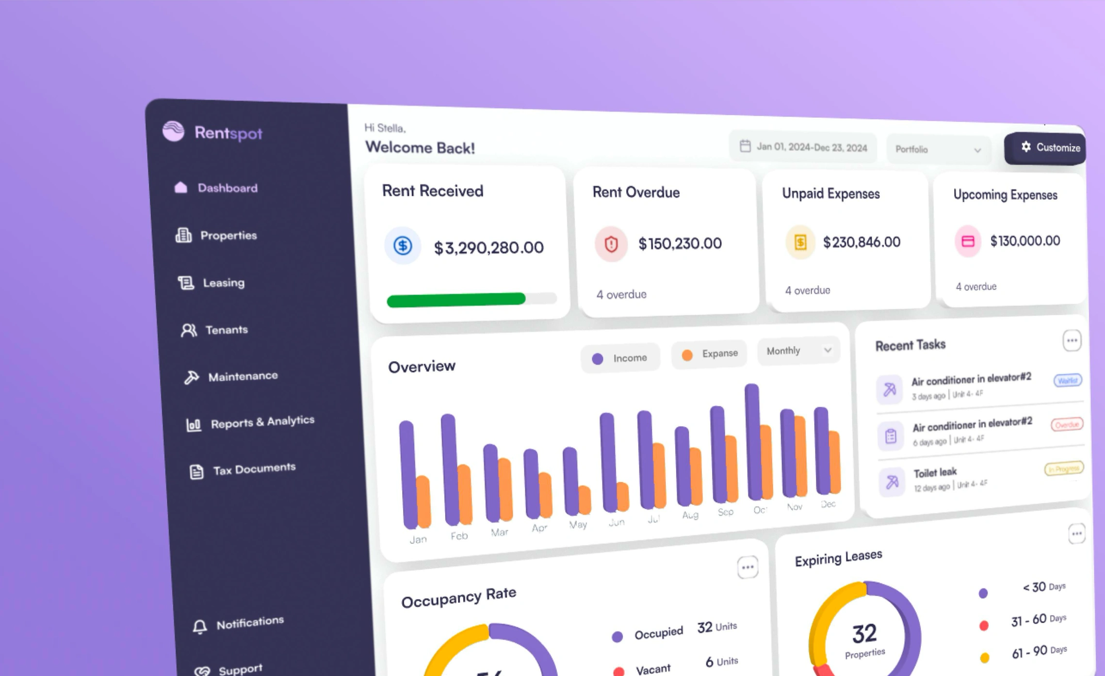
Dashboard logo
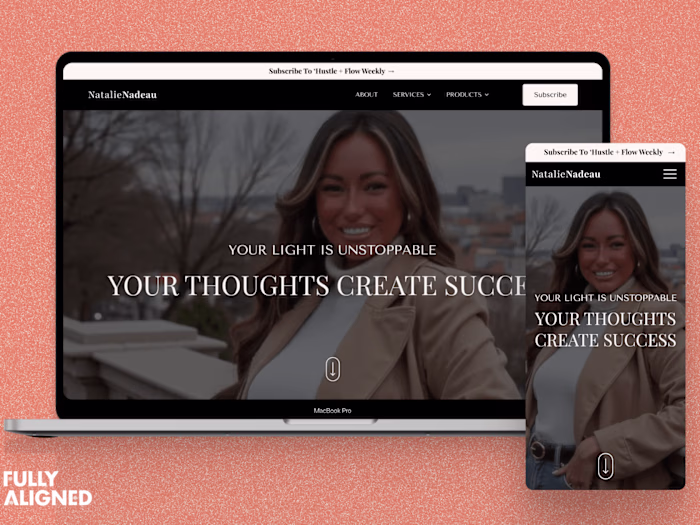
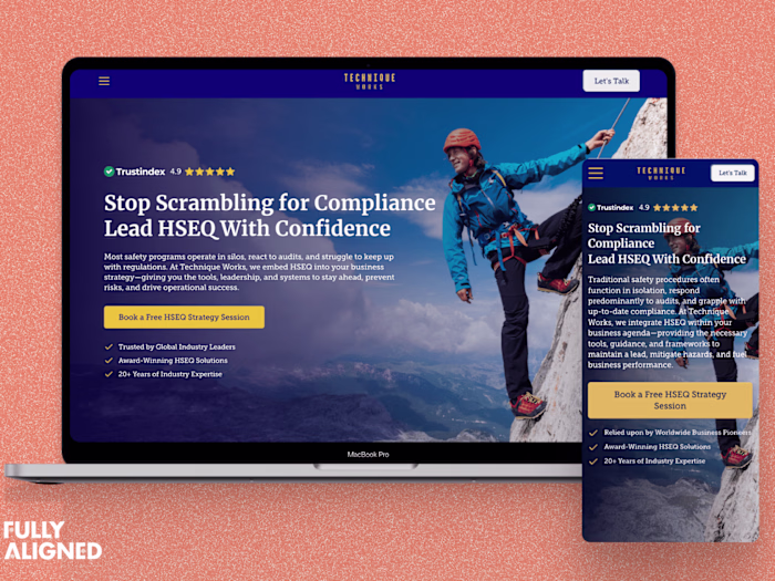
Responsive Website (desktop)
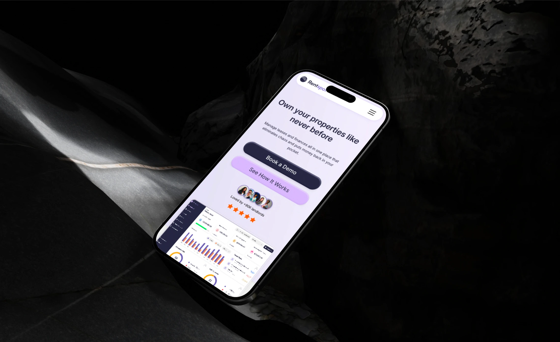
Responsive Website (mobile)
Responsive Website (home)
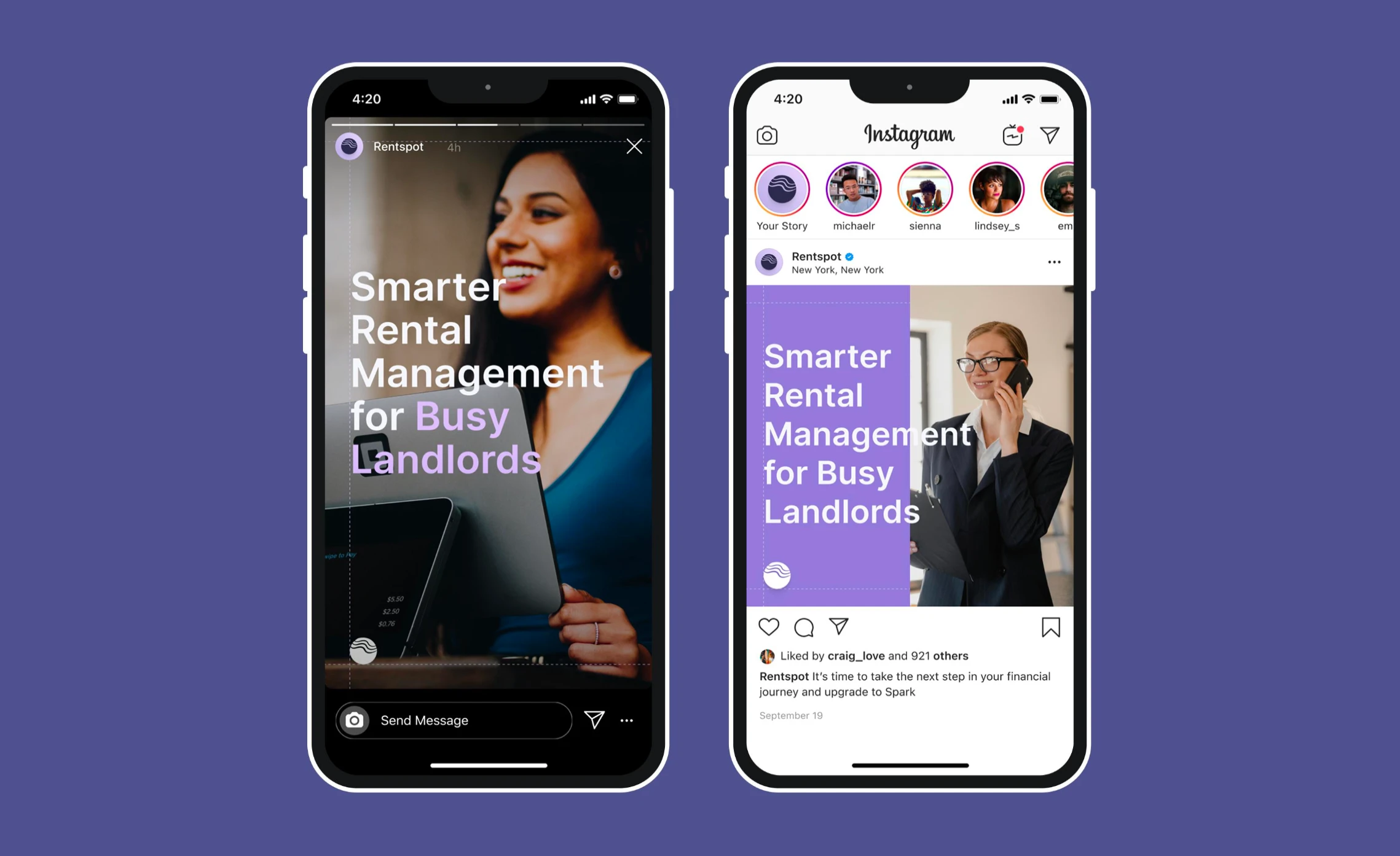
Social media kit
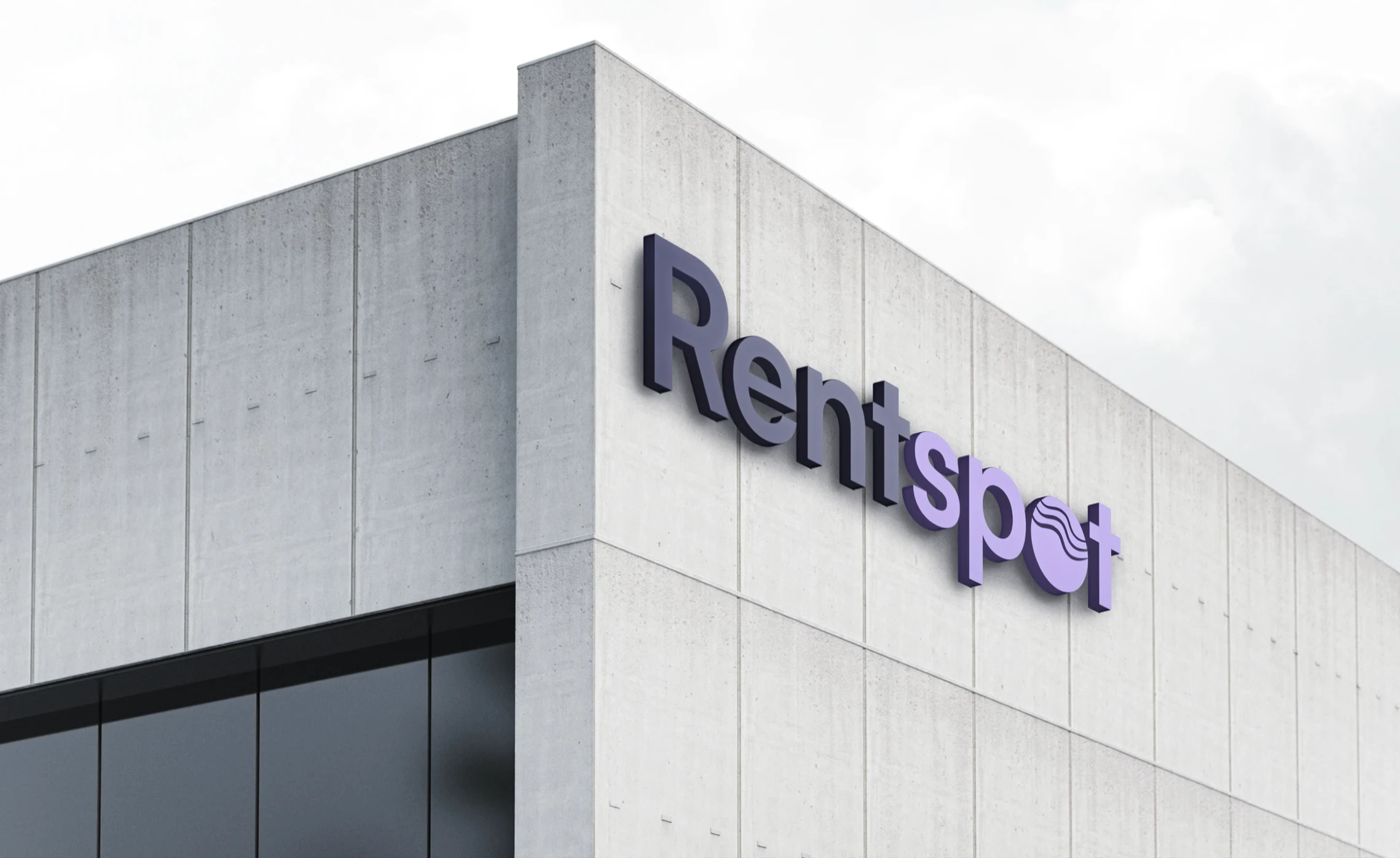
Building signage
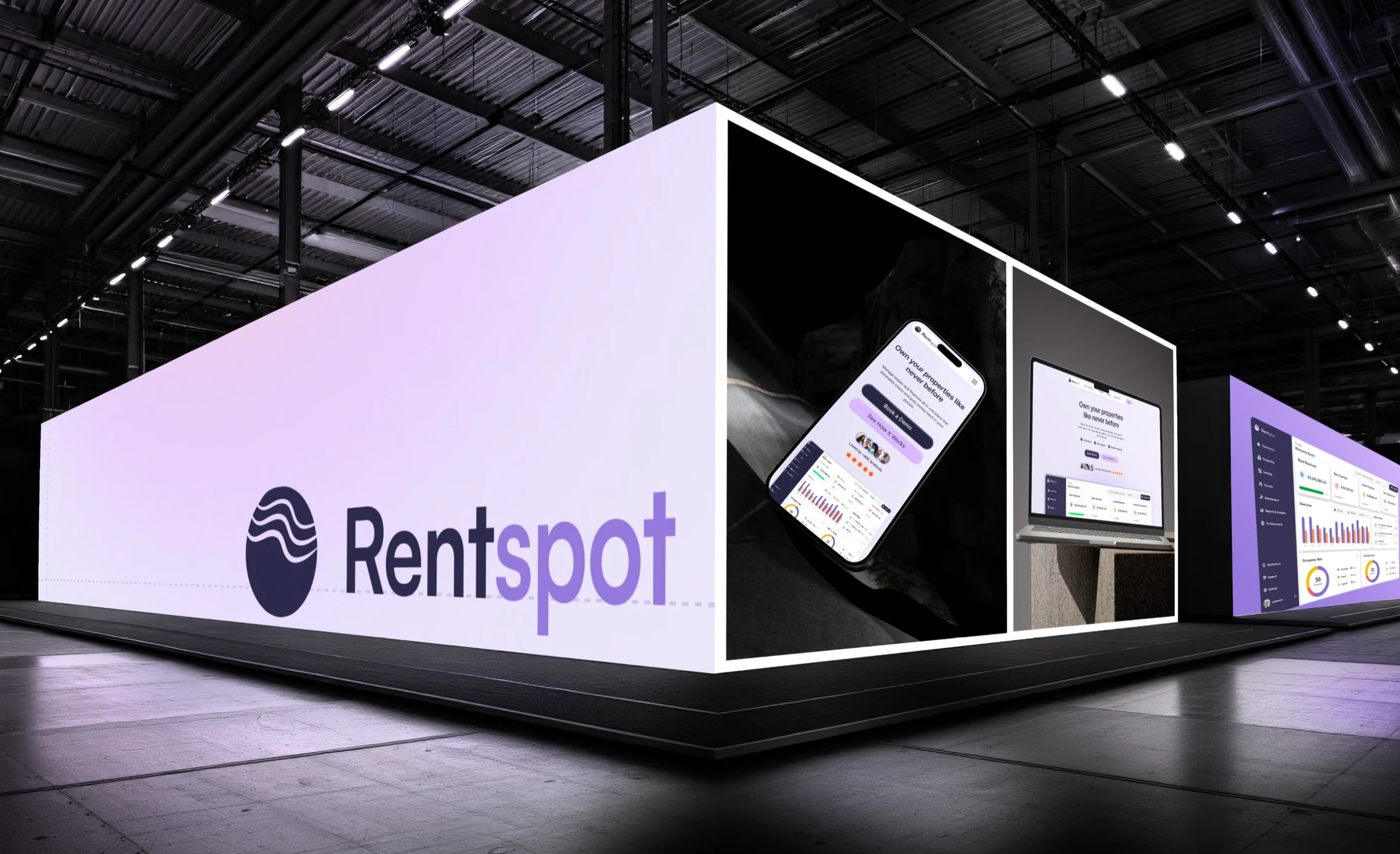
Large format displays, such as for events or advertising
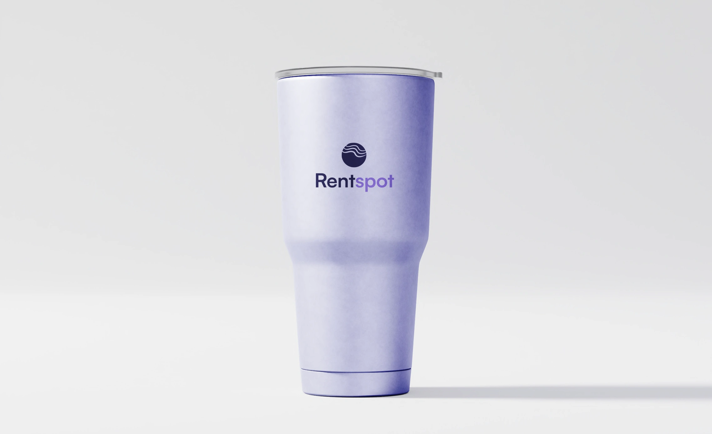
Tumbler
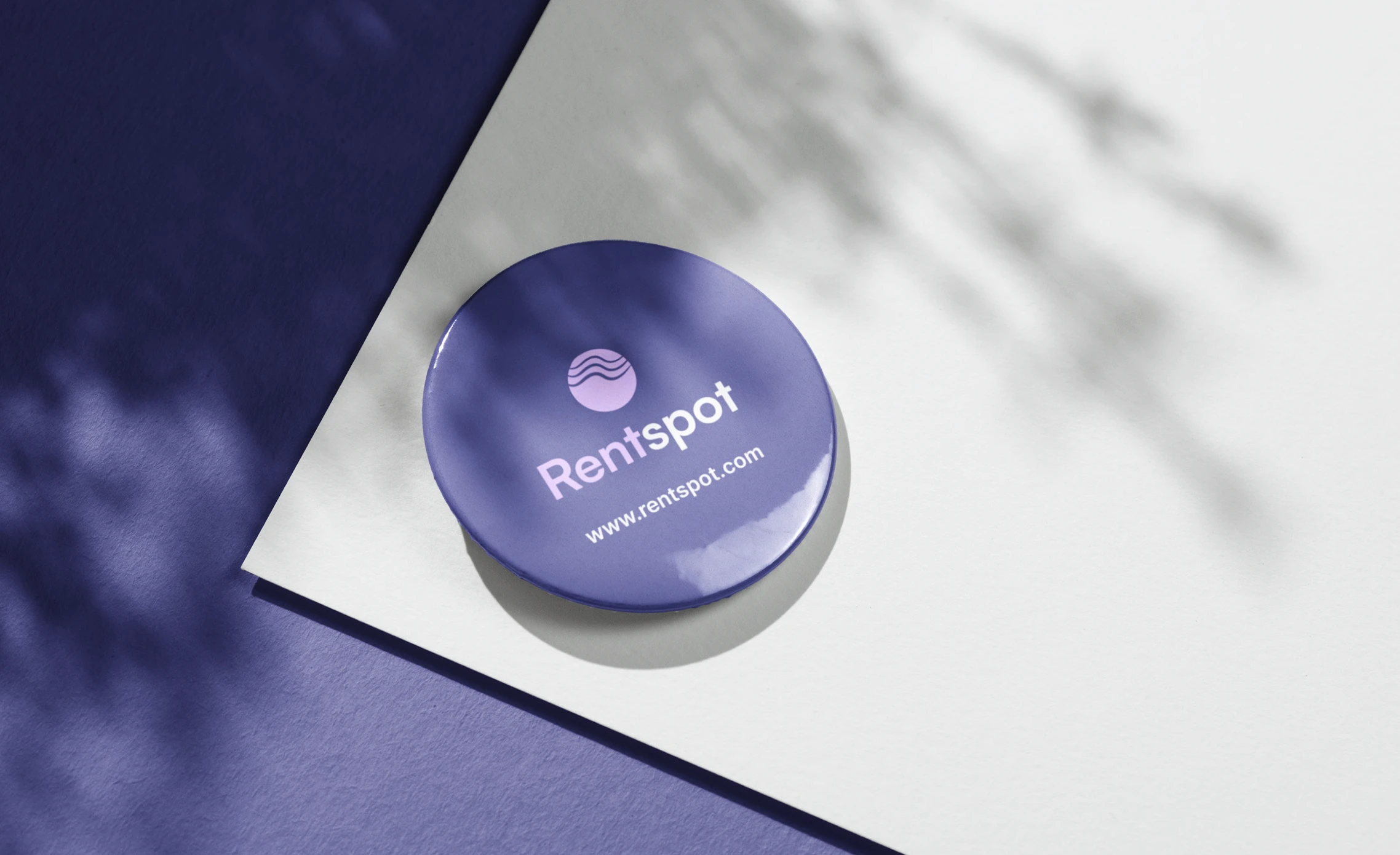
Badge
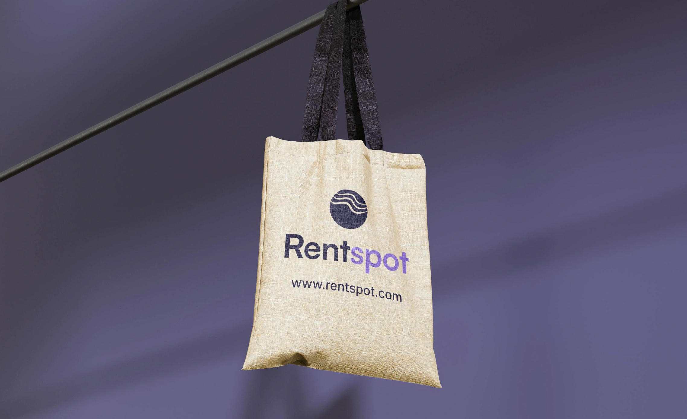
Tote bag
Like this project
Posted Oct 10, 2025
Designed and developed Rentspot's unique brand identity and website to grain clarity and trust in a fast-moving rental market.
Likes
0
Views
7
Timeline
Jun 3, 2024 - Jul 1, 2024