
Overview
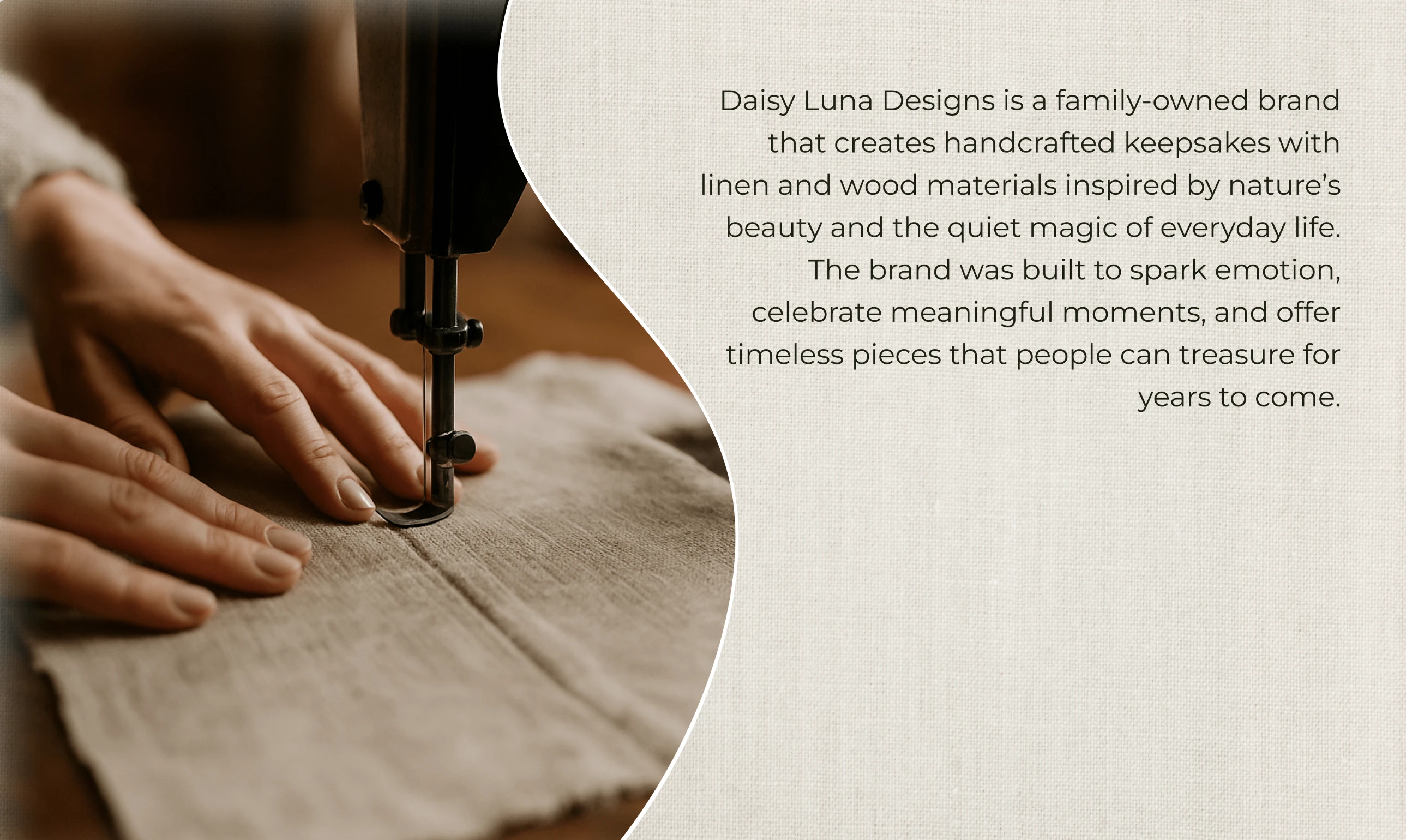
Daisy Luna Designs is a family-owned brand specializing in handcrafted keepsakes made from linen and wood materials.
The brand's aesthetic is inspired by "nature's beauty and the quiet magic of everyday life."
Their core mission is to "spark emotion, celebrate meaningful moments, and offer timeless pieces that people can treasure for years to come."
The Challenge
Daisy Luna Designs created beautifully handcrafted keepsakes, but the brand identity lacked a unifying visual and emotional thread. While the products themselves conveyed care and artistry, the branding did not fully express the warmth, timelessness, and nature-inspired essence behind them. The goal was to create a system that would:
Capture both the earthy textures and soft elegance of her materials.
Feel refined and timeless, while staying personal and approachable.
Work consistently across packaging, custom products, and printed materials.
Stand out in a market where many handcrafted brands can look interchangeable.
My Approach
This project began as a deep exploration of what Daisy Luna Designs represents at its core. It was not just about designing a logo but about uncovering the story behind the keepsakes, why they matter, what moments they are meant to honor, and how they can spark emotion.
Through collaborative discussions and visual research, I explored the emotional values of the brand: nostalgia, love, and the quiet beauty of everyday life.
I built mood boards and experimented with natural color palettes and shapes that echoed the textures of linen and wood. Each design decision, from typography to color harmony, was guided by the question, “How will this feel to someone holding a Daisy Luna keepsake?”
The final identity included:
A flexible logo system featuring a flower-inspired symbol that reflects both blooming and unfolding.
A color palette drawn from earthy tones and soft pastels, designed to evoke calm and warmth.
A typography pairing that balances timeless serif forms with modern clarity and a handwritten accent for personal moments.
Branded applications such as packaging concepts, engraved product marks, and business cards to unify the brand across touchpoints.
The result is an identity that feels poetic, natural, and deeply human, just like the pieces Daisy Luna Designs creates.
Client Review
Logo Design
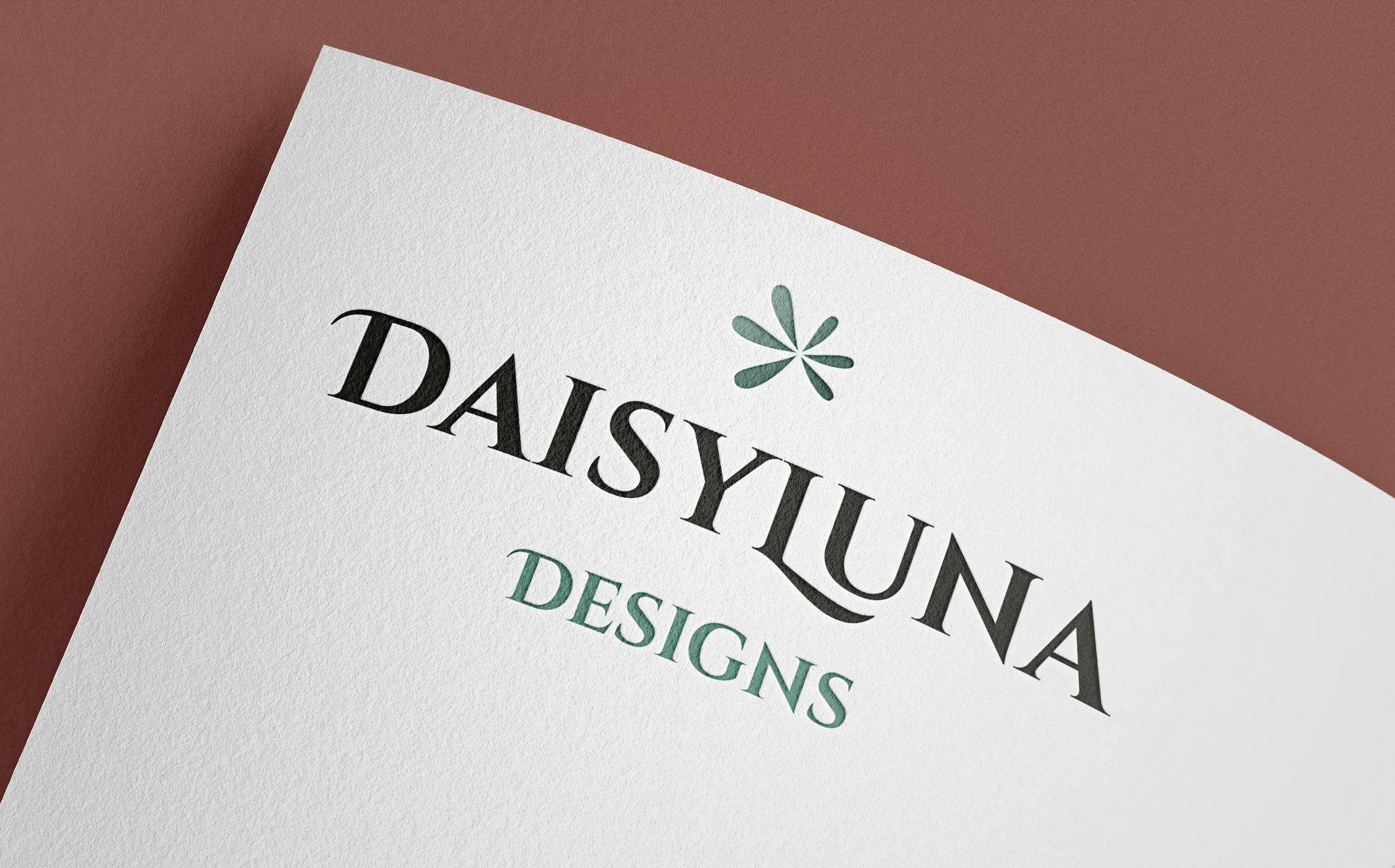
Logo
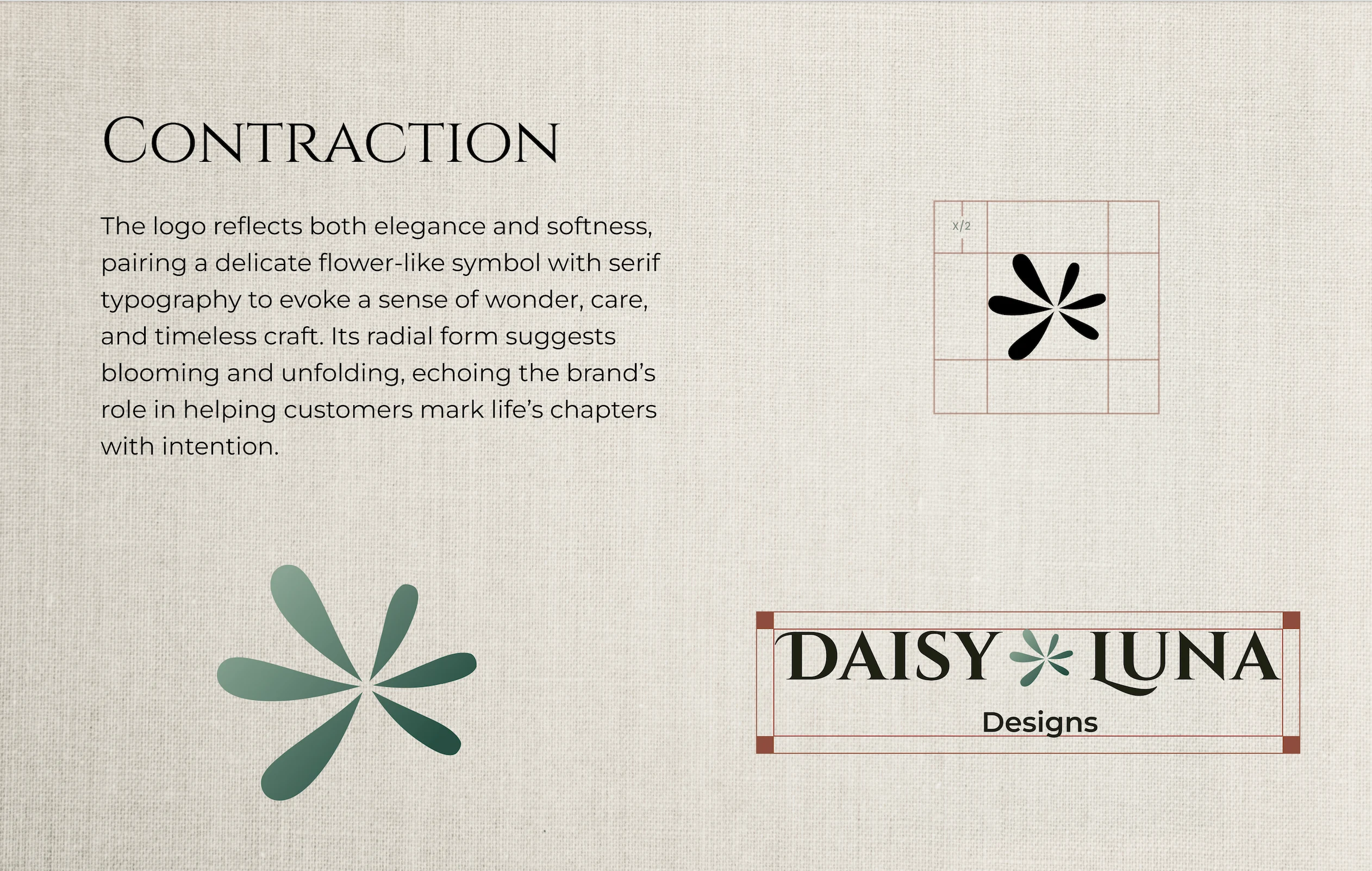
The Daisy Luna Designs logo features a "delicate flower-like symbol" paired with serif typography.
Symbolism: The radial form of the flower symbol suggests "blooming and unfolding" signifying the brand's role in helping customers "mark life's chapters with intention."
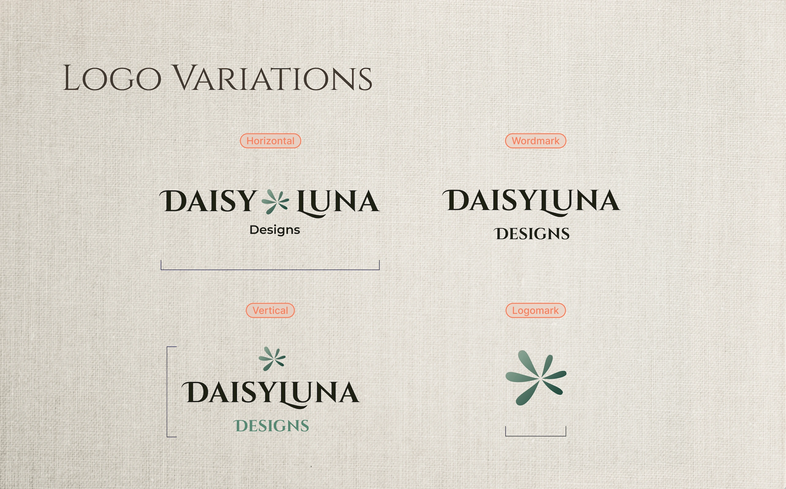
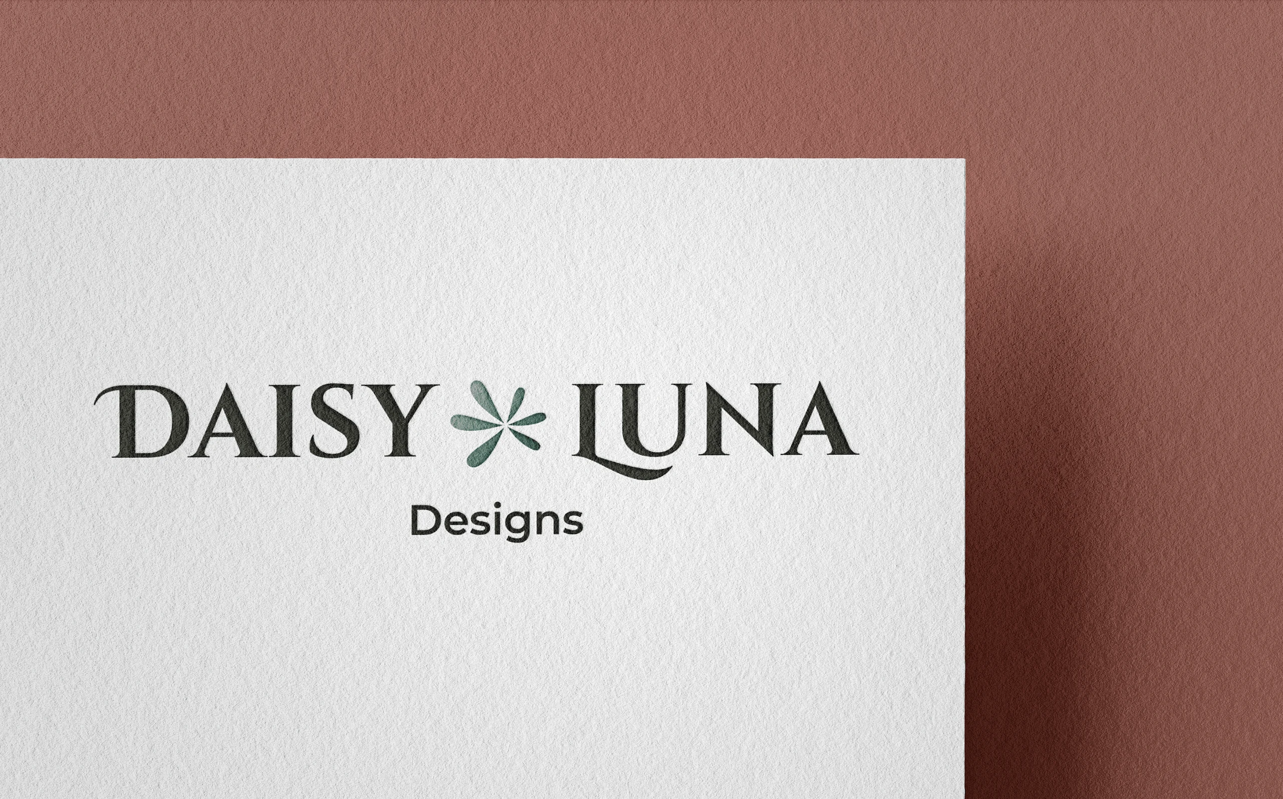
Logo Variations
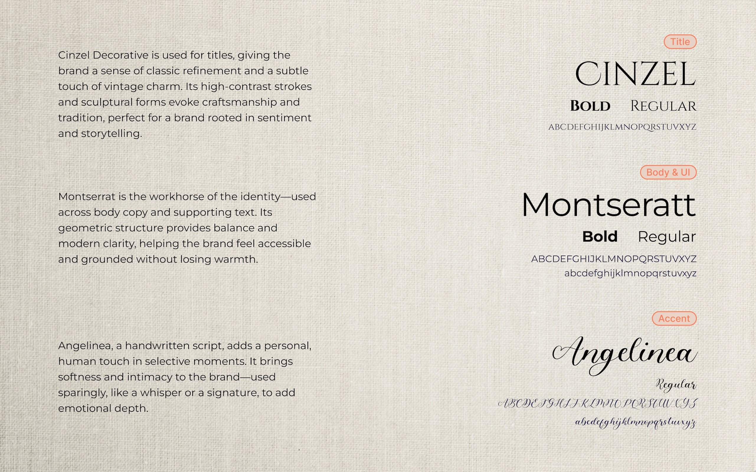
Typography: 3 distinct typefaces are used to convey the brand's identity.
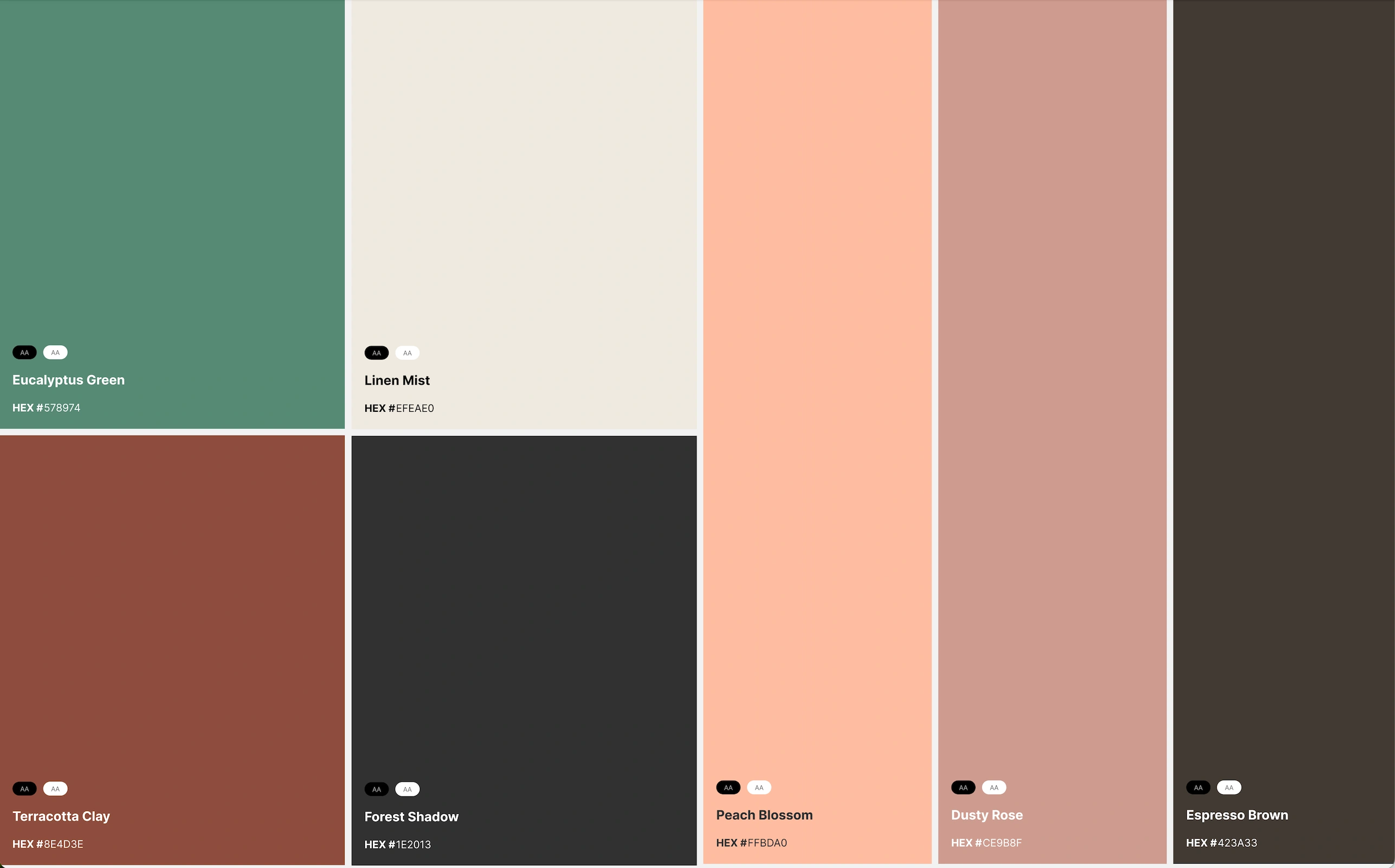
Color Palette: The brand's color palette is inspired by natural and muted tones, contributing to its earthy and elegant aesthetic.
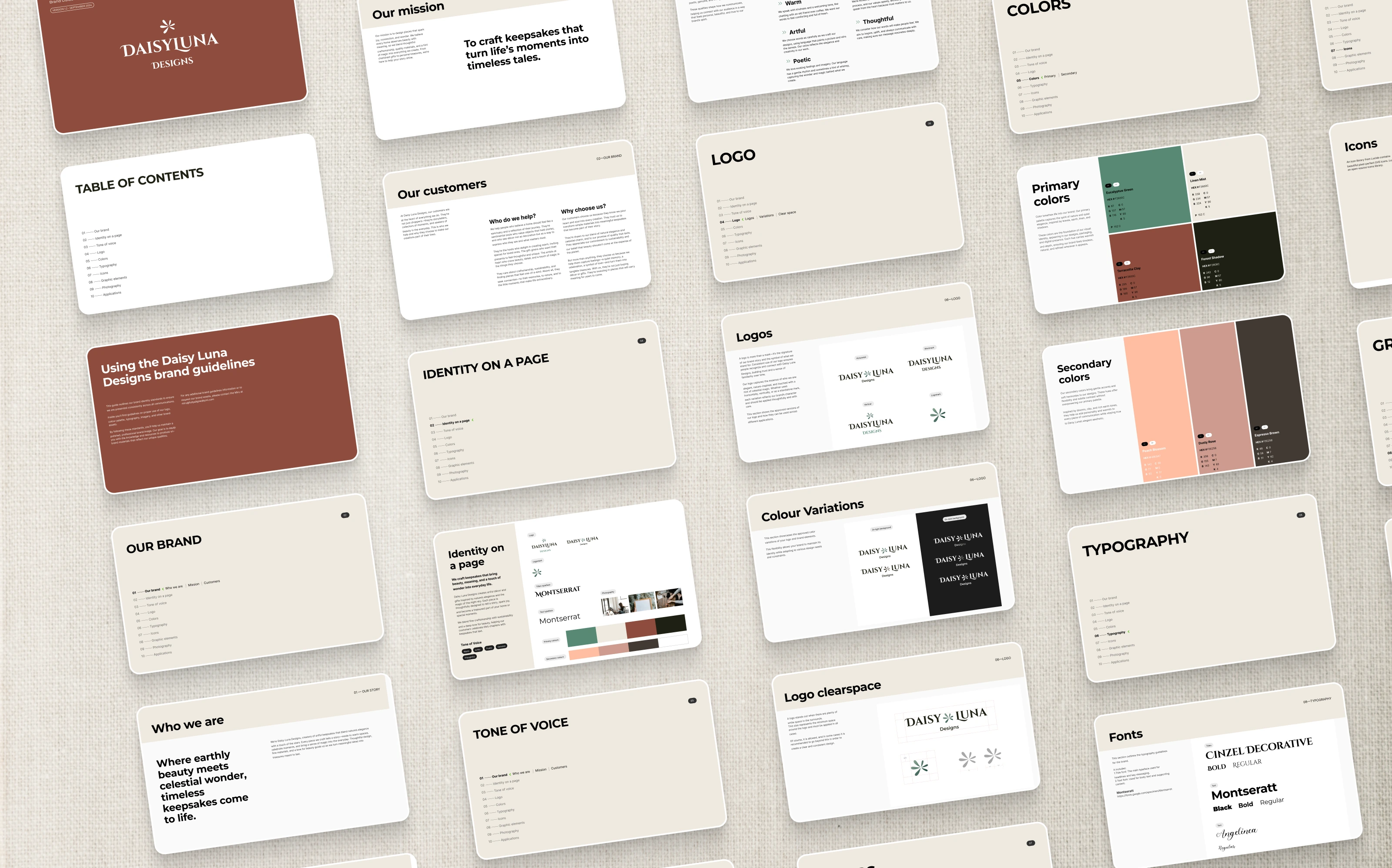
Brand Guidelines
Applications and Patterns
The brand identity extends to various applications, demonstrating consistency and reinforcing the core themes.
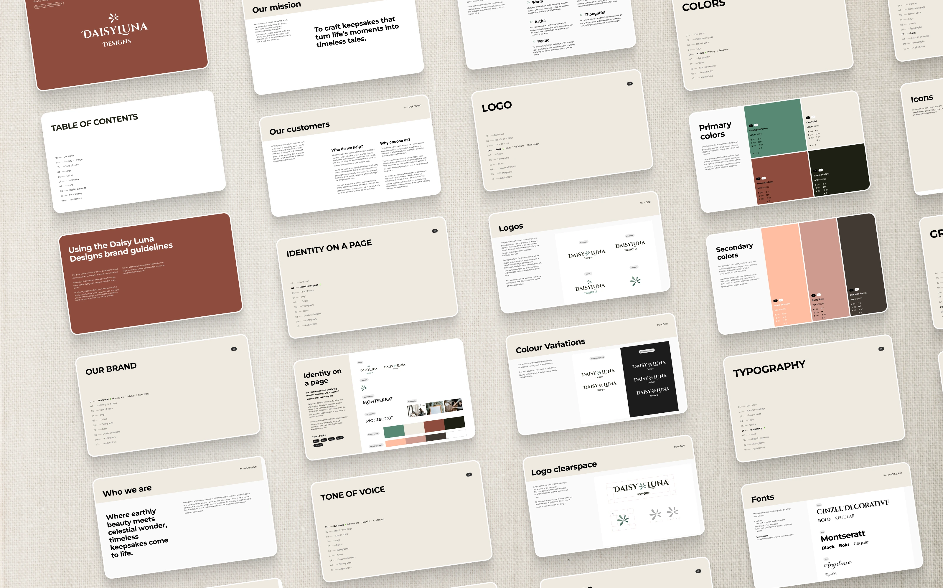
Brand Guidelines
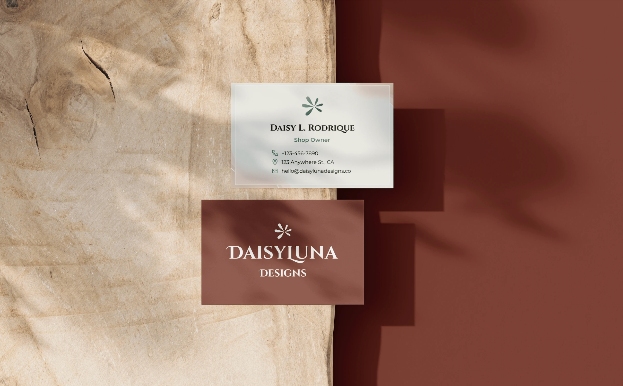
Business Cards: Feature the logo and essential contact information.
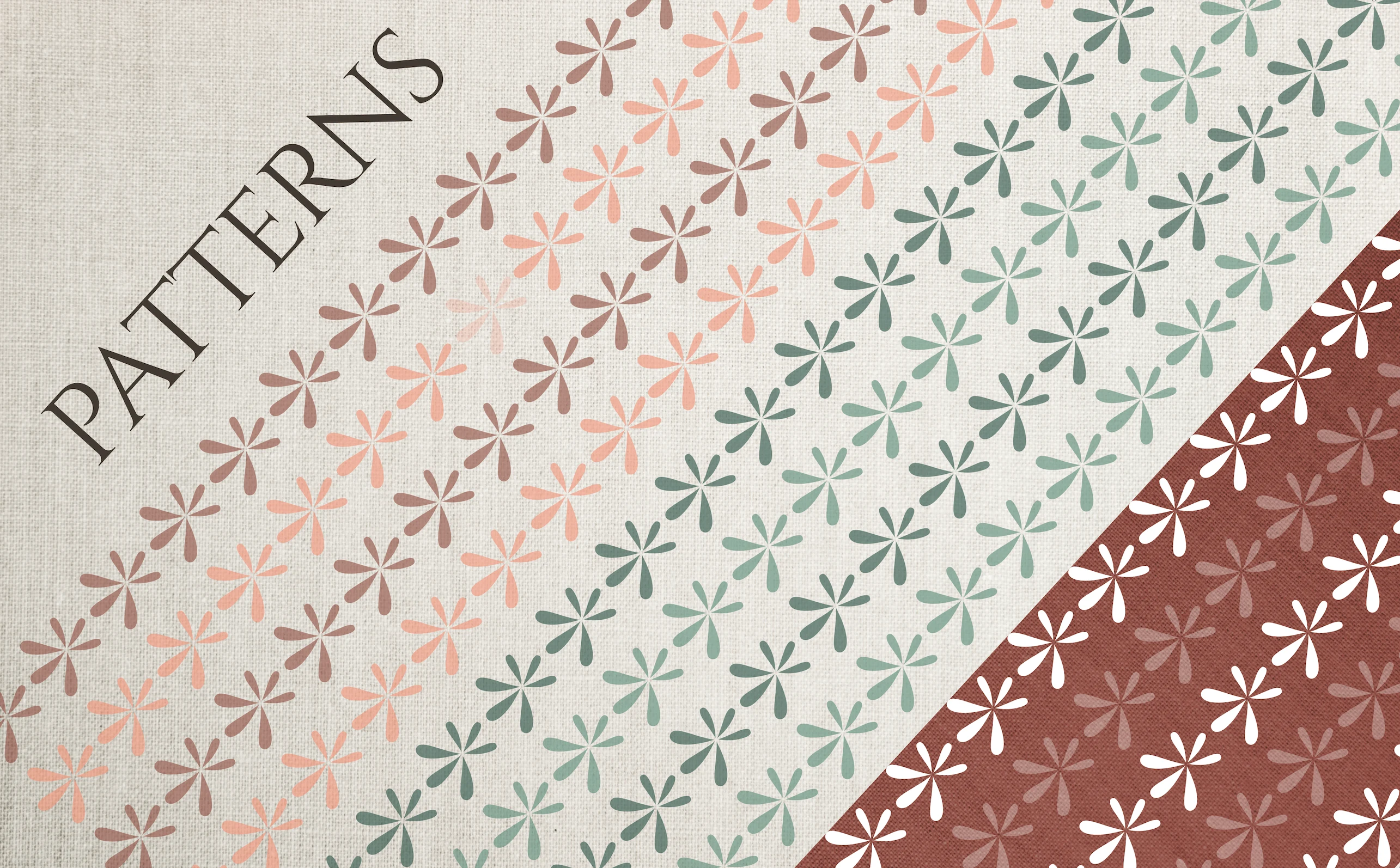
Patterns: The flower-like logomark is utilized to create repetitive patterns in varying colors.
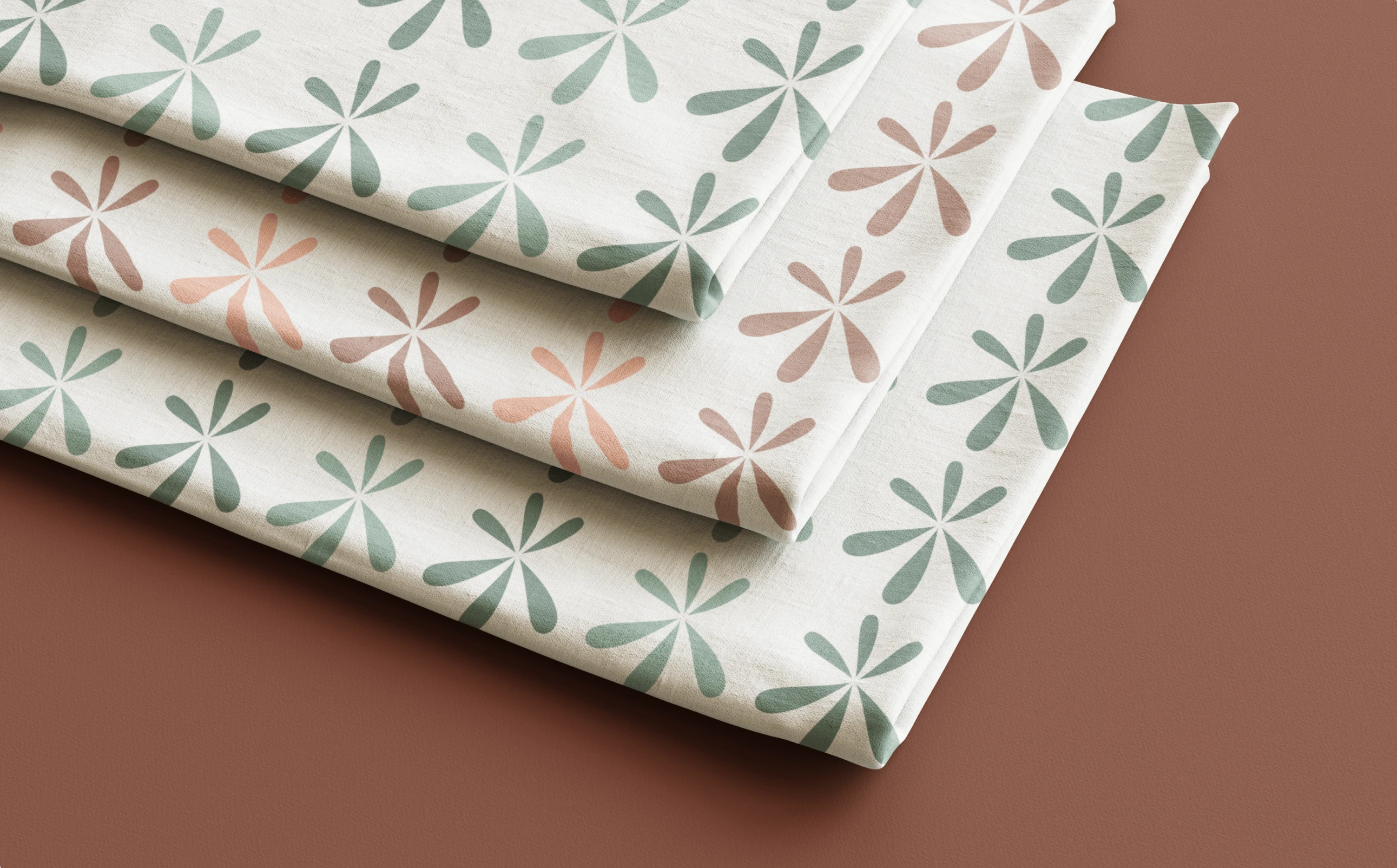
Green on linen mist, peach on linen mist
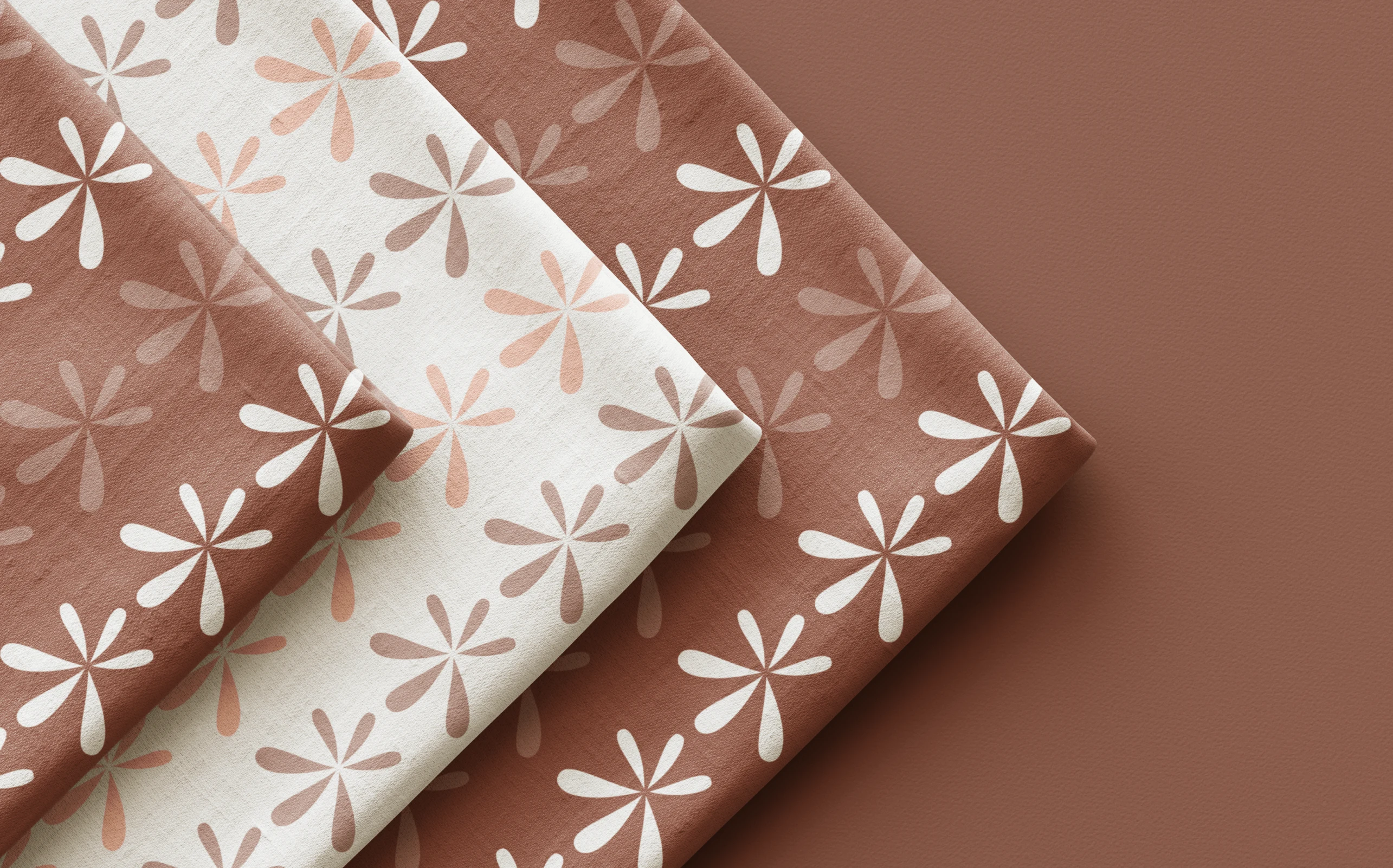
Peach on linen mist, white on terracotta clay
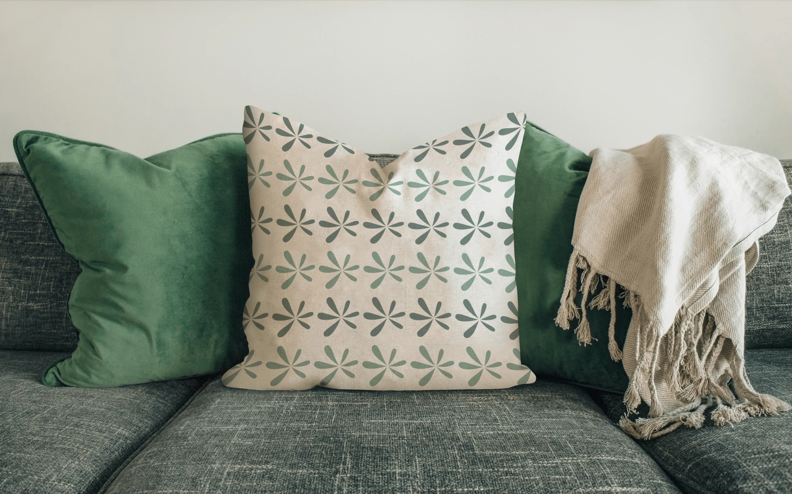
Fabrics (e.g., pillow covers, blankets)
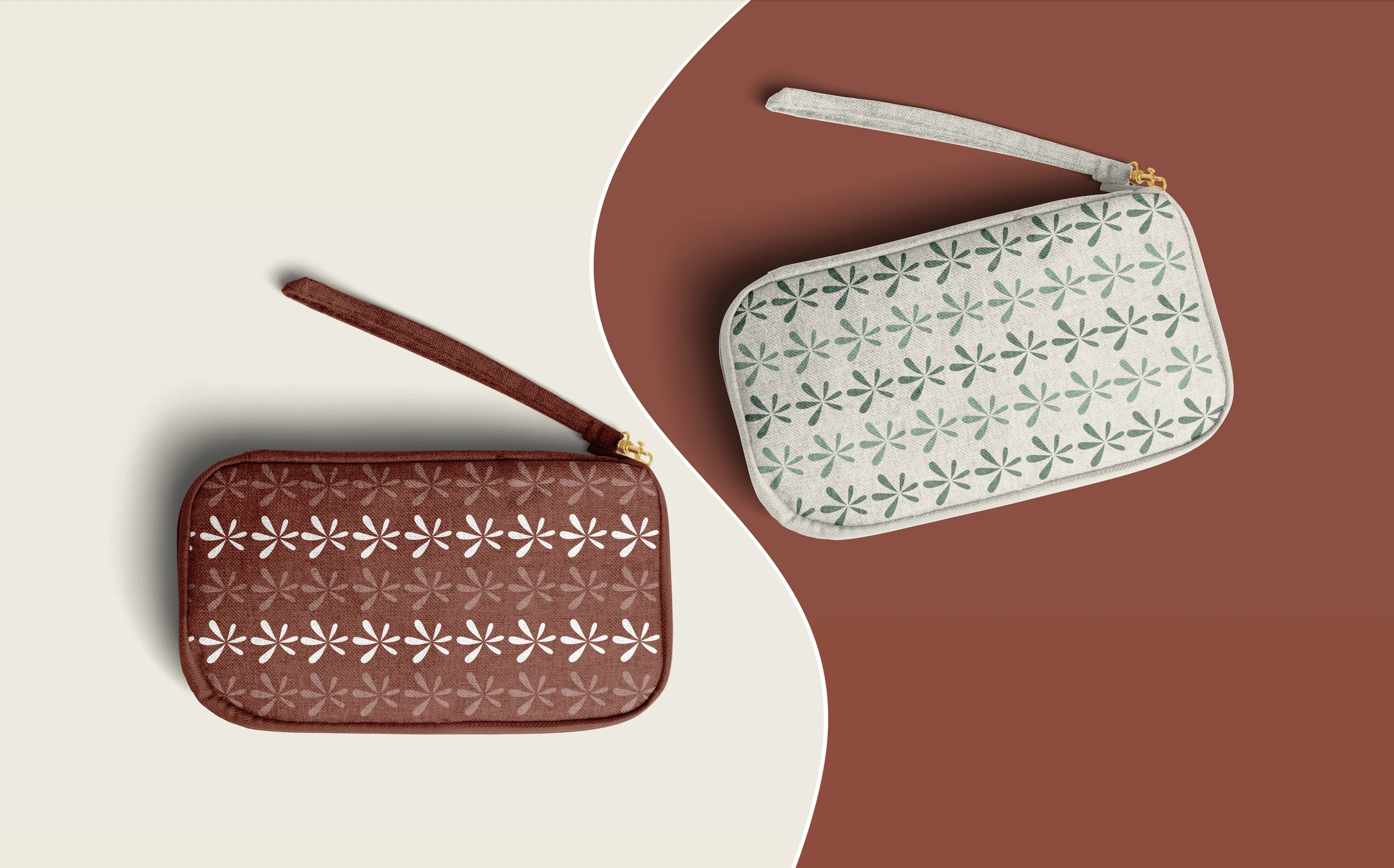
Pouches/Clutches
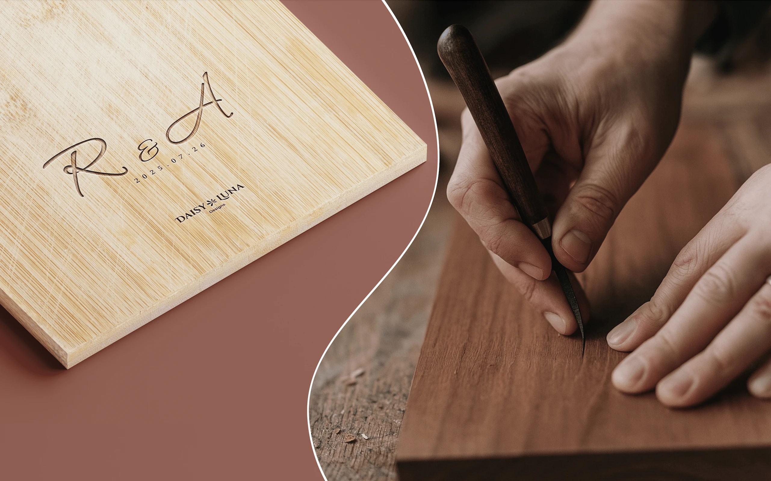
Custom Products: Examples include wooden boards with engraved initials and dates, showcasing the personalized keepsake aspect.
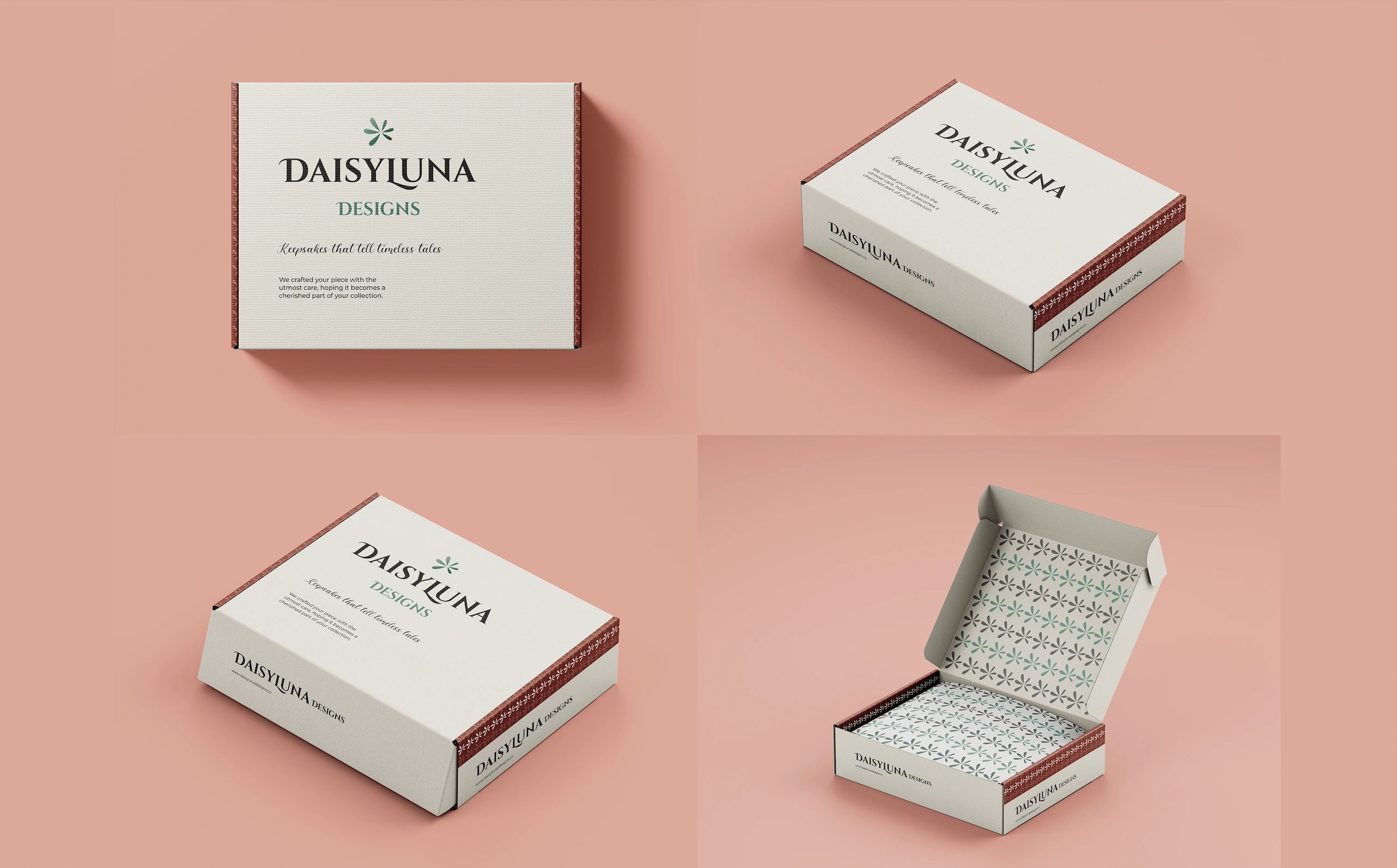
Packaging (inside and outside of boxes)
1 like · 12 views · Oct 8, 2025
Developed a cohesive brand identity for Daisy Luna Designs, reflecting warmth and nature-inspired essence.
Timeline
May 11, 2024 - May 31, 2024


