PotatoBook: A Budgeting App
7 Seers™
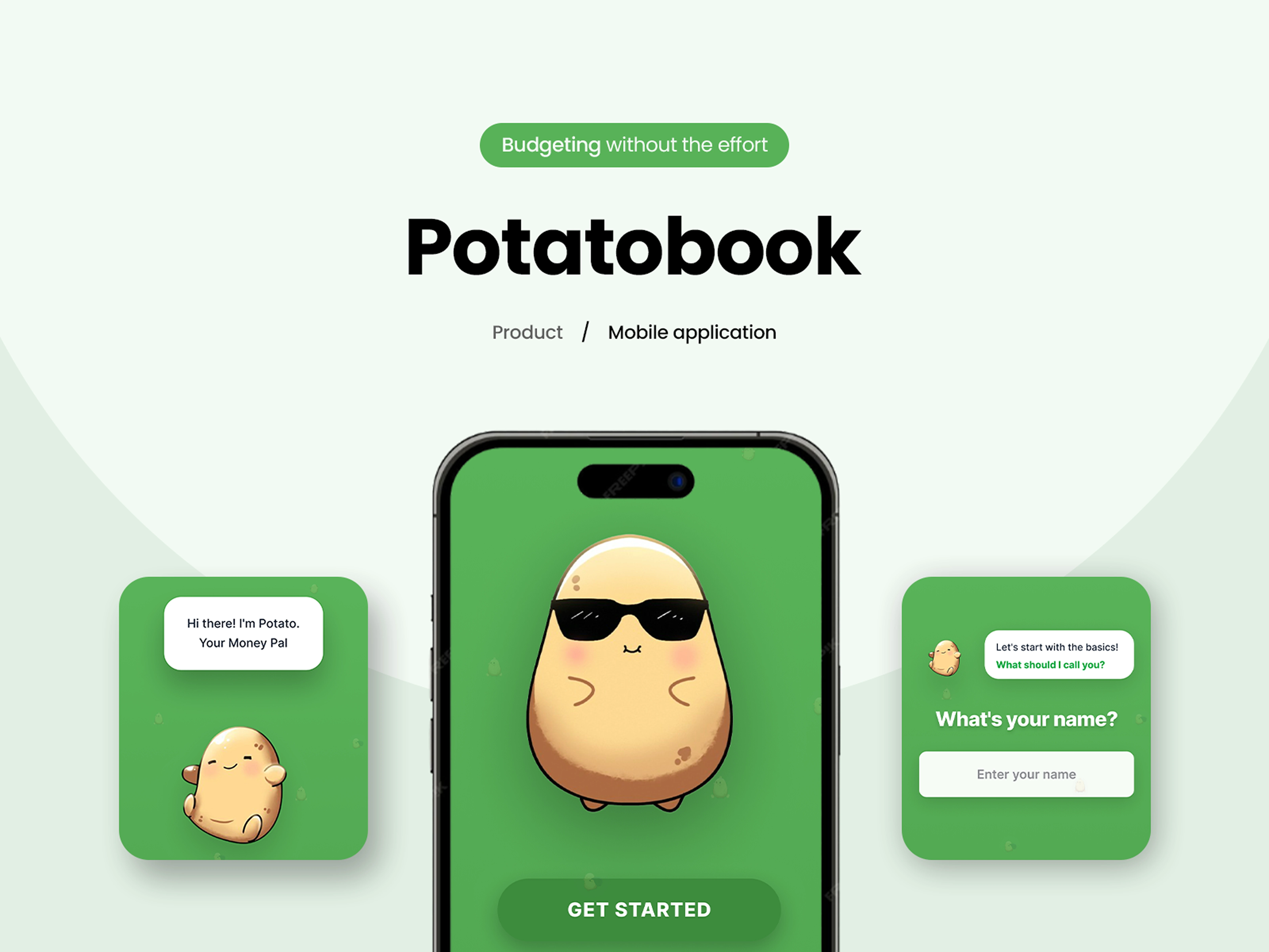
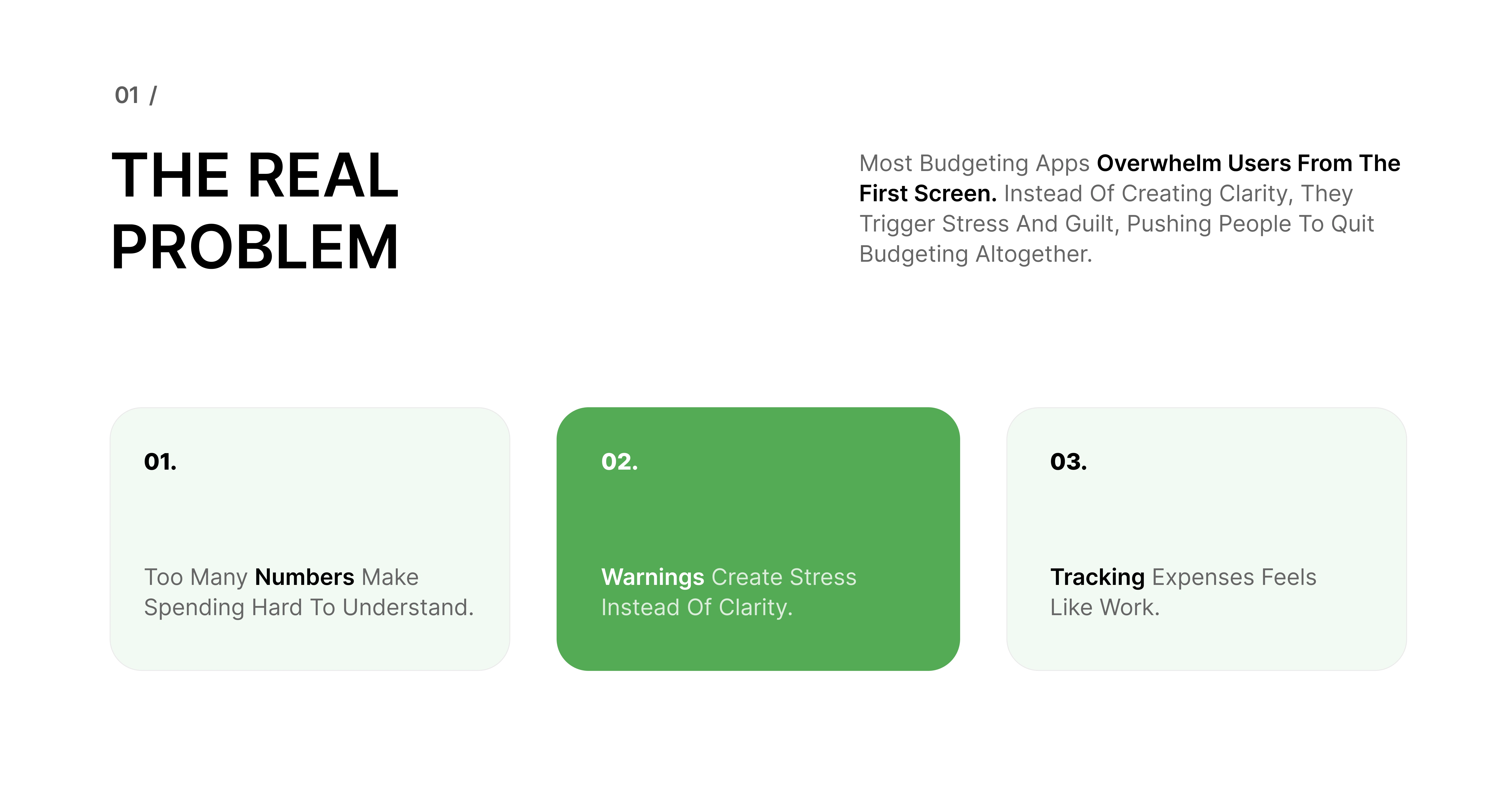
PotatoBook started with an observation: most people know they should manage their money better, but the tools meant to help them often make things worse. They feel heavy, strict, and intimidating, especially for someone just trying to get started.
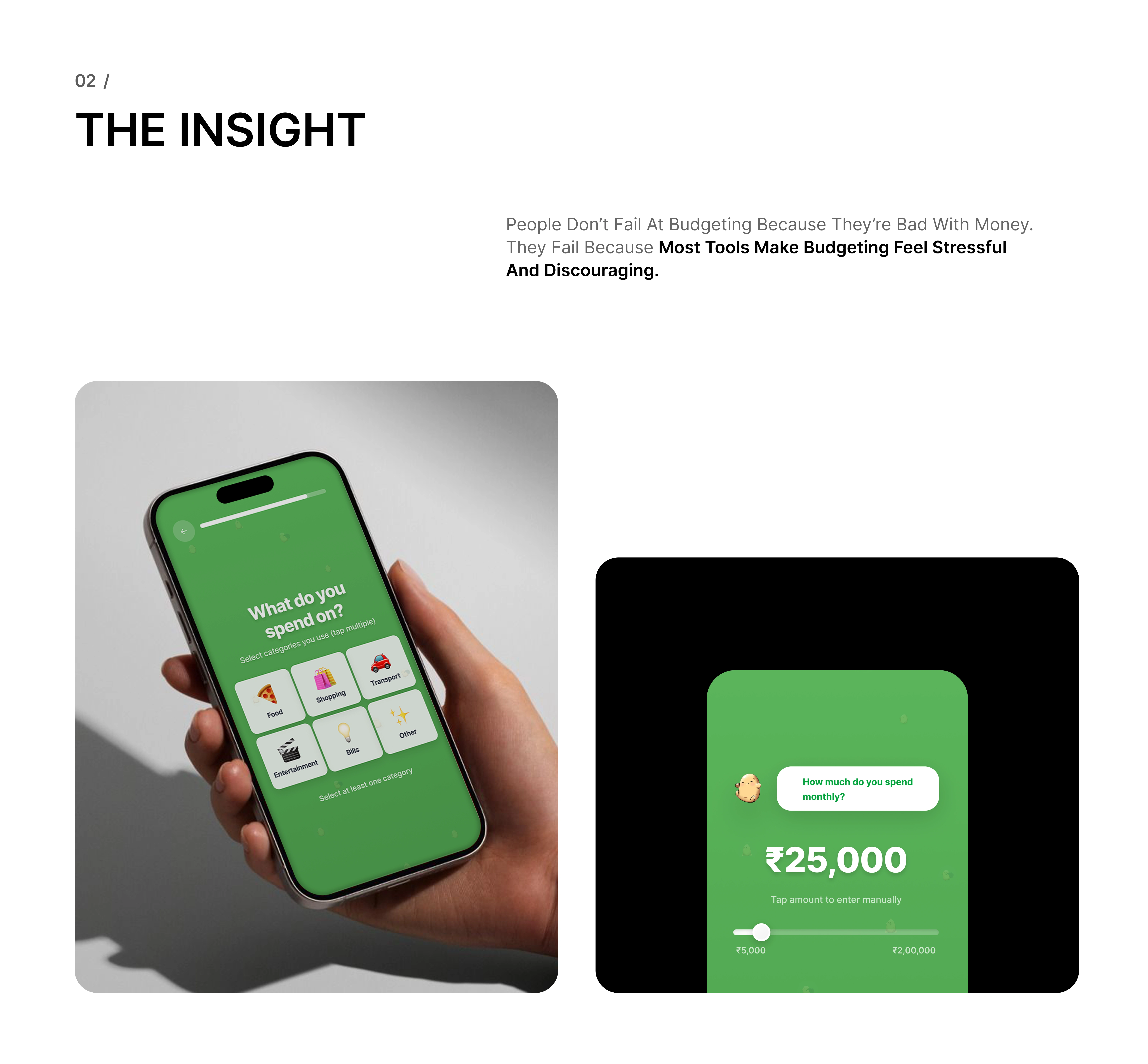
We designed PotatoBook to lower that barrier. The onboarding avoids financial jargon and starts with everyday questions instead of exact figures. The dashboard doesn’t shout numbers or warnings. It simply reflects where the user stands.
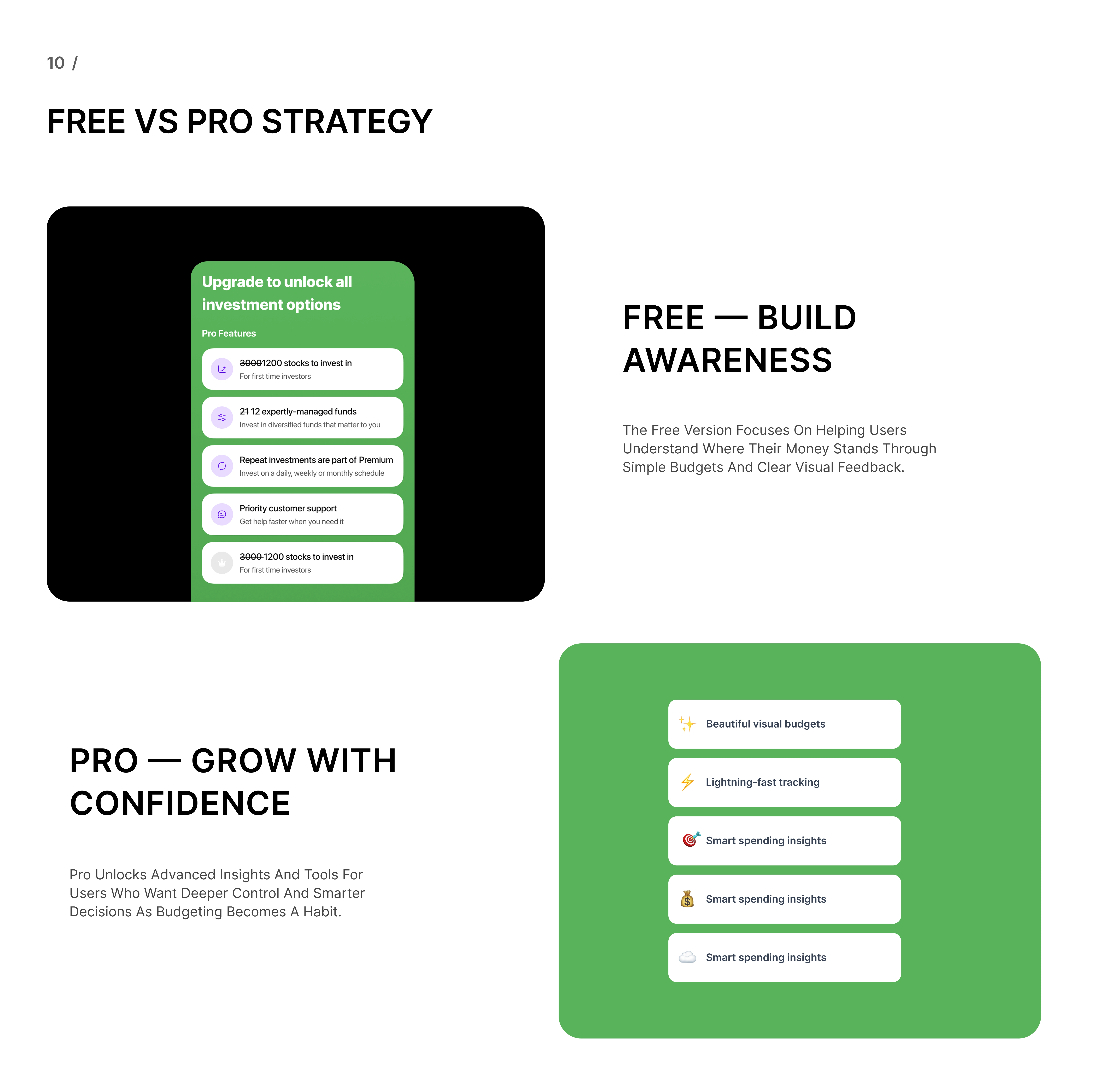
Instead of pushing users to track every expense immediately, the product focuses on budget awareness first. More detailed features are available later, once trust is built. Even notifications are written to feel supportive, not corrective.
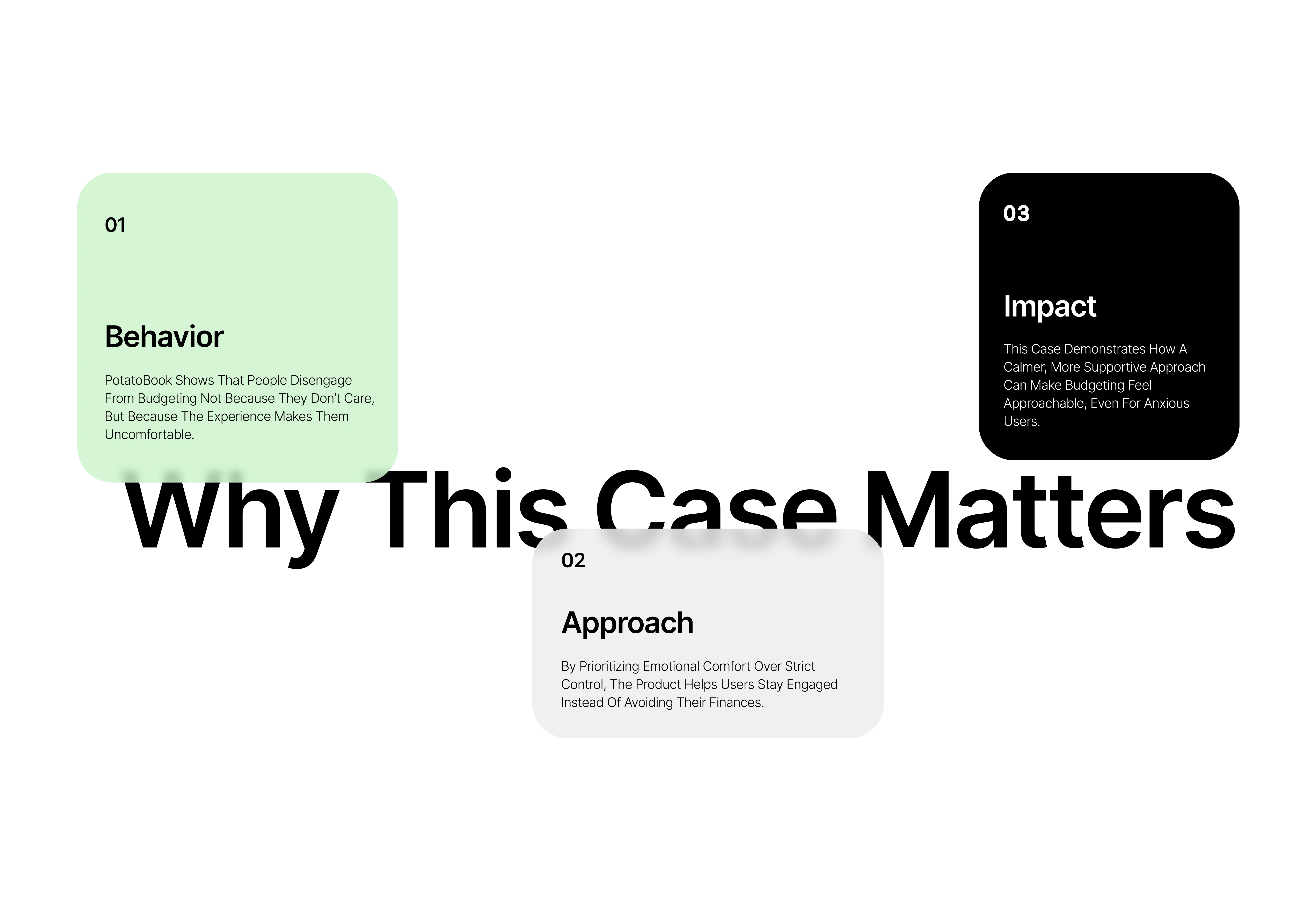
This project is a good example of how design choices directly affect behavior. When people feel less judged, they stay longer. When an app feels calm, they open it more often. That’s the outcome we designed for.
Like this project
Posted Dec 25, 2025
We designed PotatoBook, a budgeting app that focuses on emotional UX and gentle onboarding to help people build better money habits.