Ember & Bloom — A Specialty Coffee Brand
7 Seers™


Ember & Bloom started as an idea, a café designed to serve focus. A place where ideas are brewed as slowly and intentionally as the espresso itself. Built for the urban creative, the brand needed to reflect calm energy, intentional design, and a touch of modern warmth.
The founders came to us with a simple vision: “Make it feel like a place people want to spend hours in, even online.”
Challenge
Most café brands lean either too rustic or too corporate. Ember & Bloom needed a balance, minimal yet inviting, premium yet human. We had to design a visual system that could stretch across coffee packaging, café interiors, and social media, all while staying instantly recognizable. The challenge was to make the brand look like it already belonged in the city’s creative ecosystem, not another aesthetic café, but a lifestyle space.
Our Approach
We began with the essence of the name, Ember (warmth, small-batch, craftsmanship) and Bloom (growth, creativity, inspiration). That duality became the foundation of the identity.
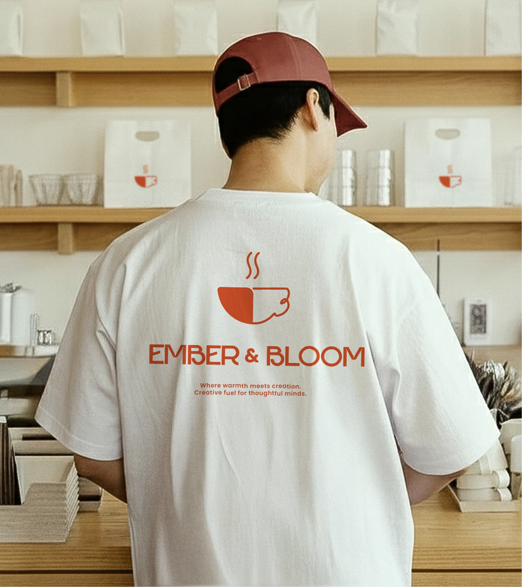
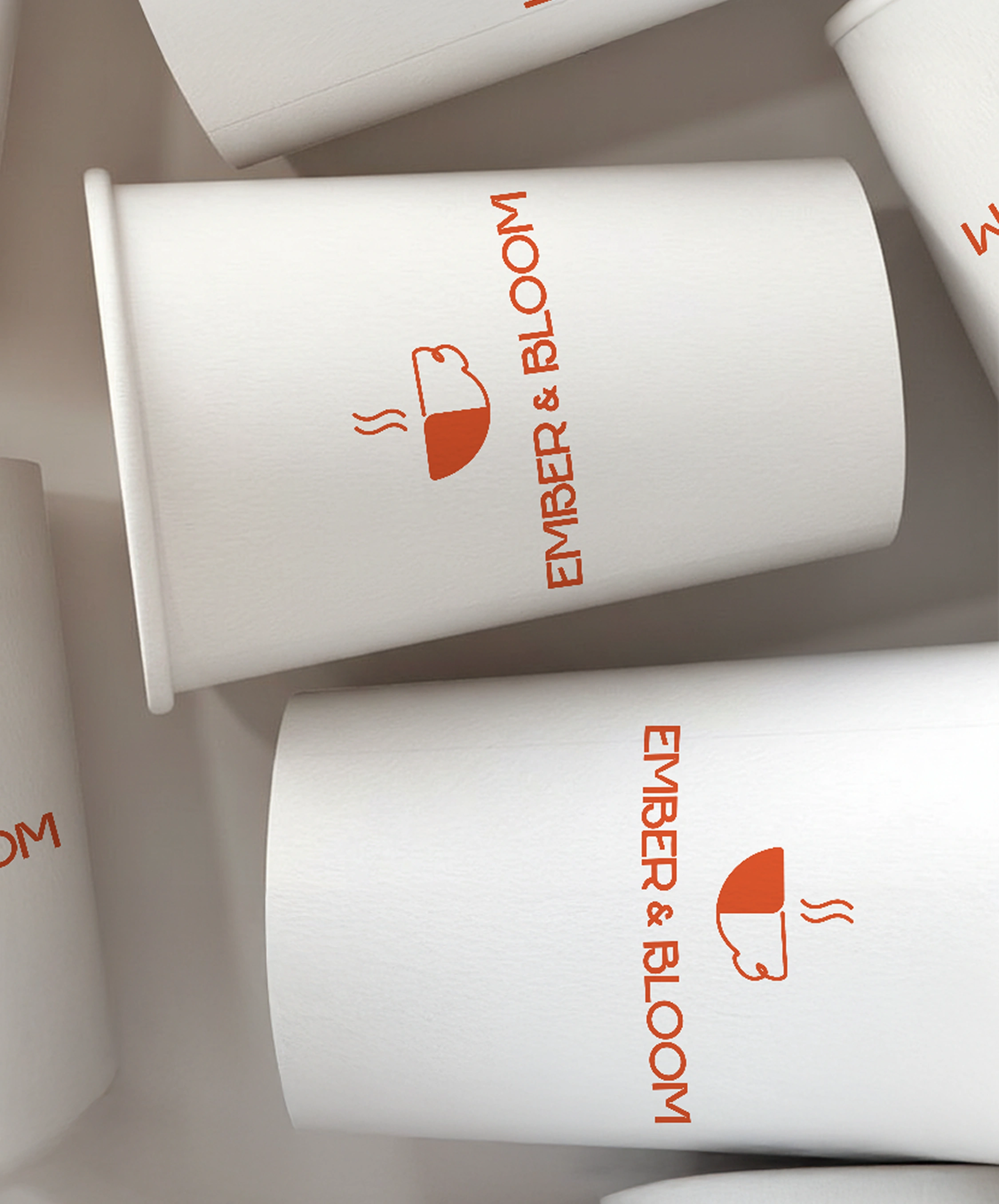
The logotype pairs bold geometry with soft terminals
The color palette draws from natural tones
Typography leaned on Neue Haas Grotesk, paired with an editorial serif for storytelling moments.
Every design decision was guided by the question: Would this make someone want to sit down and stay awhile?
Execution Across the week-long sprint, we delivered a cohesive brand world:
Identity
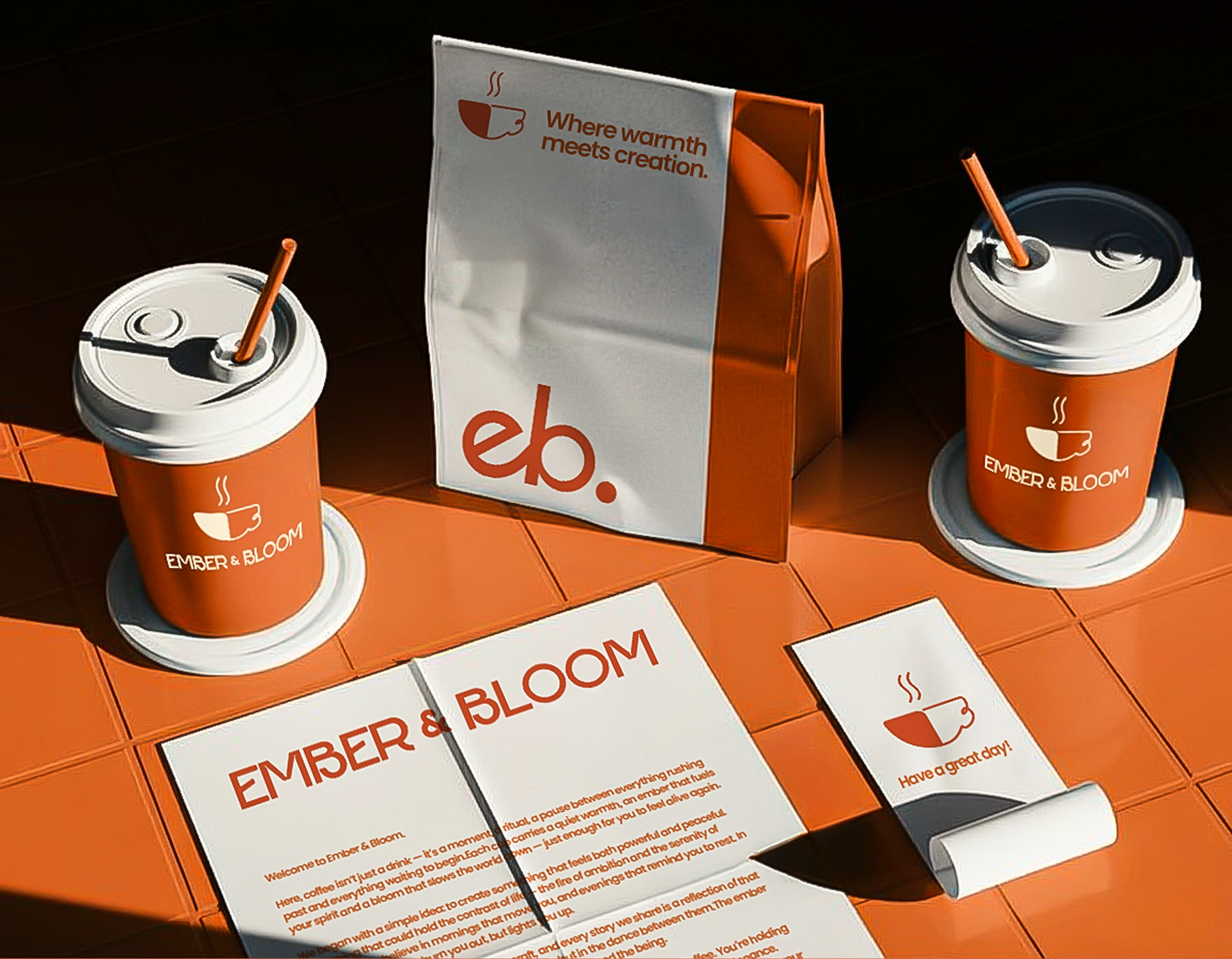
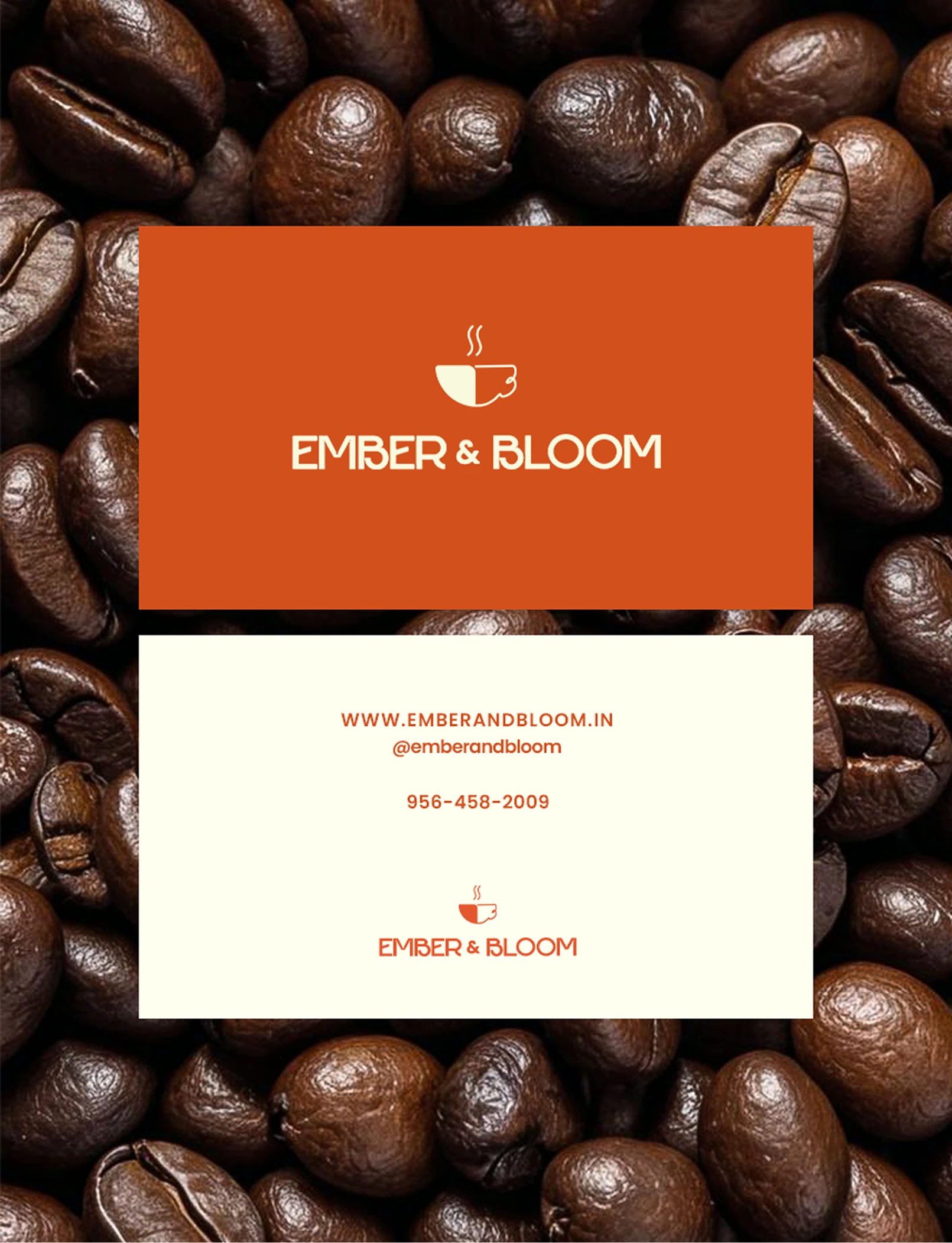
Logo family: Primary, secondary, and monogram versions for packaging and signage.
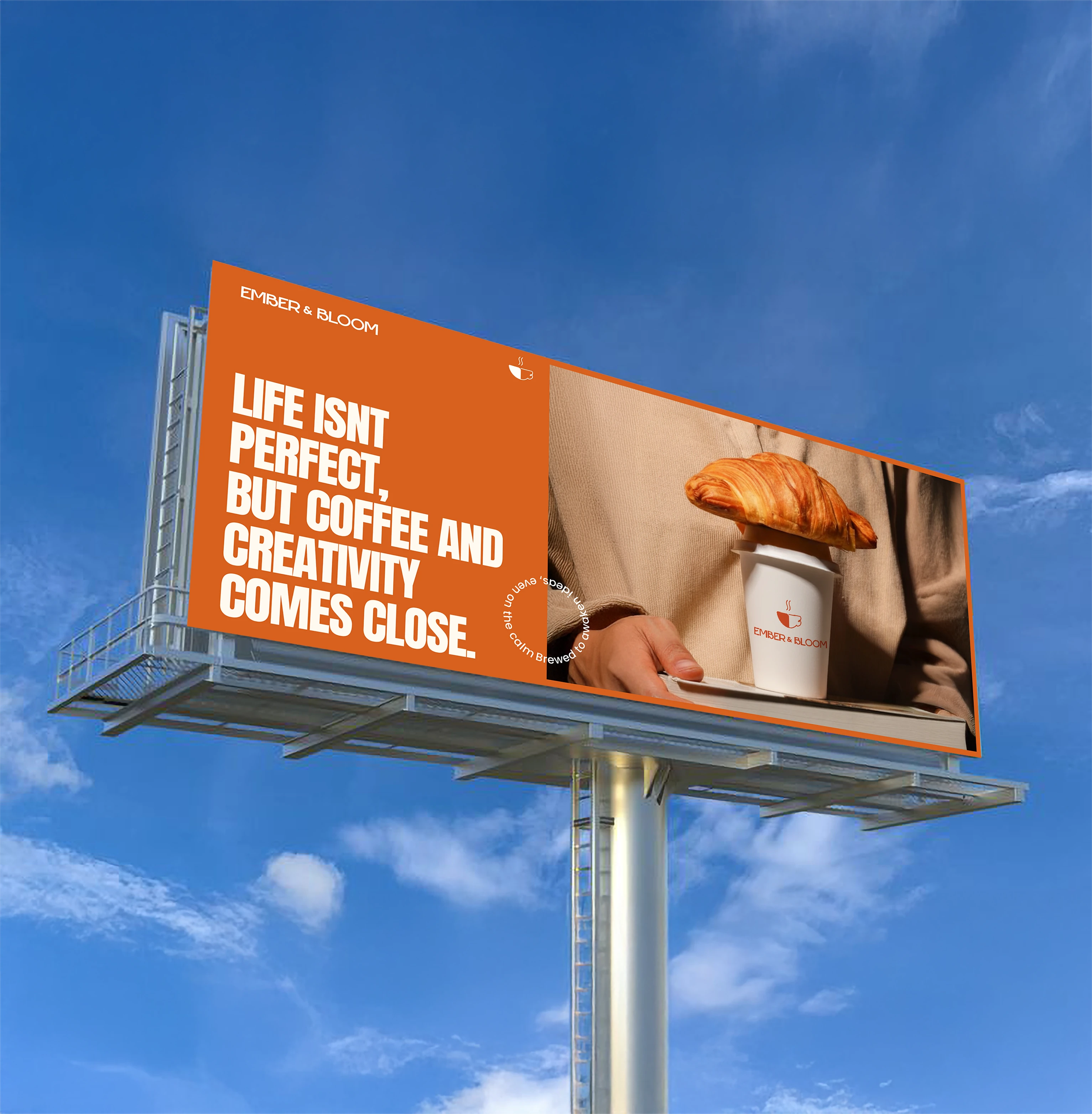
Brand tagline: “Small Batch, Big Ideas.”
Typography and color system for both print and digital use.
Packaging & Merchandise
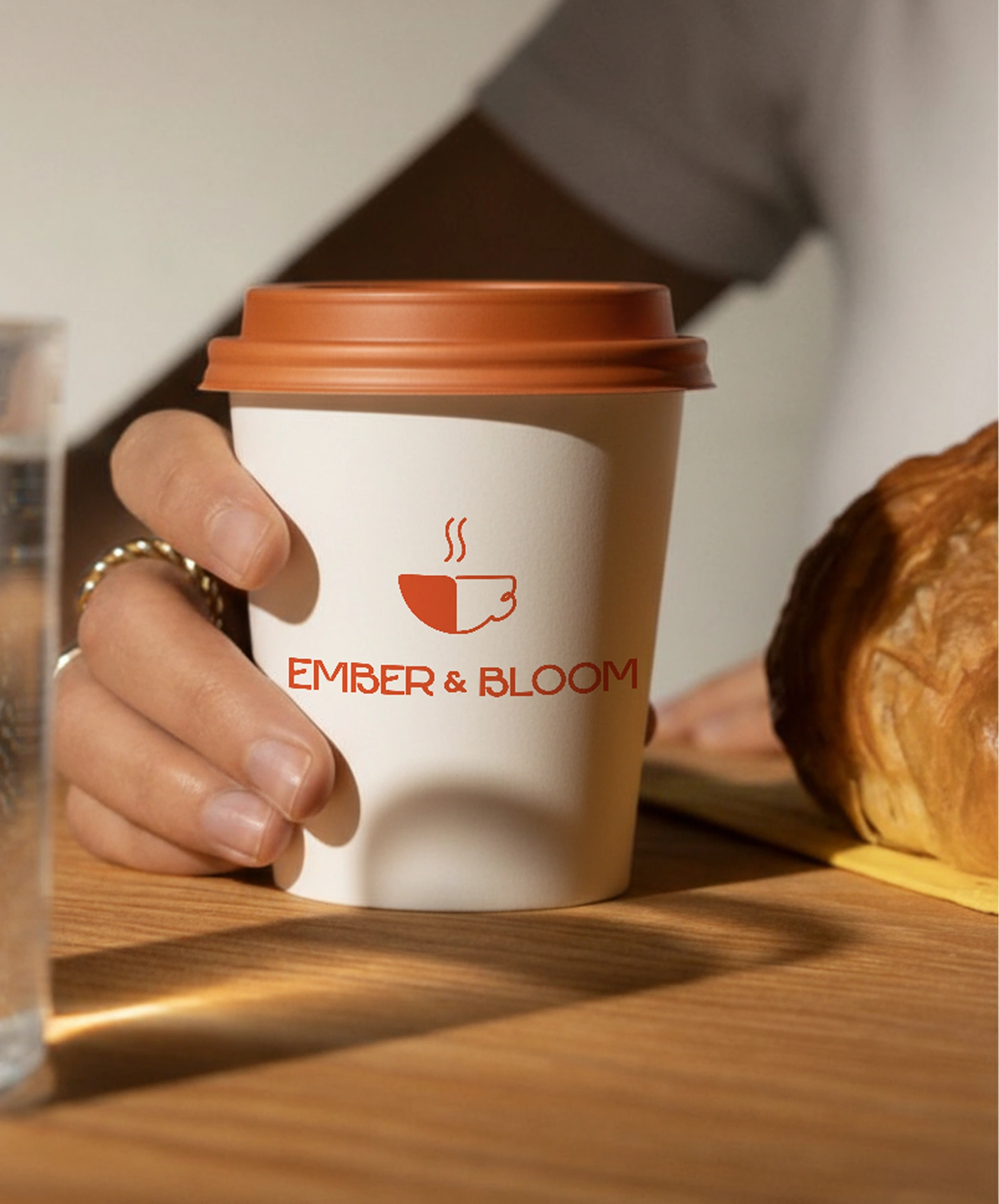
Coffee bag design (matte paper, minimal label structure).
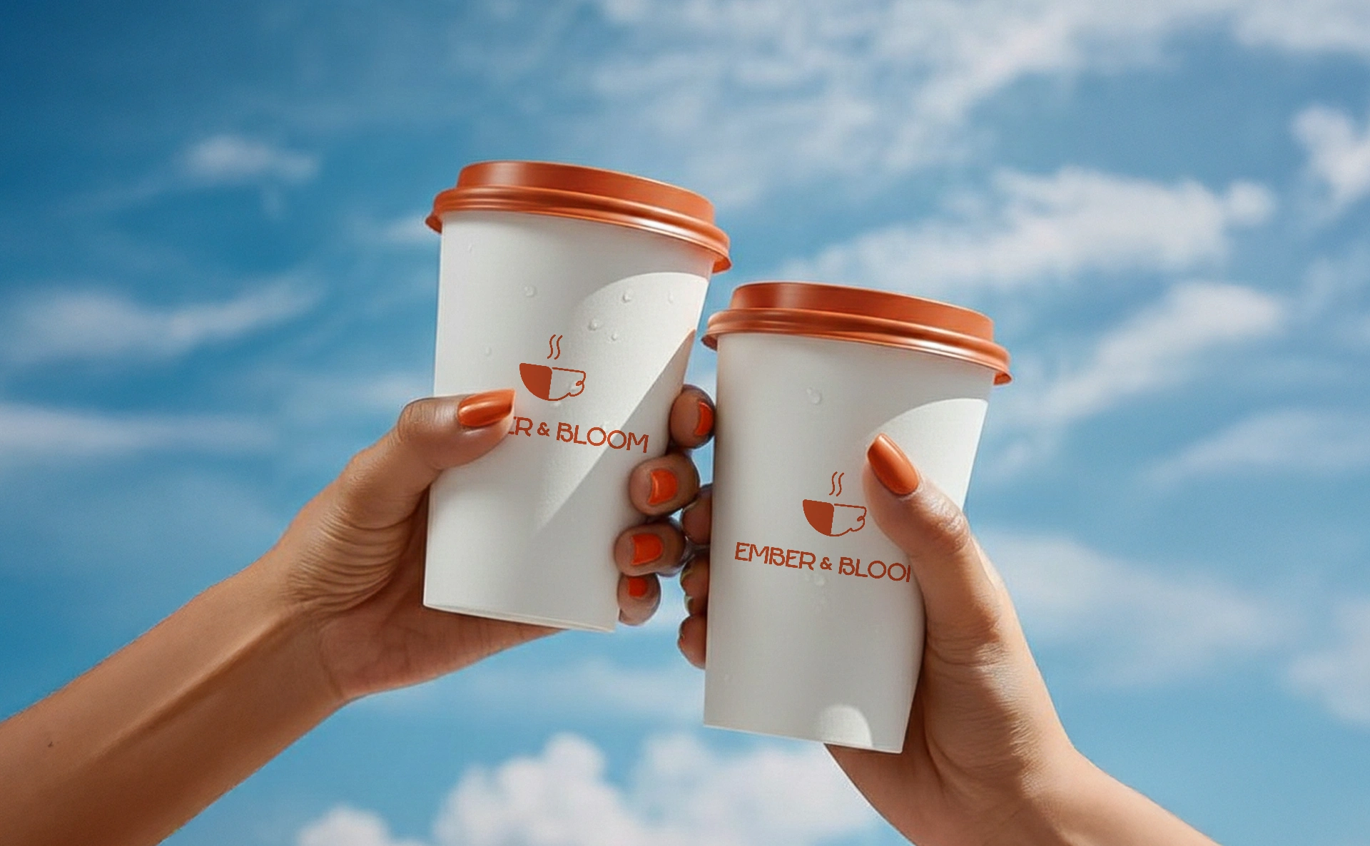
Cup sleeves and tote bags, quiet branding with soft material tones.
Digital Collateral
Social media grid mockups (Instagram carousel, quotes, product features).
Highlight icons and launch poster design for consistency in tone.
Environmental & Print
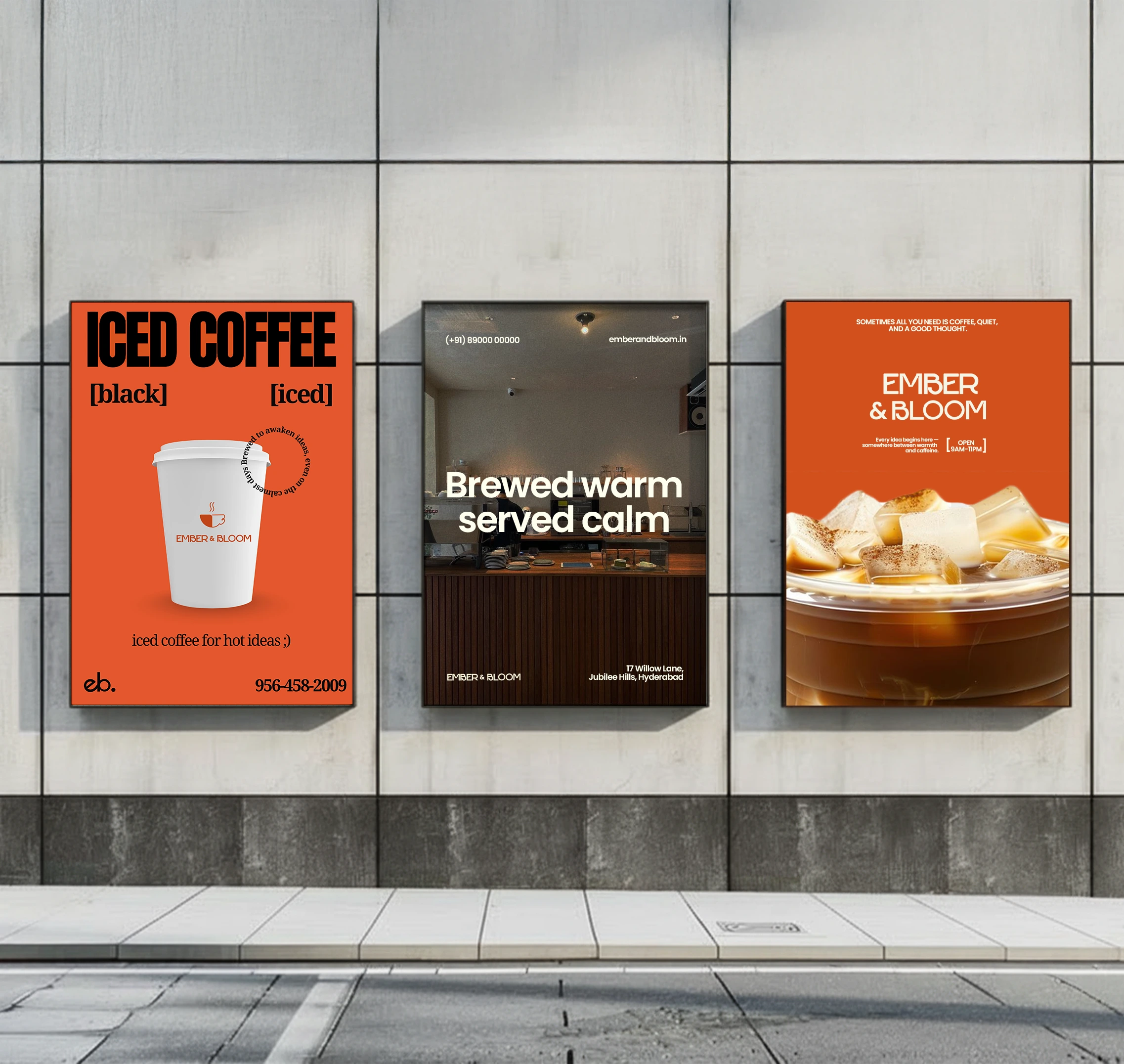
Café signage and decal mockups (interior + exterior).
A3 poster and single-page minimal menu, balancing clean grids with warm imagery.
Outcome
By the end of the project, Ember & Bloom had a complete visual identity system. For the founders, it was a vision they could build a café around.
Like this project
Posted Oct 26, 2025
We built the brand identity for Ember & Bloom, a specialty café designed for urban creatives. Warm, minimal, and made for slow ideas.