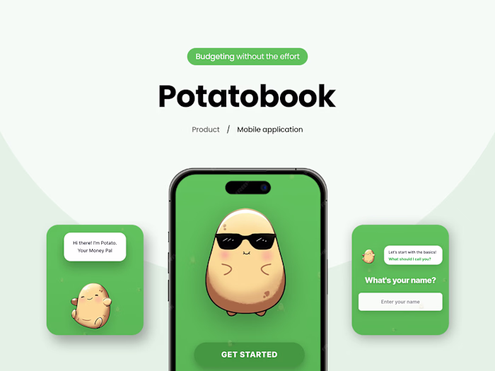
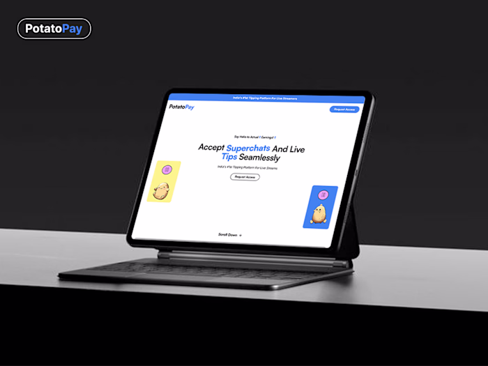
PotatoPay : A Creator Payouts Webapp + App
7 Seers™
2 collaborators


Why was this complex?
Payments, identity, and platform safety don’t like shortcuts. The hardest part wasn’t UI, it was making the money + trust experience feel simple for creators and fans. We designed flows that read like a conversation.
What we actually did
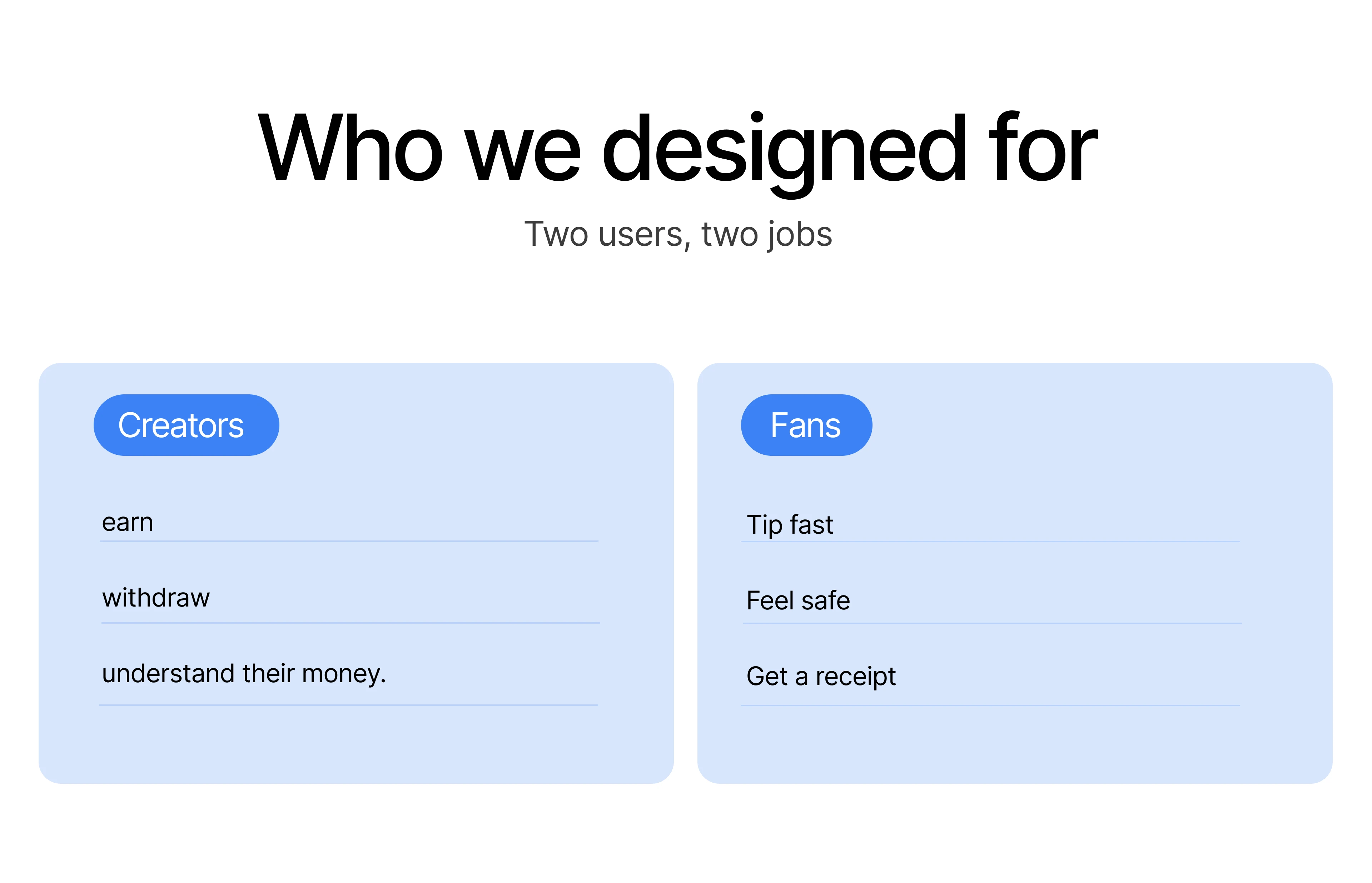
Defined users (creators, fans) and their jobs.
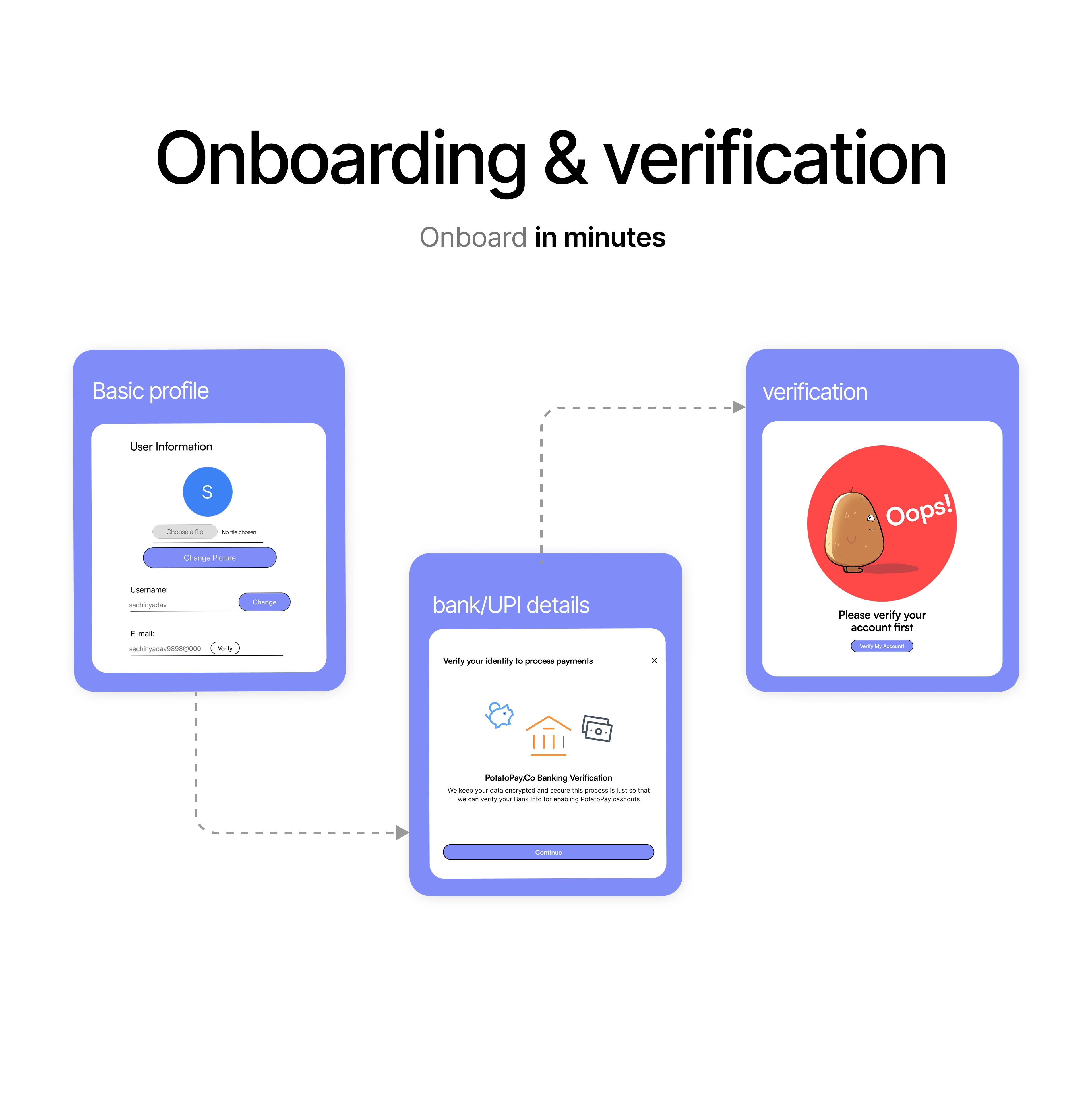
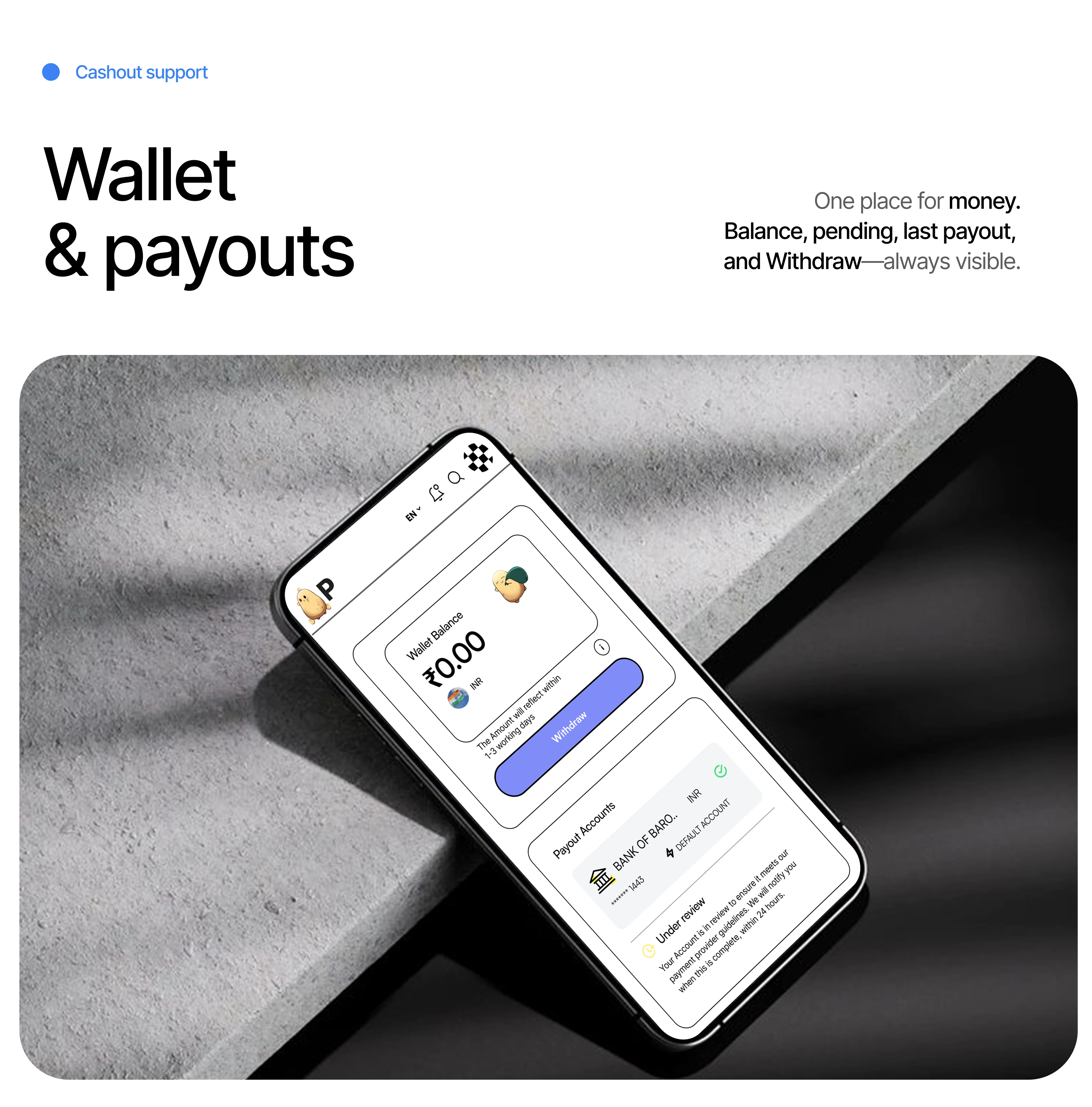
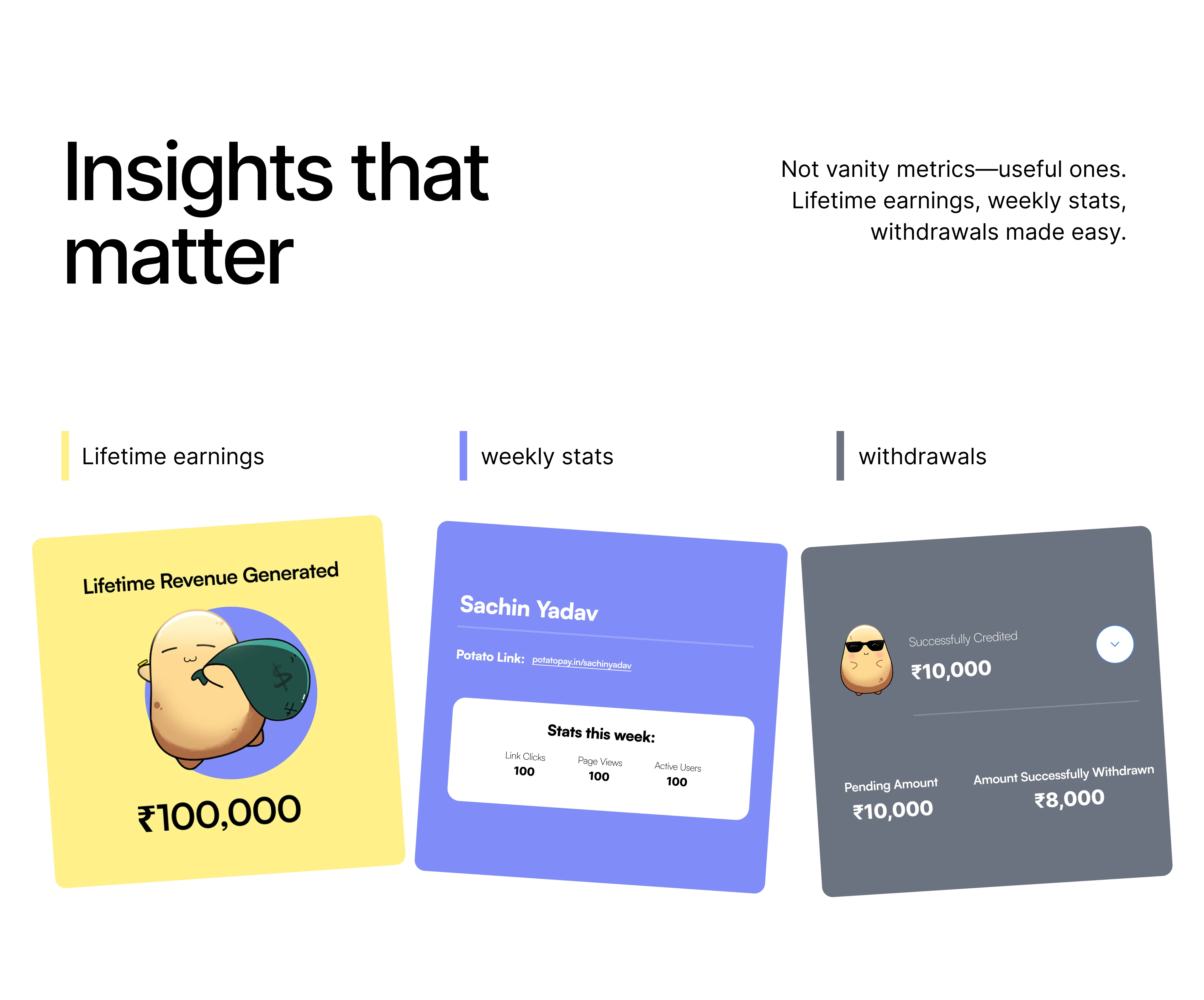
Mapped the full app IA around Home • Wallet • Insights • Safety.
Wrote microcopy for the quiet moments: empty states, failures, “what now?”
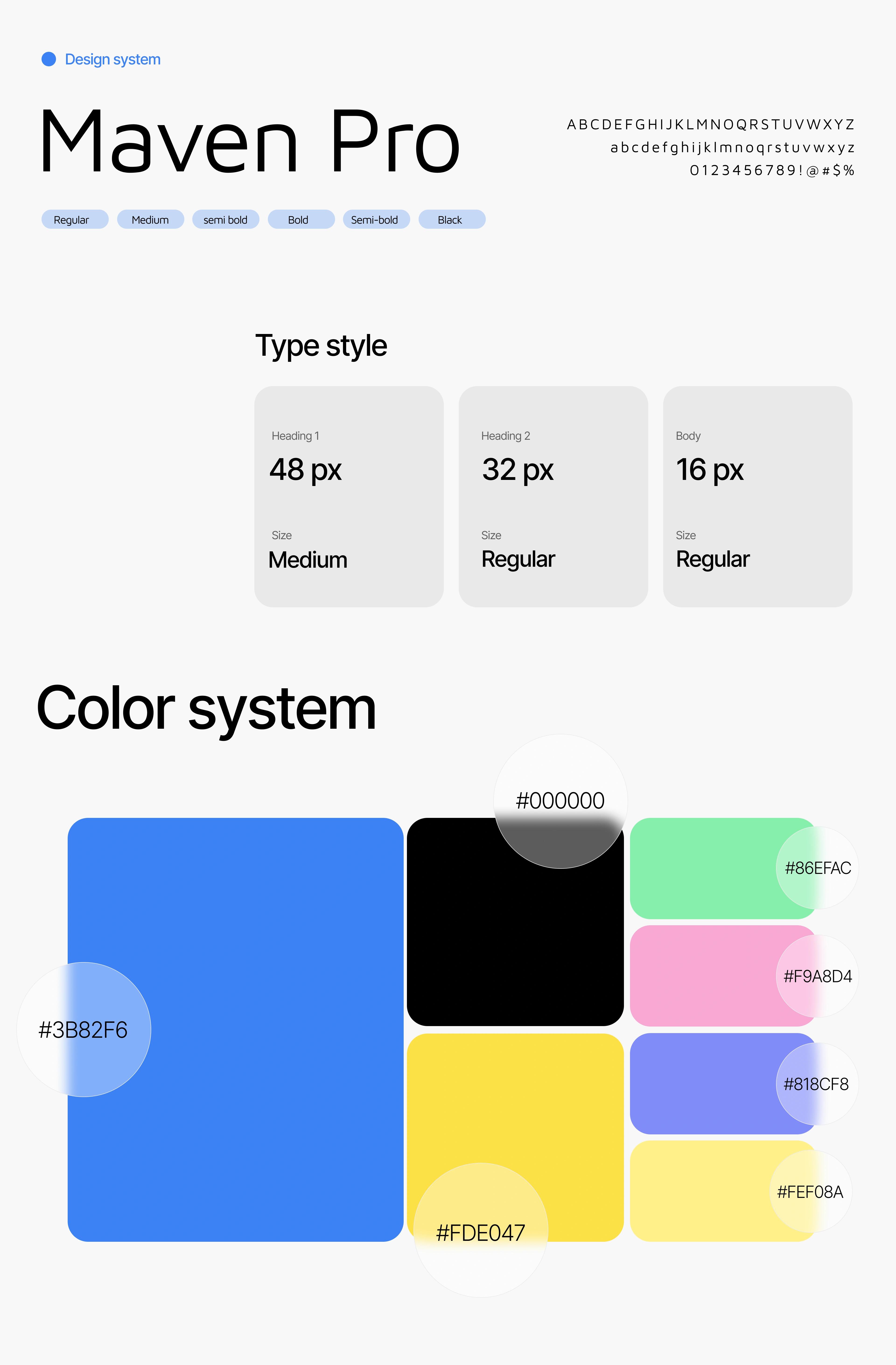
Built a shared design system used across app + website.
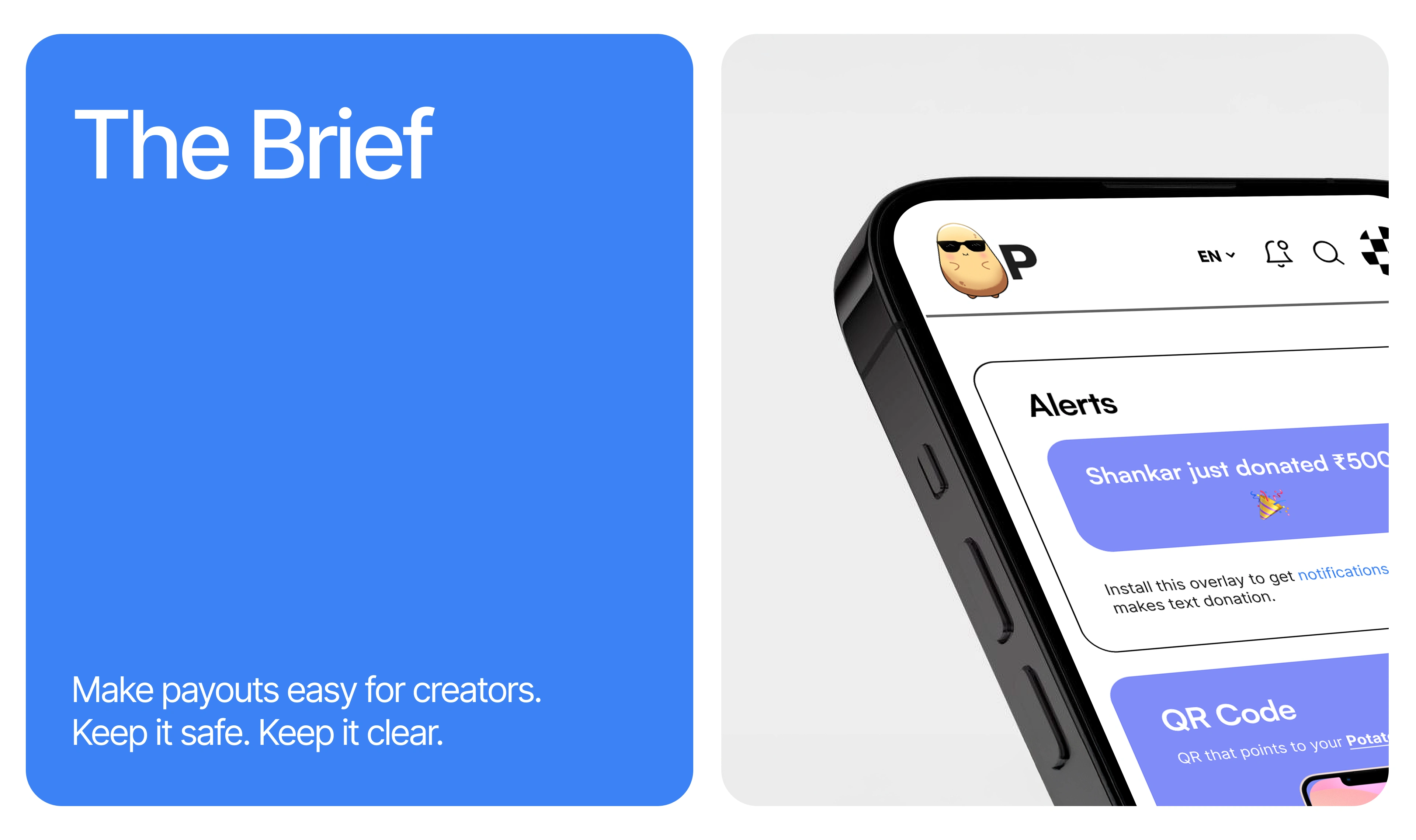
Shipped a vendor-neutral payment architecture with clear receipts and traceable events.
Tested the edge cases: low bandwidth, cancels, duplicate taps, failed payouts, chargebacks, block/report flows.
What changed for PotatoPay
Creators can earn and withdraw with confidence. Fans tip in one screen. Support gets fewer payment questions because receipts and timelines are clear. And the product has a single design language across web + app, faster to ship, easier to evolve.
Like this project
Posted Oct 26, 2025
We designed and built the PotatoPay app: clear wallet, one-screen tipping, transparent receipts, and safety controls complex under the hood, simple to use.
Likes
2
Views
63
Clients
PotatoPay