Hope Run 2025 Print Campaign Design
Grace Pereda @ Graceful Studio
Project Overview
Hope Run 2025 is a new charitable marathon taking place in Lisbon, Portugal, dedicated to raising funds to support children’s education. With a limited budget and the need for high public visibility, I was tasked with designing a flexible and compelling print campaign that could be deployed across multiple urban locations.
The Challenge
As a newly established initiative with minimal sponsorship, the charity needed to stretch its promotional budget while still achieving a professional and attention-grabbing presence in the streets. The biggest challenge was to produce visually striking materials that would clearly communicate the event’s purpose—using only two inks for most of the print assets.
My Approach
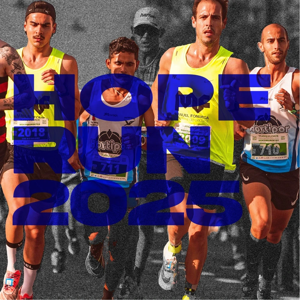
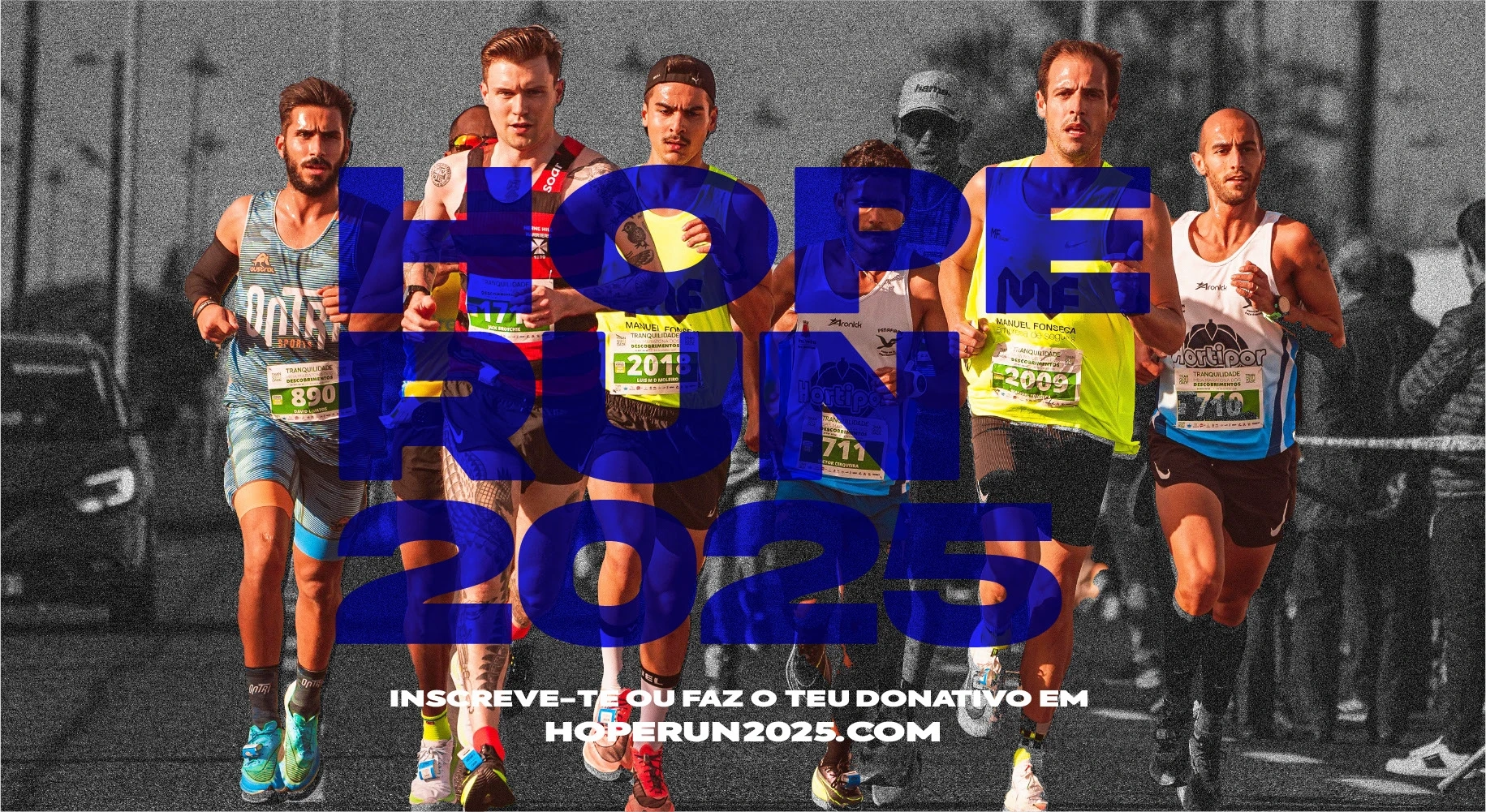
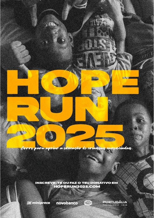
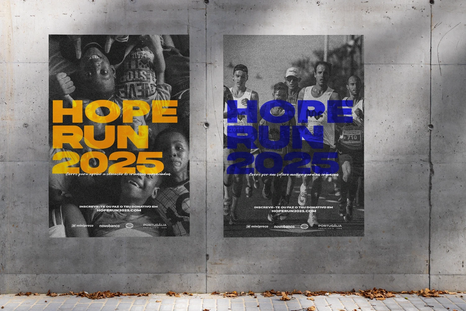
To maximize visual impact while keeping production costs low, I created two versions of the event poster, each using just two spot colours. These were designed for mass distribution across city walls and public spaces in Lisbon and other major cities in Portugal.
The two-color designs focus on strong contrast and bold messaging:
•One poster features children, visually reinforcing the goal of supporting education.
•The second shows runners, capturing the energy and call to action of the marathon.
For both, I selected:
•Bright yellow and black as one color scheme
•Deep navy blue and black as the other
I used a thick, impactful typeface to ensure readability from a distance and allow the limited color palette to shine without losing message clarity.
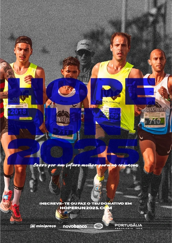
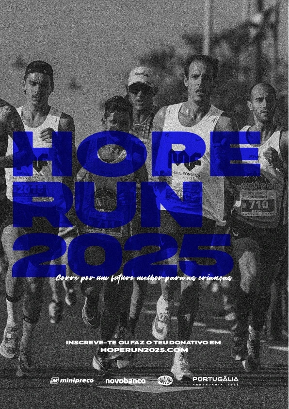
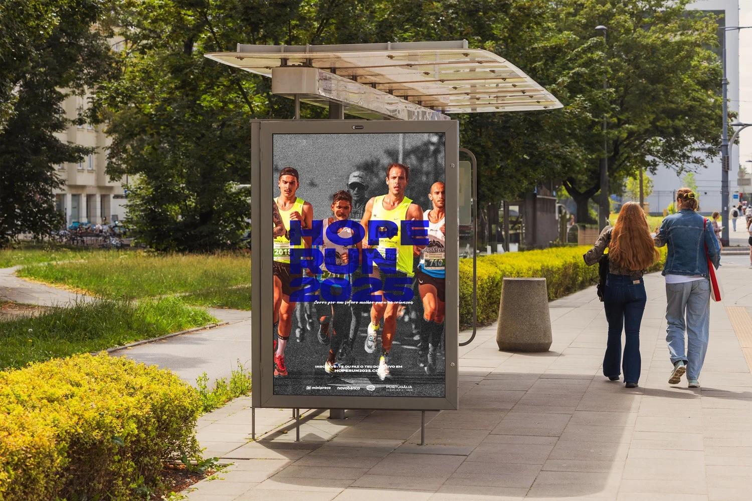
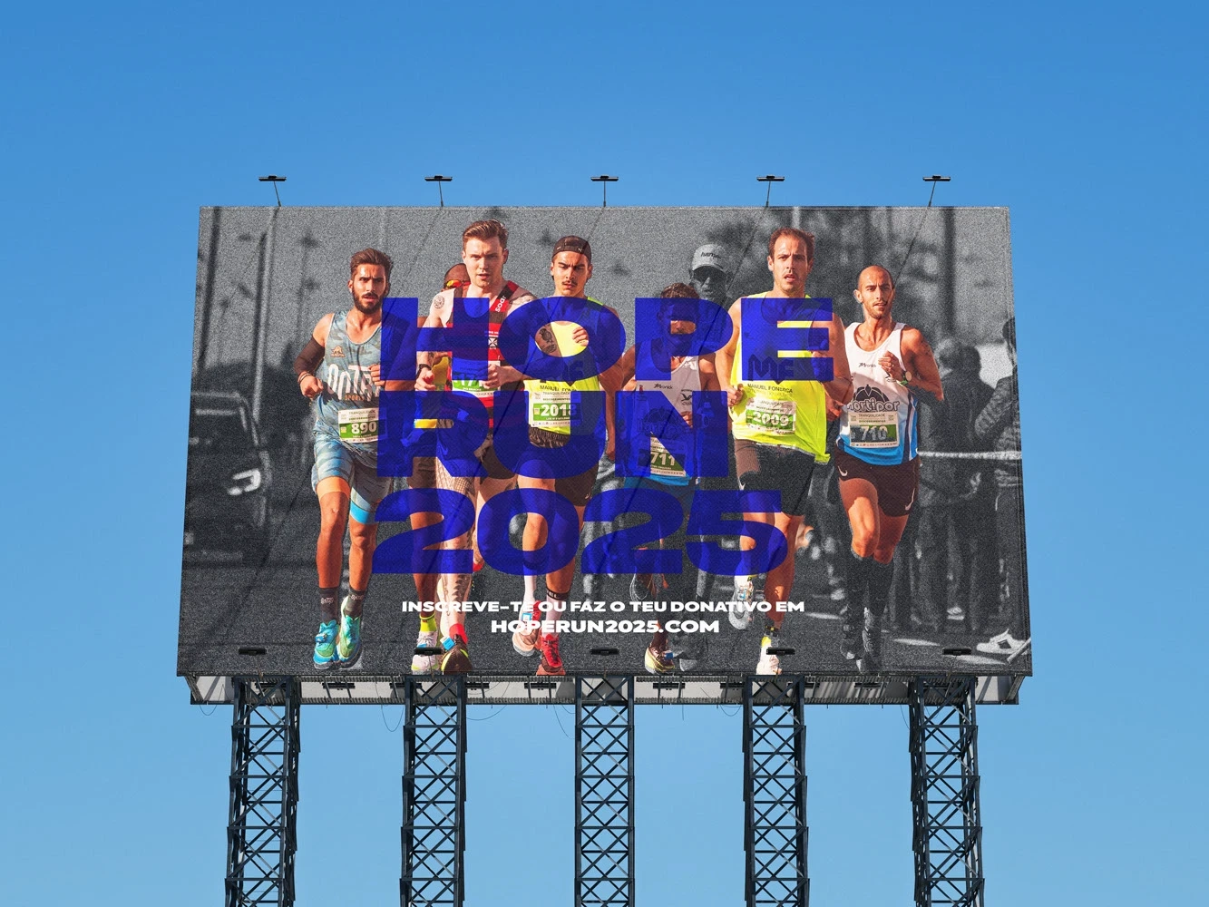
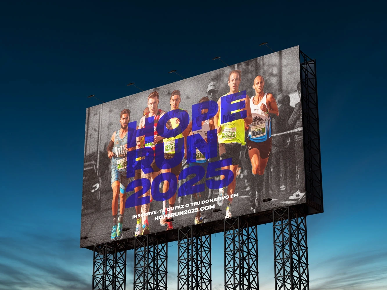
To supplement the city-wide posters, a small number of full-color versions were created for select bus stops and billboard placements. While these placements were limited, they provided higher-visibility moments to reinforce brand recognition in high-traffic areas.
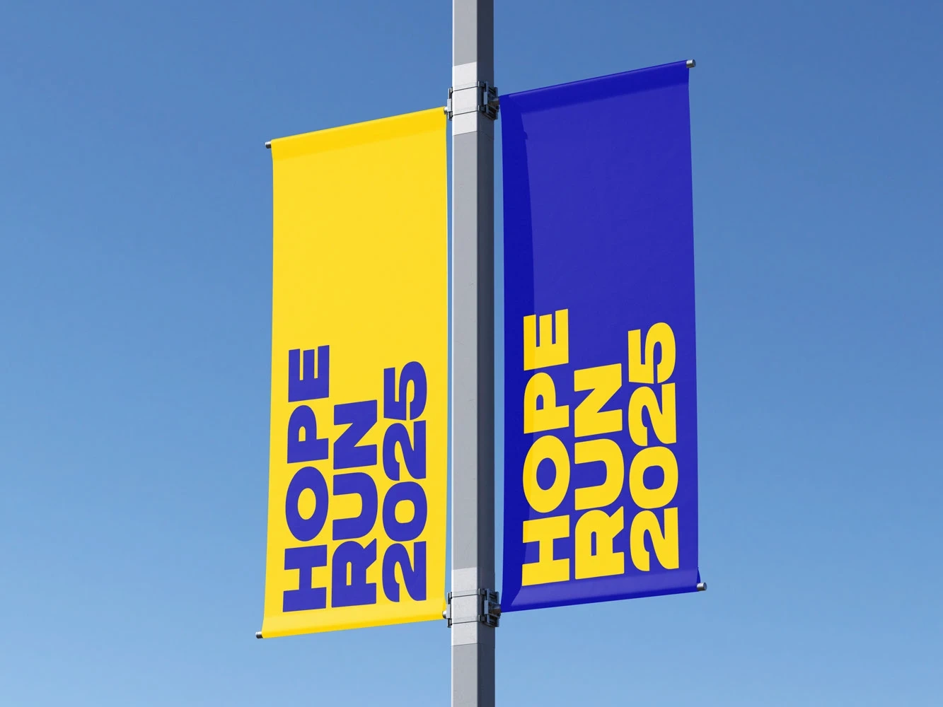
In addition to the posters, I also designed flags to be displayed throughout the cities. These flags follow the same visual logic—minimalist and limited to two inks—and are printed on fabric vinyl for durability in outdoor environments.
The Result
This campaign delivers a clear and consistent message about the mission behind Hope Run 2025 while staying well within a tight print production budget. By applying a creative approach to constraints, I developed a campaign that’s cost-effective, visually strong, and flexible across various physical formats.
It demonstrates how thoughtful design choices—like ink limitation, layout strategy, and typography—can lead to effective results, even with limited resources.
Like this project
Posted May 20, 2025
Designed a cost-effective print campaign for Hope Run 2025 using two-color posters and flags.
Likes
1
Views
13
Timeline
May 1, 2025 - May 20, 2025