Visual Identity for a Contemporary Seafood Restaurant
Grace Pereda @ Graceful Studio
Overview
Do Mar Marisqueira is a new seafood restaurant located on the Portuguese coast, aiming to offer a refined yet approachable dining experience that celebrates the region’s deep connection to the sea. The client approached me to create a complete visual identity for the brand, including the logo, menus (for both lunch and dinner), takeout packaging, staff uniforms, and social media visuals.
The main goal was to craft a cohesive identity that felt modern, elegant, and distinctly maritime—one that would resonate with both locals and tourists looking for a fresh seafood experience.
My Role
I led the project from concept to execution, handling all aspects of branding and design. This included creative direction, typography and color palette selection, layout design, packaging, and digital assets. I worked directly with the client to define the brand’s tone and visual language, ensuring that every piece was aligned with their vision and practical business needs.
The Challenge
The main challenge was to create a brand that felt premium yet approachable. The restaurant didn’t want to appear overly traditional or generic. They wanted something rooted in local culture but also visually clean and flexible across different mediums—from printed menus and uniforms to takeout materials and Instagram.
Another key consideration was ensuring that the branding system could easily extend to future collateral, such as seasonal menus or merchandise, without losing its visual consistency.
Creative Process
1. Discovery and Research
I began by researching the Aveiro region and the visual aesthetics of marisqueiras and coastal restaurants across Portugal. I studied local seafood culture, competitor branding, and visual trends in the food and beverage industry.
2. Defining the Brand Personality
Through client conversations and visual mood boards, we defined the brand personality as elegant, grounded, coastal, and confident. The tone was to be welcoming yet refined, with subtle nods to maritime heritage without falling into cliché.
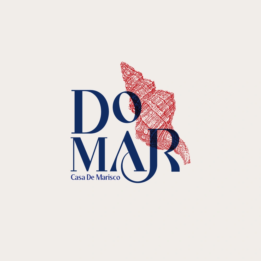
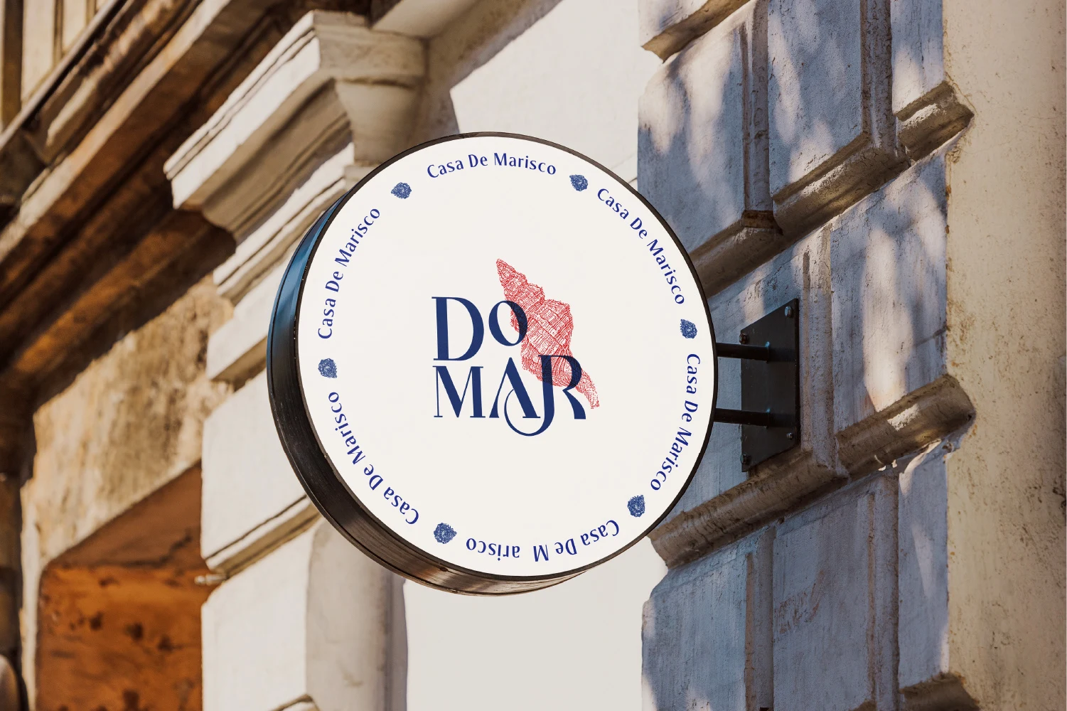
3. Logo Design
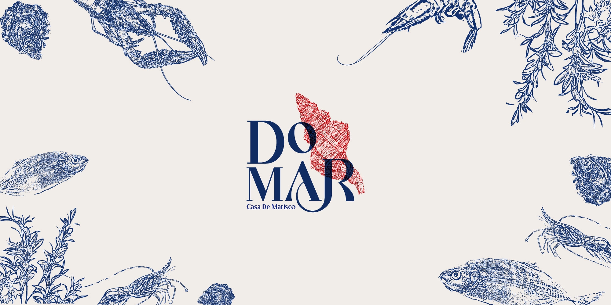
The logo is set in Marlos, a sophisticated serif font that brings a sense of heritage and craftsmanship. The typographic treatment is clean and balanced, reinforcing the quality of the culinary offering.
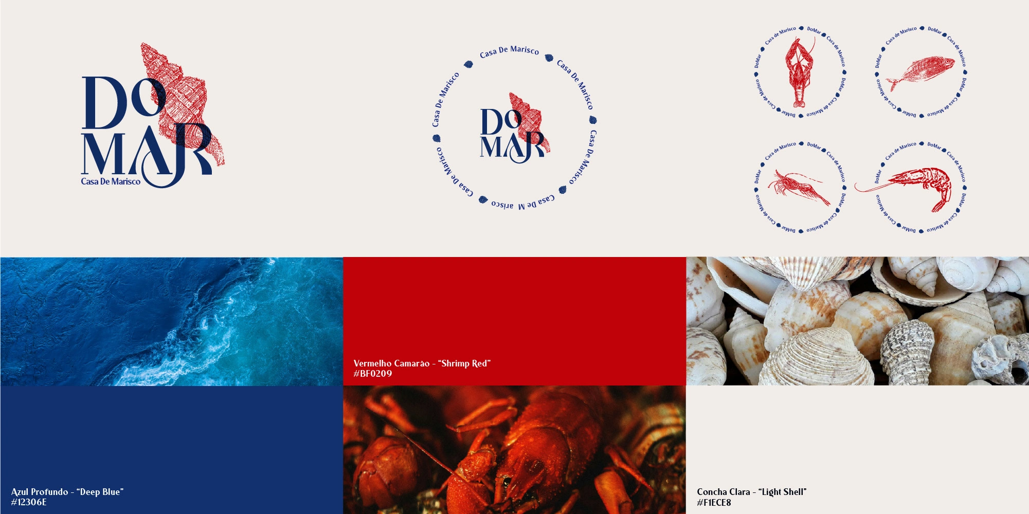
4. Color Palette Development
• Azul Profundo (#12306E) evokes the depth and richness of the Atlantic Ocean.
• Vermelho Camarão (#BF0209) adds warmth and vibrancy, referencing the freshness of local seafood.
• Concha Clara (#F1ECE8) brings lightness and contrast, reminiscent of sun-bleached shells and sandy shores.
These colors were chosen to reflect both the natural environment and the experience of dining by the sea.
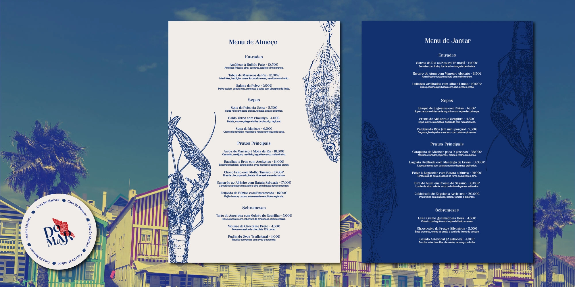
5. Menu Design
Two distinct menus were developed—one for lunch and another for dinner—maintaining consistency while adapting to the different types of dishes served at each mealtime. Layouts prioritize readability, elegant spacing, and hierarchy, complemented by refined typographic styles and minimal graphical flourishes.
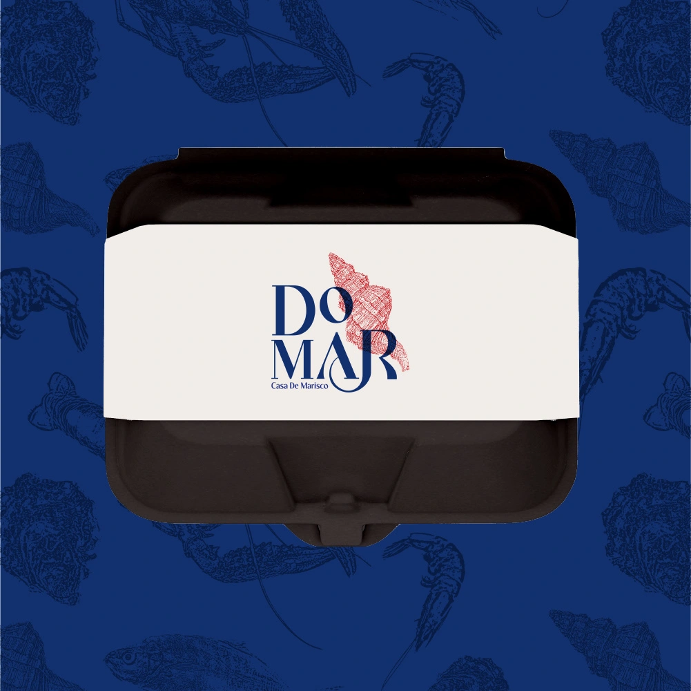
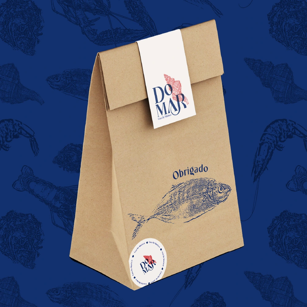
6. Packaging Design
For takeout, I designed branded paper bags and containers using the core colors and a simplified version of the logo. The packaging is functional yet stylish, helping reinforce the restaurant’s identity even outside its physical location.
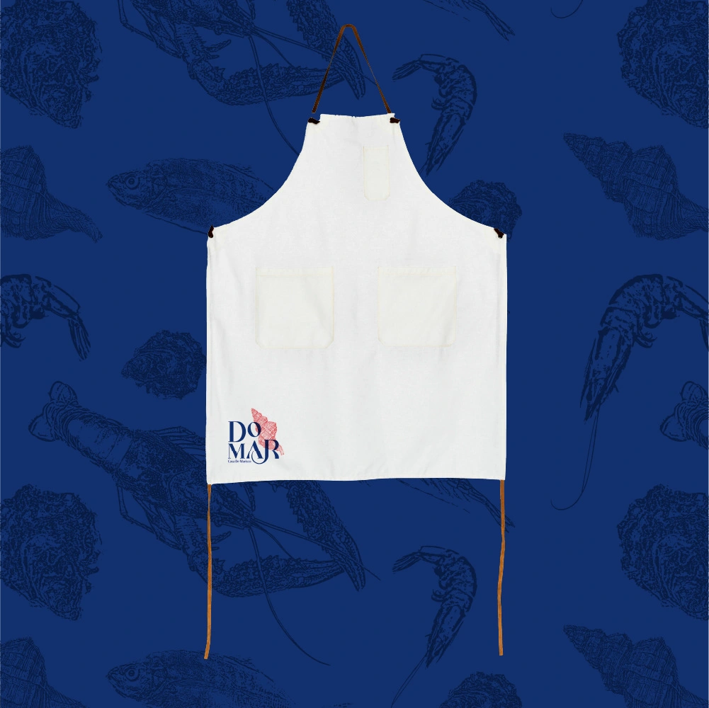
7. Uniform Design
Aprons were designed to be both practical and elegant, featuring the logo embroidered on Concha Clara fabric with deep blue trim.
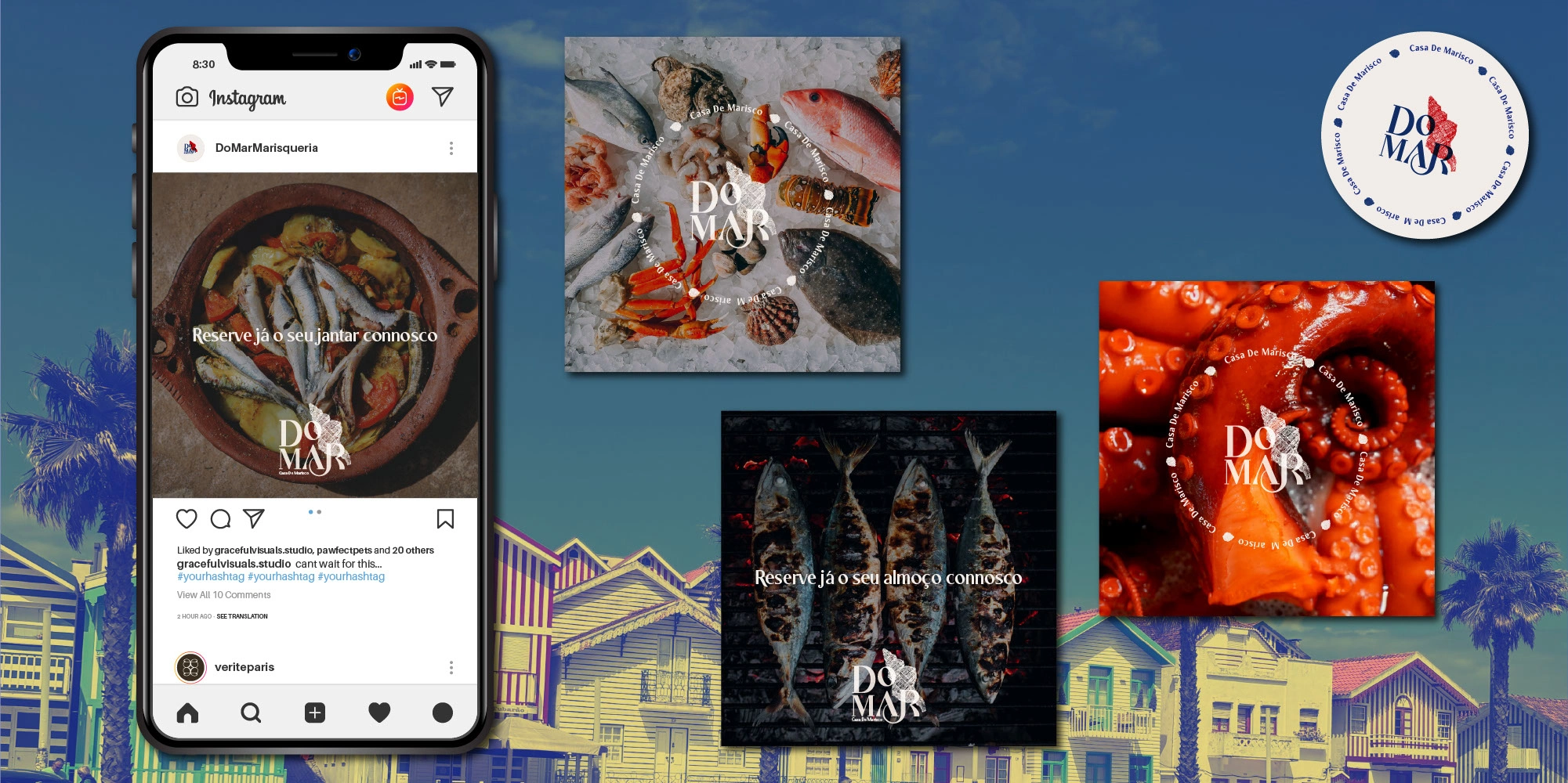
8. Digital Assets
I created branded Instagram templates and a set of launch visuals. These were designed to be easy for the client to update and use, while maintaining a cohesive look across social media channels.
Outcome
The final branding system is both flexible and distinctive. It aligns seamlessly with the restaurant’s interior concept, menu offering, and customer experience. Since launch, the restaurant has received positive feedback for its clean and stylish visual identity, especially from customers sharing photos on social media—which speaks to the brand’s strong visual appeal.
The client now has a complete set of branded materials that reflect their vision and help them stand out in a competitive market. This project demonstrates how a clear visual identity—when applied consistently and thoughtfully—can elevate a brand’s perception and support its growth from day one
Like this project
Posted May 15, 2025
Graphic Design, Photography, Logo Design, Adobe Photoshop, Adobe Photoshop Lightroom, Adobe Illustrator
Likes
1
Views
22
Timeline
May 1, 2025 - May 15, 2025