
A 19-second film for Laberde, a fashion e-commerce brand, covering both the identity and the online store I designed.
0–5 s Branding: the symbol draws itself, the wordmark opens letter by letter, then logo construction, the gold, white and black palette, and Poppins with Baskerville.
5–19 s UI/UX: real screen recordings of laberde.com, including the home page, product listing, product page with add to cart, and mobile views. No device mockups, just the interface in a clean browser window.
Delivered in 16:9 and 9:16 at 30 fps.
My role: brand identity, UI/UX web design, motion design and editing.
AI use: the music in the film is AI-generated with Google Lyria 3. All branding, UI/UX design, motion design and editing are my own work.
Laberde Fashion E-Commerce: UI/UX Web Design
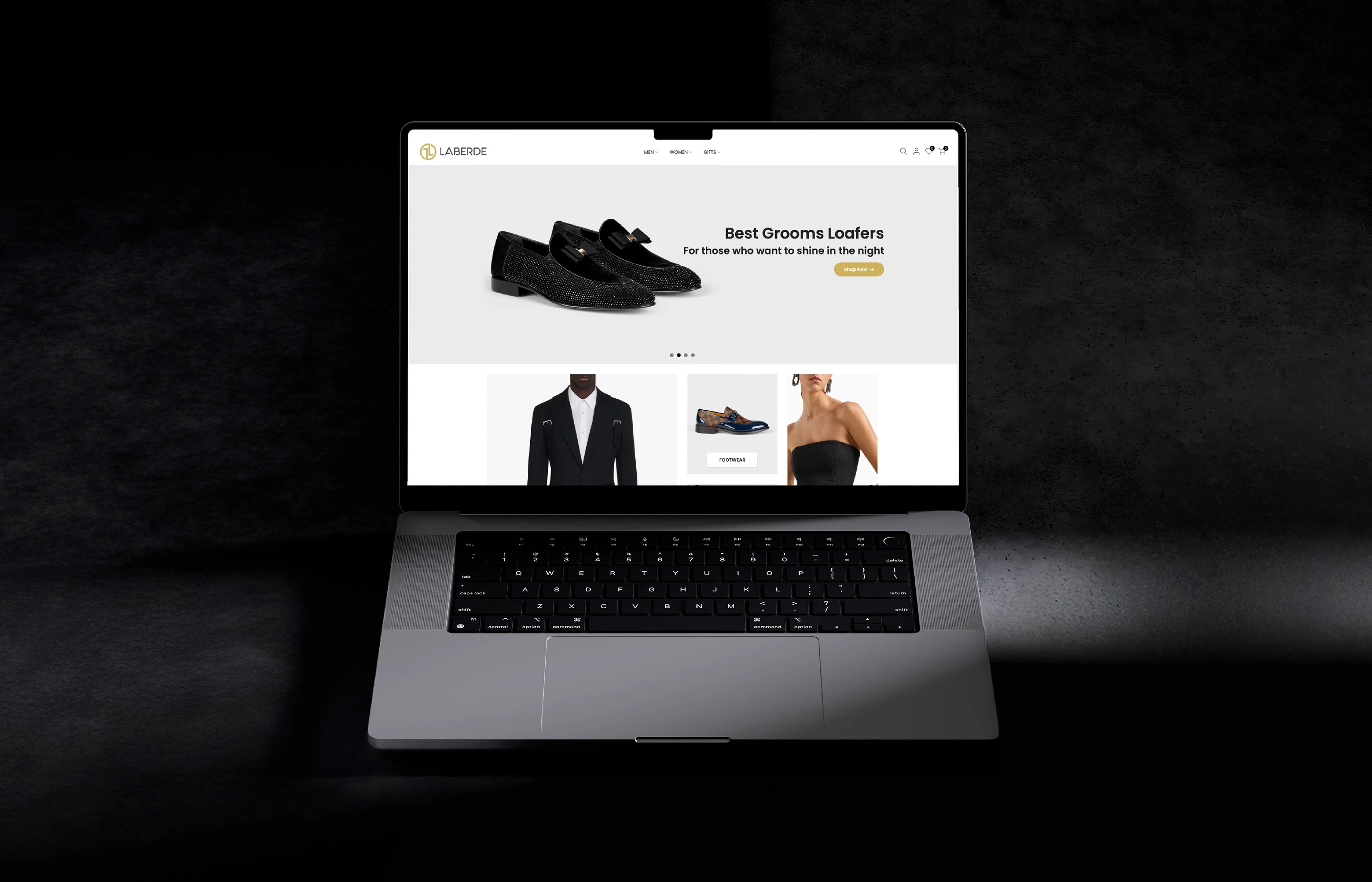
Laberde is an Istanbul-based fashion label dressing professionals who want to look sharp every day. The online store was designed to feel as tailored as the clothes: clear navigation, rich product imagery and a checkout that never gets in the way.
Role: UI/UX Design · Scope: Research, sitemap, wireframes, UI design, prototyping · Platforms: Desktop & Mobile
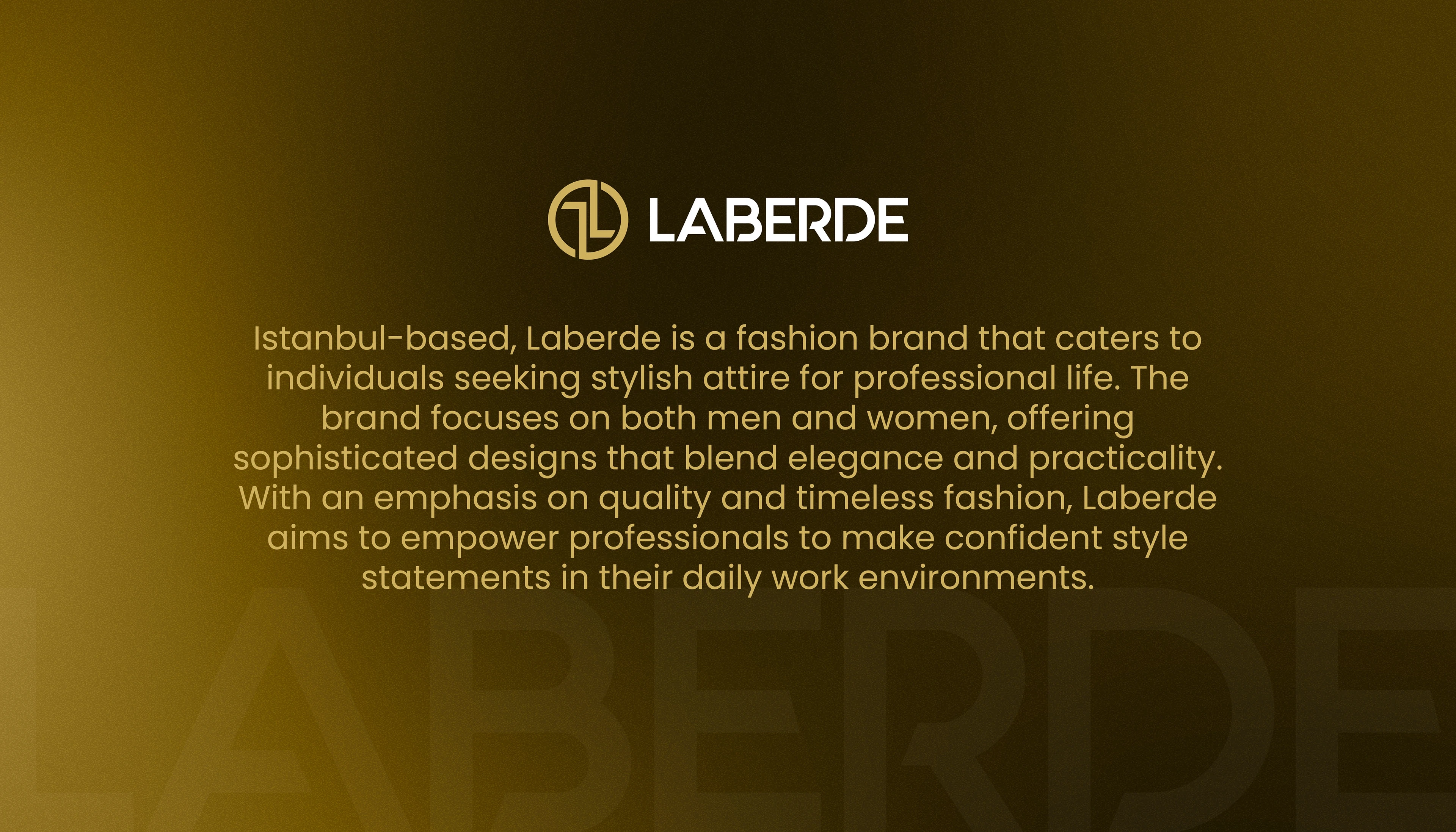
Brand Story
The site opens with motion and a short brand story that sets a confident, tailored tone before any product appears, introducing Laberde as a label for people who dress with intention.

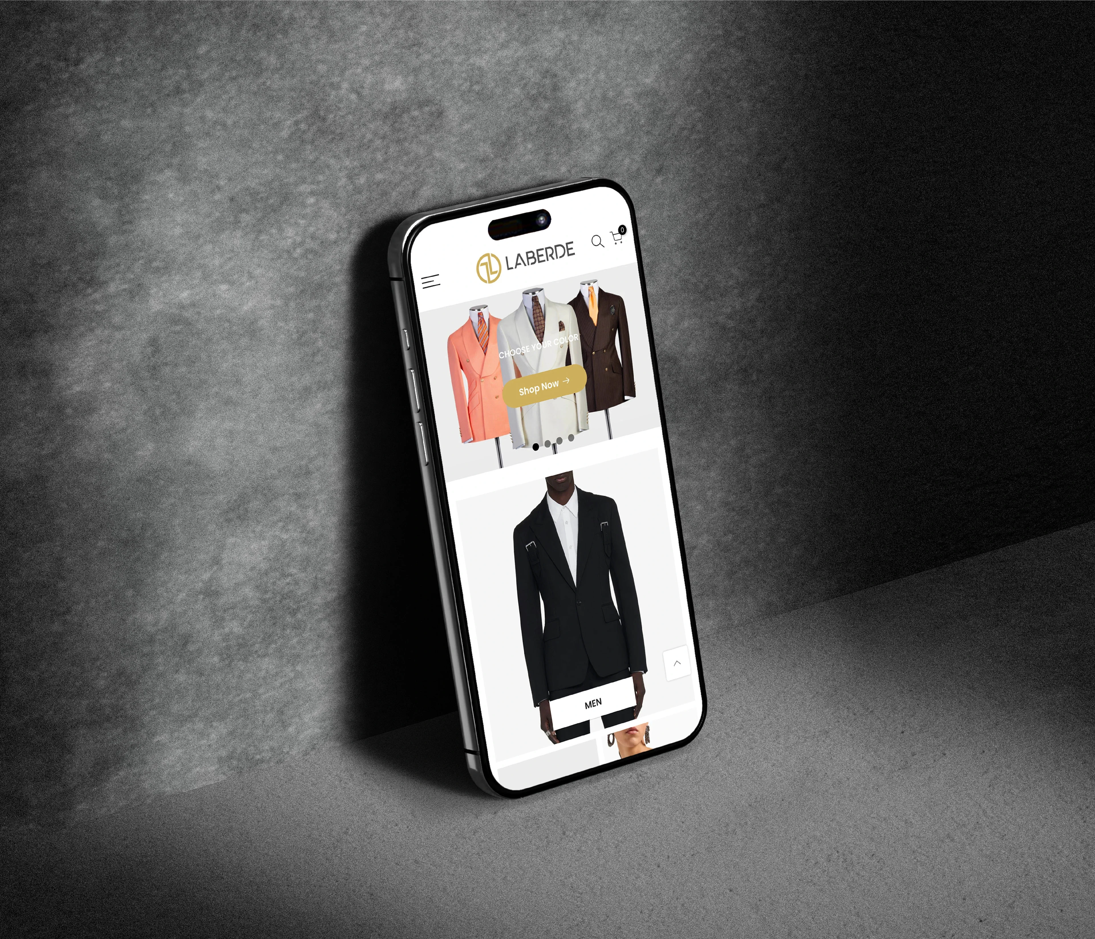
Mobile First
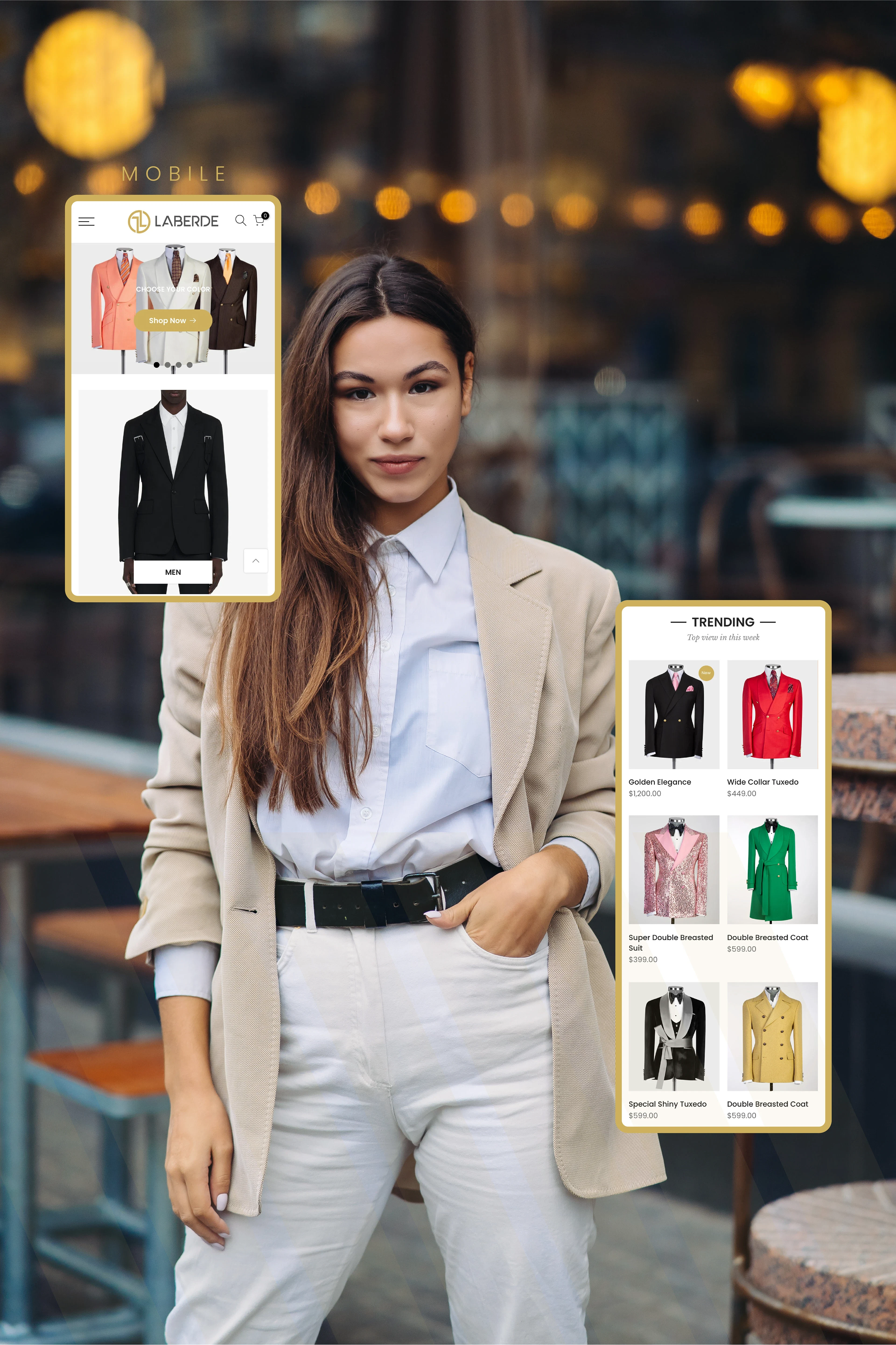
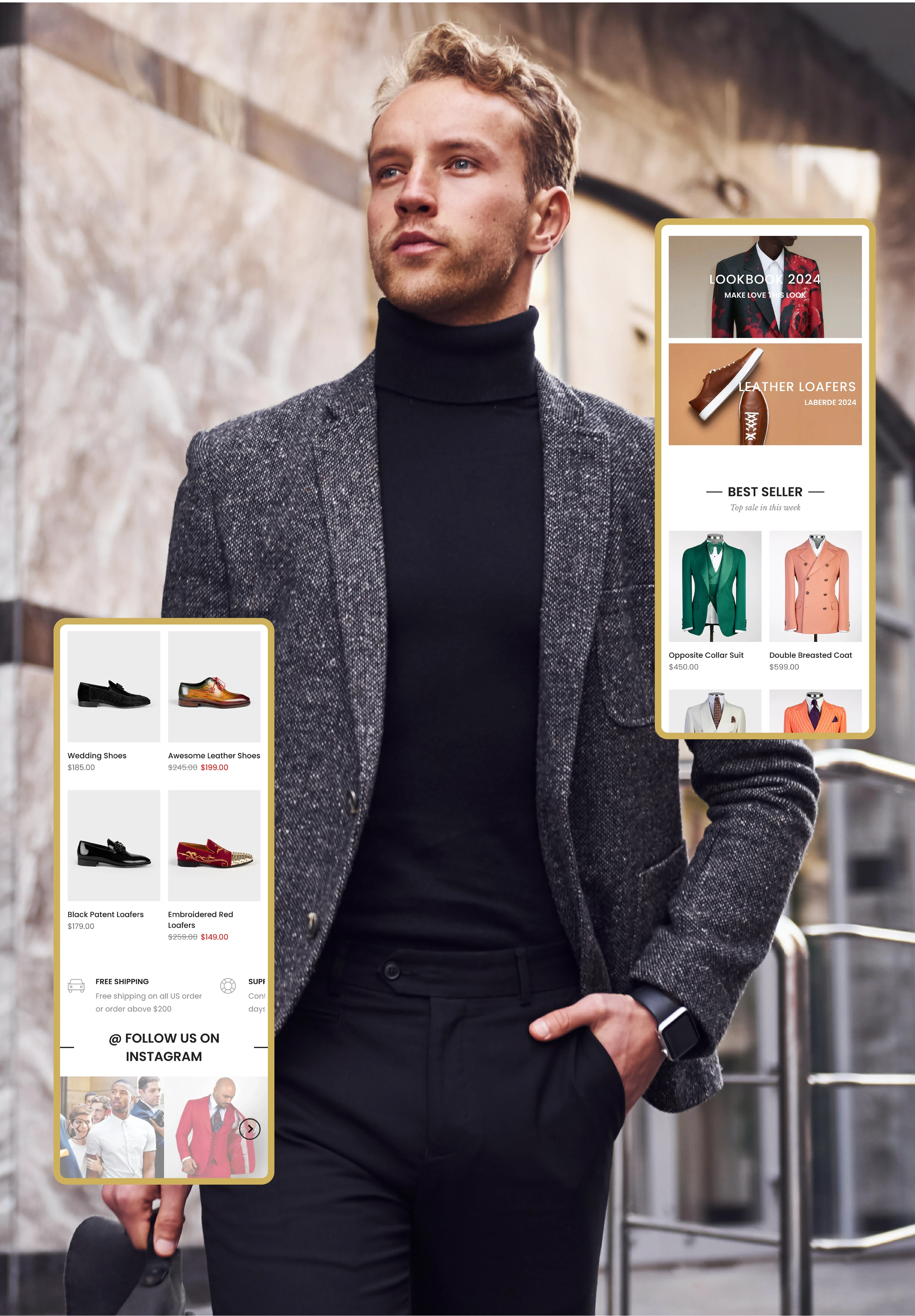
Most fashion shoppers browse on their phones, so every layout was designed for mobile first: large product imagery, a sticky menu and thumb-friendly filters that make browsing feel effortless.
Process
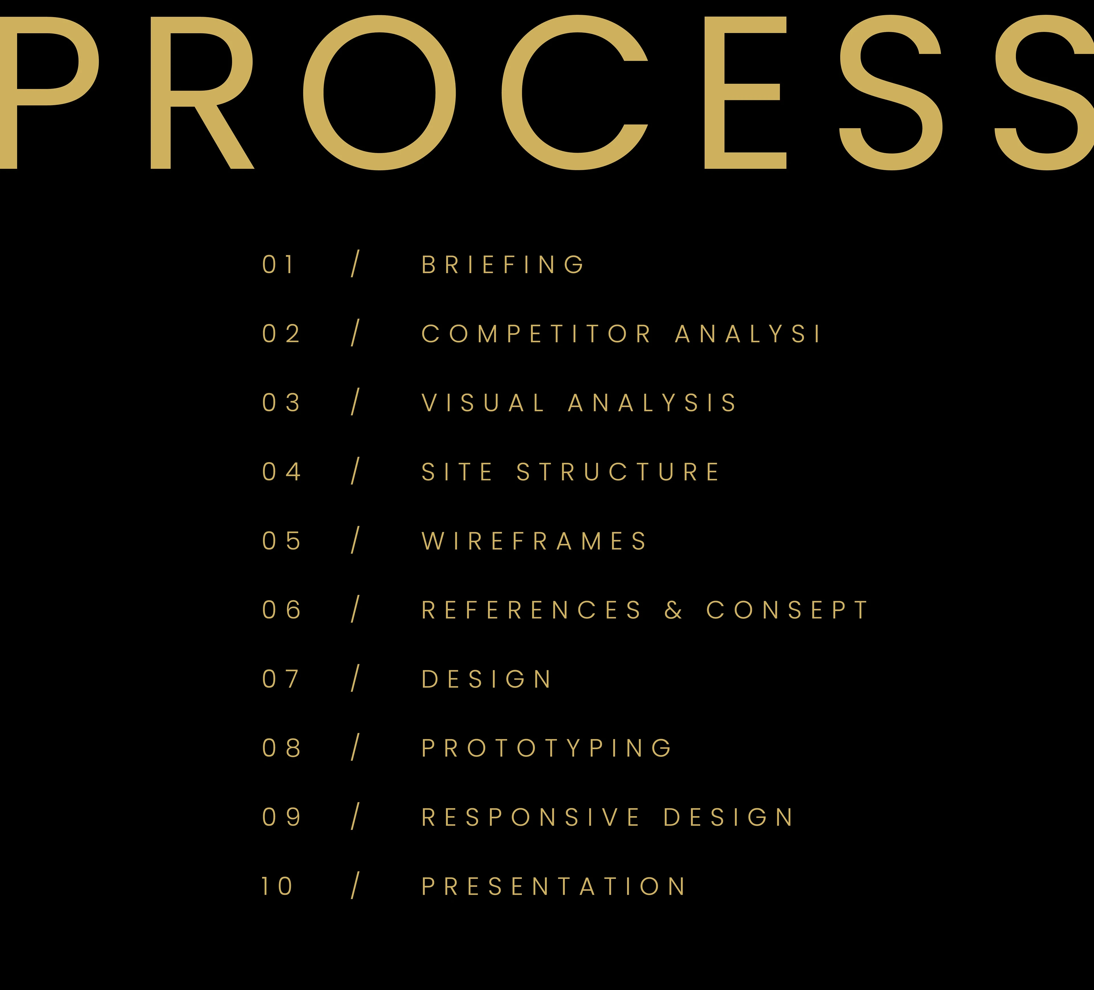
Ten steps took the store from brief to launch: briefing, competitor and visual analysis, site structure, wireframes, references and concept, design, prototyping, responsive design and final presentation. Every screen was grounded in research before any visual decision.
Site Map
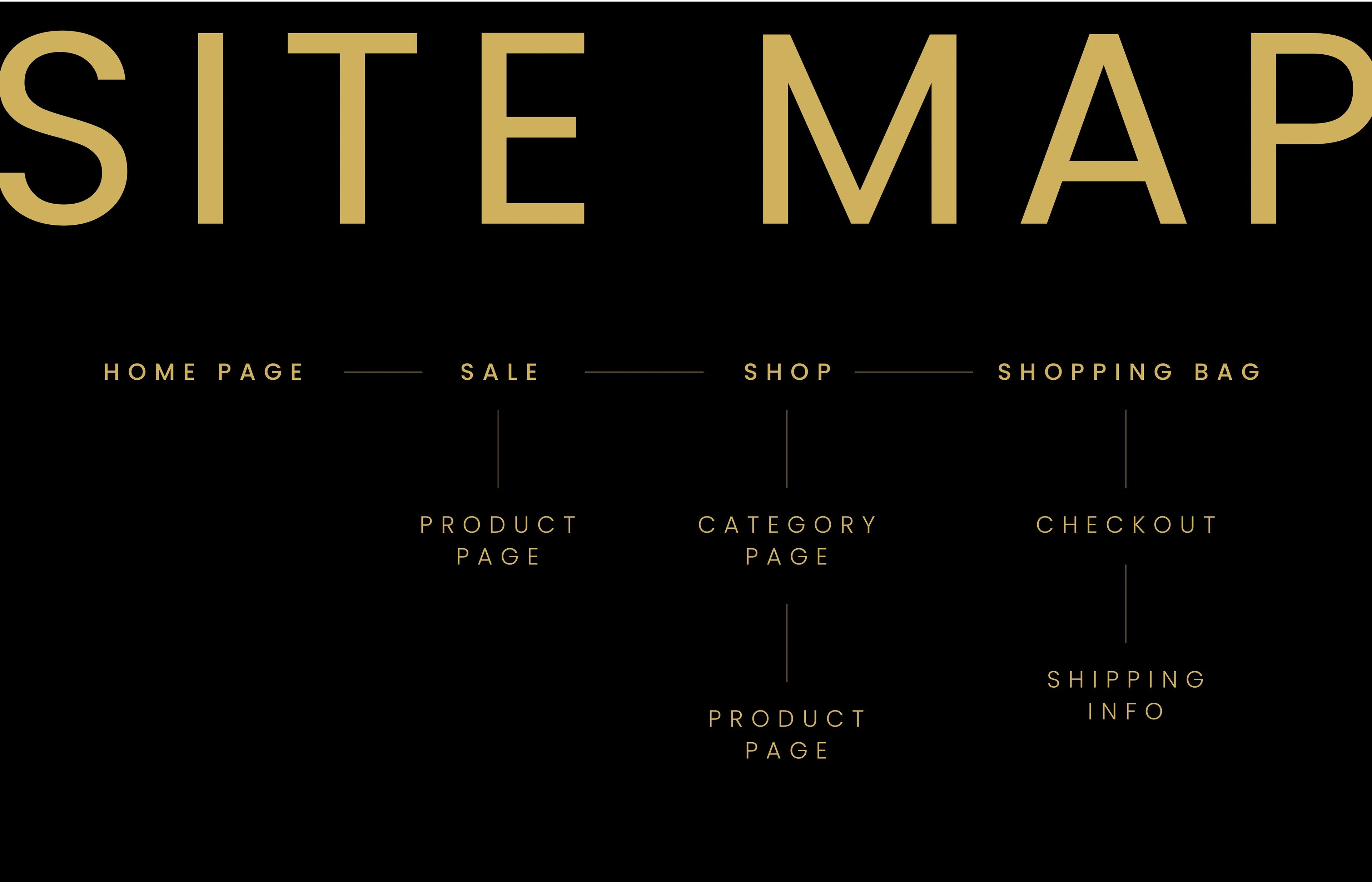
A shallow structure keeps every product within three taps. Home, Sale, Shop and Bag form the main navigation, with category and product pages branching from Shop and a short checkout with shipping info.
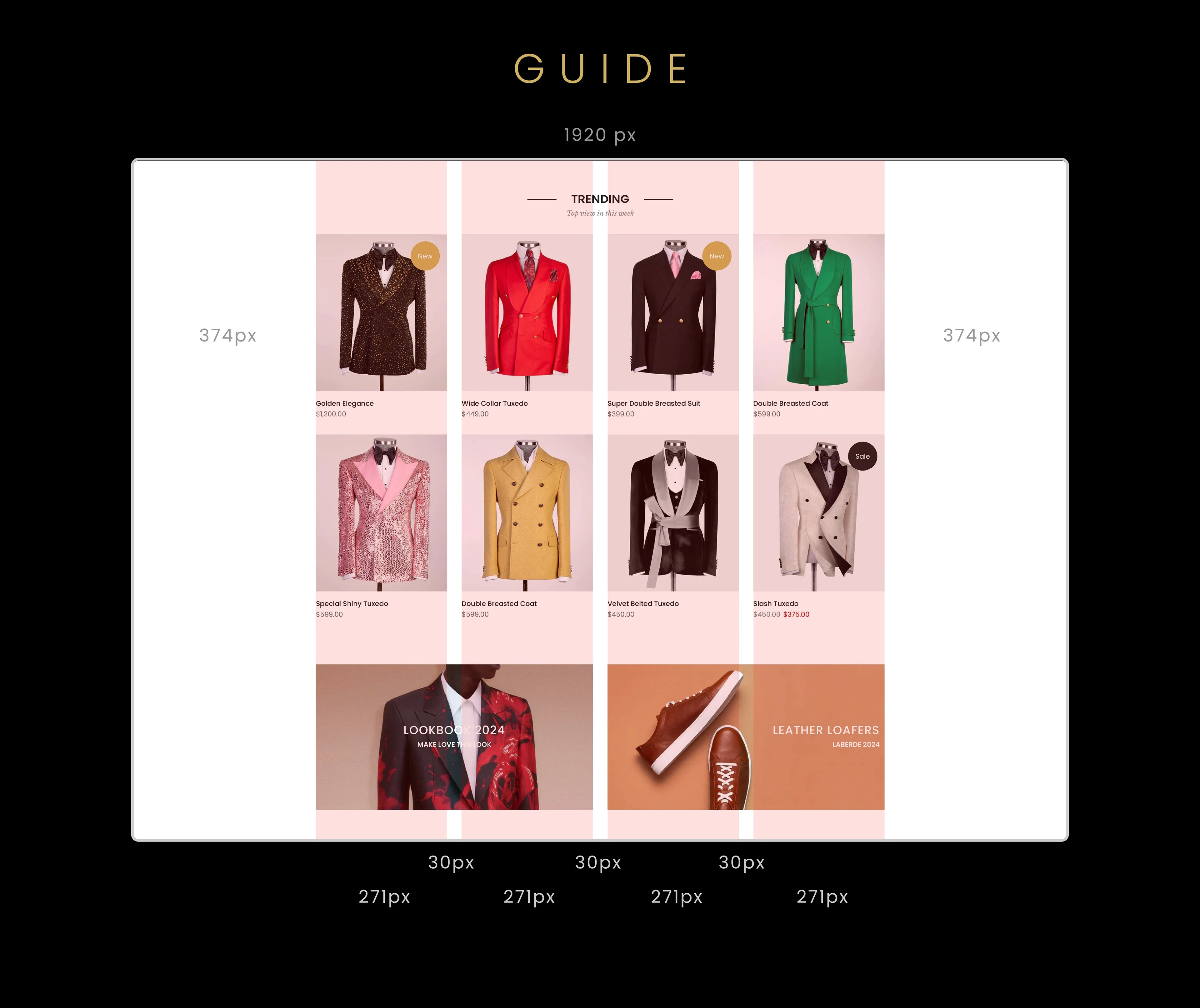
Palette & Grid
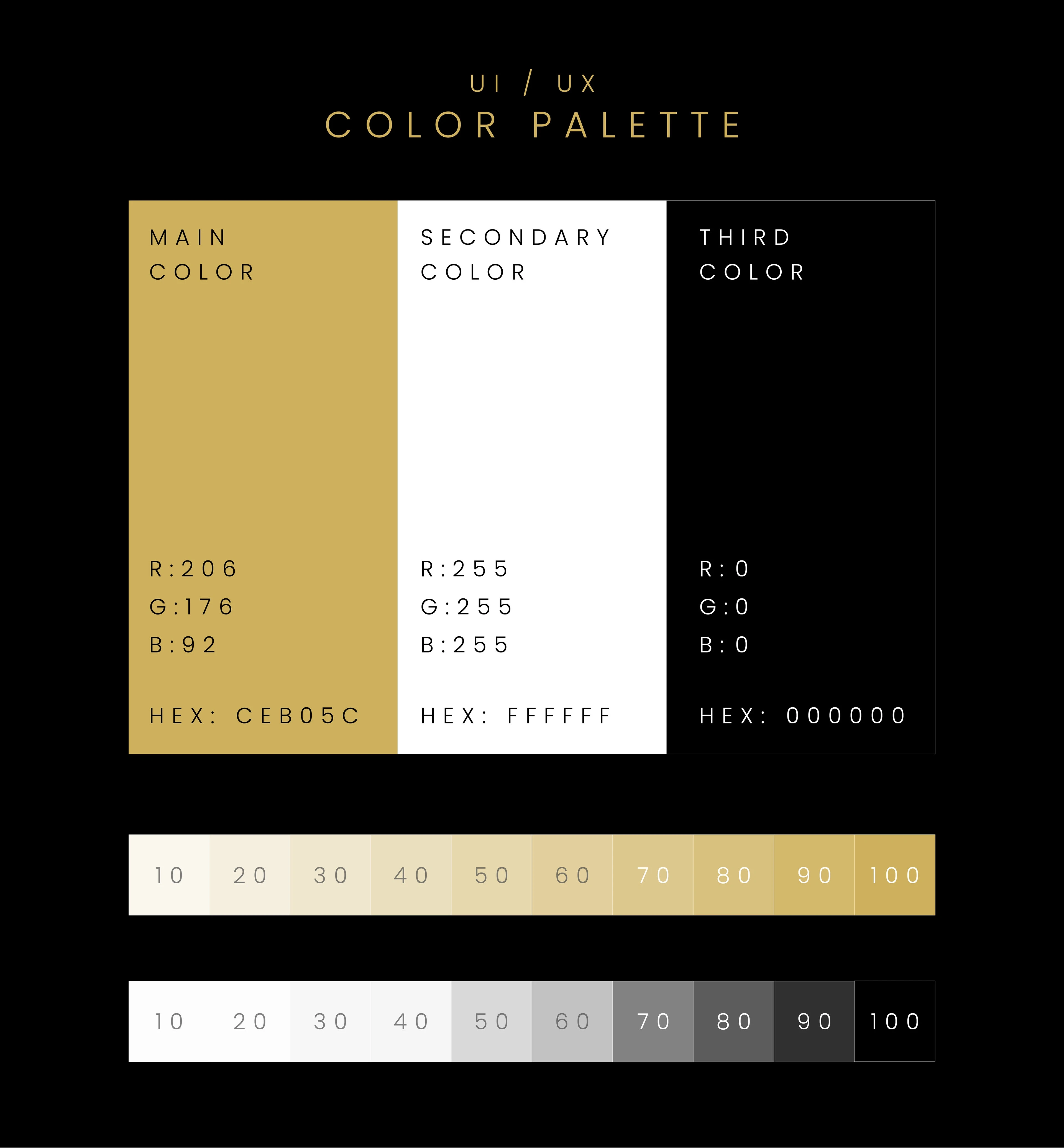
Champagne gold (#CEB05C) is reserved for actions and highlights, set against pure white and deep black. A 1920 px desktop grid with generous gutters keeps every product card perfectly aligned across breakpoints.
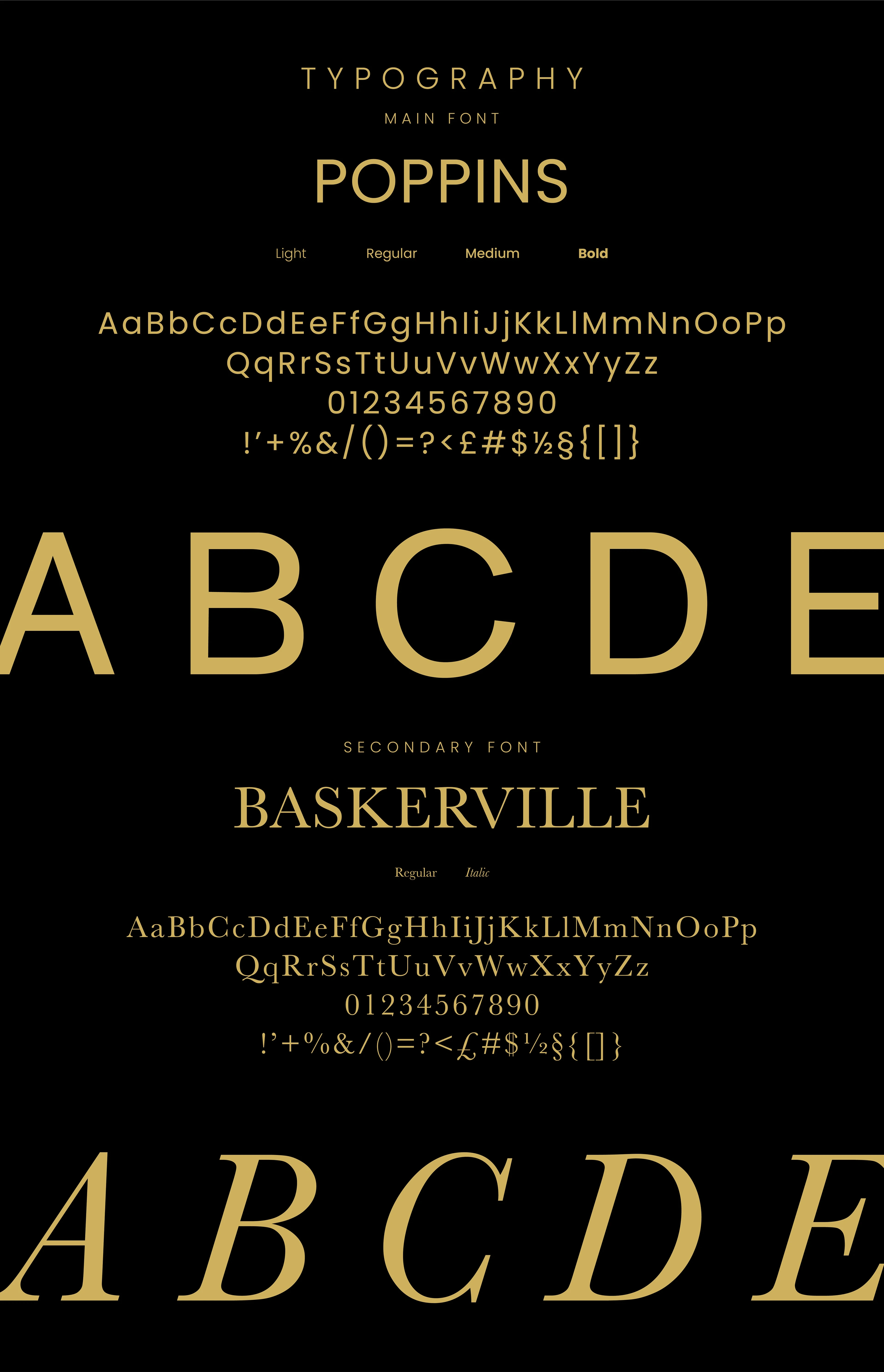
UI Language
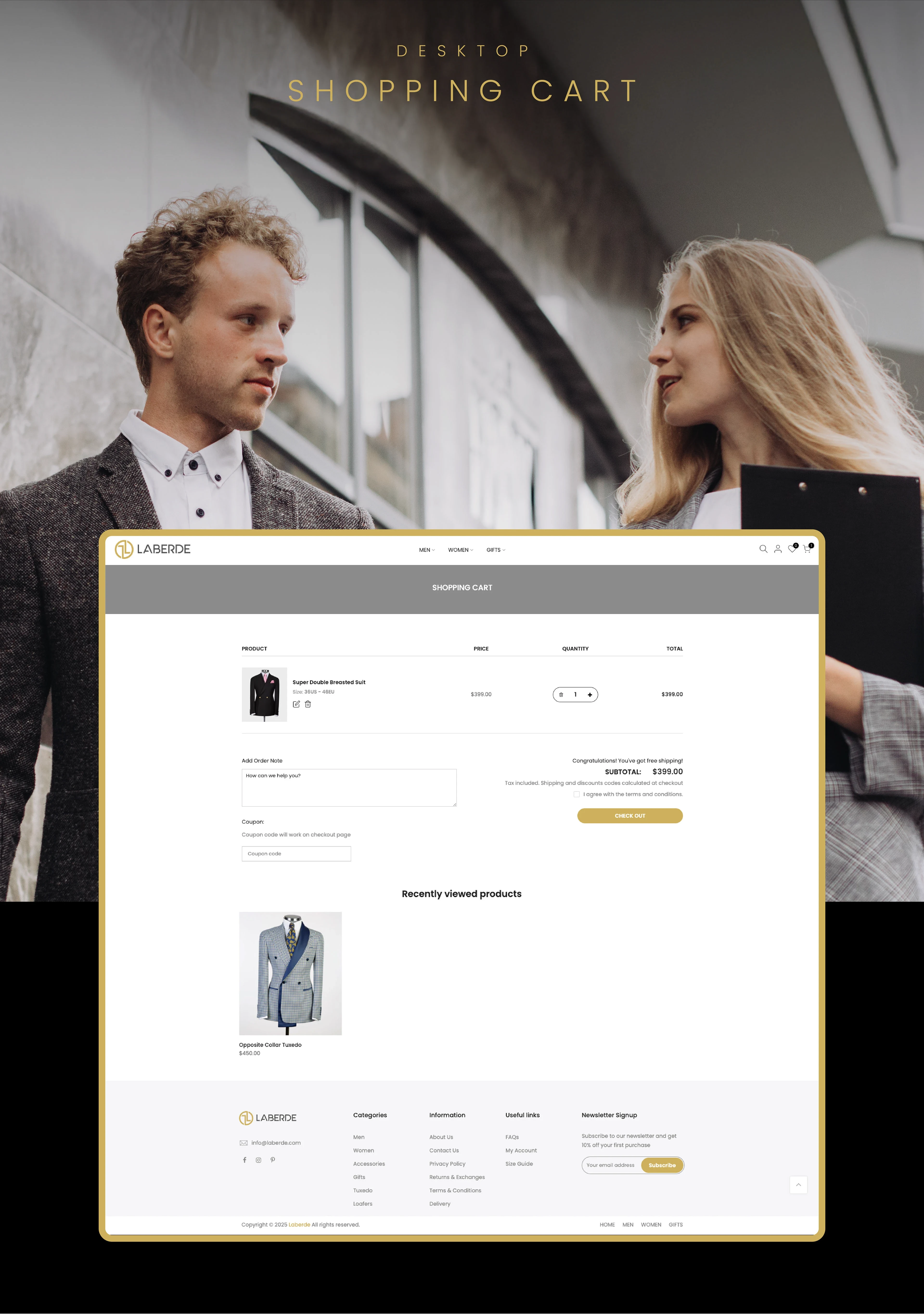
A black, white and champagne-gold palette pairs Poppins for interface text with Baskerville for editorial moments, giving the store a tailored, premium voice. A strict grid keeps product listings, the cart and checkout calm and consistent on desktop and mobile.
Product Listing
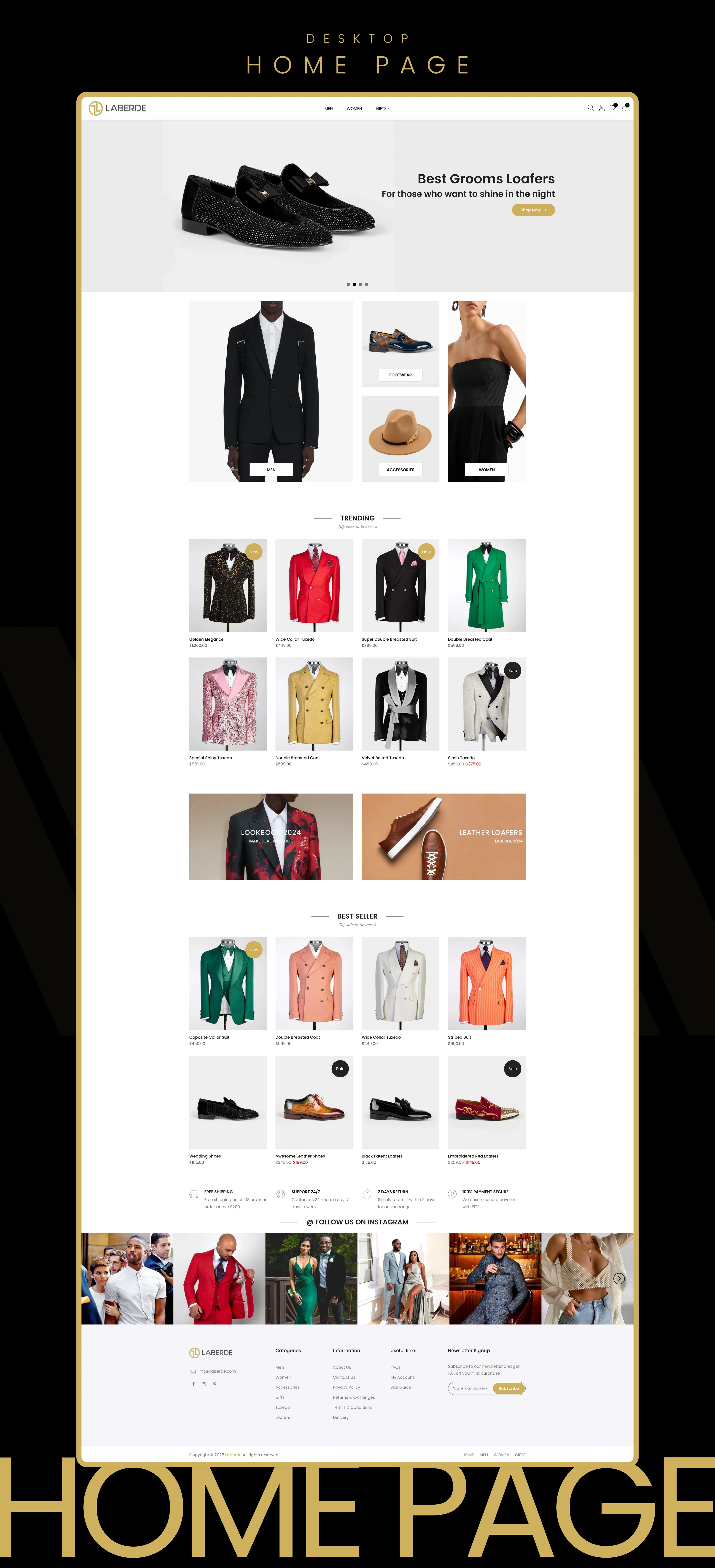
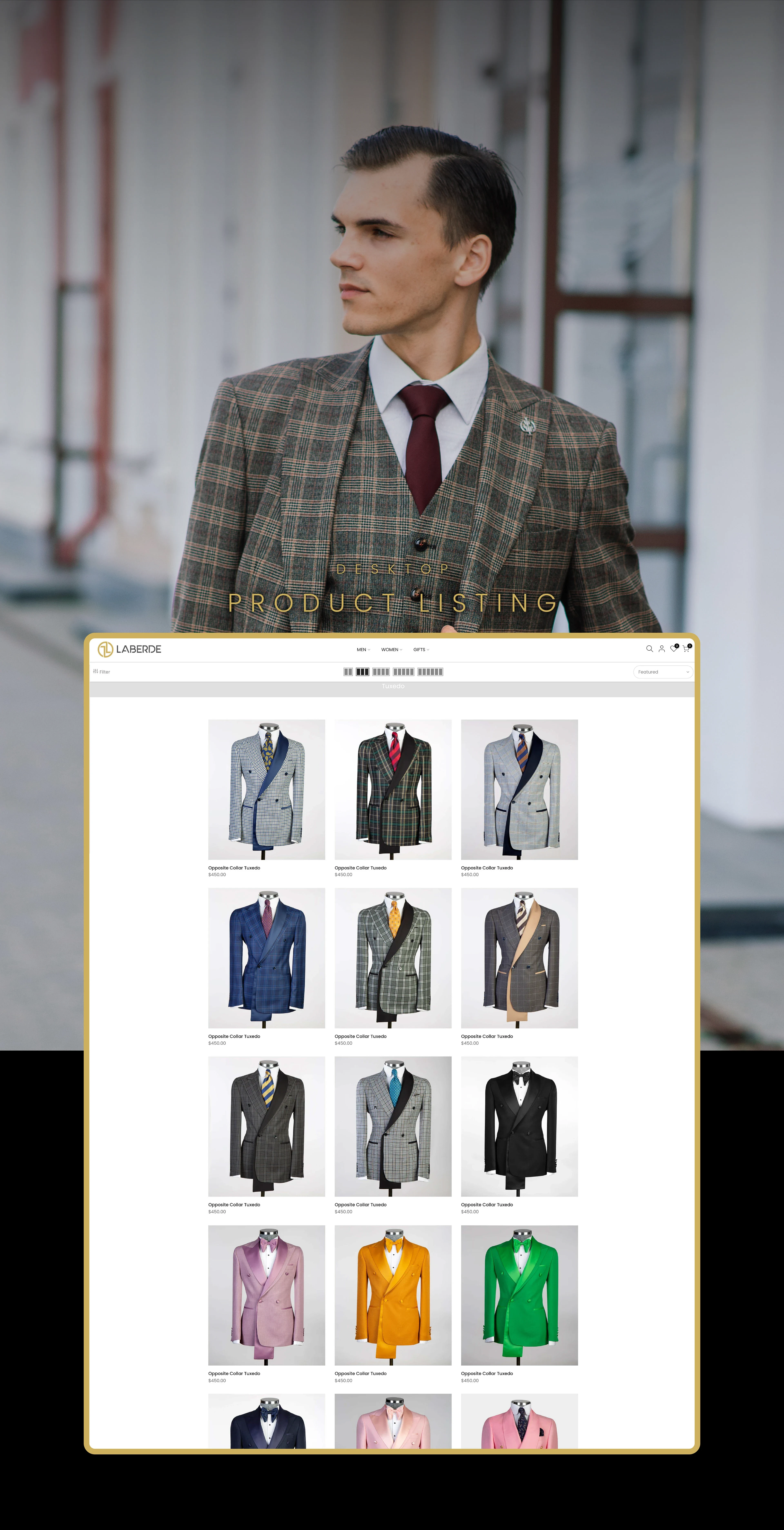
Category pages pair editorial photography with a clean product grid, quick colour swatches and clear pricing, so suits, shirts and shoes can be compared at a glance before moving on to the cart.
0 likes · 0 views · Nov 15, 2026
Film for Laberde, a fashion e-commerce brand: five seconds of branding, then the live website I designed.


