
A 27-second brand film and UI/UX case study for FinPay, a mobile app for fast, secure everyday payments, built for both personal and business use. The goal was a single, friendly place to send money, pay for services and follow every transaction without the usual banking friction.
Role: Branding and UI/UX design · Scope: research, wireframes, UI design, prototyping, user testing, brand film · Platforms: iOS and Android
This is a non-commercial concept project, made for personal development.
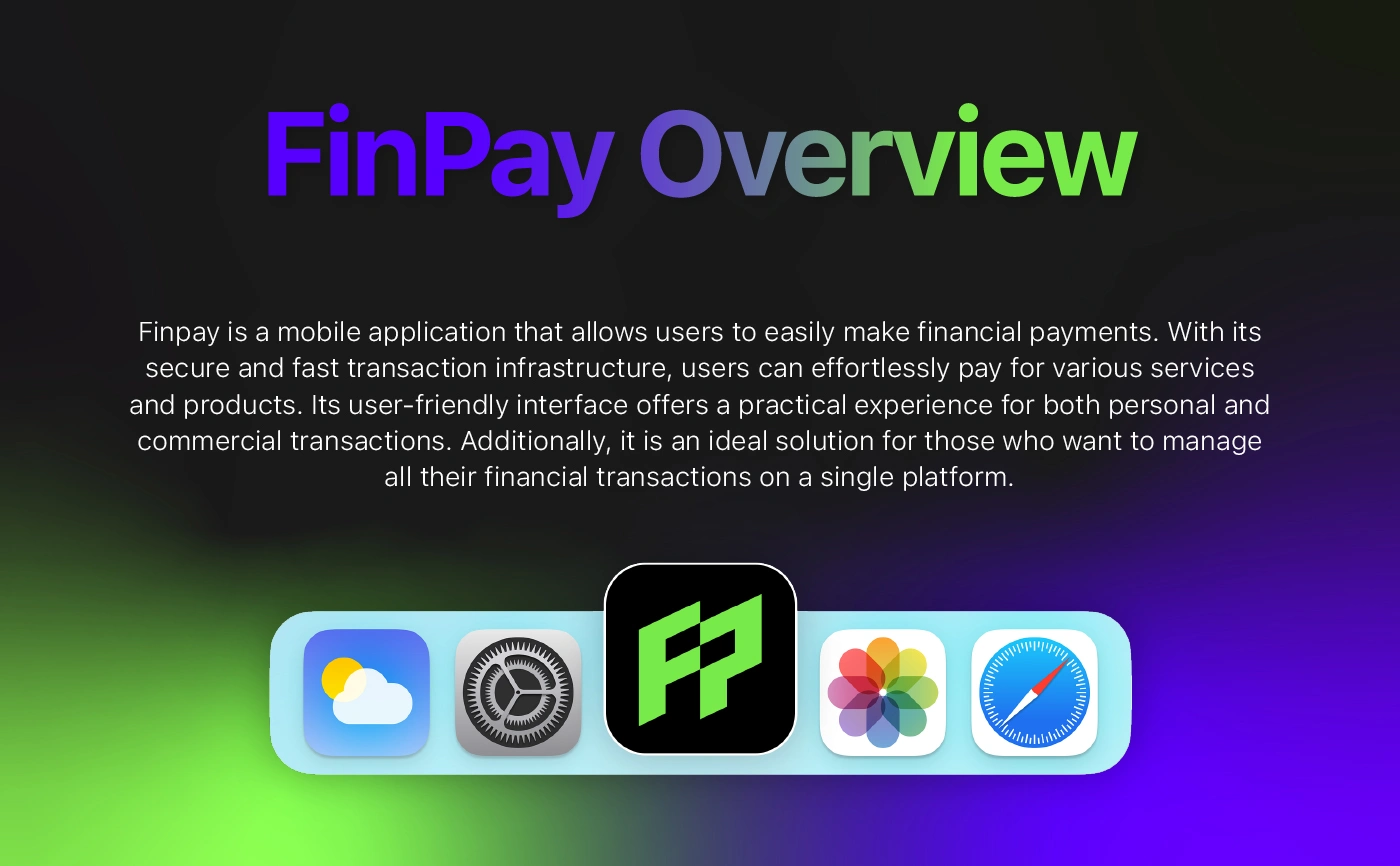
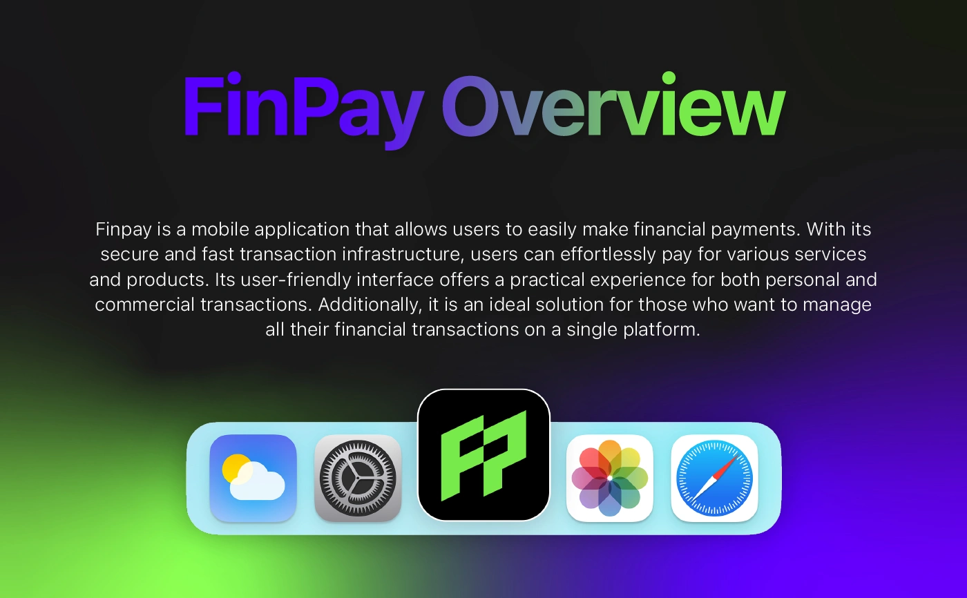
FinPay overview
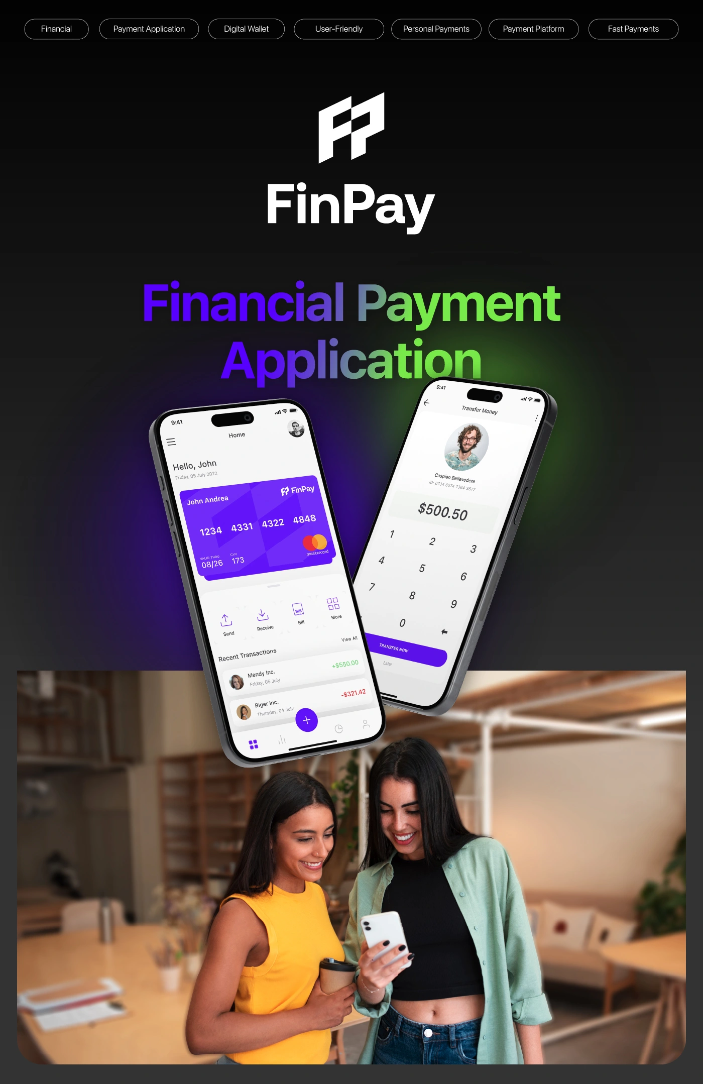
FinPay app screens
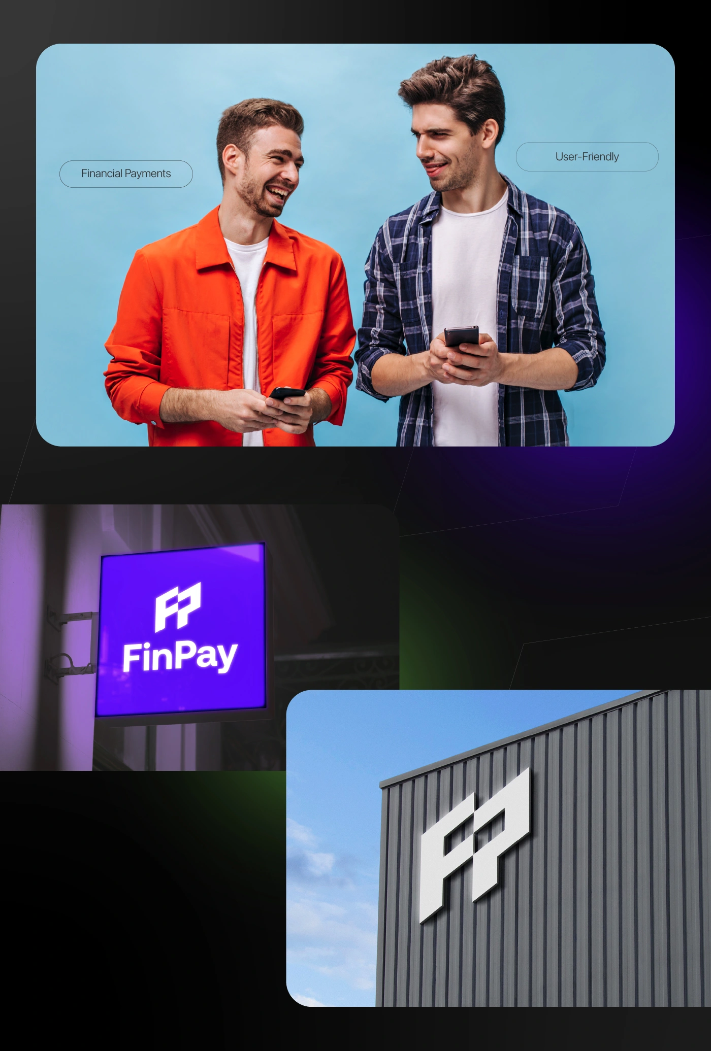
FinPay brand and app
Who it is for
FinPay is designed for young professionals and small business owners who pay and get paid every day. Lifestyle imagery and bold brand applications present a fintech that feels approachable, not corporate.
Who FinPay is for
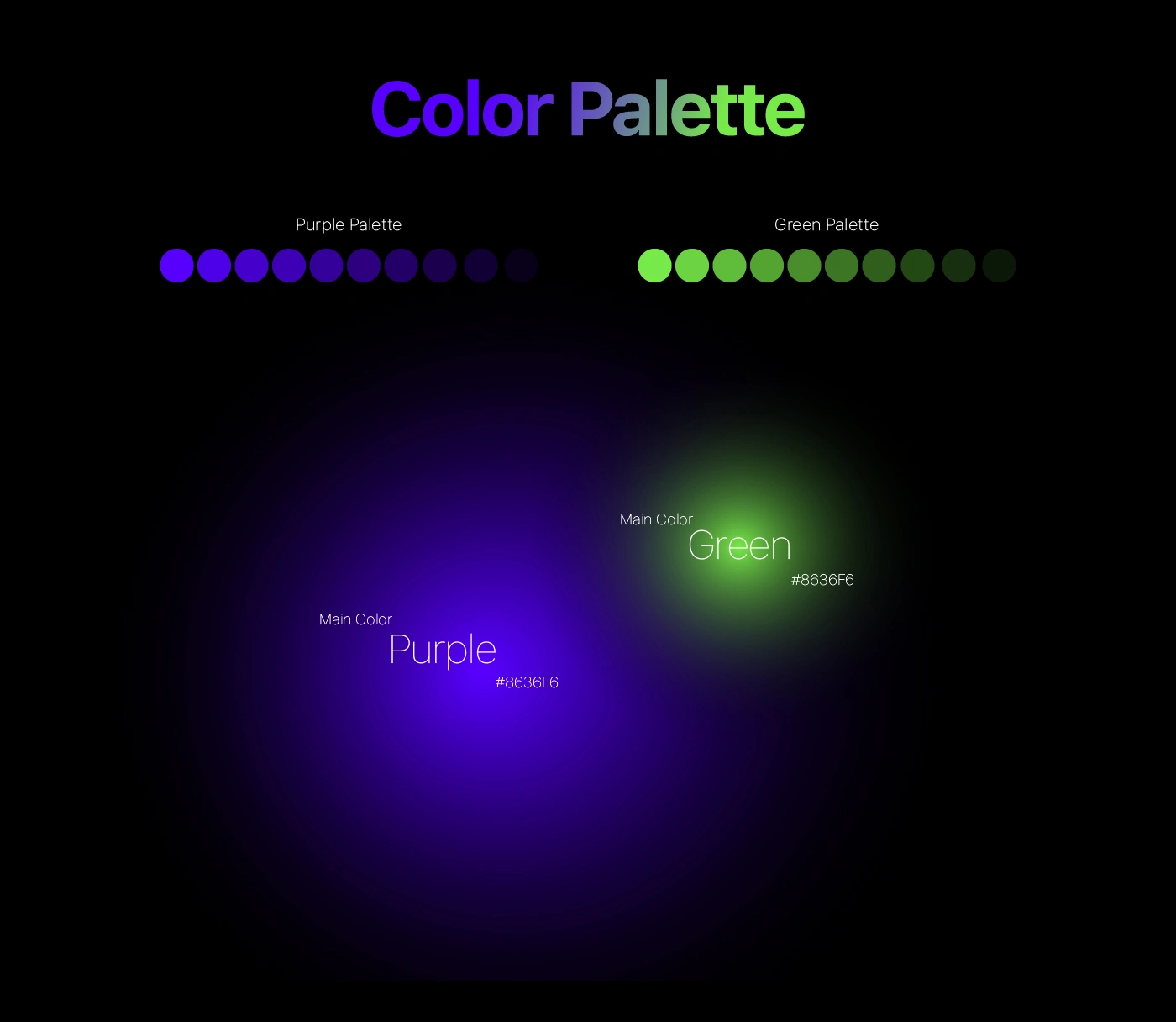
Colour palette
Electric purple and lime green glowing against deep black give the brand its energy, and make key actions and positive balances pop on screen.
FinPay colour palette
FinPay colour applications
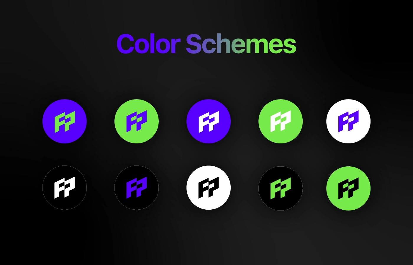
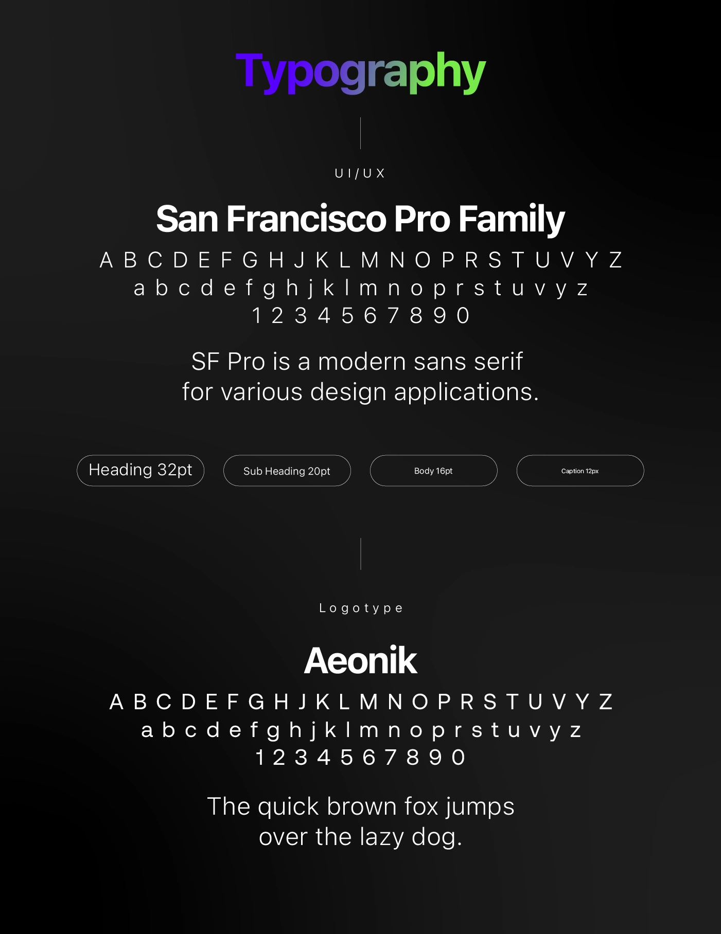
Type and schemes
The monogram is tested in purple, green, black and white versions, while SF Pro handles the interface and Aeonik gives headlines and the logotype a distinctive edge.

FinPay typography

FinPay colour schemes
The monogram
Built on a precise grid, the interlocking F and P form a compact, geometric symbol that works as an app icon, a subtle pattern and a watermark across the product.
FinPay monogram construction
Brand identity
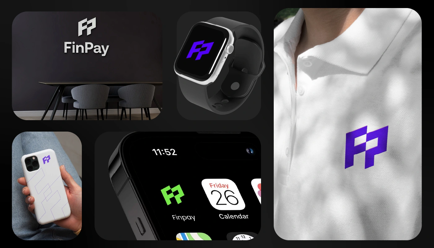
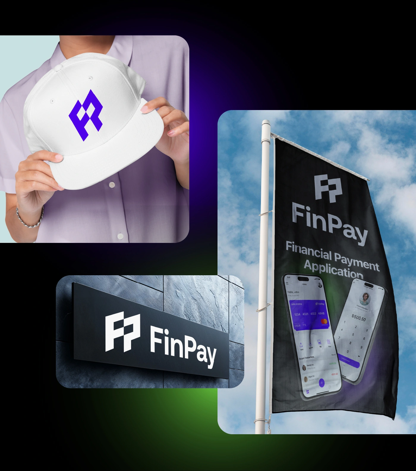
A geometric FP monogram, electric purple and lime green on deep black, and SF Pro paired with Aeonik give FinPay a modern, tech-forward identity that travels from the app icon to signage, wearables and merchandise.
FinPay brand identity
FinPay brand applications
Process
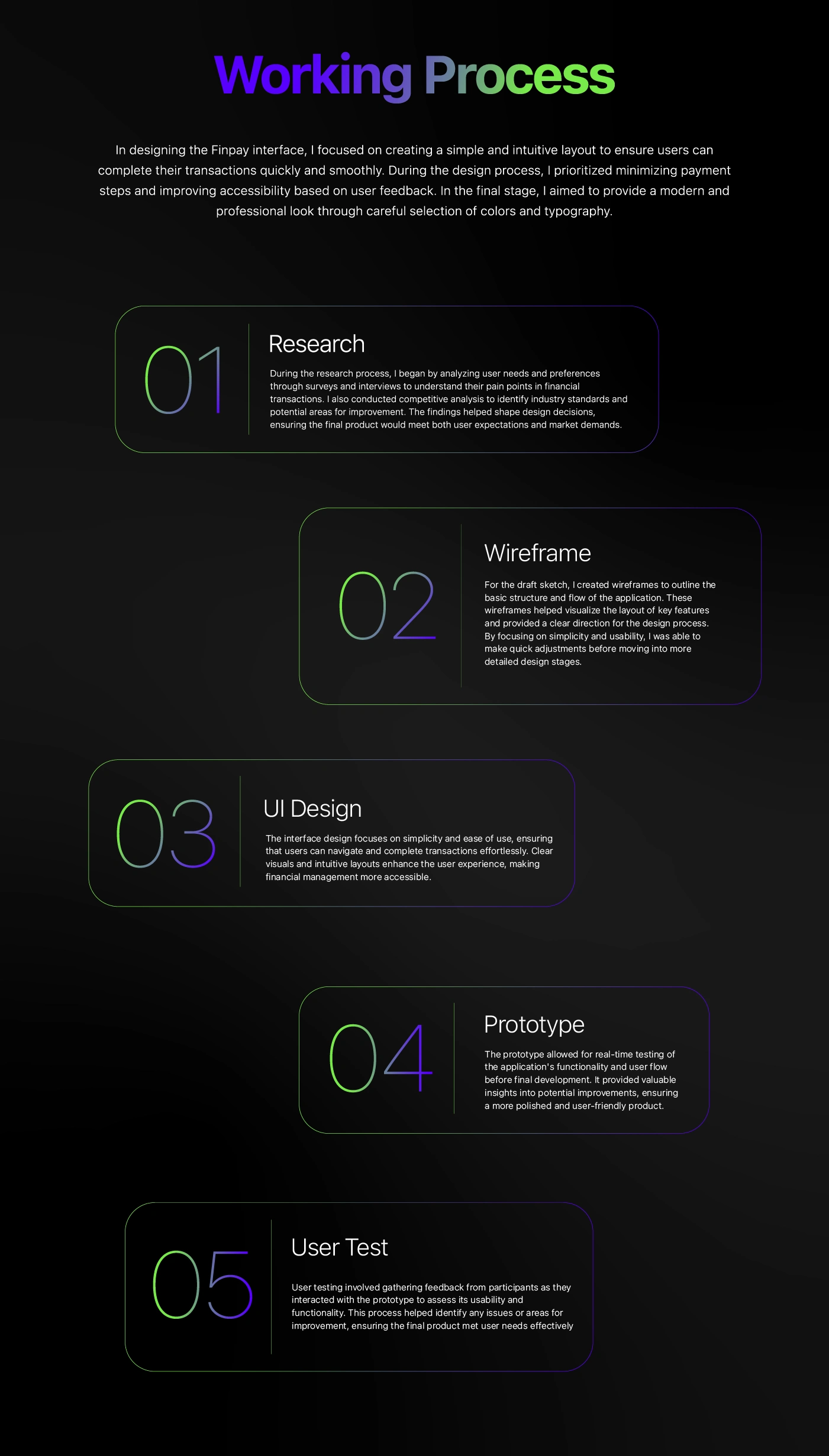
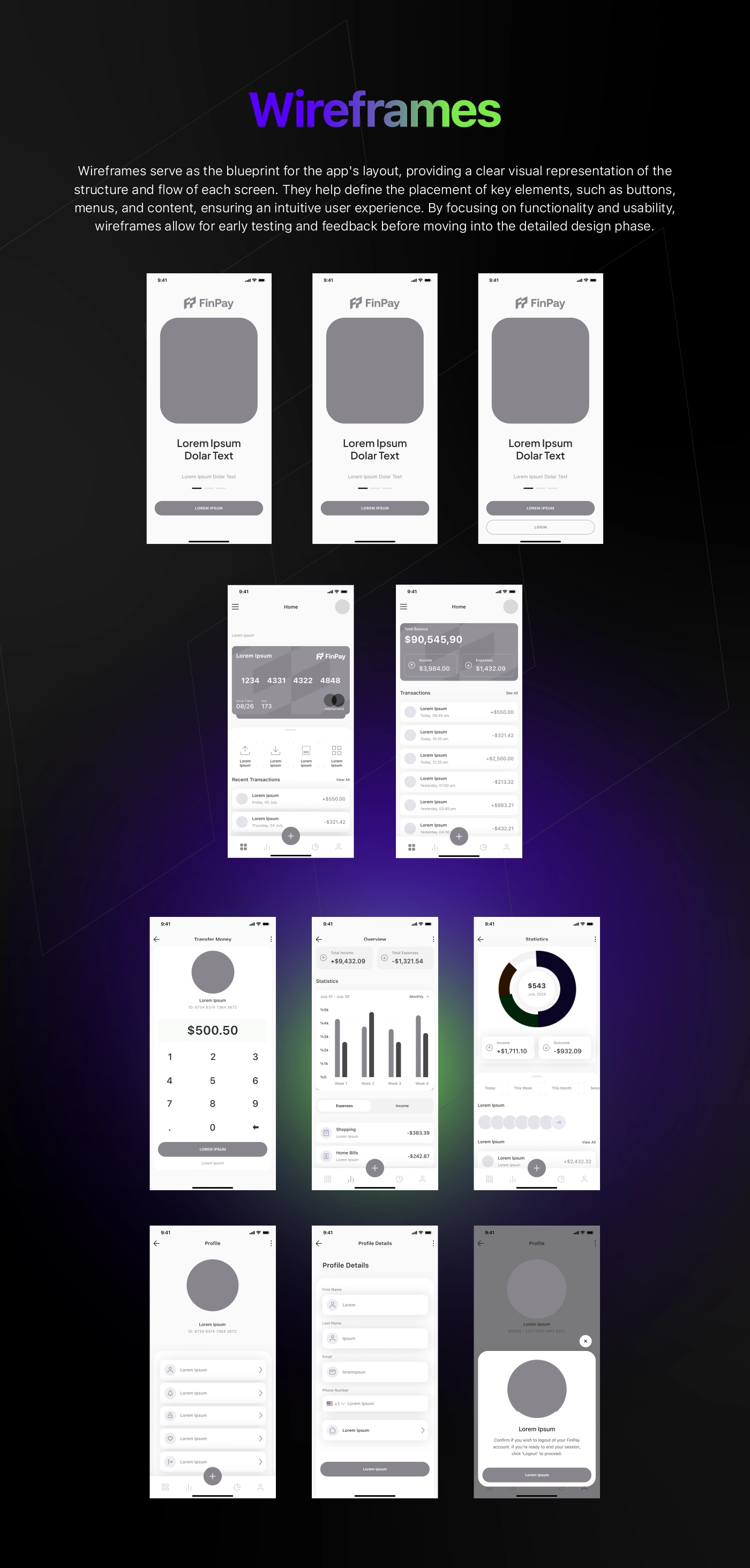
Five steps shaped the product: research, wireframes, UI design, prototyping and user testing. Low-fidelity layouts fixed the structure of onboarding, home, cards and payments before any visual styling was applied.
FinPay process
FinPay wireframes
Onboarding and card
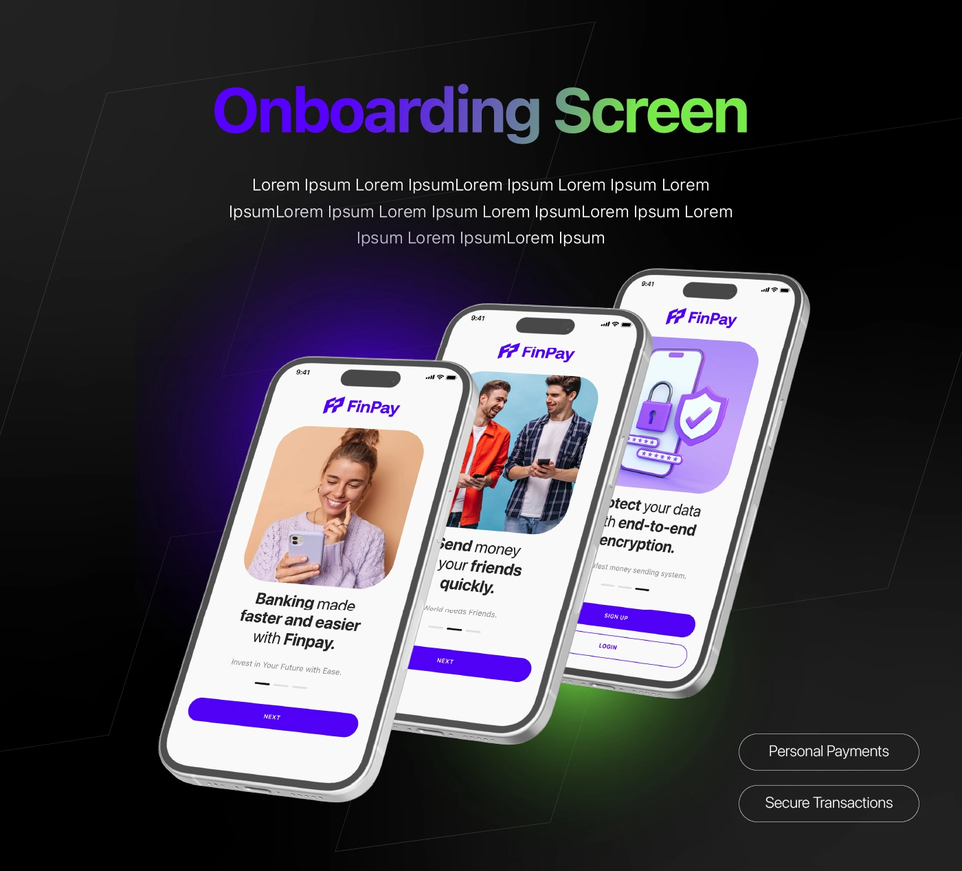
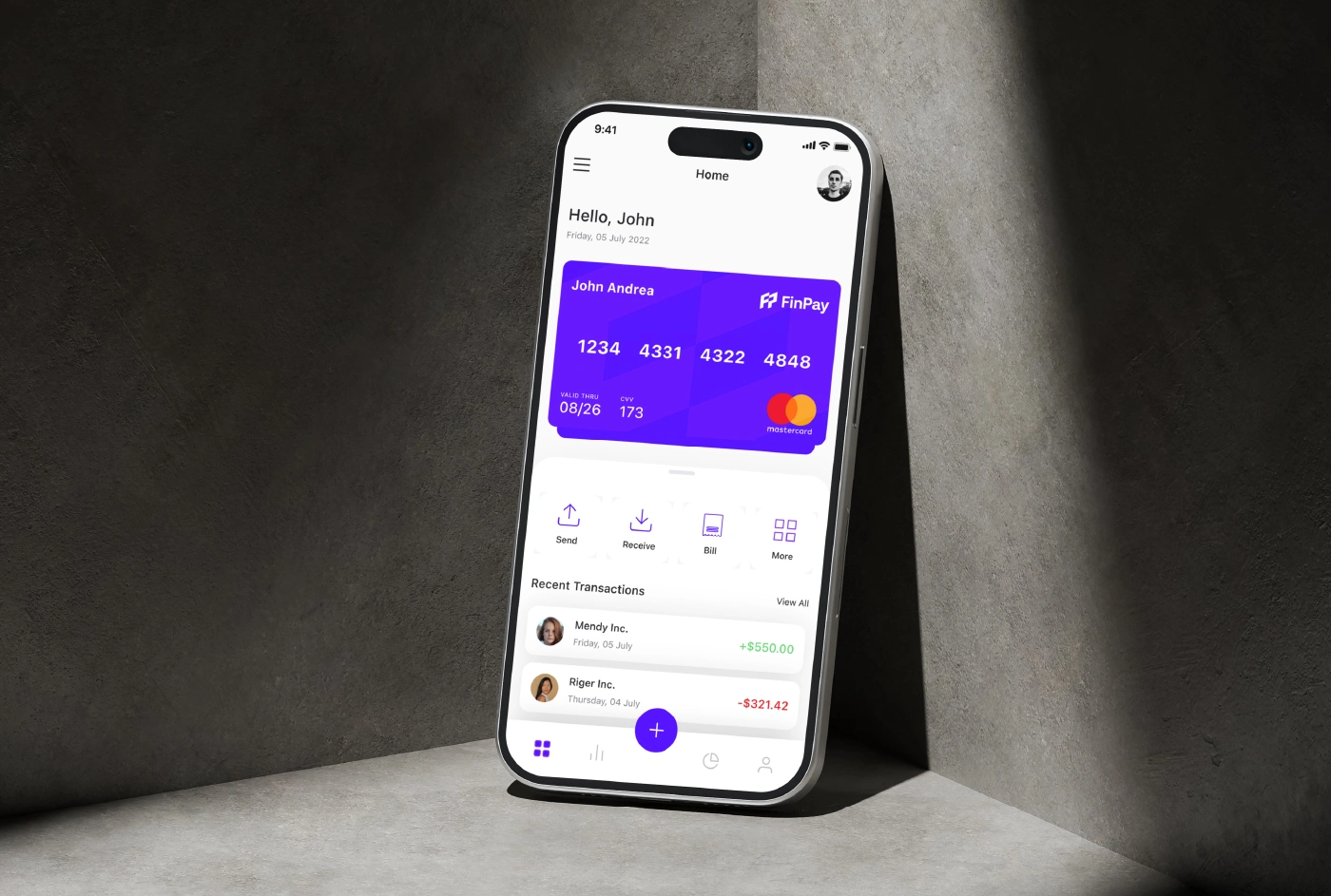
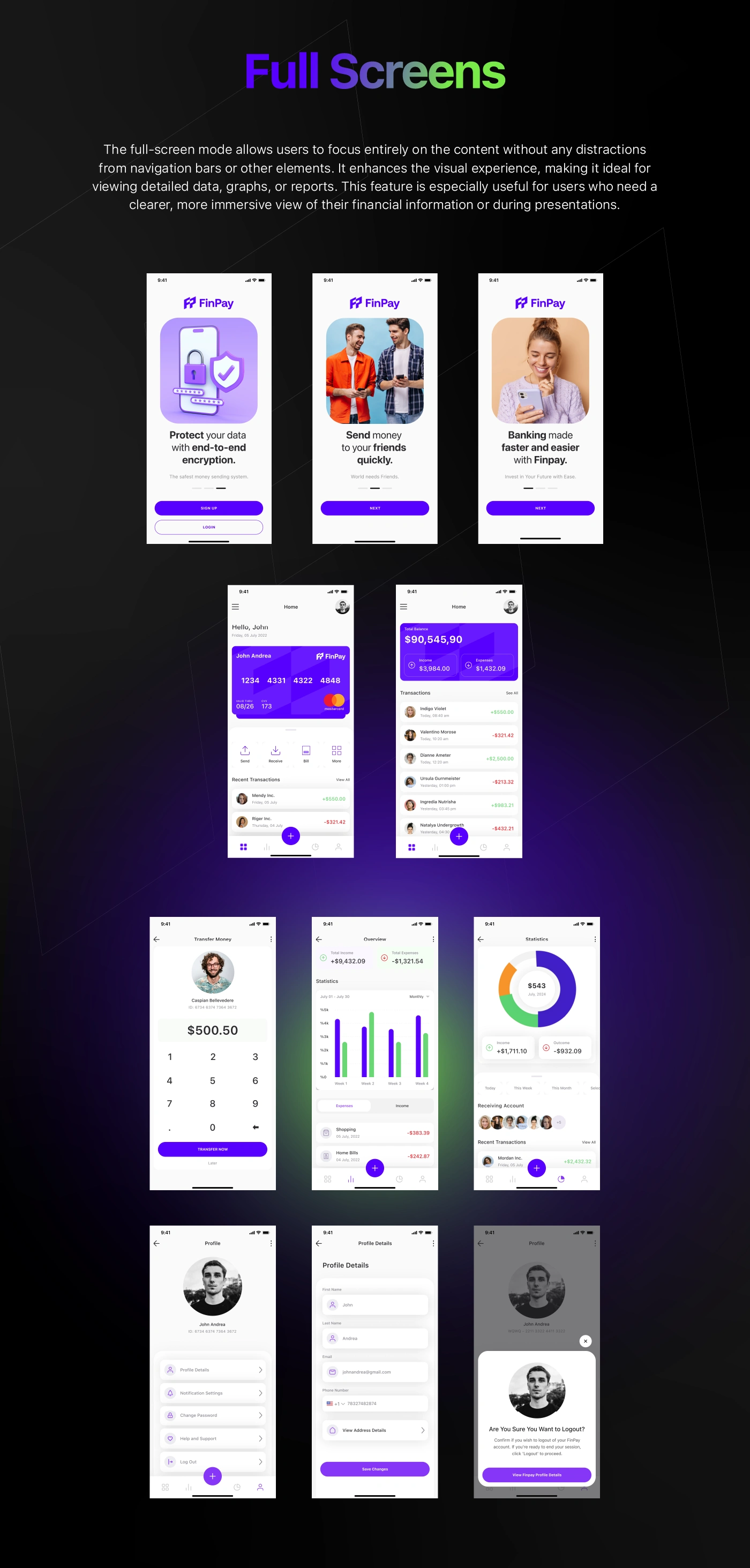
Short onboarding screens explain the value in three steps, then lead straight to a virtual card that is ready for online and in-store payments.
FinPay onboarding
FinPay virtual card
Spending insights
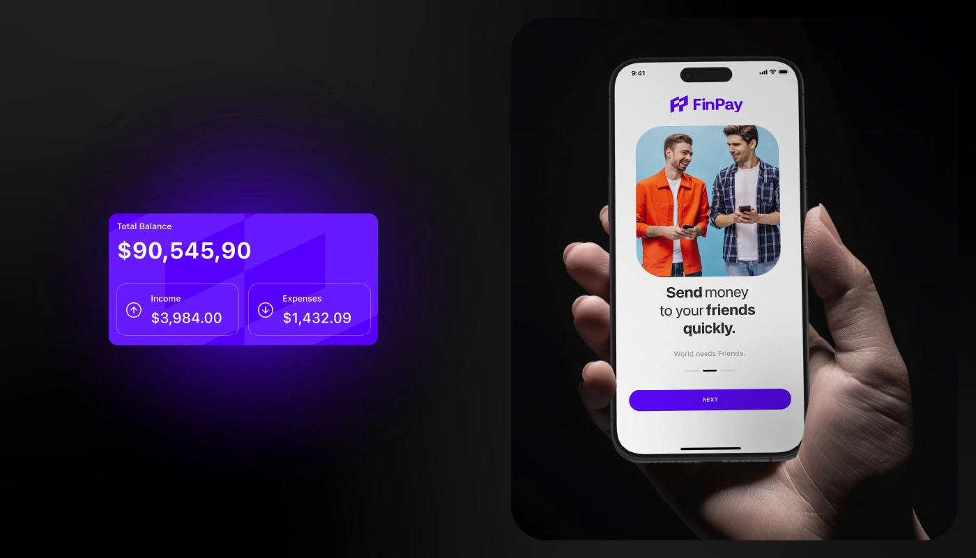
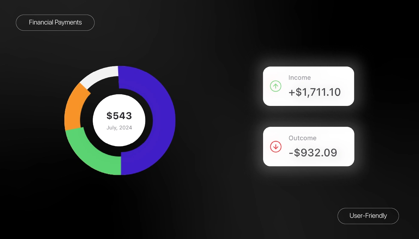
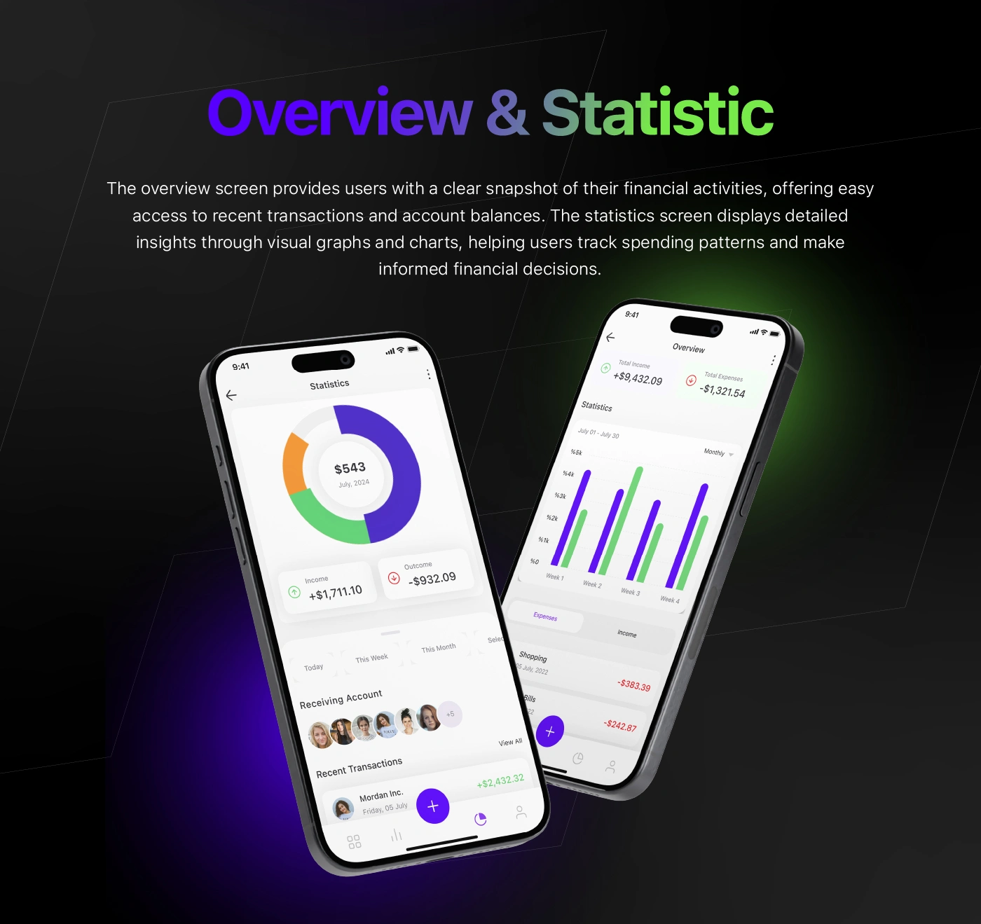
The home screen shows balance and recent activity up front, while a simple donut chart splits income and expenses so people understand where their money actually goes.
FinPay spending insights
Payments made simple
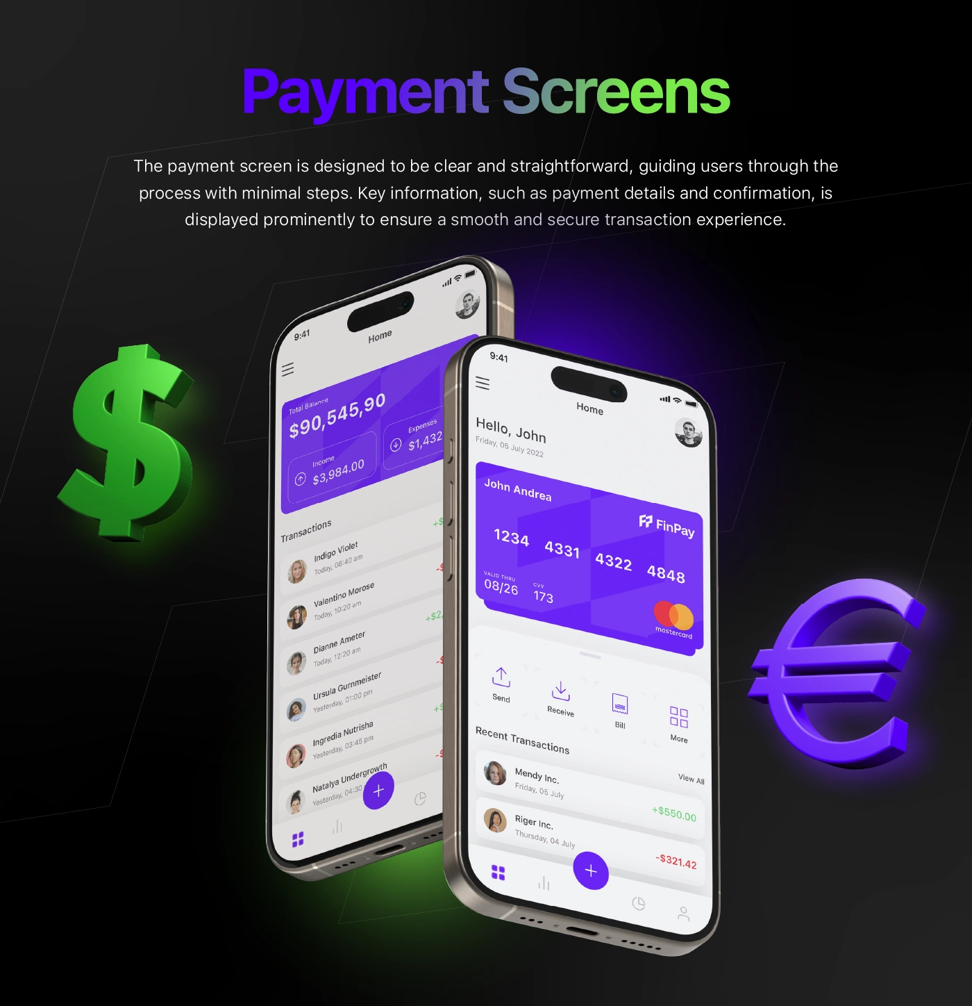
Sending money, paying bills and tracking spending each take only a few taps. Clear amounts, colour-coded income and expense charts and instant confirmations keep people in control of every transaction.
FinPay payments
FinPay transactions
Send to anyone
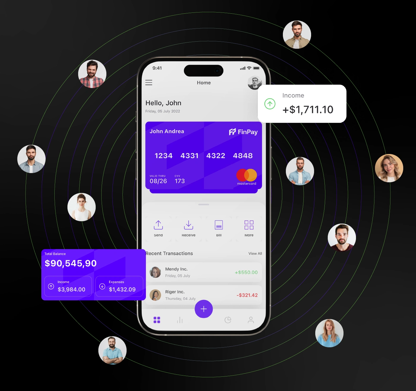
Frequent contacts orbit the balance, making it effortless to send money to friends in a tap. Off screen, the identity extends to caps, flags and signage with the same purple glow.
FinPay send money
FinPay brand in the world
Login and statistics
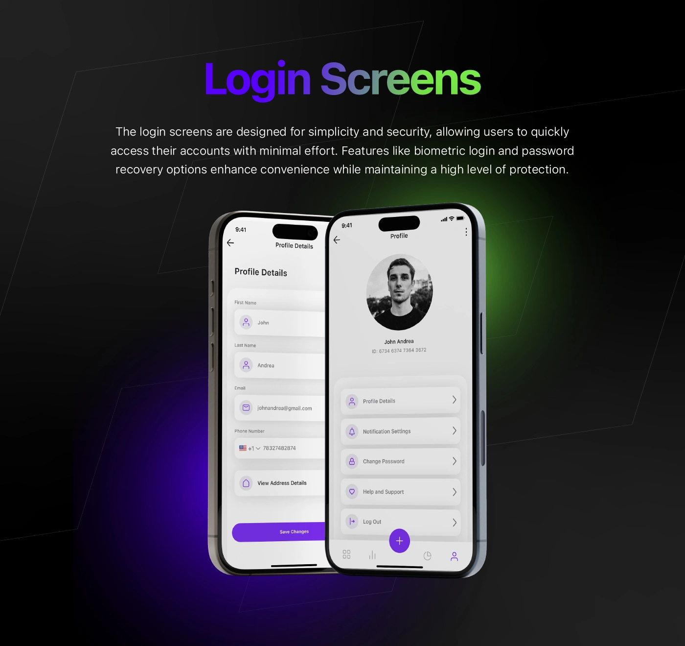
Login takes a single step with biometric options, while the statistics view turns spending into clear weekly charts and category breakdowns that are easy to read at a glance.
FinPay login and statistics
My role: brand identity, UI/UX design, art direction, motion design and editing.
Credits: mockups by Betush (Envato). Non-commercial concept, made for personal development.
0 likes · 1 view · Nov 15, 2026
Brand film and UI/UX case study for FinPay, a concept mobile payments app.


