
A 25-second brand film for NOVHUB, a software solutions company.
The NOVHUB letters resolve out of a code rain, the wordmark is built on a construction grid and turns into the N01 monogram, and the film moves through the brand's themes (Global, Connection, Software), its data, network and code visual language, the typography (Titillium Web and IBM Plex Sans), and a 12-shot montage of brand applications.
Delivered in 16:9 and 9:16 at 30 fps, every transition on the beat.
My role: brand identity, art direction, motion design and editing.
Music: generated with AI (Google Lyria 3), created specifically for this film.
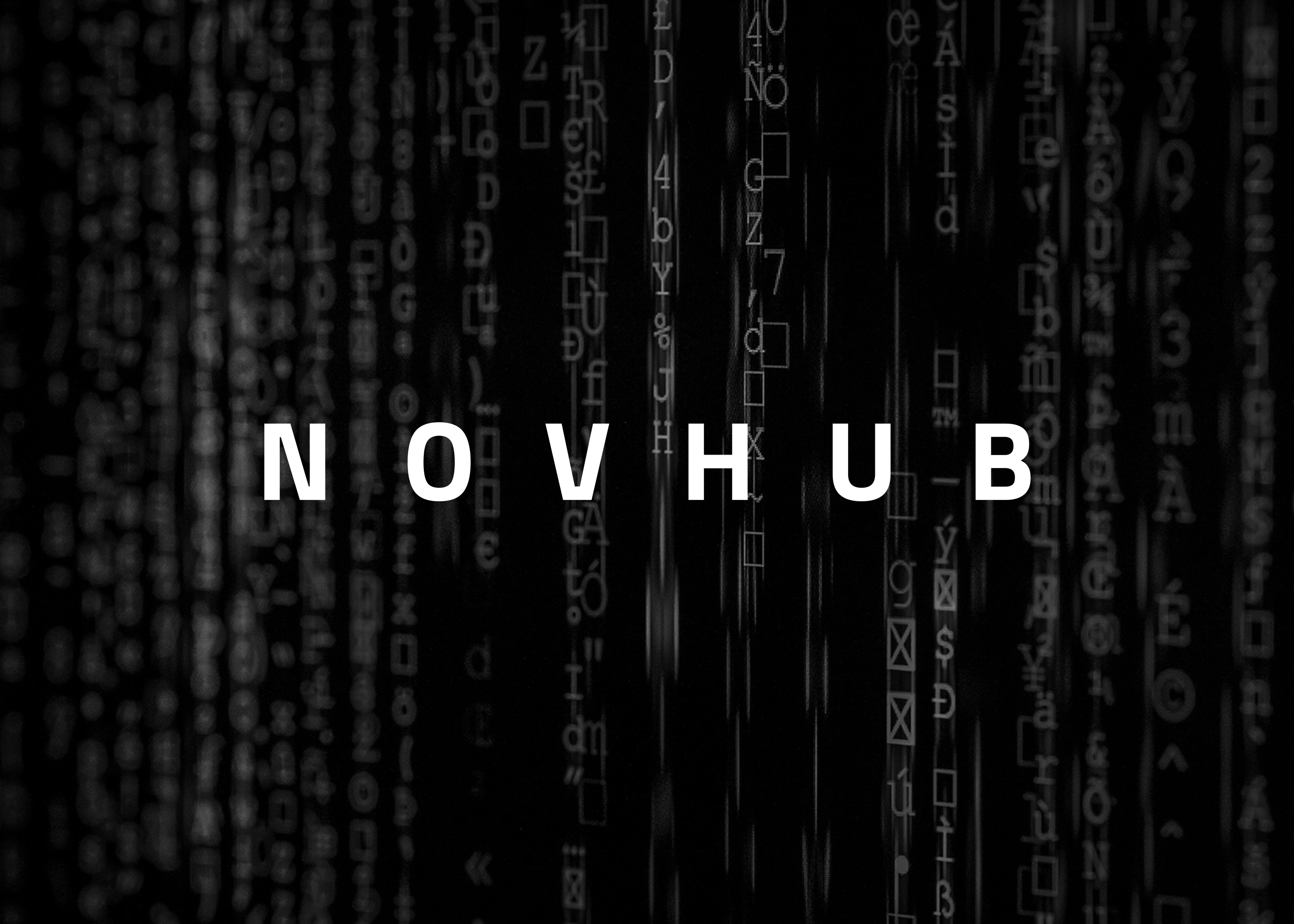
BRAND IDENTITY · Novhub Software
Novhub is a software company building global, connected solutions. The identity was designed to feel precise, technical and calm, with a monochrome palette, generous spacing and a wordmark that reads like code on a screen.
Role: Brand Identity, Art Direction
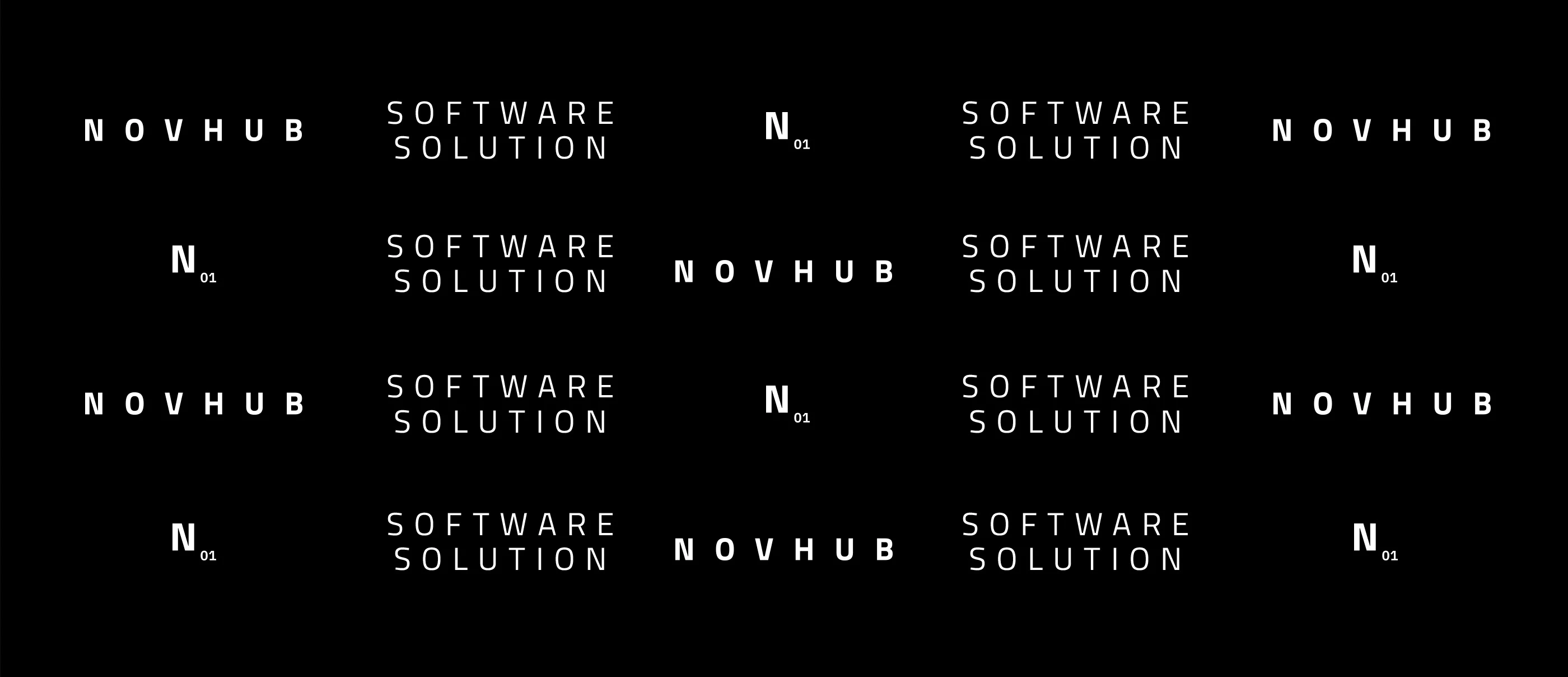
A SYSTEM OF SYMBOLS
A grid of simple symbols and spaced-out capitals forms the base of the identity, a calm, modular language inspired by code and interfaces.
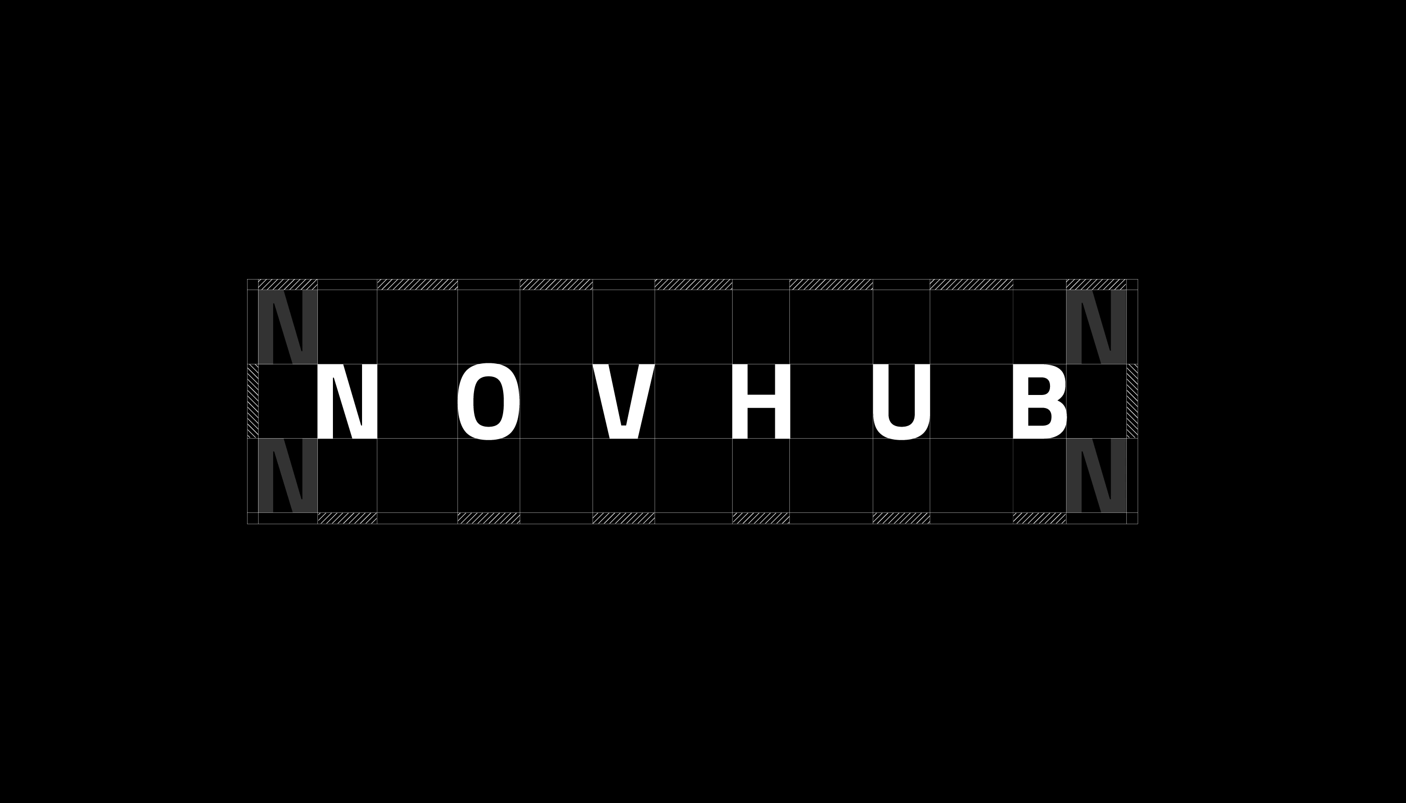
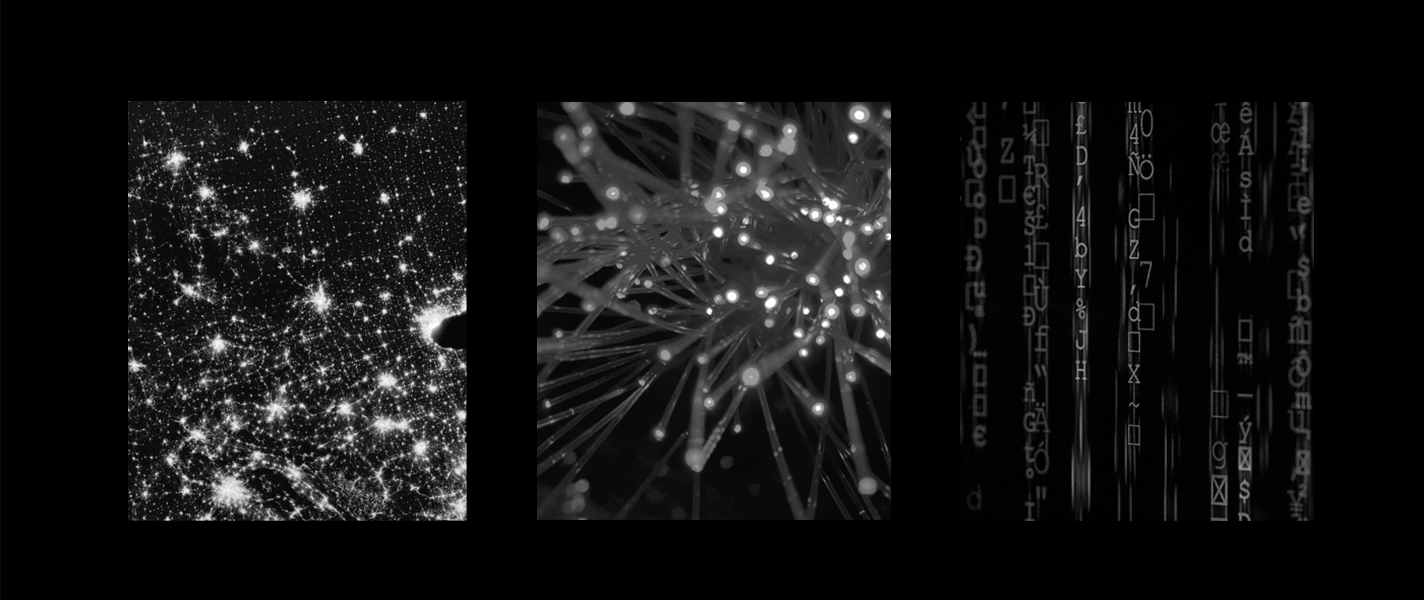
TEXTURE OF DATA
Noise, scan lines and pixel textures are used as background images, a visual metaphor for the flow of code and data behind every product.
CONCEPT
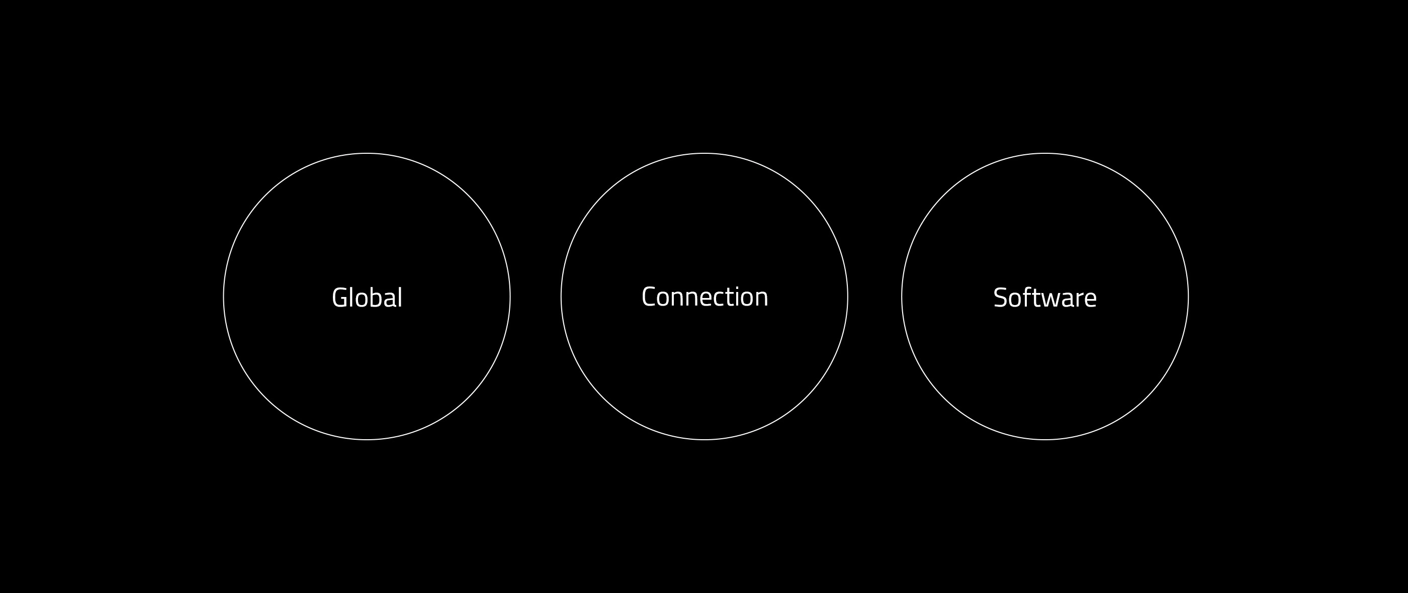
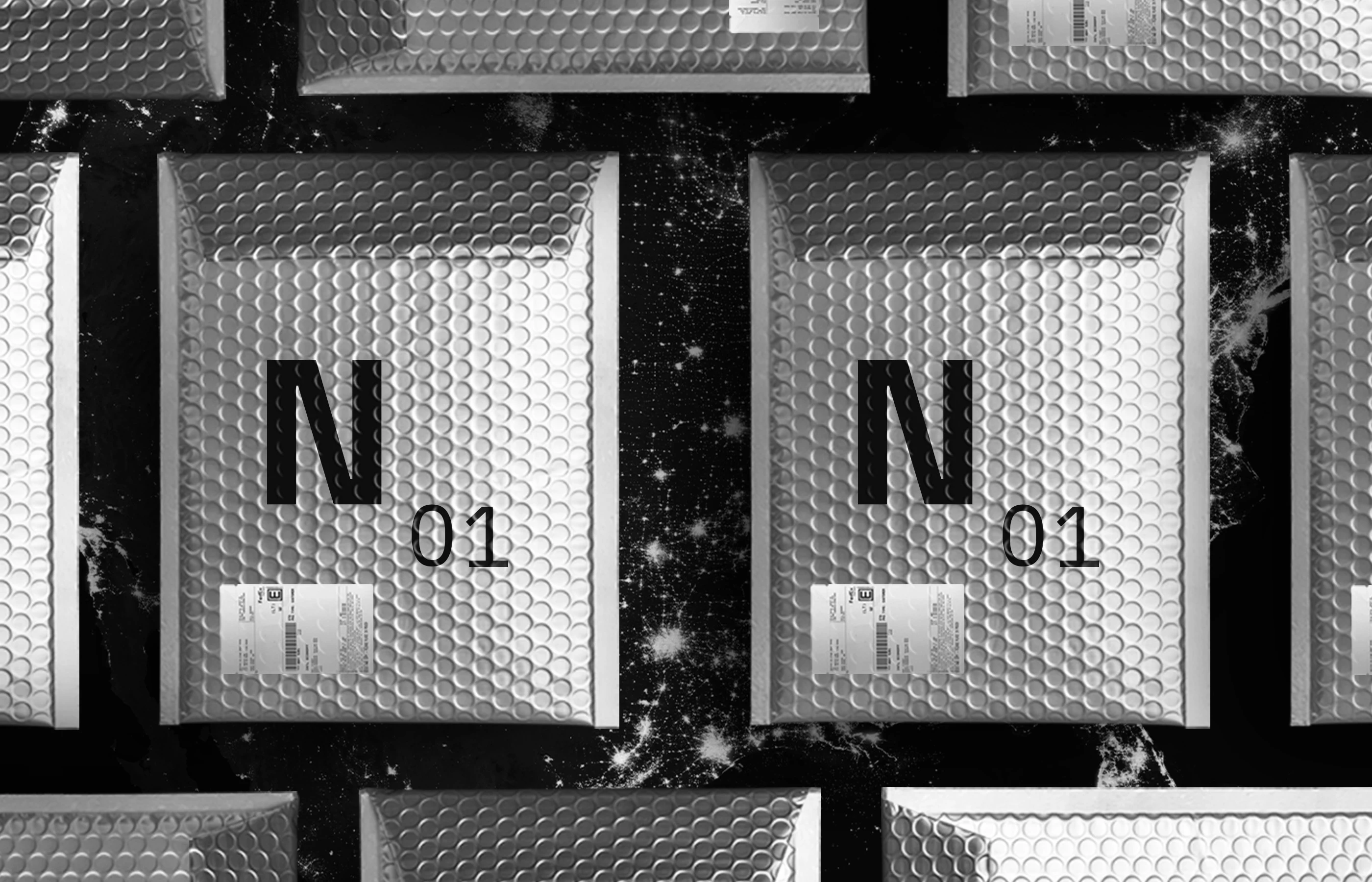
Three ideas shaped the brand: Global, Connection and Software. They come through in imagery of networks and light, and in a compact N symbol that works as a mark on products and packaging.
TYPOGRAPHY
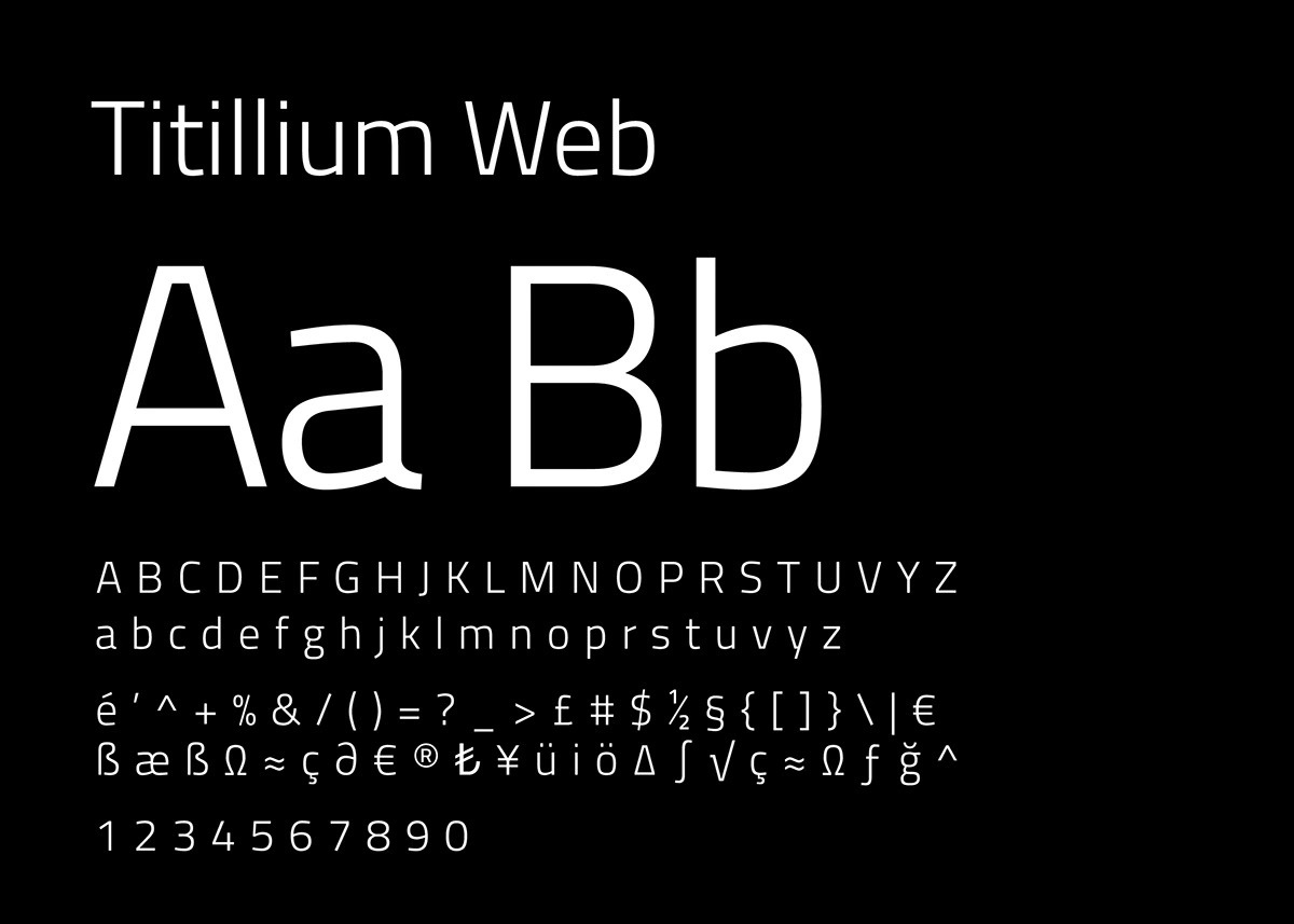
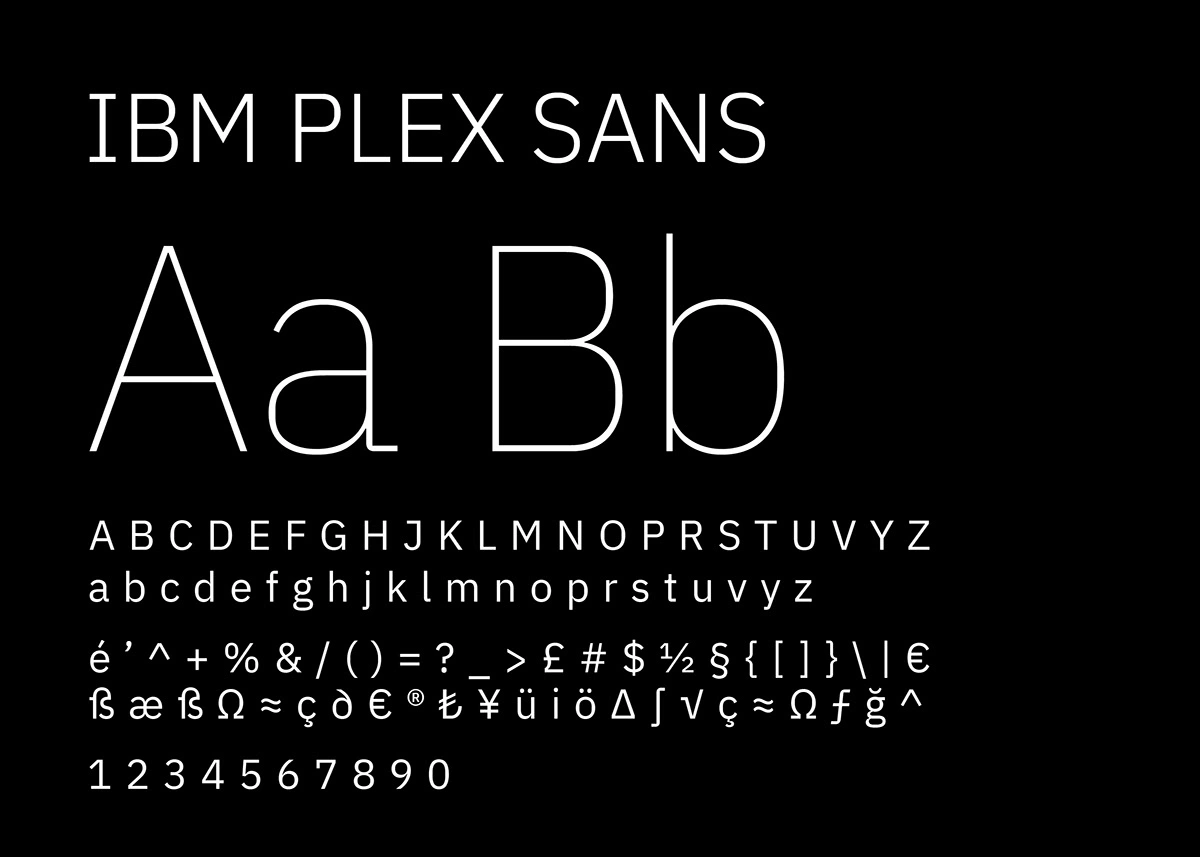
Titillium Web gives the brand its engineered, modern headlines, while IBM Plex Sans keeps body text clear and readable across documents and interfaces.
IN THE OFFICE
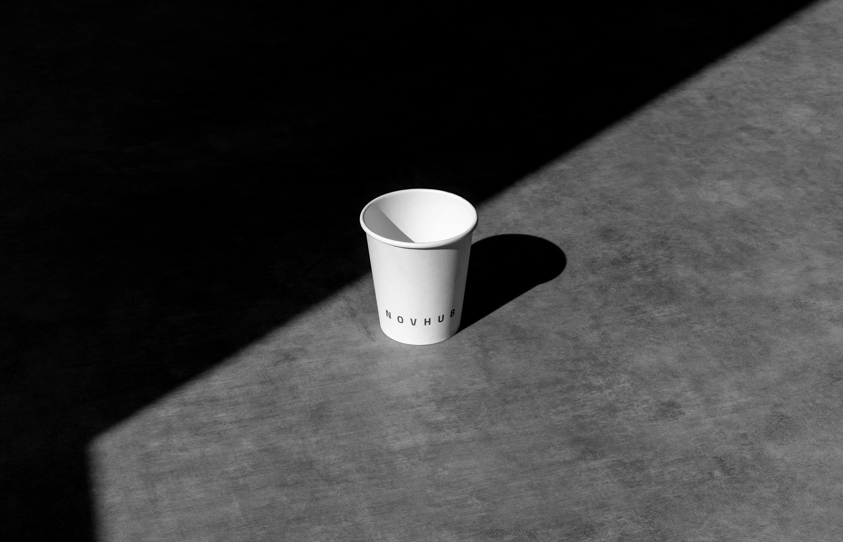
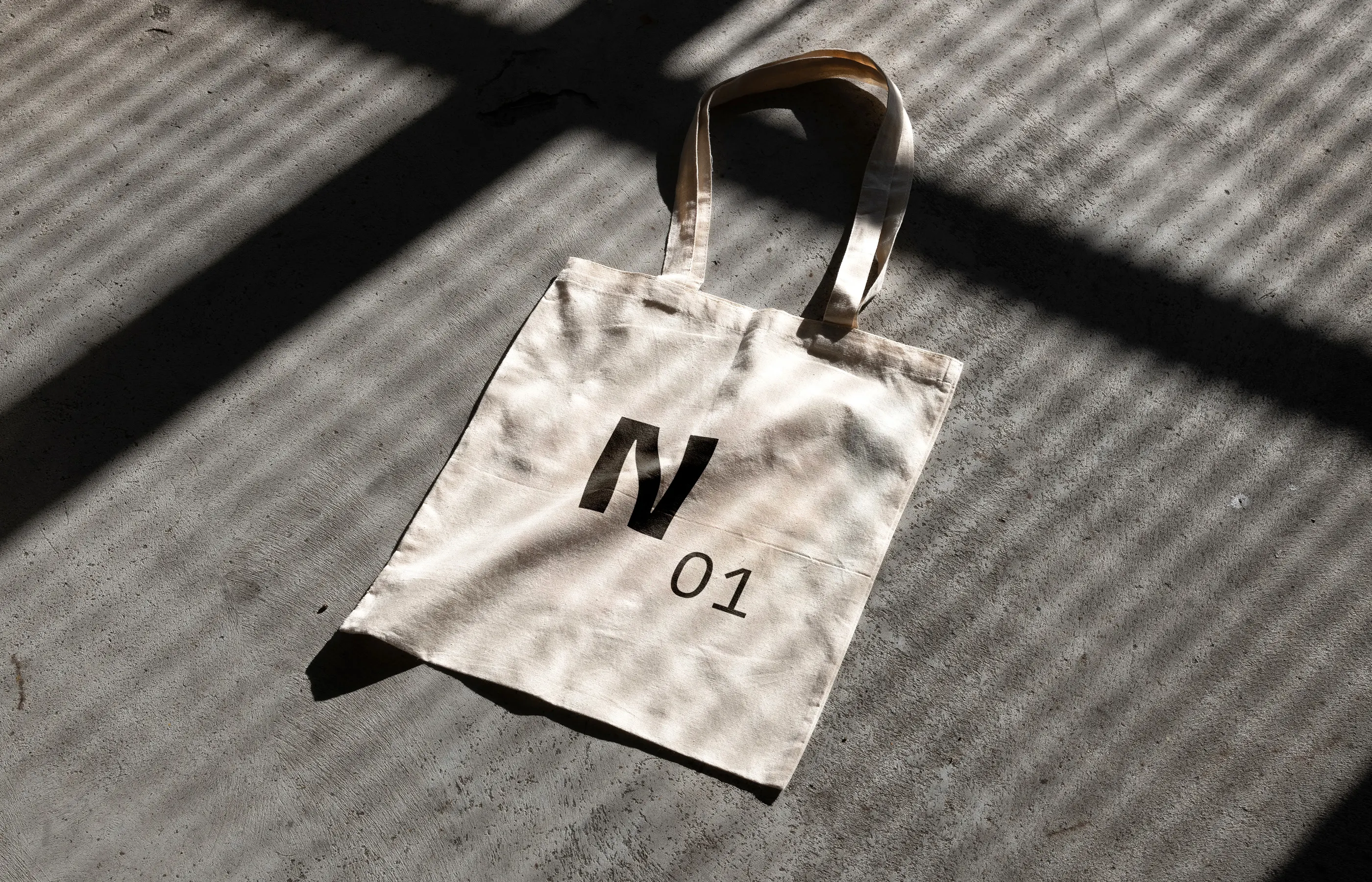
Mugs, bags and posters bring the identity into everyday office life, photographed in strong light and shadow for a calm, architectural mood.
STATIONERY
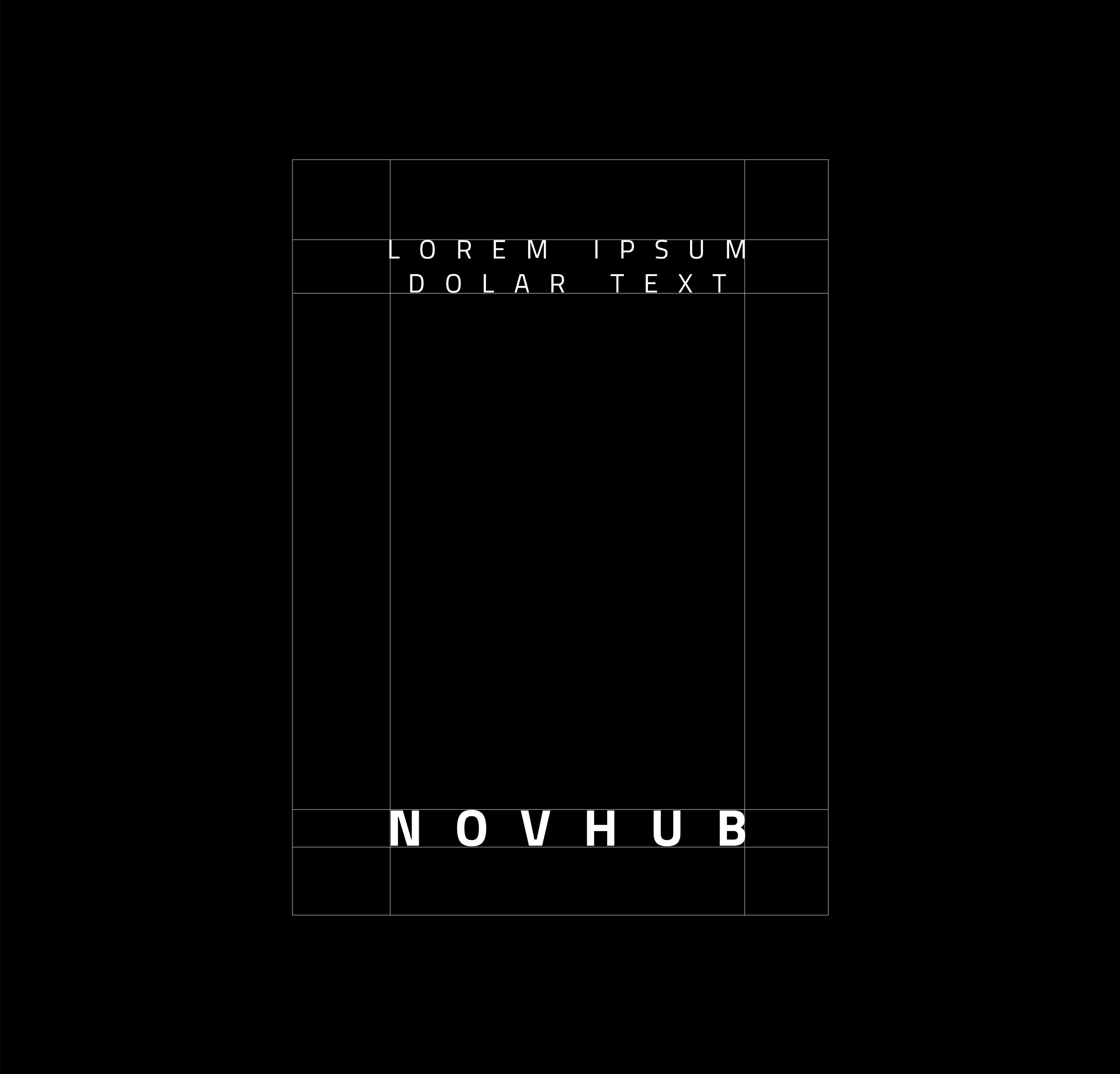
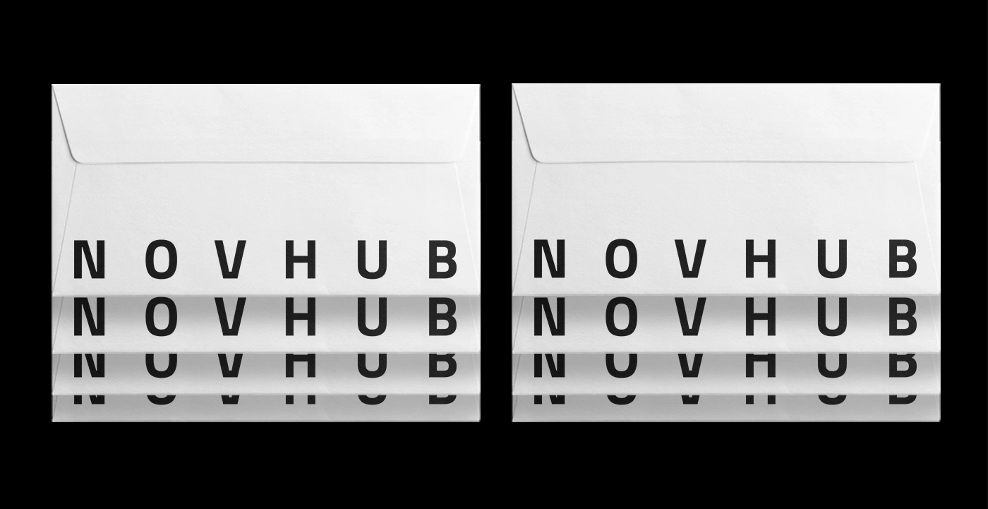
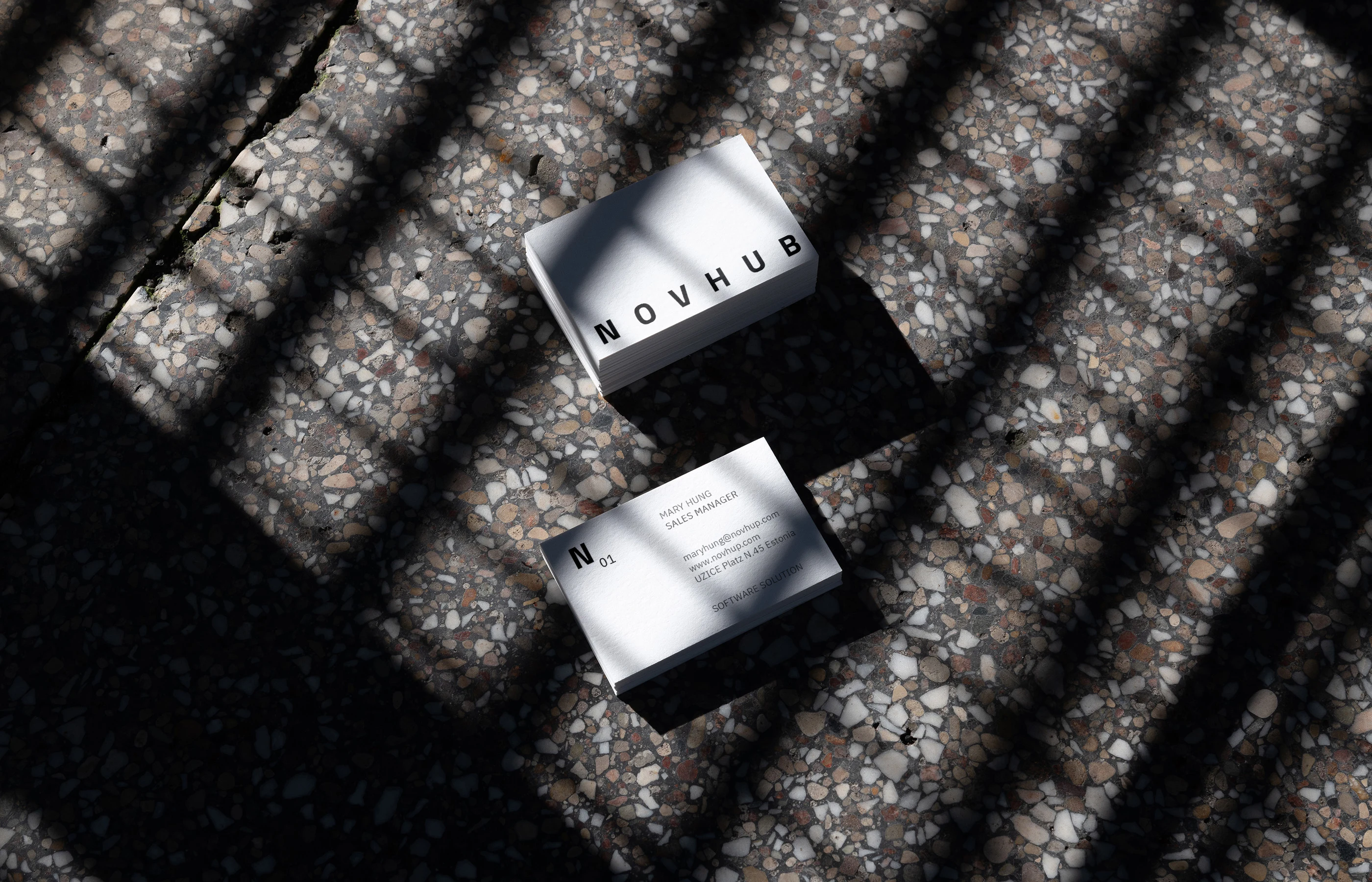
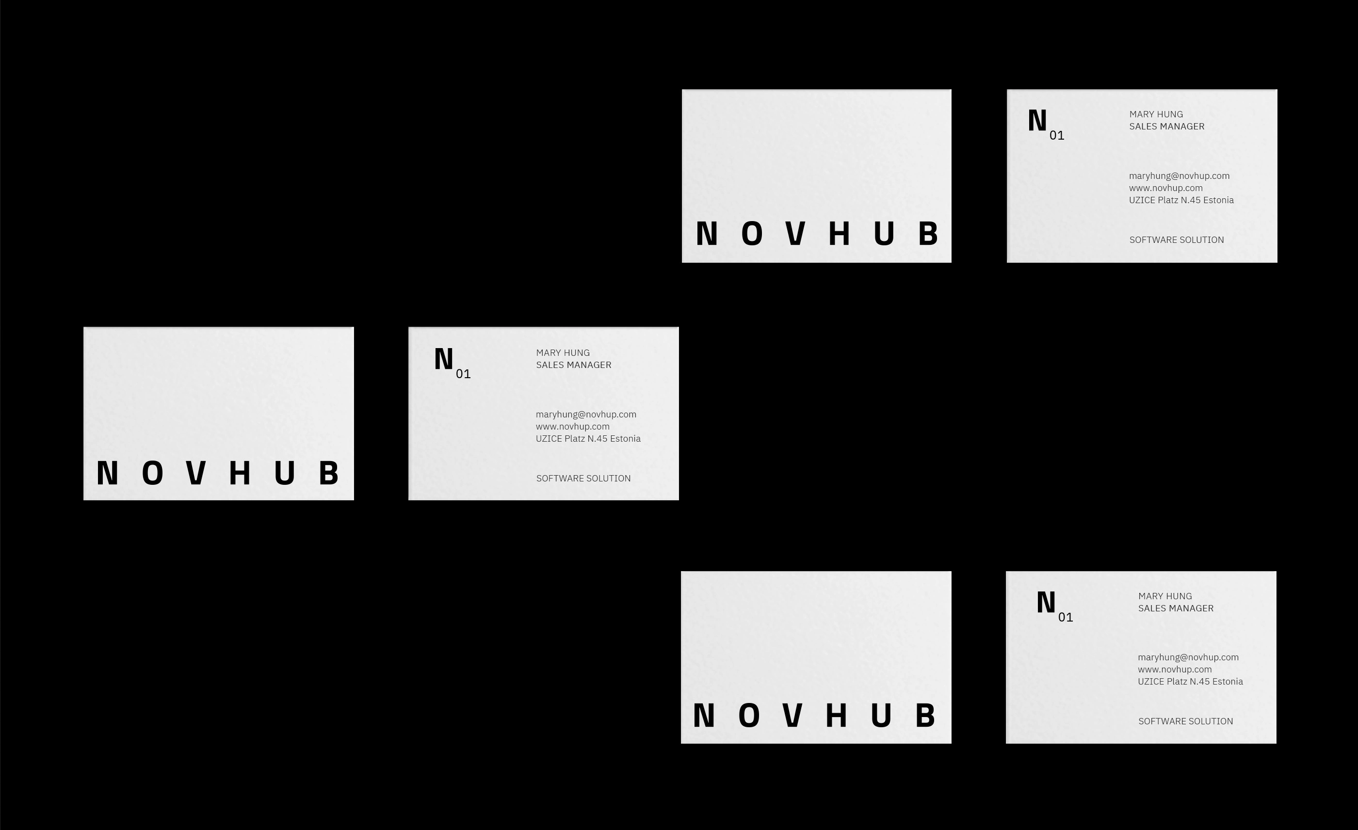
Letterheads, envelopes and cards combine wide-spaced capitals with a large N monogram, clean, structured and easy to recognise.
BRAND IN USE
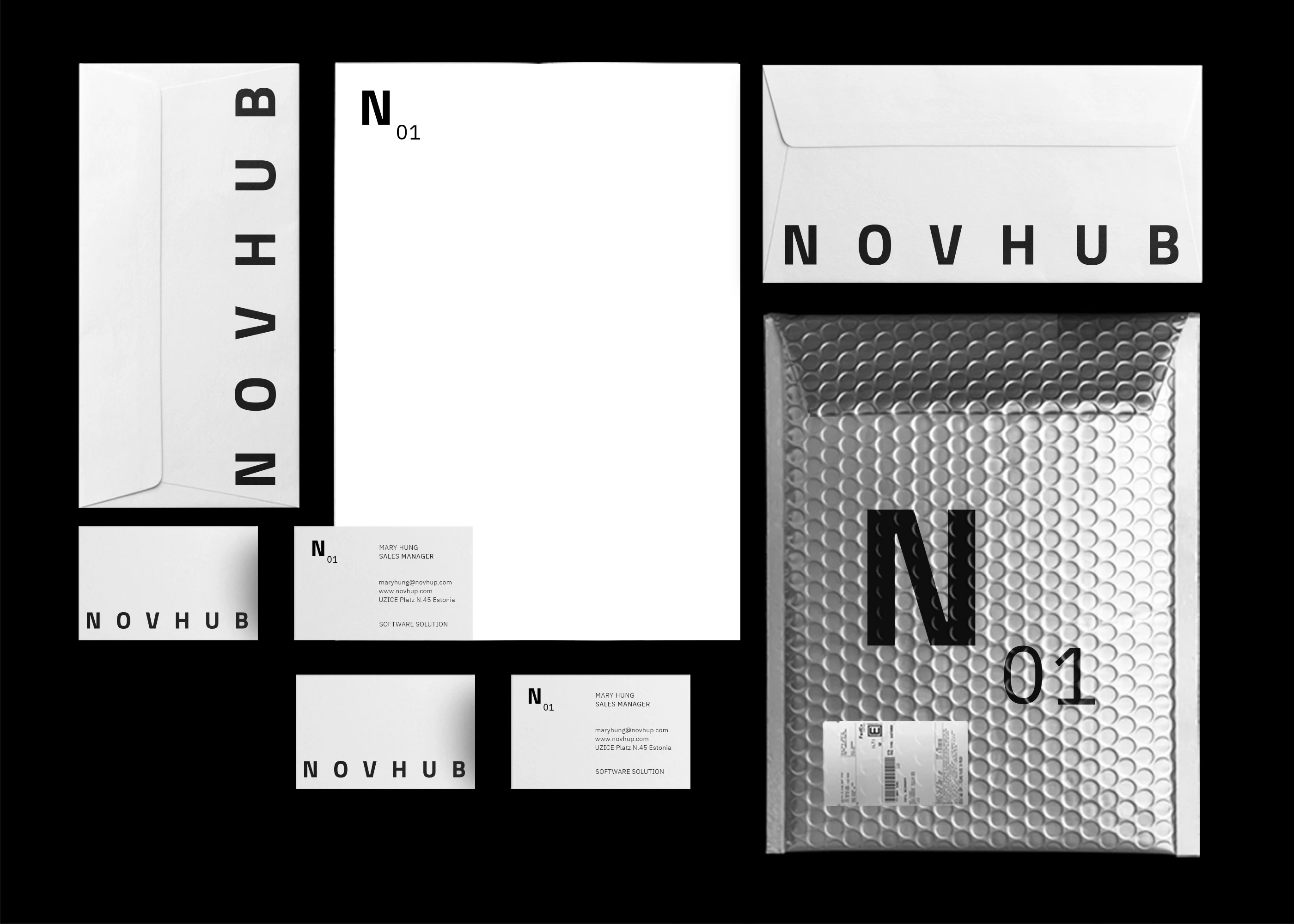
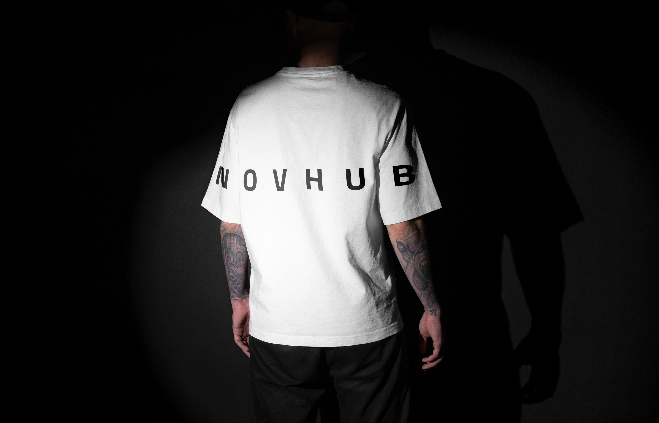
Stationery, envelopes, tote bags, apparel and packaging carry the same black and white system, with numbered N01 details adding a product-like feel.
BADGES & ID
Numbered N badges and access cards borrow the look of server labels, a subtle nod to the software world Novhub works in.
OUT IN THE WORLD
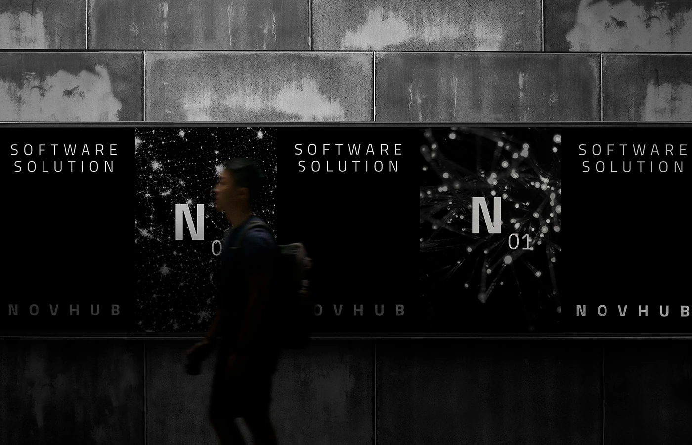
On t-shirts and large outdoor screens, the minimal black and white system feels confident and technical, standing out through restraint rather than colour.
0 likes · 0 views · Nov 15, 2026
Brand film for NOVHUB, a software company: wordmark, N01 monogram and the visual language I designed.


