
NOMA is a brand identity project for an architecture and construction studio, shaped around the connection between creative vision and the discipline of building. The identity combines a bold wordmark, precise typography and a restrained color palette to communicate clarity and confidence. Architectural imagery, concrete textures and directional light bring a sense of scale and materiality to the visual system.
The motion piece extends that identity through dynamic framing and purposeful transitions. Changes in scale reveal the strength of the wordmark while echoing the rhythm of architectural forms. Together, the static and moving elements present NOMA as a studio that carries ideas from the first concept through to construction.
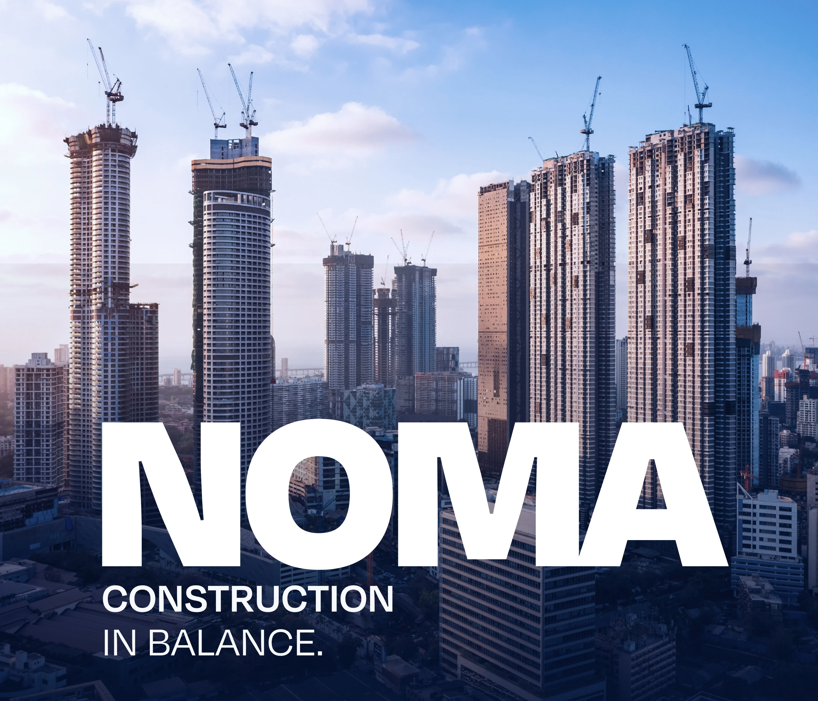
NOMA / STUDIO PROFILE
Architecture in vision. Excellence in construction.
We bring design, technical thinking and construction together, shaping every project from its earliest idea through to completion with a shared commitment to quality. NOMA represents a clear architectural vision supported by the expertise and discipline needed to build it well. Our approach connects ambitious ideas with practical decisions at every stage, giving each space, material and detail a clear purpose. The result is architecture defined by precision, integrity and lasting value, created for the people and places it serves.

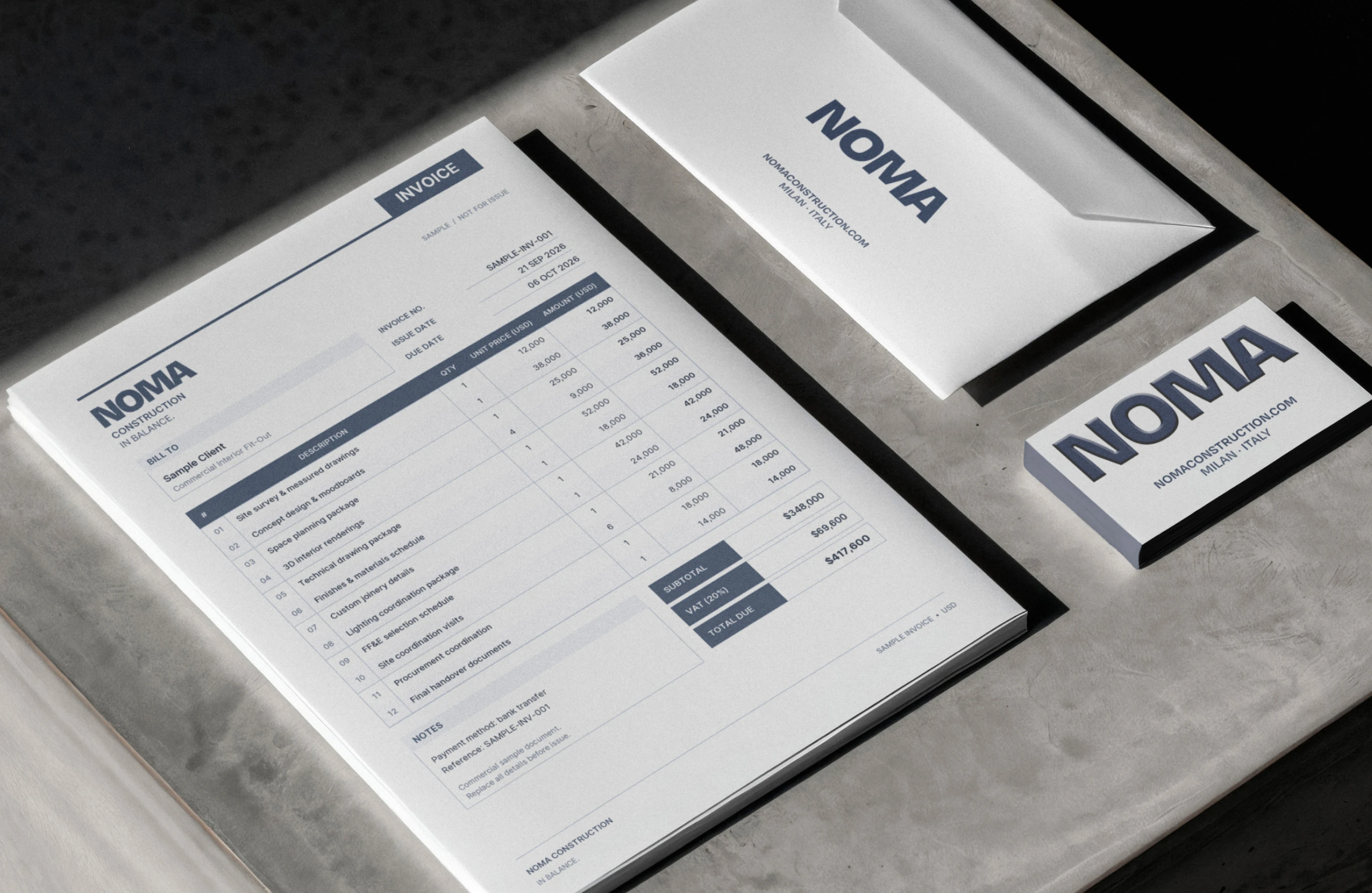
PRINT ESSENTIALS
Letterheads, envelopes and business cards are kept simple, with generous white space and the wordmark placed with precision, reflecting the order and care NOMA brings to every project.
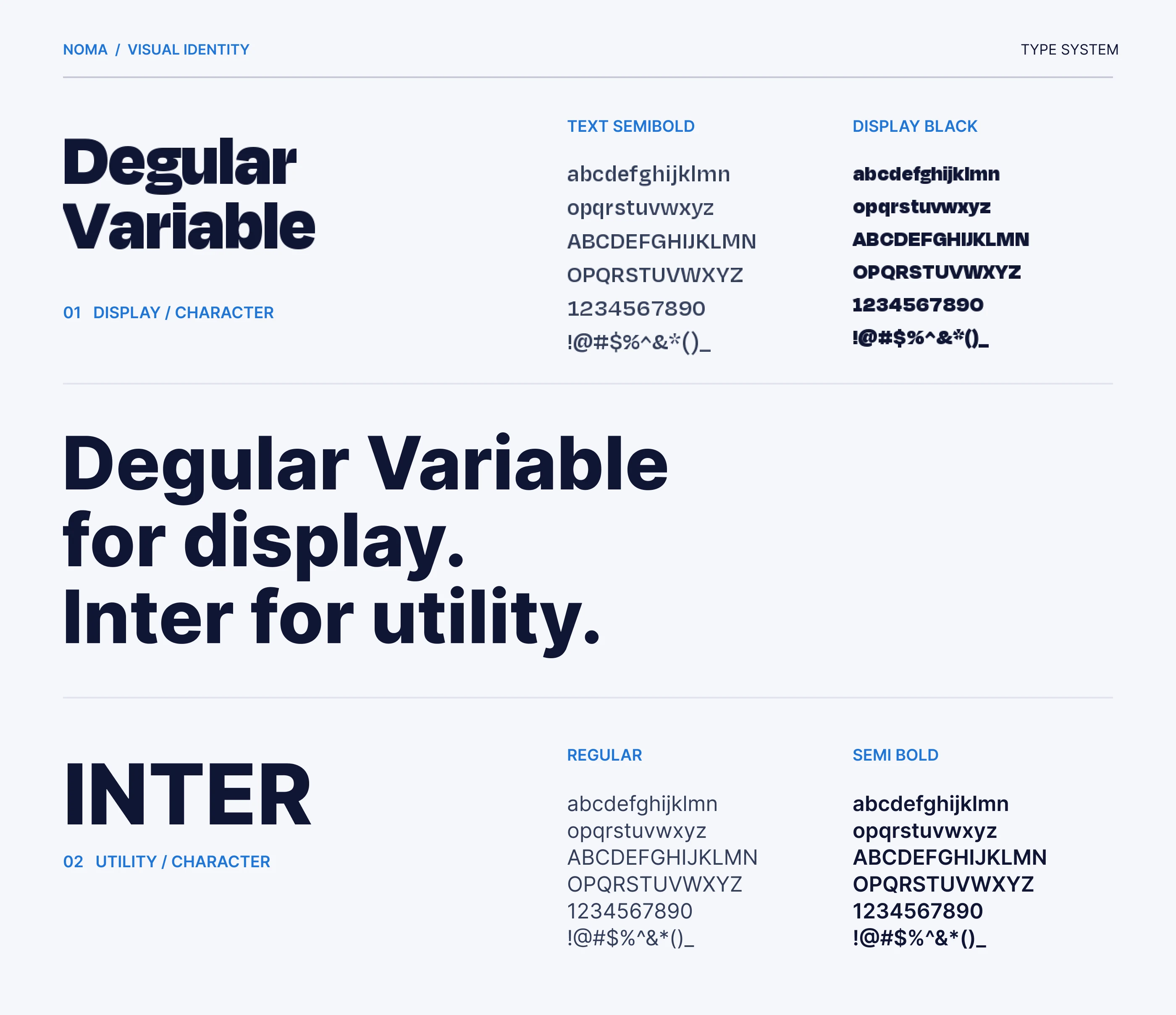
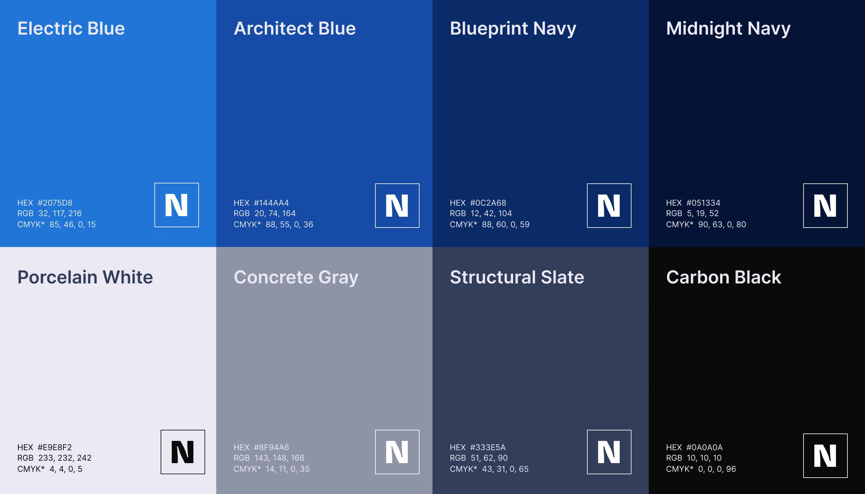
TYPE & COLOUR
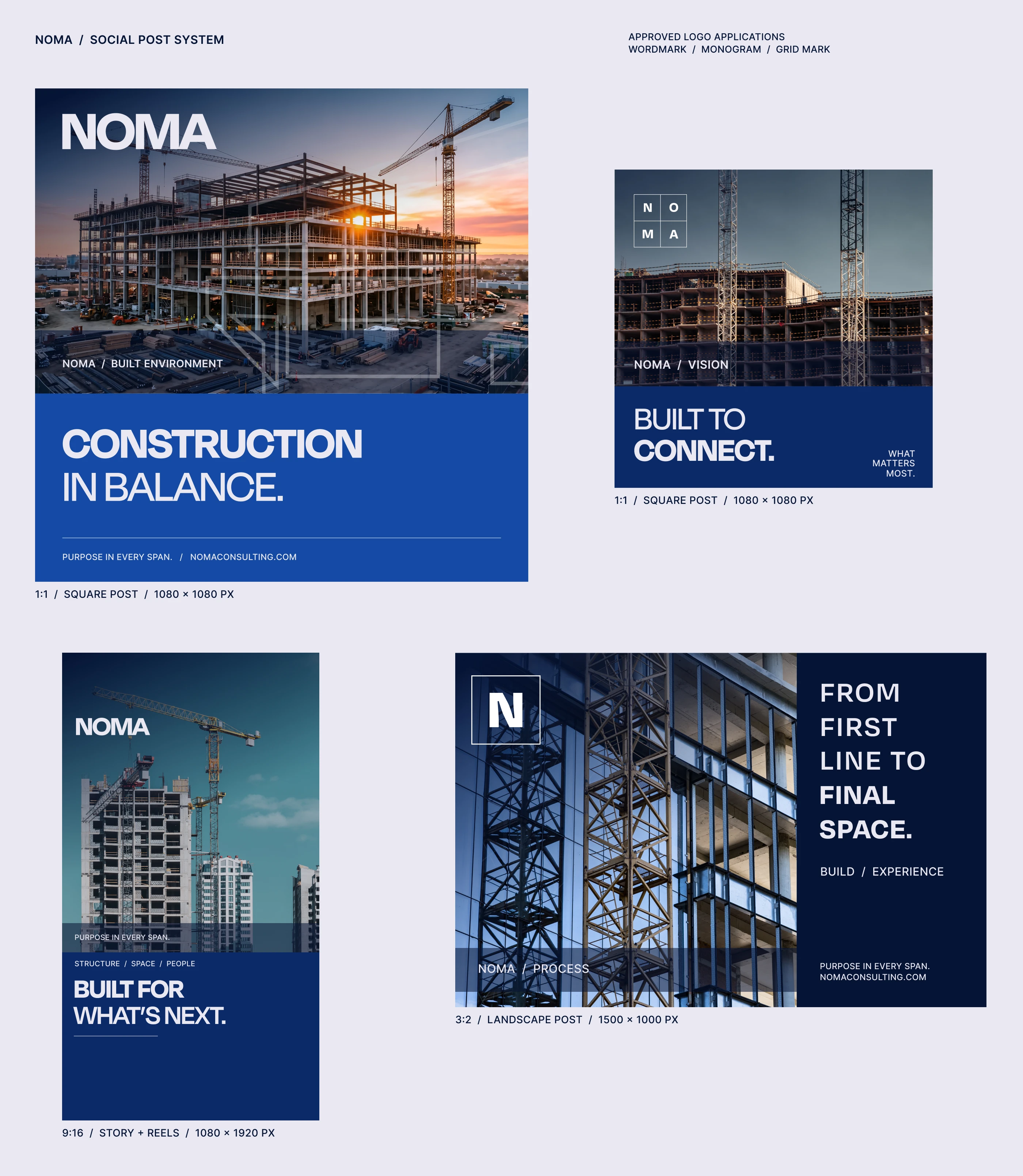
Degular Variable for display and Inter for utility give NOMA a confident yet practical voice. Construction blue, architect navy and midnight, balanced with concrete greys and white, make the palette feel engineered and trustworthy.
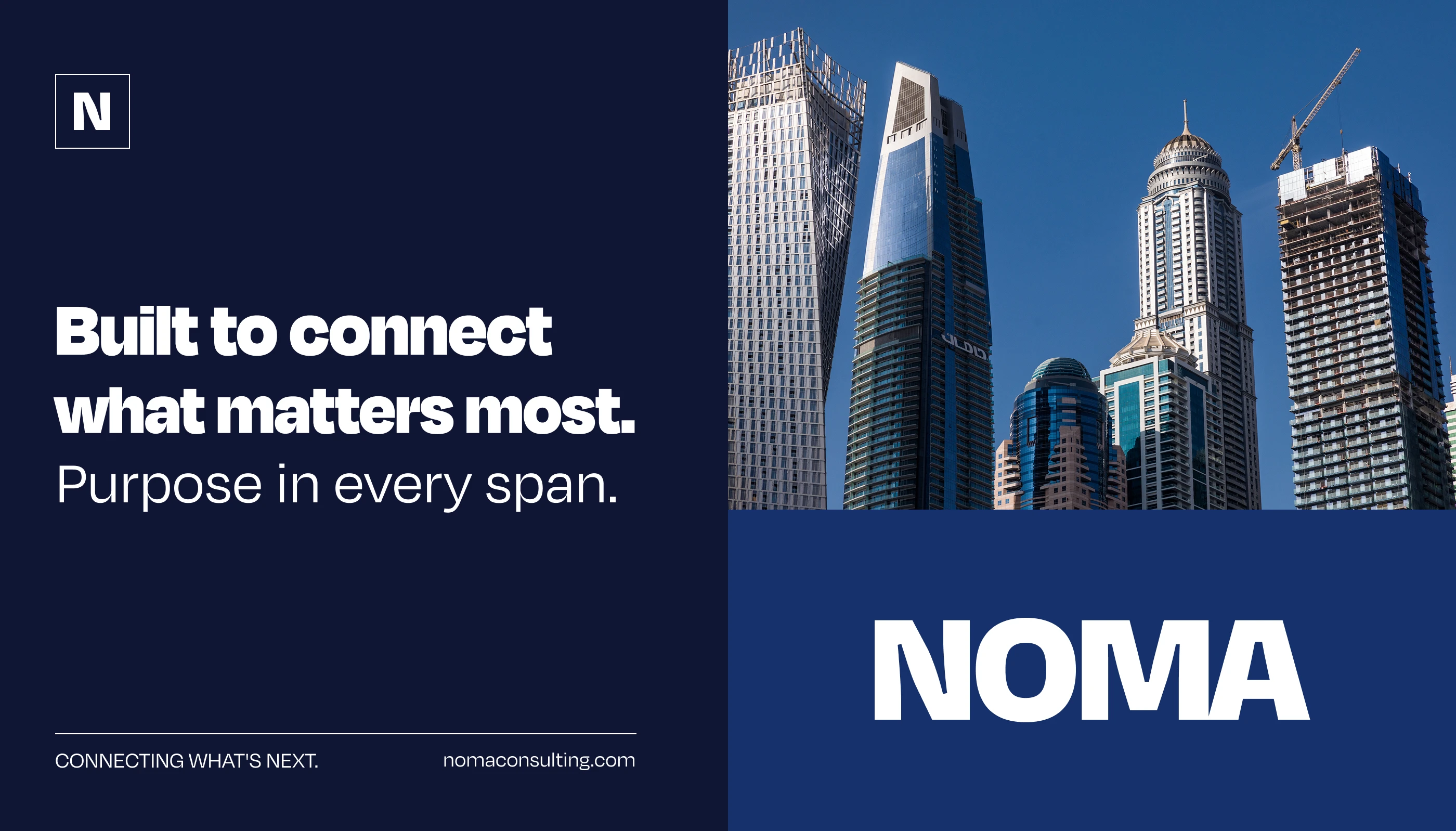
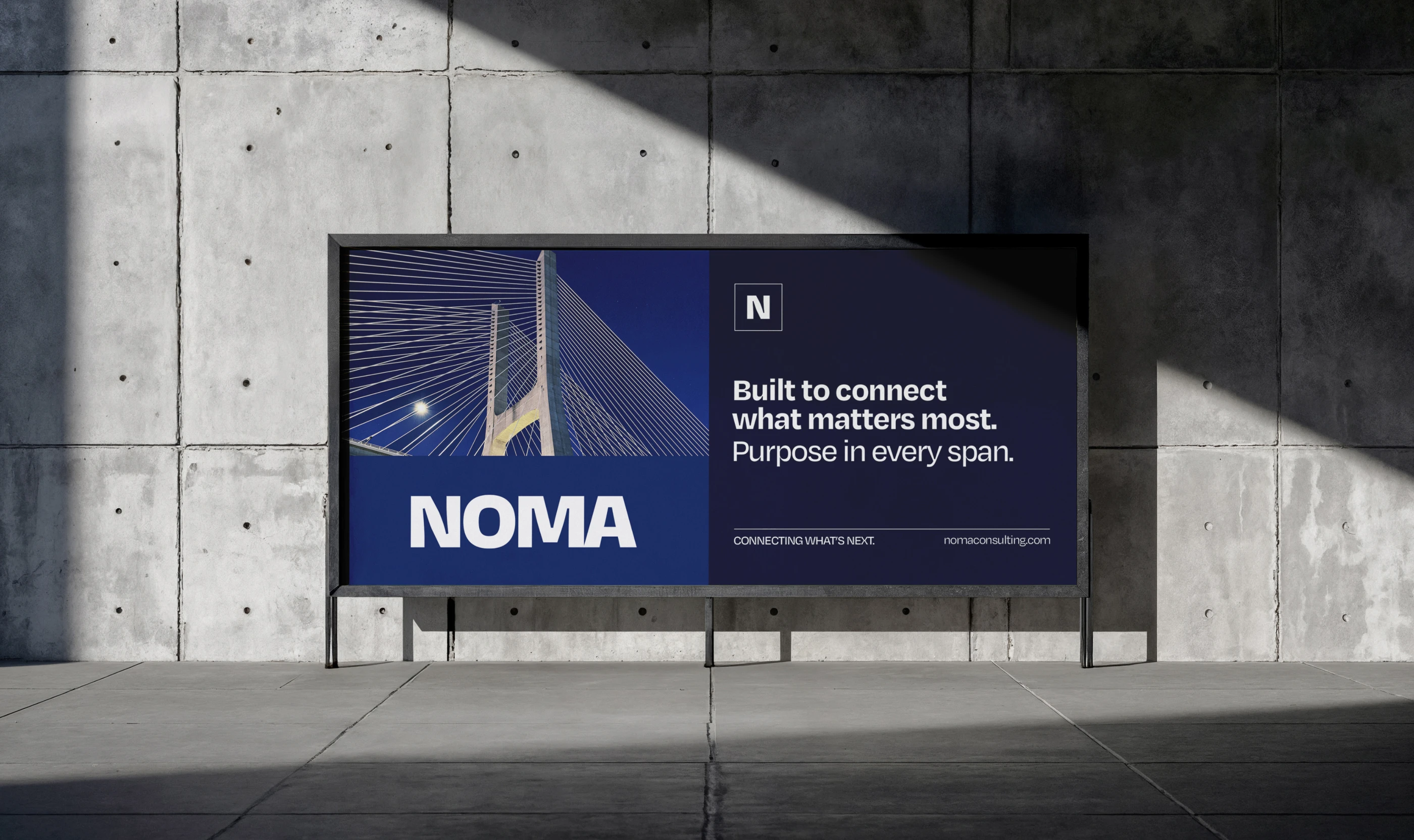
BOLD STATEMENTS
Lines like detail is a site discipline turn the company values into headlines. Large type over real construction photography gives billboards and signage a calm but confident tone.
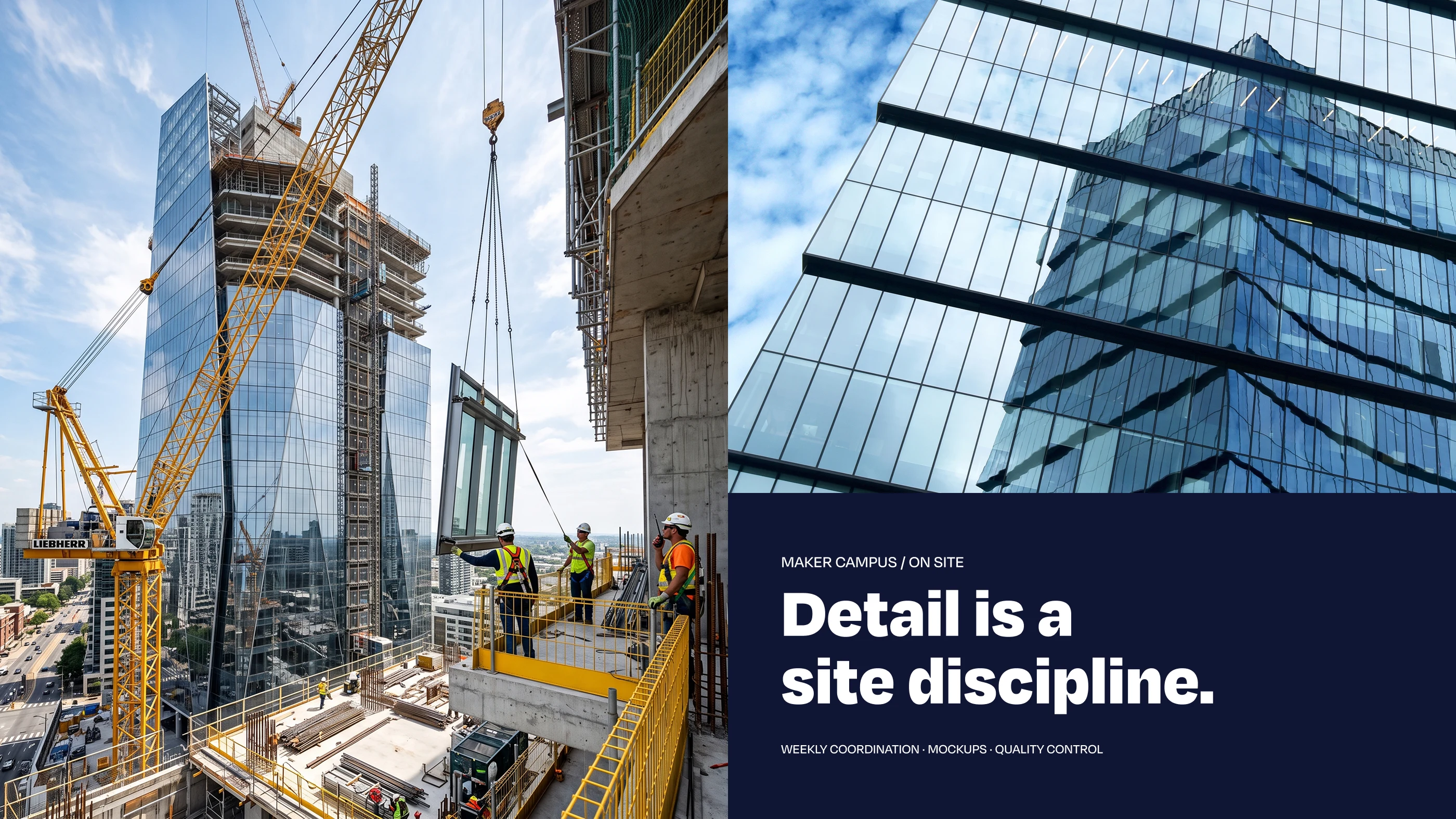
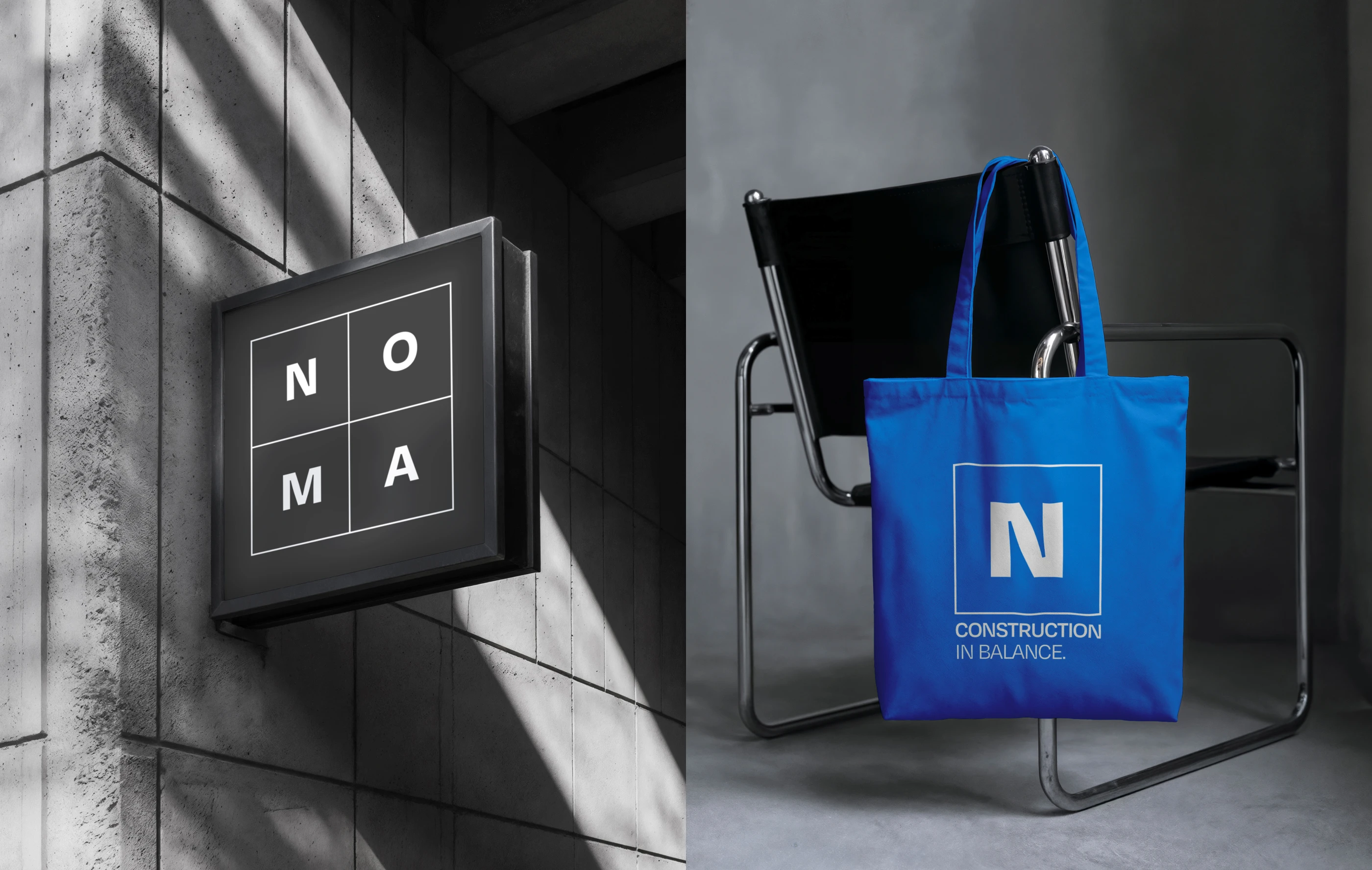
CAMPAIGN SYSTEM
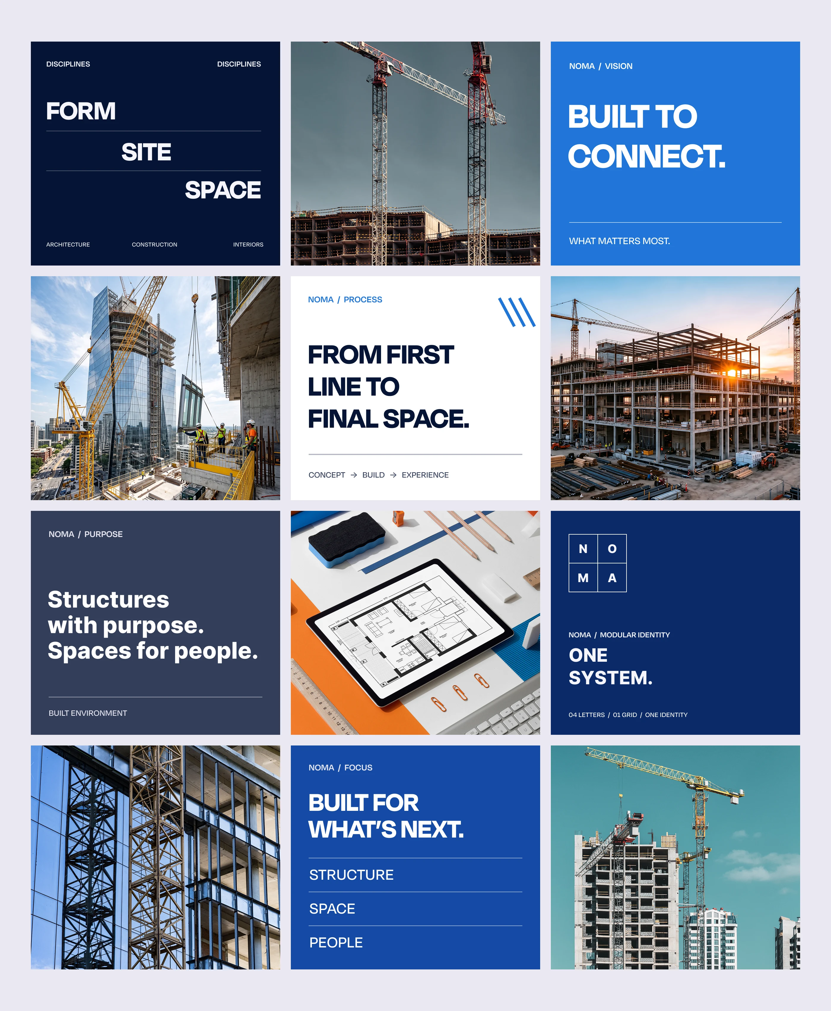
A modular grid of photography, deep blue panels and short, confident headlines lets the team produce posters, social posts and site hoardings quickly while every piece still feels like NOMA.
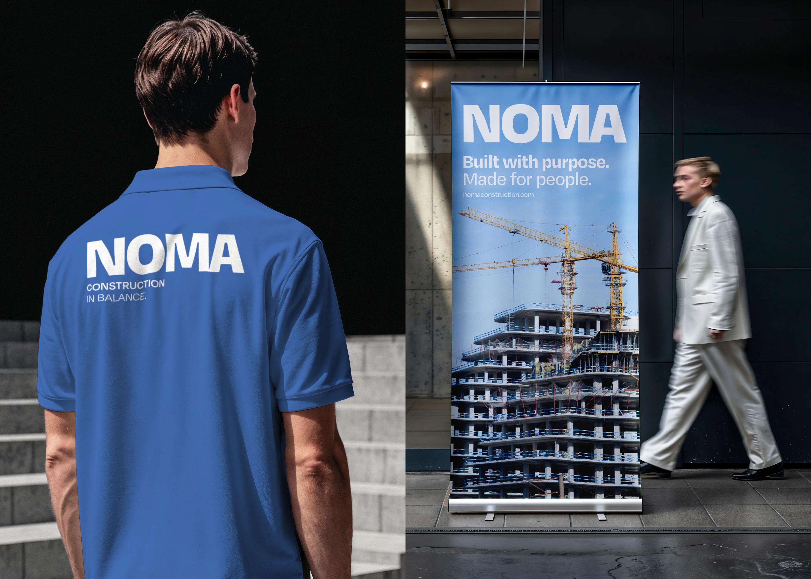
ON SITE
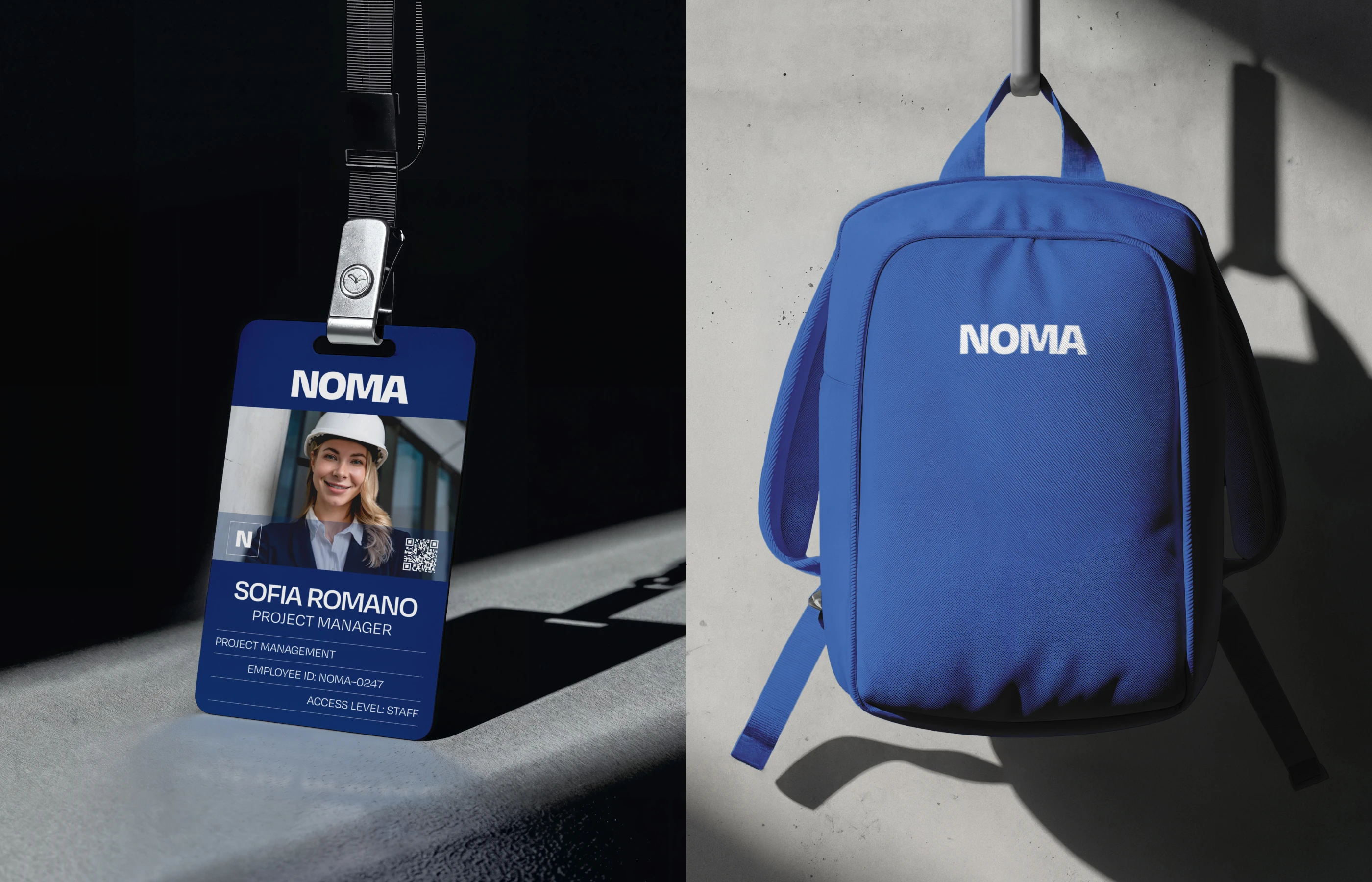
The system works hard in the real world: hoardings, banners, uniforms, hard hats, ID cards, bags and building signage all carry the same bold wordmark and modular grid.
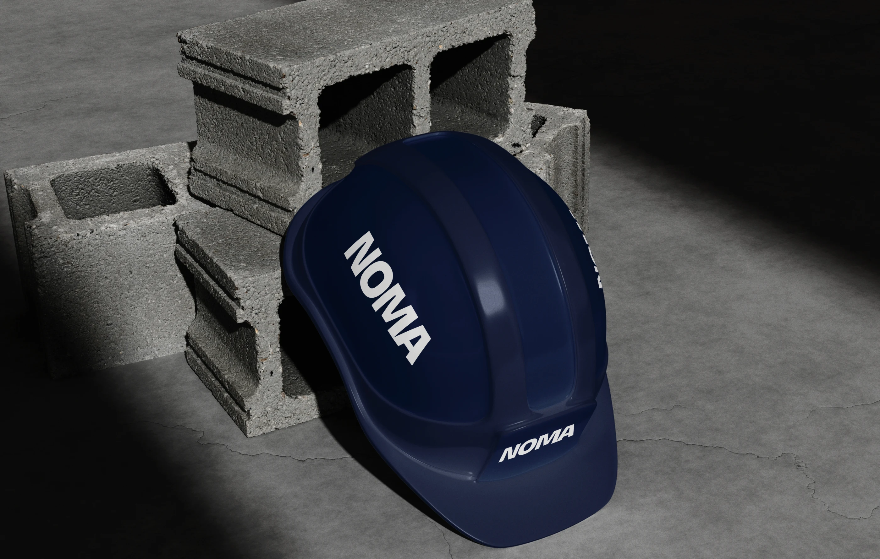
ON THE TEAM
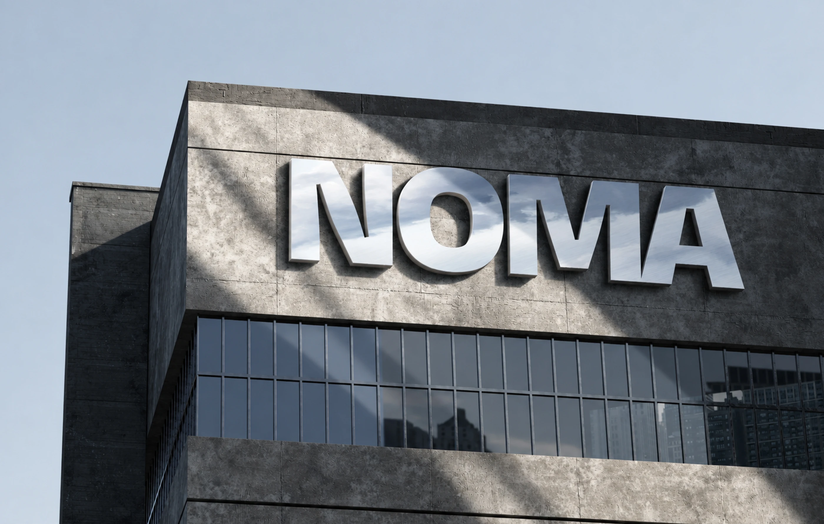
The mark travels with the people who build: on helmets, ID badges and backpacks, and finally in large dimensional letters on the facade, where the brand meets the finished building.
Music: generated with AI for this film (piano and strings, around 90 BPM, with cuts on the beat).
0 likes · 0 views · Oct 9, 2026
NOMA is a brand identity project for an architecture and construction studio, shaped around the connection between creative vision and the discipline of buil...
