All-around branding concept for a successful launch
Ela Agoston
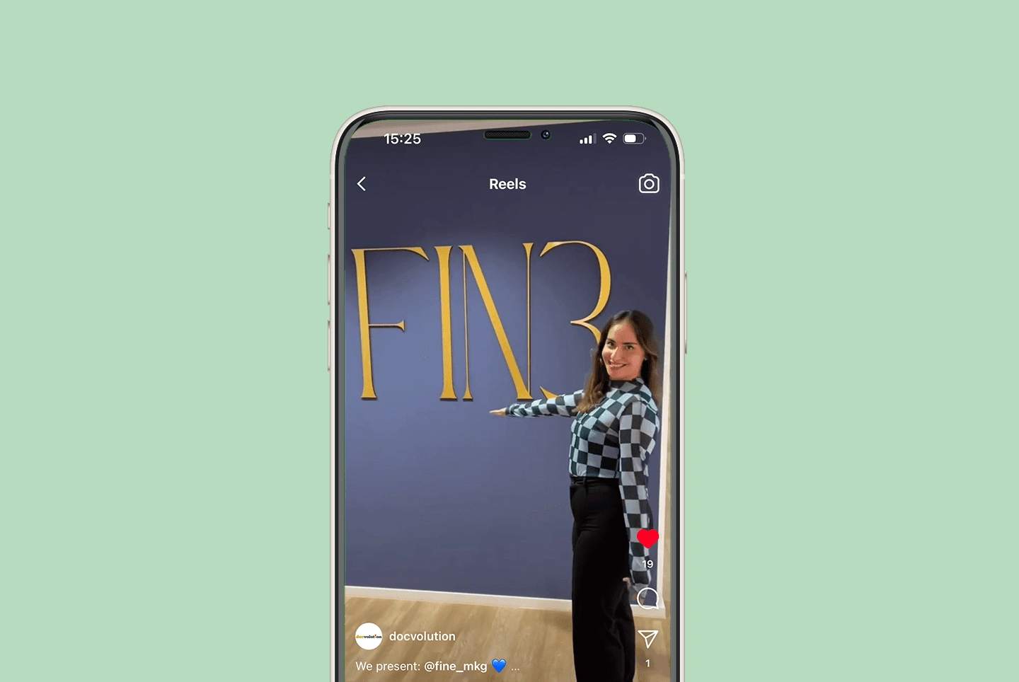
FINE
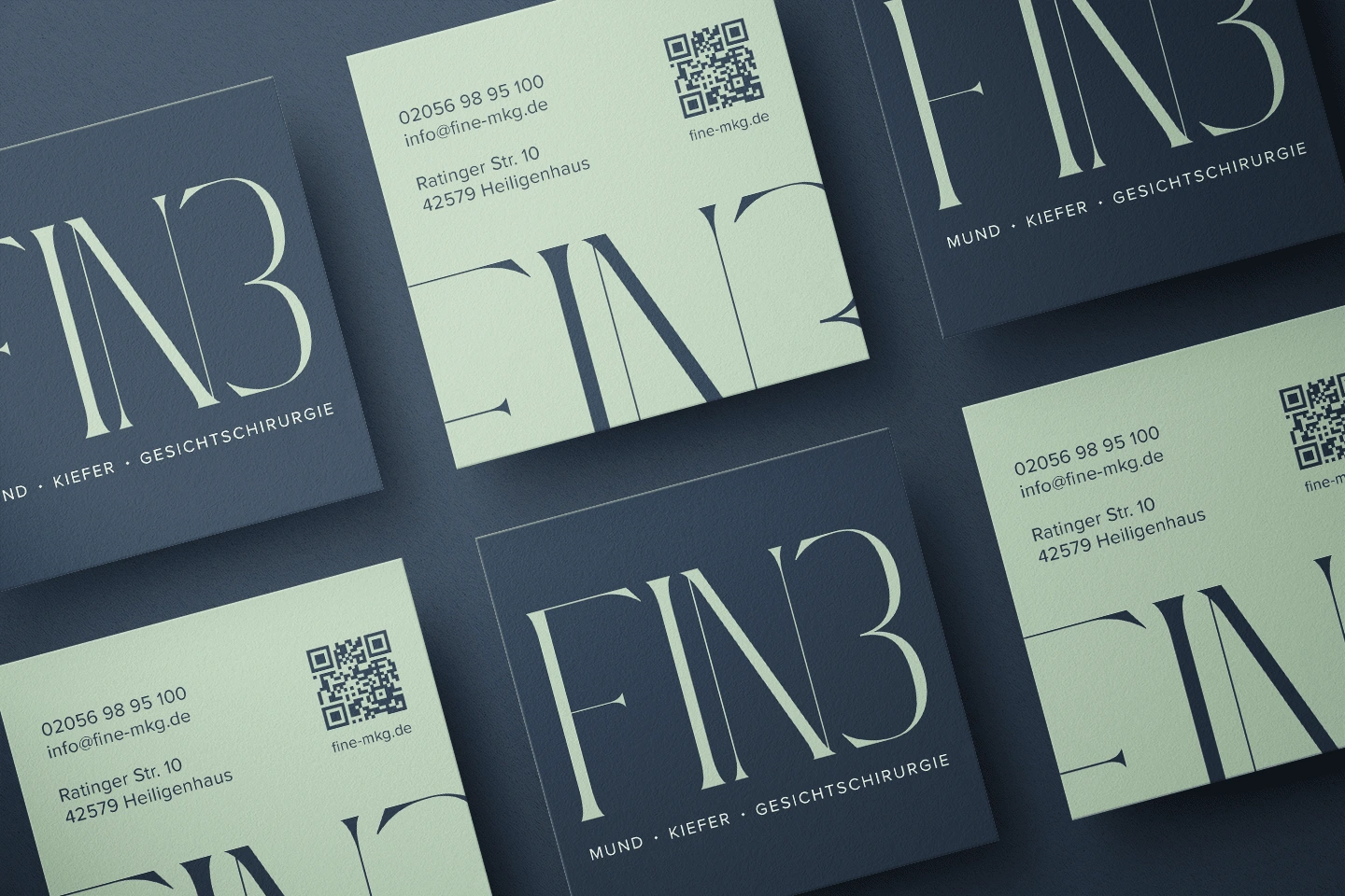
Since the practice offers not only dental but also aesthetic services, and the new space was meant to be elegant and modern, I suggested the name “FINE” to the client. The 'E' in the logo is mirrored and shaped like a 3, symbolizing the 3 MKG (Mouth, Jaw, and Facial Surgery) areas, the 3-city region, and the 3 practitioners. After developing the corporate design with the client’s input, I finished the style guide, which outlined the logo, typography, color scheme, icons and combination possibilities. This also served as my design foundation for creating the corporate stationery and merch.
Logo Usage
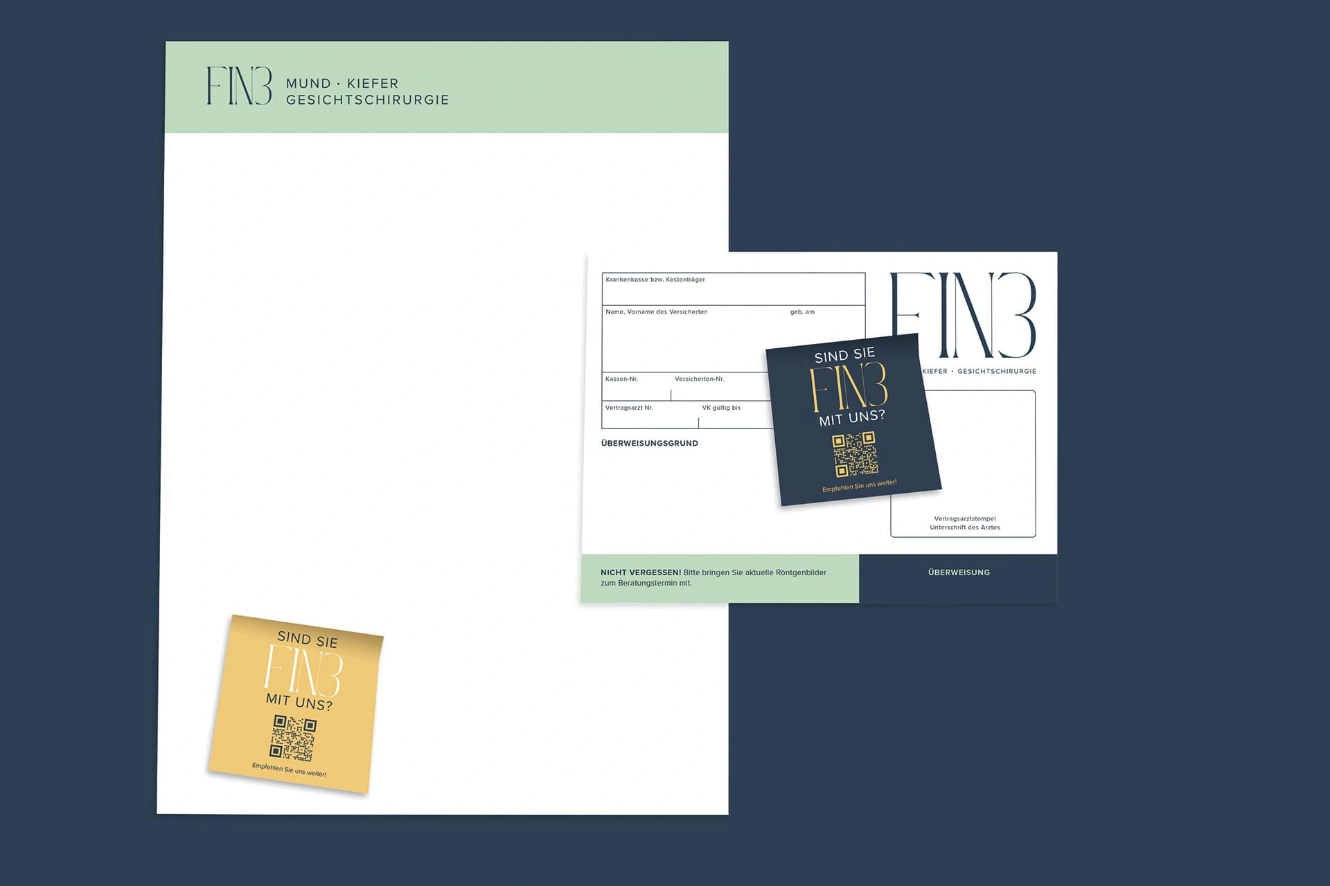
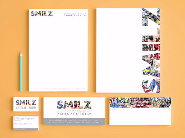
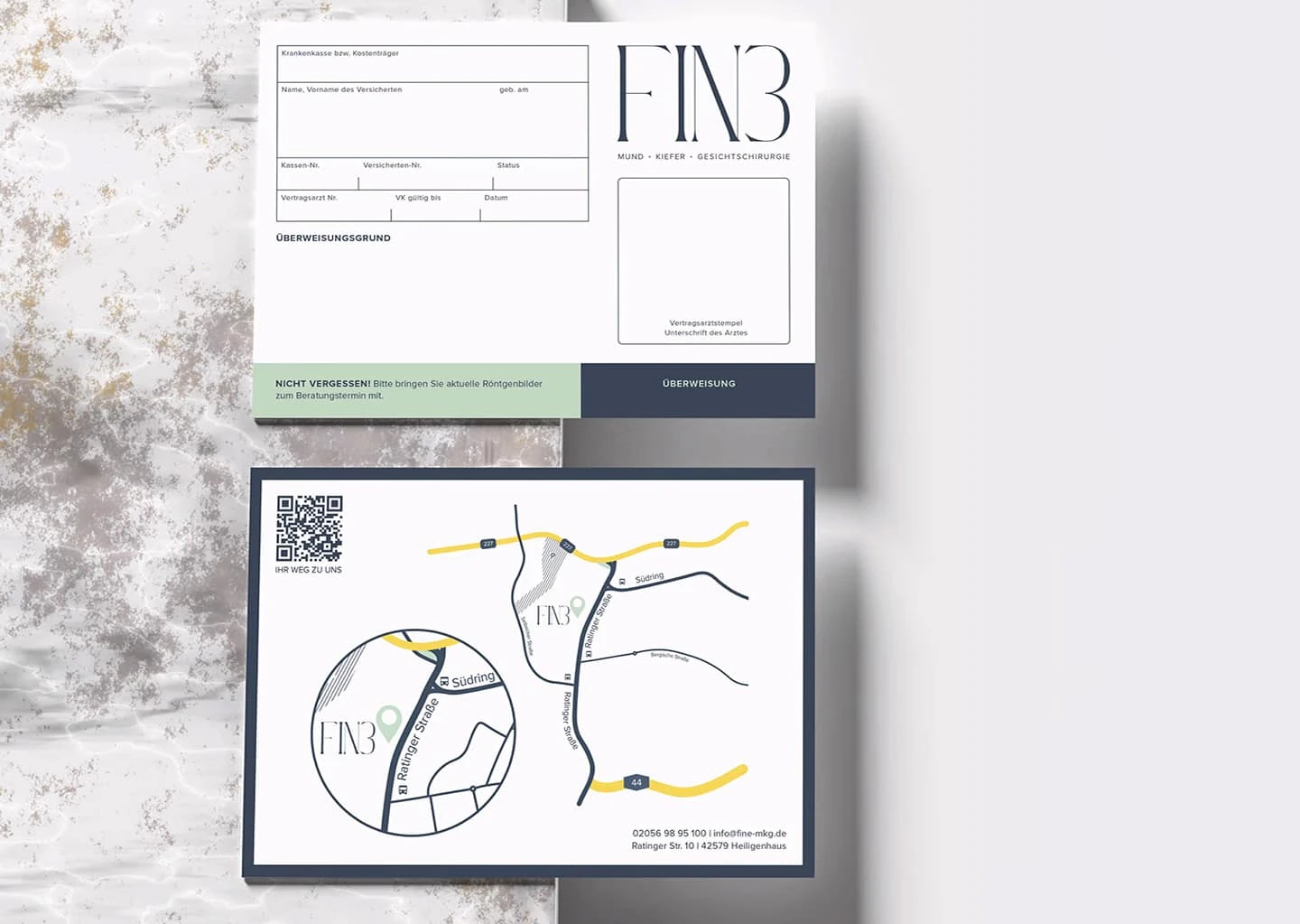
Stationery
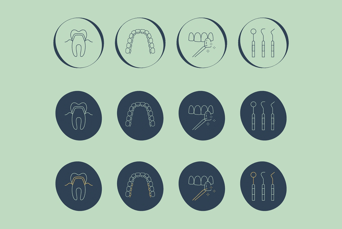
Icons
I also created an icon set for the website that complements the serif font with its unique fine lines and strokes, allowing web developers to use the variations for default, hover, and active states.
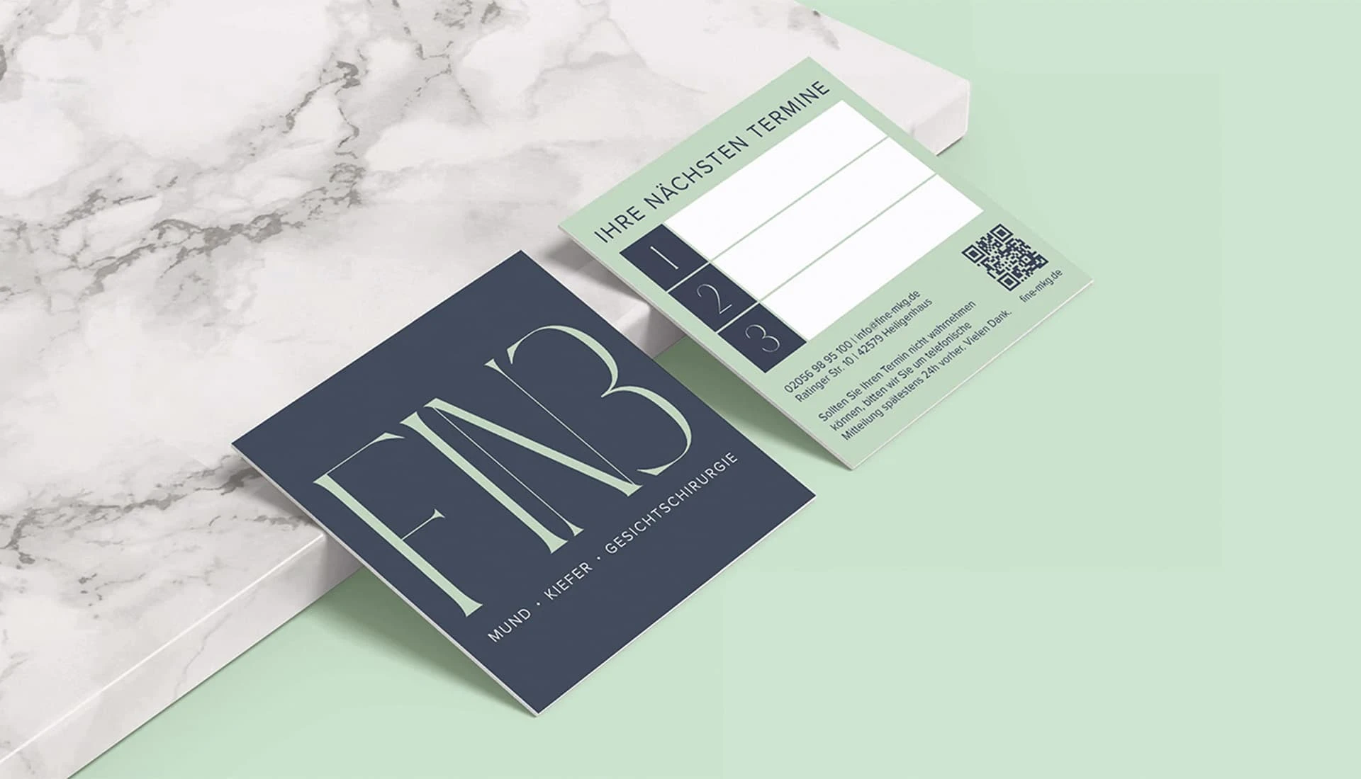
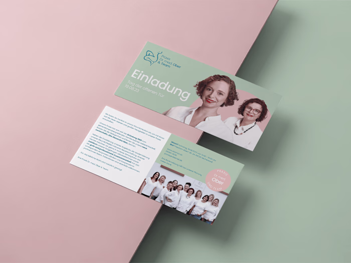
Appointment Card
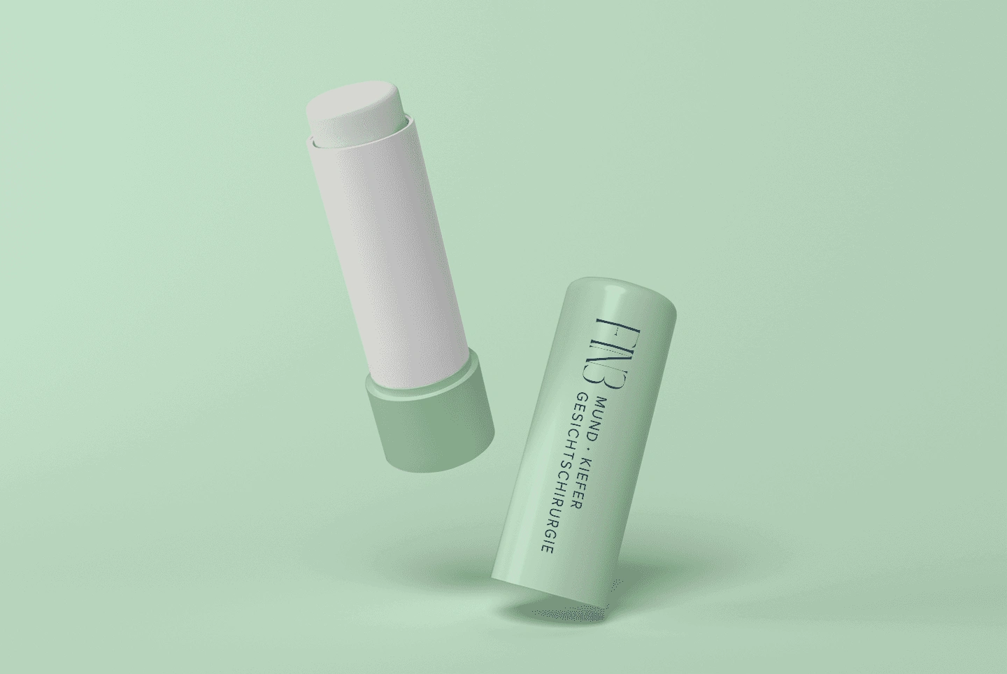
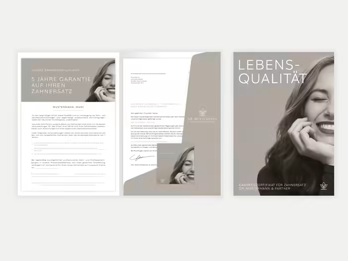
Merch
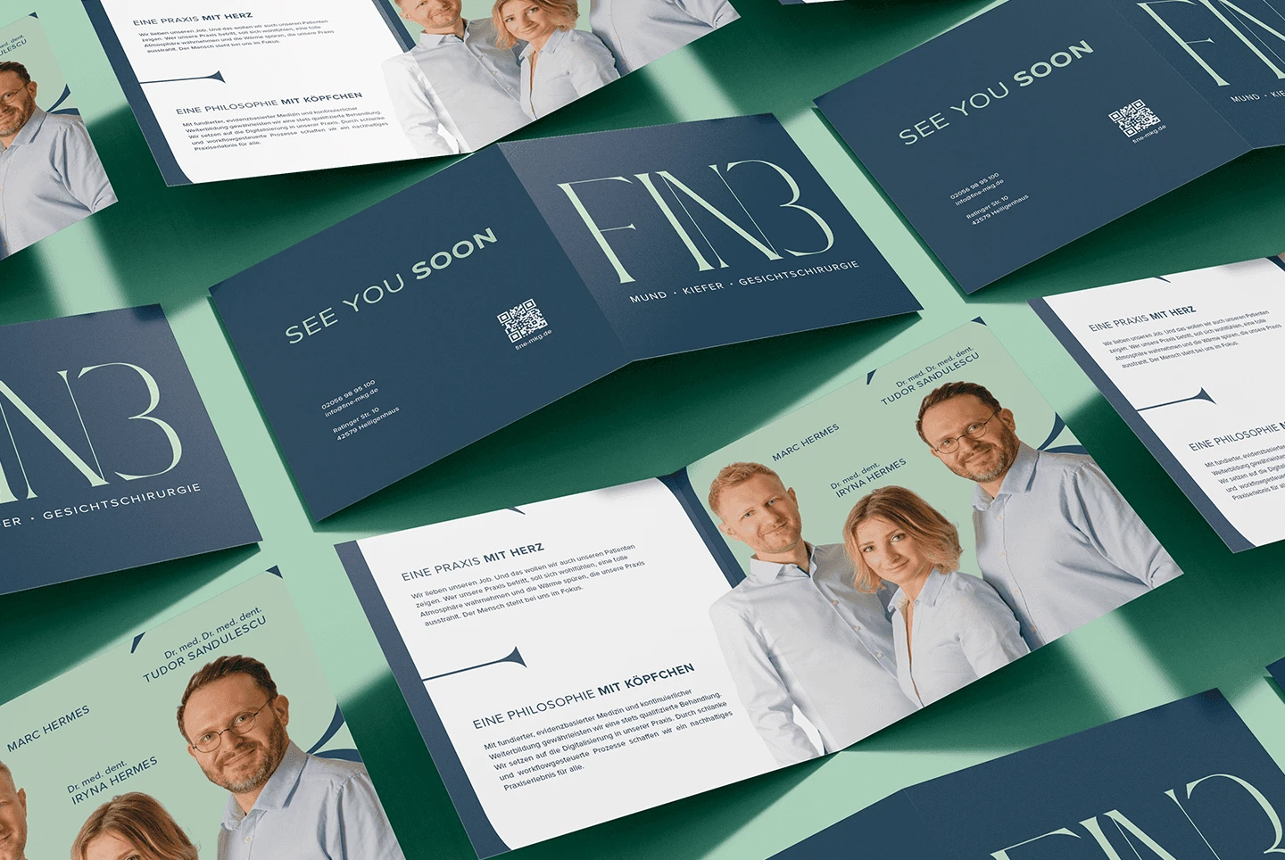
Flyer
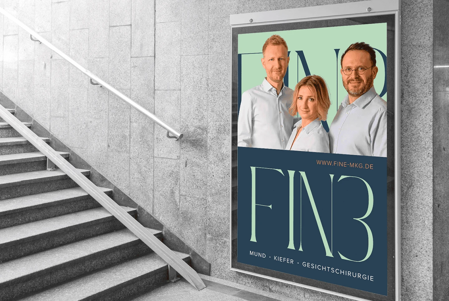
Billboard
Meeting with client <3
Like this project
Posted Jan 27, 2025
I handled branding from scratch, including concept, naming, and creating a minimal, modern design for print and digital, working closely with web developers.