Rebranding a Gynecology Practice, Preserving Its Heritage
Ela Agoston
Praxis Dr. med. Ober & Team
Dr. Sita Ober wanted to take over the established gynecology practice from her mother. It was important to her to create a practice that embraced acceptance for all religions, skin colors, backgrounds, and gender identities. I immediately knew that these values needed to be reflected in a friendly and welcoming design, using colors and shapes to convey this message.
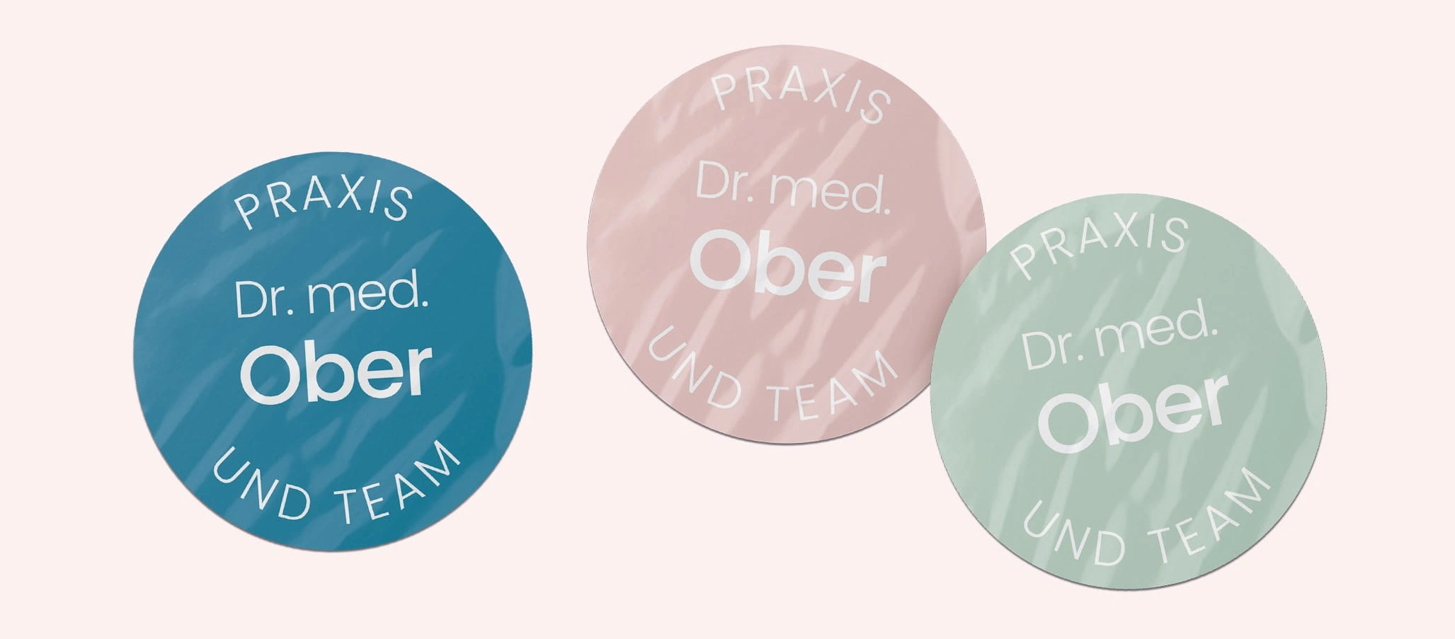
She had an emotional connection to certain elements, like the hand-drawn female silhouette and the specific colors in the original logo. She wanted a redesign without letting go of the elements familiar to many patients. To modernize the logo while respecting her wishes, I simplified the hand-drawn silhouette and gave it a contemporary touch. I also selected a modern, readable font that felt friendly and approachable. Additionally, I incorporated pastel tones that complemented the existing blue, along with rounded shapes and icons for the website and print materials. I also handled image retouching.
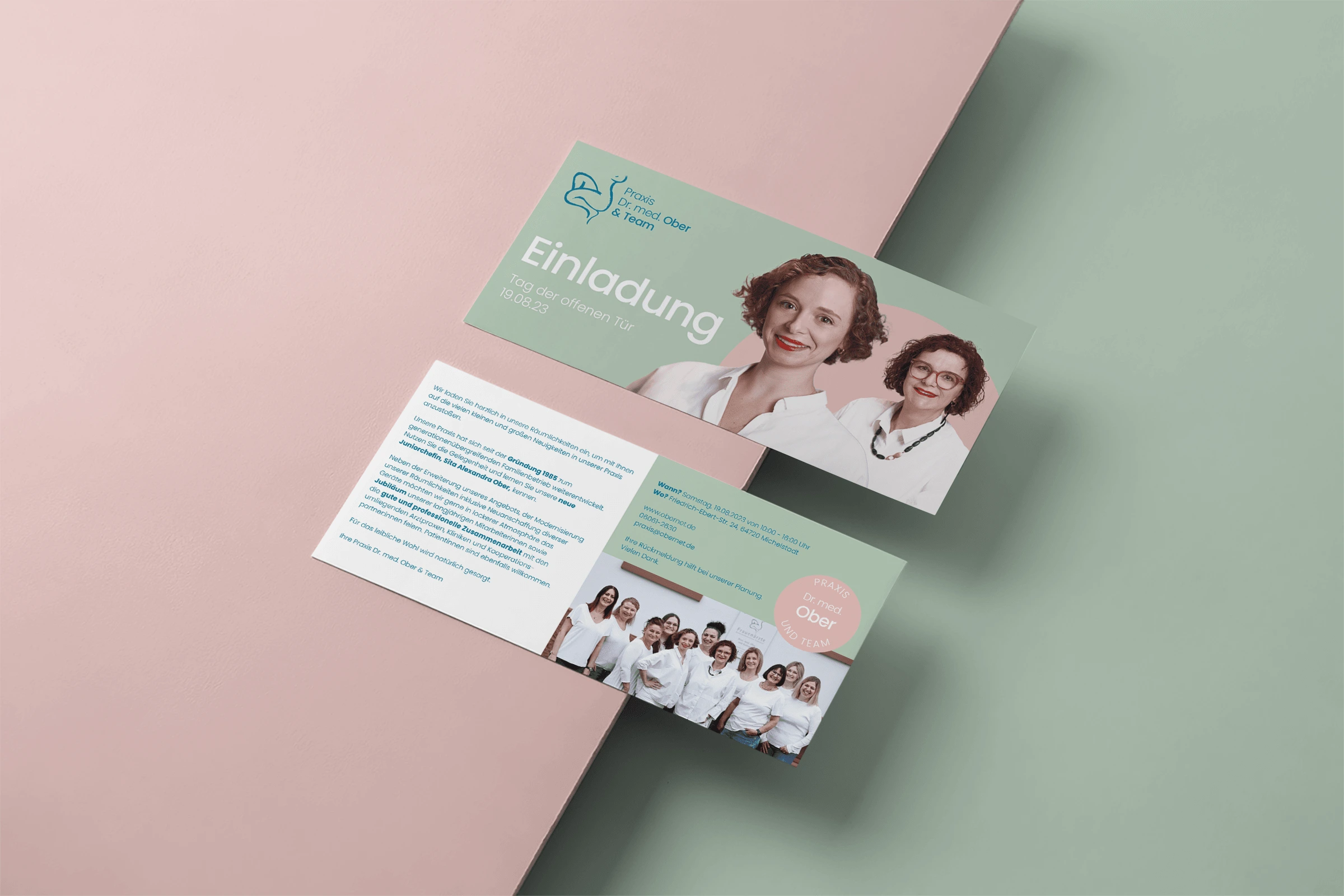
Welcome Flyer
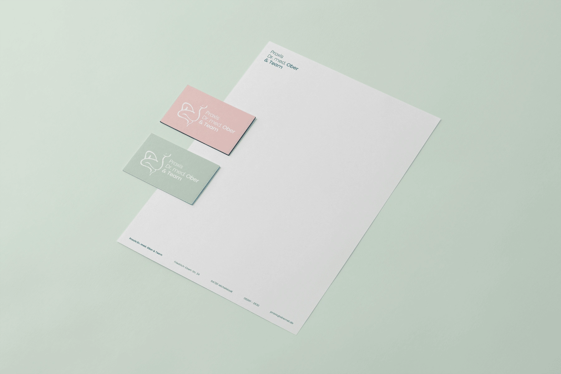
Stationery
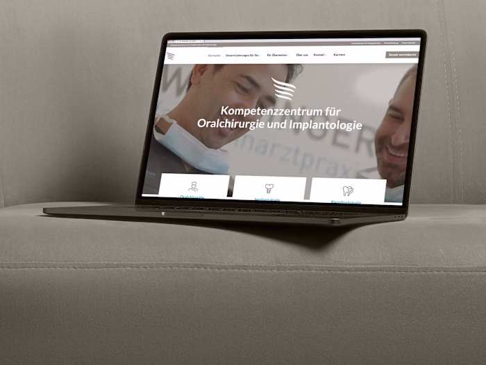
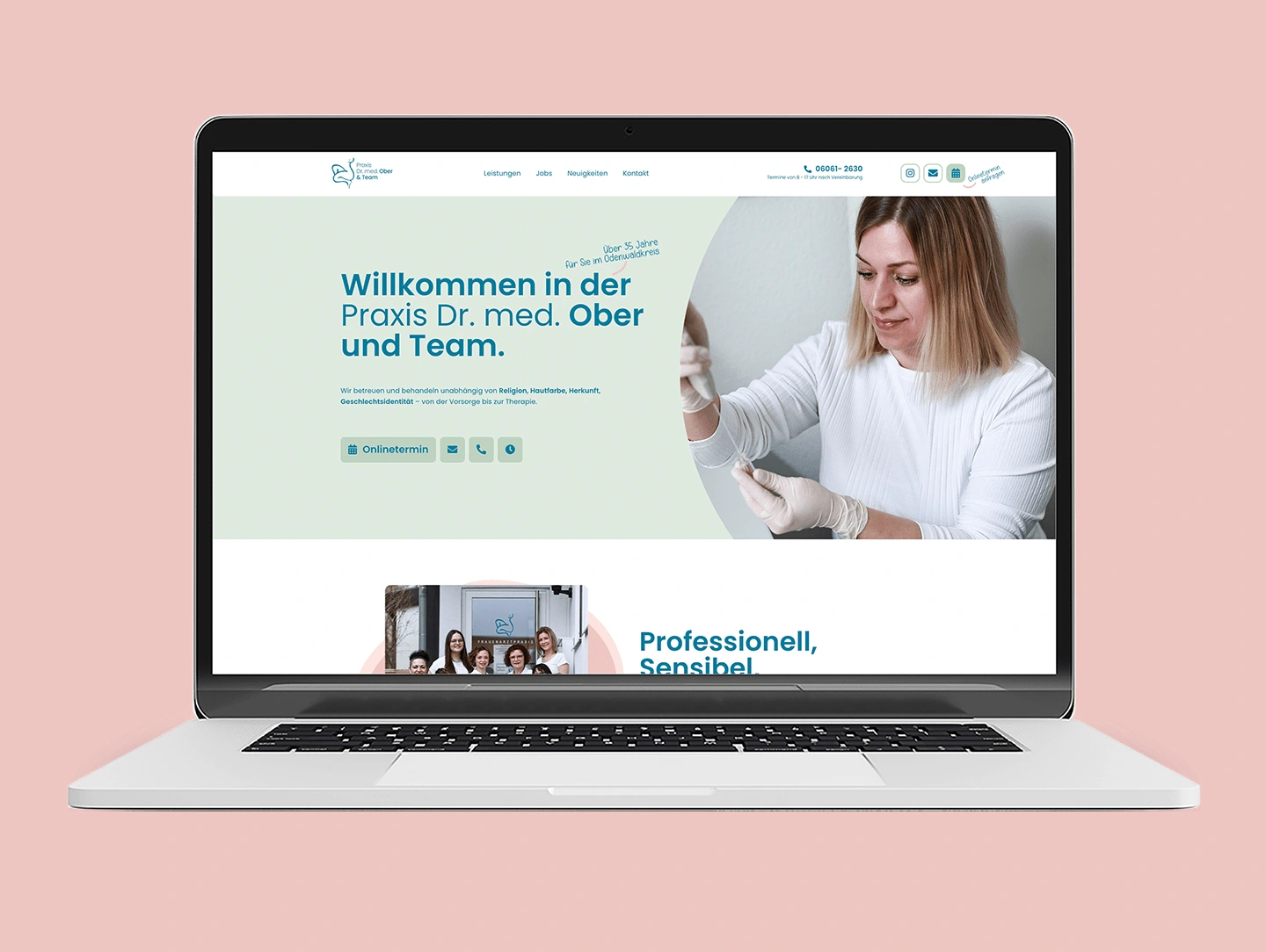
In close collaboration with the web developer, I helped apply the redesign guidelines to the website to create a consistent look and feel, ensuring my vision was carried through at every stage of the process.
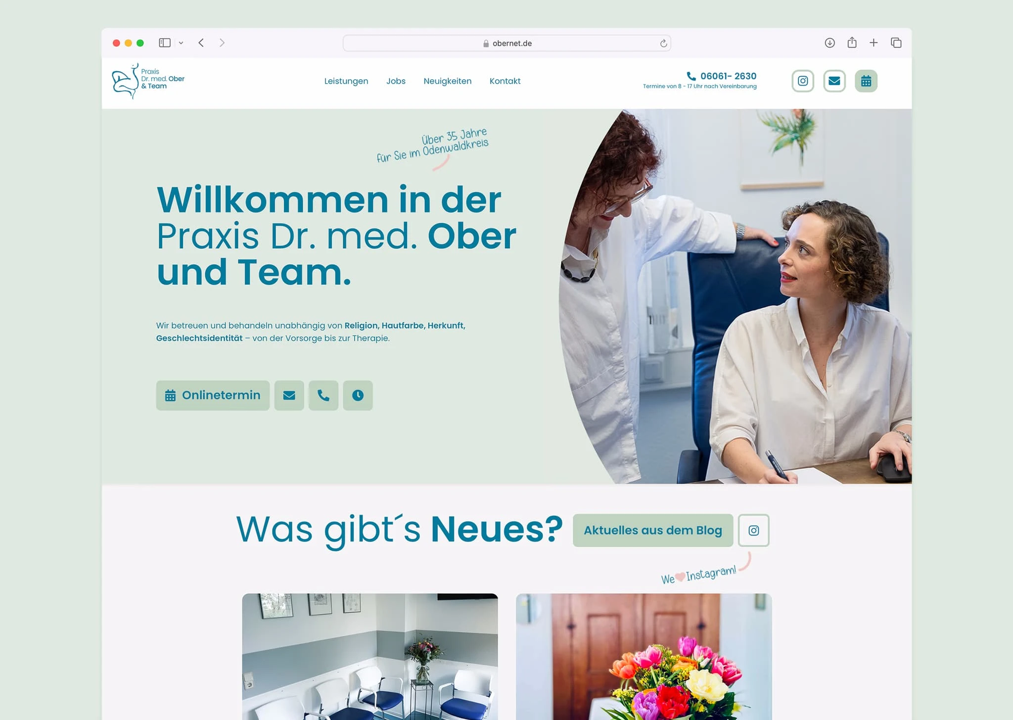
Website Redesign

Poster Design

Like this project
Posted Feb 1, 2025
I redesigned the branding for a client who had certain elements she was attached to. I respected her request by modernizing the brand while preserving its herit