Healthcare Communication Visual Systems
Scott DS Young
ANIMAS was founded to address a critical gap in healthcare: inconsistent and inaccessible provider data. Their goal is to make healthcare access as reliable and seamless as essential infrastructure.
With deep experience across healthcare operations, data analytics, and member engagement, the team identified how fragmented systems increase costs, errors, and barriers to patient care. The challenge was to translate this complex problem into a clear and trustworthy visual language.
The Challenge
ANIMAS needed a visual identity system that could communicate trust, clarity, and reliability within a complex and highly regulated industry.
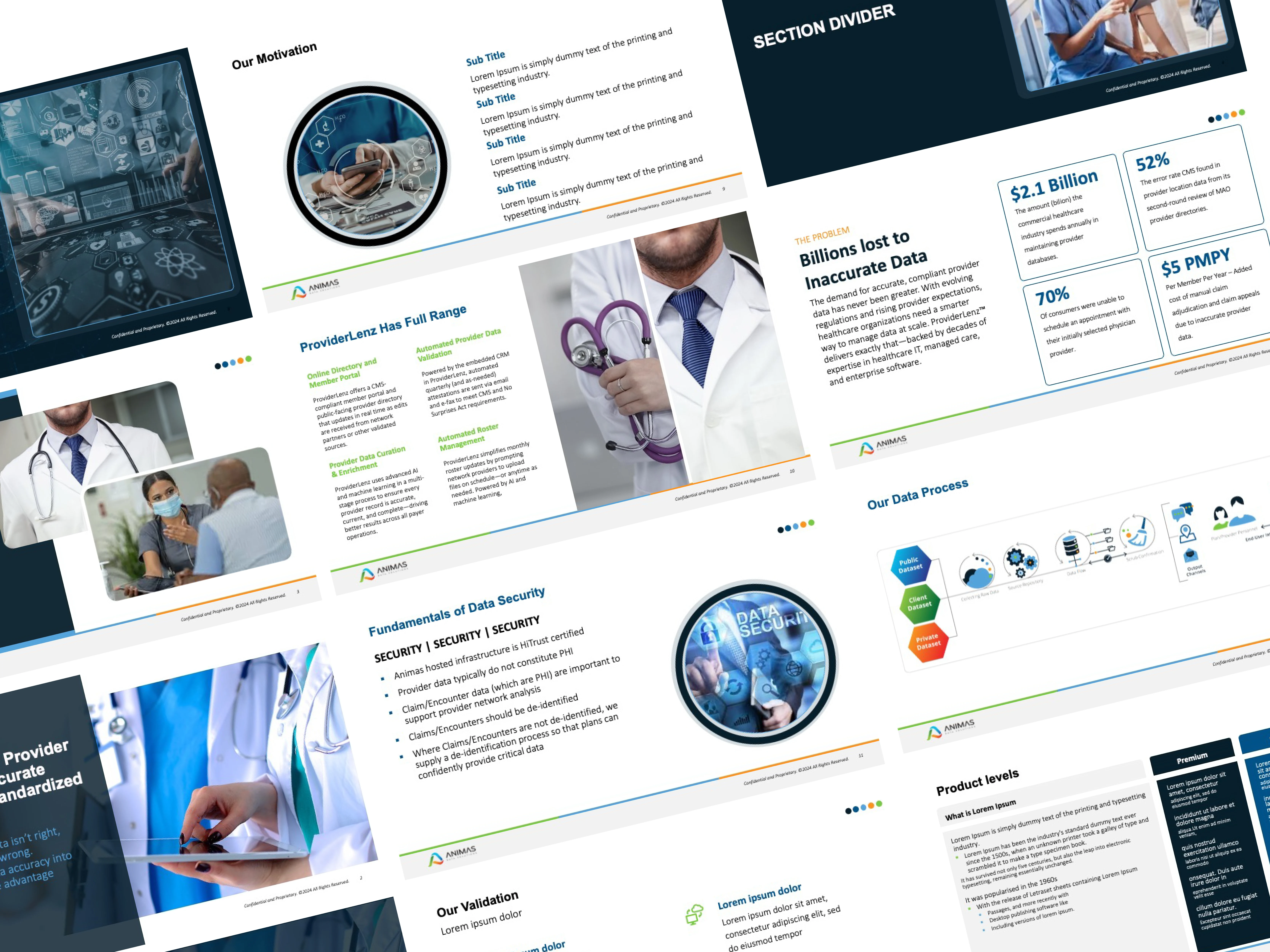
The existing identity lacked distinction and did not reflect the company’s three core pillars — Humanity, Development, and Customer Relations. The goal was to create a system that could clearly express these pillars while establishing a recognizable and scalable brand presence.
My Role
I developed a brand identity and communication system, defining the logo, color strategy, typography, and visual framework to ensure consistency across digital and marketing applications.
Process & Design Decisions
Research & Positioning
Reviewed healthcare, data, and technology brands to identify opportunities for a more human and structured visual approach.
Identity Concept
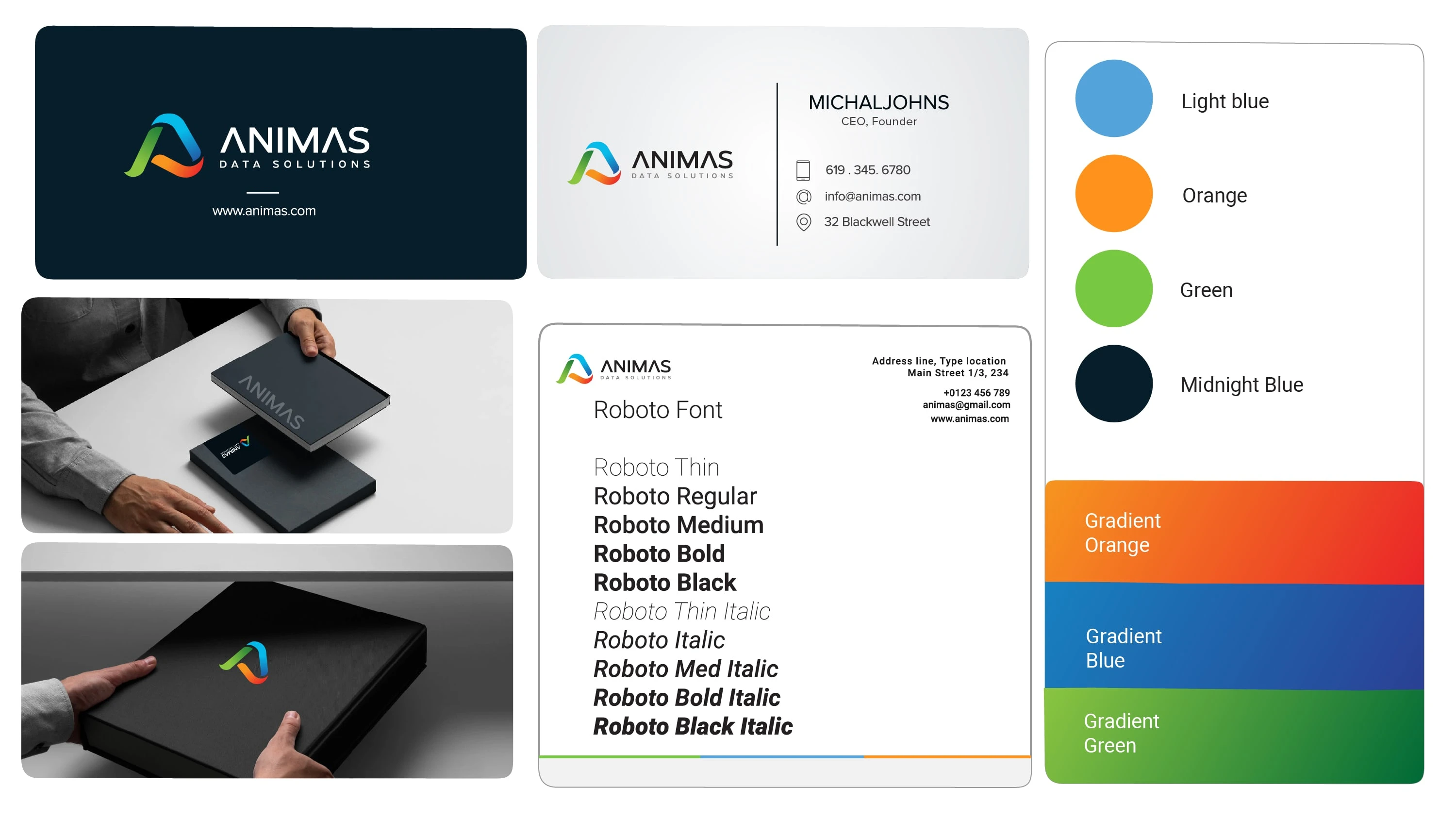
The logo is built around a stylized “A” formed by three color-driven elements representing Humanity, Development, and Customer Relations — reinforcing connection and system integration.
Typography & Color System
A modern sans-serif type system ensures clarity and readability, while the color palette balances trust (blue), growth (green), and energy (orange) to support both data-driven and human-centered communication.
System Application
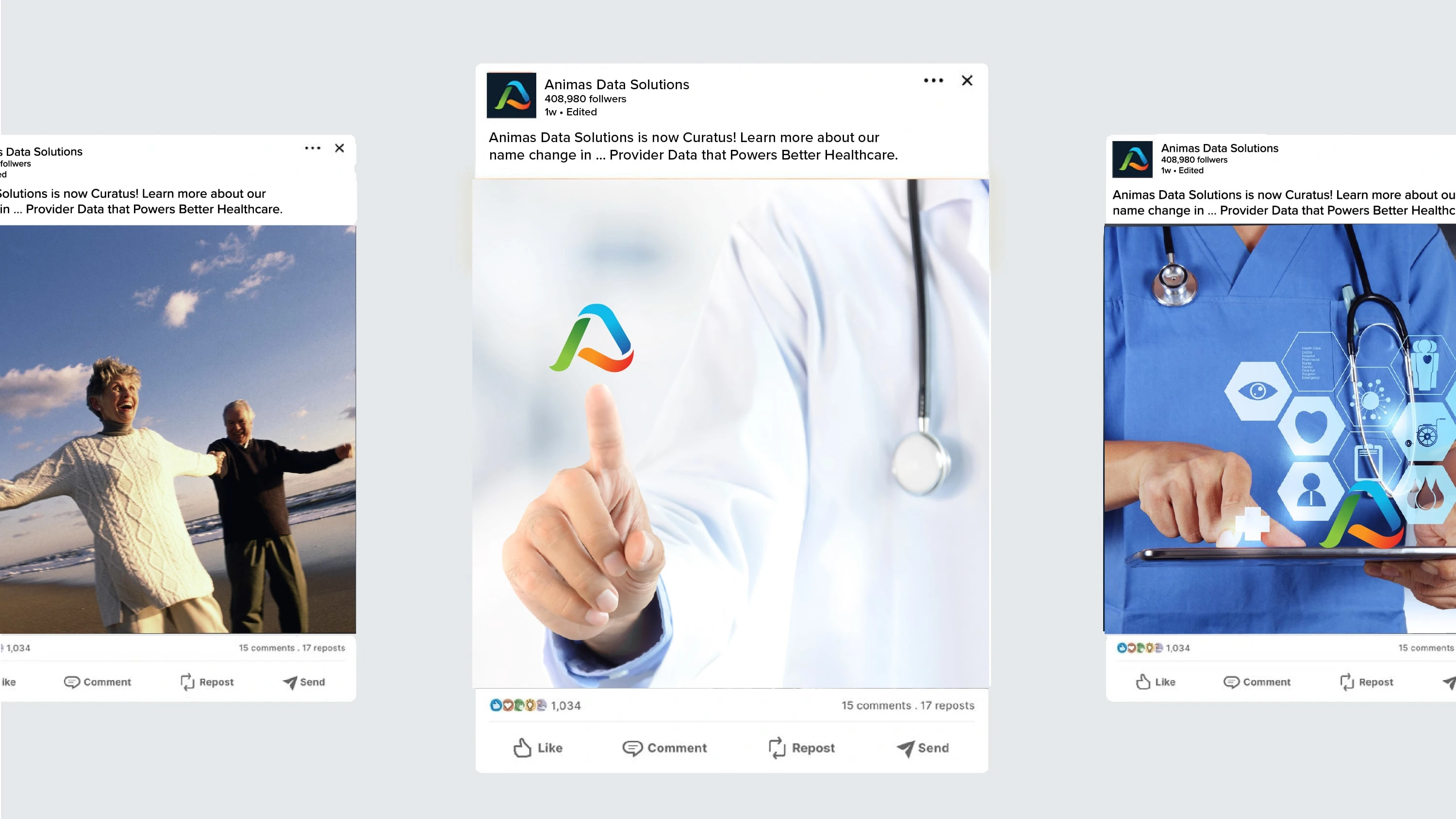
The identity was designed to scale across dashboards, marketing materials, and social content, using consistent layout structure, iconography, and visual hierarchy.
Visual System
• Modular layout structure for consistent communication
• Color-coded elements tied to core brand pillars
• Iconography and illustrations simplifying complex data flows
• Flexible identity designed for digital and marketing use
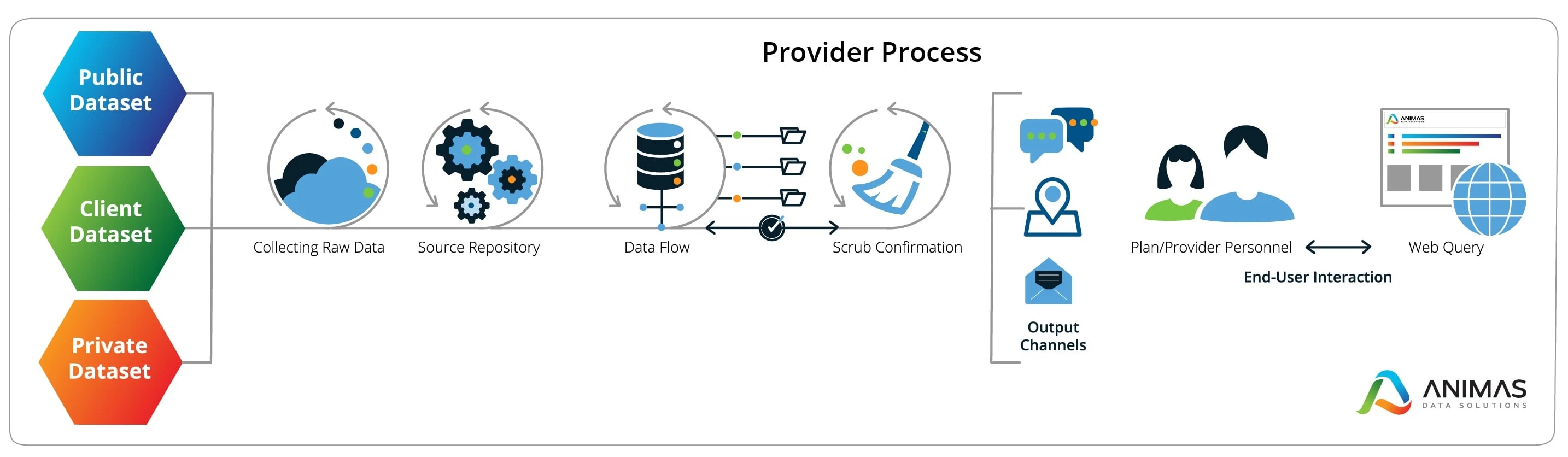
DELIVERING ACCURATE PROVIDER DATA PROCESS
Outcome
The resulting identity system establishes a clear, professional, and approachable brand presence for ANIMAS. It enables consistent communication across platforms while supporting their mission to simplify provider data management and improve access to care.
Like this project
Posted Nov 20, 2025
A healthcare communication visual system designed to translate complex data into clear, structured visuals across branding, marketing, and digital touchpoints.
Likes
0
Views
10
Timeline
Oct 1, 2025 - Nov 30, 2025