Brand Identity & Packaging for LUNERA
Scott DS Young
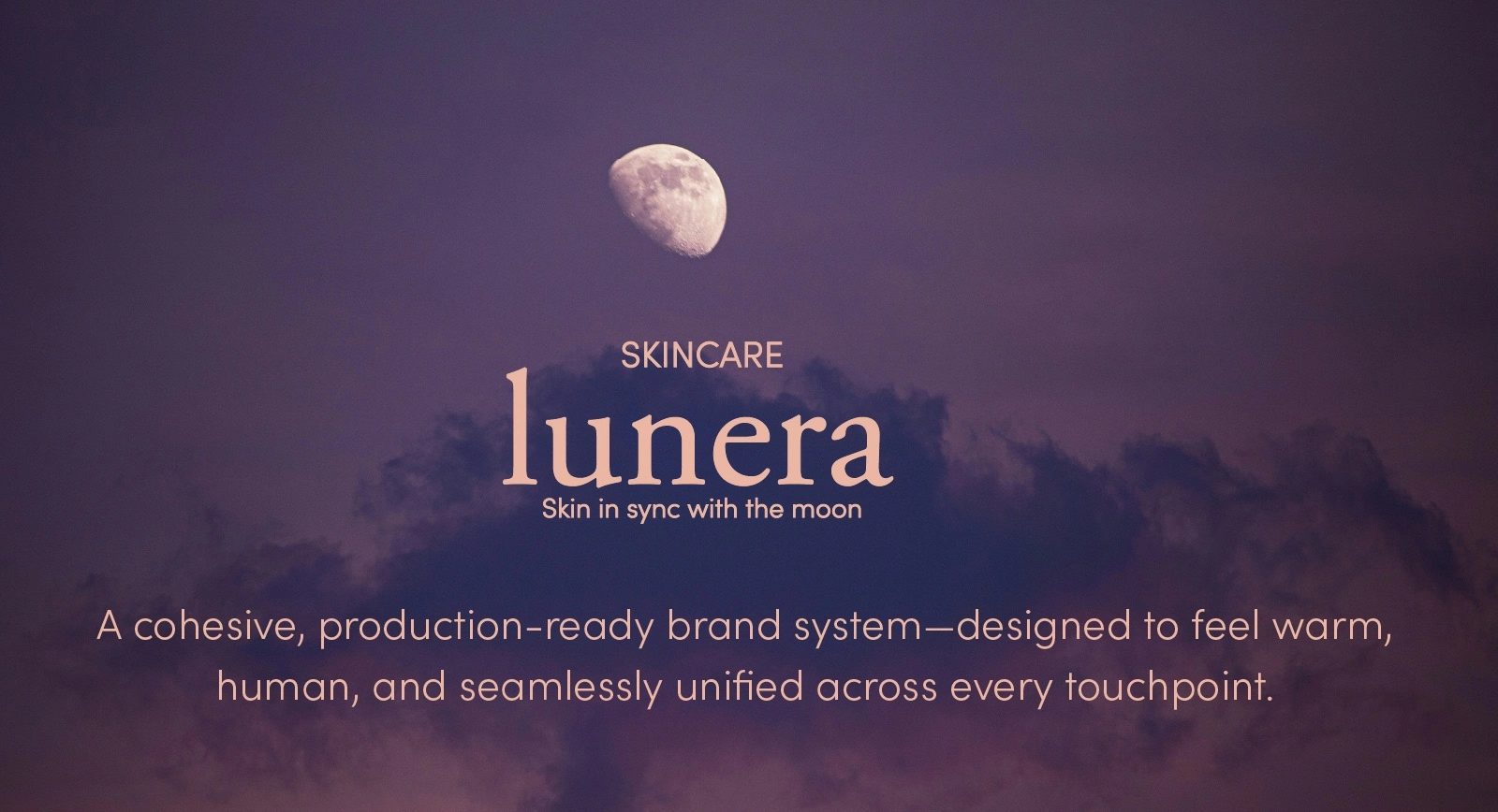
A brand system built to translate natural skincare into a calm, cohesive visual experience.
Challenge
LUNERA needed a brand identity and packaging system that aligned with its philosophy of slow, intuitive skincare.
The existing direction felt visually disconnected—cool tones and inconsistent application made the brand feel distant rather than human.
The challenge was to create a system that communicated ritual, softness, and trust—without losing modern clarity.
Approach
I developed a refined visual language rooted in restraint, material awareness, and emotional tone.
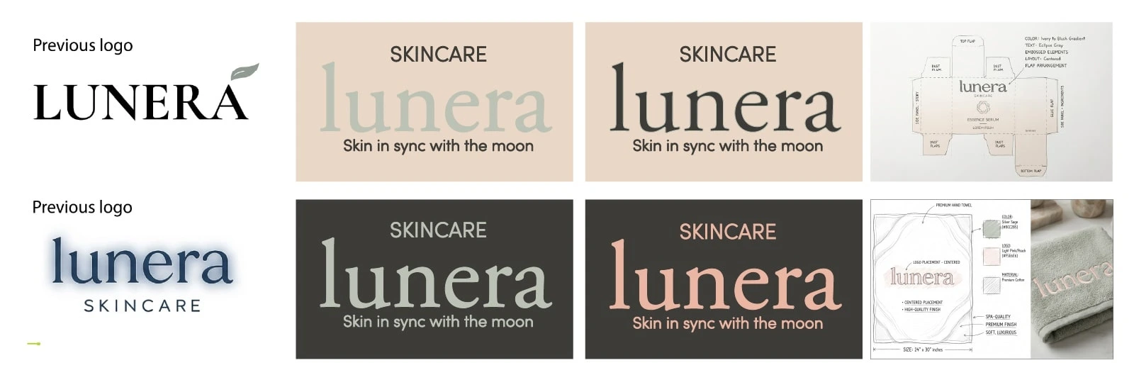
Rebuilt the color system using warm, skin-inspired hues
Simplified the logo through iterative sketching and reduction
Focused on spacing, hierarchy, and contrast to maintain clarity within a muted palette
The goal wasn’t to add more—but to remove what didn’t serve the experience.
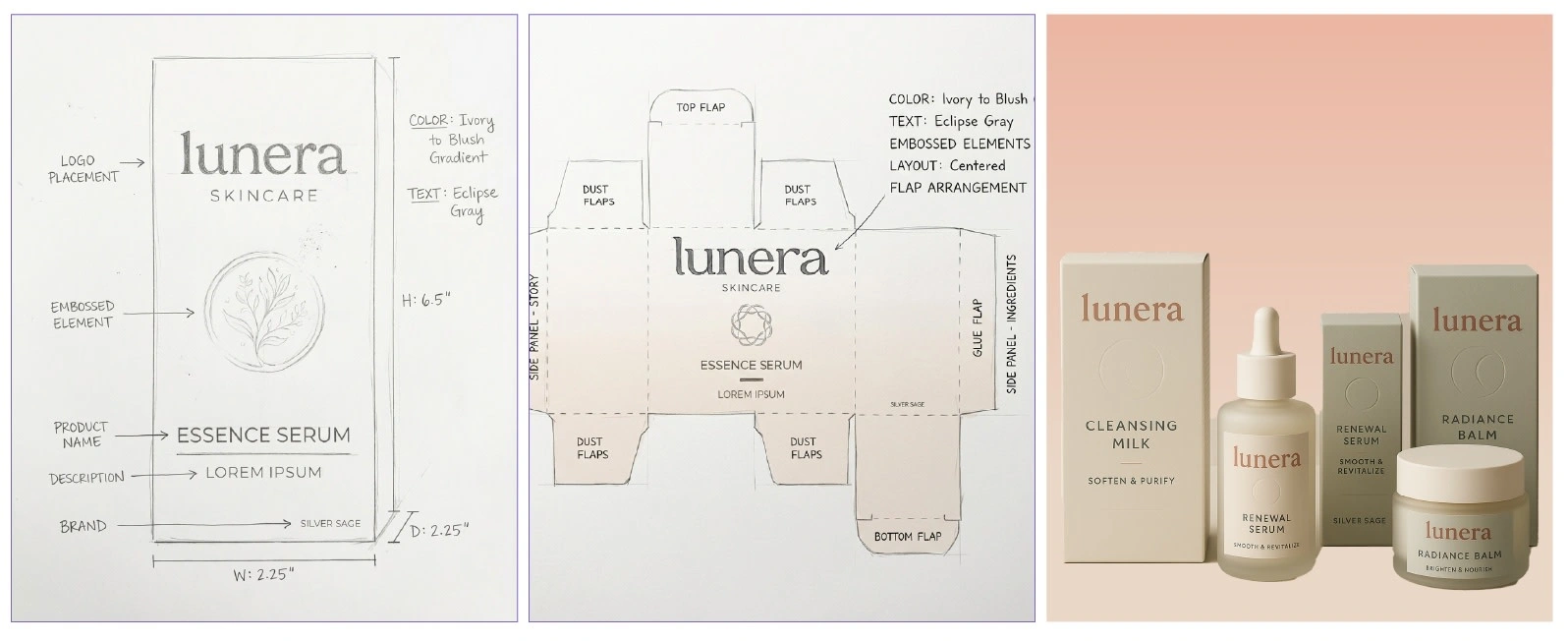

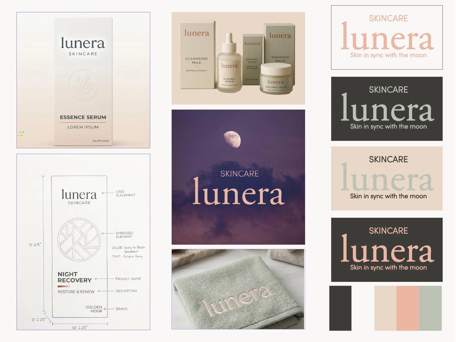
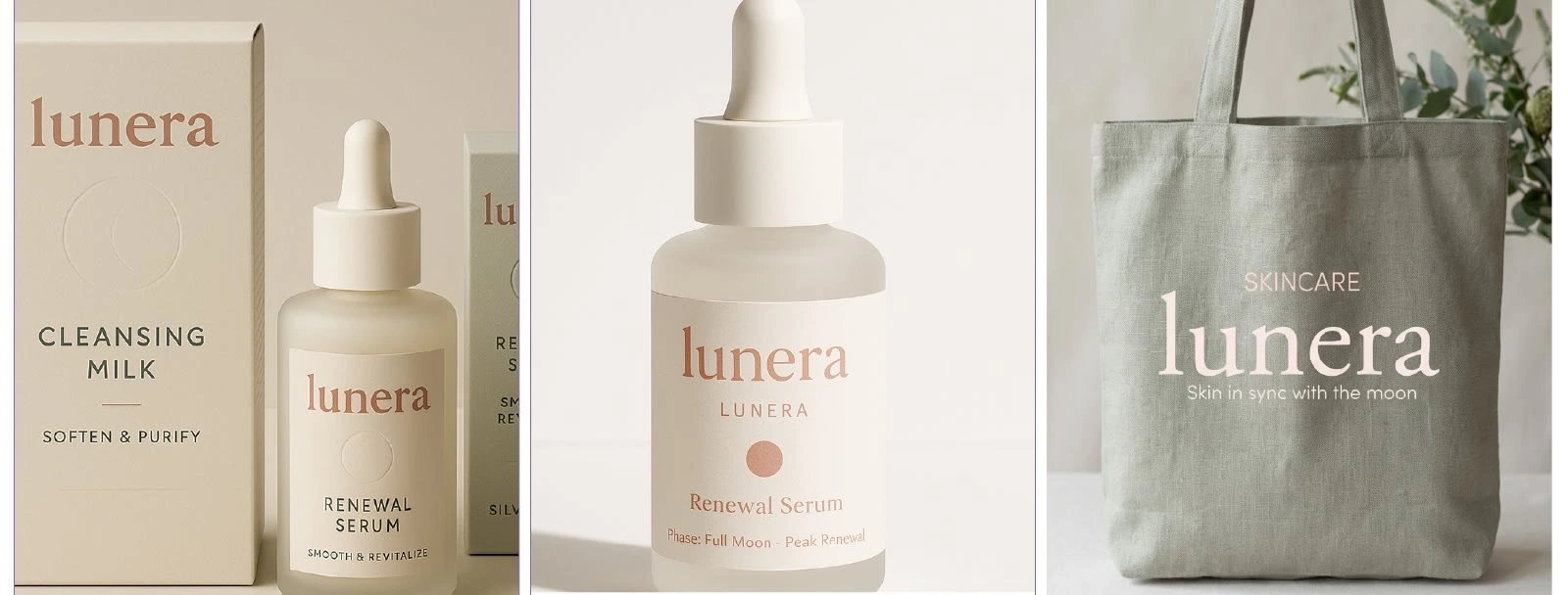
Solution
A flexible identity and packaging system designed to feel calm, grounded, and human.
A cohesive color palette inspired by natural tones and lunar softness
A simplified, versatile logo system for cross-application use
Packaging concepts that balance minimal structure with tactile presence
Each element works together to support a slower, more intentional brand experience.
Result
A unified brand system that translates seamlessly across packaging, lifestyle applications, and digital touchpoints—while reinforcing LUNERA’s core philosophy of renewal and balance.
Outcome
Like this project
Posted Nov 12, 2025
A cohesive brand system expressing natural renewal through warmth, restraint, and tactile clarity—designed to feel human, calm, and intentional.
Likes
0
Views
11
Timeline
Sep 1, 2025 - Oct 4, 2025