Healthcare Infographic & Motion Design
Scott DS Young
Healthcare Infographic & Motion Design
Case Study

Project Overview
This project focused on translating complex healthcare information into a clear, engaging visual system that could be easily understood by a broad audience. The goal was to reduce cognitive overload while maintaining accuracy, clarity, and visual interest through motion.
The Challenge
Healthcare data is notoriously dense. The client needed an infographic and motion design solution that could explain layered information quickly—without overwhelming viewers or losing credibility.
The biggest challenge was balancing clarity, hierarchy, and motion while ensuring the final piece felt approachable rather than clinical.
My Role
I led the project from concept through final delivery, handling:
Visual concept development
Information hierarchy and layout
Infographic design
Motion design and animation logic
This included translating static content into motion while preserving readability and pacing.
Process
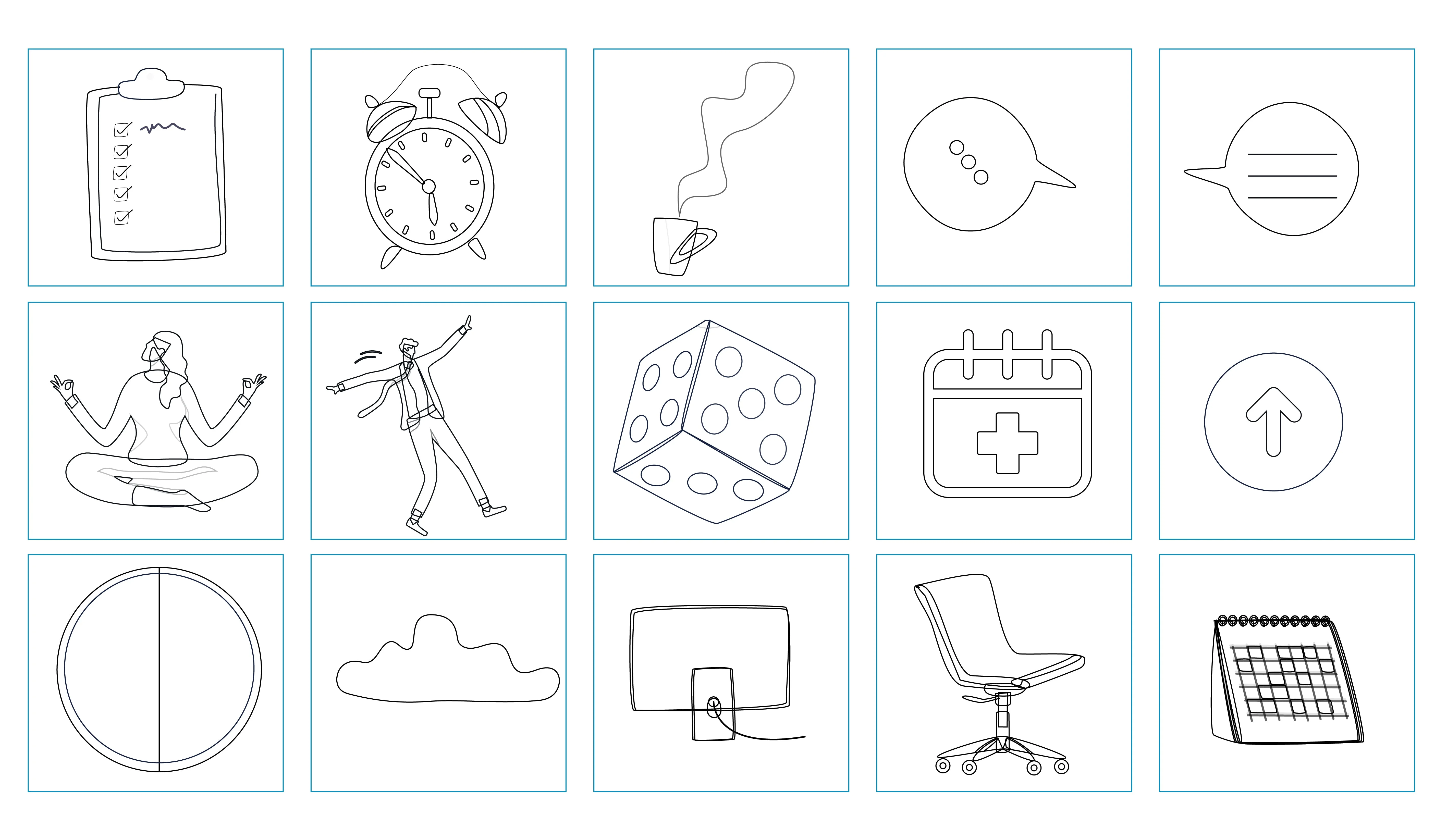
I started with rough layouts and structural sketches to test information flow and hierarchy. Early versions were intentionally simple, prioritizing clarity over polish.
From there, I refined typography, color, and pacing, then introduced motion strategically—using animation to guide attention and reinforce meaning rather than distract from it.
Before-and-after iterations show how the design evolved from static and dense to fluid, readable, and engaging.
Solution
A modular infographic system paired with restrained, purposeful motion. Information is revealed in digestible segments, making the content easier to follow while maintaining a professional healthcare tone.
Impact
Reduced visual clutter and improved readability by using clear hierarchy and intentional motion to guide viewer attention.
Three successful social media posts

Concept of person on the dice to completion
Final out come using the animation for presentation and social media
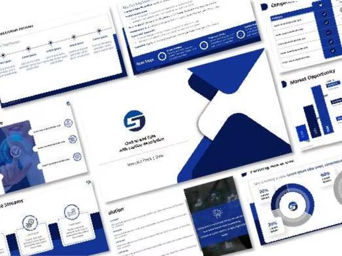
Deliverable of Infographic
Like this project
Posted Dec 16, 2025
Turning complex data into clear, engaging visuals through infographic and motion design, as I did for Alfac.
Likes
0
Views
29
Timeline
Aug 1, 2025 - Aug 30, 2025