Brand Systems Designer
Scott DS Young
Brand Identity System
Overview
A visual identity system designed to create a clear, modern brand presence while supporting consistent communication across digital and presentation environments.
The goal was to establish a cohesive design framework where typography, color, and layout work together to create a recognizable and scalable brand language.
Brand Idea
The identity focuses on clarity, structure, and visual balance. Clean typography and a restrained color palette create a professional tone while allowing key messaging and content to stand out.
The visual language was designed to feel modern and adaptable, supporting everything from presentations and digital assets to marketing materials.

Identity System Overview
Typography System
A geometric sans-serif type system establishes hierarchy across headlines, supporting information, and technical content.
Defined scales and spacing rules ensure clarity and readability across presentations, digital platforms, and marketing materials.
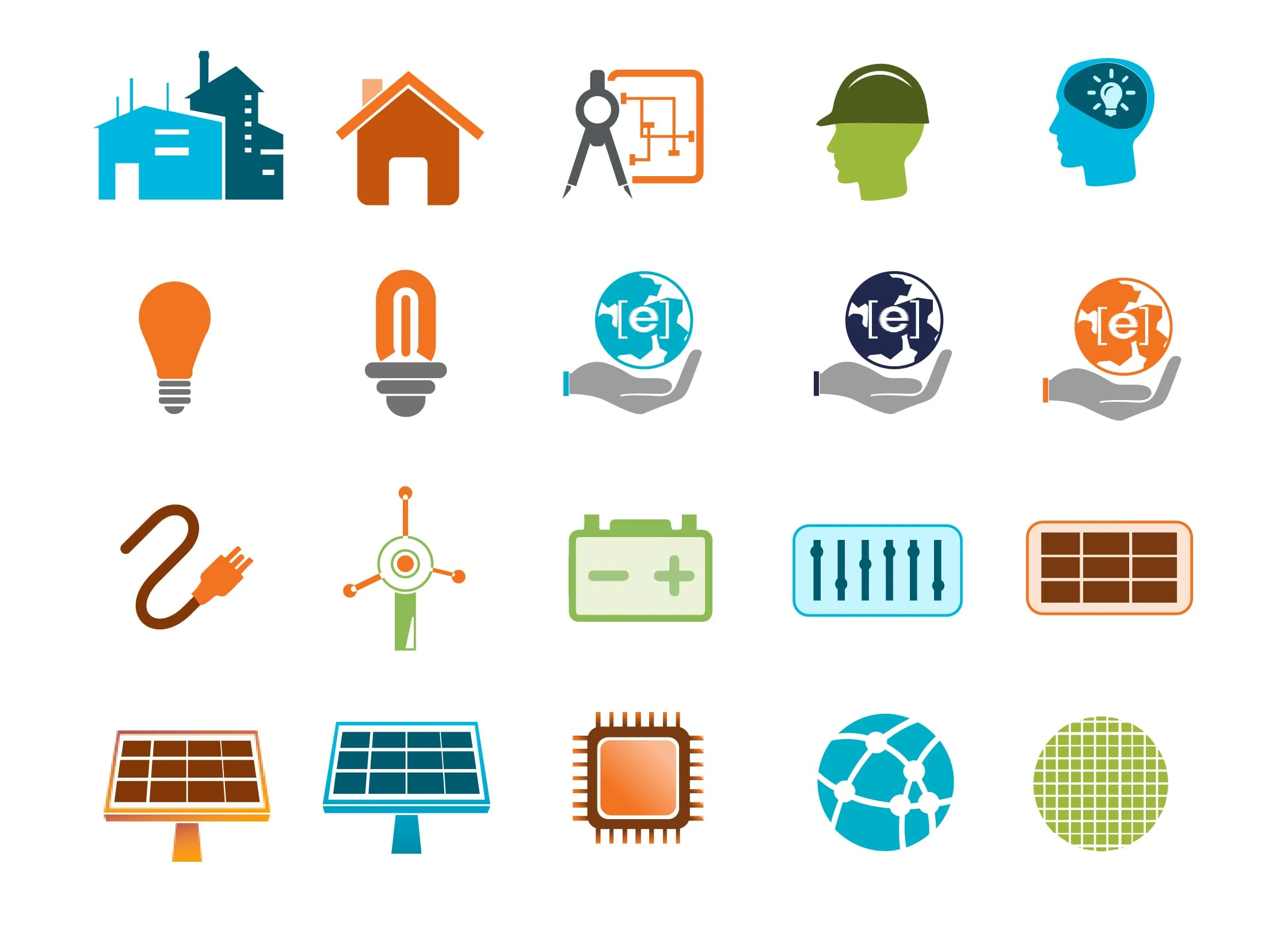
Custom illustrated iconography

Identity System Overview
My Role
I developed the brand identity system and applied it across communication materials, focusing on clarity, visual hierarchy, and consistent design standards.
The work involved defining the core identity elements, organizing the visual system, and implementing the framework across real-world brand applications.
Marketing Collateral | Social Media | Print | Web | Pitch decks
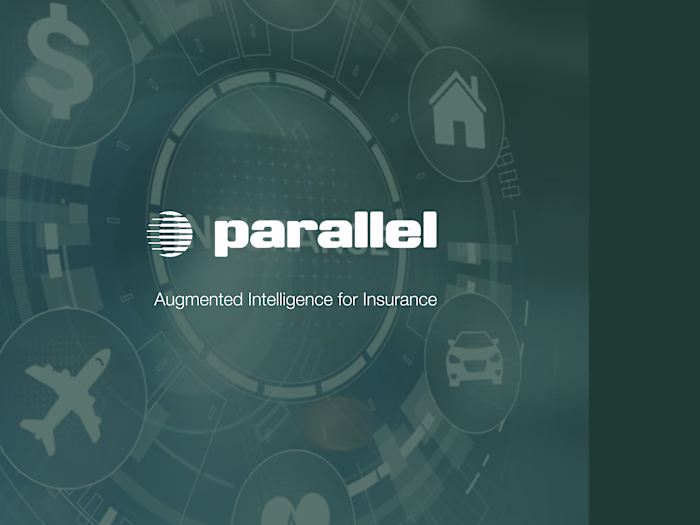
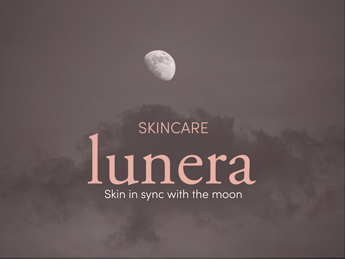
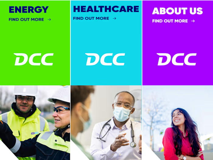
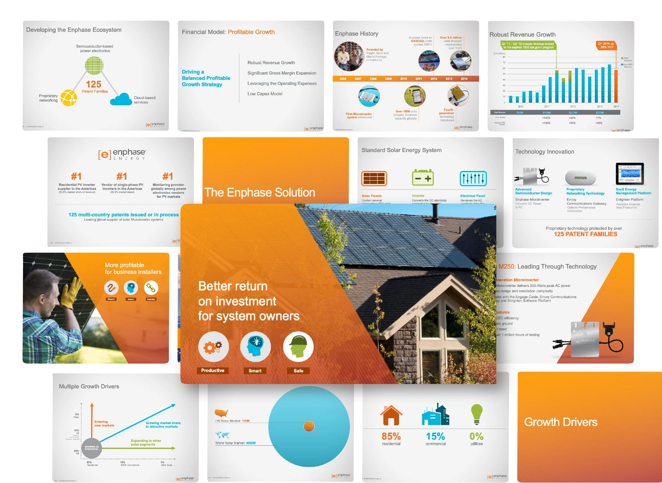
Application
The identity system was applied across multiple communication formats, ensuring the brand remains consistent and recognizable in different contexts.
Examples include:
• Presentation materials
• Marketing graphics
• Digital assets
• Informational visuals
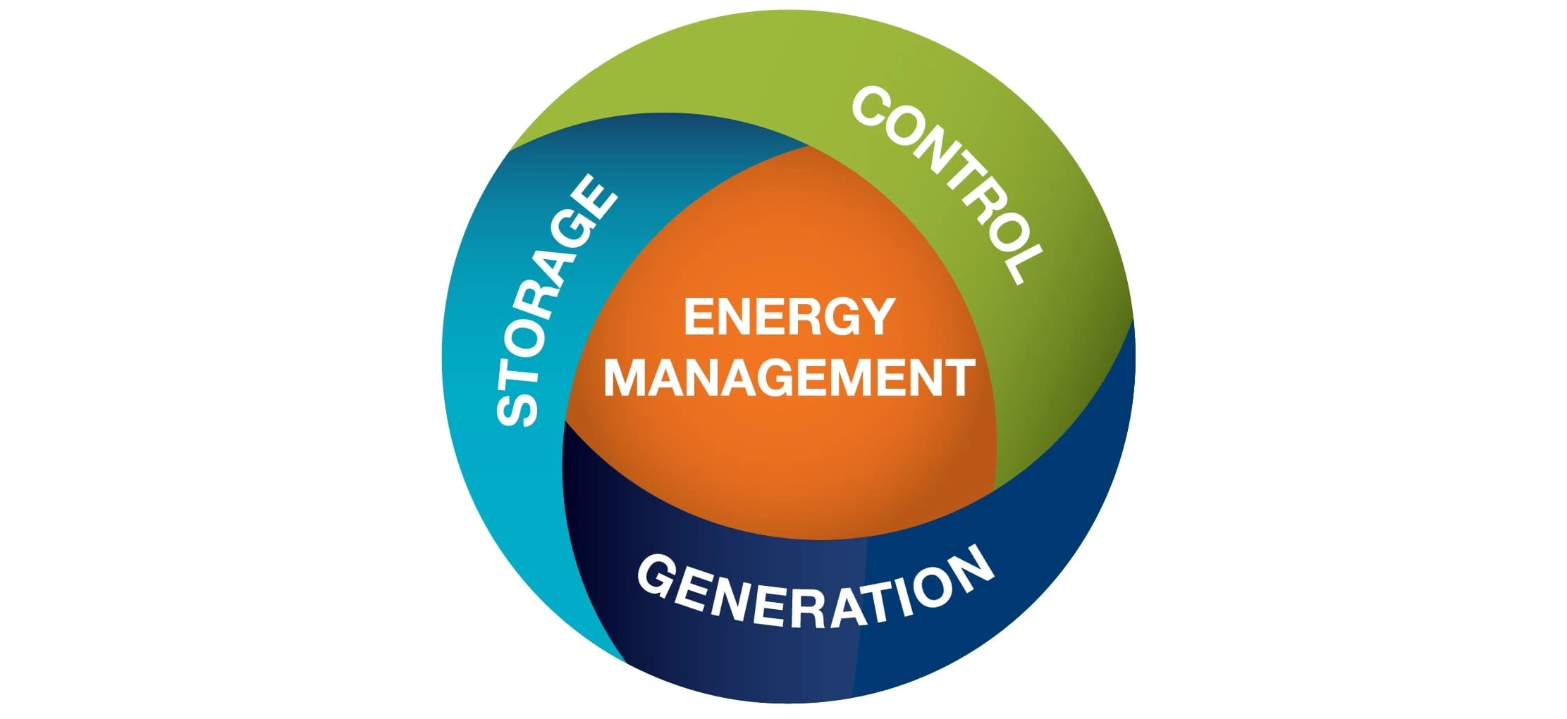
Isolated Graphics
illustrations that walk through installation scenarios
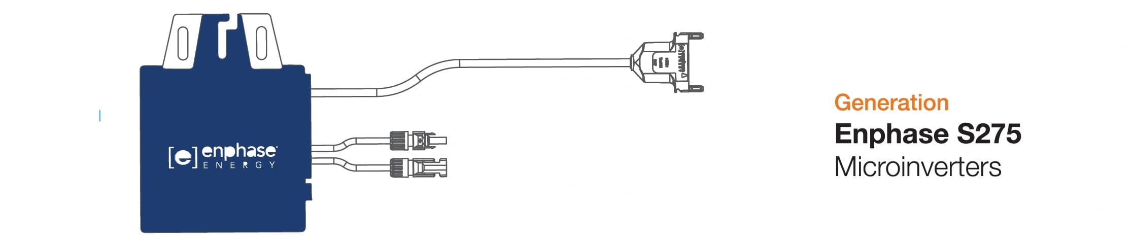
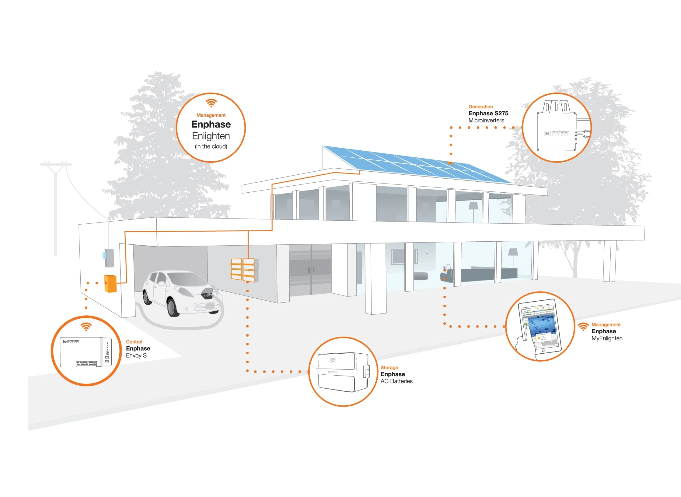
Illustrated highlighted product features

Illustrated highlighted product features
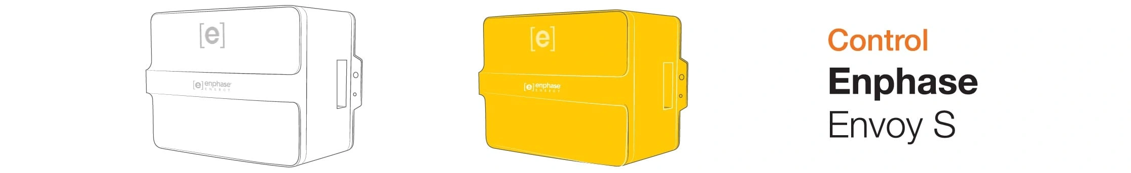
Illustrated highlighted product features

Illustrated highlighted product features
Like this project
Posted May 13, 2025
This project developed a scalable visual identity system for presentations, digital platforms, and marketing, ensuring cohesive, consistent brand representation
Likes
0
Views
16
Timeline
Feb 1, 2025 - Feb 28, 2025