Sleek Investment One-Pager for AI Infrastructure
Scott DS Young
AI infrastructure, translated into a clear,
investor-ready narrative.
Visual Direction (Color + Type)
Explored multiple color directions to define a modern, technical tone—balancing trust, intelligence, and forward momentum. The final system uses layered greens and cool tones to create depth while maintaining readability across formats.
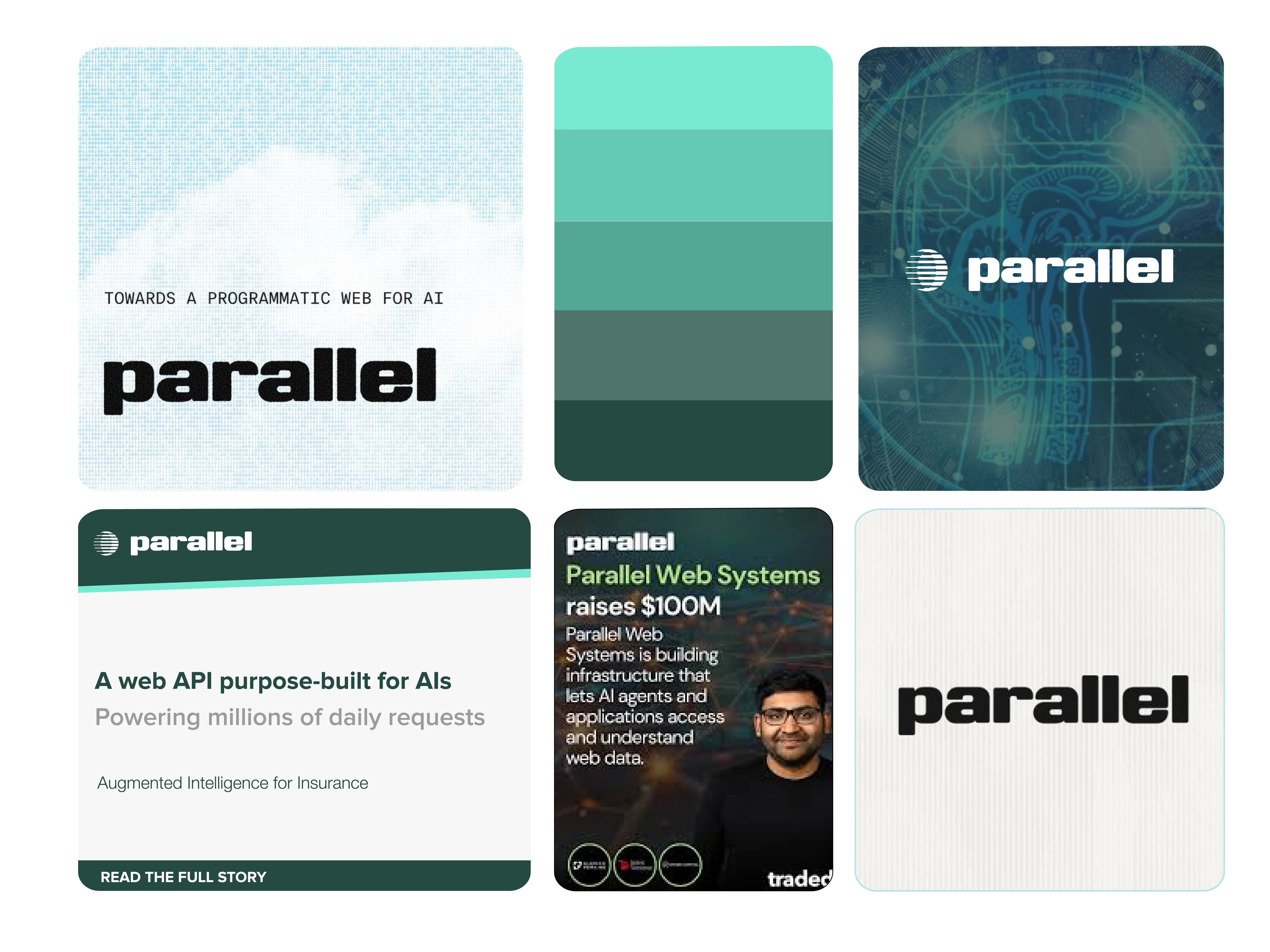
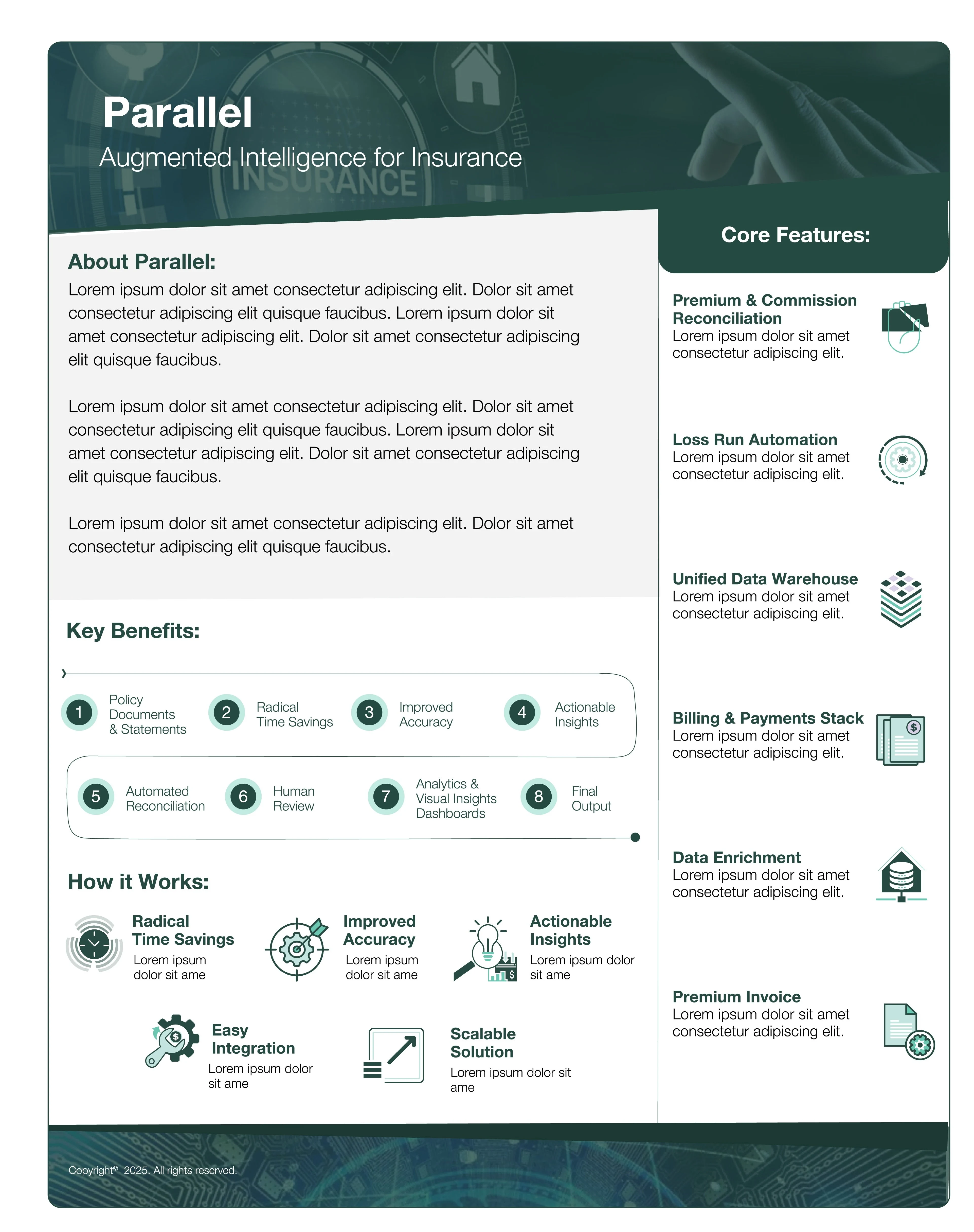
Designed a sleek, modern one-pager introducing Parallel, an
AI-powered automation platform for the insurance industry—built to communicate complex infrastructure with clarity and confidence.
Approached this as a system build, not a single asset—developing a flexible visual direction that could extend across future brand and product touchpoints.
With no existing guidelines, I established a tech-forward palette, typographic hierarchy, and layout structure designed for clarity, adaptability, and scale.
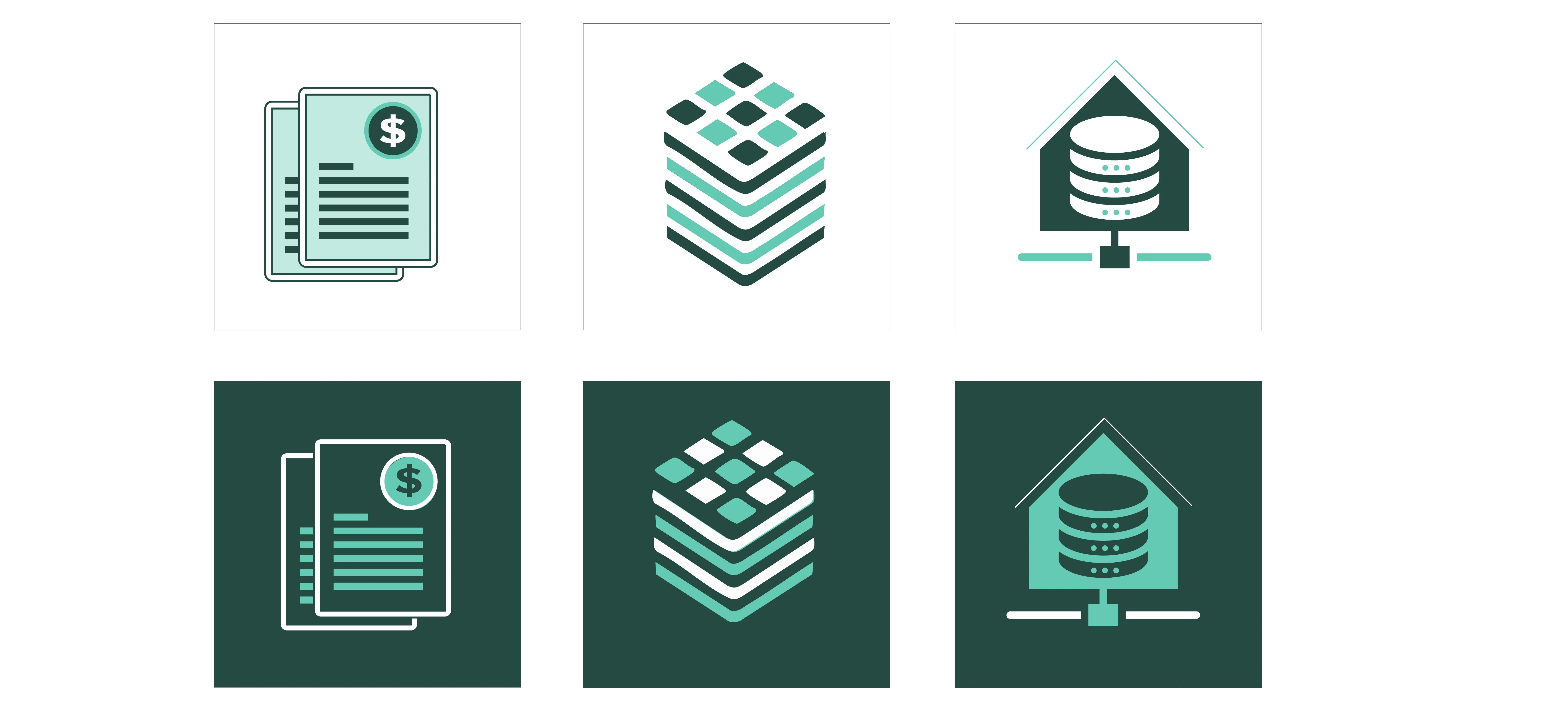
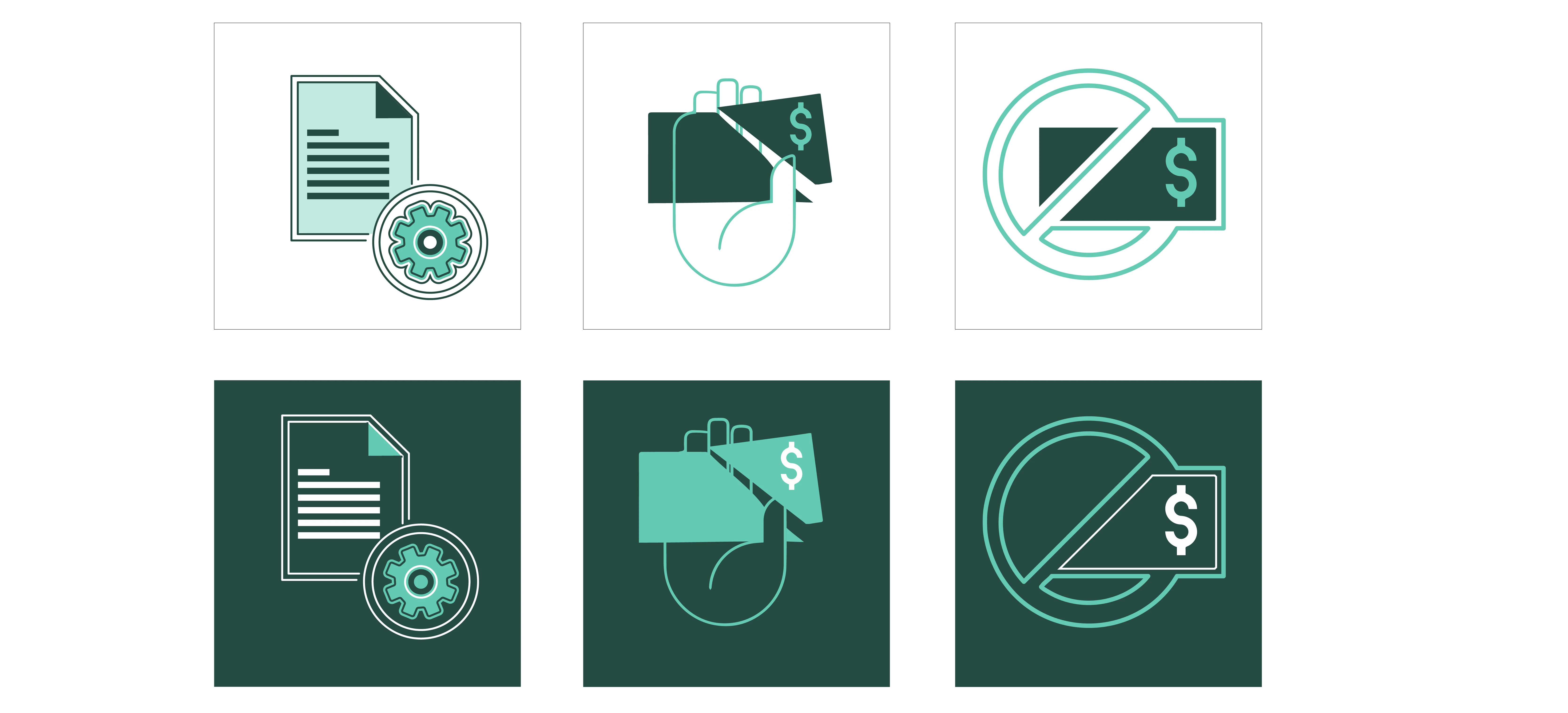
Icon System
Built in both light and dark modes, the system adapts seamlessly across presentations, product UI, and marketing materials.
Custom iconography was designed to replace traditional bullet points—making complex information easier to scan and understand at a glance.
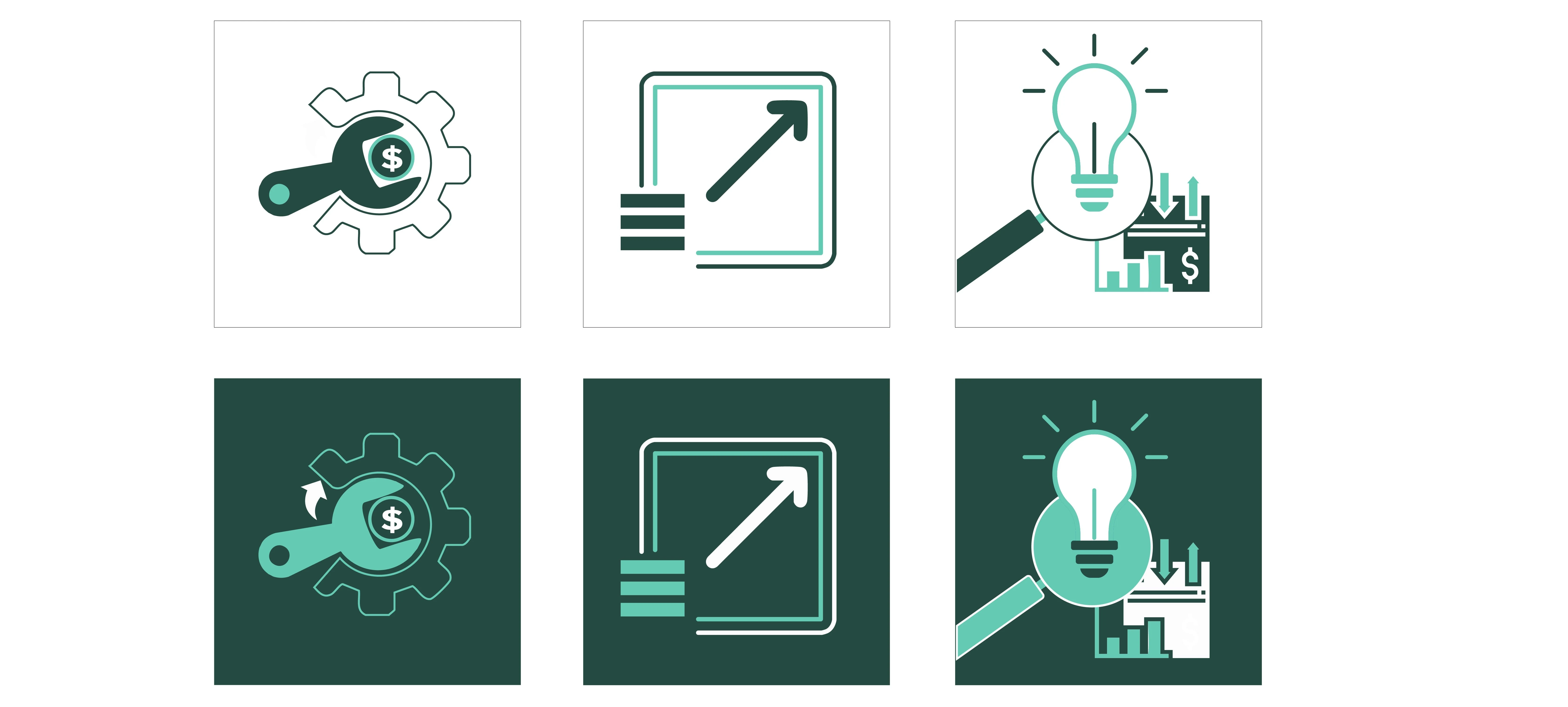
Light Mode
Light mode icons designed for clarity across presentations and print.
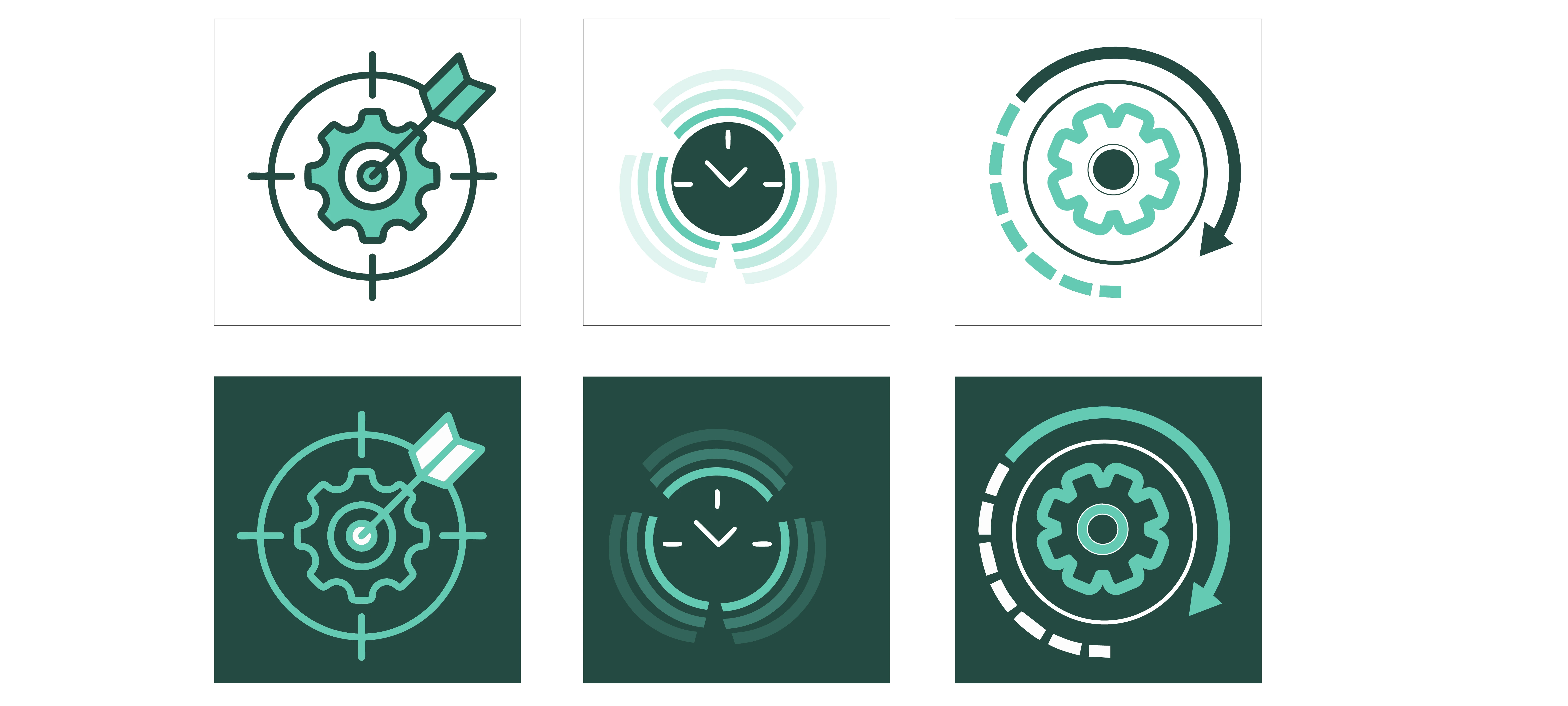
Dark Mode
Dark mode variants ensuring consistency across product and digital environments.
Application — Landing Page in use
The system comes together in a clean, structured one-pager—guiding the viewer from high-level value to detailed capabilities without friction.
Every element, from hierarchy to spacing, was designed to support quick comprehension and confident decision-making.
Impact
A scalable visual system that brings clarity to complex AI infrastructure—designed to support investor conversations, product storytelling, and future brand growth.
Closing Line
A fast-moving build, designed to feel anything but rushed.
Like this project
Posted Jun 5, 2025
Designed a refined one-pager introducing Parallel, an AI-driven platform for insurance, translating complex capabilities into a clear, investor-ready narrative.
Likes
0
Views
20
Timeline
Jun 1, 2025 - Jun 2, 2025
Clients
Parallels