Technical Data Sheet Design for Azul.com

Scott DS Young


Azul Technical Data Sheet + Motion System
Objective
To communicate highly technical product information in a clear, visual format that could scale across print, digital, and motion. The goal was to create a unified design system—one that combined readable layouts, custom iconography, consistent graph styles, and subtle animation to strengthen comprehension and brand cohesion.
Challenge
Azul’s existing technical materials were dense and hard to scan, especially for non-engineers. Translating that amount of technical content into something digestible required reorganizing the hierarchy without oversimplifying the substance.
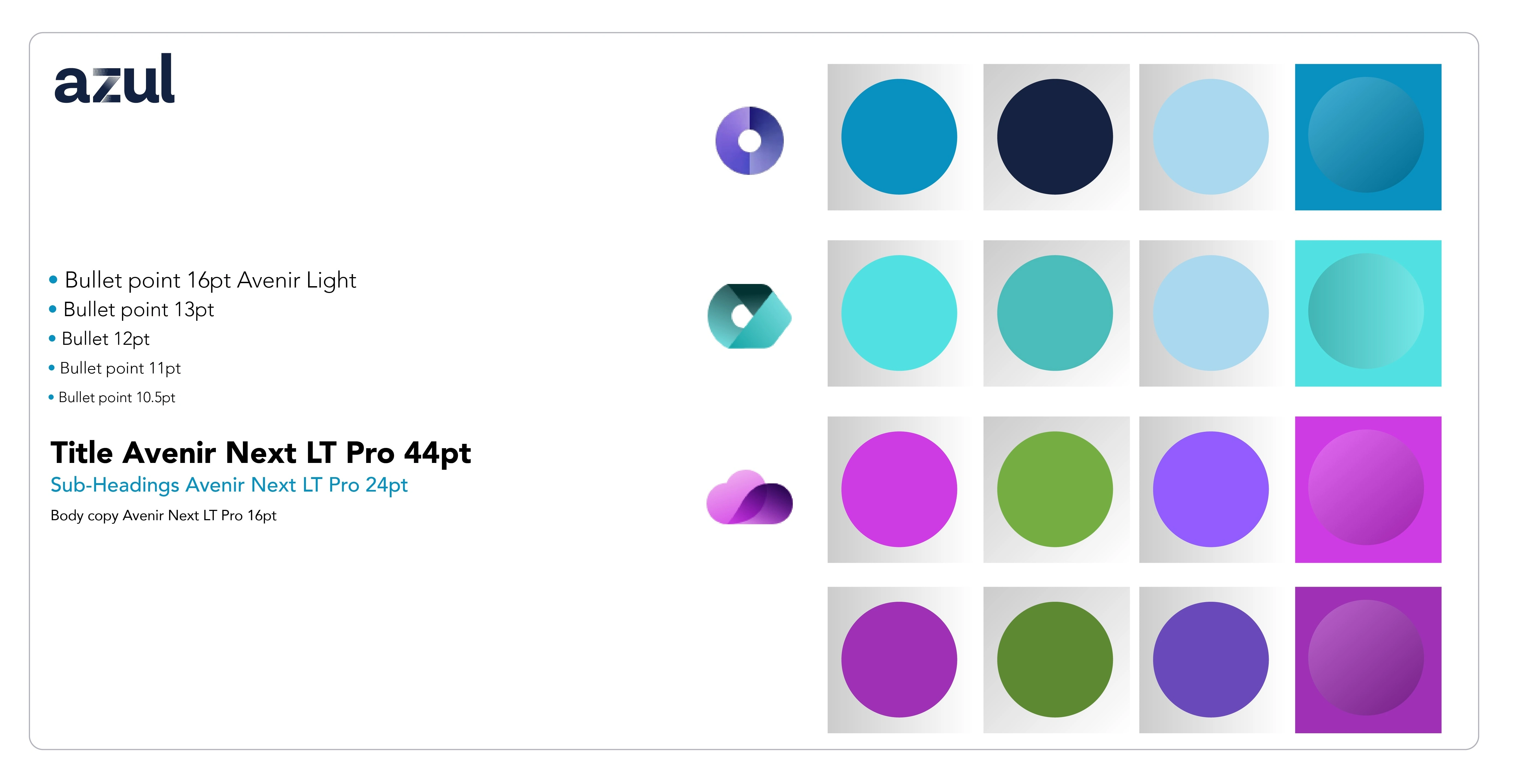
The brand also uses multiple color sets for its three product platforms, so the design needed a way to use those colors meaningfully without overwhelming the page. On top of that, the visuals needed to work not just in static form, but also as motion elements—bringing energy to the website and helping internal teams present complex functionality more effectively.
Outcome
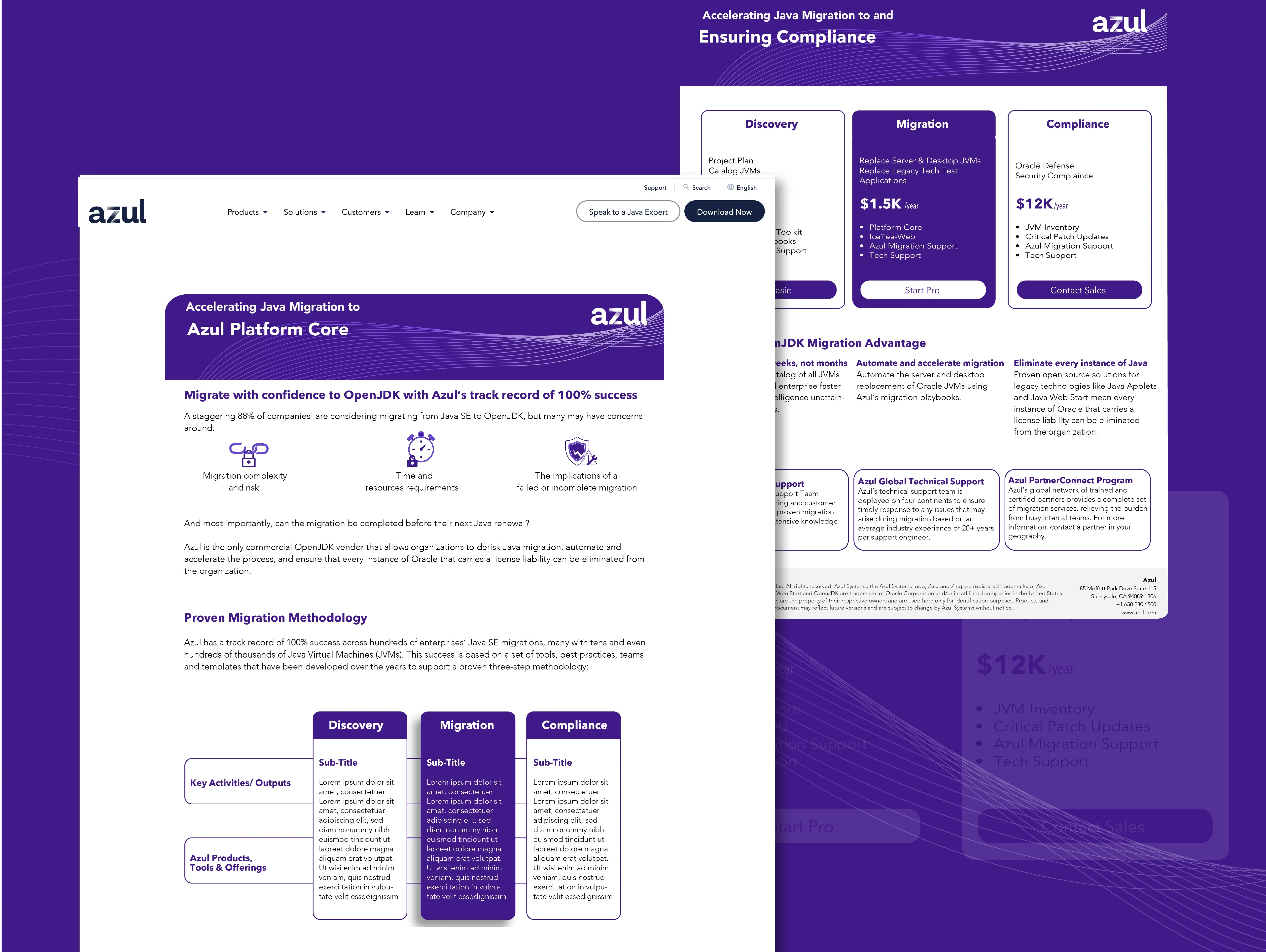
I delivered a complete visual system that aligned Azul’s technical documentation, marketing needs, and brand language. The redesigned one-pager improved readability through clearer structure, cleaner spacing, and a modular layout. Custom icons, updated graphs, and a refined color approach created consistency across all three platforms.
Motion graphics added an additional layer of clarity and engagement—giving the icons and diagrams life while supporting product storytelling on the website and in presentations. The final system is flexible, easy for the client to update, and visually cohesive across every touchpoint.
Used for a presentation and linkedin post
My Approach
Started by breaking down the technical content and identifying the core message for each platform.
Built modular layout templates to keep the information structured, scannable, and consistent.
Designed a custom icon set to help users process key details quickly and visually.
Applied a “cut the noise” philosophy—removing anything that didn’t support clarity or immediate understanding.
Developed motion-friendly visuals so icons, graphs, and diagrams could be animated for the web and presentations.
Produced files in Illustrator, Figma, and PowerPoint to ensure Azul’s internal teams could update and reuse all assets easily.
Delivered branded one-pagers for all three platforms, optimized for both readability and shareability across teams.
Before:
Raw technical content with no unified layout.
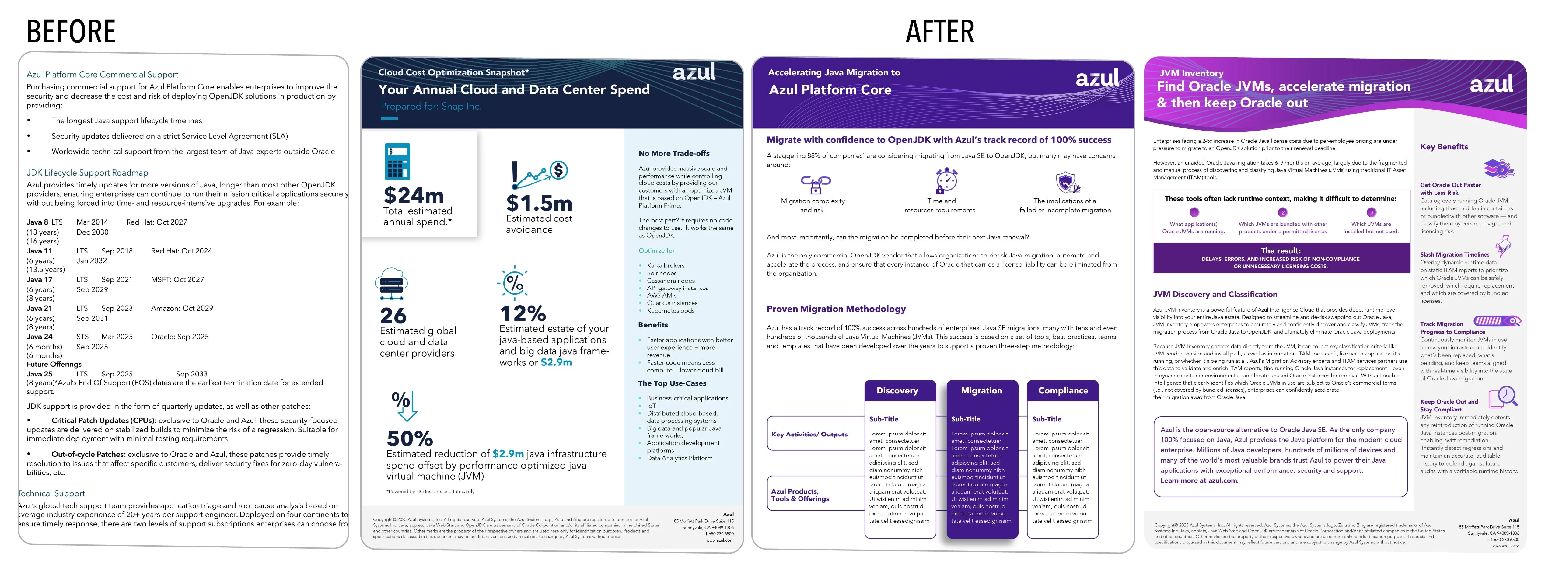
After:
A clean, branded one-pager using the brand colors for the 3 different platforms with clear hierarchy, custom icons, and a polished visual flow.
Deliverables
Audit of all technical content across three product platforms
Development of a flexible layout system tailored to each line
Integration of three distinct color brands while maintaining a cohesive structure
Custom icon design for improved readability and quick scanning
Creation of branded, one-page technical data sheets
Source files delivered in Illustrator, Figma, and PowerPoint
Template setup for easy updates by multiple Azul teams
Before/after visual refinement to show the design transformation
Need technical visuals that actually make sense?
I help teams bring clarity to complex ideas through design and motion.
Send me a message and let's discuss your project
Like this project
Posted Dec 11, 2025
Redesigned Azul’s technical sheets with clear layouts, custom icons, graphs, and motion graphics to make complex product info easy to understand.
Likes
0
Views
17
Timeline
Jun 2, 2025 - Jun 6, 2025
Clients
Azul