
ESTART is an aesthetic clinic built on three words: aesthetic, art and health. I designed an identity that brings the three together in one calm, confident system. It reassures patients the moment they walk in, and treats beauty as a form of self-care rather than vanity.
Role: Art Direction & Brand Identity
Scope: Logo, typography, colour, pattern, stationery, uniforms, signage, advertising, brand film
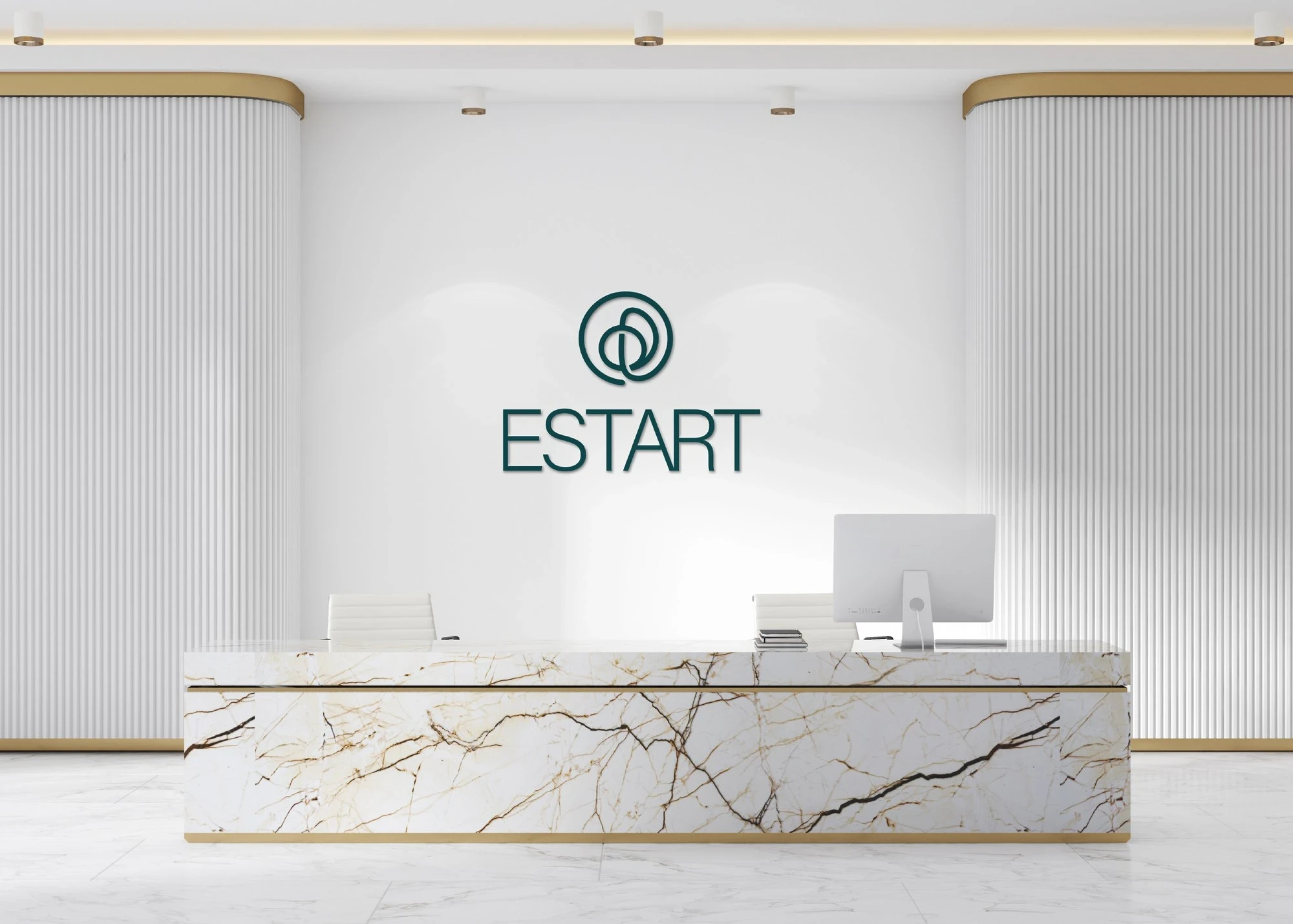
ESTART reception wall with the illuminated logo
The film
The 15-second brand film opens with the symbol drawn as a single line, then moves through the concept, the moodboard, the colours taken from nature, uniforms, posters, badges and business cards, and closes on the mark again. Every cut lands on the beat.
Note: the music in the film was generated with AI (Magnific, Google Lyria 3). The identity, art direction, animation and edit are my own work.
Concept: Aesthetic · Art · Health
Three overlapping circles carry the whole idea. Each word is a field of its own, and the clinic lives where they meet. The same circle later becomes the core of the symbol and the pattern.
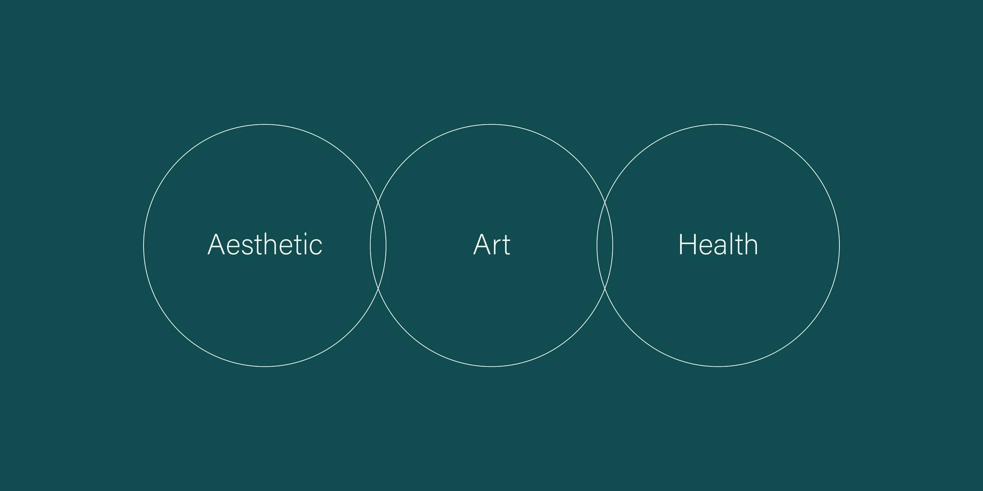
Three overlapping circles: Aesthetic, Art, Health
Colour & mood
The mood is soft, natural and bright: skin, flowers, sky and movement. The palette is taken straight from nature, with tree green, sky and sand turned into deep teal, mint and warm sand. Together they feel clinical and clean, but never cold.

ESTART moodboard: portraits, flowers, sky and movement
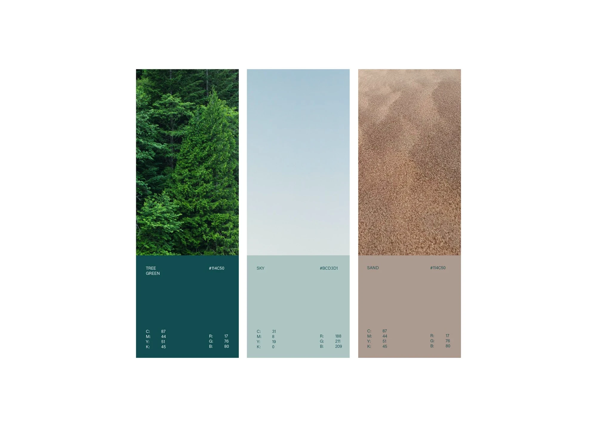
Colours from nature: tree green, sky and sand
Identity
The symbol is one continuous line that curls inward like a petal or a fingerprint, a quiet sign of personal care. It sits next to a clean, light wordmark. Deep teal, mint and sand give the logo three calm backgrounds, and Acumin Pro carries every message across its full range of weights.

Calm, natural imagery that sets the tone of the brand
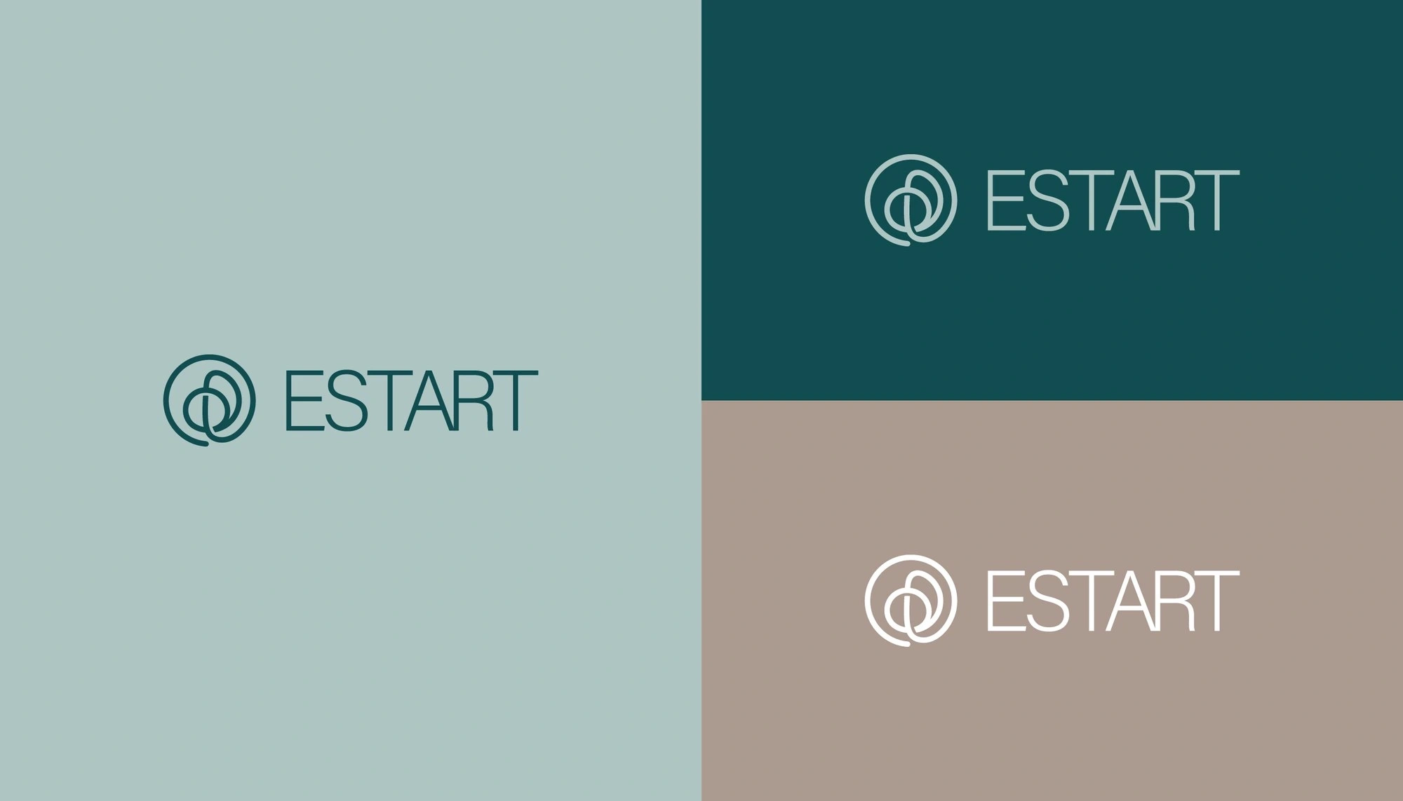
ESTART logo on teal, mint and sand
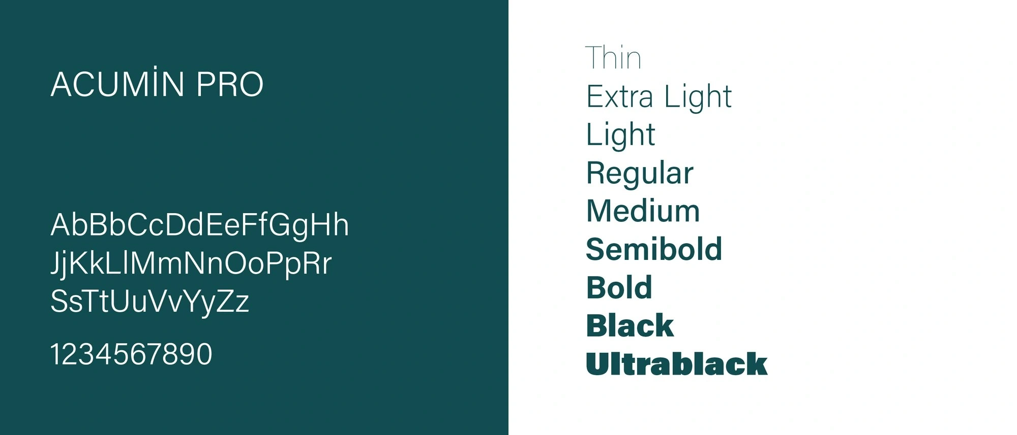
Typography: Acumin Pro, from Thin to Ultrablack
Pattern & print
The circular symbol repeats into a flexible pattern for packaging, folders and wall graphics. Large, cropped pieces of the mark run off the edge of the page, so even a plain document feels like ESTART.
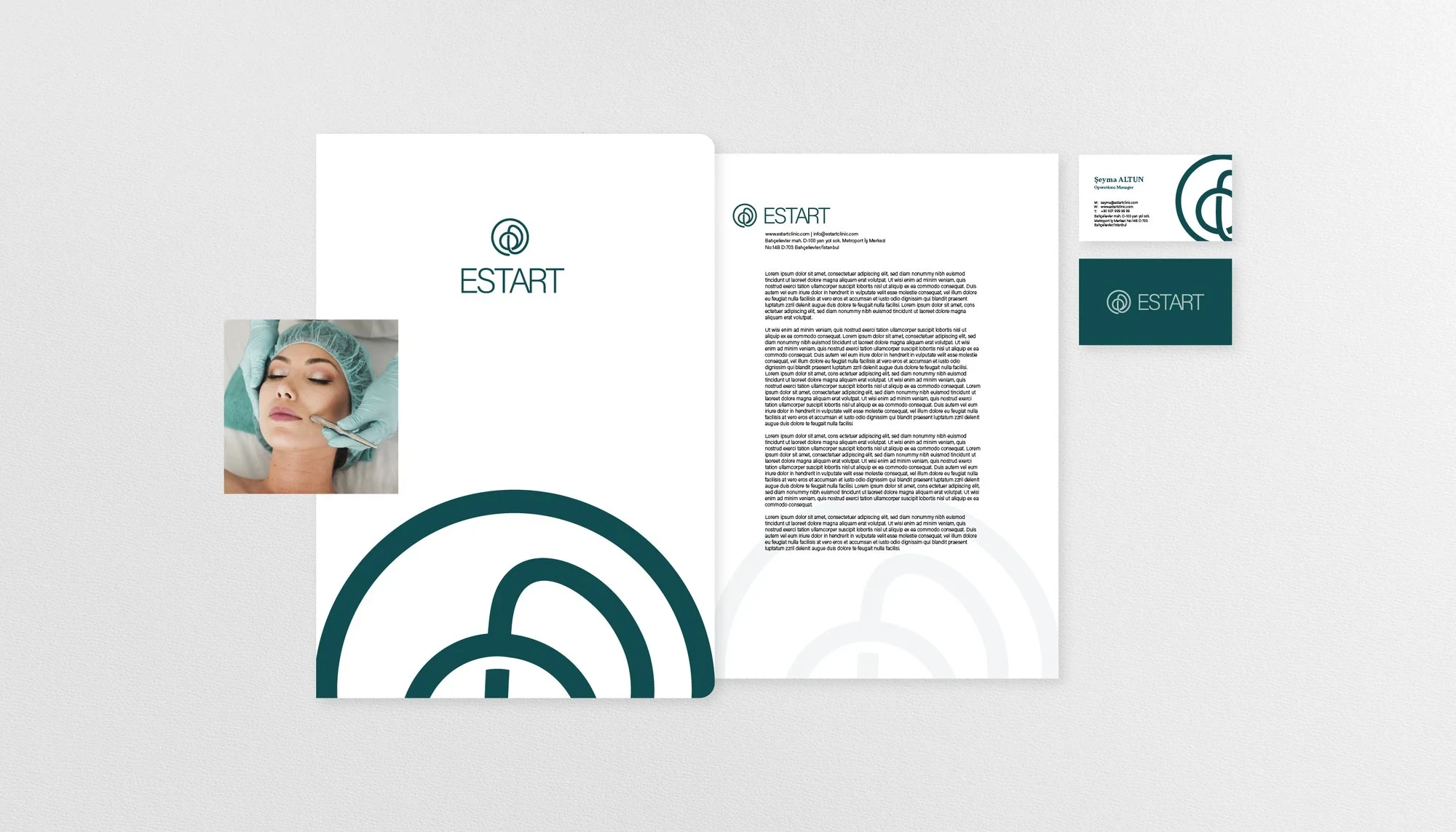
ESTART stationery set with the cropped symbol
Stationery
Letterheads and documents use generous white space, a clear grid and a small teal accent, so every patient letter feels calm and professional.
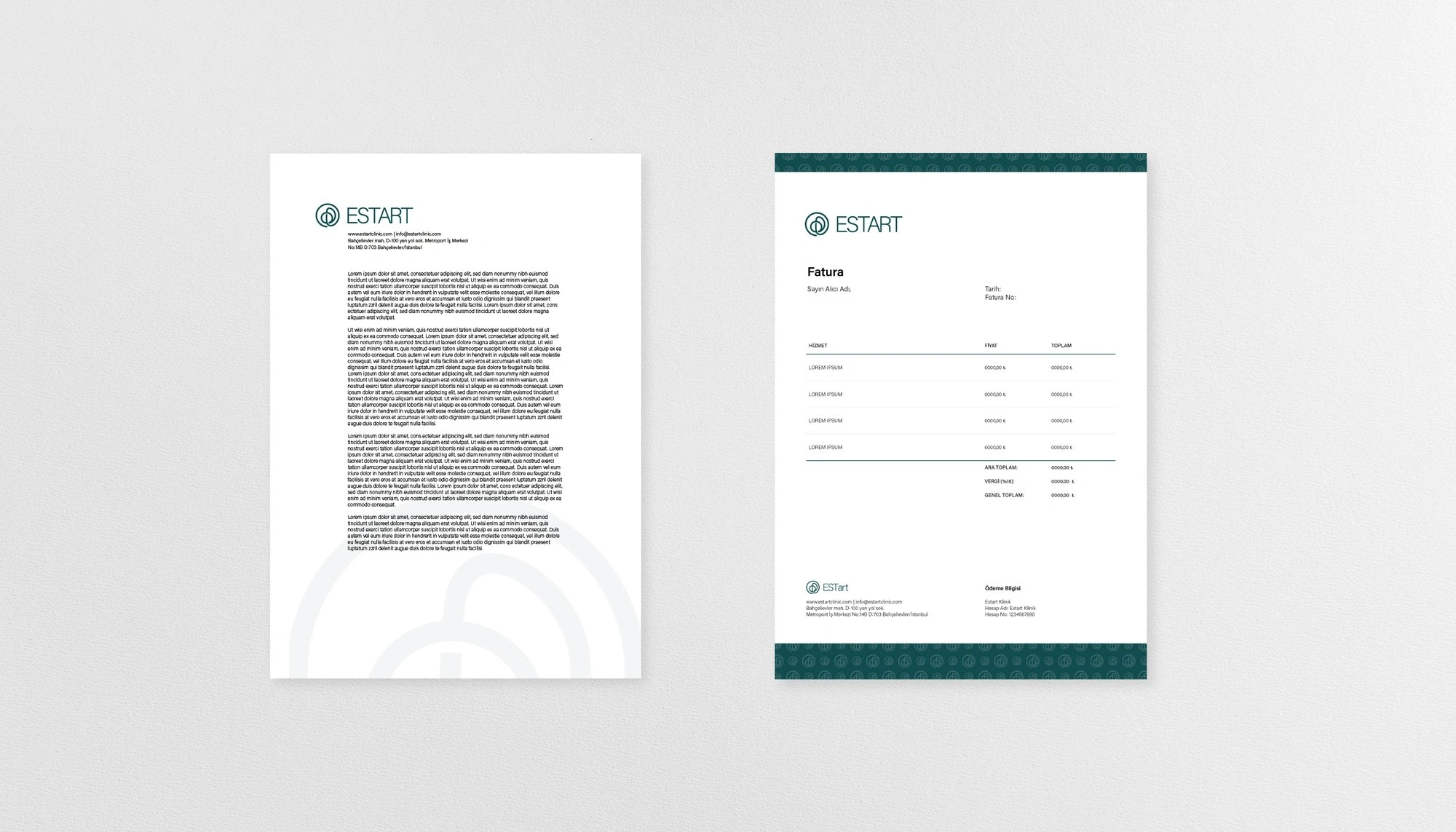
ESTART letterhead and document layout
Business cards
A solid teal side with the logo, and a light typographic side with the contact details. Simple, elegant and easy to read.
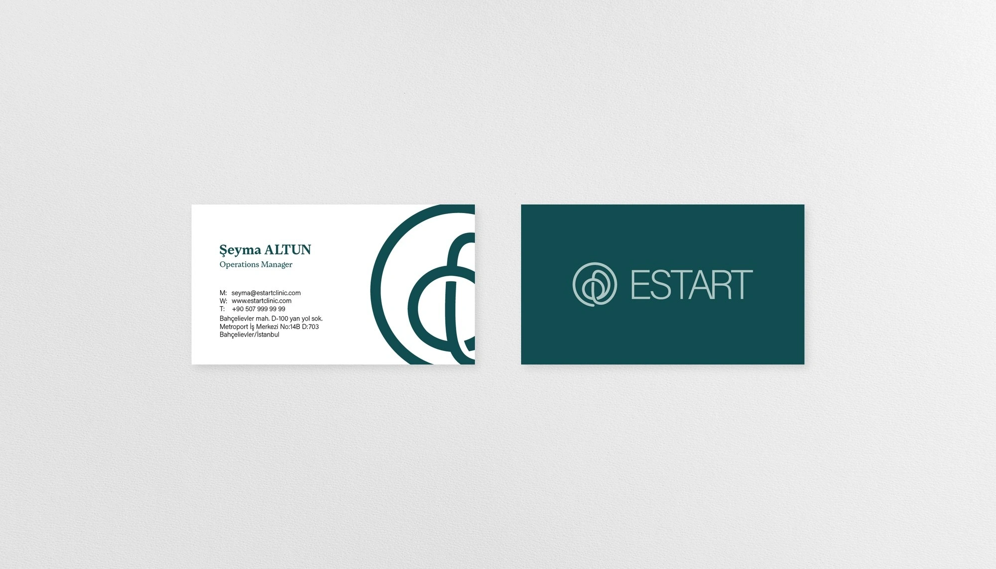
ESTART business cards, front and back
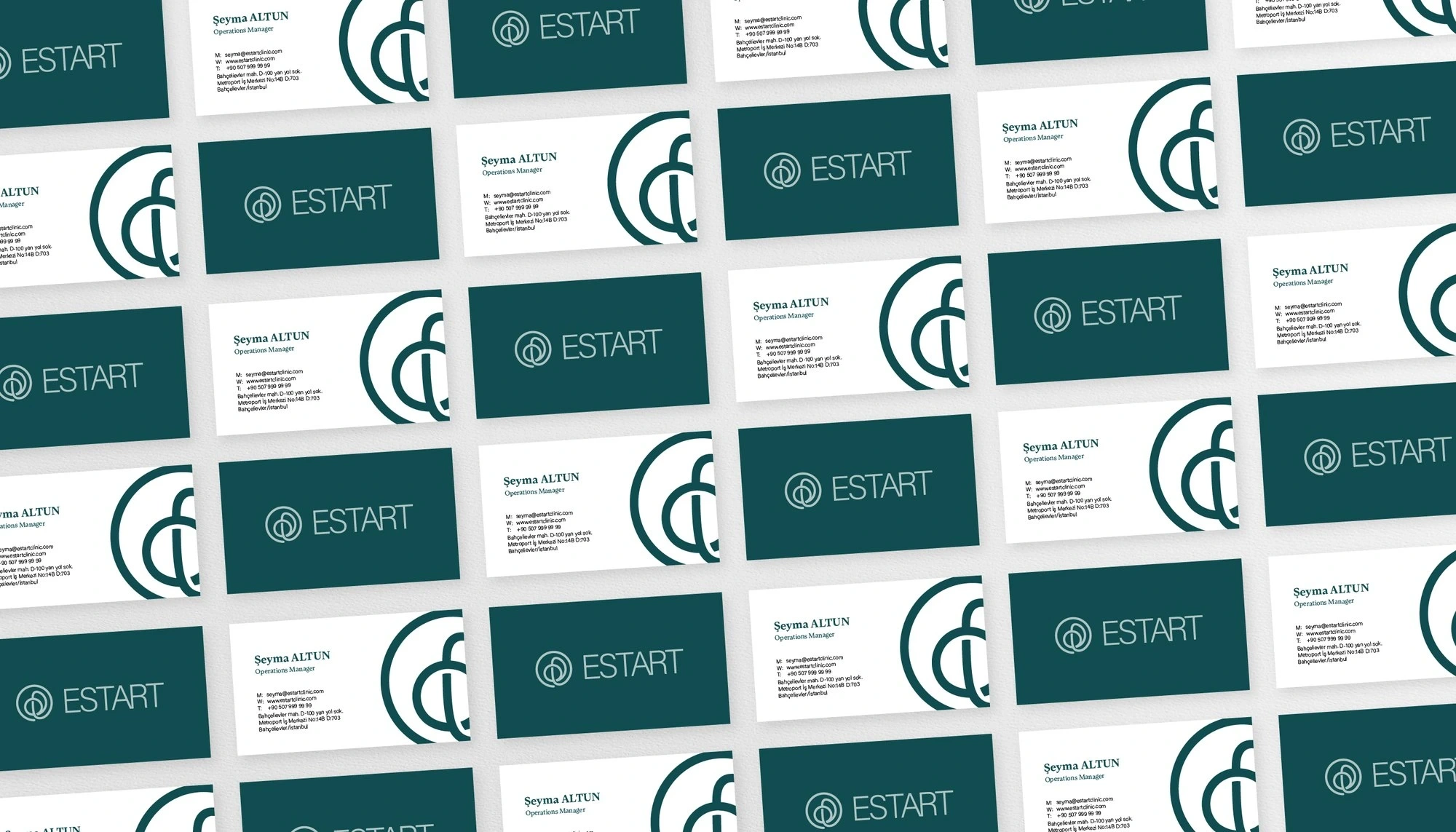
ESTART business cards in a repeating layout
The details
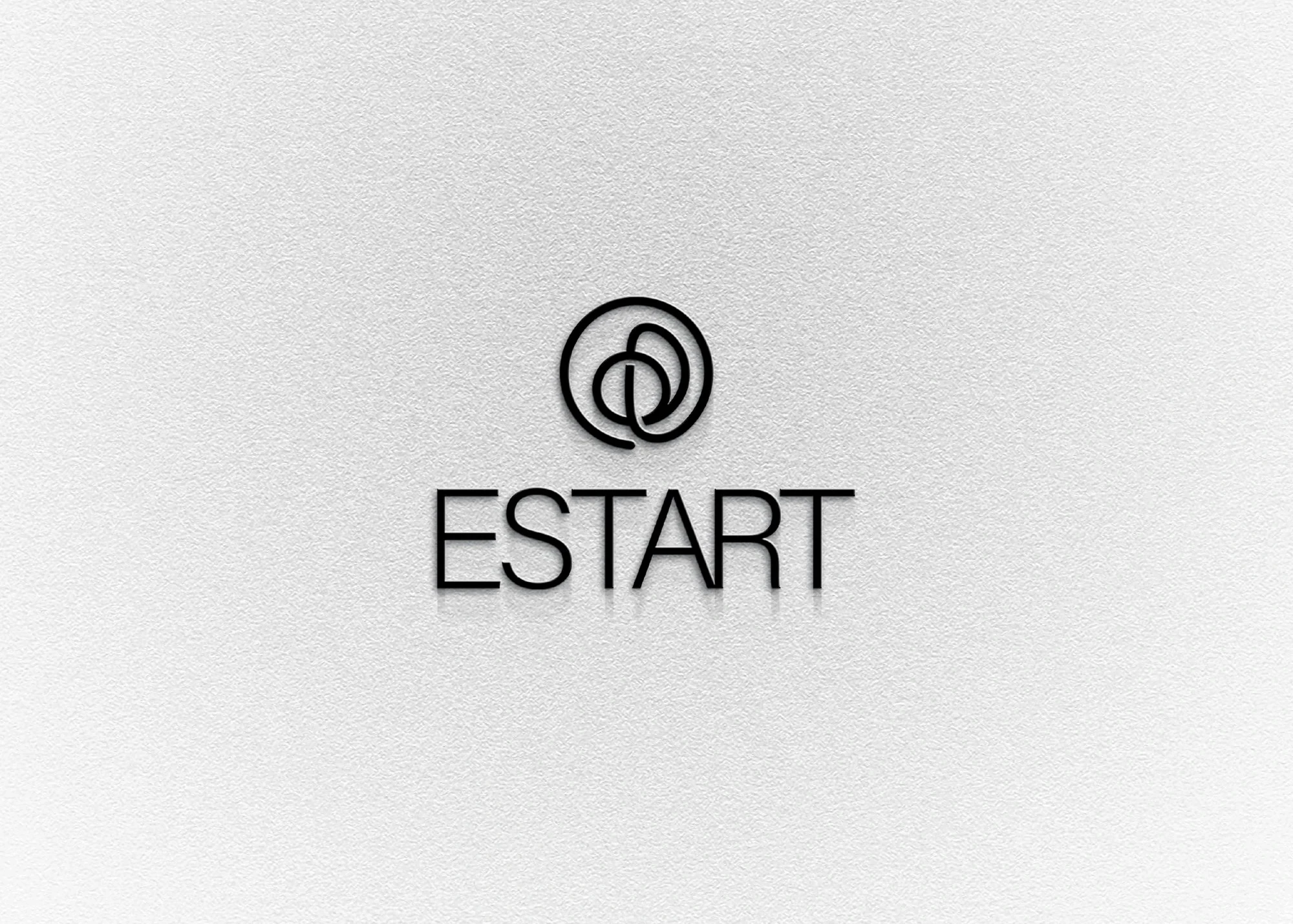
Debossed on white paper or printed in teal, the mark relies on small tactile details that speak of precision and quality.
ESTART logo debossed on white paper
Care you can see
Staff badges and uniforms carry the symbol in a subtle way. The team looks clean and professional, and the brand stays consistent from the reception desk to the treatment room.
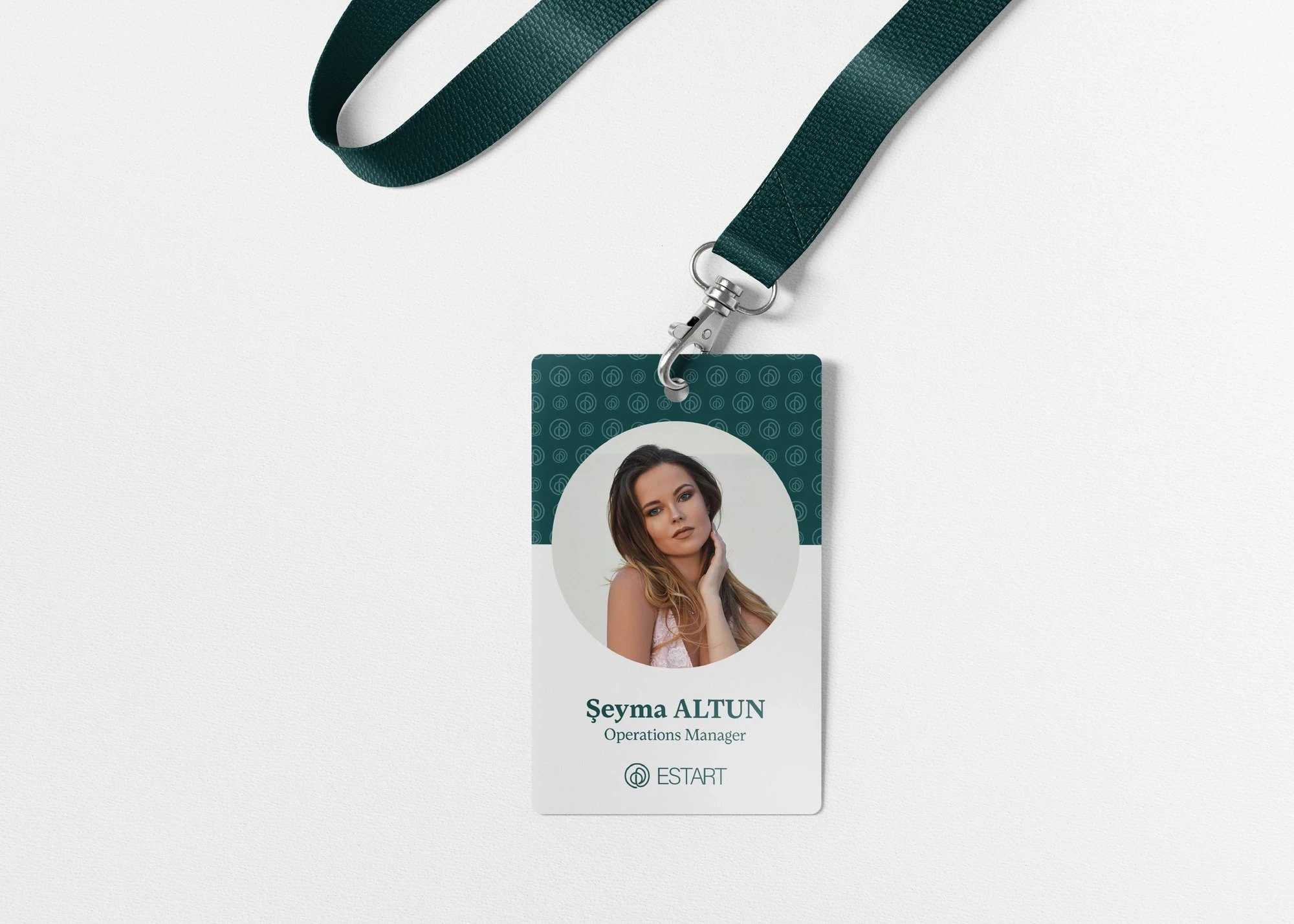
ESTART staff ID badge
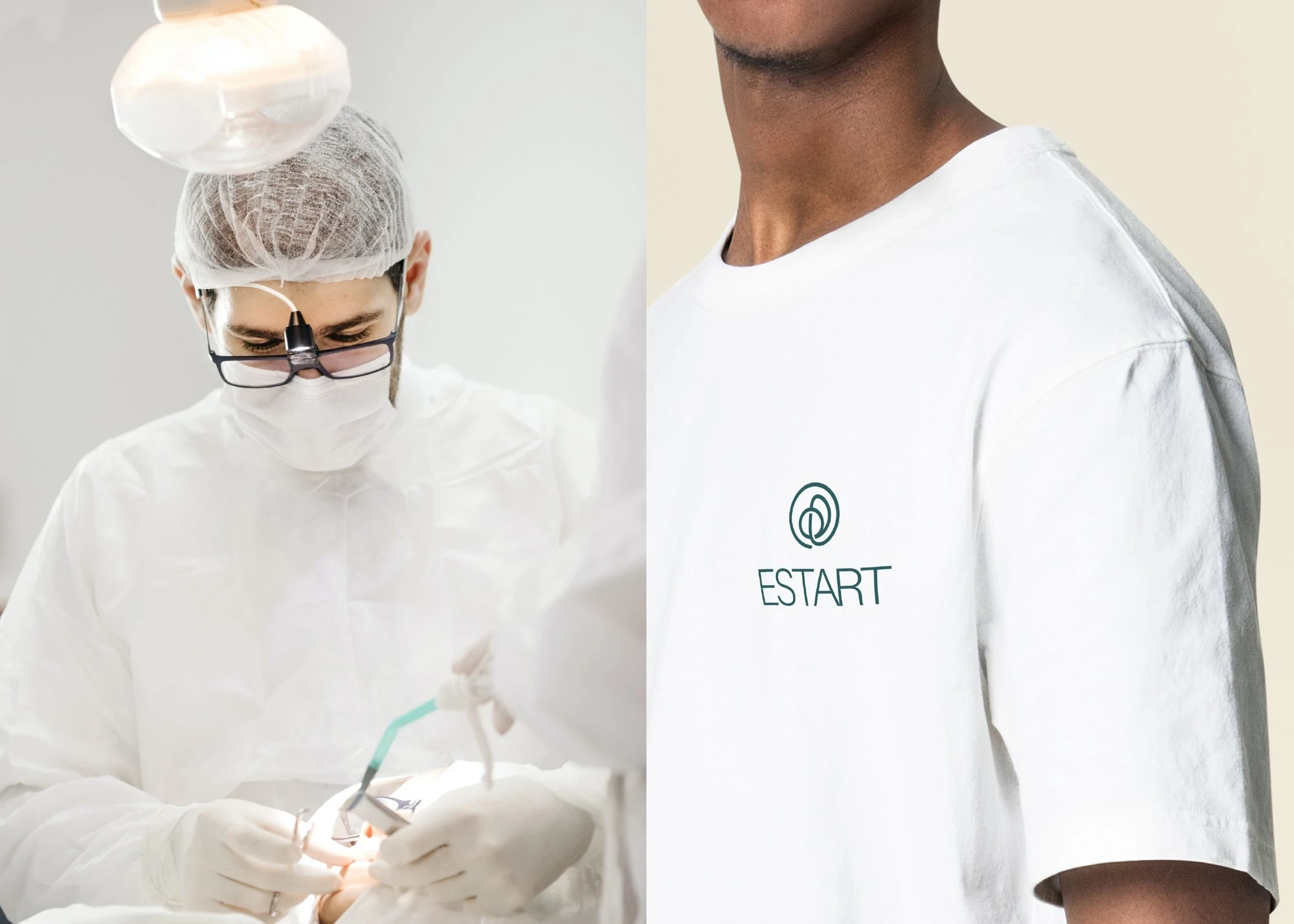
ESTART uniform and T-shirt
Out of home
Street posters and digital screens pair calm portraits with deep teal and the short line "Aesthetic. Art. Health." The clinic feels trustworthy at first glance, even to someone walking past.
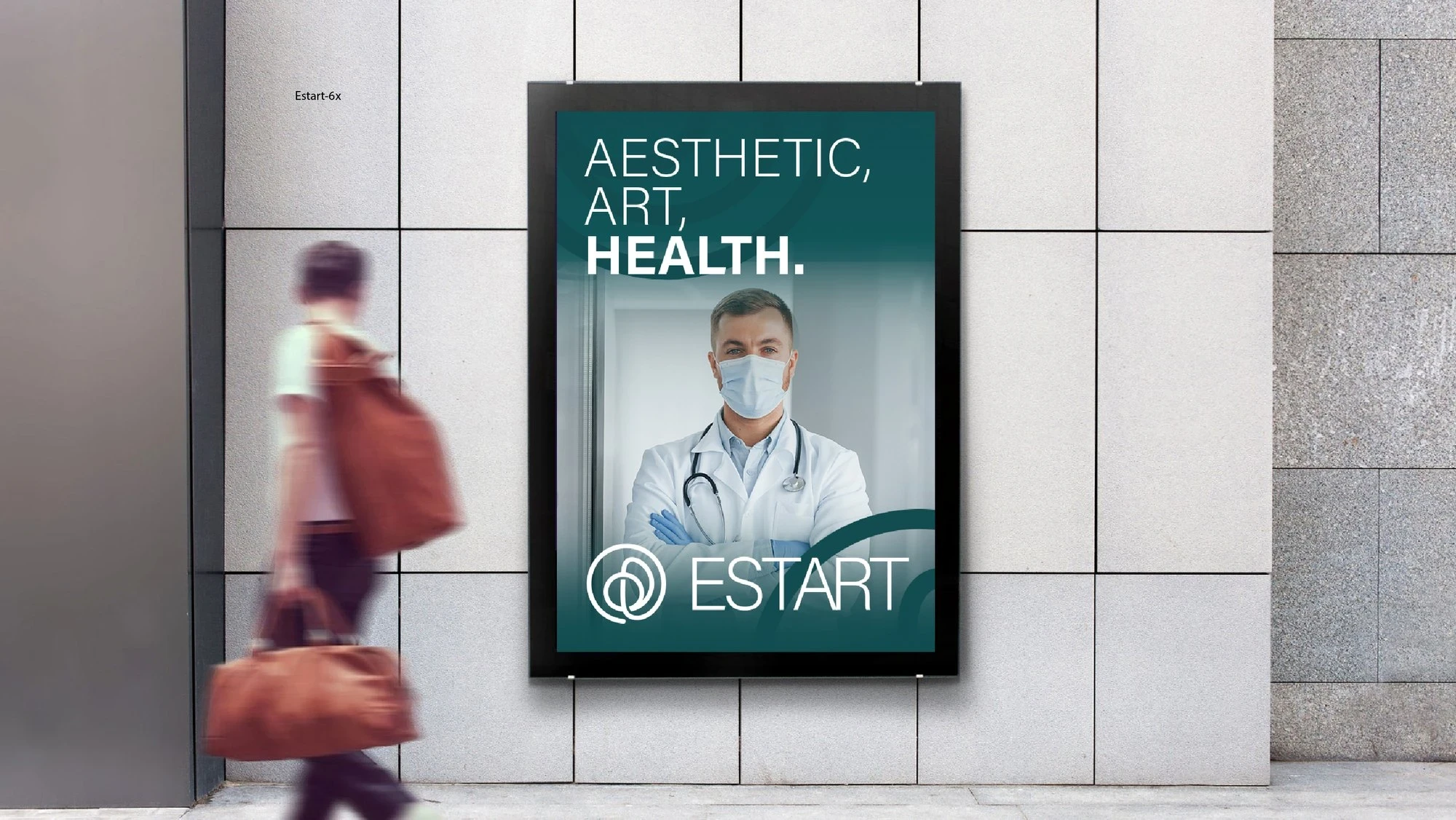
ESTART street poster: Aesthetic. Art. Health.

ESTART digital billboard
Identity, art direction and brand film by Mehmet Kırlangıç. Film music generated with AI.
0 likes · 0 views · Nov 15, 2026
Brand identity and a short brand film for ESTART, an aesthetic clinic built on three words: aesthetic, art and health.


