Built with Framer
Zthree Capital Website Redesign
Approve request to show earnings
View
Muhammad Rashid
Verified
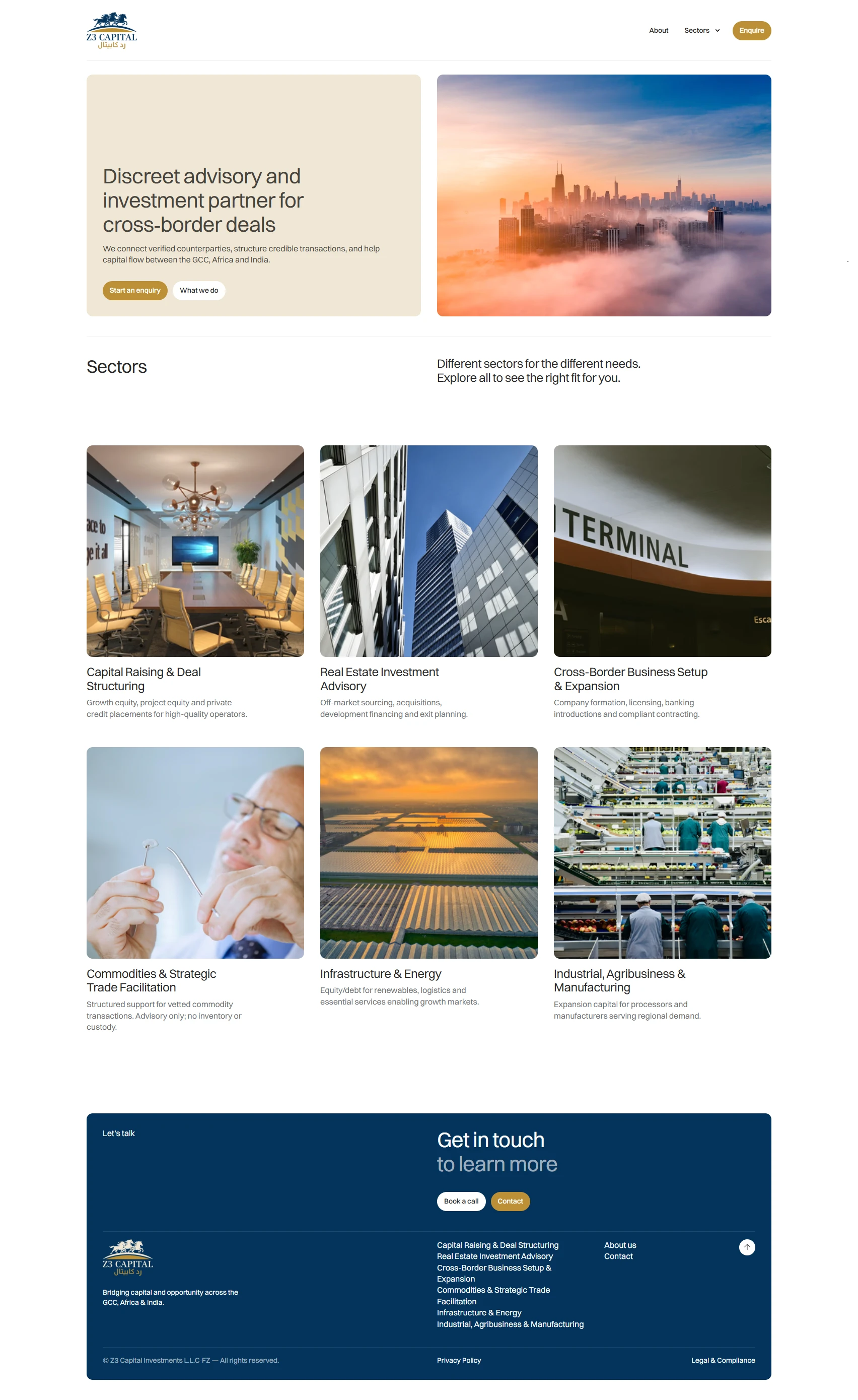
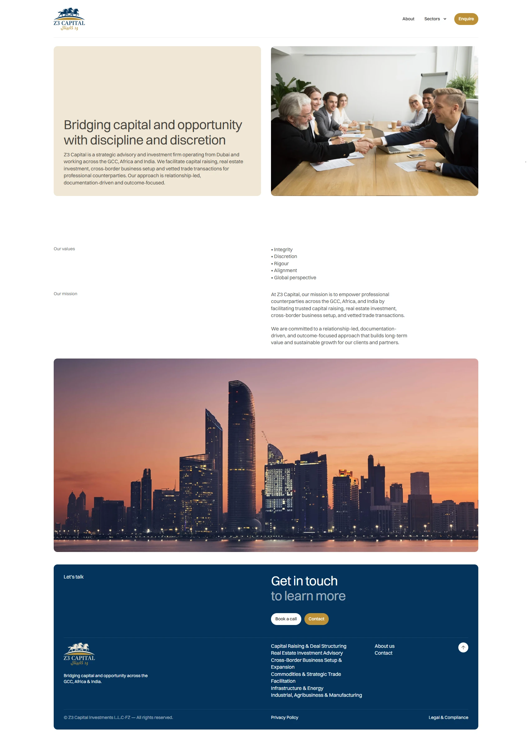
Zthree Capital — Website Redesign
A fresh, modern, and fully responsive website experience — designed and developed entirely in Framer.
When Zthree Capital approached me, their objective was clear: create a sophisticated platform that reflects their evolving brand while making it easier for users to explore their financial services and expertise. The redesign wasn’t only about visuals, but about building a seamless, engaging, and responsive experience across all devices.
Process — From Figma to Framer
Designed the full structure and UI in Figma, ensuring brand alignment and user-friendly navigation.
Once approved, the design was built directly in Framer, bringing static mockups to life with smooth transitions and real interactions.
Established global styles (typography, color system, spacing) for design consistency.
Used Auto Layout & Stacks to ensure fluid, responsive layouts.
Translated components into interactive, reusable elements for scalability.
Page Structure
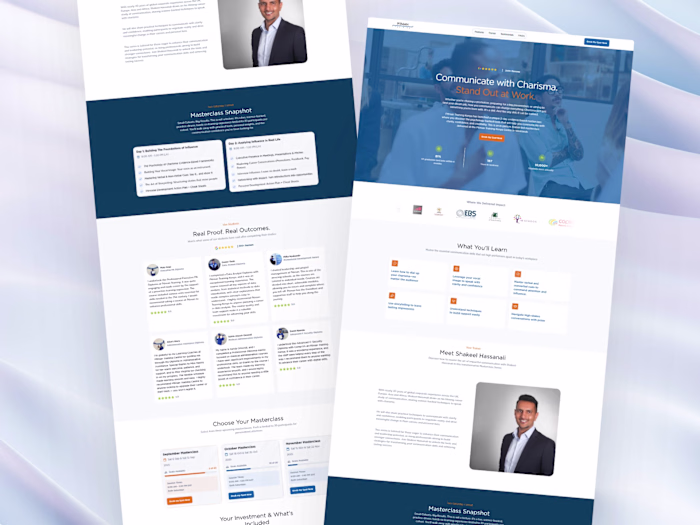
Hero Section — Impactful imagery, bold headline, and a clear CTA for instant engagement.
About Section — Clean visuals and concise storytelling to highlight Zthree Capital’s vision and values.
Services & Expertise — Grid-based layout with hover effects for an interactive showcase of offerings.
Contact Form — Simple, accessible, and integrated for seamless lead capture.
Animations & Interactions
Scroll-based animations for an engaging browsing experience.
Hover states on buttons and cards for intuitive feedback.
Smart Animate transitions for fluid movement between sections.
Mobile Optimization
Designed with a mobile-first approach for consistency across devices.
Navigation and CTAs kept simple and clear on smaller screens.
Thorough testing on mobile and tablet for usability and performance.
Performance & SEO
Optimized images with Framer’s compression and lazy loading.
Lightweight components and animations for fast load speeds.
SEO best practices applied for search visibility.
Results & Client Feedback
“We absolutely love the new look—it's clean, professional, and makes it so easy for users to find what they need.”
The redesign led to stronger engagement, clearer navigation, and an improved mobile experience, all contributing to higher user satisfaction.
Key Wins
✅ Stronger User Experience — streamlined structure and improved flow
✅ Modernized Aesthetic — clean, professional, and brand-aligned design
✅ Fully Responsive — polished across all devices
✅ Built Entirely in Framer — no handoffs, no patchwork, just smooth execution
Tools Used
Figma — wireframes, UI/UX design, prototyping
Framer — development, animations, responsive build, CMS integration
Like this project
Posted Sep 25, 2025
Redesigned Zthree Capital’s website with a modern, responsive design in Figma and Framer—delivering a sleek, intuitive, and engaging user experience.
Likes
0
Views
7
Timeline
Aug 19, 2025 - Sep 25, 2025
Clients
Rooted Social Ltd