Designing a Sustainable Shopify Store for Noble

Samson Bojesomo


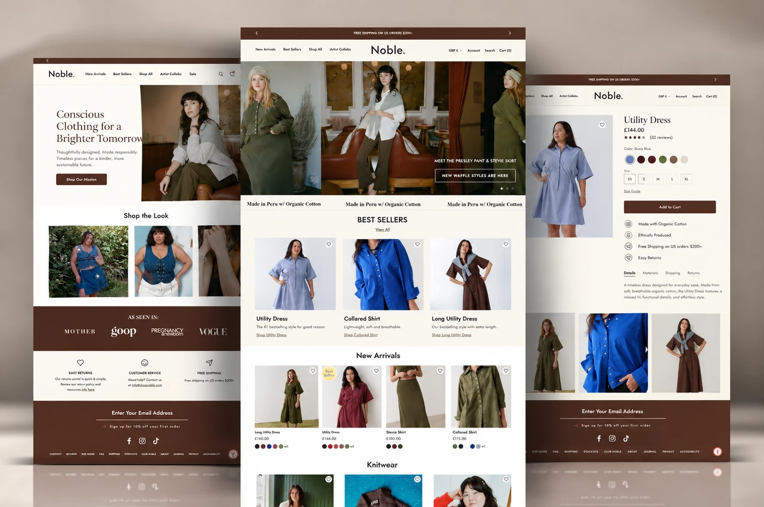
Noble: Designing a Conscious Fashion Store That Sells Sustainability Without Sacrificing Style
Brand: Noble — conscious, sustainably made clothing for a size-inclusive audience
Role: Speculative Concept Design & Build (self-initiated sample project)
Result: Concept sample not an active client engagement
The Challenge
Sustainable fashion brands often face a tradeoff: lean too hard into the mission messaging and the site feels preachy or worthy rather than desirable; lean too hard into product and the "conscious" positioning gets lost as just another badge in the footer. I built this concept to explore a Shopify storefront where sustainability, inclusivity, and genuine style desirability all carry equal weight none of them treated as an afterthought to the others.
Research & Discovery
A conscious-fashion shopper is often weighing three things at once: do I actually like this, does it fit me (literally and in terms of body inclusivity), and does "sustainable" here mean something real or just marketing. The concept was built to answer all three within the first few scrolls, rather than pushing the sustainability case into a separate About page most shoppers never visit.
The Design Process, Section by Section
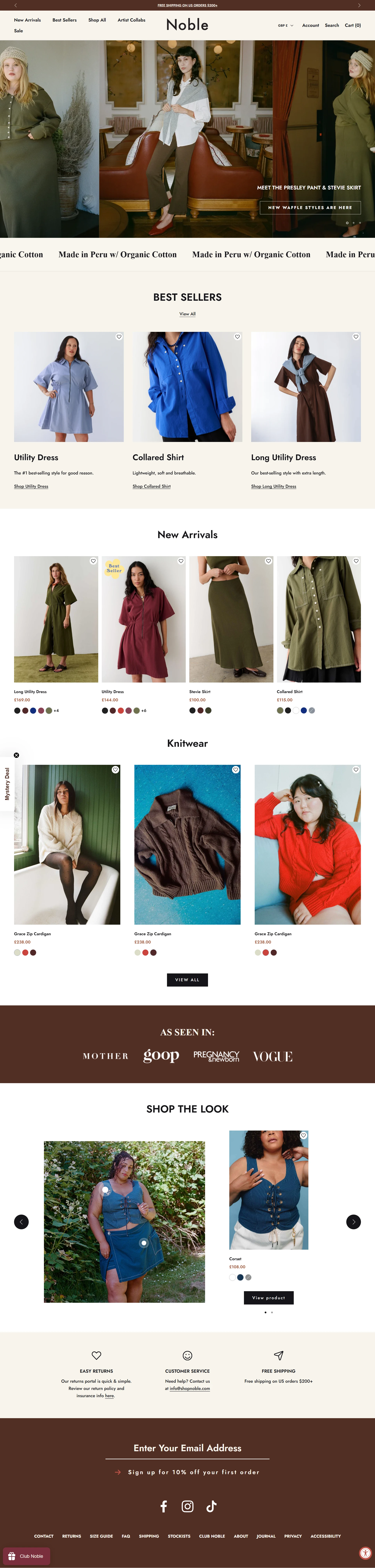
Hero — Leading With Mission as a Style Statement The homepage opens with "Conscious Clothing for a Brighter Tomorrow," paired with a warm, genuinely stylish editorial photo rather than earthy, crunchy sustainability imagery. This pairing matters: it signals from the first screen that "conscious" and "desirable" aren't in tension for this brand — the mission is stated boldly, but the photography does the work of proving it doesn't come at the cost of style.
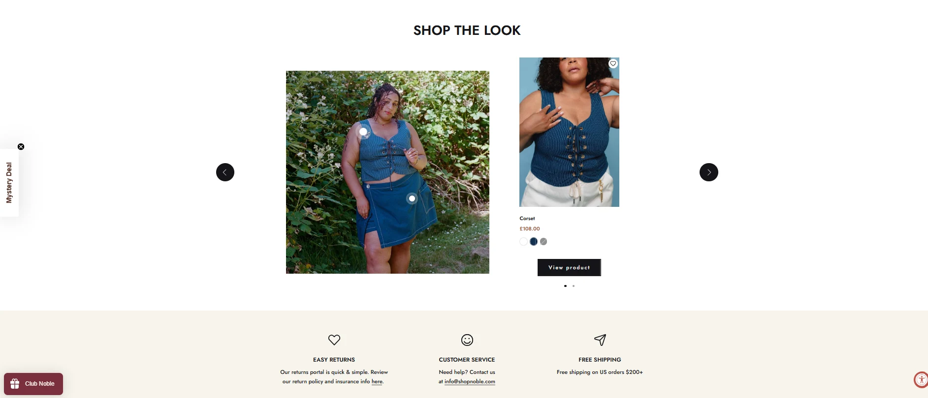
Shop the Look — Size-Inclusive Representation as Product Strategy Directly beneath the hero, a "Shop the Look" row features a visibly plus-size model styled in the same aspirational, editorial tone as the hero image. Placing inclusive representation this early and this prominently not tucked into a "sizing" page signals body inclusivity as a core brand value rather than a compliance checkbox, which builds real trust with shoppers who've been underserved by "straight-size-first" fashion sites.
"As Seen In" Press Bar — Borrowed Credibility, Early A press logo bar (Mother, goop, Pregnancy & Newborn, Vogue) sits right after the initial product imagery, lending third-party credibility before a shopper has to take the brand's own sustainability claims at face value.
Trust Icons — Removing Standard E-commerce Friction Easy Returns, Customer Service, and Free Shipping icons sit in a simple three-column row further down the homepage, handling the standard logistical reassurances every apparel shopper needs, without letting them compete visually with the mission-and-style messaging established above.
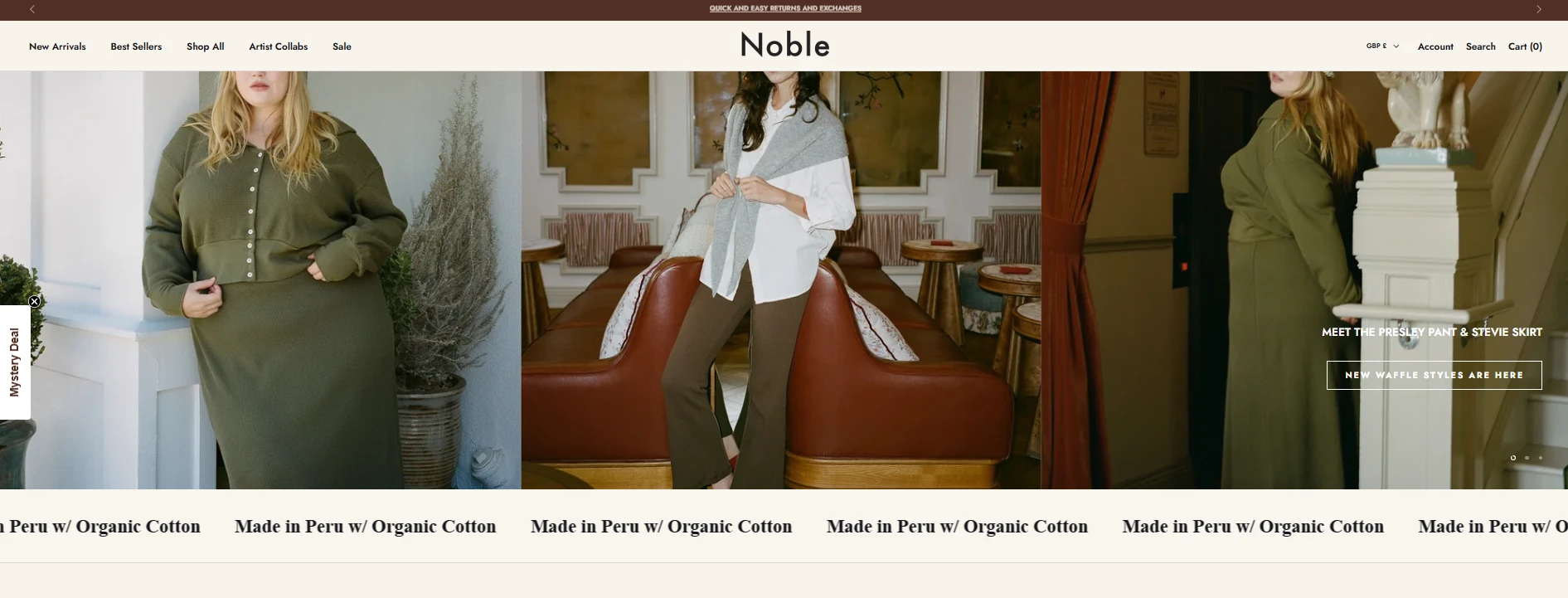
Rotating Hero Banner — Letting Product Lead on the Second Screen The secondary hero rotation (Presley Pant & Stevie Skirt, "New Waffle Styles") shifts from brand-mission-first to product-first messaging, with "Made in Peru w/ Organic Cotton" captions running beneath each image. This placement sustainability facts stated plainly as product captions, not separate marketing copy normalizes the sustainable manufacturing detail as just another product spec, the same way a size or fabric type would be listed.
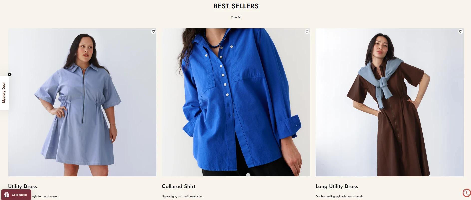
Best Sellers — Proof Through Popularity The Best Sellers section (Utility Dress, Collared Shirt, Long Utility Dress) uses direct, confident copy like "The #1 bestselling style for good reason," leaning on social proof through popularity rather than star ratings alone useful framing for a newer or values-driven brand that may not yet have the review volume larger fast-fashion competitors do.
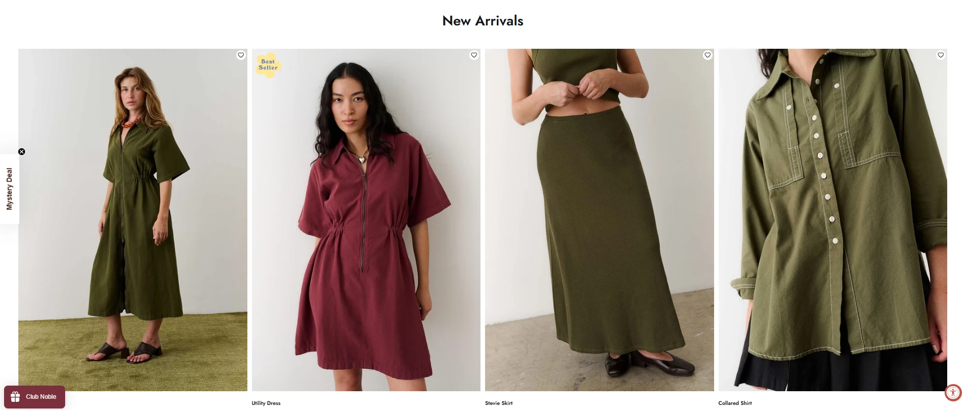
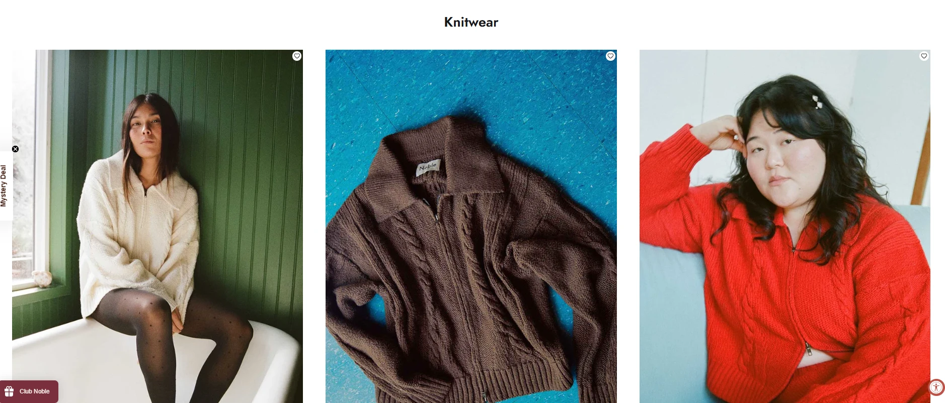
New Arrivals & Knitwear — Keeping the Catalog Feeling Fresh Clearly separated New Arrivals and Knitwear sections, each with visible color-swatch options directly on the product card, let shoppers assess variety at a glance without needing to click into every product page important for a catalog that wants to be browsed, not just searched.
Product Detail Page — Sustainability as a Spec, Not a Sermon On the Utility Dress product page, "Made with Organic Cotton," "Ethically Produced," and "Easy Returns" appear as a simple icon row directly beside the price and Add to Cart button — placed exactly where a shopper is deciding whether to buy, not buried in a separate ethics page. This keeps the sustainability case present at the moment of purchase decision without slowing down the actual buying flow.
Email Capture — Consistent Across Every Page A "Sign up for 10% off your first order" email capture appears identically across the homepage and product pages, keeping list-building a constant, low-friction presence throughout the browsing journey rather than a one-time homepage pop-up.
Visual & Brand Direction A warm, earthy palette (deep browns, olive greens, dusty blues) paired with clean serif typography gives Noble a grounded, natural feel that supports the sustainability positioning visually without leaning into the more clichéd "kraft paper and burlap" aesthetic many eco-brands default to.

The Outcome
This is a speculative concept, not an active client engagement built to demonstrate how a conscious fashion brand can weave sustainability, size inclusivity, and genuine style desirability through every layer of a storefront, from hero to product page, rather than isolating the mission to a single About section.
Tools & Skills Used
Website Design & Build · Brand Strategy · UX/UI Design · E-commerce Merchandising · Inclusive Design
Want a store that makes your values part of the shopping experience, not a separate pitch? Let's talk.
Like this project
Posted Sep 21, 2026
Created a speculative Shopify store concept for Noble focusing on sustainability and style.
Likes
8
Views
7
Clients
Noble