Conversion-Focused Shopify Product Page for Haloven

Samson Bojesomo


My Role
Replo Designer & Developer • Shopify CRO Specialist • eCommerce UI/UX Designer
The Result
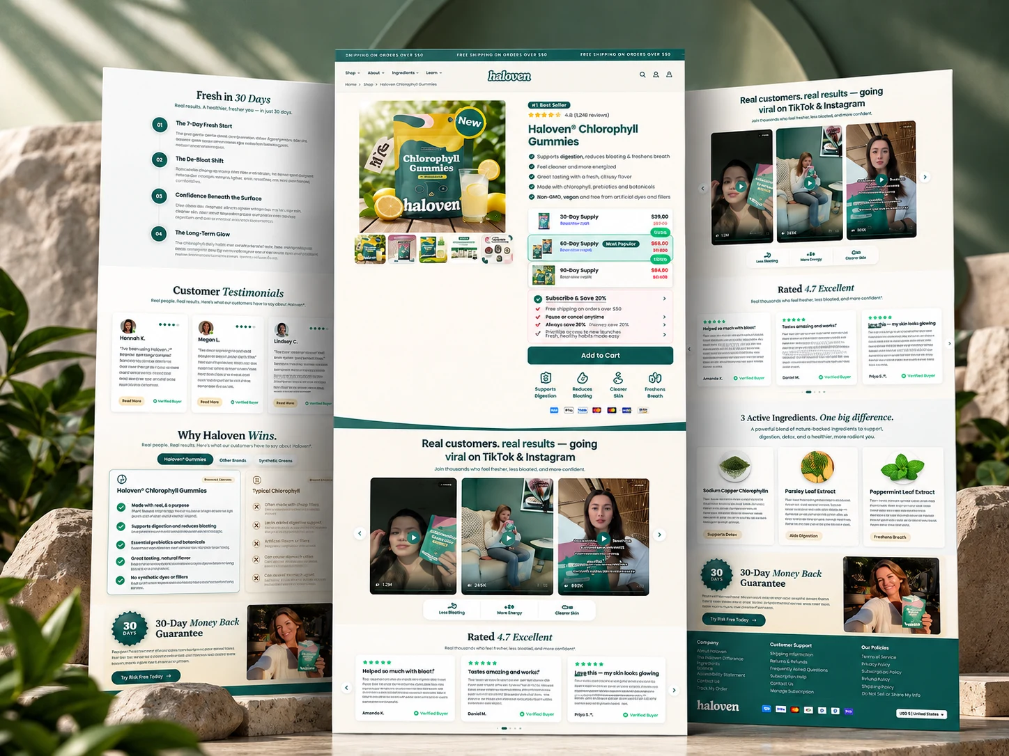
The finished Replo page creates a structured journey:
Understand → Trust → Learn → Compare → Buy
Project Overview
Haloven needed a product page that did more than look good. The goal was to create a conversion-focused shopping experience that clearly explains the product, builds trust, handles customer objections, and guides visitors toward purchase.
I designed and built the page in Replo for Shopify, combining eCommerce UX, CRO, social proof, product education, and responsive design.
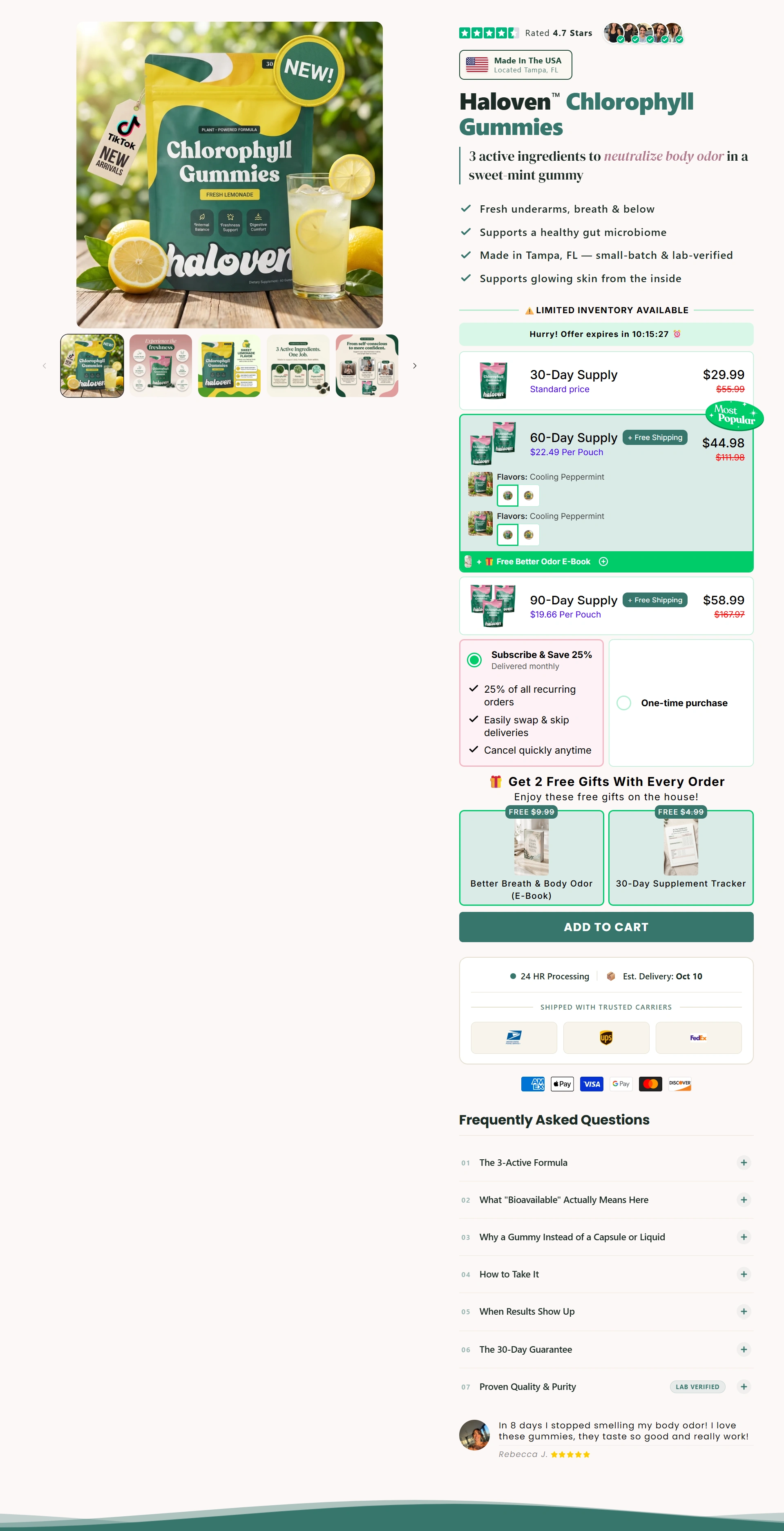
01 — Above the Fold: Make the Buying Decision Easy
The first section was designed to answer the most important questions immediately: What is it? What are the benefits? Why should I trust it? And how can I buy it?
I brought the product imagery, key benefits, reviews, offer options, purchase type, shipping information, and CTA together into a clear buying experience.
CRO focus: Reduce hesitation and make the path to Add to Cart obvious.
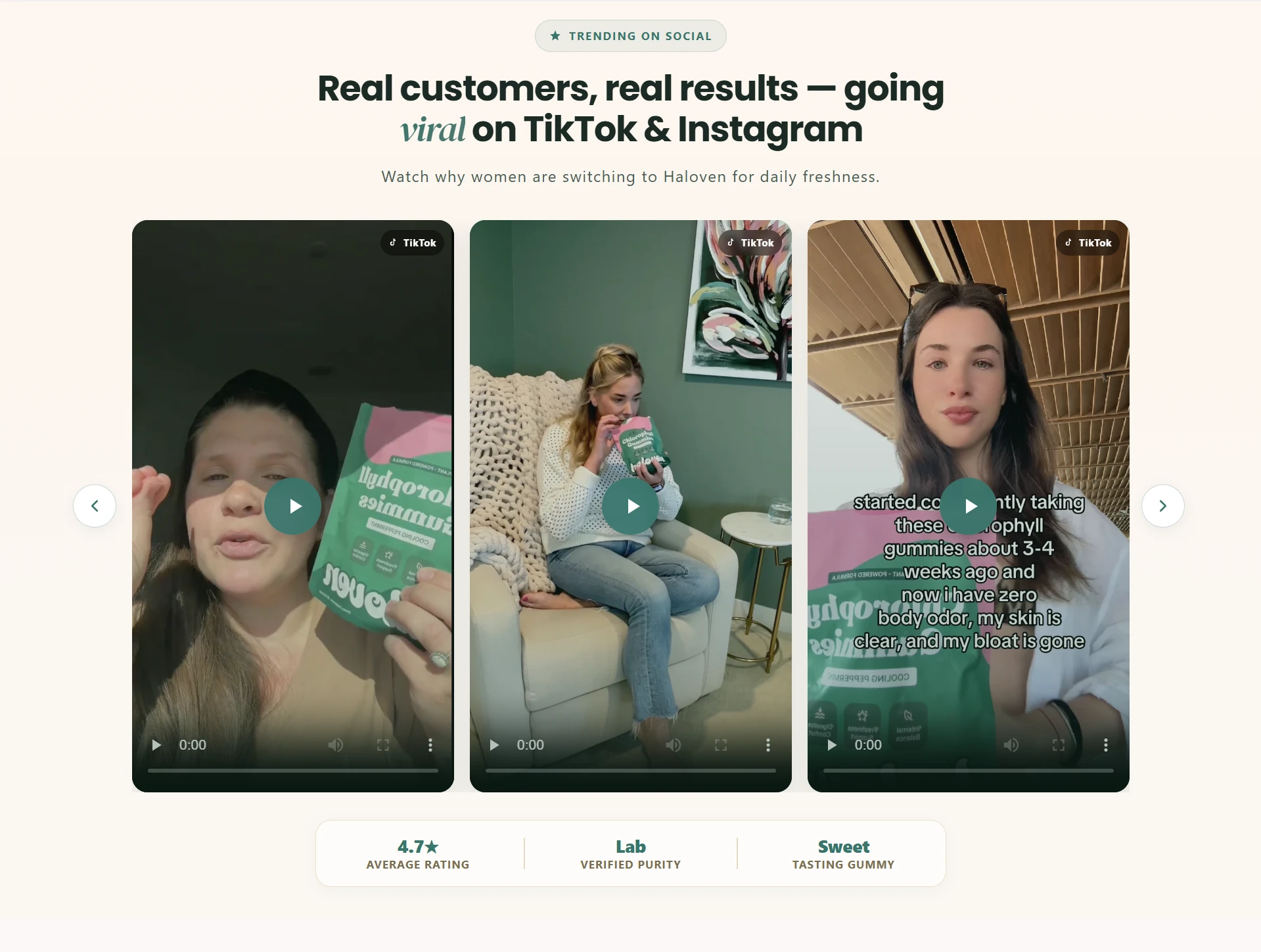
02 — Social Proof: Show Real Customer Experiences
Next, I introduced strong social proof using customer videos, ratings, reviews, and real experiences.
Instead of simply telling shoppers the product is good, this section lets existing customers help build confidence in the buying decision.
CRO focus: Turn brand claims into customer-backed proof.
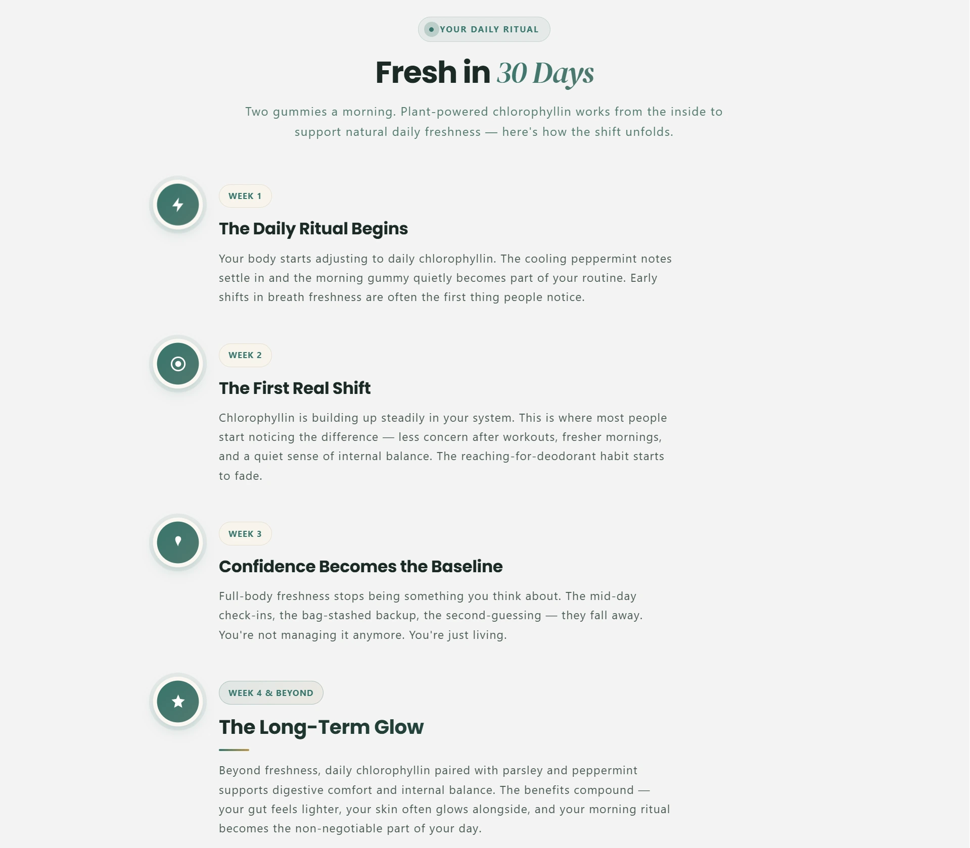
03 — Product Journey: What Can Customers Expect?
Customers often want to understand what using a wellness product may look like over time.
I structured this section as an easy-to-follow journey, helping shoppers understand the intended product experience without overwhelming them with information.
UX focus: Make product education simple, visual, and scannable.
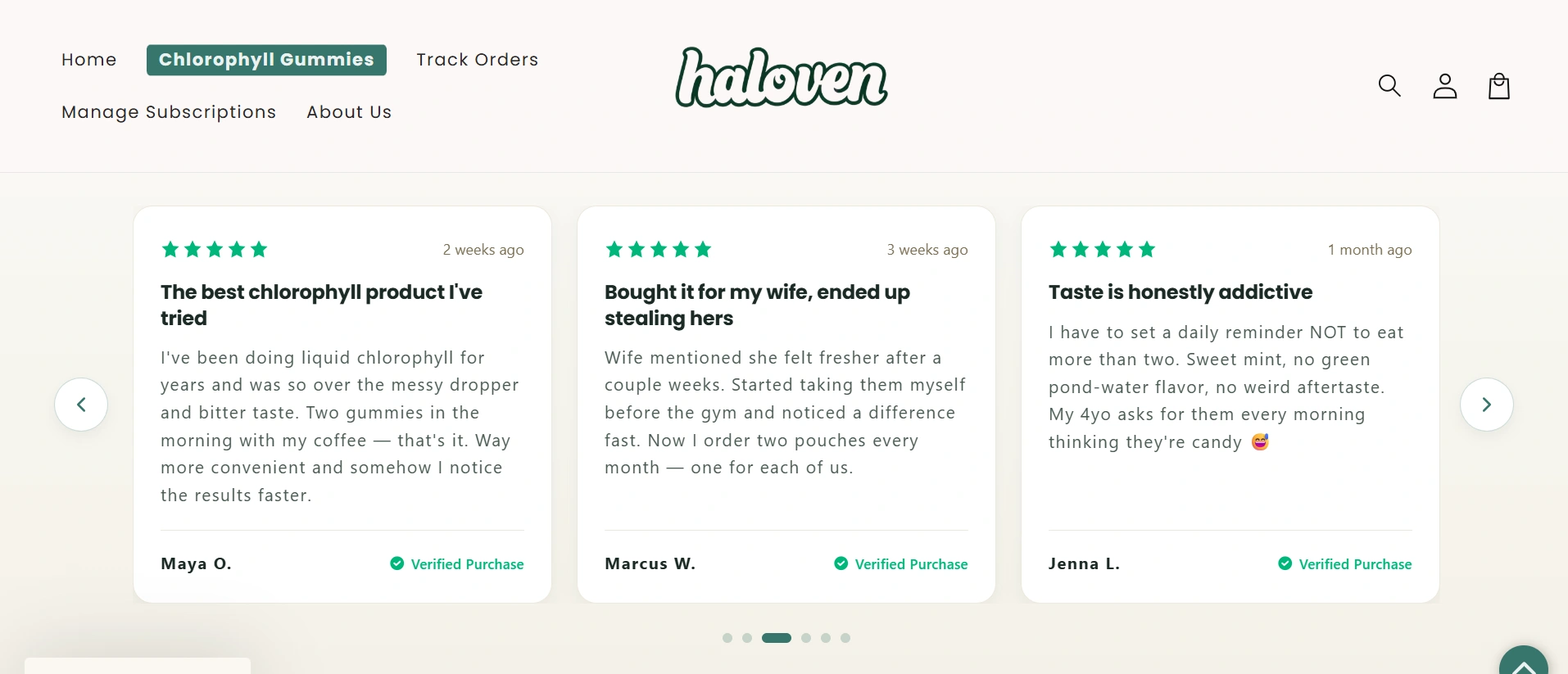
04 — Testimonials: Reduce Purchase Anxiety
The testimonial section adds another layer of trust by giving customers space to learn from other buyers' experiences.
I kept these stories visually separated and easy to scan so visitors could quickly find relatable experiences without interrupting the overall shopping journey.
CRO focus: Use customer experiences to strengthen confidence before purchase.
05 — Comparison: Why Choose Haloven?
Customers don't only ask “Is this good?” They also ask “Why should I choose this instead of another option?”
The comparison section makes Haloven's positioning easier to understand by presenting key differences in a simple side-by-side format.
CRO focus: Differentiate the product and make comparison easier.

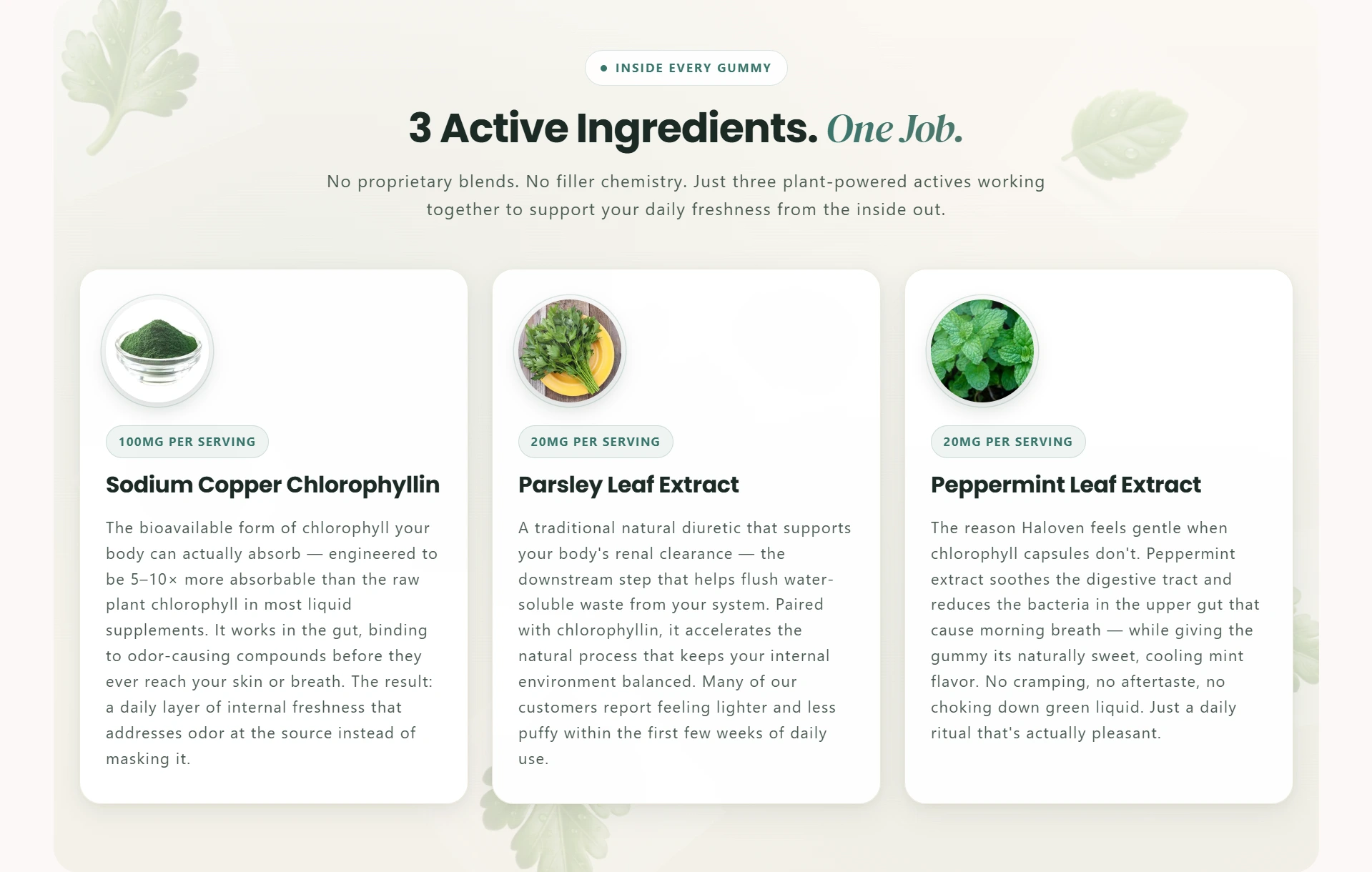
06 — Ingredients + Risk Reversal
Near the end of the journey, I focused on two final objections: “What's actually in it?” and “What if I'm not satisfied?”
The ingredient section provides additional product education, while the guarantee helps reduce the perceived risk of trying the product.
CRO focus: Answer final objections and strengthen purchase confidence.
The Result
The finished Replo page creates a structured journey:
Understand → Trust → Learn → Compare → Buy
Rather than treating the PDP as a product description, I designed it as a complete eCommerce sales experience—combining strong visual design with CRO principles throughout the page.

The client loved the final result and told me she would happily recommend my work to friends, which made the project even more rewarding.
Skills
Replo · Shopify · Conversion Rate Optimization · Landing Page Design · eCommerce · UI/UX · Responsive Design
Like this project
Posted Oct 6, 2026
Designed a conversion-focused product page for Haloven using Replo on Shopify.