Honey & Lace Brand Identity Design
Honey & Lace Brand Identity Design 🍯
Honey & Lace creates handcrafted lingerie. The brand makes pieces that convey boldness and quirkiness, while at the same time having a glimpse of sensuality.
🎯 Objective
The objective of this project was to develop a logo design in order to start promoting the brand as well as put up the labels on their wonderful lingerie. The logo had to be expressive and sensual, yet bold, quirky, and unique. There was a desire to convey the attractiveness of being different. Besides that, the main emotions to transmit through design were unique, sexy, and bold.
The main difficulty when finding a solution for this project was to be able to combine such different feelings in one design. Everyone is used to having lingerie either with a clear sensual vibe to it, or extremely bright, happy designs that are mostly targeted for teenagers. It was challenging to not slip into these extremes and find a solution that is exactly in the middle.
sketches of the logo
main logo design
Main logo
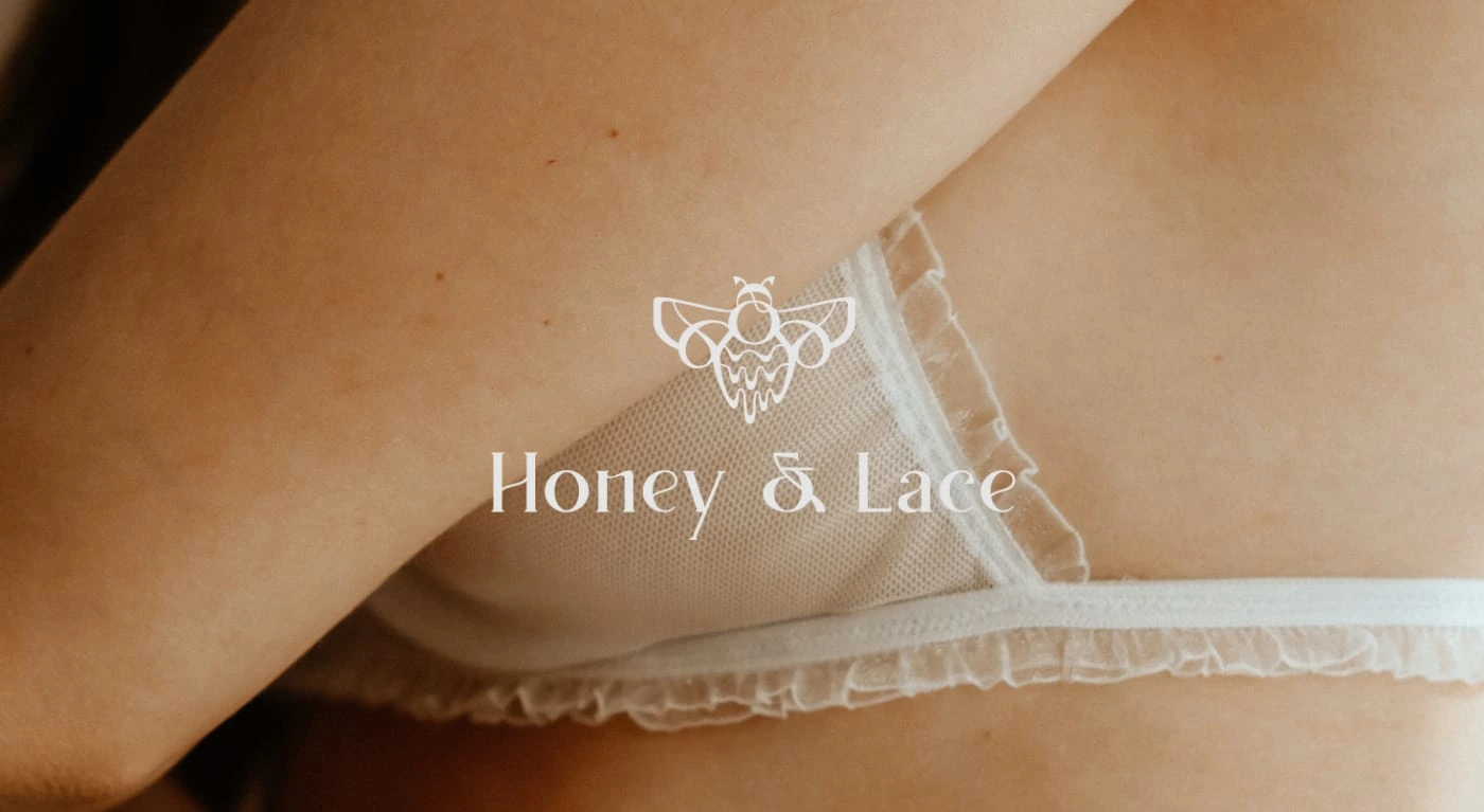
The main logo includes both the logomark (the bee icon here) and logotype (the main text of the logo), as well as supplementary information such as the establishment date and the description of the brand. Overall, I have ensured by using design principles that all the items are well-balanced and look harmonious together. I am personally a big fan of creating this type of complex logos, because they are versatile since different elements of the design can be further utilized in branding helping to keep the visual unity across different
By combining a very simple secondary font with a quirky main font and a bee design that is on one side very elegant, but on the other side has this melting effect, making it very interesting and unique, I have managed to balance the elegance with the quirkiness of the brand.
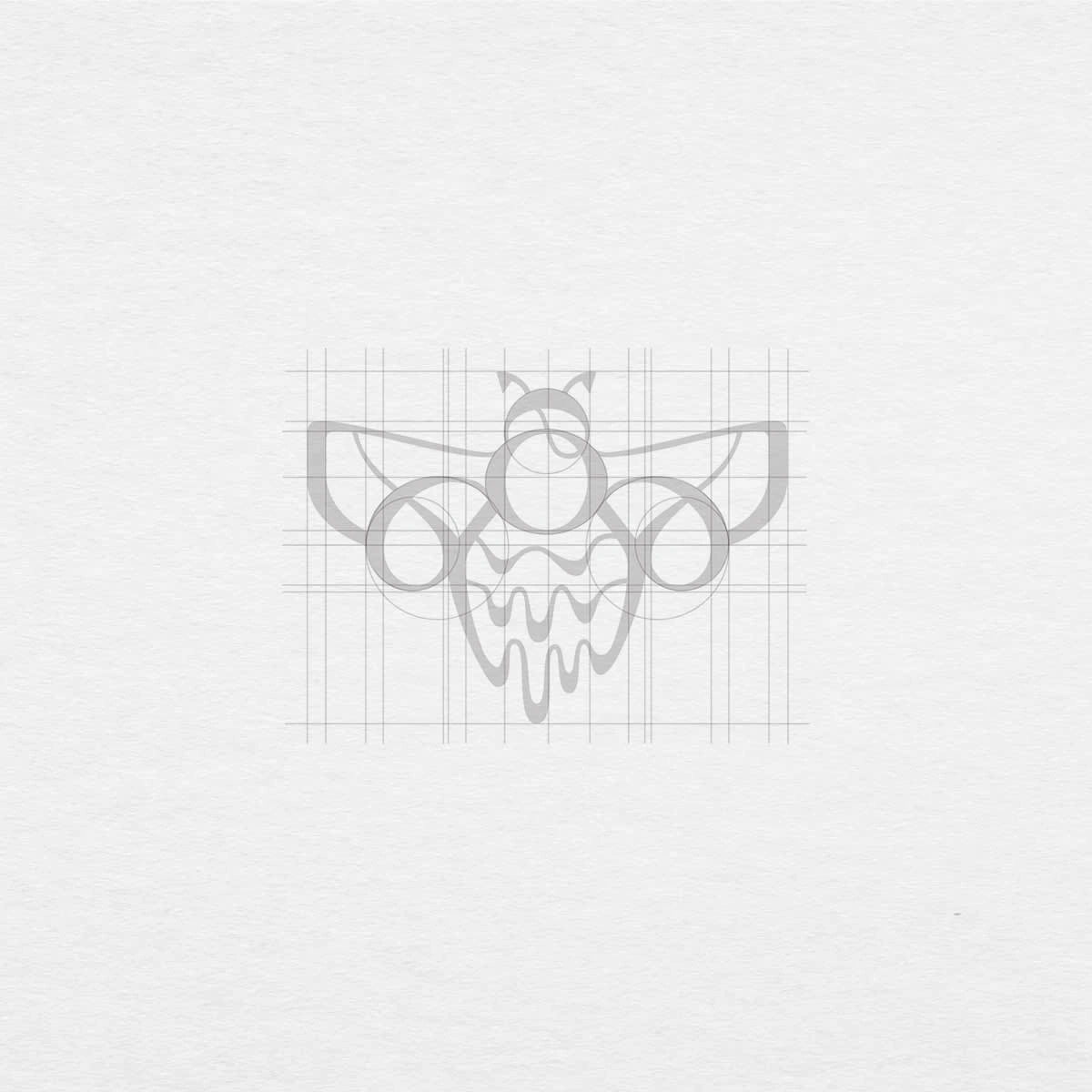
structure of the logo mark
The structure
The logomark is designed in a way to combine boldness with femininity, which has been achieved by combining thick and thin lines throughout. Not to mention that bee represents the delicate, yet outgoing character of the brand. The droopy lines of the bee represent dripping honey, which conveys this naughty vibe. The wings are designed in a way to represent the lace.
tote design
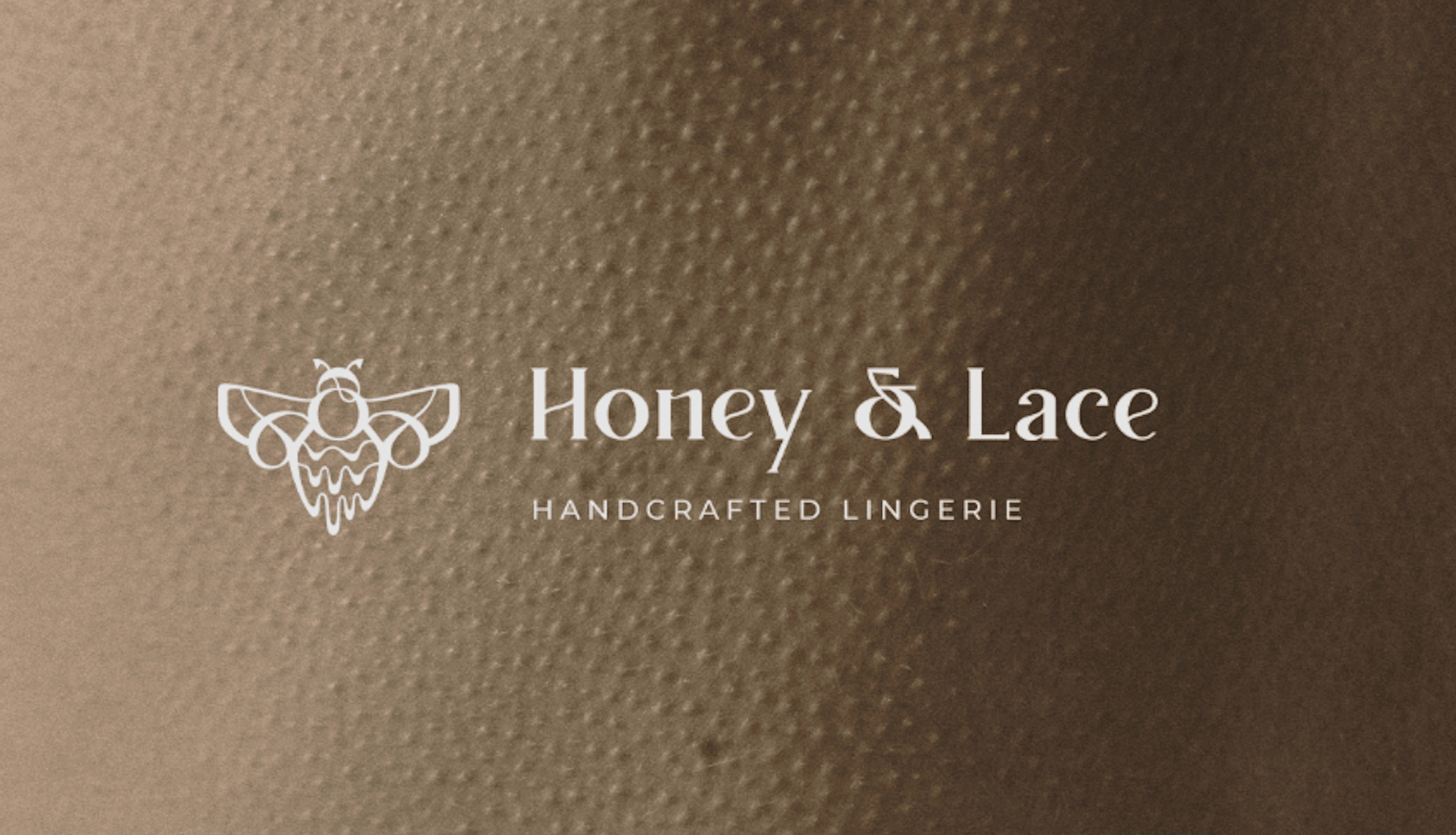
secondary logo design
Secondary logo
The secondary logo is essential for any business as it gives the flexibility to use the design in various landscapes. In the case of Honey & Lace, the main logo is in more of a vertical format, rather than horizontal, which might not adapt well in certain occasions. This is why it is important to have an alternative design that will look great on things such as clothes tags.
colour palette
Colour Palette
I have chosen the following colours for a reason. "Harvest gold" is definitely inspired from honey and bees, but not only. This shade of yellow is very deep and unique, which, if you remember, was of the main emotions to convey through the design. Then there is "black chocolate" which is essentially taken from the black stripes of the bee. And at last "timberwolf" which is needed to create a bit of a lighter environment in the design and to ensure that if we are to use it on dark backgrounds, there is a color that will be suitable for that.
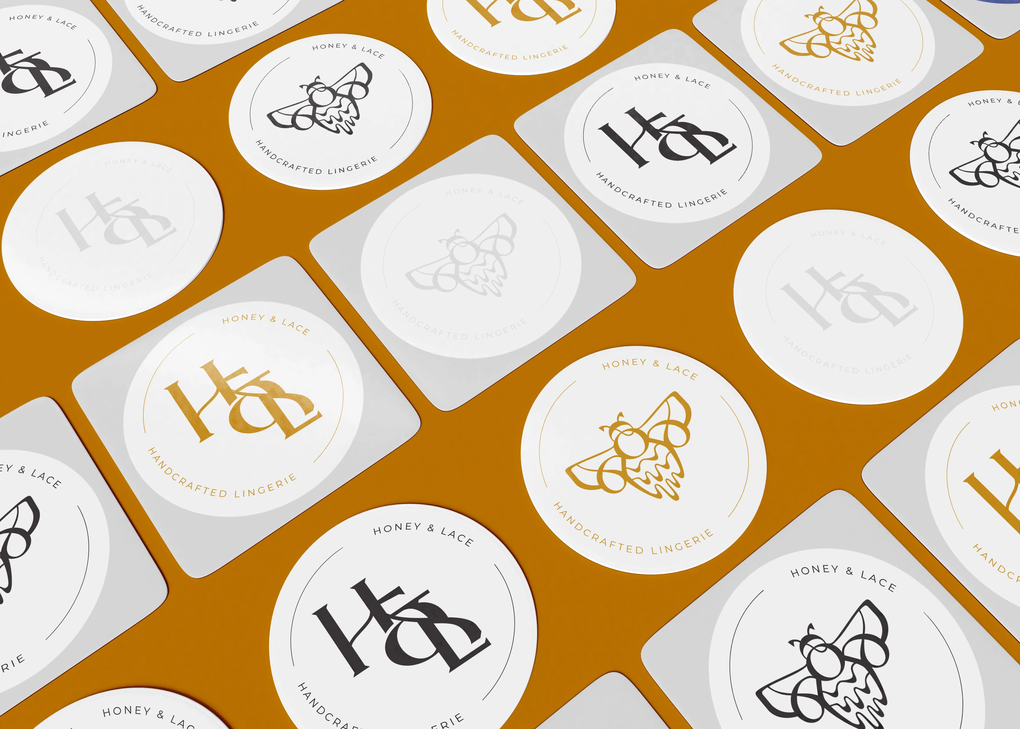
stickers design
submark design
Submark Design
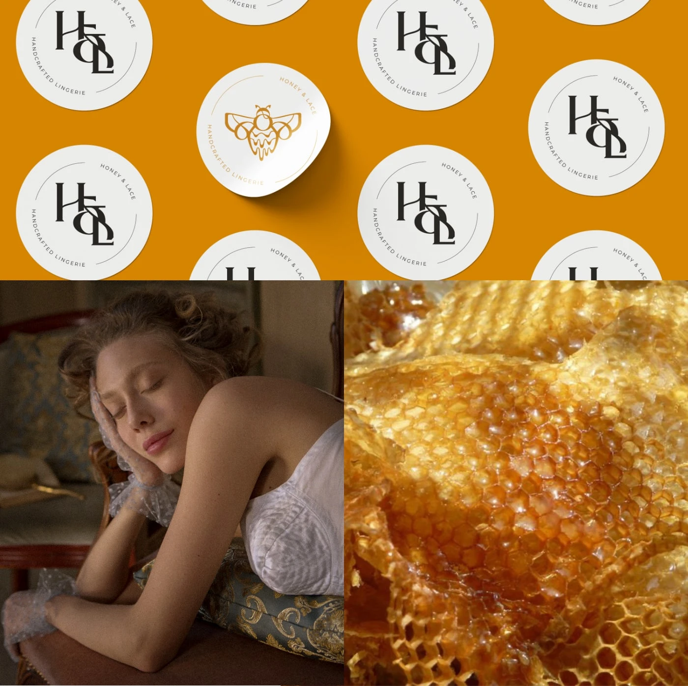
Submark is a short version of the logo that can be conveniently placed as a signature of the brand or as a watermark. It is important to have it within the logo suite of the brand. In the case of Honey & Lace, I've made the submark to have the first letters tied together with the '&' sign. Thanks to the shapes and their flow, it still connects to the bee of Honey & Lace and is perceived to be of the same brand.
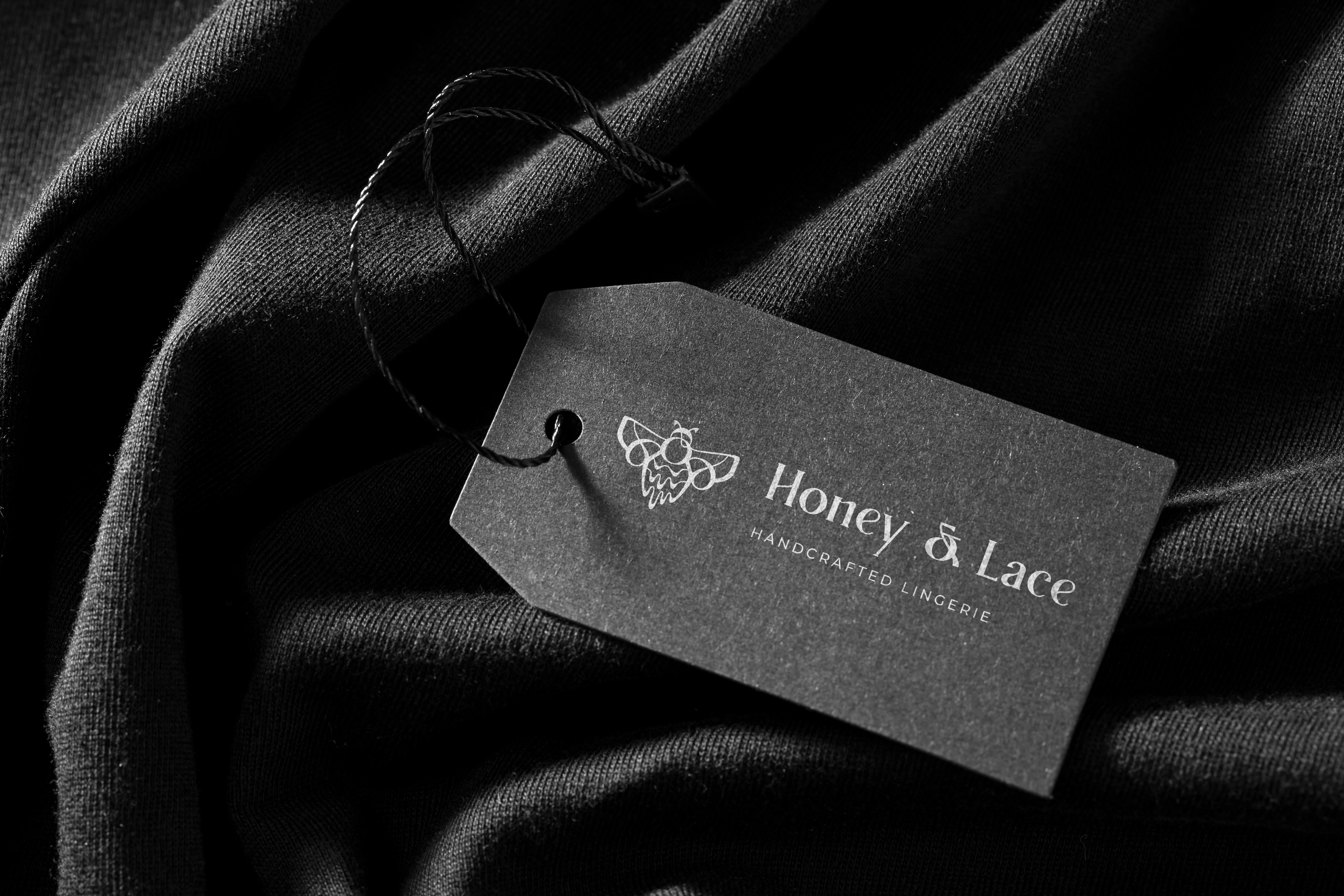
lothes tag design
branded pattern design
Branded Pattern Design
Branded pattern is created with a combination of a logomark and submark of Honey & Lace. These two items are almost a signature of a brand, so it makes sense to combine them together. Pattern design is very important for many businesses, but above all to those that sell physical items. Like this, branded packaging paper can be created, which ads touch and makes every little thing branded, which helps to make a good impression and stay on the top of the mind of your clients.
Did you like this project? Are you feeling overwhelmed with your own brand and need some guidance? Contact me and we can discuss how can I simplify your life.
Like this project
Posted Oct 31, 2022
Honey & Lace is a premium lingerie brand. They needed brand identity done in order to start selling their products on the market
