Bagno Martinelli Brand Identity Design
Sasha Brodzka
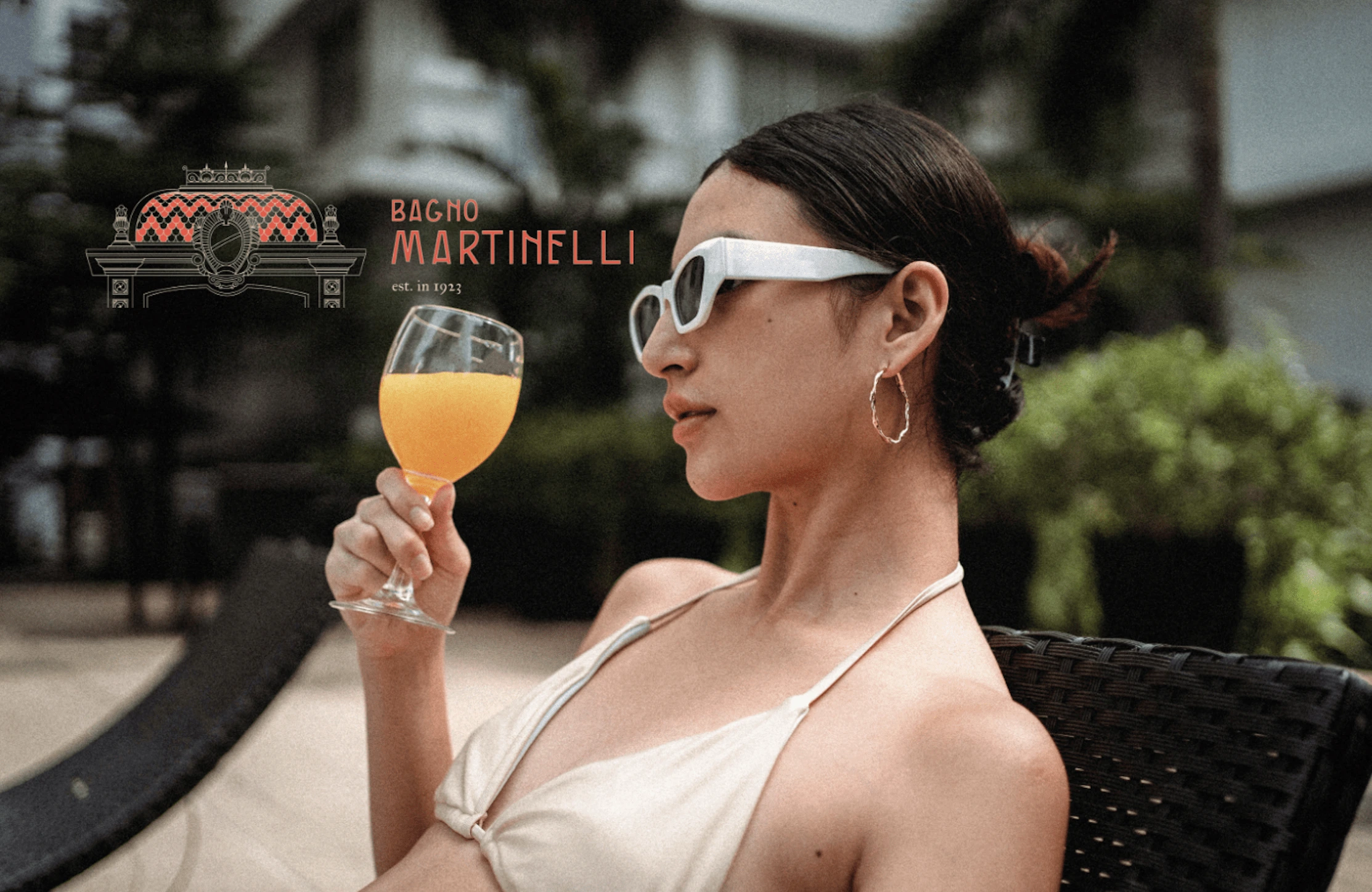
✨ Brand design for Bagno Martinelli ✨
Bagno Martinelli is a beach establishment in the wonderful city of Viareggio. It’s a historical place that dates back to 1923 (although rumour has it that it was around even prior to that!). It is located at a very strategic point in the main square of the city, so it is hard to miss!
Currently, the establishment is in the revamping stage. But before anything, they needed a logo design in order to trademark the place. Later on, various elements of the brand identity will be brought to realisation.
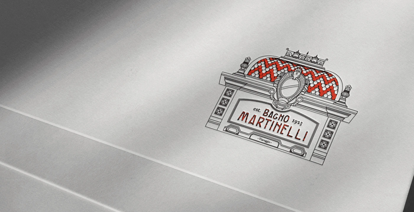
main logo on debossed on a paper
🎯 Objective
The objective of this project was to develop a brand identity design for Bagno Martinelli. The main focus was on the logo design since the establishment needed it to trademark the place. The design had to stand out from the competitors, which are essentially all the other beach establishments in Viareggio. The main emotions that had to be conveyed are relax, recreation, and fun.
main logo design
Main logo
In the logo, I went for such an unconventional design for a beach establishment, as I wanted to highlight how Bagno Martinelli compares to other beaches since the majority of them use very marine themes, such as dolphins and palms. However, those types of designs are very generic and do not portray the uniqueness of the places. Hence why here, I wanted to emphasise the dome and their liberty-styled building that none of the others have, which makes them unique elements of the Bagno.
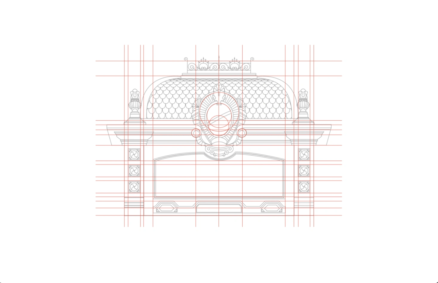
the structure of the logo
Structure
It's quite interesting to see this structure since it actually looks like a blueprint of the building. And it's definitely not made by accident. This mark was carefully designed to replicate the dome of the building in which Bagno Martinelli is located since the establishments takes a lot of pride in it.
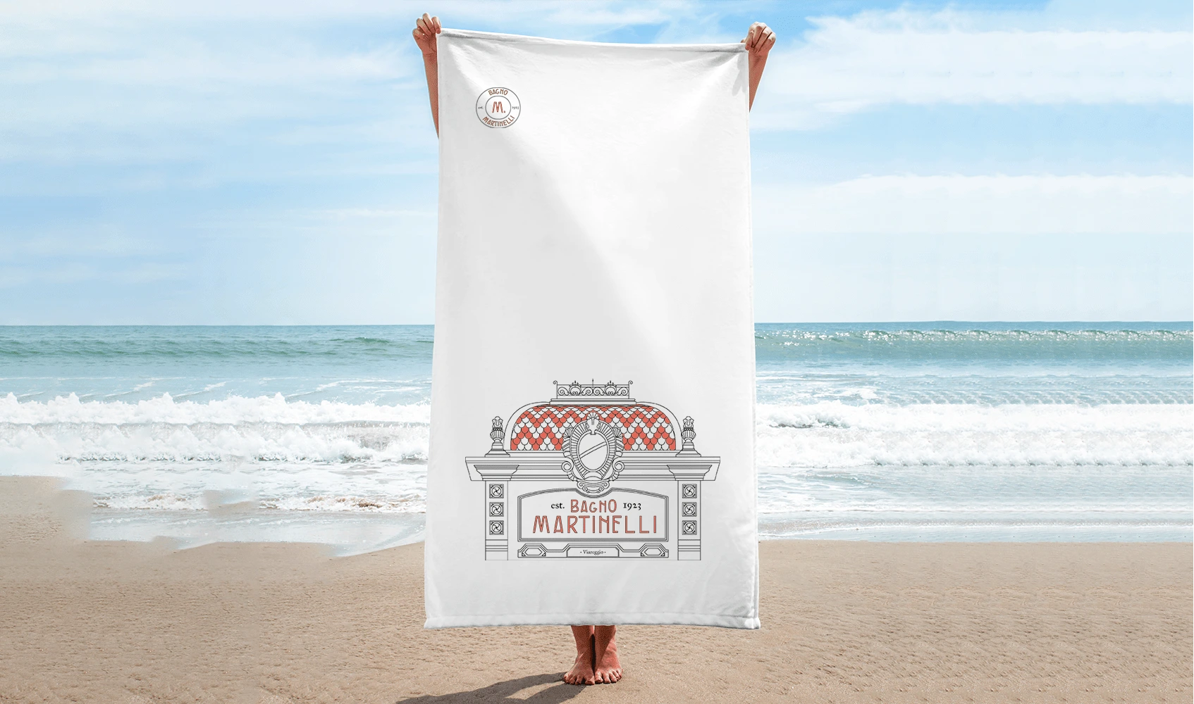
branded towel mockup
secondary logo design
Secondary logo
Secondary logo or otherwise, a horizontal version is needed for the instances in which the main logo will not be very suitable. It is crucial to have variations of the logo that will fit different landscapes since that is how it is possible to keep the brand's integrity. This design will look great on the website header as well as on different printed and digital materials.
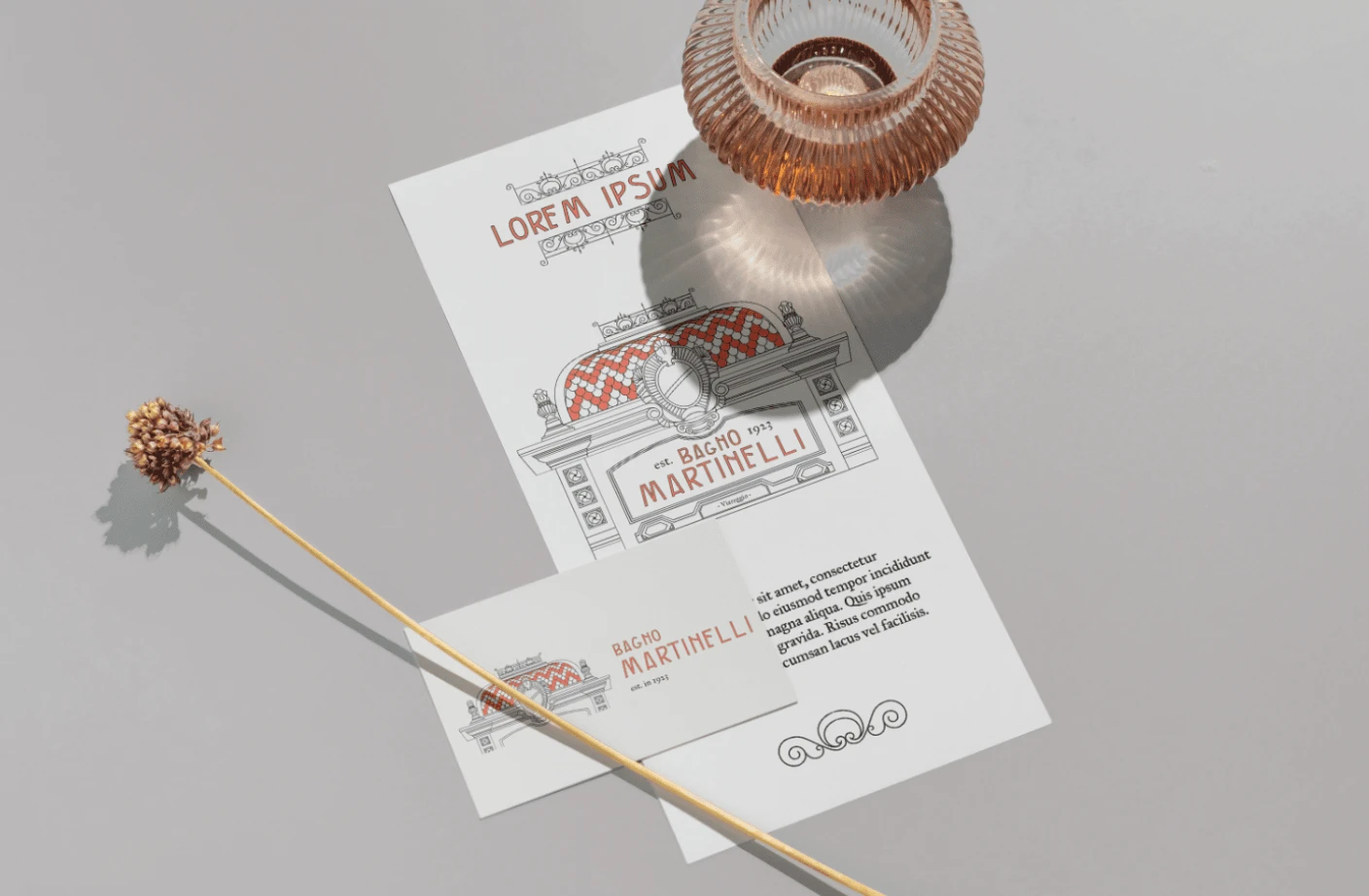
visualisation of printed materials for Bagno Martinelli
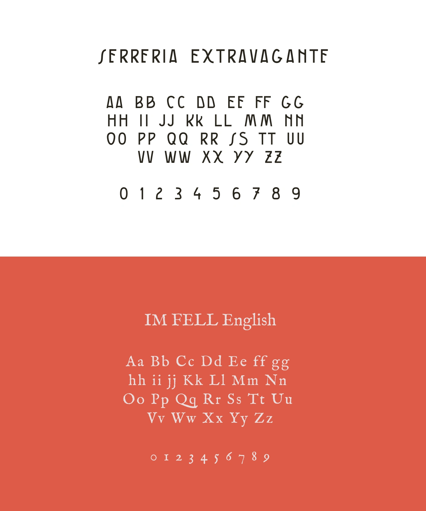
branded fonts
Branded Typefaces
Above, you may see 2 fonts that were selected for Bagno Martinelli.
"Serreria Extravagante" is the main font that is used for titles and any text that needs emphasis. This font is designed in liberty style, which is a prominent style used in Viareggio, so it fits the project perfectly.
The secondary font - "IM FELL English" is used for body text and instances where it is needed to add text that is not necessarily that important. This font has a vibe of a vintage book or newspaper. It contrasts with our main font, while is also an extremely readable choice.
Together, these fonts create a unique and easily recognisable combination that reflects the history of both the establishment and the gem of Versilia.
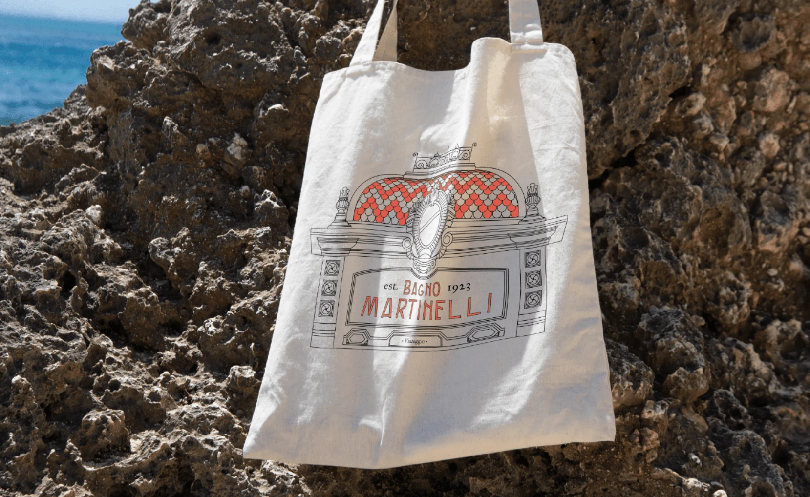
branded tote bag design
colour palette
Colour Palette
The colours chosen for Bagno Martinelli aren't only aesthetic, but they reflect the colours in which the establishment is made.
In particular, we are talking about the "fire opal" colour, which is a staple colour of the beach establishment, as it can be seen used on all the umbrellas and sunbeds.
"Pale silver" is also one of the colours Bagno Martinelli's interior provides us. Like this the design is extremely harmonious, and brand identity is extended into the real world as well.
While "raisin black" is not present in the establishment, it is needed to create balance in brand identity, since it is important to have on hand both darker colours and lighter ones to ensure a versatile use. Yet, as you can see, even this black has a bit of a faded effect, which overall creates this vintage vibe.
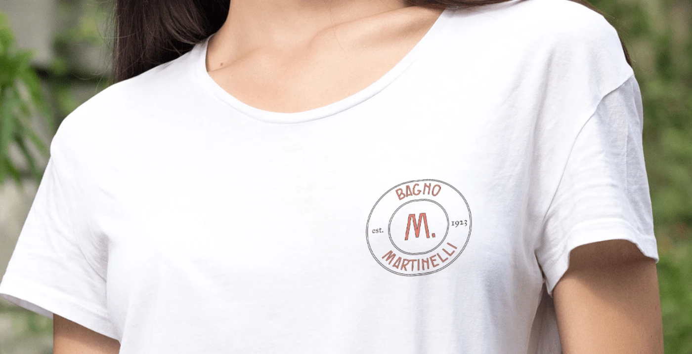
branded t-shirt design
submark design
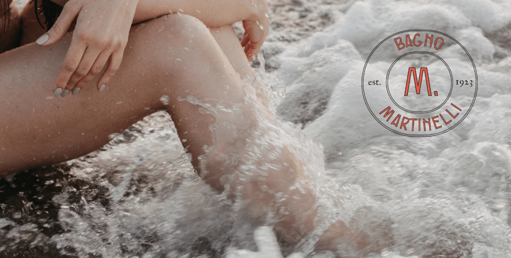
The submark
The submark is a short version of the logo that can be used in various landscapes where the brand might want to put on its mark, but the whole logo might seem excessive. For example, stickers, rubber stamps, and even watermarks In the design here, I have kept the overall mood of the brand in the mark as well. It's simple, yet elevated, transmitting the vintage vibe as well as the marine look, given that we are talking about beach establishment.
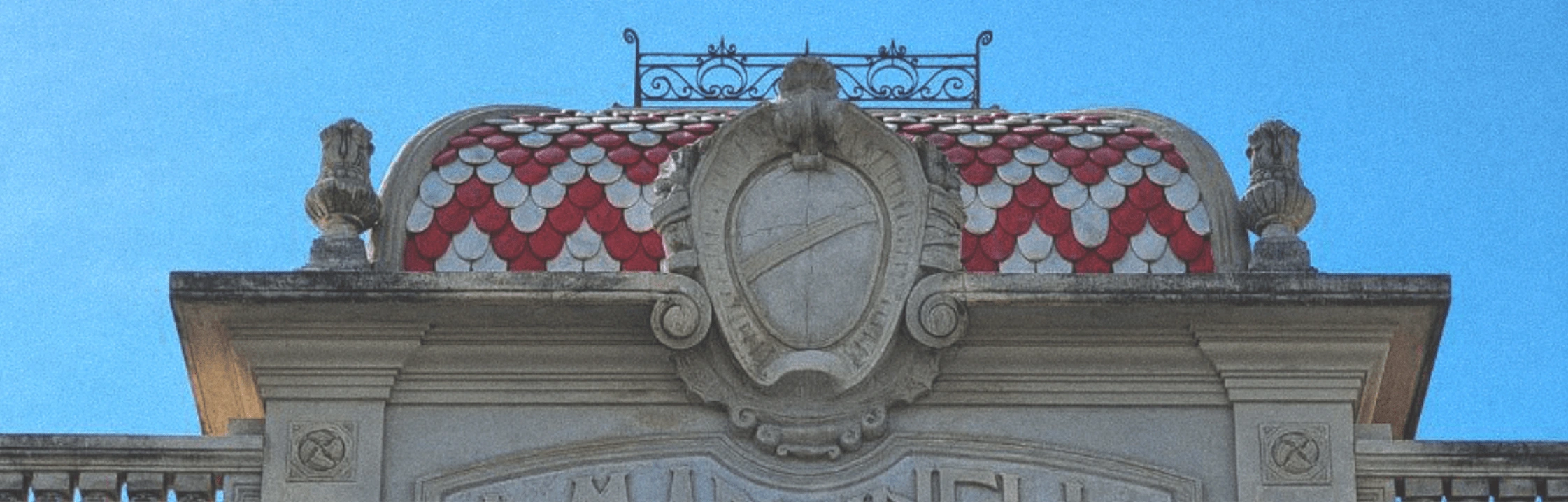
the building of Bagno Martinelli
Ready to make your brand unforgettable? Let's collaborate to create visual packaging that sets your business apart and attracts your ideal customers. Reach out to me today and let's bring your brand vision to life.
Like this project
Posted Oct 31, 2022
Brand design for a beach establishment in a wonderful city of Viareggio.