La Maison des Gâteaux Brand Identity Design
La Maison des Gâteaux Brand Identity Design 🧁
La Maison des Gâteaux is a well-known bakery in the heart of Paris, owned by a lovely couple. They have been running the business for years, focusing on amazing cakes, pastries, and bread.
They have decided to rebrand to make the bakery look more modern, however, it was also important to keep authenticity and history in the design.
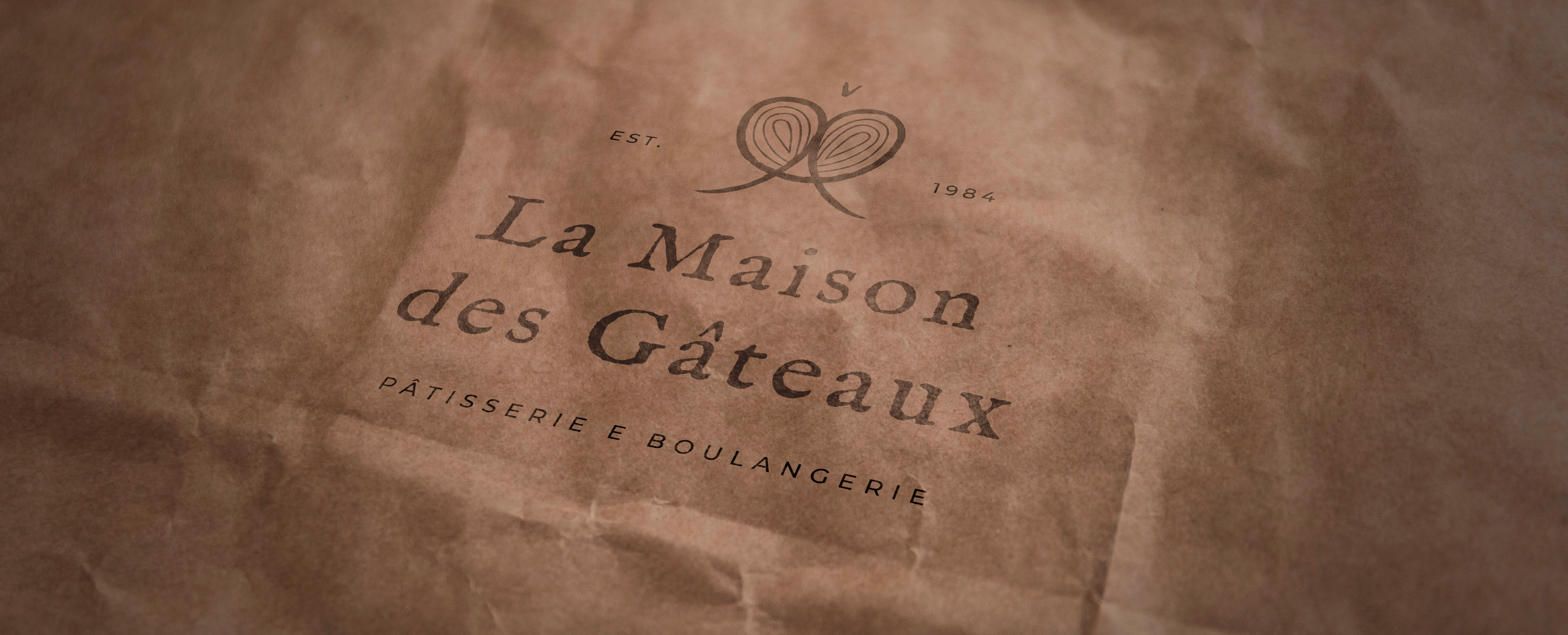
logo on a paper bag
🎯 Objective
The logo had to visually tell that this bakery is a place with its own traditions and values. It’s not that new fancy café with oat milk cappuccinos and vegan pastries. But rather a place that values traditional French pastry techniques. The main emotions that needed to be transmitted through the design are traditional, delicious, French.
The main difficulty when finding a solution for this project was to be able to create a logo that would translate traditions and quality, yet won’t look too old, given that the main objective of the project was to refresh the design.
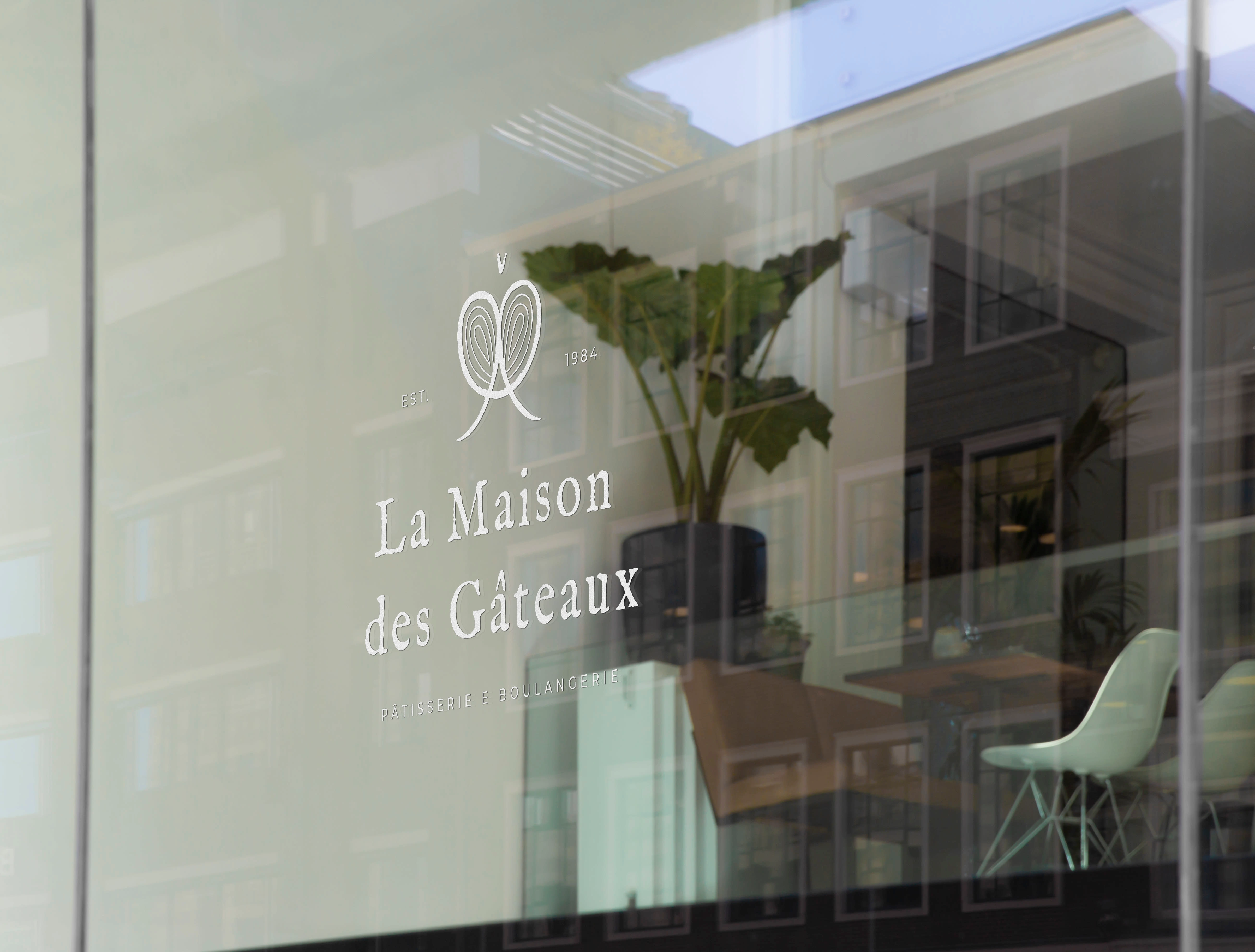
logo visualised on the display
main logo design
Main logo
In the design for La Maison des Gâteaux, I have combined a logo mark (the "icon" part) and the logotype (the textual part). This is because logos like this are very versatile and can be further divided into versions that feature only one part of the logo. That means the design can be easily adapted to different landscapes, which in turn means that it will be easier for the brand to keep the visual unity everywhere.
Overall, in the design here, I wanted to transmit a historical Parisian place that has character and authenticity. This was achieved thanks to the textures added to the logo.
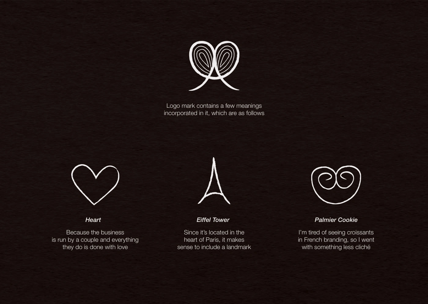
the meanings within the logo mark
Structure
The logomark is essentially a combination of a heart, the Eiffel Tower, and a palmier cookie. Heart, because the bakery is family owned and it points out that they create all the pastries with care and love. Eiffel Tower, because, of course, it's a well-known symbol of Paris. And at last, palmier cookies in order to go away from stereotypical croissants that tend to be used in the brandings of French bakeries. I wanted to go for something a bit more niche and remembered my obsession with palmier cookies. Together they create an interesting and memorable design.
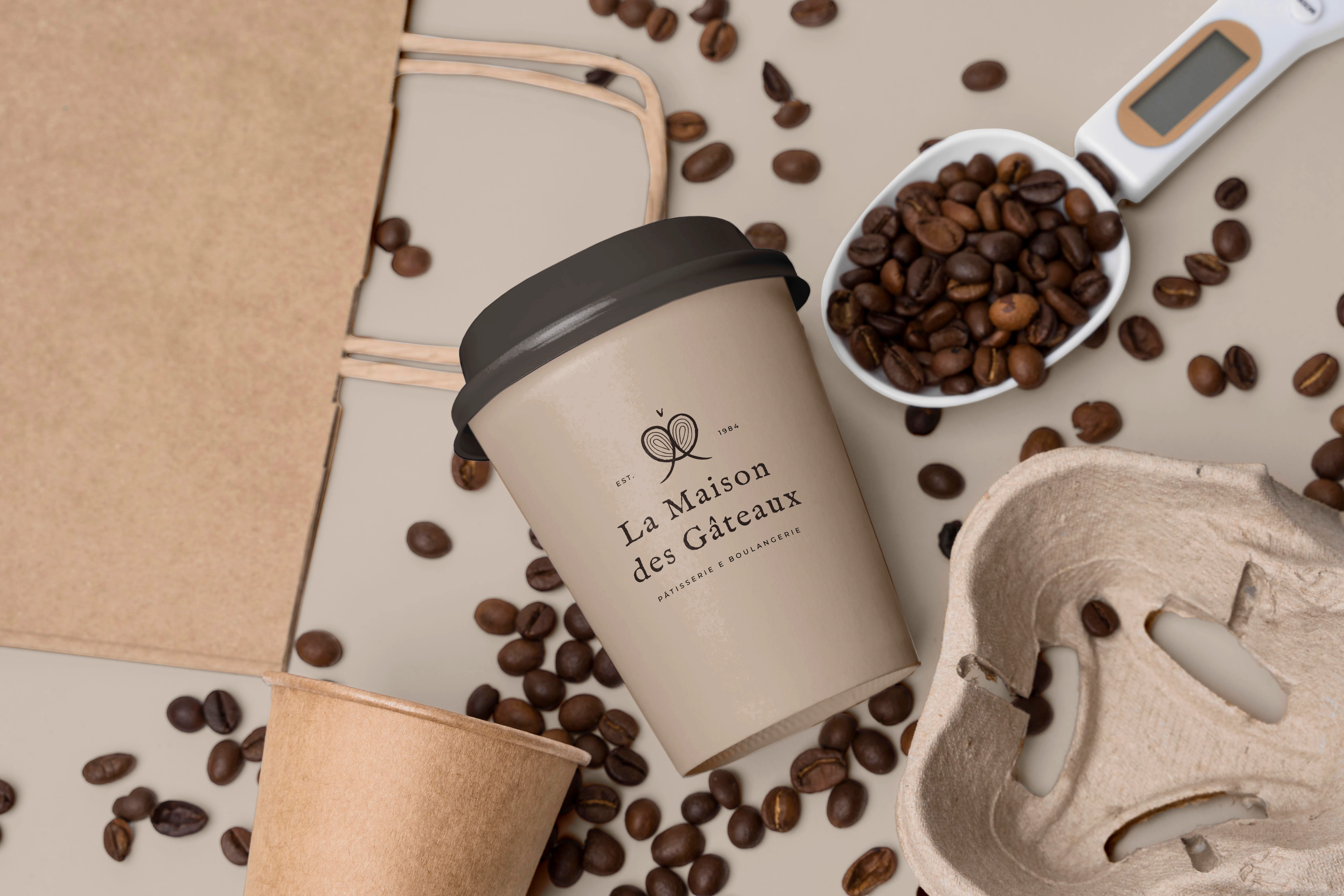
visualisation on the coffee cup
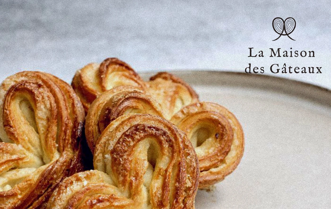
secondary logo design
Secondary logo
Secondary logo is plain and simple. I have removed all the supplementary items such as the description and establishment date. Although the main logo is absolutely beautiful, it can be too complicated when used on certain occasions. That is why the secondary version in this case is a simplified main logo.
colour palette
Colour Palette
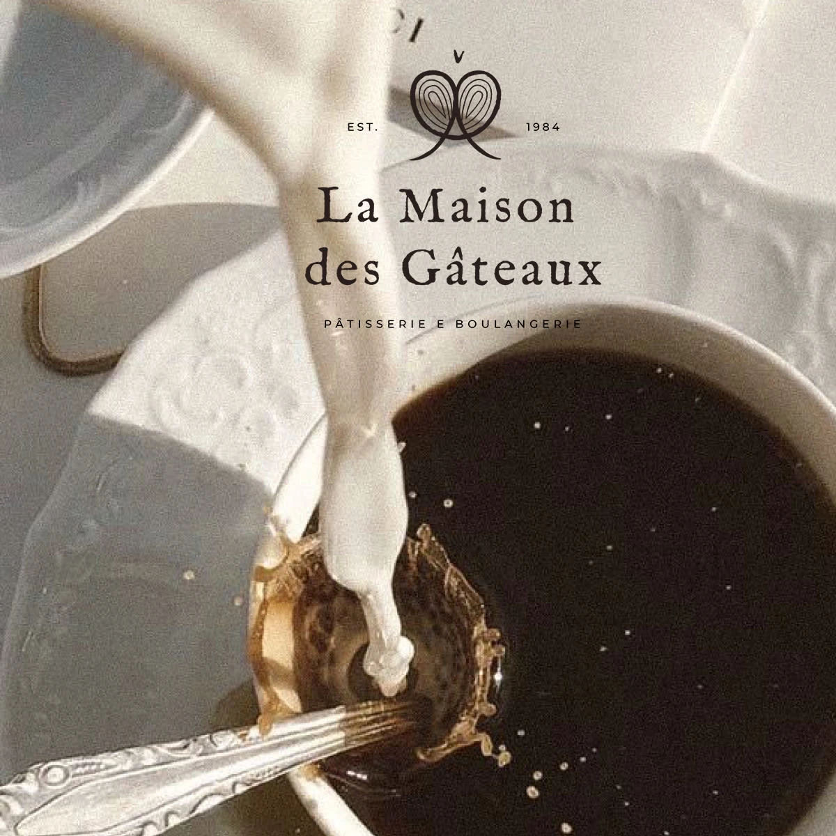
The colours chosen for La Maison des Gâteaux are very simple and minimal. Essentially, what we have here is a colour of a very dark coffee - "raisin black," and the colour of milk - "cultured." Together they create a very "tasty" design that roots in the food and beverages theme.
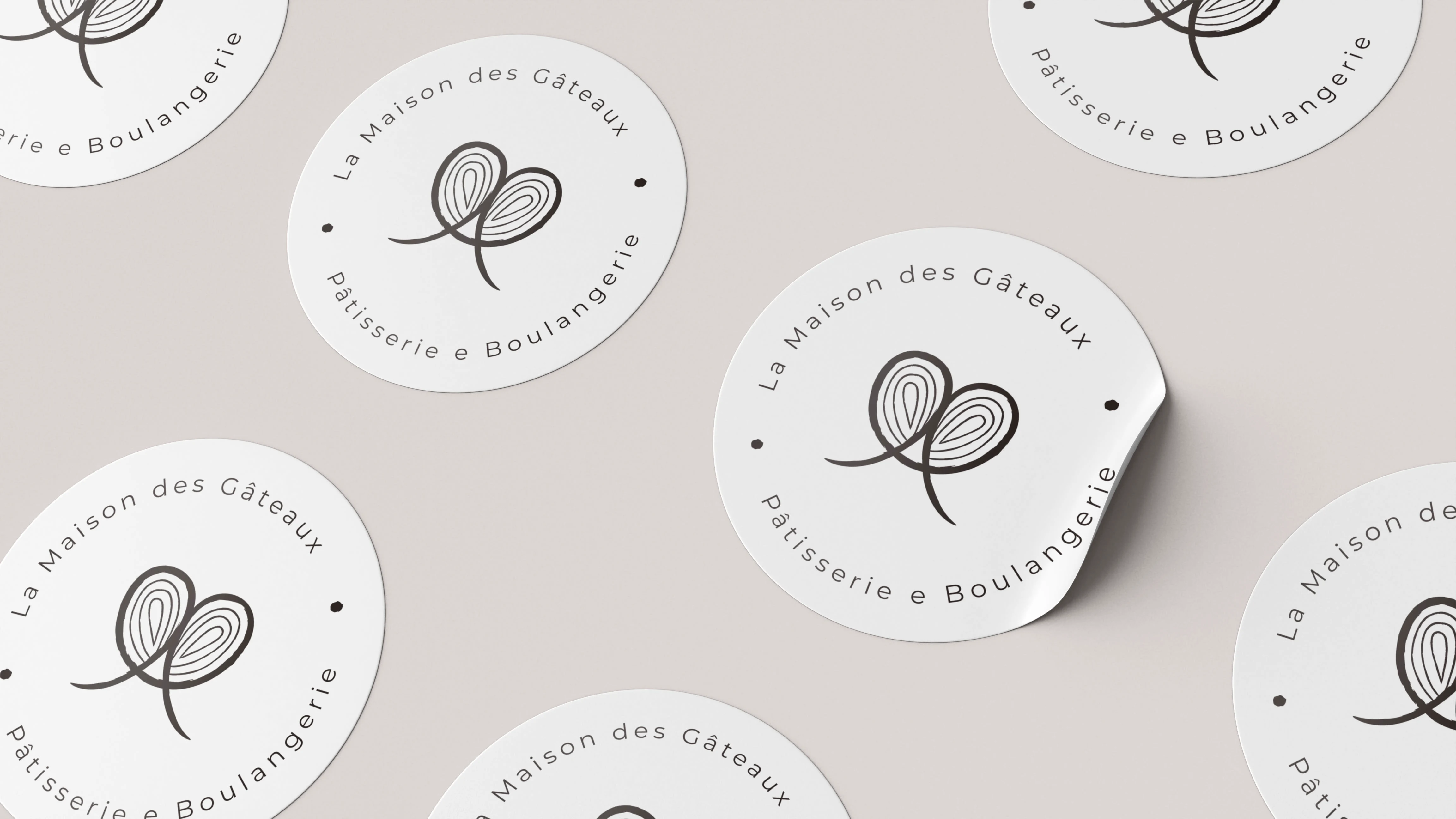
sticker design
pattern design
Here you may see a submark design as well as a pattern design for La Maison des Gâteaux. Both of them are created in order for the bakery to have a customised packaging with branded paper to wrap the delicious pastries and cakes, as well as the stickers to slap them onto the packaging and any other materials where it makes sense.
Did you like this project? Are you feeling overwhelmed with your own brand and need some guidance? Contact me and we can discuss how can I simplify your life.
Like this project
Posted Oct 31, 2022
Brand identity design for a French cake house in Paris

