MaxHome.AI Landing Page Redesign

Nirooz Vp

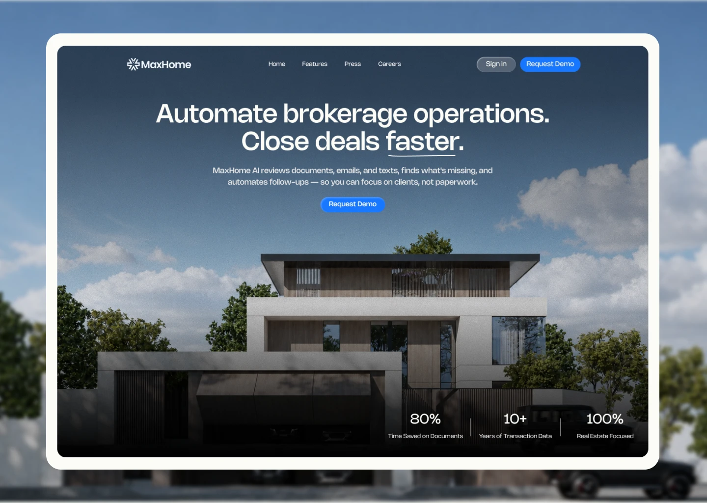
MaxHome.AI — Landing Page Redesign
The Approach
MaxHome.AI is solving a complex problem in real estate — automating the repetitive work behind transactions.
I wanted the landing page to make that value easier to understand without asking visitors to read through large amounts of copy.
I focused on clearer positioning, stronger visual communication, and a more intentional flow from understanding the product to building trust and taking action.
Restructuring the Experience
I restructured the page around the questions a potential customer is likely to have:
What does it do? → How does it help me? → Why should I trust it? → What makes it different? → How do I get started?
This helped give every section a specific purpose instead of having multiple sections communicate the same message.
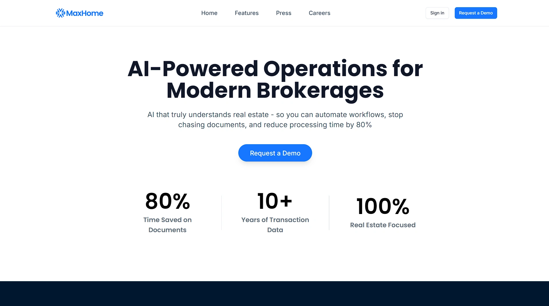
Hero — Before → After
Before
After
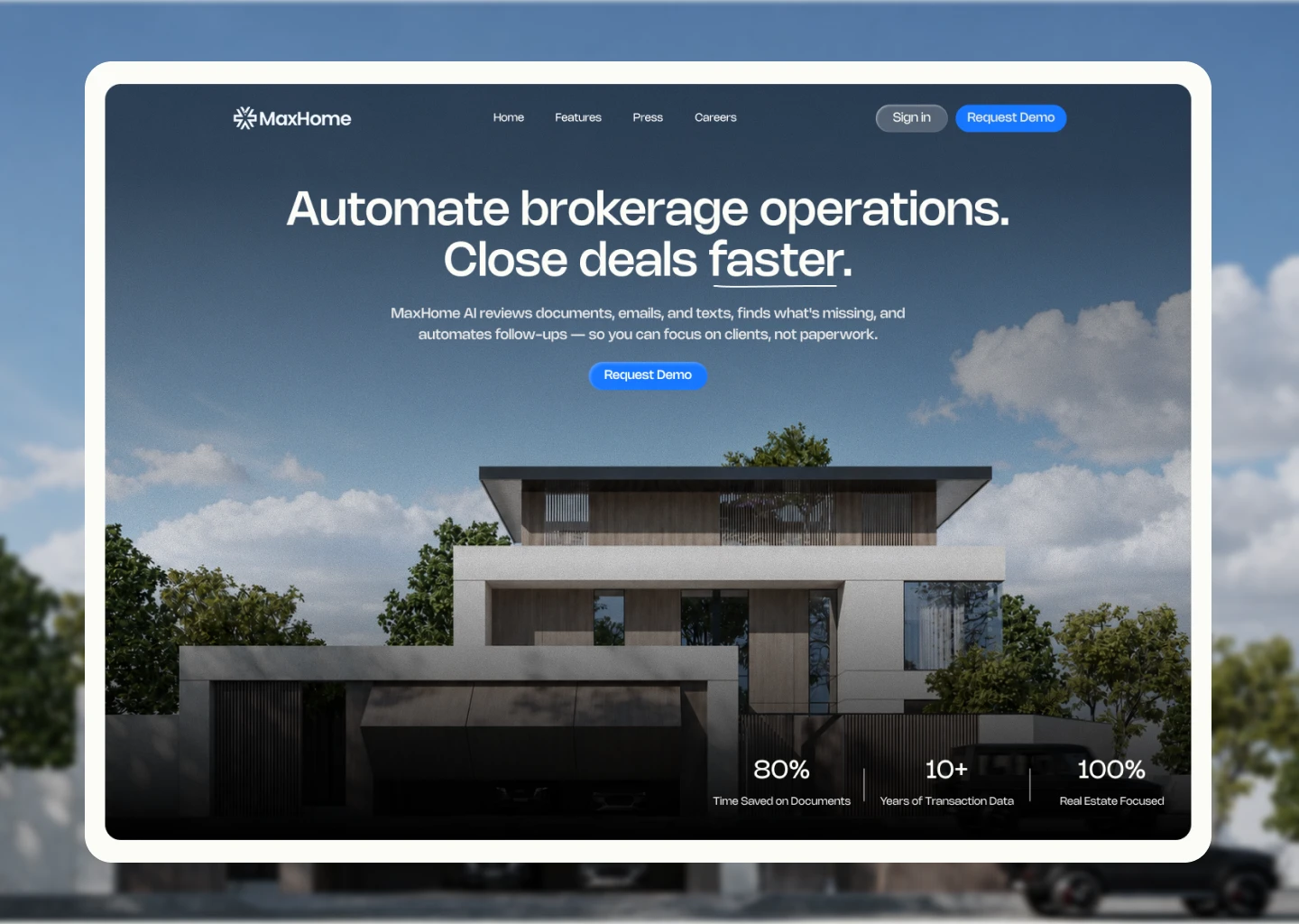
I redesigned the hero around three things: the benefit, the audience, and the product.
I also introduced a visual that immediately connects MaxHome to real estate, giving visitors context before they even read the rest of the page.
Showing the Product
Rather than explaining MaxHome's capabilities entirely through text, I used simple visuals to show how the product helps with paperwork, missing details, and task management.
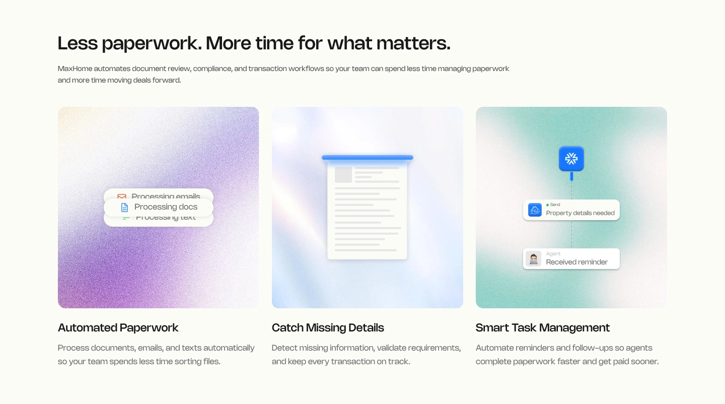
Each feature has its own visual story, making the product easier to understand at a glance.
Making the Differentiator Clear
MaxHome is built specifically around real estate workflows, so I wanted that to become part of the visual language of the page.
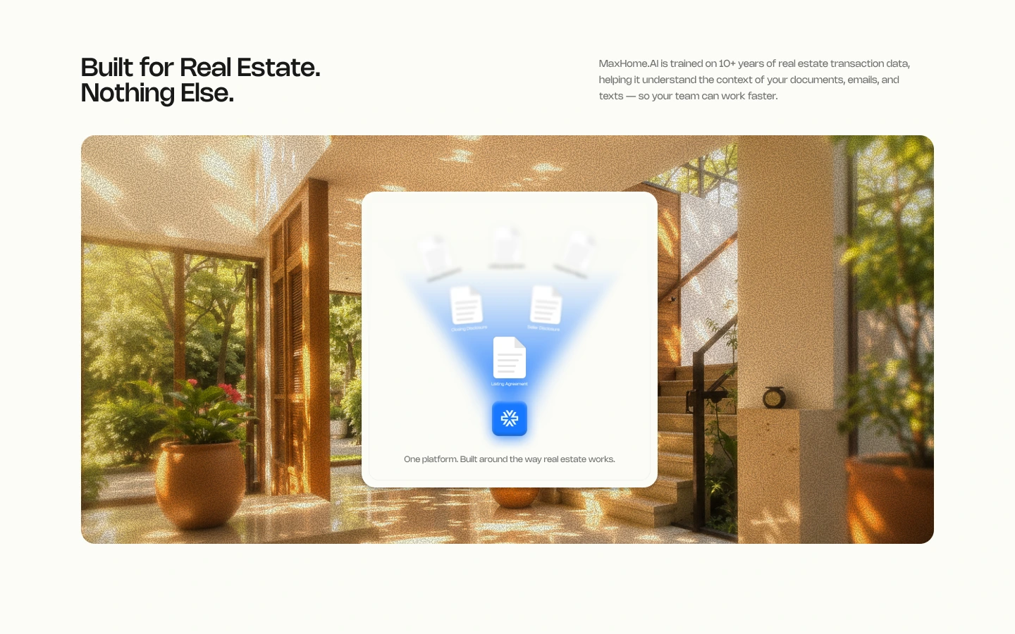
I used real-estate transaction documents and data to communicate that MaxHome isn't simply a generic AI tool — it understands the context of the industry it serves.
Building Trust Before the CTA
I brought credibility into the journey through partnerships, industry coverage, and product-specific proof, rather than leaving visitors to discover these signals at the very end.
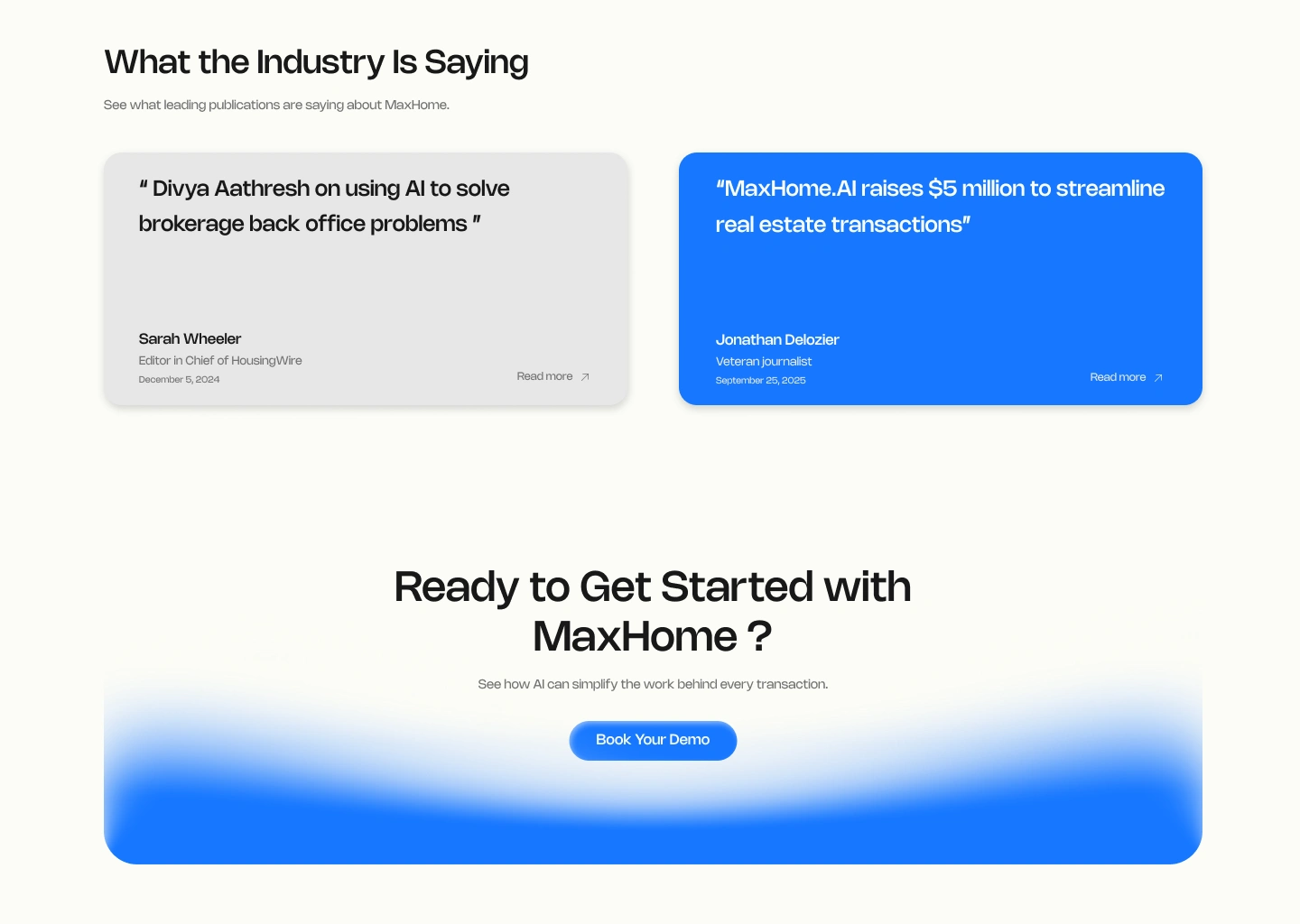
The goal was to gradually move the visitor from:
Understand → Trust → Take action
Final Direction
The redesign was less about adding more content and more about making the existing story easier to understand.
Clearer messaging, purposeful visuals, less repetition, and a stronger conversion path.
Then finish with your own CTA:
Have a product that deserves a better story?
I design clear, conversion-focused websites for startups and businesses.
Like this project
Posted Aug 25, 2026
Redesigned MaxHome.AI's landing page for clearer messaging and stronger conversions.
Likes
4
Views
17