Tethxr Mobile App Landing Page Redesign

Nirooz Vp

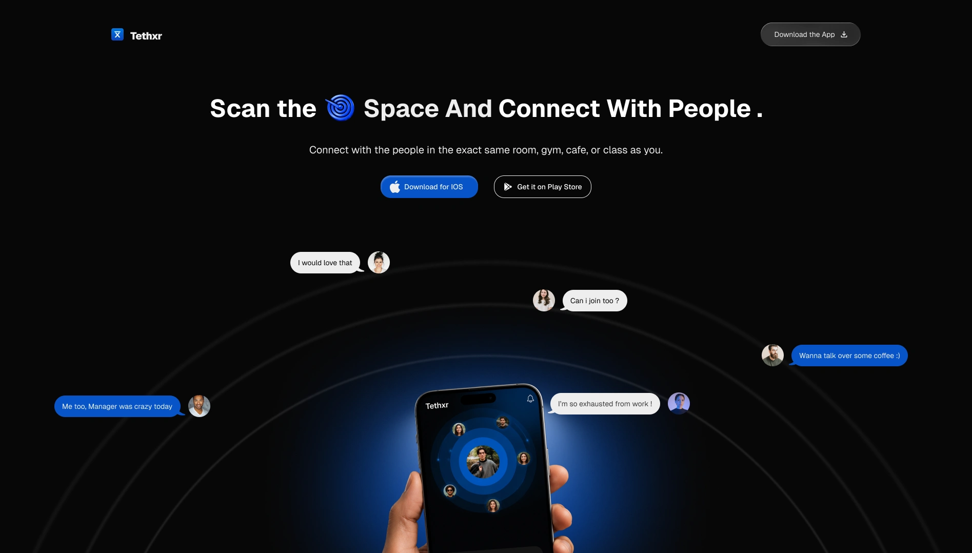
Tethxr — Mobile App Landing Page
The challenge wasn't simply to make Tethxr's website look better. The original site had a strong product behind it, but it was missing some of the personality that made the product unique.
So before designing, I spent time understanding Tethxr — what the product does, what makes it different, and what parts of its identity could be brought into the website.
Starting with the product
Instead of jumping straight into visual design, I looked for the ideas that define Tethxr and could become part of its visual language.
Proximity, discovery, people, and real-world connection became the foundation for the redesign.
Each design decision was made around those ideas rather than adding visual elements just to make the website look more polished.
Rethinking the hero
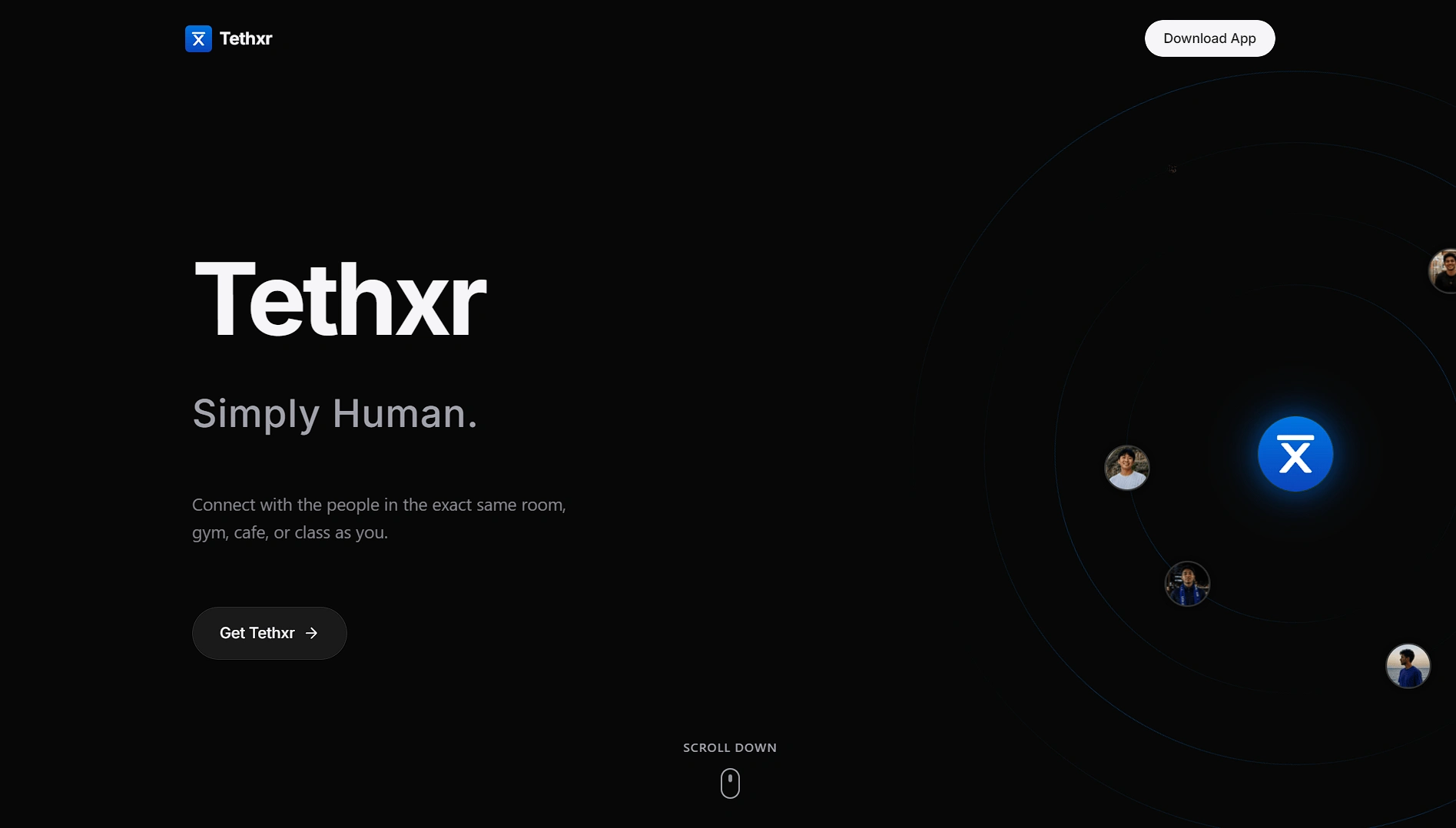
The original hero communicated the product, but I wanted the first impression to communicate more of the brand personality at a single glance.
I reworked the hero around the product's core idea, using the physical world, people, and proximity as visual cues to make the experience feel more distinctly Tethxr.
Before →
Building the rest of the experience
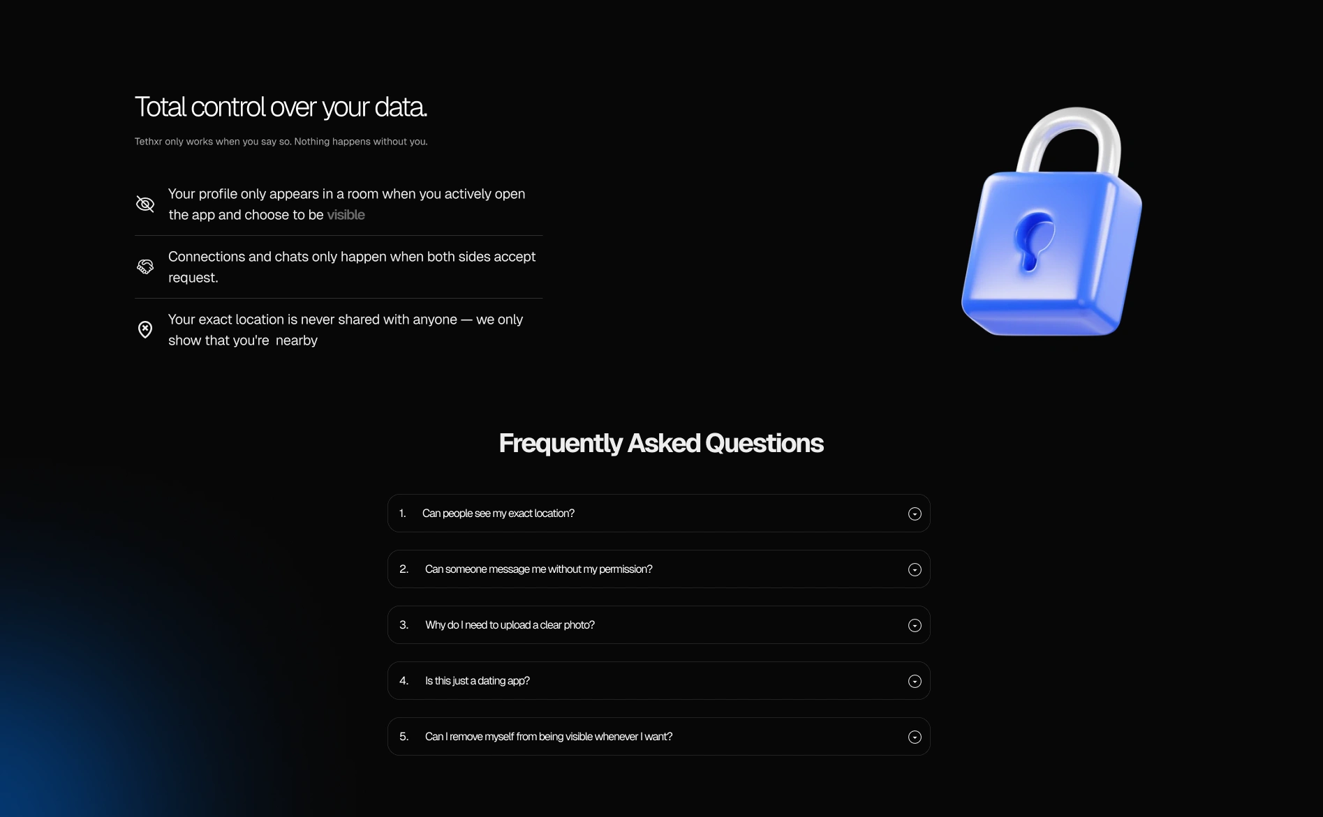
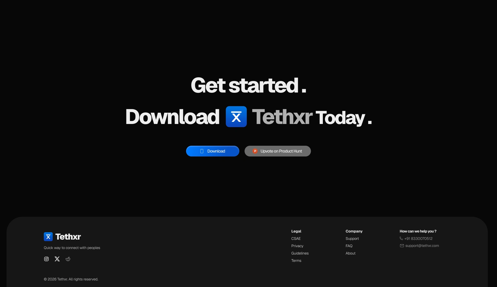
From there, I carried the same visual language across the rest of the website.
I designed four key pages, along with supporting sections including feature showcases, a Bento-style layout, FAQ, and footer.
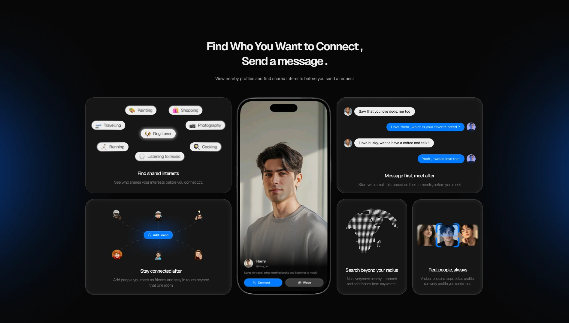
The goal was to make every section feel like part of the same product and brand rather than a collection of individual designs.
Extending the product experience
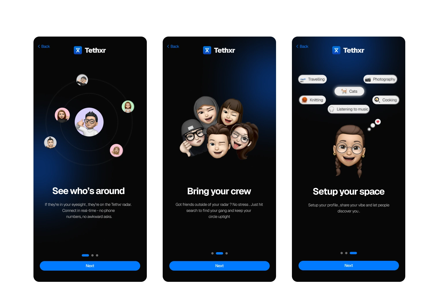
I also designed onboarding mockups for the mobile app, bringing the same visual direction into the product itself.
The result
The redesign gave Tethxr a stronger personality and a clearer visual story — making the website feel more connected to the product it represents.
The client really liked the direction, especially how the design felt more like Tethxr, rather than simply being a more beautiful version of the original website.
Want your website redesigned?
Let’s turn your product into a website that feels like your brand.
Like this project
Posted Aug 18, 2026
Redesigned Tethxr's mobile app landing page to reflect brand personality.
Likes
3
Views
11