PioVation Website Redesign

Nirooz Vp

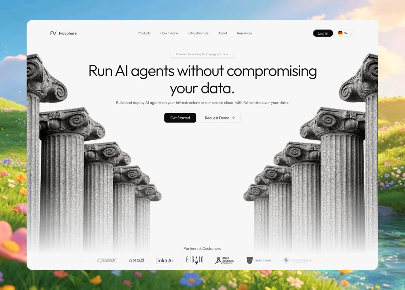
PioVation — Website Redesign Concept
When I first visited PioVation, I didn't immediately understand what the product did. I went deeper into PioSphere and the documentation to understand the platform and what made it different.
The strongest proposition I found was security and control — allowing organizations to run AI while keeping control of their data and infrastructure.
So I explored a visual direction focused on clarity, trust, and a stronger first impression.
The Hero
Before
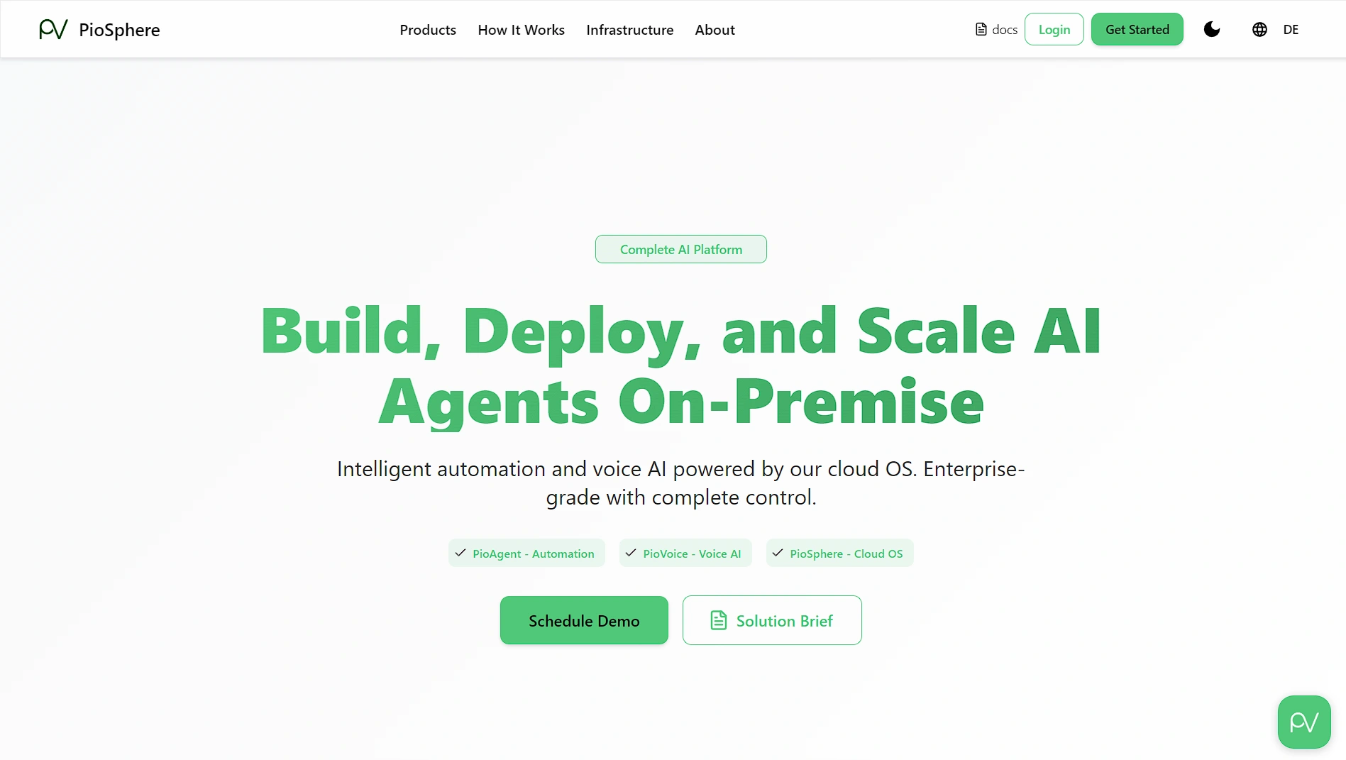
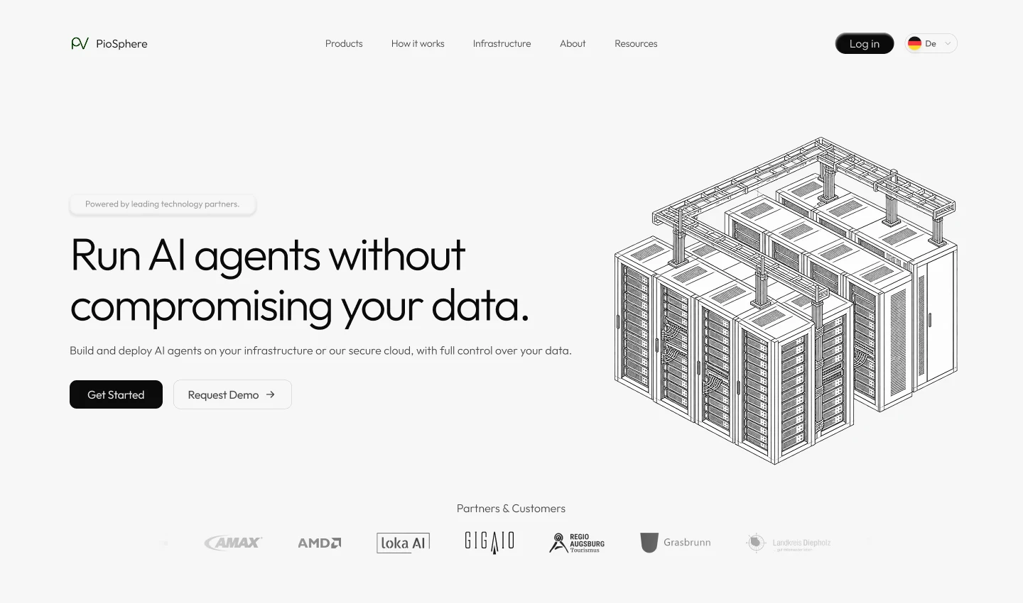
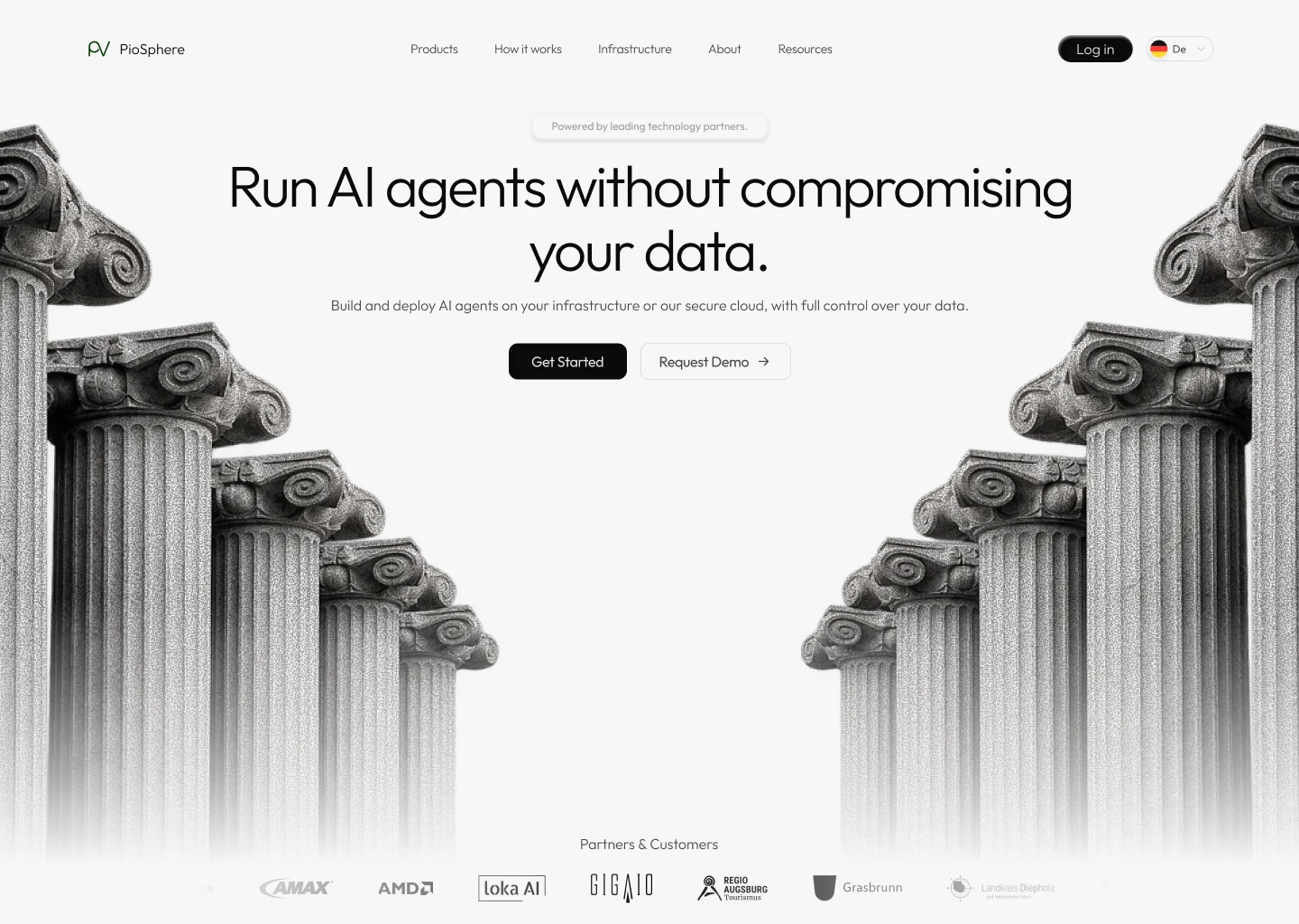
I focused the hero around one simple message:
Run AI agents without compromising your data.
The goal was to communicate the value before asking visitors to understand the technology behind it.
After :
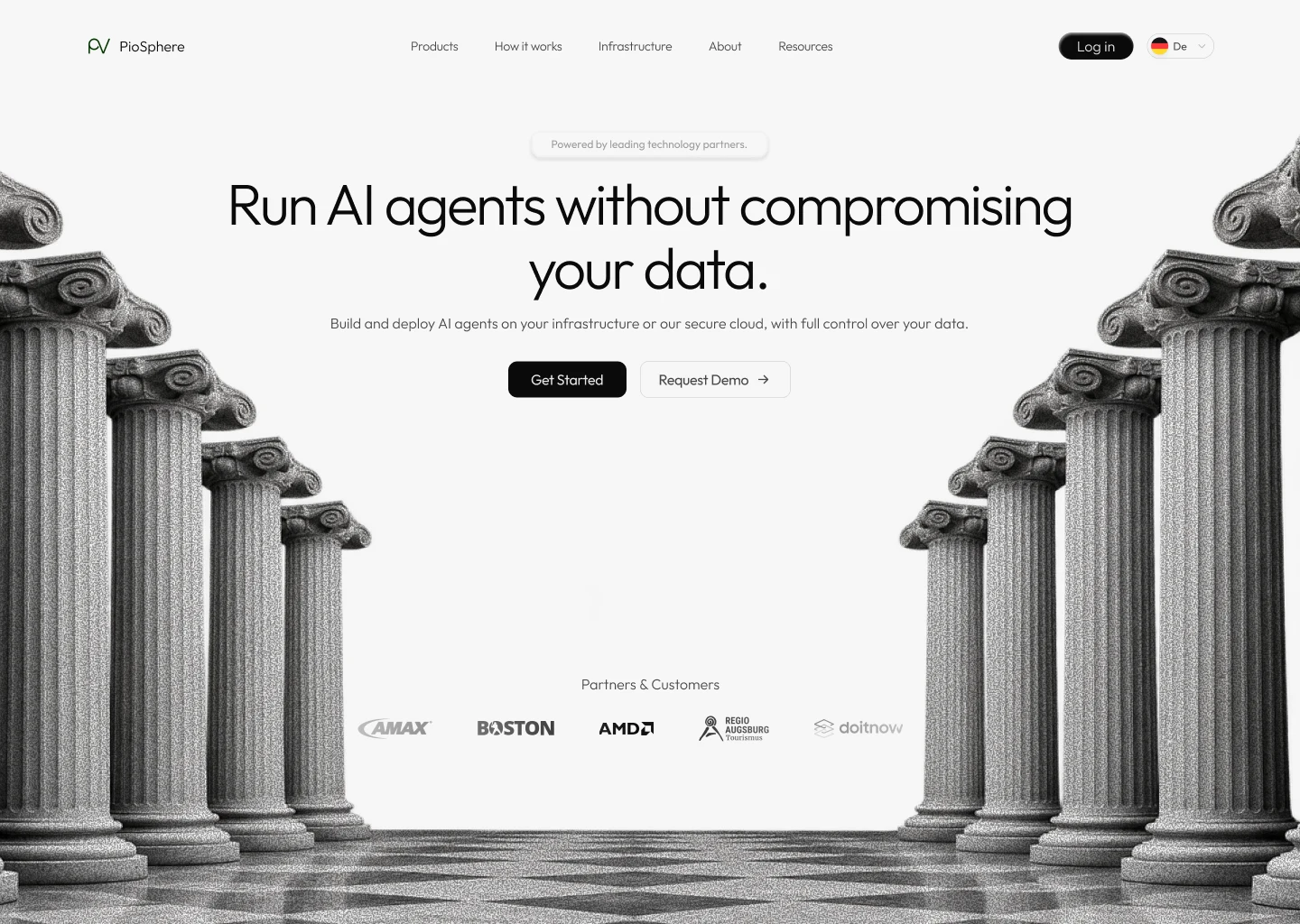
Exploring Different Directions
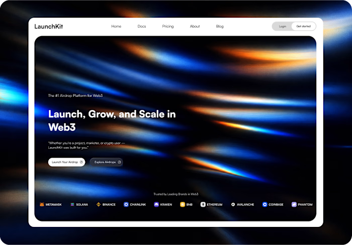
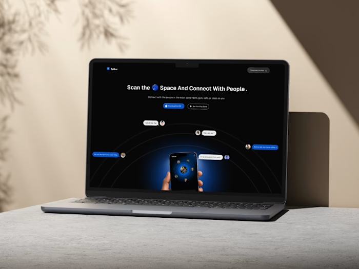
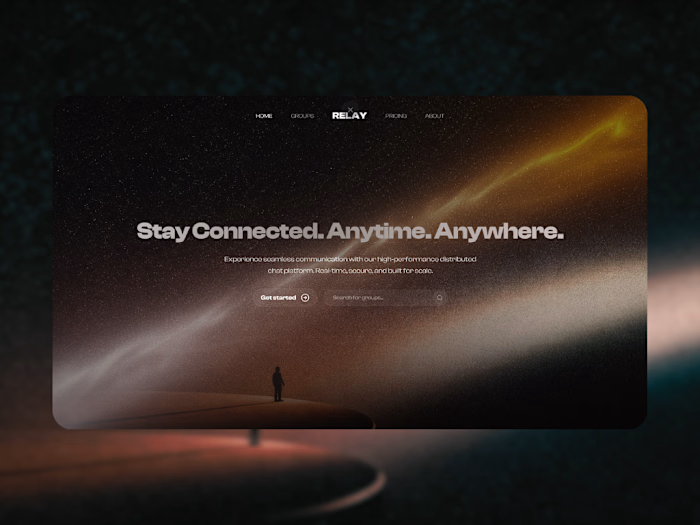
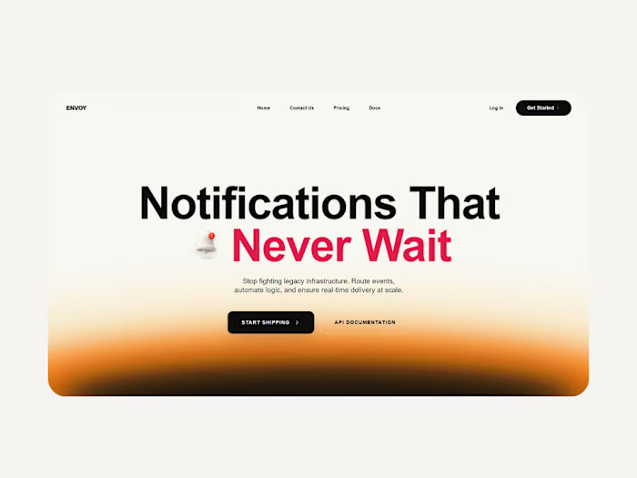
I also explored two additional hero concepts for PioVation, experimenting with different visual approaches while keeping the same core proposition.
What I focused on
Clearer proposition
Make PioVation's core value easier to understand immediately.
Simpler navigation
Reduce visual clutter and create a clearer path through the website.
Stronger trust
Bring partners and credibility closer to the first impression.
Better product visuals
Use visuals to explain a technically complex product without relying entirely on text.
Final Thought
This wasn't about redesigning PioVation just to make it look different.
It was about making a powerful product easier to understand, trust, and explore.
Have a product that needs a clearer story? Let's talk →
Like this project
Posted Aug 19, 2026
Redesigned PioVation's website for better usability and clarity.
Likes
5
Views
17