The Pan Gang | Brand Identity

Rifki Adriarshad


The Brief
The Pan Gang is a casual food brand built on the idea that eating well shouldn't feel like a chore. They offer lighter, everyday comfort meals for people who want something easy but still thoughtful. The brand needed an identity that matched that spirit: approachable, warm, and a little playful.
The Approach
The direction leaned into the casual, feel-good energy of the brand. Research focused on how comfort food brands position themselves visually, and where The Pan Gang could stand apart. The goal was to feel friendly without being childish, and clean without being cold. The name itself, "The Pan Gang," suggested a crew, a cast of characters, and that became the conceptual anchor.
Key Decisions
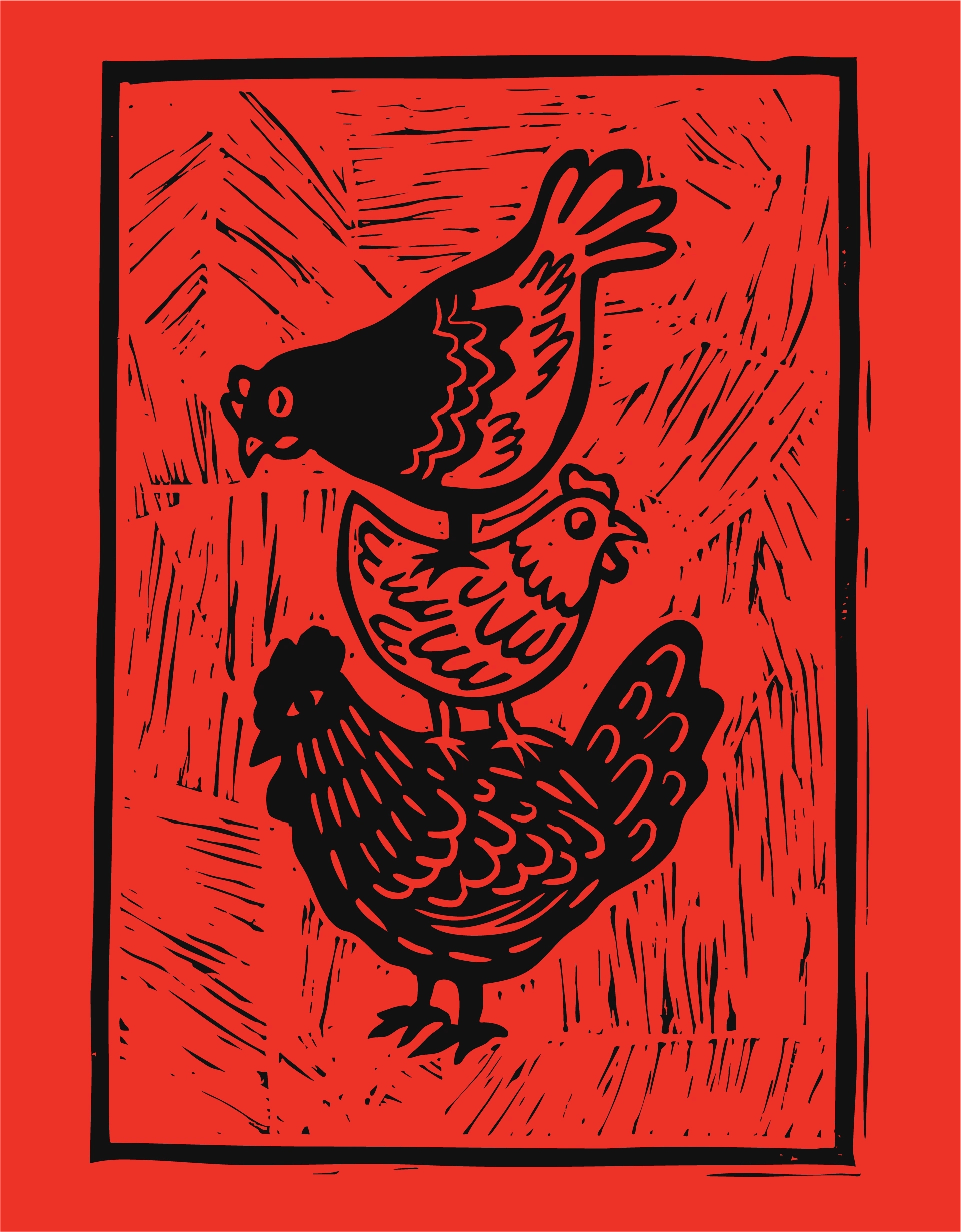
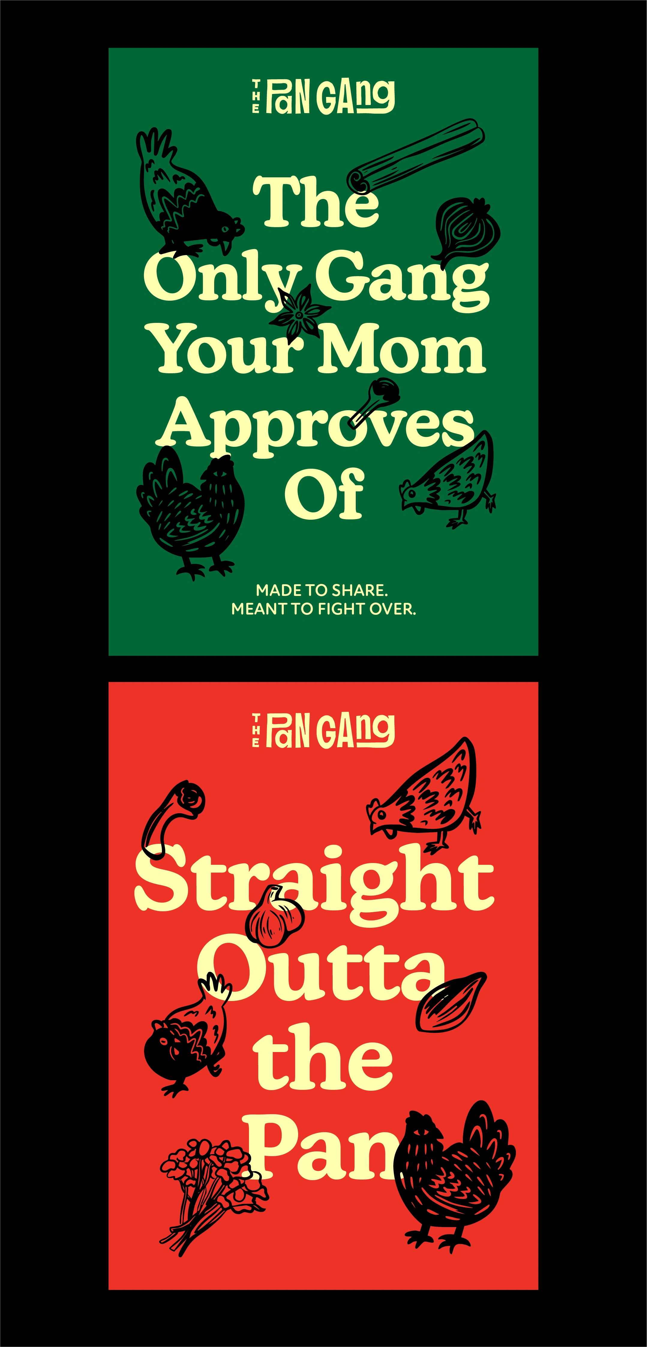
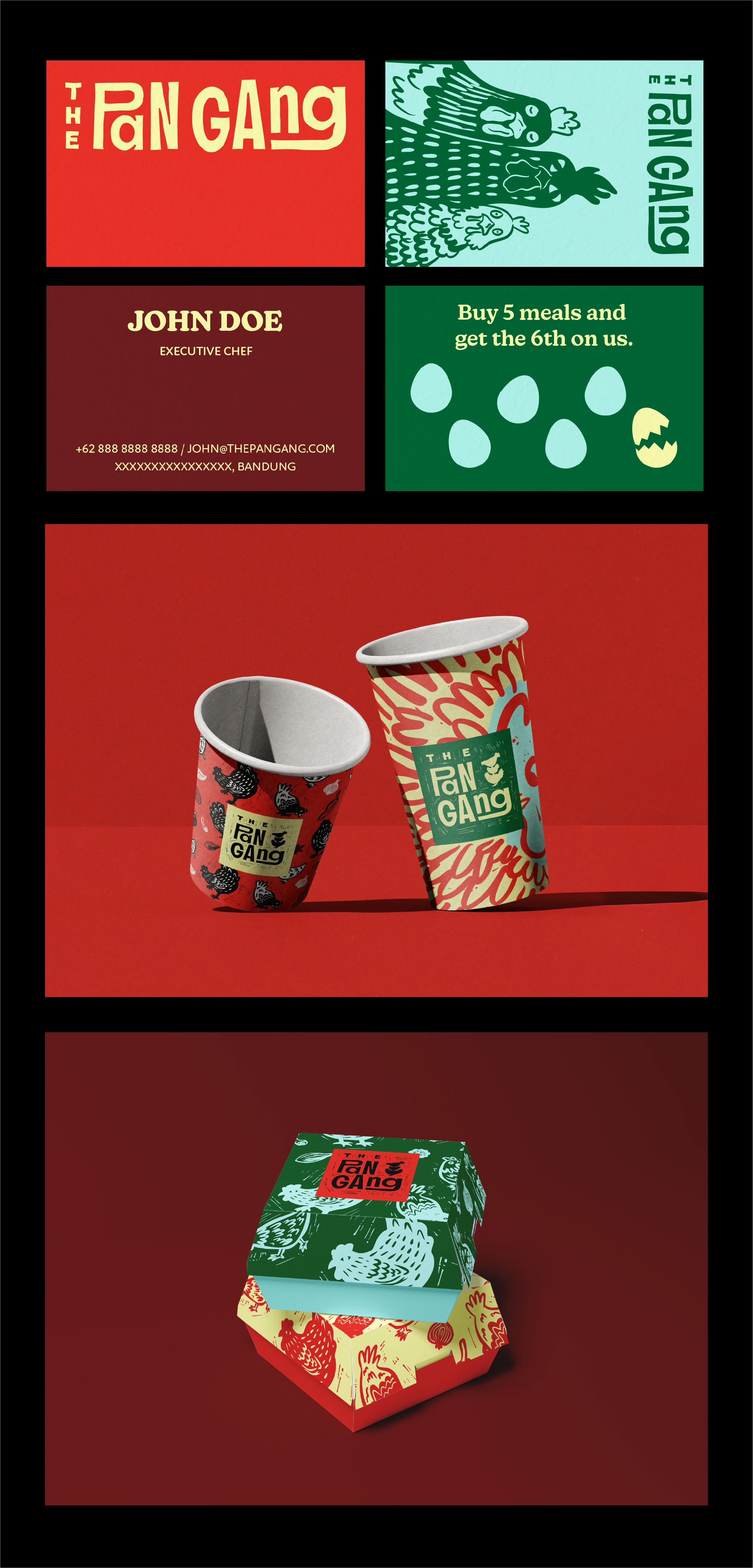
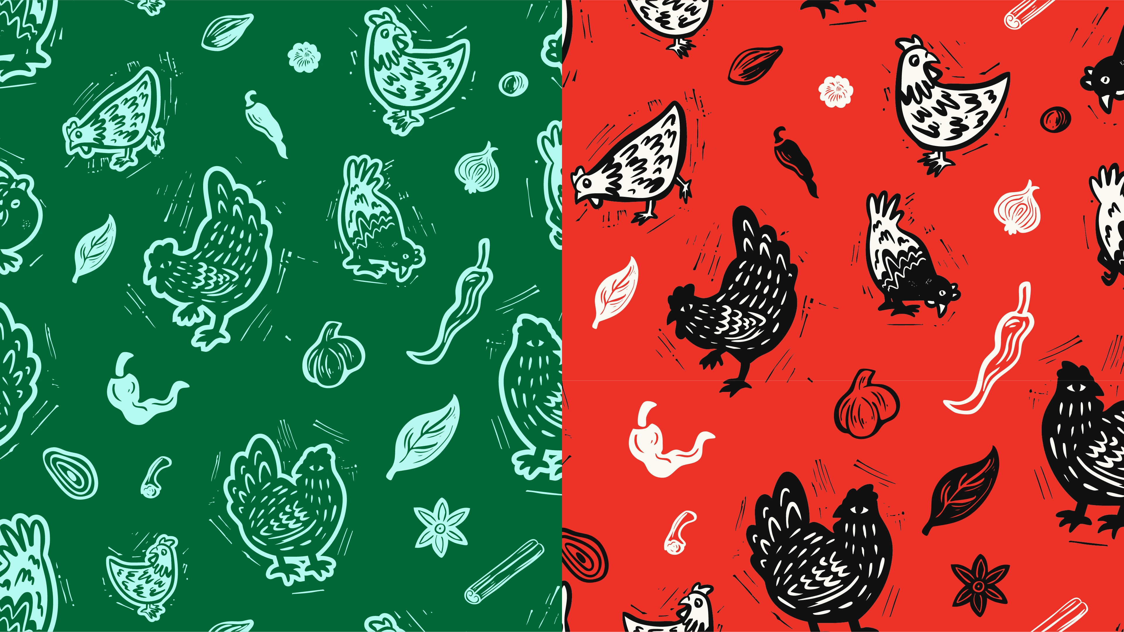
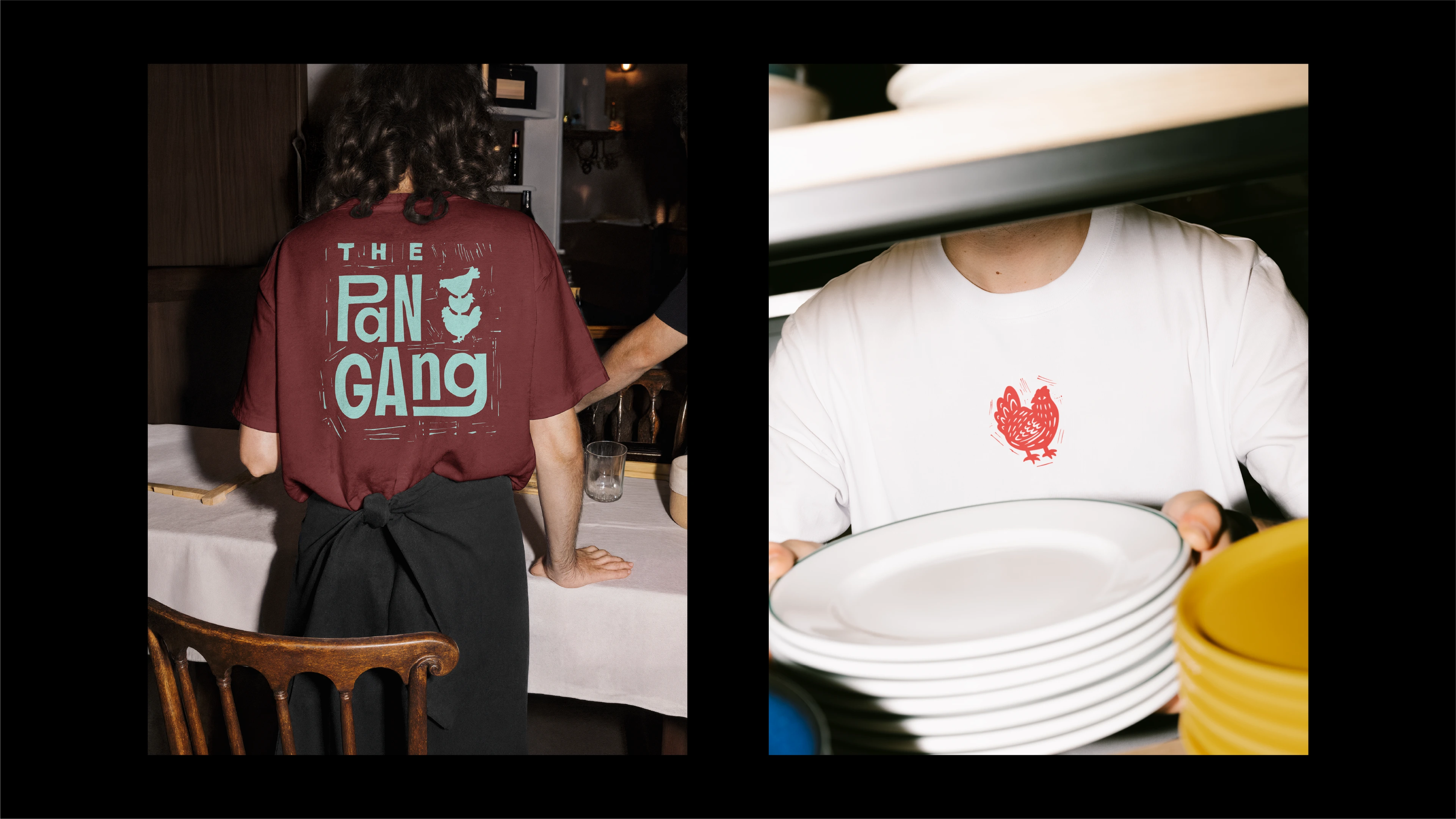
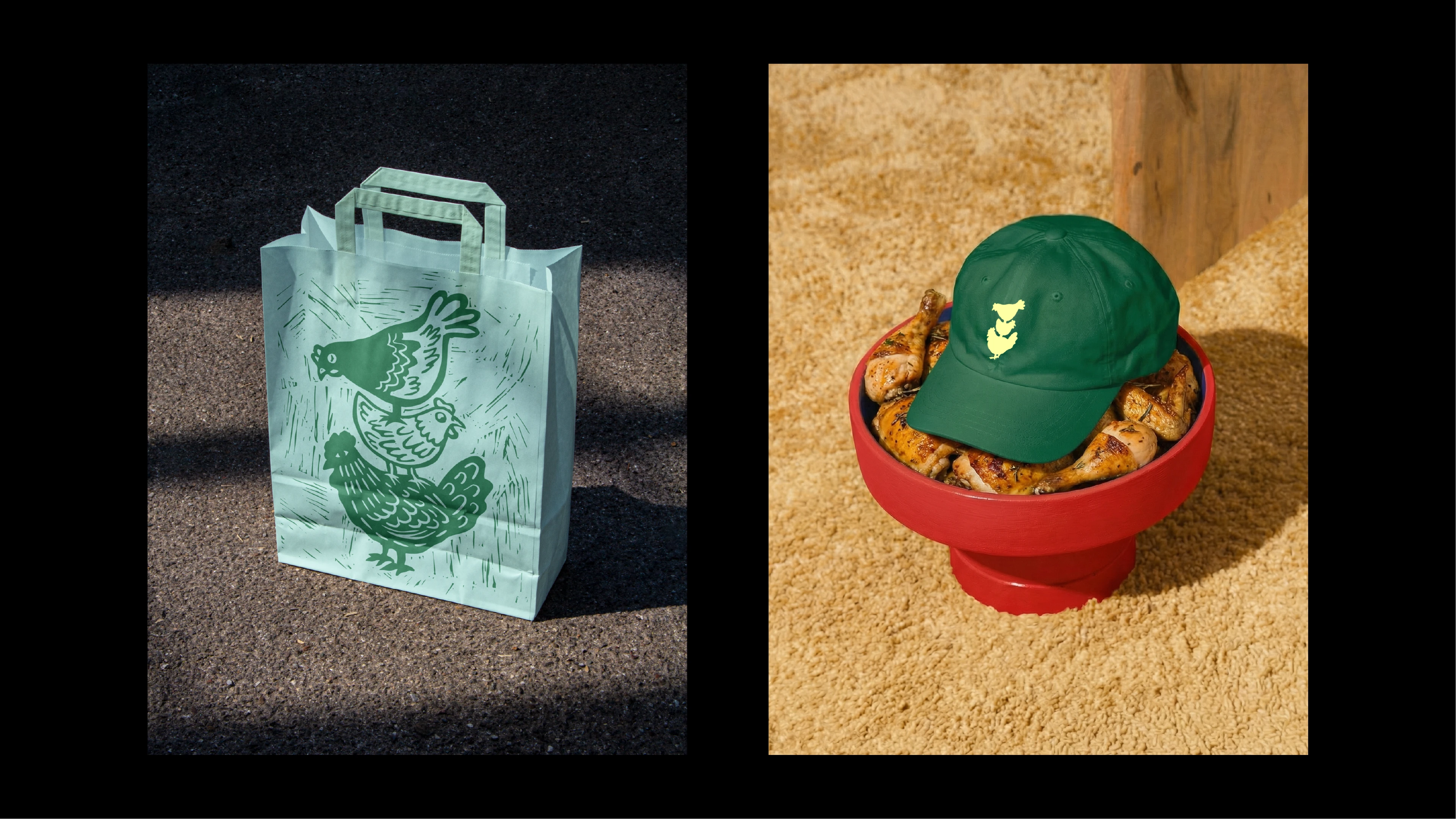
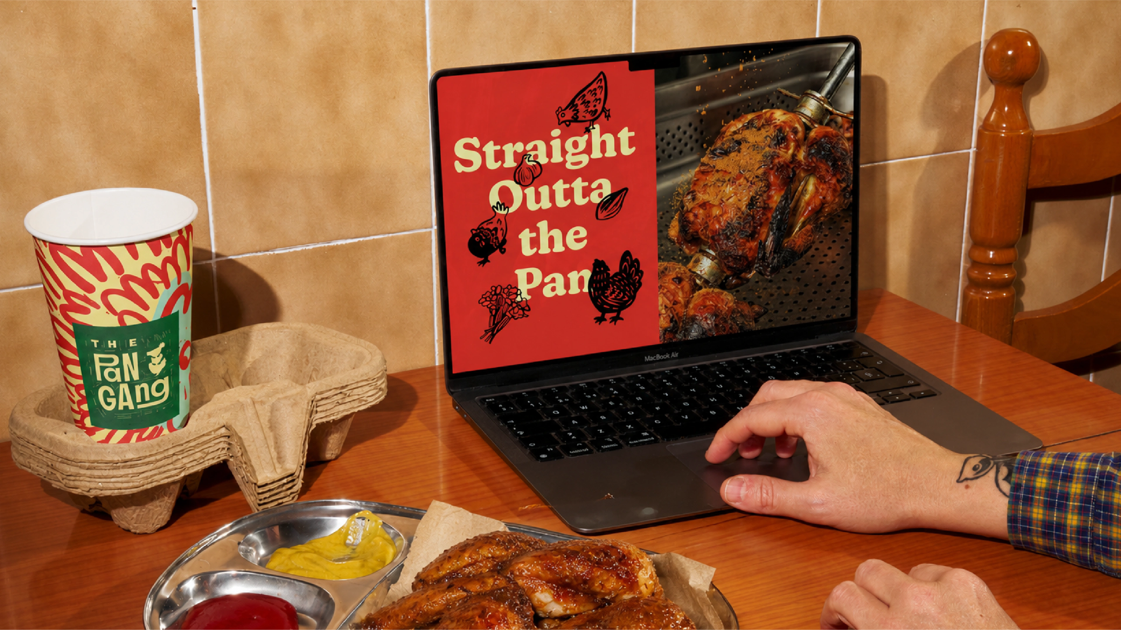
The logo is a custom logotype with a hand-drawn quality that keeps things human and warm. The illustration style uses a woodcut aesthetic, giving everything a handcrafted, tactile feel that reinforces the brand's "made with care" positioning. A full character universe was developed around the brand: a cast of illustrated characters that represent The Pan Gang crew. Each character has its own personality, and together they bring the brand to life across touchpoints, from packaging to social media to in-store materials. The characters make the brand feel like a world you're stepping into, not just a logo on a box. The color palette pulls from natural, appetizing tones that reinforce the "lighter comfort" positioning. Typography and layout stay clean so the illustrations, characters, and food photography can do the heavy lifting.
Deliverables
Full brand identity system including logo, custom logotype, woodcut illustration system, character universe, packaging design, and brand guidelines.
Like this project
Posted May 3, 2026
Brand identity for a casual food brand that makes everyday comfort meals feel lighter and more intentional.
Likes
0
Views
19
Timeline
Sep 20, 2025 - Jan 22, 2026