Meegi | Brand Identity Design
Rifki Adriarshad
The Brief
Meegi is a neuroscience clinic based in Indonesia that offers brainwave reading and sound therapy services. The clinic helps patients understand their neurological patterns and uses sound-based treatments to address conditions like stress, sleep disorders, and cognitive performance. The challenge was a common one in healthcare branding: the field carries weight and complexity, but the clinic needed to feel approachable to everyday patients, not just medical professionals. The identity had to bridge the gap between clinical credibility and warmth.
The Approach
Research started with the neuroscience space itself, looking at how clinics and health brands communicate visually. Most lean heavily clinical, cold, and technical. The opportunity was to create something that still signals expertise but feels human and welcoming. The brand also needed to work across both digital and physical touchpoints, from social media to the clinic environment.
Key Decisions
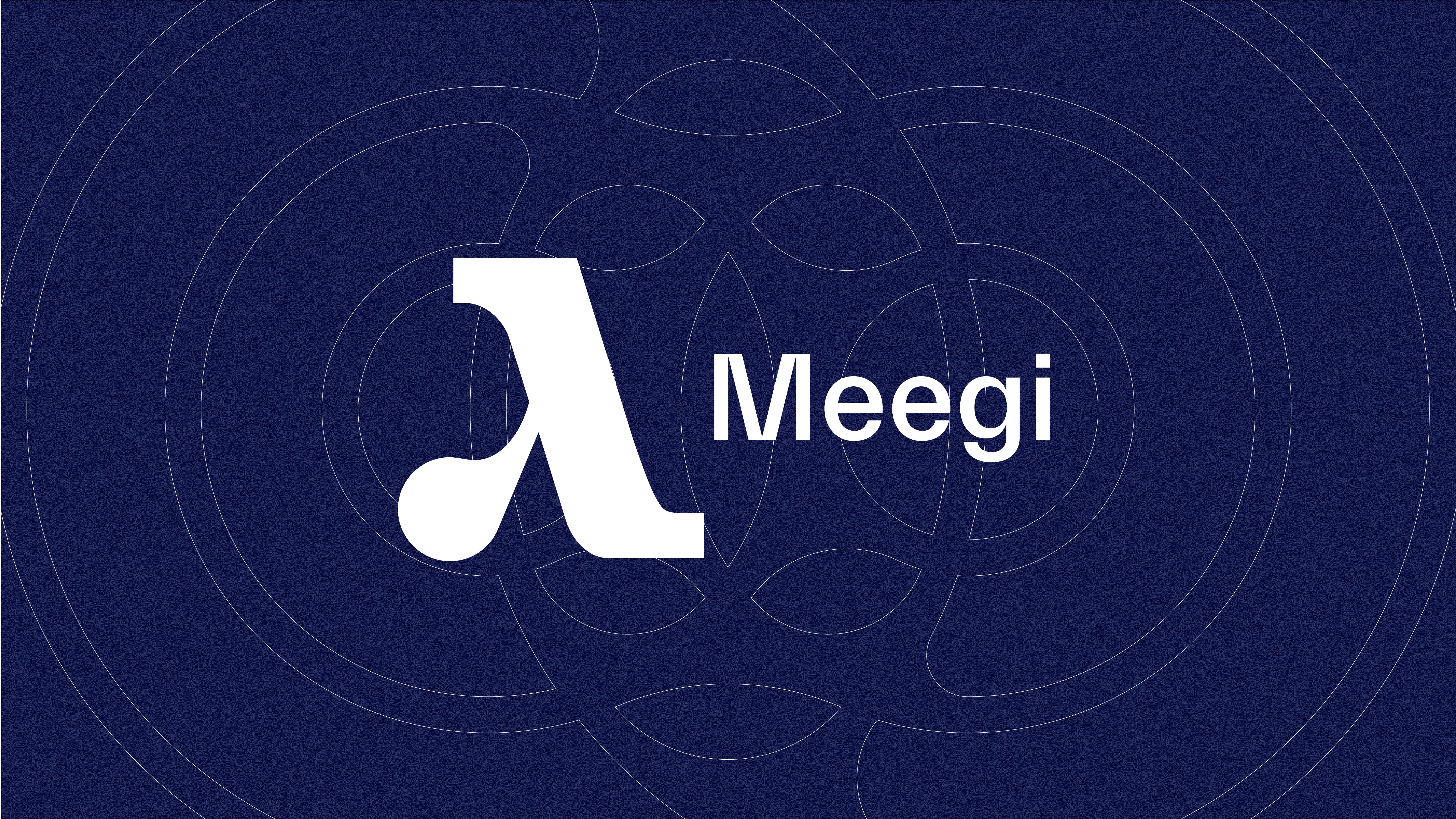
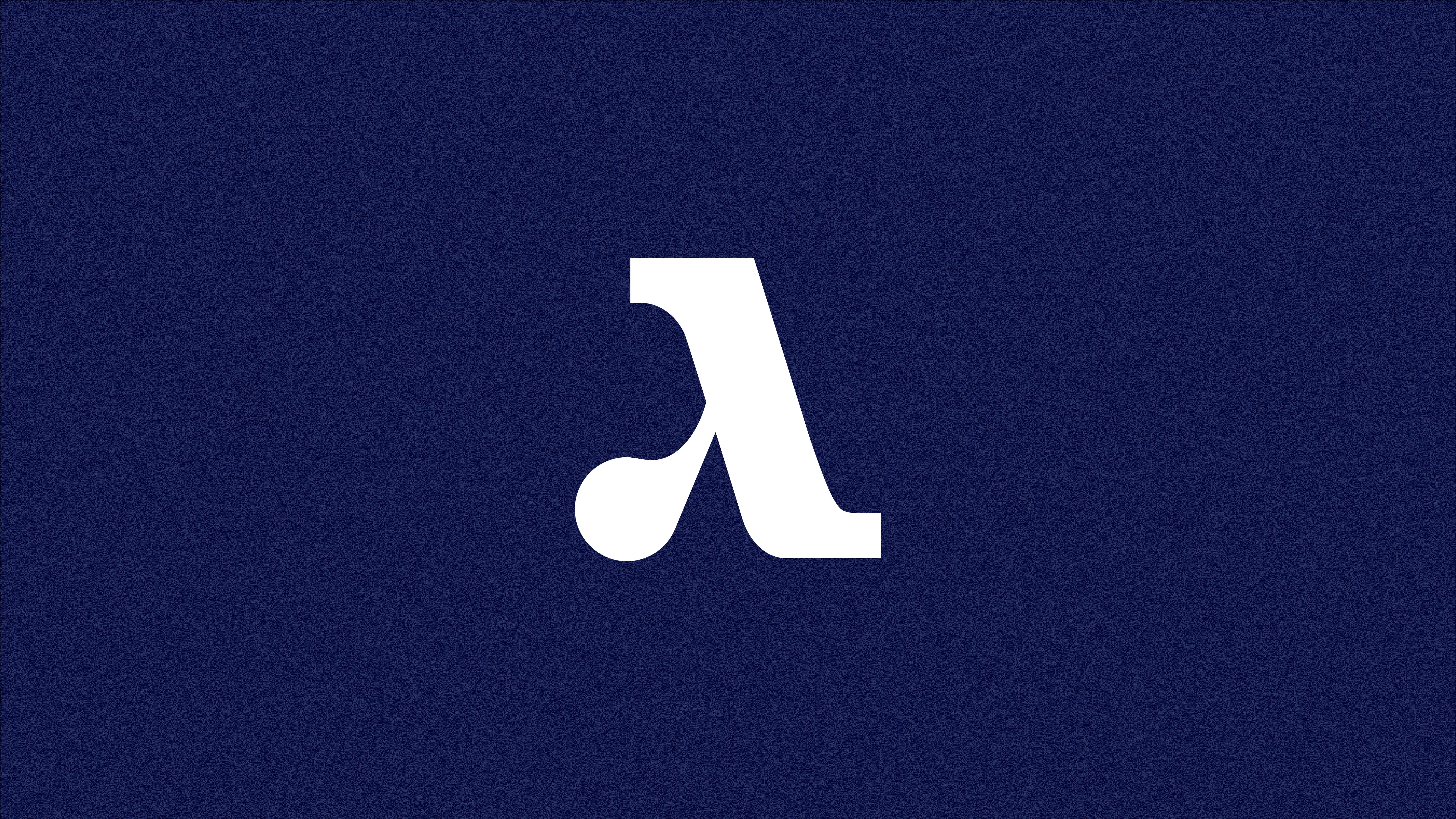
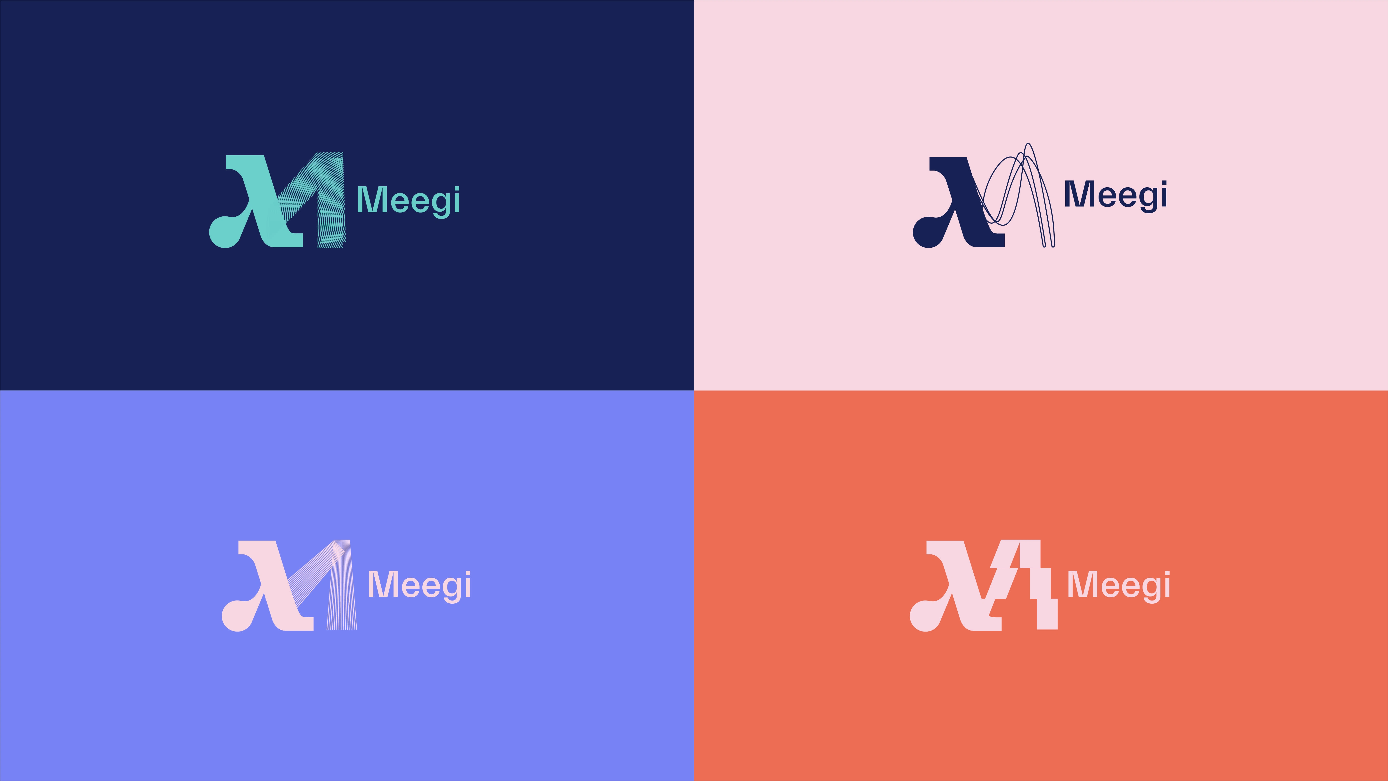
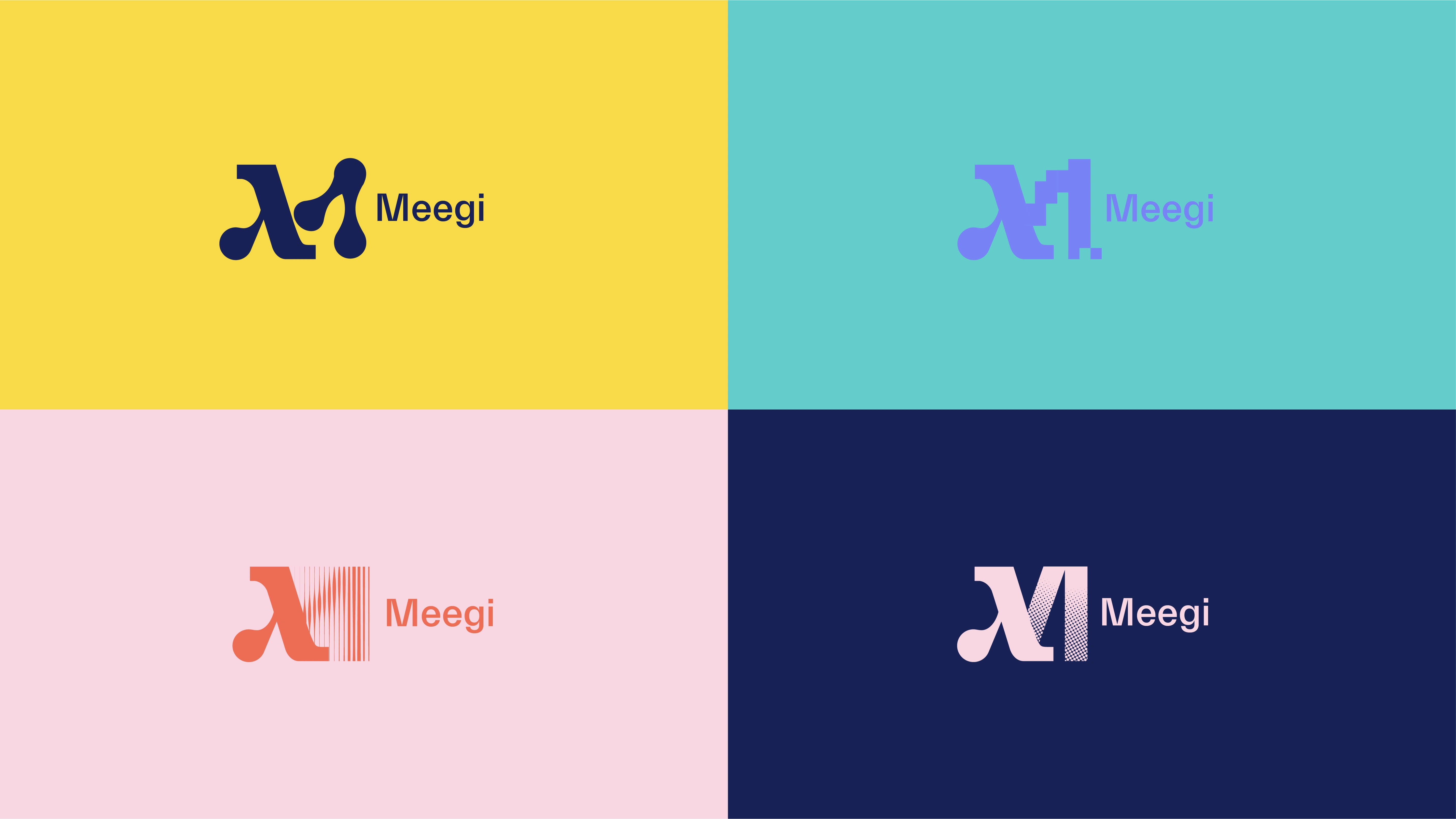
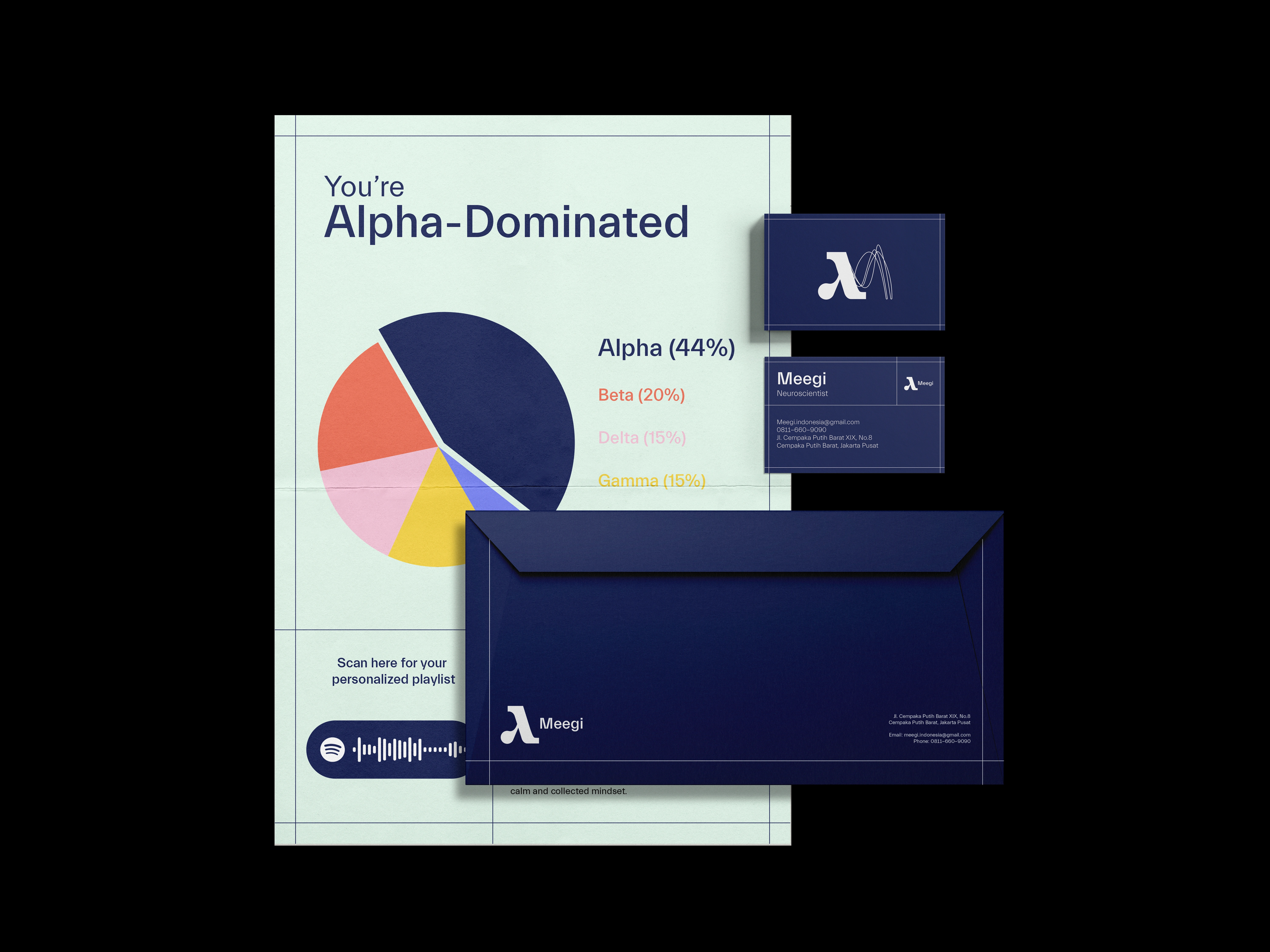
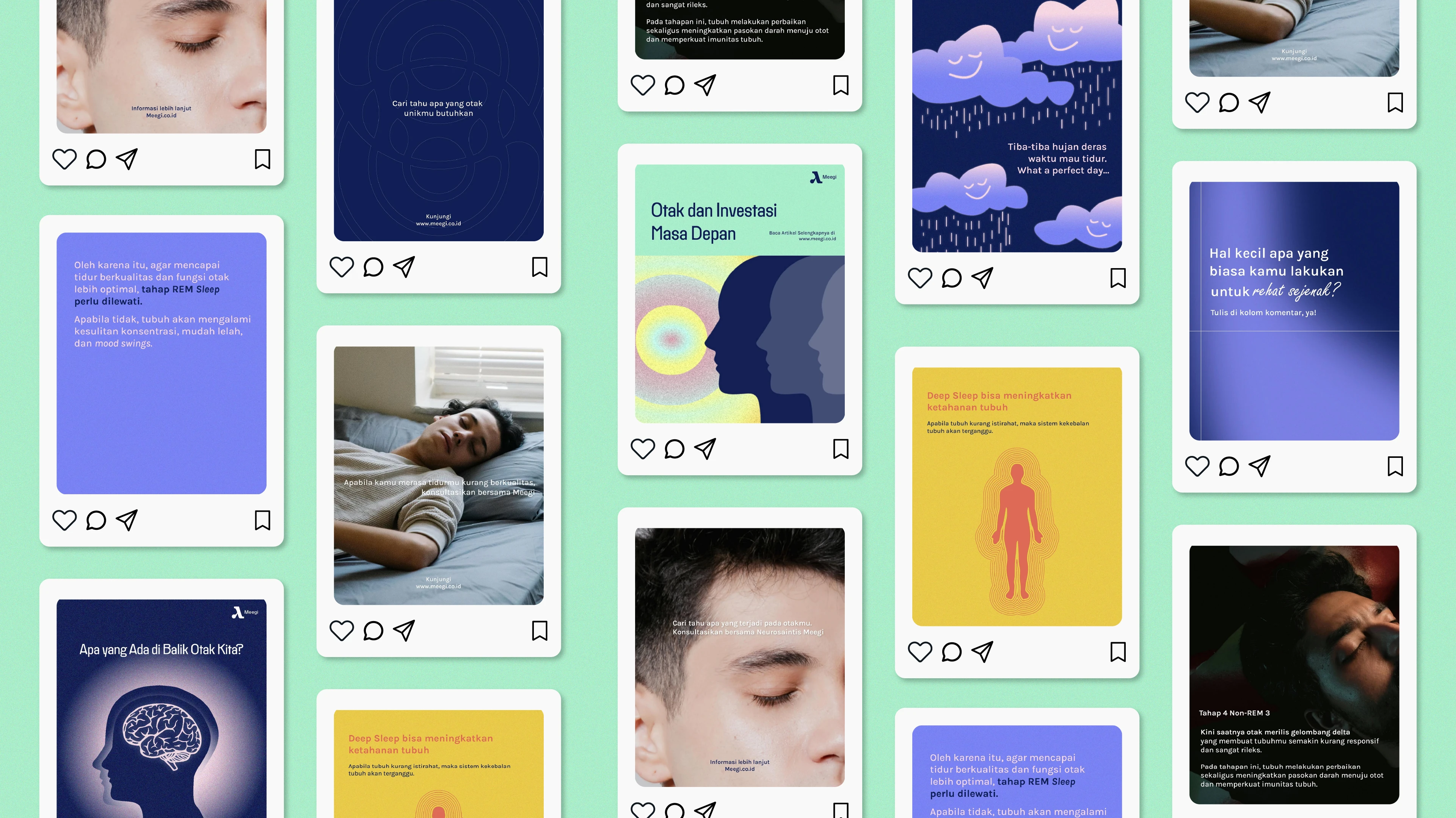
The logo is built around the lambda symbol, a reference to neuroscience and brain wave measurement. That lambda form is combined with a dynamic wave element, creating a mark that visually represents neural activity while staying clean and readable. The logo is designed to be dynamic: the wave component can shift and adapt across applications, giving the brand a living, breathing quality rather than a static mark. Beyond the logo, a full illustration system was developed to support the brand across touchpoints. The illustrations translate complex neuroscience concepts into approachable, human visuals, reinforcing the clinic's mission of making the field accessible. The broader visual system uses a balance of structured layouts and softer elements to avoid the sterile feel most healthcare brands default to. The identity is designed to be adaptable, working at small scale on a business card and at large scale on clinic signage.

Deliverables
Full brand identity system including logo, visual identity, brand guidelines, and collateral design. The brand launched and is currently live at meegi.co.id and on Instagram.
Like this project
Posted Jan 4, 2024
Brand identity for a neuroscience clinic in Indonesia, bridging clinical credibility with public accessibility.
Likes
1
Views
56
Timeline
Oct 11, 2023 - Nov 14, 2024