Agung Rai Museum of Art | Rebranding (Personal Project)
Rifki Adriarshad
The Brief
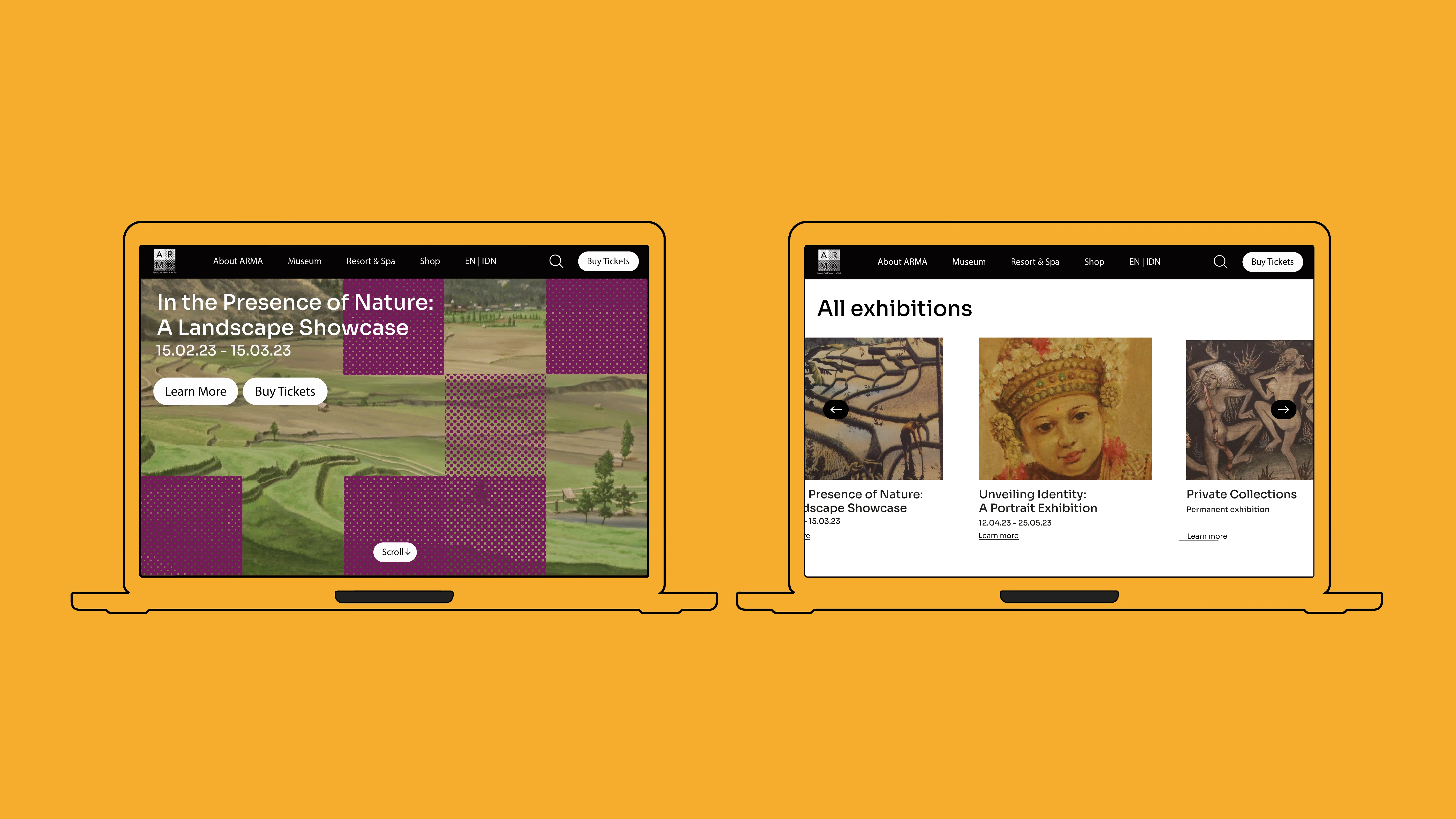
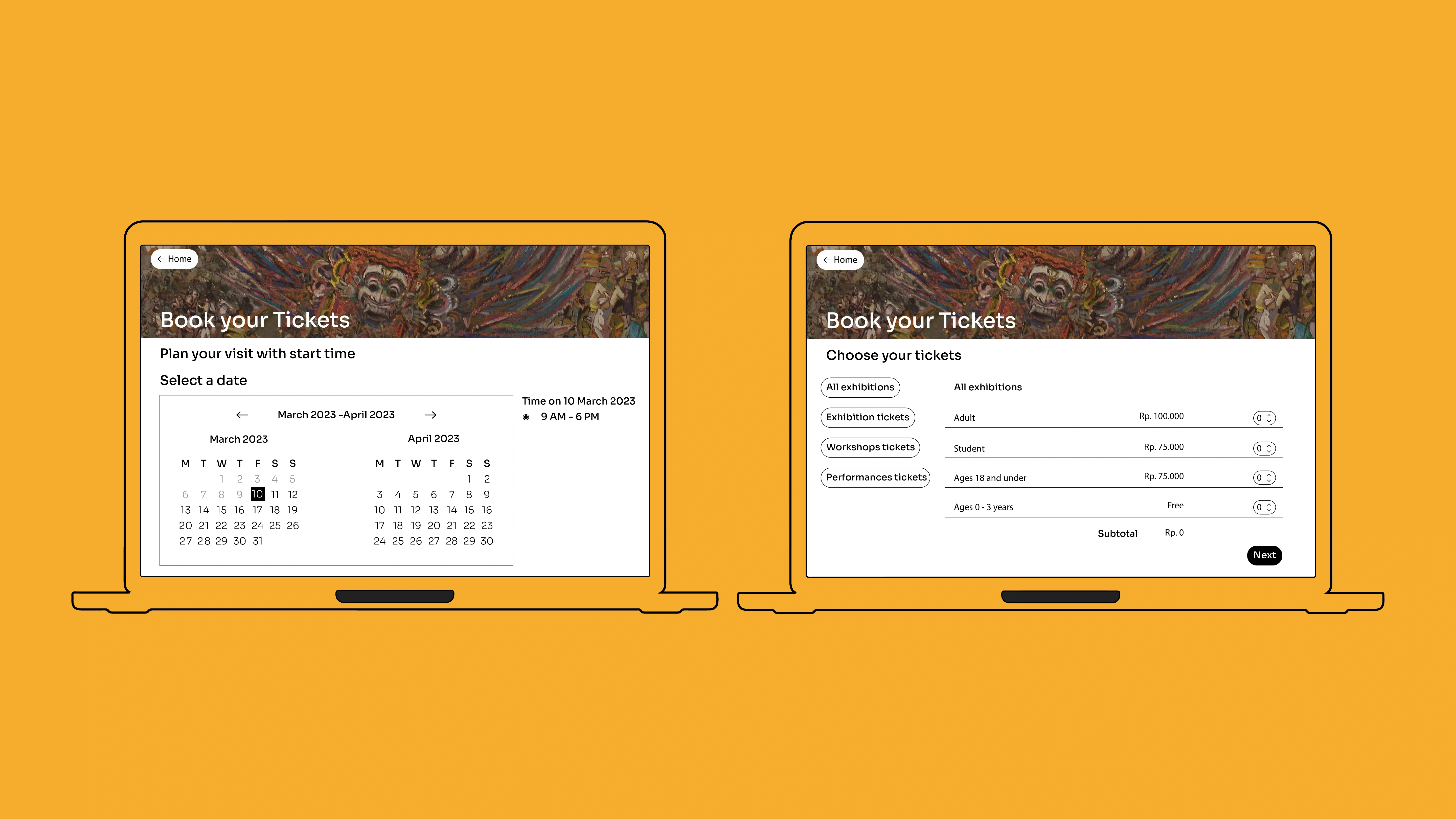
The Agung Rai Museum of Art (ARMA) is a cultural institution in Ubud, Bali, housing traditional Balinese and Indonesian art. This was a self-initiated project: the museum's existing identity didn't reflect the richness of what's inside. The goal was to reimagine the brand for a contemporary audience while honoring the institution's cultural roots.
The Approach
Research focused on how cultural institutions globally handle the tension between tradition and modernity. The best ones don't abandon heritage; they reframe it. ARMA's identity needed to feel rooted in Balinese art and craft traditions but speak a visual language that resonates with younger, design-aware visitors and international tourists.
Key Decisions
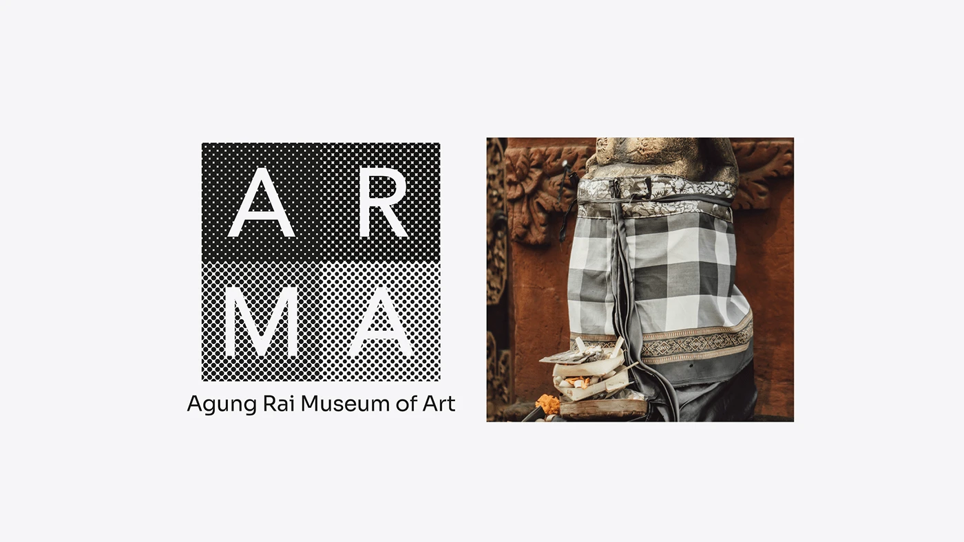
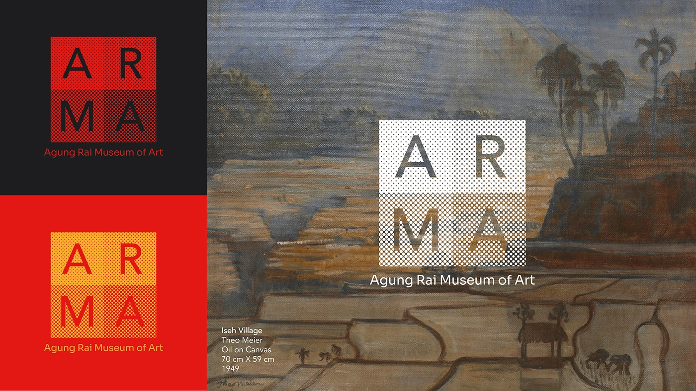
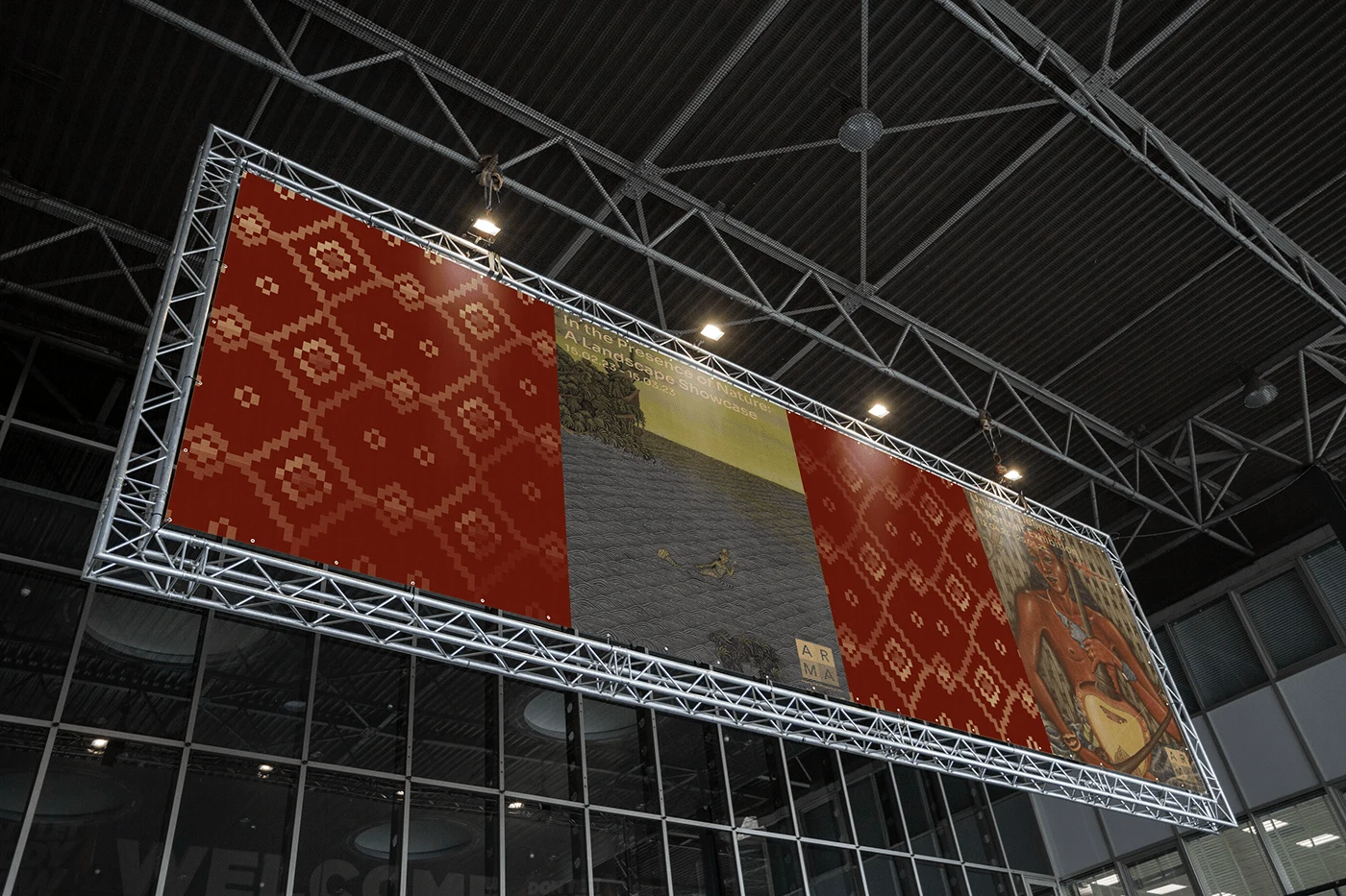
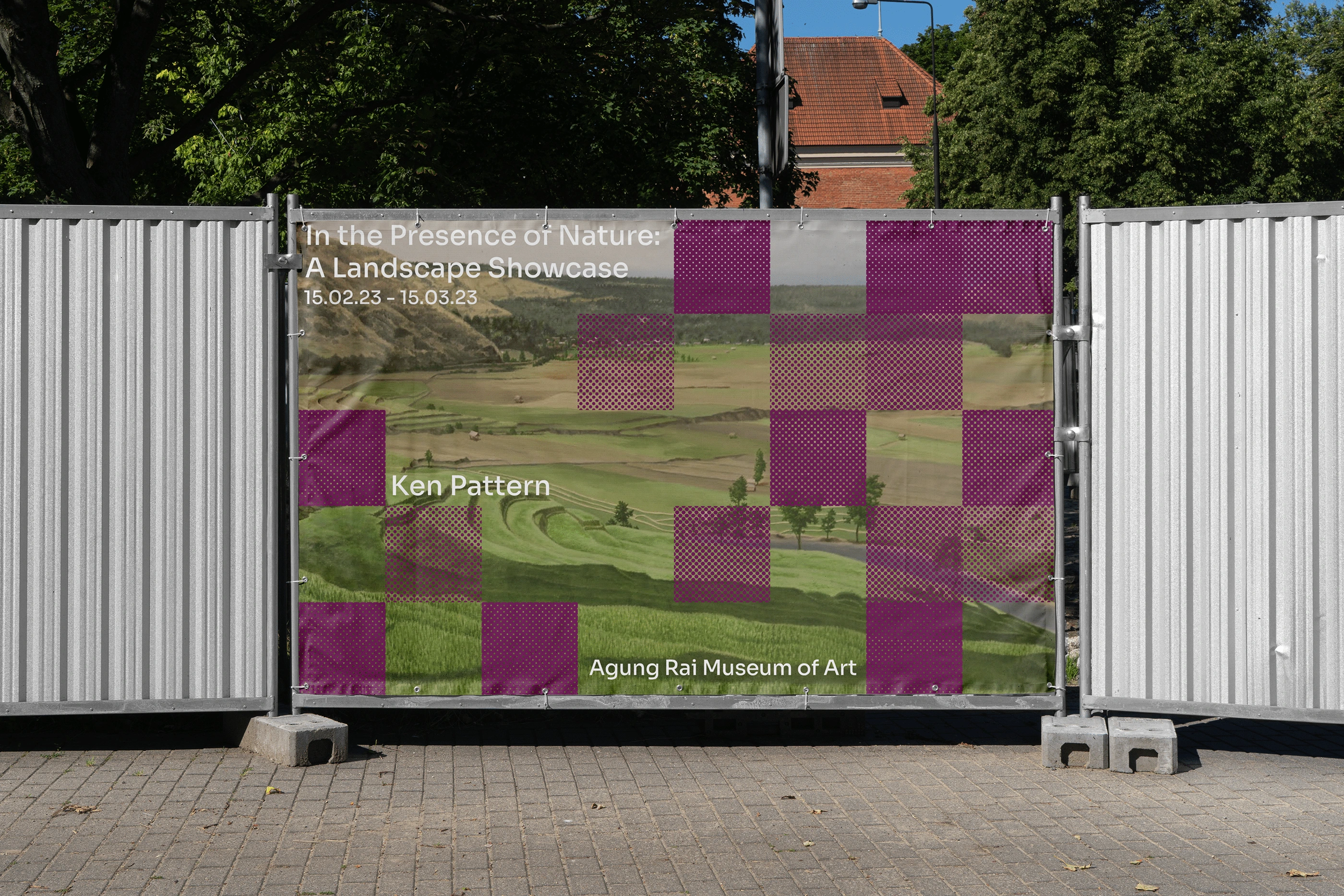
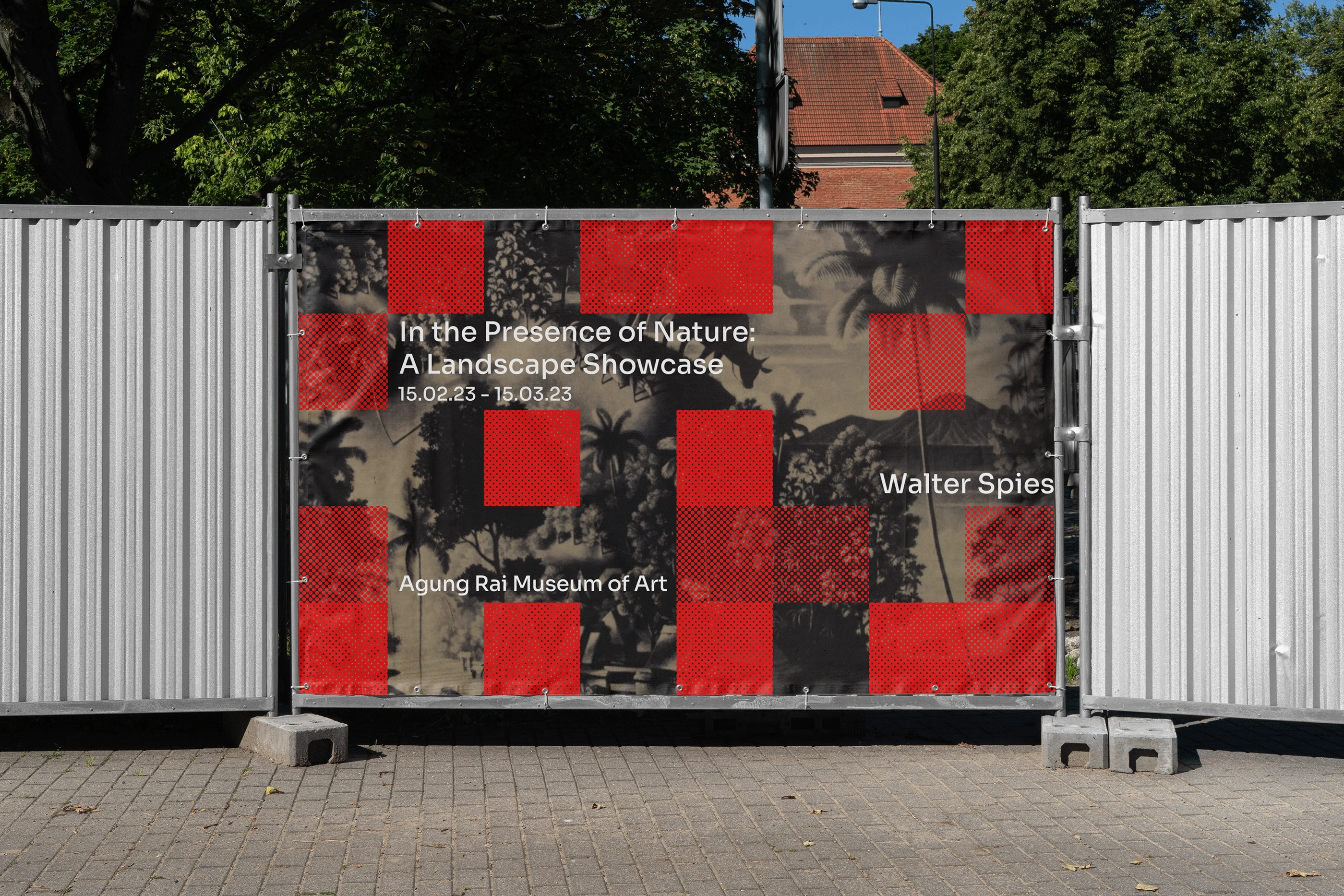
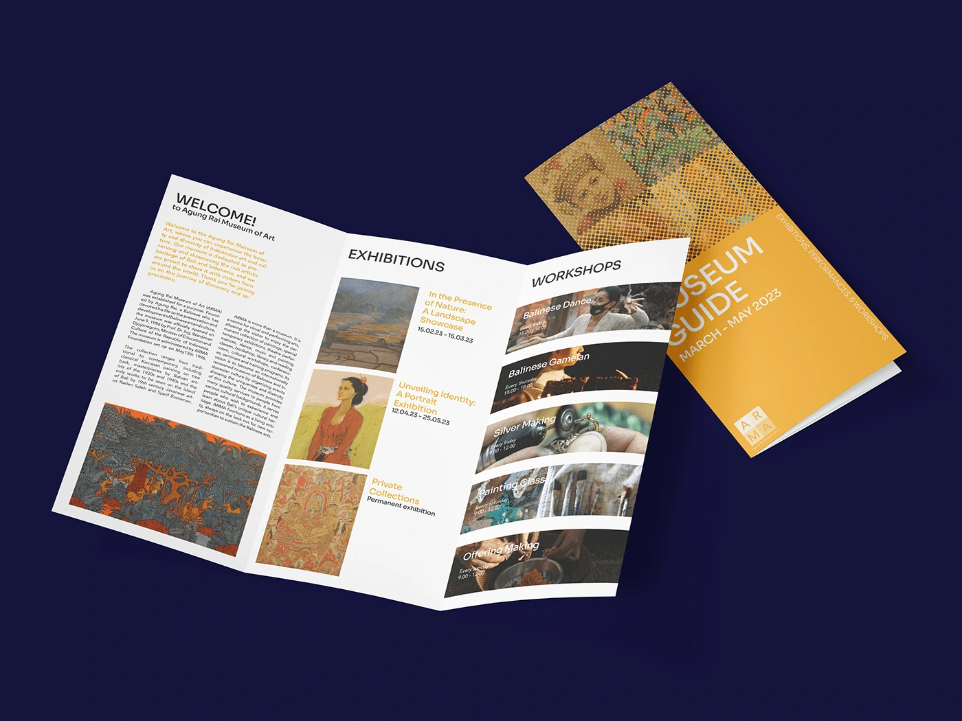
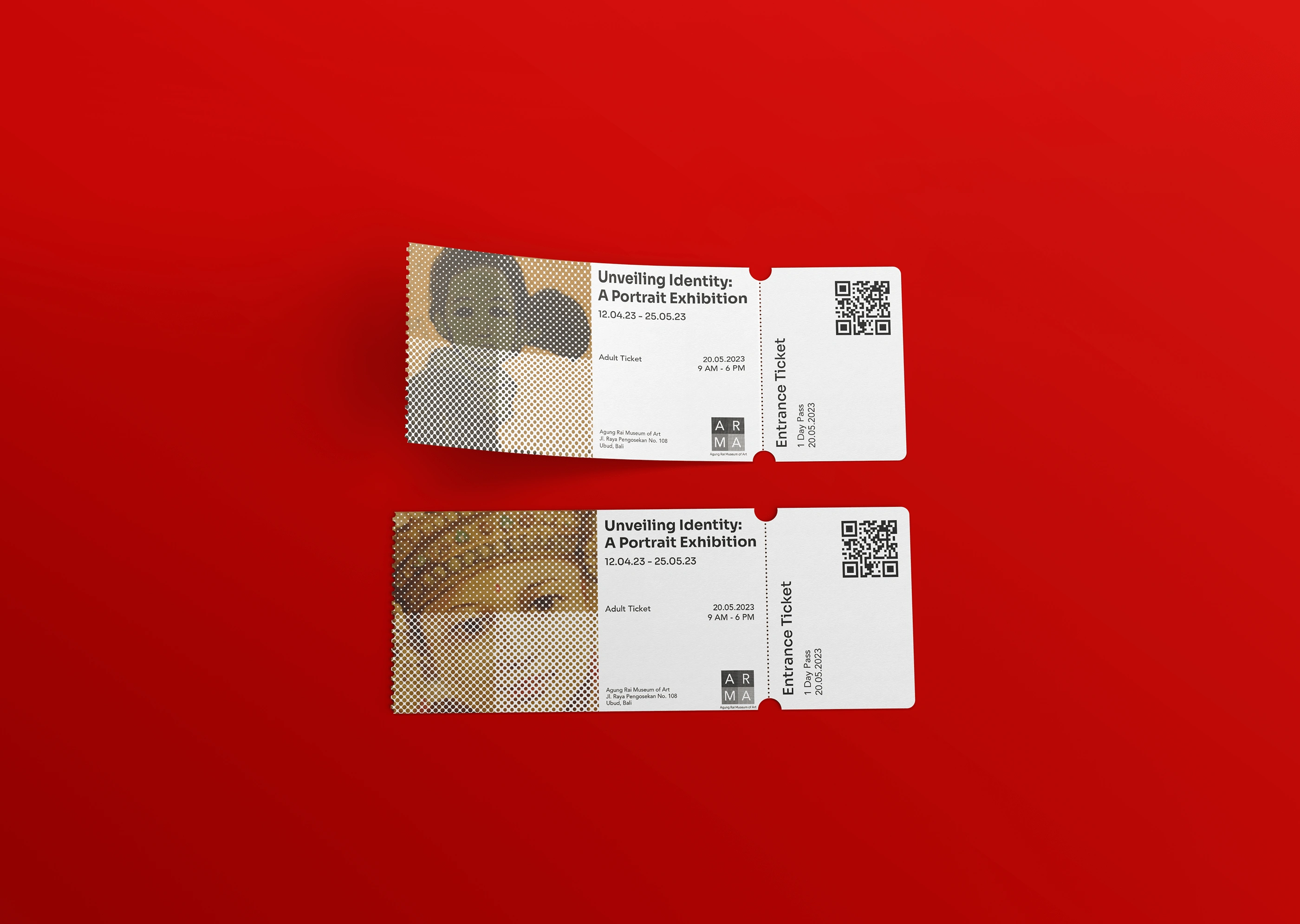
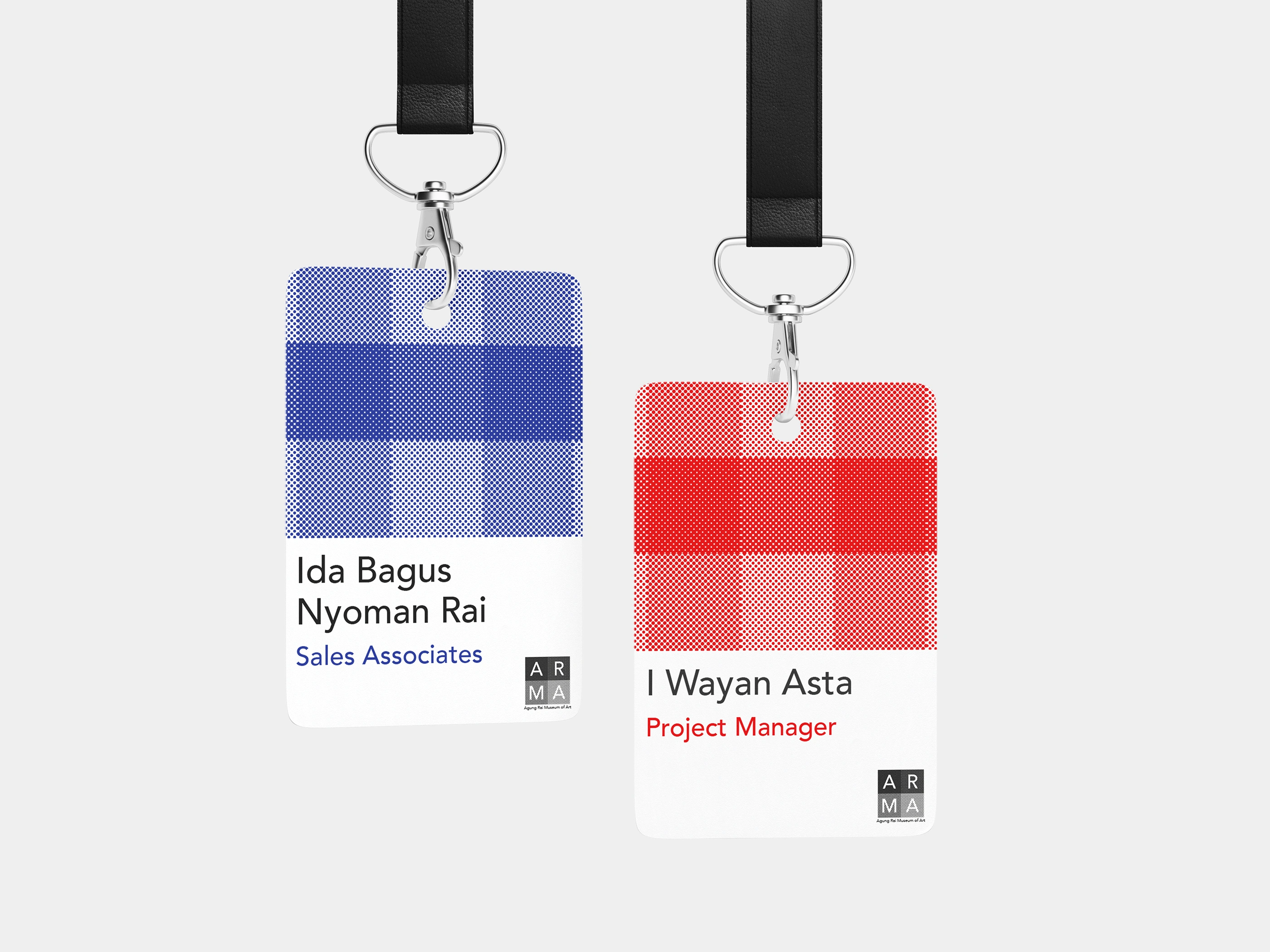
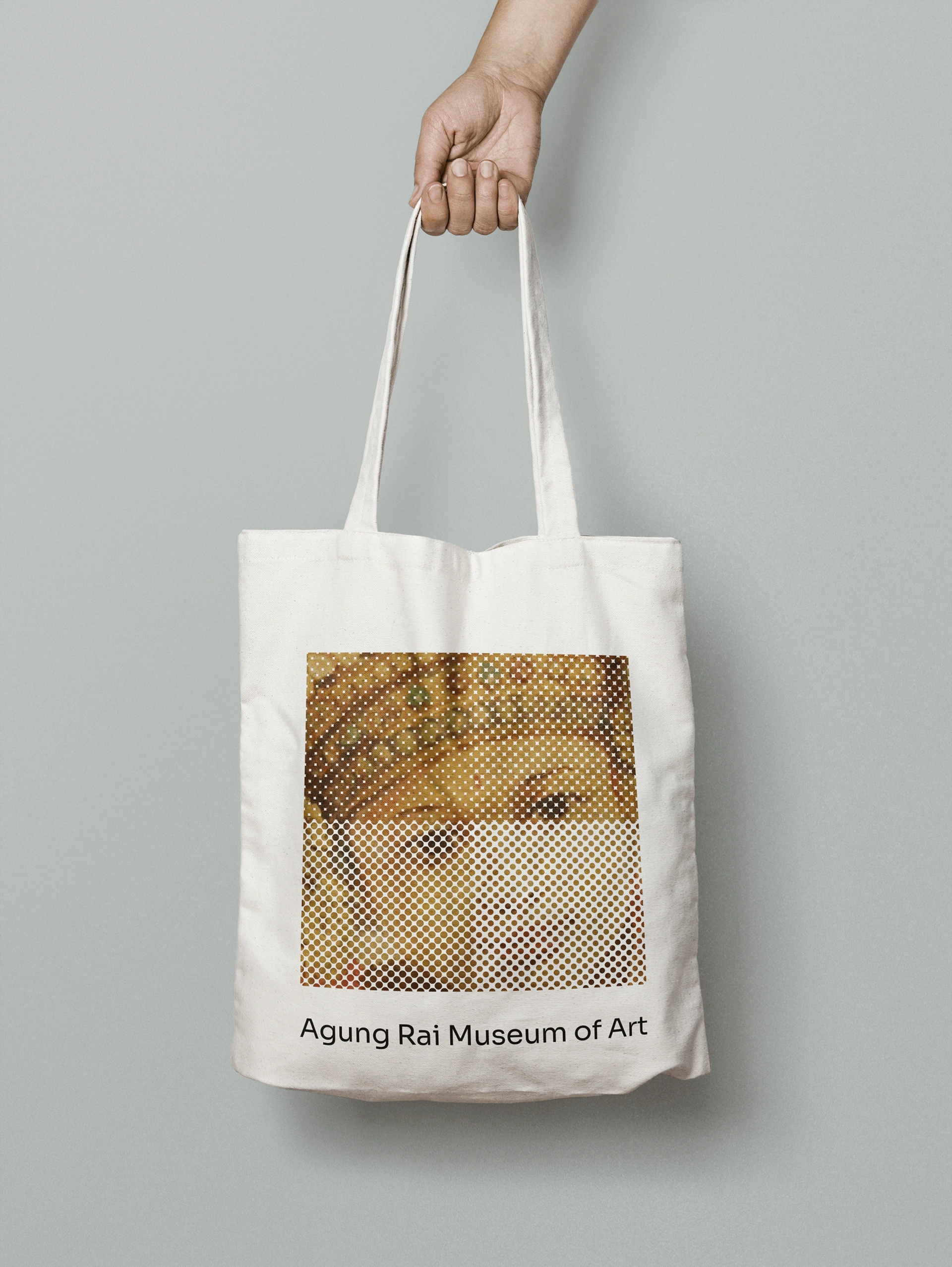
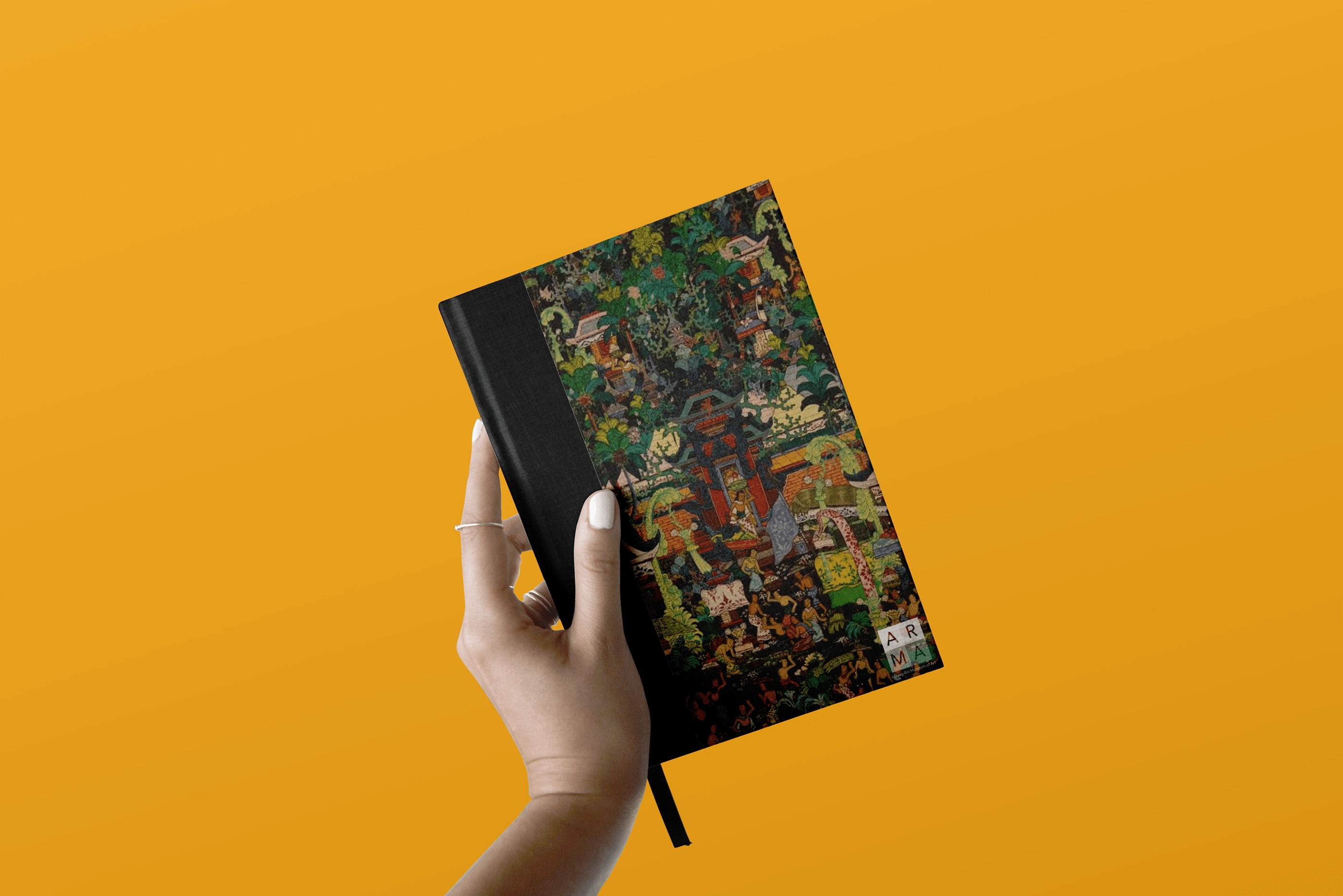
The identity is built around kain poleng, the traditional Balinese black-and-white checkered cloth. In Bali, kain poleng is everywhere: wrapped around trees, draped over temple statues, tied to shrines. It's a sign of respect to the spirits, representing balance, duality, and the coexistence of opposing forces. Bringing kain poleng into the brand identity was a deliberate choice: just as the cloth honors the spiritual world, the brand identity uses it as a sign of respect to Balinese art, which is exactly what ARMA exists to preserve. The pattern was abstracted and evolved beyond the logo into a flexible identity element that runs through every touchpoint: signage, collateral, wayfinding, and digital. It becomes the connective tissue of the brand rather than a decorative accent. The logo itself simplifies traditional Balinese artistic forms into a modern mark, but it's the kain poleng system that gives the identity its depth and meaning. Typography is clean and contemporary, creating contrast with the organic, cultural elements. The result is an identity that feels rooted in Balinese culture but could sit comfortably next to any major contemporary museum brand.
Deliverables
Full brand identity concept including logo, visual identity system, signage, collateral, and brand guidelines.
Like this project
Posted Dec 8, 2023
A personal rebranding concept for the Agung Rai Museum of Art in Bali, reimagining a cultural institution for a contemporary audience.
Likes
2
Views
37
Timeline
Jun 15, 2023 - Jul 12, 2023