Healthcare products don’t fail because
Victor Onuorah
Healthcare products don’t fail because of lack of data.
They fail because people don’t understand the data.
That was the core decision behind this design.
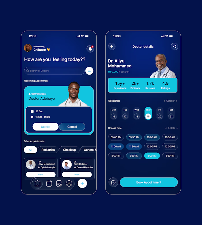
The purpose wasn’t to build another “feature-rich” health dashboard, but to solve a very human problem: health anxiety and confusion. Most users are not doctors. When they see numbers like 92 bpm or 120/92, they don’t know what to do next. They just worry.
So the first design decision was clarity over complexity.
Instead of overwhelming the user, the layout prioritizes what matters today:
A clear health overview
Visual indicators instead of raw numbers
Recent tests grouped logically
Doctors and appointments placed where reassurance is needed most
Every section answers a silent user question:
How am I doing right now?
Should I be concerned?
Who is responsible for my care?
Like this project
Posted Jan 6, 2026
Healthcare products don’t fail because of lack of data. They fail because people don’t understand the data. That was the core decision behind this design. T...
Likes
0
Views
0