Most scheduling apps give you

Victor Onuorah


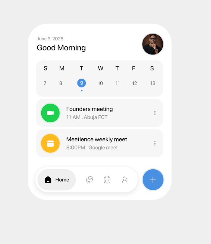
Most scheduling apps give you too much.
Too many options. Too many views. Too much to process before you even start your day.
So I designed around one question:
What does the user need to know right now?
That thinking shaped every screen, every interaction, every transition you see here.
Built entirely in Figma Make, from static UI to a fully interactive experience, while keeping the design system tight and the experience frictionless.
Because the goal was never a pretty app.
It was a useful one.
Like this project
Posted Jun 11, 2026
Most scheduling apps give you too much. Too many options. Too many views. Too much to process before you even start your day. So I designed around one questi...