
The Brief
E-Axon needed a modern logo and visual identity that communicated technology, connectivity, and forward momentum. The brand name itself carries a strong tech connotation ("axon" referencing neural pathways), and the "E" prefix signals digital-first. The logo had to capture that energy in a single mark.
Concept Development
The core idea was to build the logo around the letter "E" as both a standalone icon and the entry point into the full wordmark. The letterform was engineered with clean geometric lines and subtle curves that suggest circuitry and data flow without being literal about it.
The negative space within the "E" creates visual rhythm, giving the mark a sense of movement and precision. It reads as tech-forward without falling into cliched circuit board or pixel aesthetics.
E-Axon Logo
Visual Identity System
The full identity extends the logo's geometric language across every touchpoint. The color palette, typography, and layout system all reinforce the same clean, modern feel.
Brand Presentation
Logo Construction
Brand Applications

Stationery Design
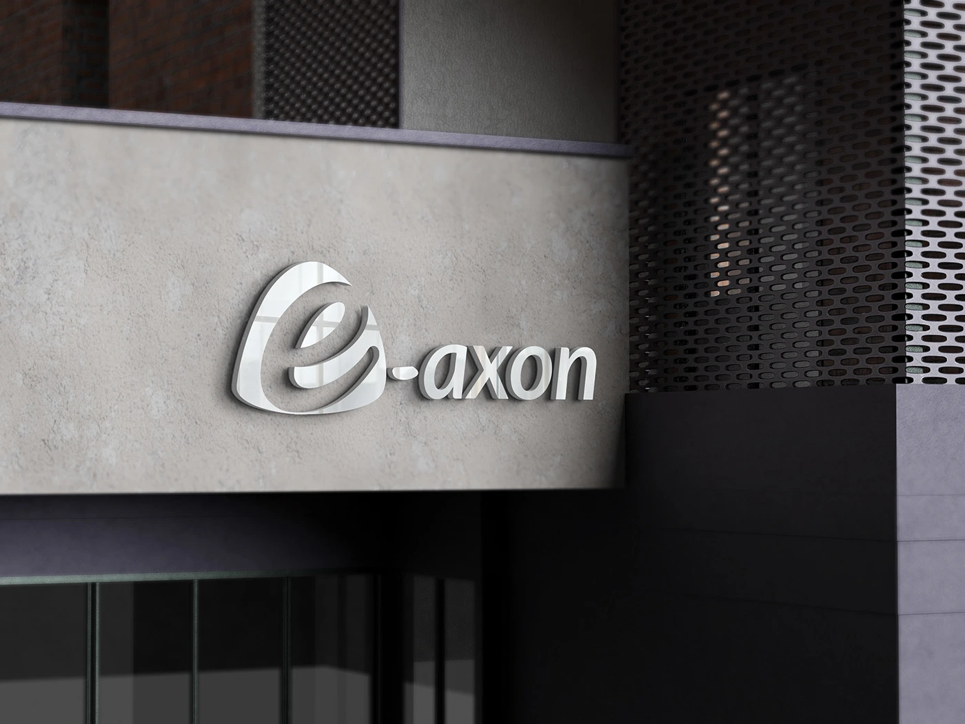
Mockup Applications
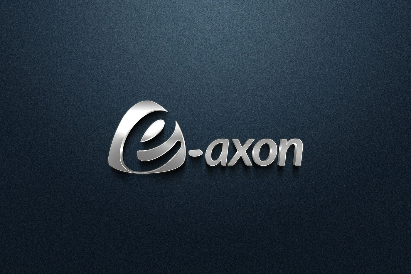
Color Variations
Design Decisions
Grid construction: The logo was built on a mathematical grid to ensure perfect proportions and consistency at every scale
Color system: A palette that balances tech-forward blues with neutral tones for versatility across digital and print
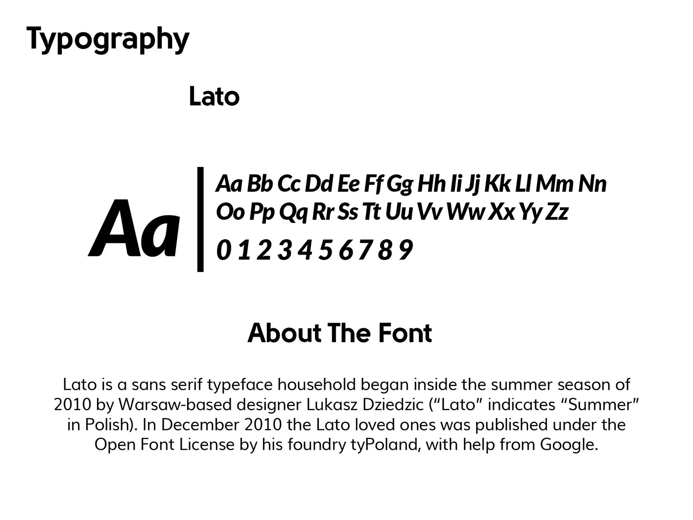
Typography pairing: Geometric sans-serif that mirrors the logo's construction principles
Scalability: Tested from app icon size through large-format signage, with the "E" icon working independently at small scales
Deliverables
Primary logo mark with full wordmark
"E" icon-only variation for compact use
Logo construction and grid documentation
Color, monochrome, and reversed versions
Complete stationery suite (business cards, letterhead, envelope)
Brand color palette and typography specifications
Vector source files (AI, EPS, SVG, PDF)
High-res raster exports for digital use
0 likes · 19 views · Jul 3, 2026
Timeline
Oct 1, 2022 - Ongoing

