Dura Riders | Mountain Bicycle Logo Design

Fahad Qaseem Khawar



The Brief
Dura Riders is a mountain bicycle brand that needed a logo conveying ruggedness, speed, and outdoor adventure. The mark had to feel at home on bike frames, jerseys, helmets, and retail packaging while staying legible at every size.
Concept & Direction
The design process started with the brand name itself. "Dura" suggests durability and toughness; "Riders" speaks to community and movement. The logo needed to fuse those ideas into a single mark that cyclists would want to wear and identify with.
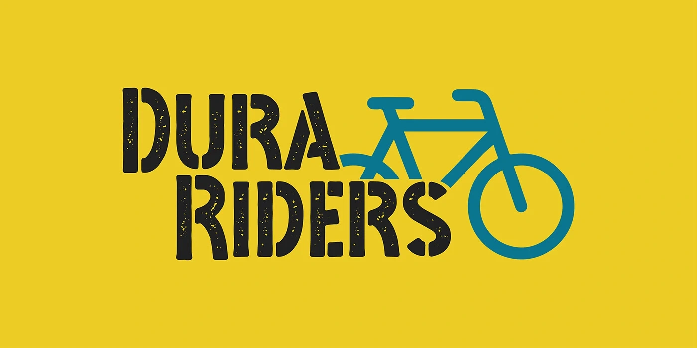
The approach leaned into bold, confident forms. The icon incorporates a bicycle silhouette abstracted into a dynamic shape that suggests motion and terrain. Rather than a literal mountain bike illustration, the mark distills the feeling of riding into clean geometry that scales from a frame decal to a storefront sign.
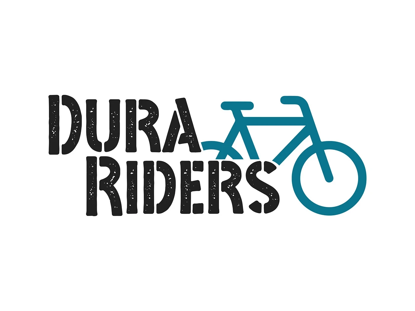
Dura Riders Logo
Brand Applications
The logo was tested across a range of real-world contexts to make sure it held up everywhere the brand would appear.
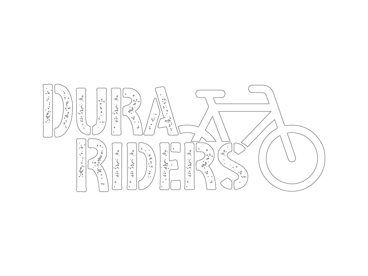
Brand Mockup
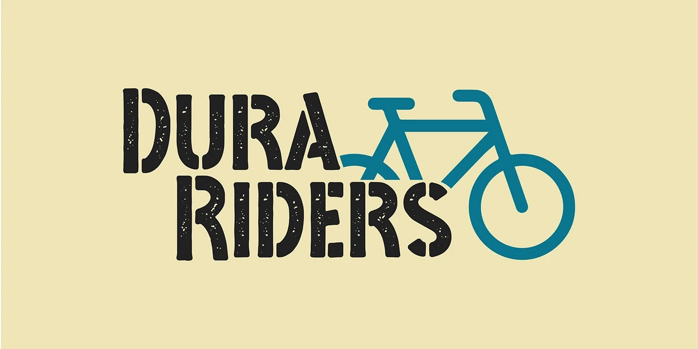
Logo Variations
Application Context
Stationery
Brand Collateral
Design Decisions
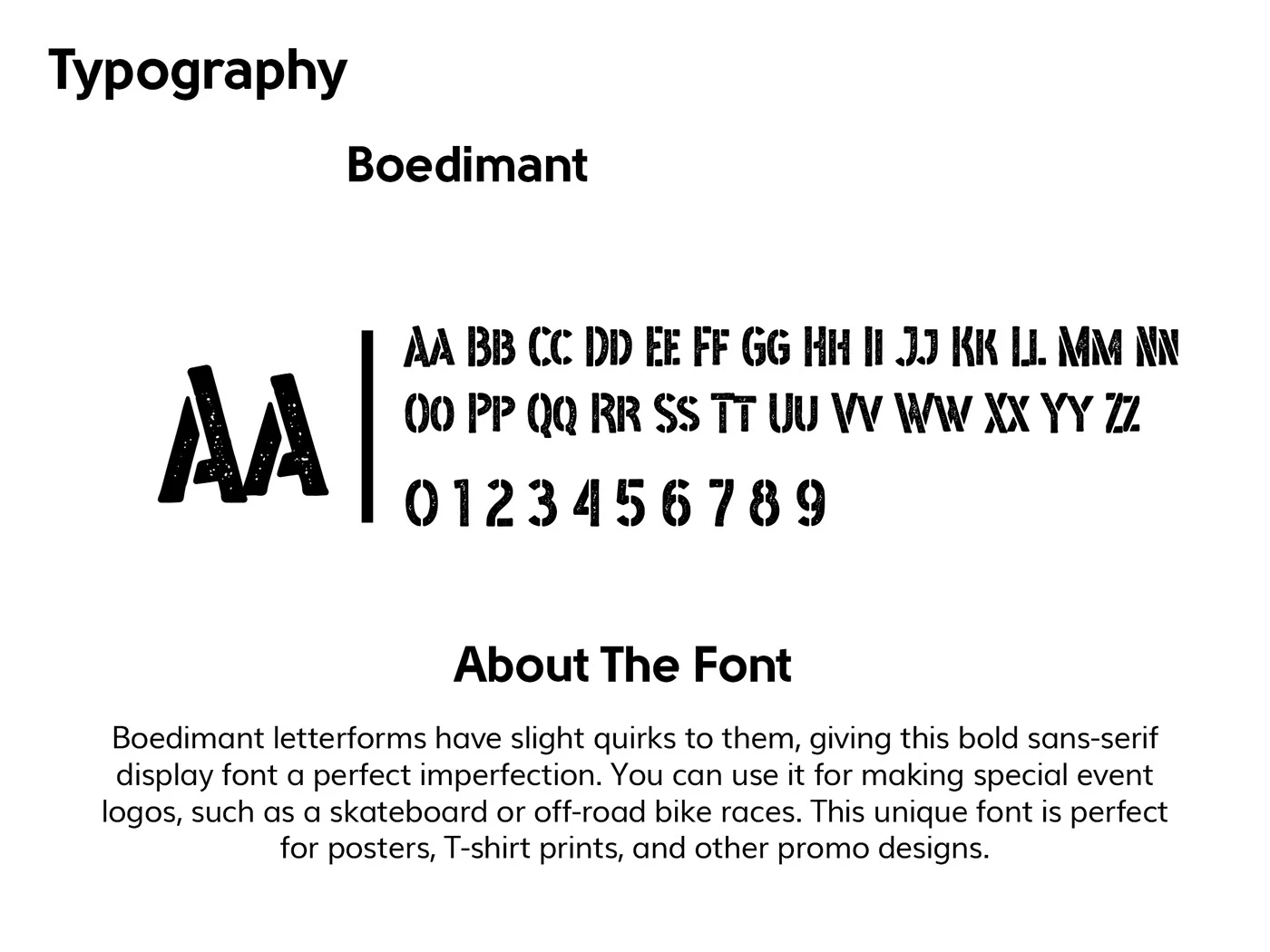
Typography: Bold, angular letterforms that mirror the aggressive geometry of mountain bike frames
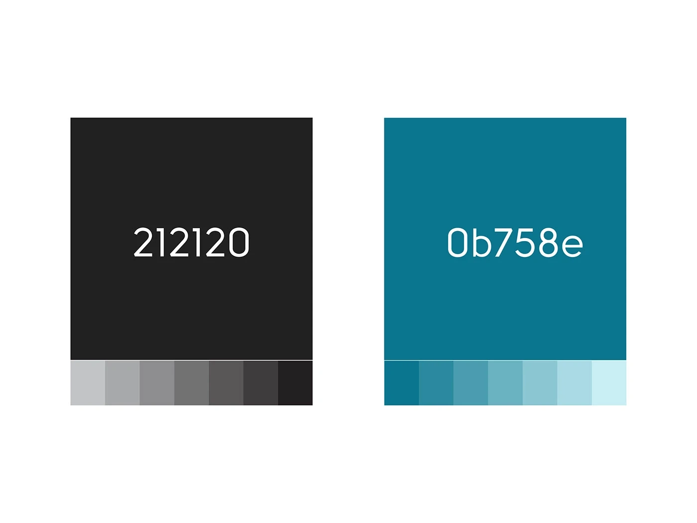
Color palette: Deep, grounded tones that connect to outdoor terrain and trail environments
Icon construction: Built on a precise grid for consistency across all reproduction methods
Scalability: Tested from favicon size (16px) up to large-format signage
Deliverables
Primary logo mark with wordmark
Icon-only and wordmark-only variations
Horizontal and stacked layout options
Color, monochrome, and reversed versions
Vector source files (AI, EPS, SVG, PDF)
High-res raster exports (PNG, JPG)
Basic brand usage guidelines
Like this project
Posted Jul 3, 2026
Likes
0
Views
14
Timeline
Dec 1, 2022 - Ongoing
Clients
Ecombranding.co